Wednesday, January 28, 2015

A timely quote about measles; an ironic one about national health insurance


 - by New Deal democrat

 I am currently reading John M. Barry's 2004 book, "The Great Influenza," about the Spanish Flu pandemic of 1918, which is said to have killed more people worldwide than any other plague (including a great- aunt and/or uncle of mine).

Two quotes seem particularly timely.

About measles:
[S]ome diseases depend upon civilization for their own existence.  Measles is one example.  Since a single exposure to measles usually gives lifetime immunity, the measles virus cannot find enough susceptible individuals in small towns to survive; without a new human generation to infect, the virus dies out.  Epidemiologists have computed that measles requires an unvaccinated population of at least half a million people living in fairly close contact to continue to exist.
 - p. 369.

In other words, a thorough enough worldwide campaign of vaccination could wipe out measles, like smallpox, forever.

About national health insurance:
"There are unmistakable signs that [national] health insurance will constitute the next great step in social legislation."
 - Rupert Blue, address as President of the American Medical Association, 1916.
 - p. 309

Real incomes: comprehensive 2013 tax data shows continuing huge disparity, and suggests slight improvement in 2014


 - by New Deal democrat

Berkeley Professor Emmanuel Saez has updated his comprehensive tax return data through 2013, showing real average incomes of the bottom 90% vs. the top 10%, 5%, and 1%.  From Justin Wolfers in the New York Times:
[With regard to t]he income share of the richest 1 percent of American families[,]  Emmanuel Saez, the economics professor who crunches these numbers based on data provided by the Internal Revenue Service, has just released preliminary estimates for 2013. The share of total income (excluding capital gains) going to the top 1 percent remains above one-sixth, at 17.5 percent.
....
[Because of income shifting from 2013 to 2012 due to the "fiscal cliff," it is f]ar better instead to focus on the average of the past two years. That average supports the narrative that the economic recovery so far has only boosted the incomes of the rich, and it has yielded no improvement for the bottom 99 percent of the distribution. After adjusting for inflation, the average income for the richest 1 percent (excluding capital gains) has risen from $871,100 in 2009 to $968,000 over 2012 and 2013. By contrast, for the remaining 99 percent, average incomes fell by a few dollars from $44,000 to $43,900.

Here's a link to the critical spreadsheet.  This is income for tax units (similar to but not identical to households). The real average income for all tax filers is the first column. The real average income for the bottom 90% is the 8th column of data. I've listed the most critical years below (first column is all tax units, the second is the bottom 0-90%):

2000   $63,649   $37,053
2007   $65,228   $36,426
2009.  $53,860   $32,019
2013.  $55,470   $31,652

Remember this is real, inflation-adjusted data.  It is the average rather than the median.

The bottom line here is the same as for just about every other study since 2009.  Wages have stagnated, and due to the increase in gas prices from $1.60/gallon in 2009 to nearly $4/gallon in 2011-13, real incomes declined slightly during that time, while due to a soaring stock market, the wealthy, who disproportionately own stocks, saw their income soar as well. 

Saez' research is exhaustive, compiling tax return data.  A drawback, however, is that now in January 2015, we are only able to see the data for calendar year 2013. Here's Saez's graph of annual real average income from 1913 through 2013 of the bottom 99%:


Thus it is noteworthy that Saez' data is very similar to that in the monthly updates starting from the late 1990s through last month by Sentier Research, and eloquently graphed by Doug Short.  Here's Sentier's graph:


So it is a fair supposition that a year from now, Saez's more comprehensive update for 2014 will show a similar increase to that we have seen in the Sentier Research.  That's good news.  The bad news, of course, is that even so, income inequality is the worst in nearly a century.

Tuesday, January 27, 2015

Consumer confidence: it's a gas, gas, GAS!


 - by New Deal democrat


This is what $2/gallon gasoline does:


via Doug Short.  This is a 7 year high in consumer confidence, and well in line with economic expansions prior to the Great Recession.

Gallup's daily economic confidence index also continues to be positive, after 7 years of being negative.

Of a piece, there used to be a site called "Professor Pollkatz" which chronicled the high correlation between George W. Bush's approval ratings and the price of gasoline.  Obama's ratings show a similar pattern.

(Btw, for you young whippersnappers, the tag line comes from an ancient Rolling Stones tune).


Oil prices and global recession: which is the cart, and which is the horse?


 - by New Deal democrat

I have a new post up at XE.com.

It seems that a poll of investment analysts showed that a majority believe that a further drop in Oil prices will signal the onset of a global recession.  To the contrary, history shows that, if there is a recession, then a steep drop in Oil prices signals that the bottom is near.

Russia Continues to Deteriorate

This is over at XE.com

A credit downgrade to junk, a falling currency and depleting central bank reserves, oh my!

Monday, January 26, 2015

A comment about the Syriza election victory in Greece


 - by New Deal democrat

As he indicates in the last post, Bonddad has an article up at XE.com describing the economic situation in Greece.  His conclusion is straightforward:
          Looking at these simple numbers, the real question that should be asked is why did this take so long to happen?
 Bill McBride a/k/a Calculated Risk, made a similar point last night:
[I]n a democracy, austerity will eventually fail at the ballot box. The people will not tolerate 25% unemployment forever - with no hope in sight.
While I disagree with many of her Doomish posts,  Yves Smith at Naked Capitalism has a very good article this morning gaming out the possibilities.  Like her, I see no reason for Syriza not to take a Maximalist approach (for examples, see GW Bush, Scott Walker in Wisconsin).  Syriza has nothing to gain by starting out with a milquetoast, let's-meet-halfway approach.  On the contrary, they have everything to gain by starting out by saying to every agent of their creditors:  "We're leaving the Euro, and we're unilaterally writing down our debts in Drachma.  If you don't like it, screw you.  If you don't want us to do that, make us an offer."

The simple fact is, the Euro states, and the European Union itself, have as much at stake as Greece.  Everybody on both sides knows that Italy and Spain, and maybe several other countries as well, are waiting in the wings.  If similar parties come to power in those countries, the sustainability of the Eurozone, and the Euro itself, are very much called into question.  No further significant European integration has happened in the 15+ years since the Euro was adopted.  Reversing EMU strikes at the heart of the European project itself:  the binding together of mortal enemies to put an end to centuries of war.  Thus every reason for both sides to put on their poker faces and play and extremely high-risk game of chicken.

A more fundamental point is about human nature.  In any economic downturn, the powerful elites are going to try to deflect all of the suffering on the powerless masses.  In a representative democracy, eventually the majority will rebel at the ballot box and elect a party which promises to end their suffering.  That's what happened in Greece, and what may happen shortly in other European countries.

In an authoritarian state, however, no such safety valve exists.  That's why, per my studies long long ago in a galaxy far far away of European history, revolutions don't happen in an era of rising expectations.  They happen when rising expectations are dashed.  So long as China's economy continues to expand stoutly, expect no meaningful turbulence.  But someday China will have a recession, and then, dear reader, is when world history will get interesting.


The Failure of Austerity, Greek Edition

This is over at XE.com

Saturday, January 24, 2015

US Equity Market Week In Review For the Week of January 19-23: The Consolidation Continues

     One of my favorite themes in looking at charts -- one that I return to fairly often -- is perspective.  While one time frame may offer little to no meaningful analysis, another has information that is clear as day.  So it is with the current market; while the short term is a technical mess, the long-term charts provide solid analysis.  So, let's start with the weekly SPYs:


The market is clearly in an uptrend, with a trend line connecting the lows of 2012 and 2014.  There are several different sell-offs, all of which use one weekly EMA for technical support.  However, two important technical indicators -- the weekly MACD and RSI -- are weakening, and have been for the better part of the year.  This means that momentum and price strength is declining, lowing upside momentum.  Overall this plays into the shorter-term dynamic that the market continues to consolidate:

   
The daily chart shows that since the beginning of the year, prices have been trading between the ~99-100 and 105 level.  The market is technically in an uptrend, as a trend line does exist that connects the lows of early April and mid-October.  But, it's a very unsatisfying trend as there is a great deal of action above that line.  And starting in December we see a clear decline in momentum and negative readings from the CMF combined with an uptick in volatility.  All of this furthers the consolidation argument.

Also consider that underneath the surface there is clearly a move to safety, as seen in these two charts:


The top chart shows the year-to-date performance of the SPYs relative to the IEFs, with the treasury market clearly outperforming.  And within the market, the defensive sectors of utilities, health care and staples are the winners.  But a change may also be afoot:


The IEFs (top chart) broke a 30-day upward trend line last week .  And the SPYs (bottom chart) not only broke through the upper trend line of their consolidation, but are also in a 5-day rally.


And the more aggressive sectors clearly outperformed the more defensive last week, with technology and industrials catching a strong bid.

     So, what does all this mean?  At the macro-economic level, the US economy is doing well, but the other developed economies are facing headwinds, as highlighted by last week's central bank action: the ECB finally started a QE program, the UK is backing off potential rate hikes and Canada cut rates.  These developments are creating headwinds.  But the US economic uptrend is clearly supporting a decent bid for US equities. 

Weekly Indicators for January 19 - 23 at XE.com


 - by New Deal democrat

My Weekly Indicator post is up at XE.com.

Simply put, you don't have a recession risk when people are bidding up prices on corporate bonds to 50+ year highs - recessions being, you know, bad for corporate balance sheets - despite an air pocket in coincident indicators.

Friday, January 23, 2015

International Economic Week in Review; Big Week For Central Bank's Edition

This is over at XE.com

To sum up this week’s central bank actions:
  • The Bank of England is now a bit less likely to raise interest rates as oil’s fall has given them a bit more maneuvering room regarding inflation.
  • Canada is concerned about overall growth, and they are acting accordingly.  As an aside, this may give the Bank of Australia an intellectual justification for action as well, given some of the underlying similarities between the economies
  • Brazil’s problems are deepening.  Growth is stagnant, but inflation is becoming more and more entrenched.  The central bank may have to engage in far more aggressive policy actions to finally take inflation out of the equation.
  • The BOJ is in a policy bind.  They are already flooding the market with yen, yet inflation’s Y/Y growth is clearly moving lower.  It’s logical at this point to ask if they’re at or very near the end of their viable policy responses.
  • The ECB FINALLY did something about inflation.  While the size of their policy response has caught some by surprise, the fact it took nearly a year into their deflationary experience is very concerning, and leads to the question of “is this occurring too late.”

Tuesday, January 20, 2015

Real wages close in on 35 year high in December


 - by New Deal democrat


The huge decline in gas prices has had a dramatic effect on consumer confidence.  As of last week, it is Near 40 year highs, ex-tech boom and 1984:


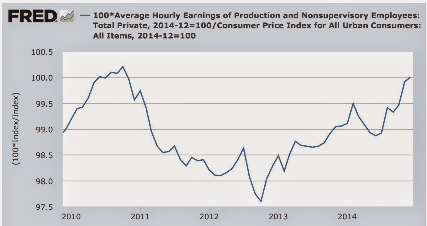
The big -0.4% decline in the CPI also means that real wages actually rose +0.1% in December, and they are only -0.2% off their 2010 peak:


With gas prices continuing to decline so far this month, there is a decent chance that real wages will make a 35 year high:


 Still under the entire 1970s period, and about 8% under their peak.  But there is no denying that the decline in gas prices is having a real effect.  In fact, both significant prior advances in real wages since 2000, in late 2006 and especially in late 2008, have occurred when gas prices declined, and they are now as well.


Monday, January 19, 2015

I'm turning more bullish on housing


 - by New Deal democrat

I have a new post up at XE.com.

Lower interest rates should help the housing market - and should subsequently feed through to the economy as a whole.  Good news.

John "Trillion Dollar Loss" Hinderaker Begins The Year Stupidly

Ol' Trillion Dollar Loss is back, ladies and gentlemen.  And, once again, he's proven that despite having a pretty impressive resume, he really don't know much about what's happening in the economy.

In writing about the Obama proposal for a tax increase, we have this gem:

Economic growth is what really matters; everything else is mostly distraction. And if there is one thing we know for sure, it is that the Democrats’ recipe of ever-higher taxes, cronyism, stifling regulations, New Class hostility to actual wealth creation (as opposed to, say, app development), and concentration of unprecedented power in government is poison to economic growth.

I have an idea.  Let's go over the St. Louis Federal Reserve's FRED data base and look at GDP growth since 2001:


No growth there.  Nope.  None at all.  And let's not forget that the Clinton economy was absolutely terrible.  Just terrible .... NOT.

This is not to say growth has been great.  But also remember that we're recovering from a debt-deflation recovery, which by definition leads to slower economic growth.

It looks like the boys at Powerline are beginning the year by continuing their now long-standing tradition of being 100% wrong about everything economic.  For a recap of the depth of their incompetence, read here.


Saturday, January 17, 2015

Weekly Indicators for January 12 - 16 at XE.com


 - by New Deal democrat

My Weekly Indicators post is up at XE.com.

I've been saying that at some point soon mortgage applications had better start turning positive.  Well, this week ....

US Equity Week in Review For the Week of January 12-16

     At the start of a new year, it's easy to fall into a pattern of thinking that the market will go up.  After all, it's the new year!  And, according to most analysts (myself included), the general consensus is the US economy ended the year with a bang that should continue forward into the new year. 

     Unfortunately, the markets are not cooperating with this sentiment.  But it's not the fault of the US economy.  Instead, global weakness is changing traders' risk calculations.  As I noted in my international week in review over at XE.com, Australia, Japan, Canada, the EU and Russia are all experiencing some type of weakness, which is increasing volatility and creating a safety bid in the market.

     Let's start by looking at the VIX:


The market was lulled into a sense of false complacency at the beginning of 2Q14, as the VIX readings moved to between 10 and 12.  There were two spikes in the second half -- one in early August and the second in early October -- but things quickly settled down toward the end of the year.  But in mid-December, volatility really picked-up.  As a result:


The treasury market has caught a strong bid at the start of 2015, with the long end (the TLTs) moving from 122.93 to 133.19, for an overall gain of 8.34%.   More importantly, notice the strength of the rally.  The 30 minute chart shows a continued move higher, with the ETF consolidating at several points and then making a disciplined advance on a regular basis.


But perhaps the real star of this latest move is the US dollar.  Starting in mid-July, the dollar started to rally and has continued on this path.  From the absolute July low to Friday's close, the dollar ETF has advanced 15.66%, indicating there is a very strong bid for US assets.  And considering the move in the treasury market, it's clear that investors are looking for safety.

     When looking at the US equity markets, things get a bit trickier because no really clear trend emerges.  The SPY's daily chart is a case in point:


On the one hand, the chart may be in the middle of a pennant pattern.  Or, we're in the middle of a downward sloping channel.  An argument could be made for either at this point.

     But several other markets may be indicating we're about to see at least a small move lower.   Consider the transports:


This index has clearly broken trend.  But, prices have not moved sharply lower. 


And the IWMs are back below their near-year long upper channel line at the 119-120 level.  But like the transports, the move lower is not sharp.  Instead, prices broke support and then consolidated right below that level.

     But in comparison to most other equity indexes, the US is the only one that is in positive territory for the last year (save for China):


Over the last year Europe, the UK, Canada, Australia and Japan are all at a loss.

So, after all of this meandering, what can we say with confidence?

1.) There is clearly a safety bid in the market.  The US dollar is rallying as investors convert other currency holdings into dollars to buy treasuries.

2.) While the US economy is in good shape, the weight of negative numbers from around the globe may pull the US indexes lower.  Or, at minimum, keep them from rallying strongly.
    

Friday, January 16, 2015

A "perfect" yield curve recession indicator: perfectly awful, that is


 -by New Deal democrat

I have a new piece up at XE.com, calling out some egregiously bad analysis regarding an allegedly perfect bond yield curve indicator, NOT!

Commodity Sell-Off Is A Demand And Supply Problem

This is over at XE.com

Demand is clearly contributing to the commodity sell-off.  After all, economies growing below potential obviously demand less of everything.  And with several regions experiencing economic problems (Russia, the EU and Japan), overall demand will be lower.  But there is also over-supply.  Shale oil exploded, adding to supply while also challenging the Saudi dominance of the oil market.  They responded as a classic oligopoly: crash the price to push out competition.  And copper is also over-supplied.  Producers invested heavily, betting on continued Chinese demand.  But as China has lowered their GDP growth projections, they are simply demanding a lower amount of raw materials.  The summation is that we’re looking at a demand and supply issue.