Monday, July 28, 2014

The housing market halfway through 2014: a comprehensive report


 - by New Deal democrat

Wtih this morning's report on pending home sales, housing data from the first half of 2014 is in the books. At the end of last year, I politely disagreed with Bill McBride a/k/a Calculated Risk, about the direction of the market this year.  Bill thought average starts and sales would be up 20%.  Based on increased interest rates, I believed they would be down by about -100,000 at some point this year.  Except for one outlier in housing starts in April, neither has panned out so far, with data coming somewhere in the middle.  With that summary, let's take a detailed look at housing through midyear.


As I wrote last month, the housing market tends to cycle in a regular order:
  • 1st, interest rates turn
  • 2nd, permits, starts, and sales turn
  • 3rd, prices turn
  • 4th, inventory turns
Because of the time lag, prices and inventory may still be reacting to a move in interest rates that has since reversed - and that appears to be the case now.  Let's look at where each of those points in the cycle stands.

Interest rates


First, here is a graph, covering the last 30 years, of the YoY% mortgage rates (inverted so that higher rates give a lower value, blue) vs. housing permits, YoY change in 100,000's (red):


Here's a close-up of the last 5 years:


Interest rates on mortgages went up from 3.4% in early May 2013 to a high of 3.6% in August of last year.  On 16 of 19 occasions since the end of World War 2, that big a change led to a YoY decline of at least -100,000 in permits. In this case, housing permits have since drifted back lower, down to 4.1% at the end of June of this year, and in the last month have been on average about -0.3% lower than they were at this time last year.


The YoY decline in interest rates indicates that we should shortly start to see some improvement in permits, sales, and starts, although probably muted since rates have not returned to 2013 lows.

Permits, starts, and sales


Here is a graph of the change, in thousands, YoY of starts (blue), permits (red), new home sales (green), and existing home sales (orange) (note that the St. Louis FRED does not track pending home sales):


Next, here is the YoY% change in the same four statistics:


Both of these graphs show the clear deceleration in the housing market through 2013 and into 2014.  With the sole exception of housing starts in April (a more noisy series than permits), which may have been a bounce-back from an unexpectedly dismal winter, all of the major series have been dead in the water this year. New and existing home sales have been consistently negative, and permits up only +2% in the first half of 2014 compared with the first half of 2013.

This morning, pending home sales were reported as down -1.1%  from May to June, and down -7.3% from June of last year, which was also the index's post-housing bust high.  It further appears that February of this year was the subsequent low in reaction to higher interest rates. The index is up +9% on a seasonally adjusted basis since that time.

In summary, through June 2014:

  • Permits are down -10% from their October 2013 high
  • Starts are down -19% from their November 2013 high
  • New home sales are down -10% from their January 2013 high
  • Existing home sales are down -6% from their July 2013 high
  • Pending home sales are down -7% from their June 2013 high
As I noted a month ago, May new home sales were as big an outlier to the upside as March was originally reported to the downside, so a significant revision was very possible.  March was subsequently revised about 10% higher, and May has now been revised over 10% lower than as originally reported.

The impact of demographics on permits, starts, and sales

I suspect the situation this year is analogous to the late 1960's (one of the four exceptions to the rule that rising interest rates cause an actual decrease in sales), when Boomers first reached adulthood and the existing apartment stock was nowhere near adequate to the task.  Multi-unit starts skyrocketed, despite higher interest rates, while single family homes languished. It was an era of generally rising interest rates, and any temporary decline in interest rates was met with heightened housing activity.

Now it is Millennials. Now as then, it is only multi-unit (apartment) construction that is carrying the recovery in housing this year. Single family home starts and sales have completely stalled.  Here is a graph of the YoY% change in single family house permits (blue) and multi-unit permits (red) since the beginning of 2011:


Since late 2013, multiunit construction has been entirely responsible for any increase in residential construction. Single family home construction has completely stalled.

Prices


Prices continue to increase, but YoY the price gains are decelerating at various rates depending on the index.  Let's start by showing the YoY% change in median prices in the Case Shiller 20 city index:


The YoY% change in median prices for new homes (red) and existing homes (blue): shows even further deceleration:


Finally, it is worth noting that the same deceleration is also showing up in the data at Depatment of Numbers Housing Tracker. I used this database of asking prices, which is updated weekly, to call in real time both the top of the housing boom in 2006, and the bottom of the housing bust in 2012.  What is particularly noteworthy is that in 2006, it was the asking prices for houses in the 75th percentile (more expensive homes) which turned first.  Now prices for those same more expensive houses are showing the most deceleration of all, as shown in this table, which shows the YoY% change for each percentile of houses for sale nationwide:


Month

25th
percentile
50th
percentile
75th
percentile
Jun 2013
6.3
7.4
7.5
Sep 2013
12.0
10.9
7.9
Dec 2013
13.3
11.2
7.8
Mar 2014
13.8
10.7
6.3
Jun 2014
14.3
10.9
5.9
Jul 2014
12.0
9.1
4.7

Inventory

With housing prices still increasing, albeit at a reduced rate, we would expect to find more inventory entering the market, as potential sellers hope to take advantage of the improved pricing situation.  And that's exactly what we find. Below is the graph of combined new and existing home inventories:


The inventory of houses for sale is not just increasing, but it is increasing at an accelerating rate YoY.


In summary, through midyear 2014:

  • Higher interest rates since May 2013 have brought growth in single family home building and sales to a complete halt. Only demographics-driven building of apartments and condos is supporting growth.  With interest rates turning slightly lower YoY as of June, there will probably be renewed vigor in housing permits, starts, and sales by the end of this year.  We have either already seen the interim bottom in permits, starts, and sales, or will shortly.
  • Decelerating and/or YoY declining sales have existed long enough for prices gains to decelerate, although they haven't turned negative on a YoY basis.  Since prices are seasonal, it is difficult to tell, but the peak may already have occurred. 
  • Although prices are decelerating, they are still higher YoY and thus inventory is continuing to pour onto the market.  This will probably continue, but will begin to decelerate between now and the end of this year.
In short, as of midyear 2014, the trends in the housing market are reacting in their normal order. Interest rates have turned positive, sales are bottoming, prices are increasing at a quickly decelerating rate YoY and may actually have peaked, while inventory is still increasing smartly and is likely to continue to pour onto the market for a while longer.


Dollar Tree Buying Family Dollar

On June 12th, I explained the reasoning behind Icahn's buying a 9.4% stake in Family Dollar.  Today, Dollar Tree has agreed to by Family dollar at a solid premium. 

Nice trade, Carl.

A note on existing home sales


 - by New Deal democrat

I put a post about last week's report of existing home sales up at XE.com.

Sunday, July 27, 2014

Steven Hayward of Powerline Fails Econ 101 (Again)

I know, I know  -- saying that one of the "experts" over at Powerline fails in econ is a foregone conclusion.  But sometimes it's amazing just how inept they are.

In his latest salvo, Hayward writes:

Anyway, most economists will tell you that your attitude about the minimum wage is a test as to whether you paid attention to the first day of Econ 101 (and even the NY Times editorial page said as recently as 1987 that the right minimum wage should be zero).  But Common Core liberalism requires a higher minimum wage now as an article of faith.

Well, actually, no there's a lot more to this than drawing simple lines on a supply and demand graph.  As noted by the CEA:

Finally, as one recent review of minimum wage research published since 2000 concluded, “The weight of that evidence points to little or no employment response to modest increases in the minimum wage.” Many economists now believe that a substantial portion of the cost to employers of minimum wage increases is offset by savings from reduced employee turnover and higher worker productivity. Moreover, in the short-run in an economy that is still demand-constrained, raising the minimum wage will increase the purchasing power of a vital segment of workers and contribute to stronger overall economic activity.

Mr. Hayward might want to actually click on the link listed above -- unless Hayward's Nobel Prize in econ informs him differently.

But more importantly, he might want to look at the actual evidence that's occurred since 13 states raised their respective minimum wage:

Beginning in January of this year, 13 states individually increased their own minimum wages, creating a sort of natural experiment in which the remaining states could serve as a control group. All that was left was for someone to do the math, and the Center for Economic and Policy Research, building on research conducted earlier in the year by Goldman Sachs, delivered that in a report last week.

Of the 13 states that raised their minimum wages, all but one saw job growth in the first five months of 2014. To be sure, that’s a small achievement in an environment where the national economy is adding something on the order of 250,000 jobs per month.

The really interesting finding is that the states that raised the minimum wage saw job growth that was, on average, higher than states that did not. The 37 states that did not raise the minimum wage at the beginning of this year saw employment increase by .68 percent. Those that did raise the wage saw employment increase by .99 percent.

In other words, states that have raised their minimum wage have seen an increase in their employment -- which runs counter to Hayward's argument.  Not that reality means much to him, however.

All Hayward had to do was search "minimum wage" in the news over the last month to find that article.  In fact, practically everyone who reads economic news on a regular basis saw that piece of news over that time period. 


Two thoughts for Sunday on increasing inequality of wealth


 - by New Deal democrat

A new study by the Russell Sage Foundation on changes in wealth is yet another piece of confirmation that "the American dream" has only been working for a select few at least since the turn of the Millennium.  Two pieces of data in that study are of particular note.

First of all, the graph of median wealth per percentile since 1984 reveals that an important change happened shortly after 2000, but before the onset of the Great Recession:


Note that between 1984 and 2003, the increase in inequality did not involve the poor getting poorer (although studies of wages as opposed to wealth indicate wages for the lower percentiles were declining during that time).  Rather, the more affluent pulled away.

After 2003, however, but before the onset of the Great Recession, the bottom 25% of households, whose wealth had previously at least kept even over the previous 20 years,  experienced a real 30% decline in wealth.

This is the group most likely to live in apartments and who therefore did not benefit on paper from the housing bubble.  Almost certainly this was due to the offshoring of blue collar  labor that grew geometrically once China was granted "most favored nation" trading status in 1999.   That this large decline for a large swathe of ordinary American households occurred during a time of overall economic growth was a calamity, and an indictment of the accompanying economic policy.

Secondly, a few words of caution in interpreting this table that accompanies the report:


While the table is certainly very powerful evidence of the precarious state of the median household, I would prefer to see a table that does not include housing wealth.  This particular table mainly shows the impact of the housing bubble and bust on wealth.  While "trading down" and cashing in the difference at retirement does occur, appreciation in housing value is most usually traded in for a larger house, or simply retained over the occupant's life.

Perhaps more importantly, this table does not adjust for age, and so must be treated with caution.  For example, the household at the 75th percentile is found to be worth $260,000.  I would regard a 25 year old who is worth $260,000 as upper middle class, if not borderline wealthy.  They can already own the median house outright, have a nice car, and devote all of their wages or salary to long term saving for, e.g., retirement, and to discretionary spending.  Pretty sweet.

On the other hand, a 65 year old worth $260,000, particularly when that includes wealth tied up in a house, is faring no better than lower middle class.  Where pensions are a thing of the past, this household is going to live a very precarious old age.

Put another way, most 20-somethings are probably in the bottom 20% of households in terms of wealth (especially with student loans).  At the other end of the spectrum, not infrequently the household with a net worth at the 90th percentile is also known as "mom and dad."  They've lived beneath their means, and put away $10,000 a year or more throughout their working lives, and due to appreciation of those savings and probably some investments like mutual funds, seen the nest egg grow.

The last time I saw a study that spelled out wealth difference by percentile by age was over half a decade ago.

The Russell Sage Foundation data is powerful.  As with all data, just sift carefully.


Near 14 year low in initial jobless claims


 by New Deal democrat

I put a post up about the nearly 14 year low in initial jobless claims up at XE.com.

Saturday, July 26, 2014

Trends in real per capita income


 - by New Deal democrat

In the last several weeks, I have done extensive research on trends in real, inflation adjusted Income per capita over the last 20 years, starting with 1993,  Translated from economics into regular english, what I have been looking at is how well each individual American, and also each individual *working* American fared in terms of income over that period.

Real personal income minus transfer payments (Social Security, etc.) is one of the 4 generally accepted markers for whether the economy is in a recession vs. an expansion.  Calculating per capita real personal income is easy, courtesy of the St. Louis FRED, and here it is (blue), and I've additionally shown personal income divided per capita only by the civilian labor force rather than by the population as a whole (red):


You can easily see that real per capita personal income rose sharply in the tech boom of the 1990s (up 24.2% from 1993 to 2000), stalled briefly during and after the 2001 recession (but never dipping below the 2000 level), and then rose more slowly  through 2007 (up 11.2% since 2000) before falling during the Great Recession, and then rising again to a new high in 2012 (up 12.2% since 2000).

In general, the civilian labor force tracked population growth until 2008, and since then has grown much more slowly than population as a whole, chiefly because of the onslaught of Boomers retiring.

In any event, whether we adjust by population as a whole, or by just the labor force, per capita real personal income has generally grown throughout the last 20 years.

Although it is not nearly as broad a measure as the Bureau of Economic Statistics' "personal income" metric, another way in which per capita income might be looked at is as real per capita adjusted gross income, i.e., the income reported to the IRS on tax forms.

While this is not kept graphically by either the IRS or the St. Louis FRED, I have created the following table showing real adjusted gross income from 1993 through 2011 (the last year available at the IRS site), adjusted per capita both by population, and by the size of the civilian labor force (+those not in the labor force but who want a job now).  The second measure is not perfect, but does make a reasonable approximation of taking into account the wave of Boomer retirements (all figures in $Trillions):

Year Pop adjusted CLF adjusted Year Pop adjusted CLF adjusted
1993 4.8134.3562001 6.008 6.014
1994 4.8644.4862002 5.6825.699
1995 5.0154.726 20035.676 5.680
1996 5.2145.0102004 5.950 5.974
19975.5205.534 2005 6.2316.345
1998 5.8545.721 2006 6.528
6.495
1999 6.1236.0482007 6.708 6.685
2000 6.3656.36520086.3226.295
avg 1993-2000 5.4715.258 avg 2001-08 6.138 6.148


2009 5.6285.625


2010 5.8245.887


2011 5.8235.911


avg 2004-11 61266.152


Note that I have averaged each 8 year period of 1993 - 2000, and also 2001 - 2008, and separately 2004-2011.  The bottom line is that real per capita adjusted gross income was higher in both of the 8 year period calculations since 2000, than in the 8 year period ending in 2000.

Still, by virtually any measure, incomes since 2000 have generally been below that year.  That is partly because of demographics, since labor force participation starts to decline slightly after age 55 and more significantly after age 60, as shown in this graph (h/t Doug Short):


Additionally, the year 2000 marked the lowest point in the last 40 years for the unemployment rate, as shown in this graph of the unemployment rate on an annualized basis:


A smaller percentage of the population has been earning wages and salaries since the turn of the Millennium, and so median and average income has suffered.

Several weeks ago, David Cay Johnston wrote a column in which he used 2000 as a benchmark, and cumulated average and aggregate per capita adjusted gross income since then through 2012.  I criticized the column, and he objected to the criticisms.

As I read the column originally, the main point of the article appeared to be that Americans are having a tough time because wages have stagnated, and the discussion of income and the Bush tax cuts in the second part of the article were evidence offered in support. 

I have subsequently been advised, if I understand correctly, that the first part of the article (including the discussion of wages) was only introductory, and the main point of the article was:
1.  Bush promised that his tax cuts would deliver prosperity for all.
2.  Bush promised that the prosperity for all would include rising incomes, even including demographic changes that were well known.
3. Therefore it is appropriate to measure Bush's promise by using the measure of income, and declines in reported income due to demographic changes do not matter, since Bush promised they would not matter, (and possibly agreed that the appropriate yardstick was a comparison with 2000).
4. Looking at income as reported to the IRS, not only was there not prosperity for all, but the average taxpayer LOST income.
5. Therefore, by Bush's own yardstick, his tax cuts were a failure and different policy choices should be made.

If this is all true, then my criticism of the article as to conflating wages with income, and not adjusting for demographics, is moot, as they are not relevant to that yardstick.   Thus, while the writer did not adjust for Boomer retirements, had he done so, the outcome, as indicated above, is the same.  

Viewing the matter not by any unique Bush yardstick, but as a matter of general economic trends, it seems clear upon my reading that most readers did in fact confuse wages and income. In such discussions, a clarifying statement that to the effect that wages have stagnated, but partly due to demographics (retiring Boomers) and partly due to increased unemployment, income as reported by taxpayers has declined, would be easy to include.  I think it is a reasonable contemplation that the confusion evident among the comments I read, was a probable result of the omission of such a clarifying statement. Regardless, if the purpose of the article is as I have described it in 5 points above, then the issue of wages and demographics are simply not applicable in terms of an examination of what is said to be Bush's own yardstick. 

But to summarize in terms of economic data vs. a particular political yardstick:

1. The trend in real per capita personal income has been rising over the last 20 years, including since 2000.
2. The trend in real per capita adjusted gross income reported to the IRS has also risen generally in the last 20 years, but in much more variable fashion, with extended periods between old and new peaks.
3. The year 2000 marked the peak of the 1990s tech boom.  Only as measured by that specific year, or to a much smaller degree, using 1999 as the benchmark, does a subsequent cumulative decline appear.  As a matter of general economic discussion, whether measuring subsequent multi-year periods by reference to that specific year is appropriate or not, I leave to the reader.


International Week in Review: US Housing Market Stalling, Edition

This is over at XE.com's Currency Blog

http://community.xe.com/blog/xe-market-analysis/international-week-review-us-housing-market-continus-stall-edition

Weekly Indicators for July 21 - 25 at XE.com


 - by New Deal democrat

This week's installment is up at XE.com.

That layoffs last week were only 2000 above a 14 year low is extremely good news.

Wednesday, July 23, 2014

Bon-Ton Stores Are Shortable Below the 9-10 Price Range


The chart above is a weekly chart of the Bon-Ton stores.  Going back about a year and a half, the 9-10 dollar price range has provided tremendous support for the stock.  The stock has also had trouble developing any upward momentum.    It's only had two meaningful rallies in the last two years, and both fizzled out.

The chart tells us that if prices move below the 9 price range there is downside opportunity.  Let's look at the reasons why.  First, BONT is a department store, as explained in their latest 10-K:

The Company, a Pennsylvania corporation, was founded in 1898 and is one of the largest regional department store operators in the United States, offering a broad assortment of brand-name fashion apparel and accessories for women, men and children. Our merchandise offerings also include cosmetics, home furnishings and other goods. We currently operate 271 stores in 25 states in the Northeast, Midwest and upper Great Plains under the Bon-Ton, Bergner's, Boston Store, Carson's, Elder-Beerman, Herberger's and Younkers nameplates, encompassing a total of approximately 25 million square feet.

I really dislike retail for a number of basic reasons: margins are very low (meaning fixed costs are very high), competition is intense and the US consumer is still luke-worm on spending, especially on non-durables (BONT's bread and butter):


And then, like all retailers, there is the 200-pound gorilla in the room: AMAZON, which is hitting everybody in the industry hard.

The company's balance sheet is actually in OK shape.  The Current ratio has been fluctuating between 1.7 and 1.92 over the last five years.   While the quick and cash ratios are much thinner, this is to be expected from a retailer where inventory is over 80% if current assets.

The real story here is stagnating sales and lack of profitability.


As the chart above shows, the best pace of growth over the last 4 years was .86%.  And the margins aren't much better:


While the gross margin (in blue) has been printing at consistent levels over 35%, the best the operating margin has been over the last five years is 4.44%.  But the average margin for the same time period is 2.87% while the median is 2.45%.  Then there's the net margin level, where the best reading over the same time period is .71%.  And for the other four years, the company has lost money, which is slowly bleeding the company's cash:


Total cash has consistently dropped from $18.9 million to $7 million over the last five years.

And finally, there is the book value situation:


Using the standard assets-liabilities book value calculation, we see a drop from $141.7 million to $127.9 million over the last five years.  However, that calculation assumes inventory is valued at 100% -- which would never happen in the a fire sale.  So, valuing inventory at 50% (which is part of the G&D analysis) we get a negative book value.  Now, a store of this prominence would never sell for nothing.  The point, however, is this company's overall value is at best declining. 

Between the intense competition in the industry, a deteriorating revenue and margin situation and the declining overall value, this stock is a sell.  A technical move below $9 would indicate the market has re-evaluated the company's overall prospects negatively, meaning it would be time to short.

The information contained herein has been obtained from sources or data that we believe to be reliable, but we do not offer any guarantees as to its accuracy or completeness. Market information is subject to change without notice and past performance is no guarantee of future results. Neither the information nor any opinion expressed constitutes a solicitation for the purchase or sale of any security or other instrument.


Tuesday, July 22, 2014

The Weak EU Monetary Base And Investment Situation

This is over at XE.com

http://community.xe.com/forum/xe-market-analysis/weak-eu-monetary-base-and-investment-situation

Saturday, July 19, 2014

Weekly Indicators for July 14 - 18 at XE.com


 - by New Deal democrat

This week's post is up at XE.com.  The positive trends keep on keeping on, especially with initial jobless claims.

International Week in Review: Hey, We're All Still Growing Moderately, Edition

This is up over at XE.com

http://community.xe.com/forum/xe-market-analysis/international-week-review-hey-were-all-still-growing-moderately-edition

Friday, July 18, 2014

US On Track For Stronger 2Q Growth

This is up over at XE.com

http://community.xe.com/forum/xe-market-analysis/us-economy-target-better-2q-growth

Tuesday, July 15, 2014

Monday, July 14, 2014

Why Is Anyone Fighting For, Or Giving Money To, American Apparel?

  • American Apparel is operating in a very weak consumer environment
  • The company has not shown a profit in 4 years
  • The company has a negative book value and a 60% debt/assets ratio.

There's been a fair amount of ink spilled on the American Apparel story.  One of the primary founders share ownership was diluted, so he devised a plan in conjunction with (I believe) a hedge fund to provide financing. 

However, here's the question for all the parties involved: why are you interested in investing in this company?

Let's start with the economic environment we're operating in by looking at personal consumption expenditures:


The year over year percentage growth in clothing and footwear expenditures is very weak.  There are numerous reasons for this (weak job growth, weak wage growth and low consumer confidence being primary contributors).  But the point is the macro environment is not encouraging.

And the company is not in good shape.  For example, they haven't shown a profit in four years:


While gross margins are fine, operating and net margins are negative or barely positive.  And top line revenue growth has been weak.  The best year was 2012 when gross revenue increased 12%.  But the 4 year average is 3.39%.

And then there's the declining book value.  Let's look at two simple measures of book value: pure value (assets-liabilities) and a modified version where I assume inventory is sold at 50% of value.


If the company has to be liquidated, the chances are you'll do so at a loss.  That means the most logical next step in the event of major problems is bankruptcy court, where no creditor wins.  And in the event the company winds up there, you've got a 60% debt/assets ratio with bond holders/lenders most likely holding senior covenants and other legal rights that supersede equity holders claims.

So, the company is operating in a weak industry, has slow revenue growth, has negative book value and hasn't made a profit in four years.  And, you're got creditors who's loans total 60% of assets, in addition to probably having all sorts of superior claims to equity holders.  This is not a good investment -- unless you're looking to short.

Sunday, July 13, 2014

David Cay Johnston Post

David Cay Johnston has formally objected to New Deal Democrats post on Friday night. NDD has taken down the post as a courtesy and out of respect for Mr. Johnston and at least until such time as he is able to review and respond as may be appropriate to Mr. Johnston's objections.


Saturday, July 12, 2014

Weekly Indicators for July 7 - 11 at XE.com


 - by New Deal democrat

My new Weekly Indicator post is up at XE.com.

Several important recent negative trends appear to be moderating.

International Week in Review: UK Data Disappoints Edition

This is up over at XE.com

http://community.xe.com/forum/xe-market-analysis/international-week-review-uk-data-disappoints-edition

Friday, July 11, 2014

GDP tanked when Medicare started, too


 - by New Deal democrat

There was an interesting article by Floyd Norris in the New York Times today, describing how the horrible final first quarter GDP  report was because:


a single government survey produced highly dubious numbers.....the results of a quarterly survey of service providers. The survey, conducted by the Census Bureau, [of] 18,000 companies in 11 service industries....

There are some possible explanations. Many of those who signed up for private health insurance under the Affordable Care Act did not do so until March and did not become covered until April or May. It could make sense for such people to defer some health care until they were covered.

That may have been what happened in 1965, the other year when health care spending declined in a quarter. That occurred while Congress was passing the legislation that established Medicare, beginning in 1966. There were large increases in health care spending after Medicare went into effect.

Sue enough, a graph of real GDP from the 1960s, shows this:


The report goes on to note that there is some evidence that weakness in health care spending carried over into the second quarter.  We'll start to see for real in a couple of weeks.

Thursday, July 10, 2014

Angie's List: How Not to Run a Company

A recent post on Seeking Alpha detailed five reasons why the author didn't like Angie's list.  Two really stood out in my mind -- massive insider selling (never a good sign) and out of control expenses.  To satisfy my own curiosity, I took at look at the company's financials and agree with the author: Angie's List is not a company to invest in for the following reasons:
  • The company is illiquid
  • In the event of an extreme financial situation, they are ill-equipped to finance continuing operations
  • The Company has five straight years of net losses and has negative operating margins
  • The company's expenses are poorly controlled
Let's start by looking at the company's liquidity position:


Above is a chart of AL's current, quick and cash ratio for the last five years.  In only one year -- 2011 -- the company had positive numbers.  In all others (save the positive current ratio in 2012) this ratio was below 1.  This tells us that, in the event the company had an extremely negative event that hit revenue, they had insufficient assets to cover liabilities.  And the numbers get worse when looking at their DIR:


The DIR has never been above 1 in the last five years.  In fact, it's been below .4 80% of the time.  In the event all revenue stopped coming in, the company would be in very deep trouble very quickly.


Turning to the company's margins, we see that they have never had a positive operating or net margin in the last five years.  And compounding that problem is the out of control expenses:


In 2010 and 2011 operating expenses were growing faster than revenue growth.  And not by a small amount.  They were 22.13% higher in 2010 and 10.82% higher in 2011.  And while they were at least growing below revenue growth in 2012 and 2013, they were still growing at very quick rates. 

An argument could be made that my observations are based more on looking at Angie's List through the eyes of someone who prefers more established company financials rather than growth company financials.  This is a valid criticism.  However, the above financials are a total wreck; should growth slow, the company would face a cash shortfall quickly.  And given their poor net income situation, financing would be difficult to obtain on favorable terms.  The first metric a bank or credit analyst would look at is their liquidity ratios, and they would not like what they saw. 

And, to top it off, the insiders are dumping the stock.  That's a terrible sign; if there's anybody who should know the company, it's the people running it.  And they're leaving the stock as fast as they can.

The bottom line is clear: Angie's List is not well run.  And the insiders obviously agree with that as they're getting out of the stock as fast as they can.


Wednesday, July 9, 2014

Analysts Are Wrong in Revising Their US Interest Rate Projections

This is up over at XE.com

Wage Growth and CPI Correlation


Above is a scatterplot comparing the year over year percentage change in seasonally adjusted average hourly earnings of "non-supervisory" employees and the Y/Y rate of change in CPI.  Notice the positive correlation: when wages increase at a higher rate year over year, CPI is likely to follow. 

Let's place the above data into a wage context:


Right now, the average hourly earnings of non-supervisory workers is low by historical standards, indicating that we can expect weaker pressure on prices from this data set.

Unemployment rate of less than 6% in coming months looks likely


 - by New Deal democrat

I have a new post up at XE.com, updating a graph I have periodically run showing how the population adjusted rate of initial jobless claims leads the unemployment rate.  It appears that an unemployment rate at long last under 6% is in prospect in the next few months.

Tuesday, July 8, 2014

France: The Sick Man of the EU

This is over at XE.com

http://community.xe.com/forum/xe-market-analysis/france-sick-man-eu

Monday, July 7, 2014

Blackberry's Current Asset Managment Bodes Well For the Future

A really good friend of mine used to love his Blackberry.  In fact, he called it is "crackerry" because he couldn't put it down.  This was about 3 years ago, and, over that time, we've seen the strong rise of Apple and Samsung as the emerging companies in the cell phone market.  But recent price action of BBRY has been positive, indicating the market is taking a second look at this company.

First, here's a long-term chart:


Here we clearly see the fall from investor grace, as the stock traded from the upper 70s to now a price around 10.  However, since mid-2012, the stock has been building a very strong technical base, consolidating losses.  In addition, it has rallied two times from the mid level of $5 and $6 share.

All of the charts below are from the last 5 quarters of financial information.

When looking at the company's financials, our first concern should be the liquidity position.  Blackberry is in a financially precarious position; it is trying to turn around in a fiercely competitive industry.  That means it needs to be able to cover its short term liabilities from its balance sheet.  As the chart below indicates, management is more than up to that task:


All of Blackberry's short term liquidity ratios are rising.  The current ratio is now slightly below 2.5 while the cash ratio is 1.52.  Also note the revised quick ratio where I assume receivables are sold at 75% of reported value is rising as well.  Current management has done very well in creating a highly liquid company in a very difficult environment.
 
Their defensive interval ratio is also in very good shape.


The DIR is a ratio of cash, cash equivalents and receivables to COGS, SGA and R&D expenditures.  What we want to make sure of is the company has enough cash on hand to cover expenses.  Notice that this number has been increasing.  The gold column is a ratio that excludes receivables.  The last two quarterly readings have been around 3, which tells us the company is extremely liquid.
 
Let's next turn to the receivables and inventory management.  Two things are common for a company in bad financial straights:
 
1.) To extend an increasing amount of credit to customers thereby closing sales that are on weaker financial footing. 
 
2.) To get caught with a large amount of inventory on their books as a result of declining sales. 
 
Blackberry has prevented both of those situations from developing:


Receivables as a percent of current assets have decreased from 35.63% to 17.10%, while inventory as a percent of current assets has decreased from 12.46% to 2.46%.
 
And finally, here is a chart of their operating - investing cash flows:


The point of this metric is to determine if the company is generating sufficient cash flows to cover their investments.  If this number is positive, the company begins to have more financing options, allowing it to choose between different methods of raising capital.  As the chart above shows, this number has been increasing consistently over the last five quarters, turning positive in the last quarter.
 
None of this takes away from the daunting task facing the company.  Quarterly gross revenue has dropped from a little over $3 billion to $966 million.  Book value has been cut by 2/3, falling from $9 billion to $3 billion.  And that's before we get into the difficulty of re-establishing a brand against two tech giants in Samsung and Apple.  However, the above data indicates that at least financially, the company is in good hands.


Sunday, July 6, 2014

A thought for Sunday: the new 3/5's Rule and plight of the DREAMers


 - by New Deal democrat

The 3/5's rule was one of the ugly compromises that had to be made in order to bring the slave-owning South into the Federal republic under the Constitution.  It stated:
Representatives and direct Taxes shall be apportioned among the several States which may be included within this Union, according to their respective Numbers, which shall be determined by adding to the whole Number of free Persons, including those bound to Service for a Term of Years, and excludingIndians not taxed, three fifths of all other Persons.
Thus from 1789 until the Civil War, the rural South was overrepresented in the House of Representatives, and had extra influence in the Electoral College, because whites were able to "represent" African slaves.

This clause came to mind because of the acute crisis of 52,000 Latino children having been captured this year attempting to illegally cross the US border.  The 10 million+ illegal immigrants (or undocumented workers depending on your persuasion), for electoral purposes, are in the same situation as the antebellum African slaves.

After the Civil War Section 2 of the Fourteenth Amendment superseded the now-moot 3/5's clause, providing:
"Representatives shall be apportioned ...counting the whole number of persons in each State, excluding Indians not taxed..."
But now the influx of illegal immigrants from Mexico and Central America has given rise to an entire new population whose have a similar lot.  Frozen out of citizenship, their numbers are nonetheless included in the population of states who get to send a disproportionate number of Representatives to Congress, in order to pass laws that, among other things, ensure that their lot can never change.

Let me say that I "get" both sides of this argument.  I fully appreciate that those who immigrate to the US illegally are queue-jumpers, they necessarily compete for low-wage jobs that might otherwise go to those who are here lawfully, and many may have no loyalty to the country where they have chosen to live.  On the other hand, I know a fair number of immigrants who have confided information to me such that I am virtually certain they did not immigrate lawfully.  They are hard workers, they want a better life for themselves and their children, and they want their children to be integrated into US society (and for what it's worth most rooted for the USA in the World Cup either first or second).  This is the classic American immigrant dream.

Further, I "get" that the compromise behind the Immigration Reform Act of 1986 - amnesty for those already here, and tougher border enforcement to keep further illegal immigrants out - failed.  The law was asymmetric.  Once legalization happens, it is forever.  But enforcement to ensure that the problem does not repeat is a chronic and permanent commitment, which is likely not to be enforced in large part due to employer desires for cheap labor.

That being said, whatever the equities of an adult crossing into the US illegally, the same does not apply to a child who did not make the choice to immigrate, and for all intents and purposes, remembers no other home except the US, and feels every bit as much of an American kid as the great great great great grandchild of Irish, Italian, Jewish, or Japanese immigrants.

There is no statute of limitations on being deported.  Like murderers, who may commit the crime at age 18 and be convicted a lifetime later at 78, DREAMers - those young people who were brought here when they were young children, and know no other home - face a lifetime of fear and apprehension.  Now they are college students and young adults, but even decades from now when they are 40, 60, or 80 years old, having married, raised a family, and worked for a lifetime, they will never vest in the privileges of citizenship, benefit from retirement programs, and at any moment's notice they will still be subject to arrest and deportation to a country where they were born but never really knew.  This is simply unconscionable.

Meanwhile, for those decades, those who want to deport them can claim their numbers for enhanced and unequal representation in Congress.

This is abhorrent now, just as the 3/5's rule was abhorrent then.  Representation should be based on the population eligible to vote.

Further, simple humanity demands that there must be a Statute of Repose for the DREAMers.  After some period of time those who were brought to this country illegally when they were children, who know only the United States as their home, should - regardless of any "path to citizenship" - at the very least have the right to remain permanently without fear of deportation.

Saturday, July 5, 2014

International Week in Review: Solid US Employment Report Edition

This is over at XE.com

http://community.xe.com/forum/xe-market-analysis/international-week-review-solid-us-employment-report-edition

Weekly Indicators for June 30 - July 4 at XE.com


 - by New Deal democrat

Independence Day didn't feature the only fireworks of the week.  The second quarter went out with a bang, too.

Friday, July 4, 2014

Happy Fourth of July


 - by New Deal democrat

Enjoy Independence Day!  Regular economic blogging will resume tomorrow.

The American Revolution is a reminder that, just because a county is a representative democracy, it can't behave like a total d*ck towards a minority subject to its jurisdiction.

What separates representative democracies from tyrannies is not that they won't do horrible things, or that things won't go horribly wrong, but that at least as to their citizens who have the right to vote, when they do a nonviolent remedy is built into the foundation law.  That's why tyrannies are internally popular during good times, but fail during hard times, while republics can endure. Had the Parliament of the UK granted full voting rights and representation to its American colonies, we might all be British!  Or maybe Canadians. ;-)

238 years ago, the Founders decided to see if a modern Republic, grounded on the principles of the Enlightenment, could successfully overcome the flaws that had brought down its ancient predecessors.  The experiment is still in progress.

Thursday, July 3, 2014

The REAL "real unemployment rate" for June 2014: 9.6%


 -by New Deal democrat

Before we leave today's employment report, here is one more item of interest, which I overlooked this morning.

The unemployment rate declined for the right reason:  fewer people were unemployed, even though  more people entered the labor force.  This is very good.  Additionally, the people not counted in the unemployment rate because they were so discouraged they didn't look at all - but would like a job now - also decreased.  the total decrease of over 600,000 in a labor force of 150 million or so, means that the "real" unemployment rate dropped by -0.4% to 9.6%, as shown below:


Comparing apples to apples, this is only 0.1% higher than 1995, and 0.5% higher than 2003.  Not "good," but definitely moving in the right direction.

This is the right way to account for discouraged workers.  Any other calculation you read that extrapolates estimates from a decade ago, or assumes no Baby Boom, is a waste of math.

The best measure yet of labor utilization?


 - by New Deal democrat

I think I have found a better measure of labor utilization than Paul Krugman's employment to population ratio of people aged 25-54. It is also a measure which fully responds to the one notable weak point in today's employment repart.

ZH and a few Doomer dead-enders have touted the increase in involuntary part time jobs and the decline in full time jobs in the more volatile Household Survey.  There is an easy rejoinder to this, and that is to take a more granular look by examining the aggregate hours worked in the economy, which I've indexed to 100 at its December 2007 maximum in this graph:


More hours were worked in the economy in June vs. May.  As usual, in the real world DOOM has failed to appear.

Now let's take out demographics (mainly Boomer retirements).  Here's the number of persons in the age group 15-64, normally thought to be the ages of employment:


Now, we divide the aggregate hours in the economy by the working age demographic group:


This tells us the number of working hours available in the economy to those in what is usually thought of as the working age demographic.  It clearly shows that the economy was at its best ever in the 1960s, and had its biggest boom in the last 40 years during the tech boom of the late 1990's.  It also shows that the worst times for labor were in the 1973-74, 1981-82, 1990, and the 2008-09 tecessions.

Interestingly, this shows just how significant an impact on the employment population there has been  by Boomers working past age 65, shown in this graph:


(h/t Doug Short)

The number and percentage of people over 65 staying in the labor force force past age 65 has been increasing for 20 years, showing the effects of increasing healthy longevity.  This even affects Krugman's preferred metric of the employment to population ratio of those ages 25-54, because the longer Boomers stay in the work force, the fewer job openings there are for members of Gen X and the Millennials.

In short, since 1973, only the top of the tech boom, and 2007, were the only times in which the work available to the prime working age labor was higher than it is now.  If more Boomers can be enticed to really retire, the lot of the prime age working population will improve substantially.


June 2014 jobs report: excellent headline, meh internals, and still not good enough


- by New Deal democrat

HEADLINES:
  • Not in Labor Force, but Want a Job Now: down 323,000 to 6.115 million
  • Employment/population ratio ages 25-54: up from 76.4% to 76.7% equalling its recent high
  • Average Weekly Earnings for Production and Nonsupervisory Personnel: up +0.2% or $.04 to $20.58, Up 2.0% YoY
In June 288,000 jobs were added to the US economy.  The unemployment rate declined 0.2% to 6.1%.  April was revised upward by 22,000 to 304,000. May was also revised upward by 7,000 to 224,000. 

The headlines numbers were very good. But since we knew the general range of job growth and unemployment, I want to focus on the 3 above headline numbers as to "real" unemployment and wages.  Two of these three numbers for June have basically gone sideways since the beginning of the year, indicating that little headway has been made as to the chronic problem of stagnant wages.  The relative  bright spot is that we have a significant rebound in the employment population ratio in the prime working age group.

Those who want a job now, but weren't even counted in the workforce were 4.3 million at the height of the tech boom, and were at 7.0 million a couple of years ago.   This month declinled, but was still above February's and last November's number.  This is almost certainly due to the cutoff in extended unemployment benefits by Congress at the end of last year.


After inflation, real hourly wages for nonsupervisory employees were probably essentially flat from May to June, The YoY change in average hourly earnings is +2.0%.


The more leading numbers in the report tell us about where the economy is likely to be a few months from now. These were mixed.

  • the average manufacturing workweek was unchanged at 41.1.This is one of the 10 components of the LEI.

  • construction jobs increased by 6.000. YoY 192,000 construction jobs have been added.

  • manufacturing jobs  increased by 16,000, and are up 129,000 YoY.

  • temporary jobs - a leading indicator for jobs overall - increased by 10,100.

  • the number of people unemployed for 5 weeks or less - a better leading indicator than initial jobless claims - decreased by 149,000 to 2,410,000 compared with December's 2,255,000 low.

Other important coincident indicators help us paint a more complete picture of the present:

  • The average workweek for all nonsupervisory workers was unchanged at 33.7 hours.

  • Overtime hours were unchanged at 3.5 hours.

  • the index of aggregate hours worked in the economy rose by 0.2 from 108.3 to 108.5. 

  • The broad U-6 unemployment rate, that includes discouraged workers decreased from 12.2% to 12.1%.

  • The workforce increased by 81,000.  Part time jobs for economic reasons increased by 275,000.
Other news included:
  • the alternate jobs number contained in the more volatile household survey increased by 407,000 jobs.  The household survey jobs numbers had been lagging the establishment survey numbers, but as expected this difference has now been almost entirely made up, with the household survey showing a 2,146,000 increase in jobs YoY.

  • Government jobs increased by 26,000.
  • the overall employment to population ratio for all ages 16 and above rose 0.1% from 58.9% to 60.0%, and has risen by +0.3% YoY. The labor force participation rate was unchanged at 62.8%, and has fallen by -0.7% YoY (but remember, this includes droves of retiring Boomers).

In summary, this report was yet another very good report, based on the standard of the last decade.  as to the headline numbers and revisions.  It is a still a mediocre report when measured against a longer timeframe. Further, many of the internals of this number were unchanged, although some of the forward looking numbers (workers in construction, manufacturing, and temp services) were positive.

We have made no headway since the beginning of this year in dealing with chronic underemployment as shown by discouraged workers, and very little headway on real wages.  The relative bright spot is the significant headway on the percentage of prime working age people being employed, which has rebounded by over 1/3 from its recession low to its pre-recession peak.


Wednesday, July 2, 2014

The Atypical Structure of the Current US Employment Market

This is up over at XE.com

http://community.xe.com/forum/xe-market-analysis/atypical-structure-current-us-employment-situation

Ebay, Part II: the Income and Cash Flow Statement

For the first part in this series on EBay's balance sheet, please go to this link.

When looking at a large, established company's earnings and cash flow statements, the main thing I want is predictability and consistency.  While I don't expect the numbers to be completely uniform, lots of jumping around indicates the underlying economy is weak or that management may be having problems.  With that in mind, let's start by looking at Ebay's Margins:


Over the last 5 years, the gross margin has declined from 71.58% in 2009 to 68.62% in 2013 -- a drop of about 4%.  This isn't fatal; it does indicate the COGS has increased slightly over the last 5 years.  At the same time, the operating margin has increased from 16.69% to 21.01%.  The primary reason for this increase is SGA expenses as a percent of gross revenue have decreased from 37.86% in 2009 to 29.68% in 2013.   The net margin has decreased from 27.37% in 2009 to 17.8% in 2013.  But this drop is a bit of a misnomer; in 2009, the company recorded $1.4 billion in "other" income, in addition to income from continuing operations.  In other words, a net margin in the high teens (17%-19%) is far more customary.

The decrease in the SGA expenses is encouraging, as it indicates costs are clearly under control.  That's always a good sign.  And the overall consistency in the revenue statement's margins also tells us management has a steady and disciplined hand.

Next, let's take a look at the company's overall revenue growth:


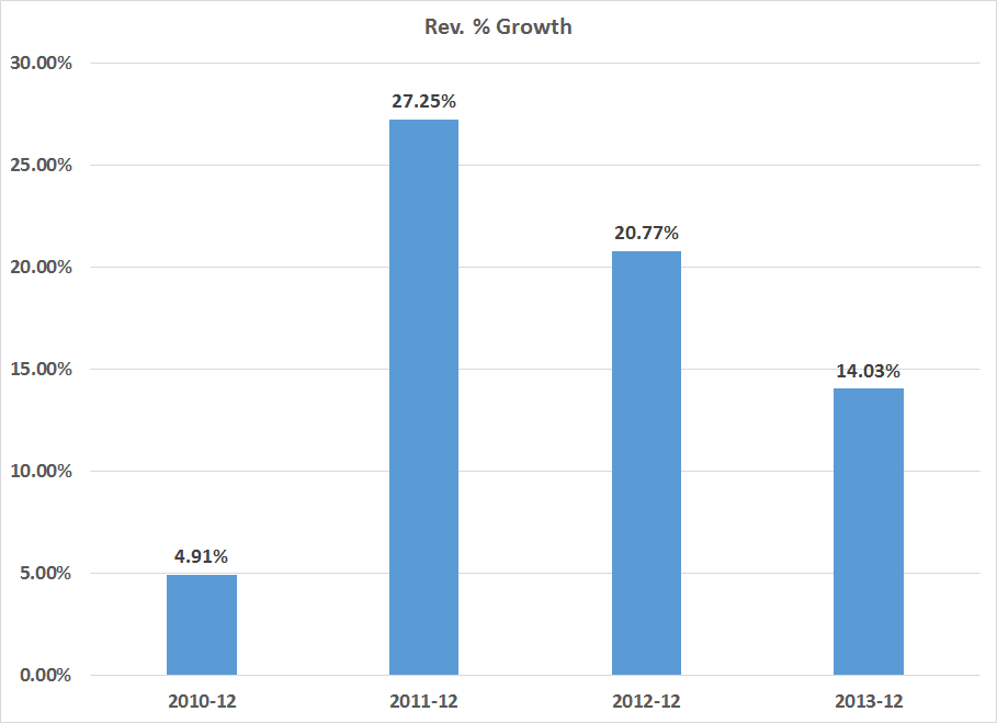
Coming out of the recession, growth was slow at a bit under 5%.  2011 and 2012 had some strong growth (perhaps pent-up demand kicking in) while 2013's figure was a bit more subdued.  However, for a maturing company like Ebay, 14% is certainly nothing to sneeze at.  Given Ebay is a mature company, top line revenue growth in the 14%-20% is far more likely.

Let's turn to the cash flow statement, starting with the relationship between operating earnings and investment activities.  A mature company like Ebay should be able to derive investment funds from its operations, thereby freeing it on the financing side. 

Here's a chart of the difference between operating cash flows and investment expenditures:


Ebay received a big cash infusing in 2009.  In that year, they had $2.9 billion in operating income but only $1.1 billion in investments.  Then they only had $567 million in PPE investments which was 19% of operating revenues.  It's also highly probably management invested minimally as the economy was just emerging form the recession and growth was low.  In 2010, there is still a net increase in cash, again with the most likely reason being conservatism on the part of management; their biggest investment expense was still PPE, but that total was only 26% of operating expenses.  In 2011 and 2012, Ebay ramped up PPE investments, which totaled $963.5 million and $1.257 billion, respectively.    The growth in their overall PPE expenditures is expressed in this chart:


In addition to strong increases in PPE, Ebay has been adding to their overall investment portfolio at a strong pace on an annual basis:


These investments have gone both to cash (in the form of short-term securities) and overall investments.

Finally, let's turn to the financing section of the cash flow statement.  It shows two points.

1.) Over the last five years, Ebay has issued $4.4 billion in debt and repaid $1.5 billion, for a net change in debt outstanding of $2.8 billion.

2.) Ebay has repurchased a little over $4 billion in stock.  Overall treasury stock has increased from $5.3 to $9.3 billion. 

This leads to an interesting question: if and when Ebay will pay a dividend.  Consider EBay's retained earnings:


Total retained earnings have increased from $8.3 billion in 2009 to $18 billion in 2013.  The board is obviously paying shareholders now in the form of share buybacks.  But, given that high level of retained earnings and EBay's ability to generate cash, a dividend might be in the future.

So, to conclude, EBay's management has costs under control as evidenced in the income statement.  Margins have been constant and growth has been steady.  I would expect a drop in annual growth rates to the high teens in the future.  The cash flow statement indicates the company has the ability generate a large percentage of its investment needs through ongoing sales, freeing the company up when it comes to structuring their financing.

Simply put, EBay's a solid company.   


Tuesday, July 1, 2014

What do the long leading indicators forecast for 2H 2014 and 1H 2015?


 - by New Deal democrat

With the first half of 2014 in the books, I take a look at the long leading indicators, that usually turn a year or more before the economy turns, at XE.com.  We now can begin to see the outlines of the first half of 2015.