- by New Deal democrat
Periodically in the last 6 months I have written stories challenging the dominant narrative about "median household income" and "median wages." As to each measure, it has been suggested that there has been no real economic recovery because both fell since 2009. While paltry nominal wage increases averaging only 1.8% since 2009 are an important part of the story, at least as important has been the effect of huge swings in the price of gasoline.
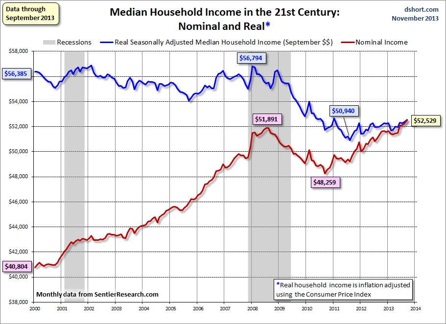
In the case of "median household income," I've shown that the measure is being swamped by the trend of Boomer retirements. Retirement of a wage earner on average causes a decline of about 50% in a household's income. Since households headed by retirees are included in the data, and Boomers are retiring at the rate of about 10,000 a day, the percentage of retiree-headed households is rising, and thus the dominant secular trend in median household income is likely to continue on a downward trajectory for the next decade or more. Despite that, measures of "median household income" have increased slightly since 2011, as shown in this graph from Doug Short's monthly update using data from Sentier Research:

In this post I'm going to update my examination of the other metric, "median wages." There are four specifically median measures of median wages, one from the Social Security Administration, measured two ways, and three from the Bureau of Labor Statistics. The former measure by the SSA was just updated for 2012 and caused a stir, because it showed a very slight further decline from 2011, but essentially this compared the situation 12-24 months ago with that of 24-36 months ago.
In my previous post, I noted that whether median real wages are declining or not depends very much on your starting point. In summary,
1. Real median wages did decline during the recovery from 2009 into 2012, but
2. Real median wages actually rose during the great recession, and by roughly the same amount.
3. Meaning that median wages measured from any period from 2007 or earlier up until the start of the Millennium have generally stagnated.
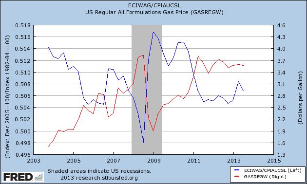
4. The primary reason median wages rising during the worst recession in 75 years and falling thereafter is the same: real median wages (blue) have been the mirror image of gasoline prices (red):


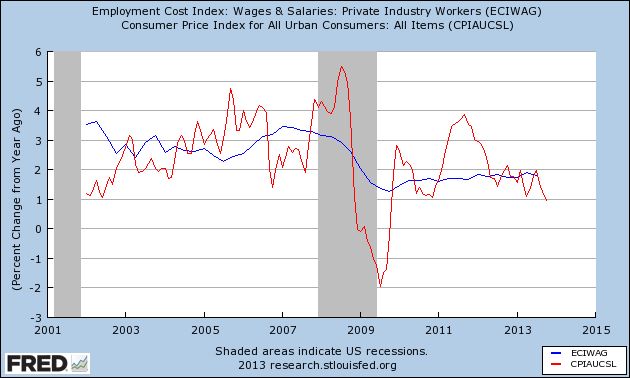
Between 2000 and 2007, nominal wages rose by about 3% a year - and so did consumer inflation. Increases in nominal wages fell during and right after the recession to as low as 1.3% YoY in late 2009, and since 2011 nominal wage increases have averaged only 1.8% YoY.
With that backdrop, let's update the 4 measures of median wages. Are they "still falling," as implied by some of the commentary describing the 2012 Social Security Administration release, or have they hit bottom?
The above measure by the Social Security Administration is annual net compensation and is derived from actual W-9 tax withholding forms. Two other measures are compiled by the Bureau of Labor Statistics, which conducts the household employment survey, reports "usual weekly earnings" for full time workers each quarter. Separately, it also keeps track of occupational employment statistics which are reported annually. Finally, I have also included the BLS's Employment Cost Index which is also released quarterly.
Here's the table of all four calculations, updated to show the recent reports. Remember that all measure the median, i.e., 50th percentile, and all are adjusted for inflation. The peak in wages is bolded. One series shows a bottom, and that is italicized:
| Year | Social Security | Usual weekly earnings | Occupational Employment | Employment Cost Index |
|---|---|---|---|---|
| 1999 | 27,164 | --- | --- | --- |
| 2000 | 27,374 | --- | --- | --- |
| 2001 | 27,713 | --- | 16.78 | 116.3 |
| 2002 | 27,784 | --- | 16.95 | 117.2 |
| 2003 | 27,657 | --- | 16.91 | 118.0 |
| 2004 | 27,903 | 785 | 16.80 | 117.3 |
| 2005 | 27,331 | 774 | 16.71 | 116.3 |
| 2006 | 27,832 | 774 | 16.80 | 116.8 |
| 2007 | 27,984 | 778 | 16.70 | 115.9 |
| 2008 | 27,468 | 778 | 17.22 | 119.7 |
| 2009 | 27,584 | 801 | 17.12 | 117.9 |
| 2010 | 27,382 | 797 | 17.13 | 118.1 |
| 2011 | 26,963 | 781 | 16.86 | 116.6 |
| 2012 | 26.959 | 778 | 16.71 | 116.7 |
According to my calculations, the employment cost index for wages bottomed in 2011 and rose slightly in 2012, while real median wages were down ever so slightly in 2012.
The decline in each series from peak to trough is -3.6% for Social Security, -3.4% for hourly adjusted Social Security, -4.1% for usual weekly wages, -3.0% for the employment estimates, and -2.6% for the Employment Cost Index.
Two of the above series, Usual Weekly Wages and the Employment Cost Index, are updated quarterly, se can get a more granular look at wage trends, and also see how 2013 is shaping up so far. The below table does that, starting with the first quarter of 2007:
| Quarter | usual weekly earnings | Employment Cost Index | |
|---|---|---|---|
| Q1 2007 | 336 | 118.5 | |
| Q2 | 335 | 118.1 | |
| Q3 | 336 | 118.2 | |
| Q4 | 332 | 117.7 | |
| Q1 2008 | 335 | 117.4 | |
| Q2 | 335 | 116.7 | |
| Q3 | 331 | 115.6 | |
| Q4 | 340 | 118.8 | |
| Q1 2009 | 344 | 120.0 | |
| Q2 | 345 | 119.7 | |
| Q3 | 345 | 119.1 | |
| Q4 | 344 | 118.6 | |
| Q1 2010 | 344 | 118.9 | |
| Q2 | 342 | 119.5 | |
| Q3 | 342 | 119.6 | |
| Q4 | 342 | 119.2 | |
| Q1 2011 | 338 | 118.3 | |
| Q2 | 336 | 117.6 | |
| Q3 | 336 | 117.2 | |
| Q4 | 335 | 117.3 | |
| Q1 2012 | 335 | 117.2 | |
| Q2 | 337 | 117.5 | |
| Q3 | 333 | 117.1 | |
| Q4 | 334 | 117.3 | |
| Q1 2013 | 331 | 117.3 | |
| Q2 | 334 | 117.7 | |
| Q2 | 333 | 117.6 |
The above quarterly data shows that the decline in real median wages appears to have stopped in the third quarter of 2012, and the Employment Cost Index to have bottomed in the first quarter of 2013.
In summary, in the longer view since the turn of the Millenium, real median wages have stagnated. Gas prices caused them to rise during the recession, and then decline thereafter as the effects of those gas prices filtered through the economy, and nominal wage increases averaged a poor +1.8% annually. Annual measures which have only been updated through 2012 do not yet show a bottom, but more timely quarterly measures suggest that, with the slight decline in YoY gas prices for most of 2013, real median wages have risen slightly.