Tuesday, August 27, 2013
I do not think these graphs are a coincidence
- by New Deal democrat
My intensive examination of real average and median wages and income has caused me to rethink a few other things. First of all, I do not think that the relationship in the graph below, which shows the employment to population ratio (blue) and real average wages (red), is a coincidence:
Notice that the employment to population ratio remained fairly steady from the immediate aftermath of World War 2 until the late 1960's, when women started entering the workforce in large numbers. By the 1990's, that trend had matured. So had Baby Boomers, the olders of whom hit age 55 in the year 2000. Research on this ratio has suggested that the decline from 2000 through 2007 was largely as a result of the beginning of the Boomer retirement tsunami. Since that time, of course, it has been augmentsd by the long term unemployed.
Meanwhile average wages for non-supervisory personnel (the series only began to be reported in the 1960's) peaked in the early 1970's and fell through the mid-1990's, and surprisingly, has increased since.
I am not suggesting that the mass entry of women into the workforce was in any way "wrong." I am merely pointing out that, as a simple matter of supply and demand, the mass entry of new laborers into the workforce should act to depress wages, and it certainly looks like that was the case. When the trend ended, so did the depression in real wages.
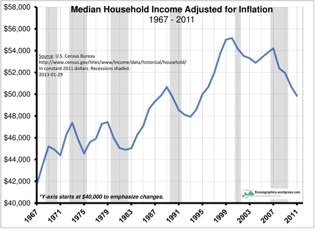
This has also caused me to rethink the graph below, showing that real median household income peaked in 1999:
As we have seen in other posts, real median wages rose slightly between 2000 and 2007, and even rose during the great recession, as the price of gas decreased. But real median household income declined. Just as we have seen that since the great recession, the continuing decline in real median household income is almost entirely a reflection of the decline in the employment to population ratio, the decline between 1999 and 2007 is probably really showing the same thing (recall that the median income of retirees is about half of that of working age households).
If this is true, then we should expect median household incomes to continue to decline for several more decades, as the entire Baby Boom generation retires and a majority of us have passed away.
By the way: those two spikes in the 1970's in the graph of real average wages? Here's a close-up of average wages (blue) and the inflation rate (red):
Back then, we had unions, and unions had power. They succeeded in writing automatic wage increases into contracts. These automatic increases were supposed to ensure that their wages did not erode due to inflation, and typically reflected the recent (higher) inflation rates. So although the spike in inflation receded (red line), the wage increases didn't (blue line), causing the echo-spike in real wages. That all ended with Reagan and Volcker.


