From the latest Fed Minutes:
Private nonfarm employment expanded in December at about the same rate
as in the fourth quarter as a whole, while government employment
decreased. The unemployment rate was 7.8 percent in December, below its
average in the third quarter, while the labor force participation rate
was the same as its third-quarter average. The rate of long-duration
unemployment and the share of workers employed part time for economic
reasons edged down in December, but both measures were still elevated.
The rate of private-sector hiring, along with indicators of job openings
and firms' hiring plans, was generally muted but remained consistent
with continued moderate increases in employment in the coming months.
Let's take these data points one at a time, and expand on the data where needed.
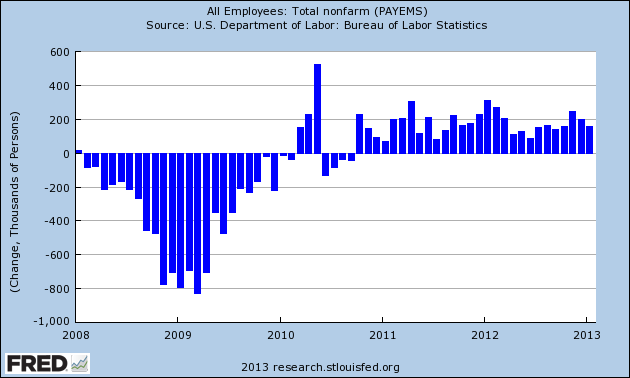
The top chart shows that while we've seen consistent job growth, we're still 3 million jobs below the total establishment job peak in 2008. The reason for this gap is the slow pace of growth, leading to the second chart showing the monthly gain in establishment job totals. While there has been two years of growth, it's been weak growth with most months coming in below the 200,000 level.
Before talking about the participation rate, let's properly define the term. According to the BLS glossary:
The labor force includes all persons classified as employed or
unemployed in accordance with the definitions contained in this
glossary, while the labor force participation rate is "The labor force as a percent of the civilian noninstitutional population."
However, these numbers are also influenced by the underlying components of the population. For example, we are currently at the front end of the massive baby boomer retirement wave, where 10,000 people per day are retiring. While the drop in the LPR is not completely attributable to that demographic trend, the research on the issue seems to be coalesing around the fact that about half of the drop is the result of retirements.
That being said, here is are two views of the LPR:
The top chart shows the total data, where a clear expansion of the labor force is seen from the years from 1965 until 2000. There are a number of reasons for this but the two biggest reasons are the baby boomers entering the workforce and women entering the work force. The second chart shows the decline in the LPR from 2008 until now. Overall, we see a drop of about 2.5%, of which about half is a result of the baby boomers retiring while the other half is the result of the great recession.
The above chart is perhaps the most troubling. It shows the total number of people unemployed for 27 weeks or longer. What it really shows is that if a person does not have a job after being unemployed 27 weeks, they stand a very poor chance of getting employed.
The above chart shows the total number of employees who are part time for economic reasons. Like the long-term unemployed, this number is incredibly high by historical standards. It also indicates that in the current environment, once you achieve this status it's very difficult to get out of this group.
For those paying attention, the charts above will show nothing new: job growth has been weak. The long-term unemployed have been that way for a long time and probably won't find a job anytime soon. And while about half of the decline in the LPR can be attributed to the boomers retiring, the other half is the result of people leaving the labor force because they can't find a job.


