
The technology ETF is in bullish territory, trading about the 200 day EMA. But prices are entangled with the shorter EMAs, largely because there has been no upward momentum since the first of the year. The MACD has given a sell signal and the CMF is declining. There is little in the chart to encourage bulls that the market is moving higher.


The daily chart of the financials ETF (top chart) shows that prices are in a clear uptrend. After breaking through resistance at the beginning of the year, they have continued to move higher, using the 10 day EMA for technical support. Although the MACD is moving sideways, the CMF indicates money is flowing into the market. The weekly chart (bottom chart), is far more bullish. Prices have broken through upside resistance of a consolidation triangle that has been forming for a year and a half. Prices are using the 10 week EMA for technical support and momentum is rising.

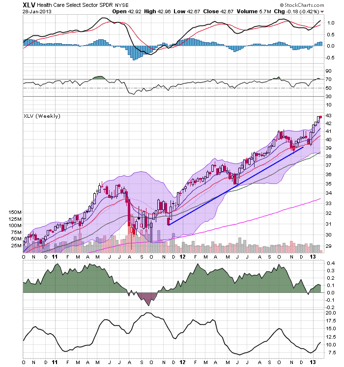
The health chart sectors daily chart (top chart) broke through resistance at the beginning of the year and has been consistently moving higher, using the 10 day EMA for technical support. Also note the rising MACD and CMF. However, the weekly chart (bottom chart) is far more impressive, showing that the market has been rallying for over year. The MACD has given a buy signal (with room to run) but the CMF is declining.


The consumer discretionary daily chart (top chart) has much in common with the other sectors. Essentially we see an early year break out with a continued rally for January. The weekly chart (bottom chart) shows a sector that has been in an upward trend for about a year, with with a slight change in trajectory in May of last year. However, this chart looks bullish, with all the EMAs rising, prices using the 10 week EMA for technical support and a buy signal from the MACD.


The daily chart of the energy ETF (top chart) show that prices have been rallying since mid-November. The MACD is moving higher and the CMF is in a very strong position. The weekly chart (lower chart) shows that prices are right at technical resistance and that they are forming a consolidating triangle.
In summation, only one sector (technology) is in bad shape. Health care's and consumer discretionary's weekly chart shows an incredibly strong sector. Financials weekly chart has broken through resistance and the energy's ETF is right on the cusp. All the daily charts save the technology sector show sectors that have moved through resistance and are rallying.
Bottom line: the sectors look really good.