I want to thank the thoughtful commenters to my post the other day concerning the surprising upward trend in real income measured since 1995.
One suggestion was to use the "billion price project" instead of the CPI. The problem there is that the billion price project's data only goes back a couple of years, and so far has closely followed the CPI.
Another suggestion was to change the measure of wages. There is a measure of median rather than mean wages, that is calculated once a quarter. It has shown lower wage increases than the monthly average wage measure, but it is only 11 years old.
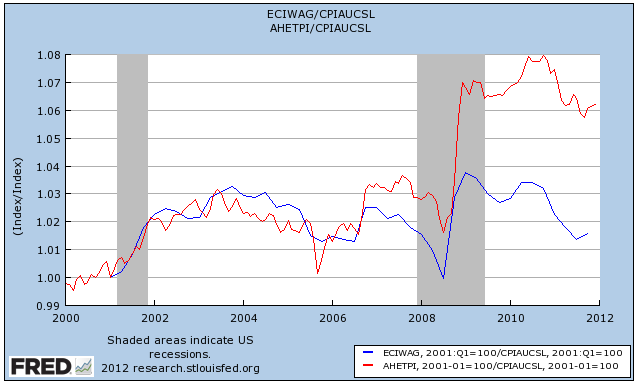
But it does make a significant difference. Here is a comparison over the life of the median wage series (in red) vs. average nonsupervisory hourly wages (blue):

Both tracked similarly until the middle of the last recession, but ever since the late 2008 deflation in gasoline prices, average wages have shown a much more positive trend. Over the entire 11 year period, median wages are up less than 2% vs. average nonsupervisory wages, up over 6%.
Another suggestion was to break the trend down into income quintiles. The typical graph of these since 1974 already adjusts for inflation, and shows an actual and significant decrease in the real wage of the bottom 20%. I'll see if I can find a way to post data starting from the mid-1990s and if I can, I'll follow up with a further comparison.