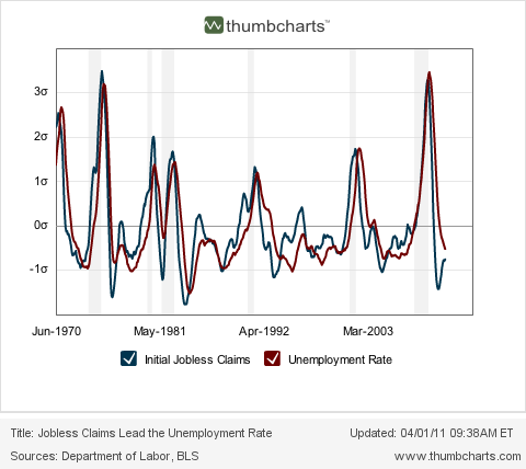
With March's payrolls number reported, let me update a few of the series showing how weekly initial jobless claims have been correlating with new job creation and leading the unemployment rate.
First, here is a graph of initial jobless claims as a percent of population (blue) vs. the unemployment rate (red):

Recall that the initial jobless claims rate has consistently led the unemployment rate for almost 50 years. In other words, the recent decline in iniital jobless claims is predicting further declines in the unemployment rate.
Now here is the Thumbcharts graph depicting the six month average of initial jobless claims (blue) with the six month average of the unemployment rate (red), compared YoY:

Once again, initial jobless claims lead the unemployment rate. The relationship depicted here is a little more complex. The continuing decline in YoY iinitial jobless claims is predicting that the 6 month average of the unemployment rate will continue to decline YoY. This suggests that in the next several months, the October and November 9.4% and 9.8% unemployment readings will be replaced with significantly lower numbers, although not necessarily lower than March's 8.8% rate.
The above relationships continue to indicate that the recent decline in the unemployment rate is no fluke. The validation of the leading relationship of the first graph above - i.e., the surprise drop in the unemployment rate - may be one of the big stories of 2011.
Secondly, let's update the scatter graph showing the correlation in recently reported initial jobless claims, with payroll growth in the same month. The below graph shows the correlation of initial jobless claims with jobs created in the private sector (blue) and all payrolls including government (excluding those months where census hiring and firing distorted the figures) since the peak in initial claims of March 2009:

The relationship continues to be close. Note that (1) job growth has occurred once the average of initial jobless claims dropped below 475,000; (2) recent job growth averaging over 150,000 a month with initial claims in the vicinity of 400,000 is no fluke; and finally (3) it appears that we only need to see initial claims drop to about 370,000 a month to give us the 300,000 monthly job growth we need to make a real dent in the 8 million long term job deficit caused by the great recession.
Third, let's compare this job recovery with previous jobs recoveries. Net job creation is hires minus fires. Initial jobless claims generally tell us about the "firing" part of that metric. Conventional wisdom is, firing has declined sharply in this recovery, but "hiring" remains lackluster. In the below graphs, pay attention to how much firing was consistent with net payroll growth. Consider especially what that means for the "hiring" part of the payrolls equation.
First, here is the current recovery compared with the 1975 jobs recovery:

The two recoveries are tracking quite closely. Notice that in the 1975 recovery, 300,000 new jobs a month were created at the time when there were about 370,000 layoffs per week. If this recovery stays on the same track, we don't have far to go for some very good job creation numbers.
Next, here is the current recovery compared with the 1983 recovery:

In that recovery, there was some enormous new job creation. On net, 300,000 new jobs a month were being created at a time when there were still 450,000 layoffs per week.
Finally, here is this recovery (red) compared with the 2003-04 recovery (blue) and the 1993 recovery (green):

Both earlier recoveries were creating comparatively *fewer* new jobs than this one. Why? In this recovery we started on net adding jobs when there were about 475,000 new layoffs a week. In the 2003 recovery that didn't happen until there were only 400,000 layoffs a week, and in the 1993 recovery that didn't happen until there were only 440,000 layoffs a week. In other words, given the same amount of layoffs, there have been more *new* jobs created in this recovery than in either of the last two.
This is strong evidence against the conventional wisdom that it is the lack of job creation that has been lagging in this jobs recovery. On the contrary, on a relative basis new job creation has been strong. It is the relentless continuation of elevated layoffs that has been the problem.