Saturday, August 5, 2023

Weekly Indicators for July 31 - August 4, and long term forecast through H1 2024 at Seeking Alpha


 - by New Deal democrat


My Weekly Indicators post is up at Seeking Alpha.

No big changes in the data, but note that mortgage and other interest rates are up close to their peaks. This will operate to slow down growth in the housing market among other things.

As usual, clicking over and reading will bring you up to the virtual moment, and reward me a little bit for my efforts.

Also, earlier this week I did a comprehensive update of my long term forecast through the first half of 2024, which you can also find over there.

Friday, August 4, 2023

July jobs report: almost across the board deterioration in leading sectors


 - by New Deal democrat


My focus remains on whether jobs growth continues to decelerate, and whether the leading indicators, particularly manufacturing and construction jobs, as well as the unemployment rate (which leads going into recessions) have meaningfully deteriorated.

Almost all of these items did deteriorate in July.

Here’s my in depth synopsis.


HEADLINES:
  • 187,000 jobs added, which would be the weakest monthly number since December 2020, except that last month was revised down to 185,000.
  • Private sector jobs increased 172,000. Government jobs increased by 15,000
  • May was revised lower by -25,000 and June by -24,000, for a total of -110,000. The three month moving average decreased to 218,000, the lowest since January 2021.
  • The alternate, and more volatile measure in the household report rose by 268,000 jobs. The YoY% gain in this report is +1.9%.
  • The U3 unemployment rate declined another -0.1% to 3.5% (still above the 3.4% low last year). The civilian labor force, the denominator in the figure, rose slightly (by 152,000), while the numerator, the number of unemployed, declined by -116,000.
  • U6 underemployment rate declined -0.2% back to 6.7% 
  • Further out on the spectrum, those who are not in the labor force but want a job now declilned -142,000 to 5.247 million, still well above its post-pandemic low of 6.5% set last December.

Leading employment indicators of a slowdown or recession

These are leading sectors for the economy overall, and help us gauge how much the post-pandemic employment boom is shading towards a downturn.  These were almost all negative:
  • the average manufacturing workweek, one of the 10 components of the Index of Leading Indicators, declined -0.1 to 40.6, equal to its lows earlier this year and down -0.9 hours from February 2022 peak of 41.6 hours.
  • Manufacturing jobs declined by -2,000.
  • Within that sector, motor vehicle manufacturing jobs declined -2,200. 
  • Construction jobs increased by 19,000, in virtually every subsector except for residential construction.
  • Residential construction jobs, which are even more leading, declined by -5,500. It continues to appear likely that January was the peak for this sector.
  • Goods jobs as a whole rose 18,000. These should decline before any recession occurs. They remain up 1.7% YoY, which is a very good pace compared with most of the last 40 years.
  • Temporary jobs, which have generally been declining late last year, declined further, by -2,200.
  • the number of people unemployed for 5 weeks or less declined -54,000 to 2,004,000.

Wages of non-managerial workers
  • Average Hourly Earnings for Production and Nonsupervisory Personnel increased $.13, or +0.5%, to $28.96, a YoY gain of 4.8%, a 0.1% uptick from its lowest YoY gain since June of 2021 set one month ago.

Aggregate hours and wages: 
  • the index of aggregate hours worked for non-managerial workers increased 0.2%, and is up 1.6% YoY.
  •  the index of aggregate payrolls for non-managerial workers rose 0.6%, and increased 6.4% YoY, 0.2% higher than its 2+ year low set one month ago, and significantly above the inflation rate, meaning average working class families have more buying power.

Other significant data:
  • Leisure and hospitality jobs, which were the most hard-hit during the pandemic, rose only 17,000, -352,000, or -2.1% below their pre-pandemic peak.
  • Within the leisure and hospitality sector, food and drink establishments rose 13,400, but remain-64,400, or -0.5% below their pre-pandemic peak.
  • Professional and business employment declined -8,000. This is the first decline in this important sector since the end of the pandemic lockdowns. This series had already been decelerating, and is currently up  1.6%, its lowest YoY gain since March 2021.
  • The employment population ratio rose 0.1% to 60.4%, vs. 61.1% in February 2020.
  • The Labor Force Participation Rate was unchanged at 62.6%, vs. 63.4% in February 2020.


SUMMARY

This was a soft report (nevertheless quite positive by historical standards), which together with revisions to the last several months, marks another notch downward in deceleration. 

Almost all of the leading metrics were down. Employment in the entire goods sector has only shown gains due to transportation equipment manufacturing and non-residential construction. The comeback in leisure and hospitality jobs is much fainter. Professional and business jobs - one of the best paying sectors - may be rolling over. That revisions appear to be becoming routinely negative is also not a good sign.

The two bright spots in the report were un- and under-employment, which declined (contra the trend I expect them to take, based on the YoY increase in initial jobless claims) and wages. Average wage gains of 0.5% and aggregate wage gains of 0.6% in a month are very good for workers. Almost certainly they will exceed the monthly inflation rate once again. Because of these two things, this was absolutely not anything close to a recessionary report. 

But the slowdown almost across the board in leading sectors is akin to another compartment of a sinking ship flooding. Still, I do not think we get a recession until goods producing jobs as a whole decline. At their current pace of deceleration, that would be in about 9 months.

Thursday, August 3, 2023

Jobless claims: a good example of why my forecasting discipline demands a confirmed trend


 - by New Deal democrat

Initial jobless claims for the last week of July rose 6,000 to 227,000. The 4 week average decreased -5,500 to 228,250. Continuing claims, with a one week lag, rose 21,000 to 1.7 million:


The YoY% change is much more important for forecasting purposes. There, initial claims were up 4.1%, the 4 week average up 5.8%, and continuing claims up 25.9%:


The behavior of initial claims in the past number of weeks has been an important example of why my forecasting discipline demands 2 months of continued readings higher by 12.5% or more for a valid signal. Many times in the past 50+ years there have been spikes higher than 12.5% which dissipated within 2 months, and did not correlate with an oncoming recession. Only when the increased number is durable does it create a valid red flag recession warning.

Needless to say, we had a “close but no cigar” spike in June. The downturn in cliams in July resets the clock.

Finally, especially in view of tomorrow’s jobs report, let’s update what this means for the Sahm Rule (an increase of 0.5% from the low in the 3 month average of the unemployment rate means that a recession has begun). 

On a monthly basis, the YoY% change in new jobless claims is higher by 8.1%. Claims have been higher YoY ever since March, and - as has been the case for 50+ years - the unemployment rate (red) is following with a delay::


Note that the unemployment rate in the above graph is depicted as the % change in a percentage number. One year ago the unemployment rate was 3.5%.

A 10% increase in the unemployment rate takes us to 3.8% or 3.9% in the coming months, as best shown in the below graph of the same information in absolute terms:


That doesn’t necessarily mean that the unemployment rate will increase month over month tomorrow, but it tells us of the underlying trend in the naar future.

As I have for many months now, I will be looking for further evidence of deceleration in job gains, wage gains, as well as evidence of the above trend in the unemployment rate in tomorrow’s report.

Wednesday, August 2, 2023

June’s JOLTS report: slow progress towards a new equilibrium


 - by New Deal democrat


Yesterday’s JOLTS report for June captured a labor market that continues to move towards a new equilibrium, mainly via a gradual decline in job openings compared with labor availability. In other words, for the umpteenth time, “deceleration.”


Job openings and actual hires both declined to new 2+ year lows, and voluntary quits also declined to just above a 2+ year low:


For comparison, just before the pandemic, shown at far left, all three metrics were close to or at all time highs. 

Hires on a monthly basis are already back to pre-pandemic levels, and voluntary quits are about 80% back to pre-pandemic levels from their post-pandemic highs. Job openings, which unlike hires and quits, is a “soft” rather than a “hard” metric, because it can be inflated by, e.g., permanent or sham listings, have now retreated by slightly more than 50% to their pre-pandemic levels.

By contrast, layoffs and discharges bucked the trend of softness and declined to a 6 month low (blue):


Their pre-pandemic range was about 1700-1900. Their 1527 level in June was far below that.  Note that layoffs and discharges tend to lead initial jobless claims (red, right scale), which have also declined significantly in the past few weeks. 

Given all the other information we have, the downturn in layoffs looks like a counter-trend move compared with the past year.

For the past 18 months, I’ve likened the job market to a game of reverse musical chairs, where there are more chairs put out by potential employers than there are job applicants willing to fill them. June’s JOLTS report continued the trend we’ve seen for the past 15 months of a jobs market slowly returning towards a convergence of the number of chairs and players. It is likely that Friday’s employment report will show more of the same as well.

Tuesday, August 1, 2023

Manufacturing and construction give very mixed signals to start Second Half 2023 data


 - by New Deal democrat


As usual, the month’s data started out with the ISM manufacturing report for last month, and construction spending for the month before last. Additionally, I am going to take a look at motor vehicle production, because I think it is unusually important right now.


Manufacturing contracted for about the 10th month in a row in July, while the more leading new orders component has now contracted for more than a year. The index did rise 0.4 to 46.4, and new orders subindex rose 1.7 to 47.3:


Any reading below 50 indicates contraction, and ISM itself indicates that a reading of 48.7 in the total index is the breakeven point for the economy. So at face value, this continues to be very negative.

This month I also want to spotlight the price paid subindex, which has been the most negative of all, down as low as 40 near the end of last year. It remains the most negative now at 42.6, up 0.8 for the month:


Here is the question: how much of the continuing steep decline in commodity prices paid by manufacturers has to do with declining demand, and how much due to increasing supply, as pandemic bottlenecks unspool? Stay tuned.

Next, motor vehicle manufacturers used to report customer demand every month. Now they only report quarterly, which is not timely enough to be very interesting to me. But the DoT does report monthly with a one month delay. They reported June’s numbers at the end of last week, showing an increase to 15.7 M cars and light trucks bought on a seasonally adjusted annual basis, while heavy weight truck sales declined to 538,000 annualized:


Needless to say, motor vehicle production is a significant component of manufacturing. This tells us, importantly, that while most manufacturing is declining, per the ISM report, motor vehicle production is still ramping up as supply chain disruptions unspool. This is of a piece with the big increase in rail car deliveries I highlighted yesterday:


Heavy weight vehicle sales in particular are very cyclical, having turned down sharply well in advance of nearly every previous recession in the past 50 years. 

This is important because the ISM index, discussed above, is a diffusion index. It does not weight its various components. This tells us that a very large component, vehicle production, has been a strong counterweight to the decline in other manufacturing industries.

Turning finally to construction, nominally total construction spending rose 0.5% in June, while the more leading residential construction spending rose 0.9%:


But after adjusting for the cost of construction materials, while private residential construction spending did rise, it remains just off its worst post-pandemic levels:


The picture that emerges from this month’s opening data is very mixed. Manufacturing as a whole continues to decline, but against the weight of the very important expanding sector of motor vehicles; while construction continues to increase nominally, but the most leading component has rebounded only slightly in real inflation-adjusted terms.

Monday, July 31, 2023

Dow Theory says transportation and production of goods should move in tandem; what is its message now?


 - by New Deal democrat

Partly because mid year data is now being completed, and partly to re-examine my forecasts, I’ve been conducting a top-to-bottom re-check of my metrics.


One thing that seems very important is that, despite no real downturn in business at all, commodity prices have declined -9.6% in the past 12 months, one of the 4 steepest such declines in over 100 years:


The other three all occurred during recessions, two of which were the Great Depression and the Great Recession. In other words, this time the decline in commodity prices may have uniquely been about increasing supply (due to the unspooling of pandemic chokepoints) rather than decreasing demand. If so, that has been a much stronger tailwind for the economy than I have previously believed.

A similar positive is that measured both in terms of real average hourly wages and real aggregate payrolls, average American households have seen an increase in their real income over the past 12 months:


Similarly, this is an economic tailwind driven by decelerating consumer inflation (mainly about gas prices).

On the other hand, when it comes to both the production (blue, right scale) and sales of goods (red) (vs. services), there is little doubt that important sector of the economy has stagnated:


Over the weekend, I spent some time checking to see if measures of transportation of goods supported the data indicating stagnation in the goods sector. Here’s what I found.

The Cass Freight Index measures the YoY% change in the volume of freight moved by trucks. This index peaked in January and has been in decline ever since:


Intermodal rail traffic has been at recessionary level declines, while total carloads are essentially flat YoY:


Confirming a suspicion I have had elsewhere, the breakdown of rail traffic by sector by the AAR indicates that the biggest reason total carloads have not declined is the big increase in motor vehicle and parts loads, up about 12% YoY to date:


The Department of Transportation takes truck, rail, air, and water freight together and combines those into it Freight Transportation Index, which over time generally moves in tandem with industrial production:


It’s absolute level as of May indicates a significant decline since the end of last year:


Interestingly, note that all three of these truck, rail, and freight metrics also declined sharply in 2015, when an industrial recession did not punch through into any decline in consumer spending.

So, finally, here is the comparison of the Freight Transportation Index with real personal consumption for goods:


As in 2006-07 and 2015-16, the downturn in freight transportation has not been matched by any downturn in consumers’ purchases of goods. Almost certainly because of the steep deflation in producer prices and deceleration of consumer prices which, as shown in the second graph at the top, has increased the real spending power of consumers.

Saturday, July 29, 2023

Weekly Indicators for July 24 - 28 at Seeking Alpha


 - by New Deal democrat


My Weekly Indicators post is up at Seeking Alpha.

While there continues to be evidence of the normal progression of weakness from long leading to short leading to coincident indicators, there has also been an anomalous major positive resurgence in some of the short leading indicators.

By normal historical standards, we “ought” to be well into a downturn. And yet consumer spending continues strongly, as we saw yesterday in the personal income and spending report, and as was reflected in Thursday’s Q2 GDP.

As the mid year data rolls in, I will be shortly updating all of my systems, starting with a comprehensive look at the long leading indicators (probably!) this week.

In the meantime, the high frequency report will bring you up to the virtual moment on the data, and bring me a small reward for the effort I put into it.

Friday, July 28, 2023

Driven by the hurricane force disinflationary tailwind, real personal spending and income, and real sales, all increase nicely


 - by New Deal democrat


In the current economy the personal spending and income report is just as important as the jobs report. That’s because, despite the downturn in manufacturing production and many parts of the housing market, consumer spending especially on services has continued to power the economy forward.


Today’s report was more good news in that regard, as every important metric was positive.

Let’s start with real personal income (red) and spending (blue), which in the below graph are normed to 100 as of the onset of the pandemic. Real income rose 0.1% in June, while real spending rose a solid 0.4%:


One of the 4 important coincident measures for the NBER, real personal income less government transfer receipts, also rose 0.2% to another new high. It is now up 2.4% (vs. only 1.3% two months ago) YoY:


As you can see, this is the kind of rebound you would expect to see coming out of a recession, not heading into one.

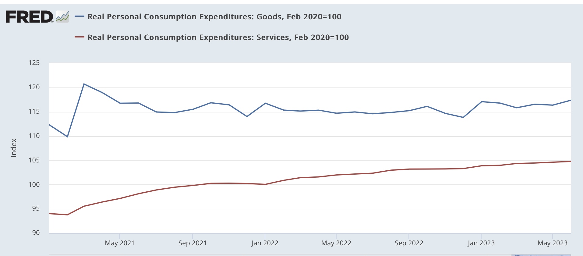
On the spending side, here’s how goods vs. services spending compare:


Real spending on services continued to rise at a steady clip (roughly 2.6% YoY), while real spending on goods, which had been flat, had a nice +0.9% pop. Outside of this past January, this is one of the strongest readings in 2 years.

Real spending on goods can be decomposed further into durable (red) vs. no durable (blue) goods, showing that the big increase was in durable goods:


We know that motor vehicle sales have recently finally increased to over 15 million announalized. My suspecion is that is what is reflected in the big increase in durable goods consumer spending in June.

The personal saving rate - income that isn’t spent - declined -0.1% for the month, although it is still elevated compared to its 2.7% level at its low water mark last June:


Consumers tend to get cautious and save more in the advance of a recession. That has occurred in the past year, but this month was a small positive.

Additionally, the personal consumption deflator gets used in the calculation of real manufacturing and trade sales, which is another important coincident indicator monitored by the NBER. These rose 1.1% in May, but they are still below their recent January peak:


Finally, note that almost all of the good news reported above had to do with “real” i.e., inflation adjusted metrics. The good news was greatly assisted by the continuing decleleration in the personal consumption deflator, up only 0.2% in June, and is up 3.0% YoY:


This is a very sharp deceleration from its peak of 7.0% YoY twelve months ago. But as shown by the month over month % changes below:


There will be much more challenging YoY comparisons beginning with next month’s report.

To sum up: almost everything about this report was positive. If you are cheering on a “soft landing,” then this report is potent ammunition. And it is all-around good news for average American consumers.

On the other hand, as noted above, last June was an inflection point. Gas prices in particular, along with a host of other commodities, declined in price thereafter. If that tailwind is ending - and I suspect it is - what happens next? 

Thursday, July 27, 2023

Q2 GDP indicates continued good expansion now, but more storm clouds gathered ahead


 - by New Deal democrat


Now let’s deal with this morning’s big news: real GDP improved at a perfectly respectable 0.6% over the first Quarter of this year:


This works out to a 2.4% annualized rate. Although it continues the slowdown from the white hot 2021 numbers, it would be average for the economy since the turn of the Millenium.

As per my usual practice, though, I want to focus on those parts of the report which tell us where the economy is likely headed: real private residential investment (a proxy for housing) and proprietors income (a placeholder for corporate profits, which won’t be reported for another month).

And the bottom line is, both were negative - housing for at least the 5th Quarter in a row..

Professor Edward Leamer gave a famous lecture almost 20 years ago showing that nominally, housing as a share of GDP turned down on average 7 quarters before a recession began. As indicated above, that metric (blue in the graph below) has now been down for 5 quarters. Measured in real terms (red), it has been considerably longer than that:


Taken strictly by itself, this metric argues that the most likely time for the onset of a recession is autumn (Q4) of this year.

The second long leading indicator, according to a lengthy history discussed several decades ago by Prof. Geoffrey Moore, is corporate profits deflated by unit labor costs. We con’t have unit labor costs yet for Q2, but these have been rising sharply in this expansion. And corporate profits themselves won’t be reported for one more month. So I make use of the placeholder of proprietors’ income, which typically turns either several quarters later than, or simultaneously with, corporate profits.

Here’s their historical record:


And here’s what they look like so far in this post-pandemic expansion:


Corporate profits turned down in Q2 or Q3 of last year, depending on how you measure. Proprietors’ income, as reported this morning, declined -0.3% in Q2, after peaking nominally in Q1.

Finally, let me take a look at a very important coincident indicator, real personal consumption expenditures. The monthly numbers, especially for services, have continued to rise sharply YoY. For the first two months of Q2, they are only up 0.2% from Q1, and will be updated tomorrow.

But the GDP report shows that real PCE’s rose 0.4% in Q2, suggesting that tomorrow’s personal consumption report is going to be very positive:


While there’s lots more that can be discussed, today’s preliminary GDP report for Q2 indicates an economy that continued to perform very well, but is going to come under increasing pressure in the quarters just ahead. In short, we’re not in recession now, but one continues to look like it is on the table for the very near future.

Continuing improvement in new jobless claims re-sets the clock


 - by New Deal democrat


Let’s get the easy part of this morning’s slew of data out of the way first:  initial jobless claims declined -7,000 to 221,000. The 4 week average declined -3,750 to 233,750. With a one week lag, continuing claims declined -50,000 to 1.690 million:


All of these are generally 5 month lows.

The more important YoY% change for forecasting purposes also declined, to 4.7% for initial claims, 9.1% for the more important 4 week average, and 28.3% for continuing claims:


With two more weeks to go, for the month of July so far, m/m claims are up 8.7%:


My discipline requires that there be 2 months in a row of claims being higher than 12.5% YoY to warrant a red flag recession warning. At this point, it will be almost impossible for the monthly average to cross that threshold. Unless that happens, this re-sets the clock. In other words, if August is bad, that wouldn’t be enough. September would also have to cross the threshold as well.

Nevertheless, although II won’t put up a separate graph, that claims remain higher YoY does suggest that the unemployment rate is also going to climb higher by several tenths of a percent in the next few months - just not enough to come close to triggering the Sahm Rule for recessions.

Wednesday, July 26, 2023

Prices for new single family homes down YoY,, while sales fluctuate; apartment rent changes YoY are zero


 - by New Deal democrat


June’s new home sales, and Apartment List’s Rent Report, this morning rounded out our view of this important leading sector through June.


New single family home sales are the most leading of all the government housing reports, but they are very noisy and heavily revised. That was on full display this morning, as the original spike higher in May to 763,000 units was revised sharply lower to 715:000. June’s initial number came in lower than that at 697,000:


I’m showing the last 30 years in the above graph because, while we’ve made up half of the decline since just before the Fed started raising rates, this remains a very moderate pace of home building when measured over the longer term.

Meanwhile prices (red in the graph below), which follow sales with a lag, are -4.0% lower than they were a year ago:


Prices are not seasonally adjusted, so YoY is the best way to measure. Note that with sales having picked up, we should expect prices to follow suit shortly, ending the anomaly I discussed yesterday of new and existing homes selling for the same median price.

Also, yesterday I neglected to show the updated house price indexes compared with owner’s equivalent rent, so here they are now:


Owners equivalent rent is going to continue to decelerate on a YoY basis, but how soon? In the housing bust, it took three full years (2010 vs. 2007) for OER to follow prices into outright decline.

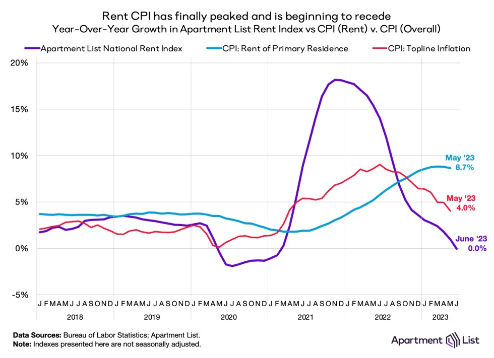
One clue is that CPI for rent of primary residence (gold in the graph above) was on the same trajectory as OER, turning negative finally with almost the same 3 year lag.

Which brings us to the final update in this post, new apartment rents through June as reported by Apartment List. These rose 0.4% in June, but that is not seasonally adjusted. Compared with pre-pandemic years, it is very low:


So again we need to compare YoY, and here the increase in rents was precisely 0:


This is the lowest since the series’ inception except for the pandemic year.

Because we have a record number of multi-family housing units under construction, there is every reason to believe that this downward trend will continue for awhile. Which means I don’t expect anything like a 3 year delay before the official CPI measure of rents hits 0 as well. And by inference that suggests OER is going to come down a lot faster than it did in 2007-10, when even at peak apartments were being built at less than half the pace they are now.

Tuesday, July 25, 2023

House prices stabilize (or even increase!) for existing homes, while prices have been slashed for new homes. What’s going on?


 - by New Deal democrat

Both the Case Shiller and FHFA housing price indexes were reported this morning through May. To quote each in turn:

“The S&P CoreLogic Case-Shiller U.S. National Home Price NSA Index, covering all nine U.S. census divisions, reported a -0.5% annual decrease in May, down from a loss of -0.1% in the previous month….
“Before seasonal adjustment, [it] posted a 1.2% month-over-month increase in May…. After seasonal adjustment, [it] posted a month-over-month increase of 0.7%.”

Meanwhile, according to the FHFA, “U.S. house prices rose in May, up 0.7 percent from April, according to the [ ] seasonally adjusted monthly House Price Index. House prices rose 2.8 percent from May 2022 to May 2023.”

Wait a minute! With higher interest rates and a decline in permits and starts for new homes, shouldn’t prices reflect that weakness and be declining? Which is a good way to segue to the post I was oriingally going to put up yesterday, about the fundamental bifurcation in the housing market between new and existing homes. I am indebted to Wolf Richter, who covered this very well at this post.

To cut to the chase: the two sectors are behaving very differently because builders have been able to cut prices sharply, while existing homeowners, wedded to 3% mortgages are unable or unwilling to cut prices and absorb a doubling of their monthly payments due to interest rrat3 increases.

In view of this mornings’ data, let’s look at existing homes first. The median price for an existing home, per last Thursday’s report, was only down -1.2% (Realtor.com only allows FRED to show the last year. Meanwhile, as indicated above, YoY prices as reflected in the Case Shiller report were down only -0.5%, and for the FHFA they actually showed an increase of 2.8%:


If you’re not going to cut your price, and housing is near record unaffordable levels with a doubling of interest rates from 3% to over 6%, sales are going to suffer pretty drastically. And they have, declining over 35% from peak to new lows as of last Thursday’s report on sales:


Normally I would expect inventory to pick up as a result, but partly because existing owners don’t want to or can’t part with their existing 3% mortgage rates, and partly because of what’s happening with new homes, inventory is at a new record low for June:


Which brings me to new homes. These are more important for the economy, tending to lea it by about 18 months. Here is the exact same graph of new single family home sales over the past 2 years to compare with that for existing home sales as shown above:


These are only down -9% from peak (vs. -36% for existing homes).

Part of the reason why new house prices spiked was low mortgage rates, but part wa also a sharp increase in commodity prices like for lumber involved in home building. Those peaked in or near June of last year, and are down between 4% and 10% depending on which measure you use. Meanwhile ew home prices followed commondity prices higher, and peaked in October of last year. Since then, the price of the median new home has declined by over 15%! (Shown in black below):


In fact as of the dates of their respective last reports, the median price of a new single family home is only about 0.1% higher than the cost of the median existing home (graph from Wolf Richter):


As you can see from the above graph, typically new homes demand a significant price premium over existing homes - but not now!

Put this all together, and your can easily imagine that buyers are fleeing existing family homes and flocking to new homes. As a result, these 20% price cuts have resulted in permits for single family homes making up about 40% of their decline from their pre-interest rate hike peaks:


This increase in permits has coincided with a decline to 2.5 year lows in permit for multi-family housing, while the previous surge continues to be reflectedi\ in the record number of multi-family units under construction:


It is very unlikely that this situation will last very long. Either the prices at which existing hojmes are offered is going to decline, or that for new single family homes is going to increase again. And if it’s the latter, there will be a further decrease in new homes being built