Saturday, April 16, 2022

Weekly Indicators for April 11 - 15 at Seeking Alpha


 - by New Deal democrat

My Weekly Indicators post is up at Seeking Alpha.

There was good news and bad news this week.

The good news is that the yield curve decisively un-inverted this week. The bad news is that it happened because Treasury yields at the long end rose to close to 5 and 10 year highs, reflected in mortgage rates tied for 10 year highs. This is going to wreak havoc in the housing market.

As usual, clicking over and reading will bring you up to the virtual moment on all of the important economic trends. Also as usual, it will reward me just a little bit for the effort I put in to producing the report.

Friday, April 15, 2022

Real aggregate payrolls and sales


 - by New Deal democrat

There seems to be some pushback against the narrative that real wages have declined, based on compositional effects (lower pay occupations vs. higher pay occupations). While some of that is true (for example, 5/6’s of all leisure and hospitality losses have been recovered, vs. 3.4% actual job *gains* since February 2020 in professional and business services; and a 91% rebound among total payrolls) - it is far less a factor than it was 18 or even 12 months ago.

Another way around that is to look at *aggregate* payrolls, particularly for nonsupervisory employees. This takes out the distortions introduced by outsized pay increases for the bosses, and also takes into account the total hours of pay earned in the economy. Since aggregate real payrolls are also a good, fundamentals based coincident indicator for the economy as a whole, let’s take a look at them, and compare them with the consumption side as represented by real retail sales.

Here is the YoY% change in both real aggregate retail sales (blue) vs. real aggregate payrolls over 3 time periods going back 75 years:

1948-1994 (old retail sales index):


1994-2020 (new index, pre-pandemic):


2020-present (pandemic era):


In general, although both are noisy, real sales slightly lead (by several months) real aggregate payrolls, with the one notable exception of the late 1990s tech boom.

As I noted yesterday, a YoY decline in real retail sales has been a very reliable indicator of an oncoming recession during the past 75 years. YoY real aggregate payrolls have generally turned down right at the beginning of the recession itself. Thus the YoY decline in March in real sales would ordinarily be very concerning. I am discounting it somewhat because it is in comparison with the March and April 2021 stimulus splurge. If the YoY decline were to continue into May, that would be a very real concern.

For now, as shown in the graph below, real aggregate nonsupervisory payrolls are up 2.6% from one year ago, and the trend has been higher:


While the consumer may not be as strong as they were a year ago, they aren’t rolling over yet either.


The production side of the economy remained solid in March


 - by New Deal democrat

Industrial production, the King of Coincident Indicators, increased in March by 0.9%. February was also revised higher by 0.4%, but January was revised lower by the same percentage, for a wash. Manufacturing production also  increased 0.9%. Total production thus made another new record high, while manufacturing is still below its record levels of 2007 and early 2008:


On a YoY basis, total production is up 5.5%, while manufacturing is up 5.2%. Compared with the last 50 years, and particularly the last 20, this continues to be solid growth:


Of course, industrial production still lags when it is compared with either population growth or GDP growth over the past 25 years (i.e., the China shock is still very impactful).

But still, in summary, while there may be some weakening of the consumer side of the economy, as we saw with yesterday’s real retail sales number, the production side of the economy continues to perform well.

Thursday, April 14, 2022

Real retail sales in March continue to show a weaker consumer sector, forecast weaker jobs reports and GDP


 - by New Deal democrat

For the past few months, I have suspected that a sharp deceleration beginning with the consumer sector of the economy was more likely than not. The retail sales report for March was consistent with that suspicion.

Nominally retail sales rose +0.5% in March, but since consumer prices rose 1.2%, real retail sales declined -0.7%. Further, they are up only 0.2% from last May (using that month because March and April were the stimulus months): 


Typically a YoY decline in real retail sales is a recession indicator. Since compared with last March, sales were down -1.5%:


ordinarily I would be worried. But since last March and April were temporary post-stimulus spending sprees, I think the comparison with last May is a better one.

Thus the big takeaway is that real retail sales have been esssentially flat beginning last May. That’s not recessionary, but it’s not good either. In other words, this report remains consistent with a slowdown in the consumer sector of the economy.

Next, let’s turn to employment, because real retail sales are also a good short leading indicator for jobs.

As I have written many times over the past 10+ years, real retail sales YoY/2 has a good record of leading jobs YoY with a lead time of about 3 to 6 months. That’s because demand for goods and services leads for the need to hire employees to fill that demand.  The exceptions have been right after the 2001 and 2008 recessions, when it took jobs longer to catch up, as shown in the graph below, averaged quarterly through last month: 

Through February recently the two have been in near-perfect sync, at roughly +4.5% YoY. With real retail sales now essentially flat for the last 10 months, I continue to expect the string of monthly jobs reports averaging 500,000 or more will end in several more months. Whether we get a negative print at some point before the end of summer will depend on whether sales continue to go sideways, improve, or deteriorate.

Finally, real retail sales per capita is one of my long leading indicators. Here’s what it looks like for the past 30 years:


These are down -2.7% since last April, and down -0.6% since last May, although unlike the year immediately before both of the last two recessions the trend is also higher by +1.6% since last July. On a mechanical basis this remains a negative signal, and continues to reinforce the long leading forecast of a stall or near-stall in the economy by about the end of this year.


Jobless claims: the employment sector of the economy continues to do just fine


 - by New Deal democrat

[Note: I’ll comment on this morning’s retail sales report for March separately]

Initial jobless claims rose 18,000 to 185,000 from their 50+ year last week. The 4 week average rose 2,000 from last week’s all-time low to 172,250. Continuing claims declined -48,000 this week to 1,475,000, a new 50 year low (but still higher than the 1960s):


Essentially nobody is getting laid off. We’re still about 1.6 million shy of “full employment,” by my calculation, but with that exception, the jobs part of the economy is doing just fine.


Wednesday, April 13, 2022

Coronavirus dashboard for April 13: watching the BA.2 “bump”


 - by New Deal democrat

The BA.2 “bump” (h/t Dr. Eric Topol) is upon us (and hopefully a “bump” is all it is). Let’s take a look at where we stand.


Cases bottomed 8 days ago at 28,378. As of yesterday they had increased to 32,835:


Hospitalizations have continued to decline, and at 9859 are the lowest since March 2020 when the pandemic was just beginning:


Deaths are at 527, just above their 10 month low of 498 the previous day. Only in June and July 2021 have deaths been lower than this. The below graph shows the long term view of both deaths (bold line) and cases (thin line), scaled separately:


Each successive wave has been *relatively* less lethal (i.e., deaths vs. cases) than the previous one, with the exception (slightly) of Delta last summer. Note there was a slight increase - a “bump” in Topol’s terminology - last April, during Alpha, that was focused on Michigan.

I suspect this is because ever increasing percentages of the population have been  vaccinated and/or infected, priming the body’s immune system for a better response.

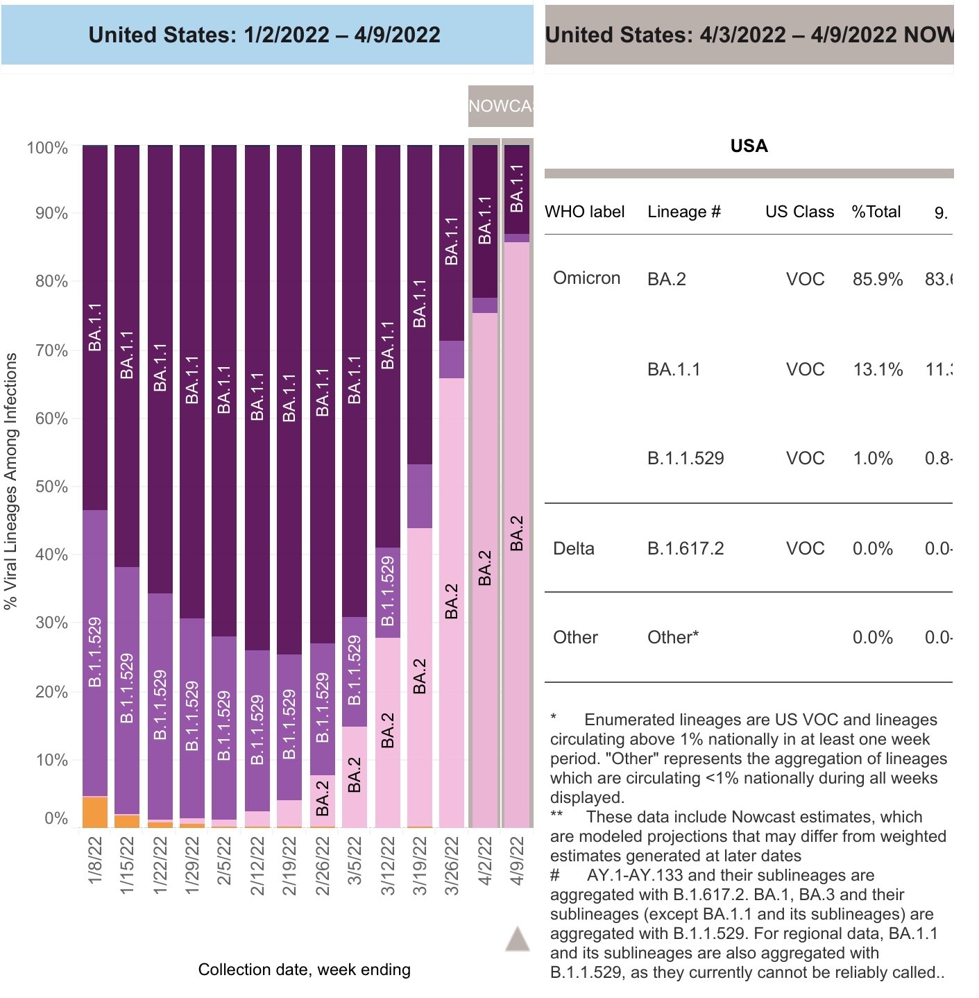
The CDC reported yesterday that as of last week BA.2 accounted for 86% of all new infections:


Regionally, in the Northwest and Southwest BA.2 is 88% of new cases; in the upper Midwest it is 84%; in New England it is 90%; and in NY and NJ it is 92%:


Here’s what the level of new cases looks like broken down by Census Region:


As you can see, cases are rising in every region (except for the South, where the last few days’ increase is due to a data dump by Texas - otherwise it is still decreasing). Cases started increasing in the Northeast first, 4 weeks ago, and that region has the biggest increase.

Because BA.2 started earlier and has been furthest along in the Northeast, and because in Europe BA.2 cases have typically peaked once BA.2 in the country reached 90% of all cases, here is a more detailed breakdown of the Northeastern States over the past 8 weeks:


So far there is no sign of BA.2 peaking in any of those States. Since in European countries the turnaround tended to occur quickly, as in within a week, hopefully we will start to see signs of a peak in some Northeastern States shortly.

Tuesday, April 12, 2022

March consumer inflation part 2: I told you so; the Fed *must* start paying attention to house price indexes


 - by New Deal democrat

This is the second part of my take on the March consumer inflation report.


As you may have already read, total inflation clocked in at +1.2% for March alone! YoY consumer prices are up 8.6%, the highest 12 month rate since 1981. As anticipated, gas prices were a huge contributor; less energy, prices were up 0.4%; less both food and energy they were only up 0.3%:


The spike in gas prices may be - to use a recently dreaded word - transitory. In the past 4 weeks, gas prices are down 5%; as of this morning oil prices, which had been as high as $123/barrel on March 8, are back under $100.

There was some small good news in one sector: the price of used cars and trucks fell -3.8% in March:


 but prices are still up 35% YoY:


And of course, used vehicle prices are down because they have become unaffordable for enough people that sales of such vehicles has also turned down.

But I want to focus on the housing component of CPI, which constitutes over 33% of the total input. There, both rent, and the much larger CPI component of owner’s equivalent rent, which is how house prices are figured into inflation, rose 0.4% for the month, and are up 4.4% and 4.5% YoY, respectively. This is the highest YoY rate of housing inflation for either measure since 2002.


Further, I fully expect the housing component of inflation to continue to worsen considerably. That’s because, as I first pointed out half a year ago, the major house price indexes - the FHFA index and the Case Shiller index - lead owners equivalent rent by roughly 12 to 24 months, particularly in major moves.

The below graph shows the YoY% change in both house price indexes in shades of blue, compared with the YoY% changes in the CPI measures of rent of primary residence, and owners’ equivalent rent in shades of red:


There have been 3 major pulses of house price increases in the last 25 years: in 1997-98, 2004-06, and 2020-present. In each case, after roughly a 12-24 month lag, both CPI rent measures surged as well. That’s because big surges in house prices make renting more attractive (or necessary for those on more limited budgets); this drives more demand for apartments, which drives rent increases. And the current rise in house prices of nearly 20% YoY, is significantly worse than either of the previous two. With CPI housing inflation already at a 20 year high, we can further record CPI housing increases as this year progresses.

As I have also pointed out before, before owners equivalent rent is fully passed through into CPI, total inflation has normally cooled, as shown in the graph below:


But that is because, faced with surging inflation, the Fed has embarked on a series of rate hikes (shown in black above) that culminated before owners equivalent rent peaked. The economy buckled, recessions started, and total inflation subsided as a result, before owners equivalent rent had fully peaked.

Unfortunately, even after the record surge in house prices was in full swing over a year ago, the Fed stayed on the sidelines. Now rents, and owners’ equivalent rents, are surging as well, and the Fed has only made one 1/4 point rate hike. Now the Fed is almost certainly going to stomp on the brakes, with a hard landing to follow.

It’s too late for this cycle. But with three examples of surging house prices feeding through with a delay into the CPI in the past 25 years, in the future the Fed simply *must* pay attention to house prices as reflected in those indexes. Better a small tamping down of the economy early than a major sudden stop later.

March consumer inflation part 1: real wages decline sharply


 - by New Deal democrat

The March consumer inflation report was particularly important, and particularly bad. So much so that I am going to divide my comments into two separate posts.


First, the news on real wages was terrible. While nominally nonsupervisory wages rose 0.4% in March, since inflation rose 1.2%, “real” wages declined -0.8% in March alone. On a YoY basis, real wages were down -1.8%:


Aside from the outset of the pandemic during April and May 2020, this is the worst number since 2011, and one of the 4 worst months since 1991.

Further, on an absolute scale, real wages were the lowest since March 2020; they were also down -1.6% since July 2020:


Finally, real aggregate payrolls are only up 1.5% YoY, and only up 0.3% in the past 7 months. Since real aggregate payrolls turning negative YoY is frequently something that happens shortly before recessions (and likely is a causative agent), although there are some false positives, this is also not good news:


We really need real wages to turn up. But the signs are not good that inflation may abate in the absence of the Fed slamming on the brakes. I’ll discuss that separately in part 2 of this update.

Monday, April 11, 2022

Housing affordability update: prices vs. mortgage payments; and ramifications for the economy


 - by New Deal democrat

No economic news today, and most States didn’t report new COVID cases over the weekend, so let’s take a look at something else; namely, housing affordability, which I’ve been meaning to update for several weeks.


The first graph below compares 4 measures of house prices: the FHFA purchase index, the Case Shiller national index, and the Census Bureau’s measures of median prices for new and all houses sold. The best way to get to the “real” inflation adjusted cost of housing would be to divide by median household income, but since that is only officially calculated once a year, a good monthly proxy is average hourly wages, which is what I use below. All 4 measures are normed to 100 as of January 2006, at or close to the peak of the housing bubble for all of them:


You can see that all 4 are at, close to, or even higher than they were at their bubble peaks. They range from 94.7% for Case Shiller to 104.9% for median new home prices.

While the NAR doesn’t permit FRED to publish historical data on the median price for existing home sales, their most recent report for February lists that price as 357,300. The median in January 2006 was 217,400. That’s a 64% increase. Since average hourly wages have increased 65% in the same period, that means that the “real” price of existing homes now is virtually identical to what they were at the peak of the bubble.

But if prices are equal to their bubble peaks, the story is different with mortgage rates. In 2006, they got as high as 6.8% in July, and were 6.51% in April. By contrast, the most recent weekly update pegs a 30 year fixed rate mortgage at 4.72%; the daily update has the rate at 5.08% - nearly tied for a 10 year high:


Since house prices in real terms are almost identical to their 2006 highs, let’s compare a $250,000 mortgage then and now at the prevailing mortgage rates. Here’s the monthly payment for each:

April 2006: $1865.
July 2006: $1913.
April 2022: $1583.

The bottom line is that the average monthly mortgage payment now is a little over 80% in real, wage-adjusted terms, of what it was at the peak of the bubble.

I do not expect prices and mortgage rate to continue to rise together, as they did up until the peak of the bubble. That’s because what made the bubble was the reckless “fog the mirror” mortgages, sold to just about anybody, bundled into phony “AAA-rated” mortgage bonds, and in turn sold to equally reckless “investors.” 

Lending is much more responsible now. So if mortgage rates increase, I expect sales to tumble, followed in pretty quick succession by prices.

Let me close by updating one of my favorite housing graphs, comparing the YoY change in mortgage rates, (inverted, *10 for scale) with the YoY% change in housing permits and starts:


Mortgages are about 1.5% higher than they were a year ago, the biggest YoY change in 10 years. A 15% YoY decline in housing permits and starts would hardly be surprising, and a 10% decline seems almost certain. Such a decline will be a big negative for the economy going forward into 2023.

Saturday, April 9, 2022

Weekly Indicators for April 4 - 8 at Seeking Alpha


 - by New Deal democrat

My Weekly Indicators post is up at Seeking Alpha.

After several weeks of tightening and then inversion, the yield curve in the US Treasury market un-inverted in a big way this past week - via higher long term rates which drove mortgage rates above 5%, which will have a decidedly negative effect on housing.

As usual, clicking over and reading should be educational for you, and will help me pay for dinner out if the weather is nice.

Friday, April 8, 2022

In the Paul Krugman vs. Nate Silver cage match, I’m on Team Nate


 - by New Deal democrat

Prof. Paul Krugman and Nate Silver got into a dust-up earlier this week about why so many voters seem to have soured on the Democrats. So that you don’t have to go digging through all the Twitter detritus, Alternet has a good write-up copying all the relevant tweets. (Apparently the two have been at odds at least since 2014, when Five Thirty Eight left The NY Times and went to ESPN; I do not know nor do I care who dissed whom first back then).


The dust-up started when Nate wrote:


Krugman responded:


Since how the average American is doing in the economy is something I’ve been obsessively following for about 20 years, and I’ve also spent a fair amount of time parsing what economic indicators appear to best forecast at least Presidential votes, I think I’m qualified to weigh in.

Sorry, Professor, I’m on Team Nate on this.

Yes, Nate Silver shouldn’t have said “some folks on here” without being able to back it up with at least one specific (Note: I’m not going to go digging for that either, but my recollection is that I have read tweets from partisans to the effect that “Actually the Economy is Great;” I think one such partisan may have been Dana Houle). But the *substance* of Nate’s criticism - that voters do not think the economy is going so great - is in my opinion on target. Krugman “straw man” criticism is actually something of a “straw man” itself, failing to come to grips with the issue.

First of all, I should point out that, as to Presidential elections, Silver himself did a regression on some 50 economic indicators to attempt to figure out which ones best predicted *Presidential* outcomes. But to my knowledge no such systematic review has taken place with regard to Congressional and State elections. So take the Presidential formula with a hefty grain of salt.

If this were a Presidential election year, the decline in the unemployment rate would be good news for Biden, because the unemployment rate is one of the best predictors of incumbent vs. insurgent Presidential vote. I was also able to determine that real retail sales were also a very good indicator. James Surowiecki has calculated that changes in real disposable personal income during the election year is also predictive. Finally, economists at the London School of Economics have calculated that the Index of Leading Economic Indicators through the first quarter of a Presidential election year work well.

The news with respect to the above statistics is mixed. The unemployment rate is clearly down, the index of leading indicators is still positive but has decelerated sharply through February, and real retail sales per capita and real disposable personal income are down.

Perhaps more importantly, as shown in the graph below, since last May (when the big stimulus effect first wore off), on a per capita basis, real personal income is down -1.6%, real *disposable* personal income is down -2.6%, real average nonsupervisory wages are down -1.9%, and real retail sales per capita are only up 0.1%:


These are averages; in other words, while median measures would be better if we had them, taking the vast mass of people together, about half of all of them have sustained *real* economic losses in the past 9 months since the stimulus wore off, and they are reining in their spending. 

By contrast, only 1.8% of the population in the entire age bracket from 16 through 65 who were not employed as of last May has gotten a job:


In other words, 1.8% have benefitted from less unemployment, while somewhere near 50% (again, we don’t have median measures so this is the best we can do) have sustained losses. On top of that, since some stimulus benefits have ended (the $3000 child care credit comes to mind), this has created a hole in lots of families’ wallets, and the evidence shows they are blaming Democrats (thank you, Manchin and Sinema).

The difference between how “the economy” is doing, vs. how average families are doing, is best shown by comparing real *aggregate* payrolls, up 3.0% since last May, vs. real  *average* wages:


In the aggregate, even after inflation payrolls are up 3.0%. But the average worker’s hourly wage is down -0.8%. The economy has been booming; the average worker’s wallet, not so much.

So I side with Nate Silver.

Thursday, April 7, 2022

Benchmark revisions, oh my! Four week average of jobless claims makes all-time 55 year series low


 - by New Deal democrat

The DoL made revisions to the last five years of jobless claims, in particular revising the seasonal adjustments, and the differences are eye-popping.

Last week initial claims (blue) were reported at 202,000. With the revisions, they are now 171,000! This week they declined -5,000 from that revised figure to 166,000, tying the revised number from two weeks ago. The 4 week average (red) for last week, originally reported at 208,500, became 178,000, and declined a further -8,000 to 170,000 this week. On the other hand, continuing claims (gold, right scale), originally reported last week at 1,307,000, were revised to 1,506,000, and rose 17,000 this week to 1,523,000:


But that’s not the biggest story. Not only are the initial and 4 week averages pandemic lows, with the revisions initial claims last week is the lowest for the entire series going back almost 60 years with the exception of one week - November 30, 1968, which saw only 162,000 layoffs. The 4 week average was even better: this week’s number is the all-time series low, including all of the 1960s back to the series inception in 1966, as shown in the below graph which shows the current week’s numbers normed to 0:


And remember, the US population in the 1960s was only half of what it is now, so as a rate, this is by far the fewest % of layoffs in the population ever recorded. By the way, the revisions also indicate that layoffs were even lower than we thought - significantly below 200,000 per week - in 2018 and 2019.

For completeness’ sake, continuing claims were lower throughout the 1960s:


Is it any wonder that wages have been increasing as sharply as they have?

Wednesday, April 6, 2022

Scenes from the March jobs report; and the Great Resignation as “Take This Job and Shove It!”


 - by New Deal democrat

It’s been a little while since I took a more in-depth look at the jobs market, so let’s take a look.

As I wrote last Friday, we are at historic lows in both the unemployment and underemployment rates. In the graphs below, the current values of each are normed to zero for easy comparison:


Historically few people are involuntarily unemployed.

So, how close are we to “full employment,” and what sectors haven’t caught up yet?

As I wrote Friday, as of March we are only 1.579 million jobs short of where we were in February 2020 just before the pandemic hit. But since the population, and in particular the working age population has changed since then, below I show the total labor force participation rate (that is, the % of the US population that is either employed or unemployed, vs. not in the labor force at all), and also the prime age (25-54 years old) labor force participation rate:


The total population LFPR is 62.4%, vs. 63.4% in February 2020, while the prime age LFPR is 82.5%. The former has declined sharply since 15 years ago, and has continued to decline, for a very simple reason: Boomers are old! When we focus on the prime age rate, that is only 05% short of its value as of February 2020. Since there are about 176 million Americans in that prime age demographic, that’s roughly a 0.9 million shortfall in that age group. If we figure there’s about another 60 million adults below the age of 65, the total is also probably around 1.5 million:
  

Similarly, when we look at the series “Not in Labor Force, Want a Job Now,” which is a pretty self-explanatory statistic, that is 5.737 million, also about 1.5 million above its best level just before the Great Recession:


In other words, all three ways of looking at the remaining jobs shortfall tell us that about 1.5 million more jobs need to be added to get to full pre-pandemic employment. We’ve been adding over 500,000 jobs a month, so if this continues for just 3 more months, we will have full employment.

Turning the second question, the BLS itself has helpfully prepared the below graph of the gains and losses of various employment sectors since the pandemic started:


The usual suspects of leisure and hospitality (including food and drink), government, and education are still there, and manufacturing is still lagging.

The above tells us the nominal shortfalls. What about the % of job losses? That’s what the below graph shows:


Surprisingly, on a %age basis, it’s mining and logging that has sustained the biggest losses, down -12.5%. Leisure and hospitality comes in next, down -8.7%. Government is down -3.1%, education is down -1.9%, wholesale trade is down -1.8%, and manufacturing is down -1.0%.

Finally, on the theme of “somebody is wrong on the internet,” Kevin Drum writes that “The Great Resignation was neither great nor a resignation,” citing work by the San Francisco Fed that “suggest that the high rate of quits is simply a reflection of the rapid pace of overall labor market recovery.”

The San Francisco Fed makes an interesting case, citing historical manufacturing data. But my bone to pick is with Drum, who claims that “the quit rate [from the JOLTS report] merely rebounded to its old Great Recovery trendline . . .[or] merely ... only very slightly above trend,” producing the below graph in support:


I submit that Drum’s choice of the bottom of the Great Recession as the starting point for his “trend” is performing some Olympic-level heavy lifting. By contrast, when we graph all the way back to the beginning of the statistic in 2000, here’s what it looks like:


The quits rate very suddenly jumped 25% higher than it had ever been in the previous 20 years (3.0%/2.4%=1.25). By contrast, hires, which had previously in Y2K been as high as 4.3%, and 4.1% in 2019, only increased to 0.2% above that to 4.5%.

So, hires barely budged, but quits jumped to all-time new highs by a very wide margin.

A better comparison is with job openings, which like quits soared to all-time highs as well, almost simultaneously with quits:


Drum’s claim is almost preposterous. The only difference is that the Great Resignation is less “I’m going to contemplate my navel” than “Take this job and shove it! [because I’ve found another one that pays way better].”


Tuesday, April 5, 2022

Coronavirus dashboard for April 5: BA.2 likely only causes a ripple; and on track for record low daily deaths


 - by New Deal democrat

This is a good time to look at the impact - or, better speaking, the lack thereof - of the BA.2 Omicron variant in the US.

Nationwide the 7 day average was 28,961 yesterday:


This is the lowest since last July, and lower than all but about 3.5 months since the end of March 2020. Only late spring 2020 and from mid-May through mid-July in 2021 were lower. In other words, on a national level, there is no BA.2 wave whatsoever yet.

The above graph comes from The NY Times, because the State of Kentucky decided to make an enormous data dump yesterday (like 190,000 cases and 2900 deaths!) yesterday, which is ruining the comparisons on my typical data source, 91-Divoc.

Omitting the South (and so KY), here are the regional breakdowns in cases, as well as NY, NJ, and MA, 3 of the States in the Northeast where there *has* been something of a BA.2 wave:


Note that for the Northeast as a whole, and NY in particular, cases are beginning to level off after 3 weeks. I mention this, because the BA.2 wave in Europe has set the pattern for BA.2 impacts. Below are cases in the 5 big countries in Europe, as well as the EU as a whole:


The BA.2 waves started between the end of February through the first week in March. In every country but Germany, they have already peaked. And Germany is misleading, because they had a data dump 6 days ago. Without it, cases there would only be where they were 2 weeks ago. In other words, in Europe BA.2 waves, where they occurred, have only lasted 2.5-3.5 weeks.

Further, in Europe, the BA.2 waves generally peaked once the variant reached the level of 80%-90% of all cases. With that in mind, here is today’s update from the CDC of variance prevalence in the US, showing that BA.2 is no 72% of all case, having risen about 15% in each of the past two weeks:


And here their map of the regional breakdown:


BA.2 makes up 75% of all cases on the West Coast (where there has been no discernible wave whatsoever) and 84% in the Northeast (New England + NY and NJ).

The Northeast is going to hit 90% or more BA.2 prevalence within a week. Above I mentioned that cases in the Northeast look like they are beginning to level off. I expect a peak to be obvious there within a week to 10 days. The rest of the country is probably about one or two weeks behind that.

Turning to hospitalization admissions, they are at their lowest level ever during the pandemic, averaging 10,744/day during the past week:


And finally, here are deaths, currently averaging 604:


This is the lowest level since last August, and lower than all but 4 months of the past two years.

In conclusion, it now looks nearly certain that, on a national level, at worst there is going to be just a BA.2 ripple, and maybe just a long tail of a very slow decline from 30,000 cases daily.

Further, while deaths have declined at a far slower rate than cases, because cases are down over 96% from their Omicron high, and at peak there were only 2600 deaths a day from Omicron, a 96% decline in deaths would take us down to only about 100 per day. And because victims are typically hospitalized before they succumb, and hospitalizations are at new record lows, this further supports the hypothesis that we are perhaps only a month away from a new record low in daily deaths from COVID.