Saturday, October 16, 2021

Weekly Indicators for October 11 - 15 at Seeking Alpha


 - by New Deal democrat


My Weekly Indicators post is up at Seeking Alpha.

There are a couple of signs that the inflationary surge may be at or just past its peak, mainly in that the costs for ship transportation, which have been soaring for months, have stopped doing so and in one case have reversed. Meanwhile on the production side, some commodity costs are still increasing sharply.

As usual, clicking over and reading will bring you up to the virtual moment as to the economic picture. It will also reward me a little bit for my efforts.

Friday, October 15, 2021

Another strong month for real retail sales growth; to cope, employers are going to have to sweeten the pot to add employees


 - by New Deal democrat

Real retail sales, perhaps my favorite monthly economic indicator since they tell us so much about average consumer behavior, and are also a good short leading indicator for jobs, were reported this morning for September, and they were positive.

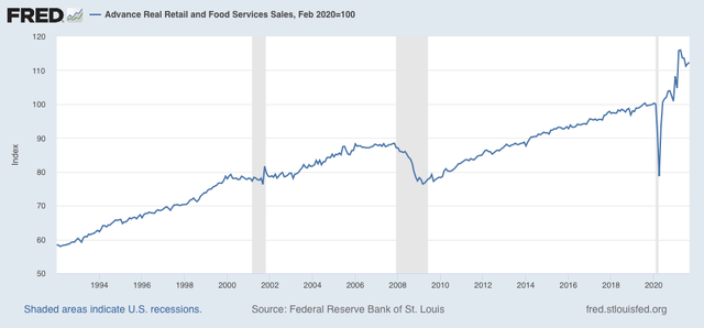
Nominally retail sales increased +0.7%, after a +0.2% upward revision to +0.9% for August.  After taking into account +0.4% inflation, real retail sales increased +0.3%. Although real retail sales are down -3.2% from their April peak, they are +12.3% higher than they were just before the pandemic hit:


They are also 8.1% higher YoY, and 3.8% higher just since January, as will be discussed further below.

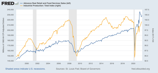
Last month I wrote that ”while the recent decline from April is consistent with a slowing economy ahead, if sales stabilize here I don’t see this as a harbinger of an actual downturn.” That still looks correct. To show why, let me overlay industrial production (gold, right scale) with real retail sales in the graph below:


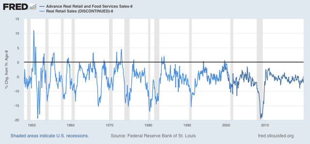
Industrial production is only 0.3% higher than it was in February 2020 just before the pandemic. In other words, manufacturers have not ramped up production equivalent to the increase in sales at all. The only time the economy gets in real trouble is when production has substantially outpaced sales (as at the end of the 1990s and mid-2000s, not coincidentally shortly before recessions began). Production and imports are still trying to catch up to this very strong increase in consumer sales, which is why we have such huge bottlenecks at all of our ports and rail and truck shipping as well. As noted above, real retail sales are over 8% higher YoY. How extreme is that? Well, here’s a graph that subtracts 8% YoY growth from retail sales from 1948 through 2019:


With the exception of 2 months during the 1990s, real retail sales haven’t been this strong YoY since 1984. The modern global supply chain simply can’t cope with that huge an increase to new all-time levels.

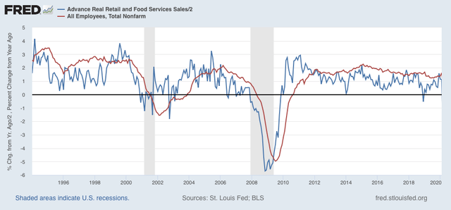
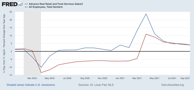
Now let’s turn to employment. As I have written many times over the past 10+ years, real retail sales YoY/2 has a good record of leading jobs YoY with a lead time of about 3 to 6 months. That’s because demand for goods and services leads for the need to hire employees to fill that demand.  The exceptions have been right after the 2001 and 2008 recessions, when it took jobs longer to catch up, as shown in the graph below, which takes us up to February 2020:


Now here is the same graph since just before the onset of the pandemic. Note the scale is much larger, given the huge changes wrought by the early lockdowns, and of course the comparative spikes from the data one year later:


As with the recoveries immediately after the two prior recessions, up until the past several months YoY job creation has been well below YoY real retail sales growth. But for the last 3 months, jobs have caught up to forecast trend.

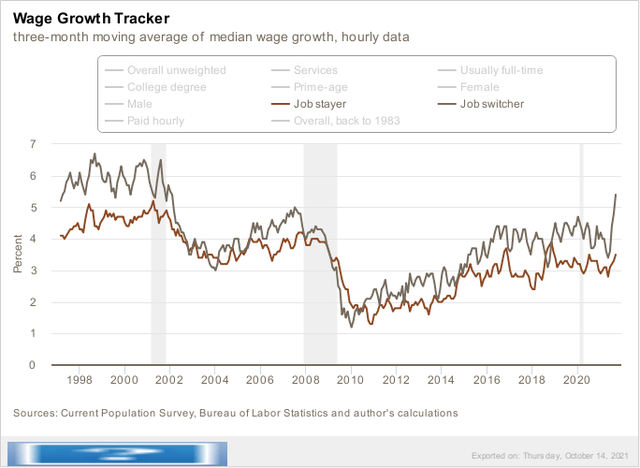
Although the most recent jobs report was, relatively speaking, disappointing, this still  argues that we can expect jobs reports in the next few months to average out about even with those from one year ago, which averaged about 500,000 per month. Before I go, let me supply one more graph from my former co-blogger Invictus:


Job switchers have seen explosive growth in their wages in the past few months. To cope with labor’s new-found great strength, employers are going to have to engage in lots of wage and life-style sweeteners to maintain the 500,000/month jobs growth they need.

Thursday, October 14, 2021

Jobless claims: a renewed downward trend?


 - by New Deal democrat

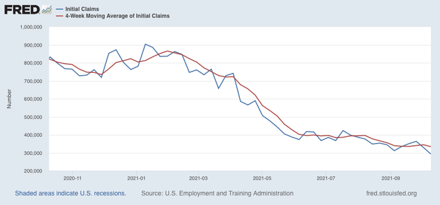
Jobless claims declined 36,000 this week to 293,000, another pandemic low. The 4 week average also declined 10,500 to 334,500, also another pandemic low:


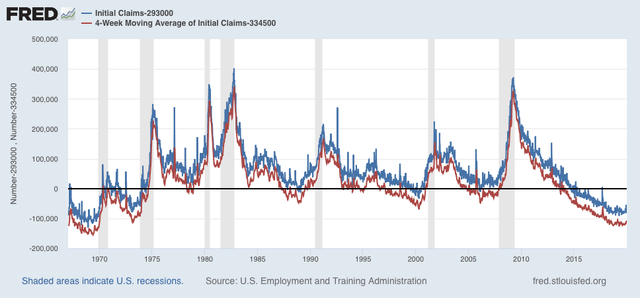
With the exception of the last few years of the last expansion, this level of weekly initial claims would be very low for any point in the last 50 years, and the 4 week average would be average for an expansion:


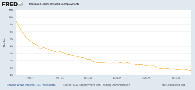
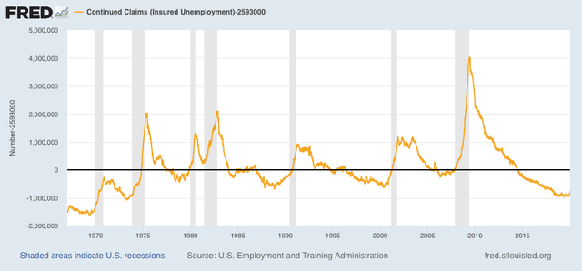
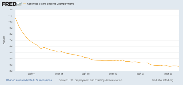
Continuing claims declined 134,000 to 2,593,000, also a new pandemic low:


This level would also be normal for the middle of the last few expansions:


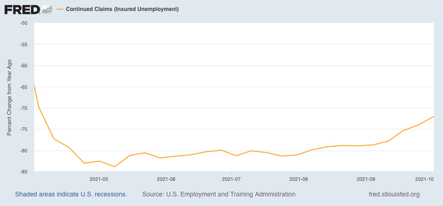
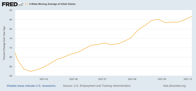
Finally, here is the YoY% change of continuing claims:


Based on the YoY change, it appears that the ending of all of the emergency pandemic assistance programs by some States in June had very little effect, but the complete nationwide phase-out last month may be a cause for the decline in continued claims in the last few weeks. 

Whether this week is just a bit of a downside outlier, or the actual beginning of a renewed downward trend in claims remains to be seen. But it certainly adds to the evidence that employees have little fear of layoffs at present.


Wednesday, October 13, 2021

Continuing accelerated consumer inflation points to sharp slowdown, but no recession imminent


 - by New Deal democrat

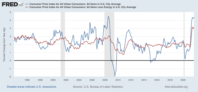
Inflation, along with the expiration of the emergency pandemic payments, is one of the two big threats to this expansion. This morning’s report on consumer inflation for September, at 0.4%, was certainly elevated compared with its typical pre-pandemic reading of 0.2%/month, but on the other hand was the third month in a row of sharp deceleration from springtime, during which inflation averaged 0.8%/month. 

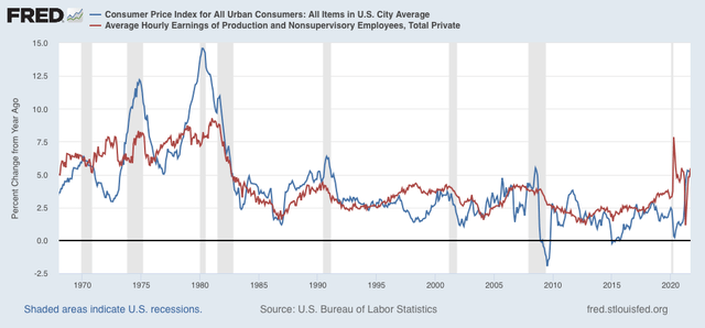
Typically inflation has not been a concern unless inflation ex-gas (red) has been in excess of 3.0%. YoY it is now 4.1%, as it has been for 2 of the 3 prior months. Meanwhile YoY total inflation (blue) is 5.4%, slightly higher than the last 3 months: 

Just as importantly, one of the traditional “real” harbingers of a recession has been wages (more broadly, household income) failing to keep pace with inflation: 

Since April, on a YoY basis wages had failed to keep pace with inflation. In September, they eked out a 0.1% gain.

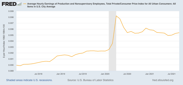
In Absolute terms real wages have been more or less flat for over a year:

This does not necessarily portend a recession, but it is certainly consistent with a sharp slowdown.

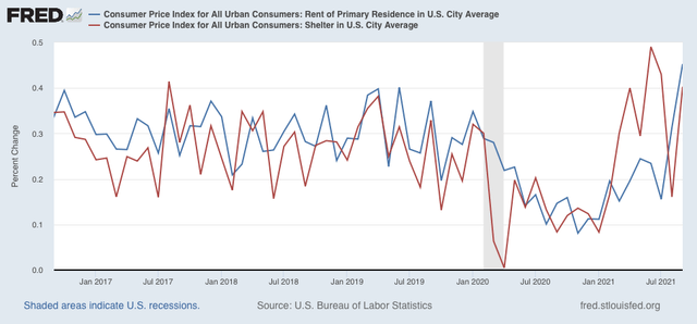
Taking a somewhat more granular look at inflation, housing (shelter) is over 1/3 of the entire index, and reflects households’ biggest monthly expense. The bad news is that on a monthly basis both inflation in shelter (blue in the graph below) and rent increases (red), which had been within their normal ranges in August, are now both running hot (particularly with the expiration of the eviction moratorium):

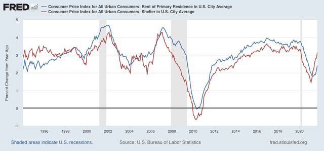
This has caused the YoY indexes to also turn up:

This will bleed over into the general shelter inflation index, which has already been telegraphed for many months by price increases as measured by the FHFA and Case-Shiller Indexes.

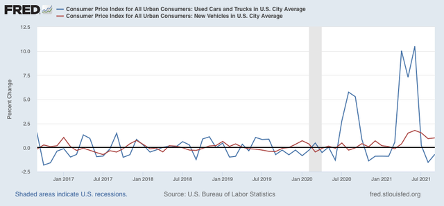
Turning to motor vehicles, new car prices (red) continued to increase at an elevated pace in September, while used car prices (blue) hit a wall in July and have decreased for two month is a row since then:

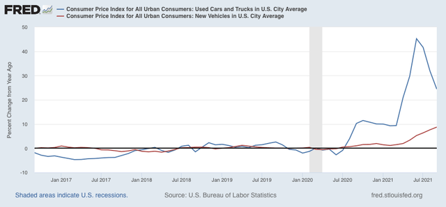
On a YoY basis, used car prices, which had been up over 40%, are now up “only” 24%, while new car prices are now up nearly 10%:

Finally, although I won’t bother with a graph, there have been renewed gas price pressures in the past several weeks, with prices up about $.10/gallon in that time.

What is the conclusion from all of this? 

First of all, price pressures in these very important sectors of the consumer economy - housing, vehicles, and gas - are constraints going forward into 2022. As I wrote in connection with last month’s report, heightened inflation has gone on long enough now that I expect some damage to show up in consumer spending. It hasn’t yet, probably because in the aggregate personal savings is up over 20% since just before the pandemic began. That’s quite a cushion! Additionally, “real” wage earnings have generally kept pace with inflation, as opposed to declining, so that suggests that consumers can maintain at least a steady level of “real” spending - and it is spending that drives production and jobs.

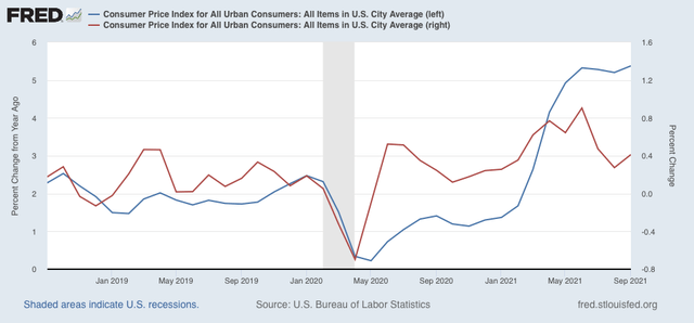
Secondly, there has been a real deceleration in inflation between the second quarter, during which consumer prices increased at an 8.4% annualized pace (red, monthly right scale vs. YoY, blue, left scale), and the third quarter, during which they increased at a 6.6% annualized pace:

 I expect inflation in both wages and consumer prices to decelerate further from here, with a very important caveat that inflation in rents is a wild card. 

To me this adds up to a sharp slowdown in the economy, but not enough evidence at this point - certainly not in the long or short leading indicators - to suggest a recession in the immediate future.

Tuesday, October 12, 2021

August JOLTS report: progress towards a new jobs equilibrium?


 - by New Deal democrat

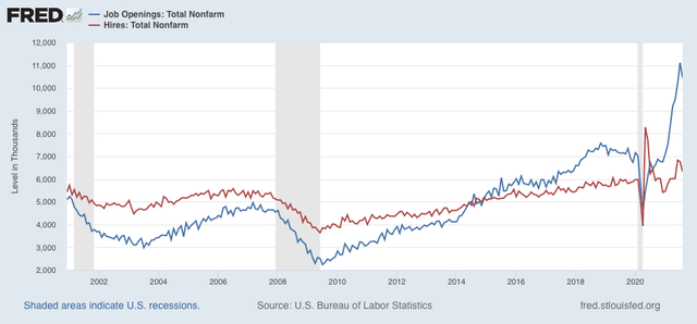
This morning’s JOLTS report covers August, which you may recall featured a disappointing jobs report (since revised somewhat higher ), during which the Delta wave was growing to its worst levels, and two months after a number of GOP-controlled States terminated enhanced unemployment benefits, on the theory that they were excessive and were coddling idle workers. Despite this, last month we did not see a big drop in unfilled job openings. This month we did - but we saw a big decline in actual hires, too.

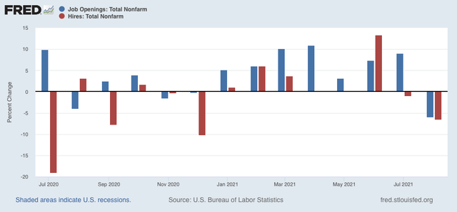
Job openings decreased 659,000 to 10.349 million (blue in the graph below), while actual hiring  (red) also decreased 439,000 to 6.322 million:

Here are the month over month percentage changes for each of those metrics:


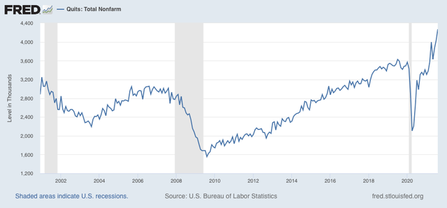
Meanwhile, voluntary quits rose to a new record of 4.270 million:


The record number of people voluntarily quitting their jobs (meaning they are not eligible for unemployment benefits) is testimony to the record robustness of the jobs market despite the cutoff of emergency benefits by many States.

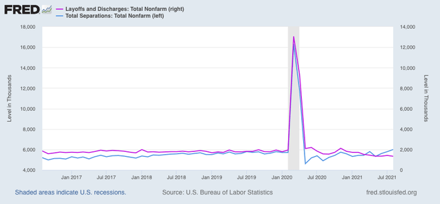
Layoffs and discharges (violet, right scale) declined by 322,000 to 1.343 million to yet another record low, while total separations (light blue, left scale) rose by 211,000 to 6.003 million, a level that was typical during the last two expansions:


Last month I wrote that “this is a market that continues to be out of equilibrium and is searching for a new one.” This month is evidence of some progress in that direction, given the decline in job openings. The record number of quits and the record low in layoffs and discharges indicates, however, that the market remains very tight and tilted in favor of labor over management (for the first time in over 20 years). But the sizable decline in actual hires belies the idea that, with a cutoff in benefits, employers will be hiring a new batch of needy potential workers.

In other words, the termination of benefits has apparently not been effective at all in actually generating new employment. The inability to find child care, or concerns about the safety of jobs on offer, and possibly the amount of previous emergency benefits that have been saved and are providing a cushion, remain likely factors.

A great deal continues to depend on the course of the Delta wave, which has not receded significantly at all along the northern (colder) frontier of States. I do not believe that a new equilibrium in the jobs market will be reached until the COVID pandemic recedes at least into a tolerable background status.

Saturday, October 9, 2021

Weekly Indicators for October 3 - 7 at Seeking Alpha


 - by New Deal democrat

My Weekly Indicators post is up at Seeking Alpha.

Although I have read a few pieces this past week about deep downgrades to Q3 GDP estimates, and other problems with sales, the fact remains that the high frequency indicators are almost all positive, across all timeframes.

As usual, clicking over and reading will bring you fully up to date on the economic trends, and bring me a little pocket change as well.

Friday, October 8, 2021

September jobs report: once again, two very different surveys net to a “relatively” disappointing gain


 - by New Deal democrat


As I previously indicated, two items I was particularly watching for in this morning’s report were (1) manufacturing hours and payrolls - to see if that white-hot sector was holding up in the face of supply bottlenecks, and (2) whether there were continued gains in leisure and hospitality jobs, or whether Delta had caused those to stall. 

While this morning’s report came in well short of expectations, with the big positive revisions to previous months the 6 month average of monthly gains is still over 600,000.

Here’s my synopsis of the report:

HEADLINES:
  • 194,000 jobs added. Private sector jobs increased 317,000, but government (mainly education) shed -123,000 jobs, having a great deal to do with haywire seasonal adjustments this year. The alternate, and more volatile measure in the household report indicated a gain of 526,000 jobs, which factors into the unemployment and underemployment rates below.
  • The total number of employed is still -5,333,000, or -3.3% below its pre-pandemic peak.  At this rate jobs have grown in the past 6 months (which have averaged 653,000 per month), it will take another 8 months for employment to completely recover.
  • U3 unemployment rate declined -0.4% to 4.8%, compared with the January 2020 low of 3.5%.
  • U6 underemployment rate declined -0.3% to 8.5%, compared with the January 2020 low of 6.9%.
  • Those not in the labor force at all, but who want a job now, rose 287,000 to 5.969 million, compared with 5.010 million in February 2020.
  • Those on temporary layoff decreased 128,000 to 1,124,000.
  • Permanent job losers declined -236,000 to 2,251,000.
  • July was revised upward by 38,000, while August was revised upward by 131,000, for a net gain of 169,000 jobs compared with previous reports.
Leading employment indicators of a slowdown or recession

These are leading sectors for the economy overall, and will help us gauge how strong the rebound from the pandemic will be.  These were mixed, and net to neutral:
  • the average manufacturing workweek, one of the 10 components of the Index of Leading Indicators, was unchanged at 40.4 hours.
  • Manufacturing jobs increased 26,000. Since the beginning of the pandemic, manufacturing has still lost -343,000 jobs, or -2.8% of the total.
  • Construction jobs increased 22,000. Since the beginning of the pandemic, -201,000 construction jobs have been lost, or -2.6% of the total.
  • Residential construction jobs, which are even more leading, rose by 2,100. Since the beginning of the pandemic, 42,500 jobs have been *gained* in this sector, or +5.1%.
  • temporary jobs declined by -5,200. Since the beginning of the pandemic, there have still been 256,800 jobs lost, or -8.7% of all temporary jobs.
  • the number of people unemployed for 5 weeks or less increased by 154,000 to 2,237,000, which is 155,000 higher than just before the pandemic hit.
  • Professional and business employment increased by 60,000, which is still -385,000, or about -1.8%, below its pre-pandemic peak.

Wages of non-managerial workers
  • Average Hourly Earnings for Production and Nonsupervisory Personnel: rose $0.14 to $26.15, which is a 5.5% YoY gain. This continues to be excellent news, considering that a huge number of low-wage workers have finally been recalled to work. 

Aggregate hours and wages:
  • the index of aggregate hours worked for non-managerial workers rose by 0.5%, which is a  loss of -2.8% since just before the pandemic.
  •  the index of aggregate payrolls for non-managerial workers rose by 1.0%, which is a gain of 6.0% since just before the pandemic.

Other significant data:
  • Leisure and hospitality jobs, which were the most hard-hit during the pandemic, gained 74,000 jobs, and is still -1,594,000, or -9.4% below their pre-pandemic peak.
  • Within the leisure and hospitality sector, food and drink establishments gained 29,000 jobs, and is still -930,400, or -7.6% below their pre-pandemic peak.
  • Full time jobs increased 591,000 in the household report.
  • Part time jobs increased declined -36,000 in the household report.
  • The number of job holders who were part time for economic reasons declined by -1,000 to 4,468,000, which is an increase of 70,000 since before the pandemic began.

SUMMARY

Once again there were two very different reports: the establishment survey was relatively weak for the second month in a row (again strongly influenced by the seasonality of the education sector), while the household survey was very strong.

In general there were weak gains across the board in all sectors of business hiring. Of the two areas I was most paying attention to, manufacturing hours were steady, and payrolls increased at their typical rate since the pandemic lockdowns ended. Meanwhile the food and beverage and wider leisure and hospitality sectors had their second month of very weak gains in a row, indicating a major impact from the Delta wave on consumer behavior. The most positive news was the continued strong increase in aggregate employee hours and wages, plus the second month in a row of very positive revisions to the prior two months’ data.

On the household side of the report, full time jobs increased sharply, while part time jobs declined slightly, and total jobs increased over half a million for the second month in a row. Both the unemployment and underemployment rates declined sharply once again. On the other hand, those not in the labor force who nonetheless want a job now increased.

I suspect that the more volatile household report is giving us a slightly leading signal vs. the establishment report, so I am discounting a little bit the mediocre job sector gains in the establishment report. At the same time, it is clear that the pandemic continues to have a big negative effect on services that involve indoor activities. 

All in all, a decent positive report - just not as good as most people were hoping for.

Thursday, October 7, 2021

A slow grind in new and continued claims as Covid’s effects gradually transition from pandemic to endemic


 - by New Deal democrat

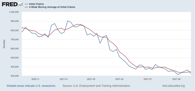
Jobless claims declined 38,000 this week to 326,000, still 14,000 above the September 4 pandemic low of 312,000. The 4 week average rose 3,500 to 344,000, 8,250 above their September 18 pandemic low of 335,750:


Continuing claims declined 97,000 to 2,714,000, a new pandemic low:


Here is the YoY% change of continuing claims:


Based on the YoY change, it appears that the ending of all of the emergency pandemic assistance programs has had very little effect on continuing claims, at least so far.

With the Delta wave declining 40% from peak in the past month, the failure to make more downward progress in new claims is not due to changes in the pandemic, but more likely reflective of an economy grinding ahead with continued issues both in supply bottlenecks and in consumer (and potential employee) wariness in engaging in many indoor or crowded activities.

In tomorrow’s jobs report I will be paying particular attention to manufacturing, first in terms of average hours of work and secondly in changes in manufacturing payrolls themselves, to gauge whether supply bottleneck issues are affecting that leading sector. Whether retail jobs generally and leisure and entertainment jobs more specifically continue to improve is also going to be a focus.


Wednesday, October 6, 2021

Updated US wealth distribution data shows how bad the Great Recession and its aftermath were, and how effective the pandemic assistance has been


 - by New Deal democrat

The desert of new economic data this week continues today. But last week the Fed released its quarterly data on wealth distribution in the US, and it shows an important point about the efficacy of the emergency pandemic assistance. Let’s take a look.


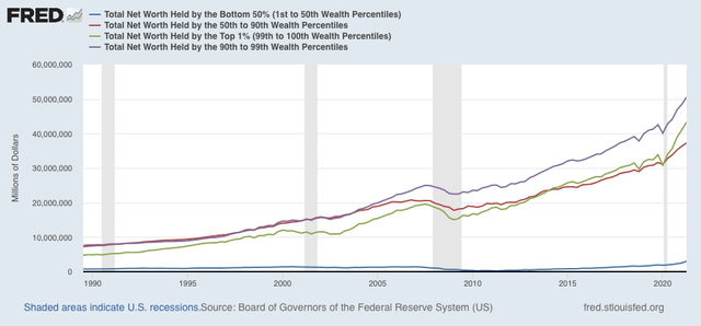
Let’s start with the raw absolute levels of total wealth held by the bottom 50%, 50%-90%, 90-99%, and top 1% of the US population:


The total net worth of the US as of Q2 of this year was about $134 trillion (yes, trillion). Of that, only $3 trillion was held by the entire bottom half of the population. At the other extreme, the top 1% alone held assets worth $43 trillion.

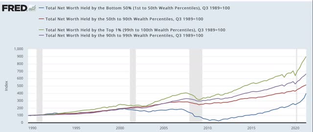
Since the bottom half of the distribution shows up as squiggles at the bottom of the graph above, to better show the fluctuations among the groups, here is the same information normed to 100 as of the beginning of the series in 1989:


Most noteworthy is the virtual collapse - by nearly 90%! - in assets held by the bottom 1/2 of the population between its temporary peak in 2000 and several years after the end of the Great Recession in 2011. By contrast, with the exception of the stock market pullbacks during the tech crash and the first part of the Great Recession, the value of assets held by the top 1% has almost relentlessly increased in the past 30+ years.

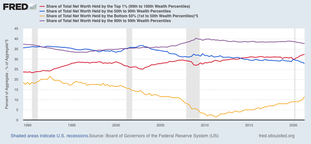
Another way of looking at this is the %age share of total net US assets held by each wealth percentile, shown below:


Again, with the brief exception of stock market pullbacks, the share of US assets held by the top 1% (red line) has increased almost continuously since 1989. By contrast, the share held by the bottom 50% (gold, multiplied *5 so that it shows up as more than squiggles) declined by 93% from 4.3% in 1992 to 0.3% in 2011.  A secondary phenomenon in both the absolute and %age share numbers is that the 50th-90th%iles (blue) and the 90th-99th%iles (purple) held roughly steady with one another until the 2000s, after which the wealthier cohort pulled away from the middle class cohort, and has retained that advantage since.

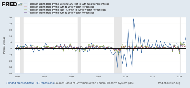
Next, let’s look at the YoY% change in wealth for each group:


What is most noteworthy here, aside from the pasting that the poorer half of the US wealth distribution took during and after the Great Recession (frankly, a real indictment of both Bush’s and Obama’s emergency packages that bailed out Wall Street and the banks  and left Main Street dangling), is the ground made up by the bottom half of the wealth distribution in the latter part of the last expansion and even more dramatically as a result of the emergency measures put in place to deal with the pandemic. In absolute terms, the bottom 50% holds more wealth than at any point in the series (note, of course, this is not adjusted for inflation), but also the highest share of total assets than at any point since early 2006 - but still, only slightly more than 1/2 as much as the share they held at the end of the 1980s.

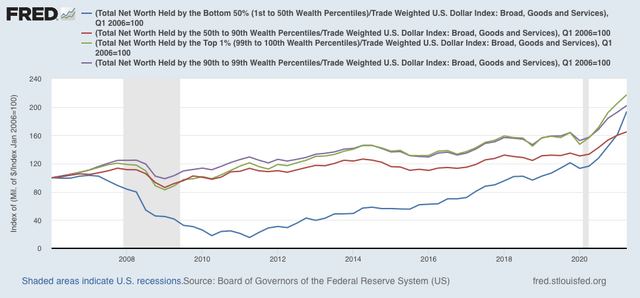
Finally, to give some indication of how this plays out in “real” terms, here are the total wealth amounts normed to 100 in 2006, and adjusted for the trade weighted value of the US$:


Again, how badly the poorer half of the US was treated during the Great Recession and the first part of the recovery thereafter shows up strongly, as does how well they did relatively speaking in the latter part of the expansion, and even moreso with the emergency pandemic assistance.


Tuesday, October 5, 2021

Housing and car sales, oh my!


 - by New Deal democrat


[If last week was a slow week for economic data, this week is a virtual wasteland until Thursday, so I took yesterday off.]

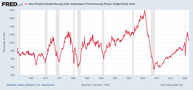
Last month I wrote that typically it has taken at least a 20% decline in housing construction to be consistent with an oncoming recession, and that we weren’t there yet.


As of the most recent housing permits report, single family permits were down 17% from their recent peak:


One of the most persuasive fundamentals-based models of economic cycles, by Prof. Edward Leamer, with decades of proof ever since World War 2, posits that housing is the most leading harbinger, turning down about 7 quarters before a recession, followed by motor vehicles, followed by producer durable goods, followed by consumer durable goods.

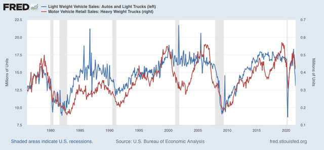
So, the most recent report on motor vehicle sales is not very encouraging. I have stopped following the private manufacturer reports, because most producers have cut back to quarterly rather than monthly reports, so the monthly numbers are mainly estimates. But the BEA issues its own report with a one month delay, and the most recent report for August, just released, showed a decline of over 10% for that month alone, and a total decline of 28% since April (blue in the graph below). Meanwhile, the more leading heavy trucks segment also declined 5% for the month, and a total decline of 19% since March (red):


Outside of the 1970 recession, heavy truck sales have declined at least 23% (and usually much more than that) before a recession began. Light vehicle, including cars, have typically declined at least 10%.

So heavy truck sales have not quite hit the point of being consistent with an oncoming recession, although cars and light trucks have.

It is important to note that our current situation is sui genesis compared with the past 70 years, because there has been no significant increase in either short or long term interest rates. Demand remains intact. 

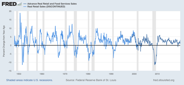
This is entirely a supply bottleneck, which has driven prices for finished goods higher. A close analogy would be the oil shocks of the 1970s, at least one of which was an artificially caused supply shortage (the Arab Oil Embargo). The big difference here is that there is no wage-price inflationary spiral, because there are no unions able to obtain automatic “cost of living” wage increases. We have seen wages increase sharply in many places due to the pandemic, but with all emergency benefits ended, that has or shortly will almost certainly cease. If the supply shortages do not ease shortly, then the next thing to watch out for is whether more broad durable goods spending by both producers and consumers stalls. In particular real retail sales per capita has almost always turned negative YoY shortly before the onset of recessions in the past 70 years:


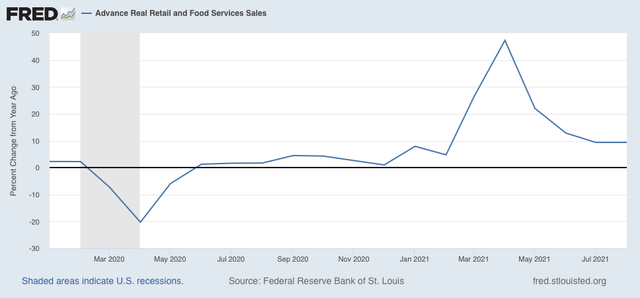
By contrast, at present YoY real retail sales are up almost 10%:


If that number were to suddenly plummet close to 0, I would be much more concerned that the supply bottleneck was on the verge of creating a recession.

Saturday, October 2, 2021

Weekly Indicators for September 27 - October 1 at Seeking Alpha


 - by New Deal democrat


My Weekly Indicators post is up at Seeking Alpha.

Commodity prices and transportation cost continue to soar, and there are even signs of further acceleration. If you go by the regional Fed reports, it is beginning to affect manufacturing. If you go by the ISM, not even a little bit.


As usual, clicking over and reading brings you up to the economic moment, and rewards me a little bit for my efforts.

Friday, October 1, 2021

Manufactuing remains white hot, while construction spending is mixed


 - by New Deal democrat

As usual, we started out the month with the forward-looking ISM manufacturing report for September, as well as construction spending for August.


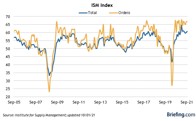
Let’s take the ISM report first, since it is an important short leading indicator for the production sector. And here, the news was good, as the overall index improved to 61.1, among its highest numbers in several decades (but not quite as high as several readings earlier this year). The more leading new orders subindex held steady at a white-hot 66.7:


There is not a hint of a manufacturing slowdown in this number, despite the well-documented problems in the supply chain.

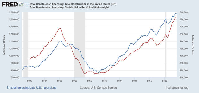
Turning to construction, overall spending including all types of construction was unchanged, while spending on the leading residential sector increased 0.4% at or making new all time highs:


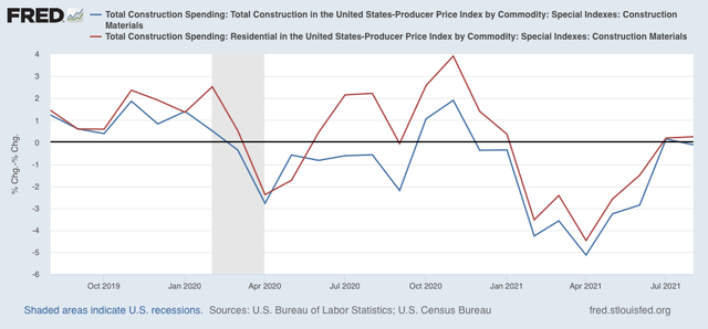
Adjusting for price changes in construction materials, “real” construction spending declined -0.1%, while “real” residential construction spending increased 0.2% m/m:


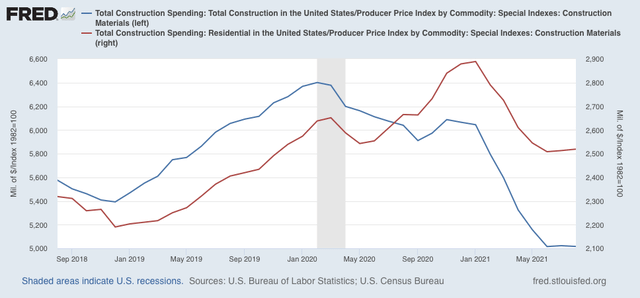
In absolute terms, “real” construction spending declined sharply earlier this year, but now appears to have bottomed out:


So the leading aspects of both reports were positive, although price issues in construction materials remain problematic.

Real spending increases, real income declines in August


 - by New Deal democrat


(Note: I’ll report separately on construction spending and the ISM manufacturing index later.)

Real personal income and spending held up well throughout the pandemic, due to a vigorous government response. This morning these were reported for the last full month of any assistance. 

In nominal terms, personal income rose 0.2%, and spending rose 0.8% (but with a downward revision of -0.4% to July).

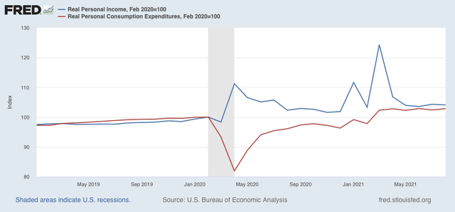
But in real terms, personal income (blue) declined -0.2%, while real personal spending rose 0.4%. Real income (blue) is 4.1% above where it was in February 2020, and real personal spending (red) is still 2.8% above its immediate pre-pandemic level:


The trend for the last for months for both has been essentially flat.

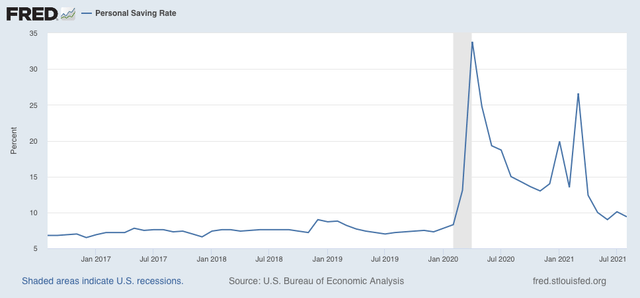
Meanwhile, the “cushion” in personal savings due to the emergency pandemic programs continues, as the savings rate remains significantly above where it was before the pandemic. In February 2020 the rate was 8.3%. In August it was 9.4%:


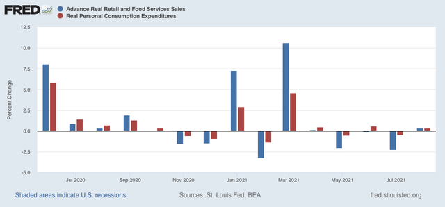
Real personal spending is basically the other side of the coin compared with real retail sales, since they cover the seller and buyer of consumer transactions, which is over 2/3’s of the entire economy:


Both of these have returned to basically normal levels m/m, and both increased 0.4% in August. Needless to say, this is positive.

With the total expiration of emergency measures, the next few months will be much more challenging.

Thursday, September 30, 2021

New jobless claims increase: exit Delta, enter supply chain chokepoints?


 - by New Deal democrat

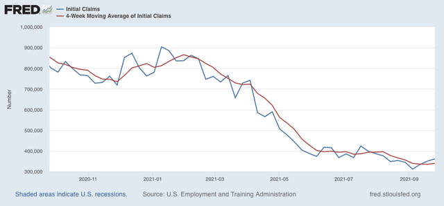
This week jobless claims were higher for the third week in a row, and the 4 week average also rose slightly. Initial claims rose 11,000 to 362,000, and the 4 week average rose 4,250 to 340,000, from last week’s pandemic low:


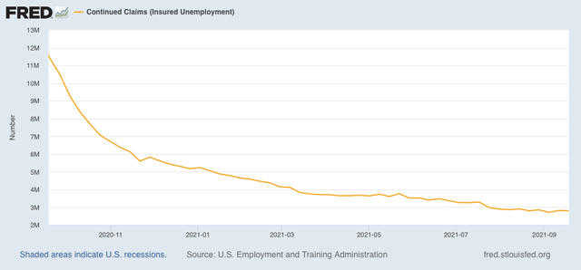
Meanwhile, continuing claims declined 18,000 to 2,802,000, but remain above the pandemic low of 2,715,000 of two weeks ago:


It appears that the ending of all of the emergency pandemic assistance programs have had very little effect on continuing claims.

With infections from the Delta wave now down almost 1/3rd from their peak one month ago, we can safely say that the increase in new claims in the past few weeks is not due to COVID. It may just be noise. It’s also possible that the bottlenecks in the supply chain have led to some cutbacks downstream, as the ability to manufacture or sell goods is constrained by what is available. The next jobs report, which will be issued a week from tomorrow, should give us further insight as we can look to see where if anywhere there have been job losses.

Wednesday, September 29, 2021

Coronavirus dashboard for September 29: the demographics of disease and death


 - by New Deal democrat

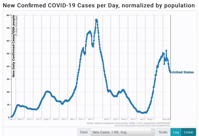
First, let’s start with the good news. The Delta wave continues to roll out just about as swiftly as in rolled in. Cases are down almost 33% nationwide, including in all 4 regions: 


And all 5 States that were the worst hit at the outset - AR, FL, LA, MO, and MS - are all continuing to decline. Below I show them, plus RI, which is #25 among the 25 lowest States + DC. In other words, all the early poster children for Delta are now in the bottom half of all States for new infections:
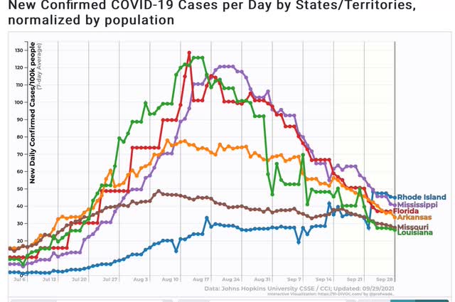

Only 5 States are in any kind of uptrend at all - AK, MI, MN, ND, and NE:


Note that all of them are near or at the northern border with Canada, and 3 of them are also among the Trumpiest. To drive the point home, here is Canada itself, plus MI and MN:
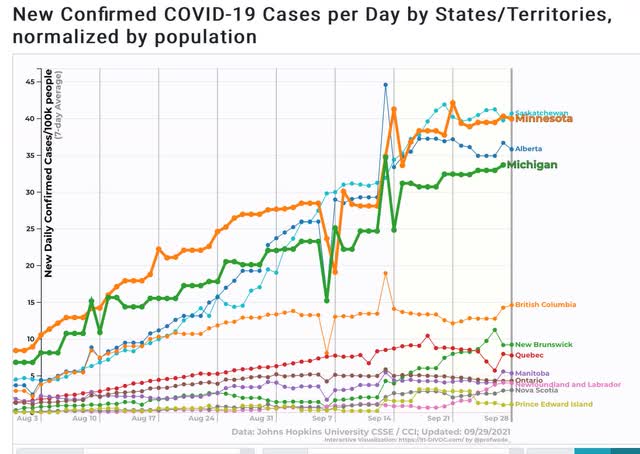

Alberta in particular is likened by Canadians to Texas in the US. So you have two of the (even) colder provinces, which are also the “libertarian” conservative provinces, having the worst records.

In other words, Delta continues to migrate north, and continues to hit the least vaccinated areas the hardest.

I hasten to add, however, that even with this relatively “good” news, the number of case is still far higher than at any point during the worst of the spring or summer 2020 waves:


 Now to the demographics issue. Let me start with this graph of mortality by age for COVID vs. the Spanish Flu:
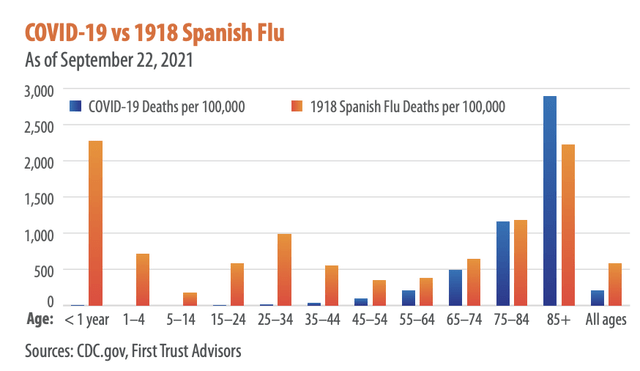

The graph comes from Brian Wesbury, a financial analyst whose twitter feed strongly indicates he is a devotee of Hayek and Ayn Rand. But don’t dismiss it - I went to the CDC site itself to verify the numbers for COVID, and here they are:
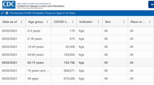

As of one week ago, there had been only 544 deaths from COVID among children since the beginning of the pandemic.

In other words, measured per capita, COVID (so far) has caused only 1/3rd the percentage of deaths compared with the 1918 Flu; and among the young, it has been far, far less deadly (so far, according to one graph I have seen, it is roughly equivalent to the number of children who die from influenza each year).

But haven’t we heard that Delta has been attacking the young at a much higher rate than the original strain of the disease? Yes, we have, and yes, according to the below graph it is true:
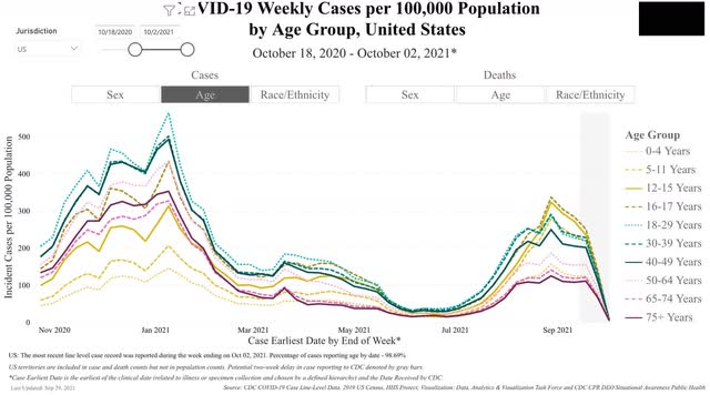

You can see that, per capita, Delta has attacked those two ages the most, followed right behind by the 12-15 demographic, and then the 5-12, 18-29, and 30-39 demographics virtually in a tie.  Note that by contrast, children were among the least hit by the original strain last autumn and winter.

Now let’s turn to deaths. And it’s a completely different story:
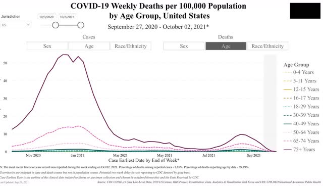

Delta continues to kill at the highest rate the oldest demographics in reverse chronological order. But because there are far fewer people over age 75, and also fewer in the 65-74 demographic, the raw *number* of people under 65 killed by Delta is larger, giving us fatalities of about 2000/day.

But this is still a vaccine success story, because over 80% of people over 65 are fully vaccinated. Deaths among the 65-74 demographic are only about 1/3rd of what they were last winter, and deaths among those over 75 are less than 1/5th what they were!