Saturday, October 13, 2018
Weekly Indicators for October 8 - 12 at Seeking Alpha
- by New Deal democrat
My Weekly Indicators post is up at Seeking Alpha.
Last week the bond market fell out of bed. This week the stock market followed. But some other short leading indicators have softened as well.
As always, not only is this a great way to measure the economy on an up-to-the-moment basis, clicking over and reading also rewards me just a little bit for the work I put in to tell you where the economy is headed.


Friday, October 12, 2018
Housing's most difficult comparisons in years begin next Wednesday
- by New Deal democrat
After a real quiet week for news, next week we get retail sales, industrial production, the JOLTS report, existing home sales ... and housing permits and starts. The week after, real residential fixed investment will be reported as part of Q3 GDP. Permits and residential fixed investments will have some of the most challenging comparisons in a long time.
Here's why. First, here's a graph of 30 year mortgage rates:

These have broken out to highs not seen since early 2011.
Here's what that means for a graph that I have run many times: the inverted YoY change in mortgage rates (blue) vs. the YoY% change in single family permits (red, divided by 10 for scale). I've also added 0.75% to the inverted YoY number for mortgage rates to account for the positive effect demographics have had on the comparison over the last six years. Remember that permits tend to follow mortgage rates by about 6 months:

In short, even giving the housing market credit for a demographic boost, we are probably going to see the YoY change in building permits for single family houses go to roughly zero. Since (not shown) permits surged between last October and this March, the comparisons will be quite difficult.
Another housing comparison that is going to get much more challenging starting next week is purchase mortgage applications. Here's a close-up on those over the last five years from Ed Yardeni's blog:

For most of the last two months, purchase mortgage applications have been compared with some of the weakest numbers in all of 2017. Beginning with the report next Wednesday morning, for the remainder of the year, almost all of the comparisons except for a couple of weeks will be against index values of 240 or higher (this past week they were reported at 239). And the latest surge in mortgage rates hasn't really shown up in these yet.
The bottom line is that housing is facing probably the most difficult set of circumstances in that market since prices bottomed in 2012. And the acid test begins next Wednesday.
Thursday, October 11, 2018
Subdued September inflation means real hourly and aggregate wages grow
- by New Deal democrat
Courtesy of subdued gas price increases this year vs. one year ago, overall consumer prices rose only 0.1% in September vs. 0.5% one year ago (and 0.3% over the last two months vs. 0.9% one year ago). As a result, YoY CPI growth is down to 2.3% vs. 2.9% several months ago, and that means that "real" wages increased, despite no movement in growth nominally YoY.
With that background, let's update real average and aggregate wages.
With that background, let's update real average and aggregate wages.
Since nominal wages for non-managerial workers are up 2.7% through September, this means that real wages, which had been flat, have grown in the last few months by +0.4% YoY:

In the last 2 1/2 years, real wages had been essentially flat. The last couple of months moves the needle a little bit:

Further, because employment and hours have increased, real *aggregate* wage have continued to grow:

Real aggregate wages -- the total earned by the American working and middle class -- are now up 26.2% from their October 2009 bottom.
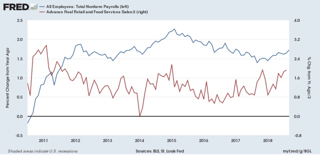
Finally, because consumer spending tends to slightly lead employment, let's compare YoY growth in real retail sales, first measured quarterly (red), with that in real aggregate payrolls (blue):

Here's the monthly close-up on the last 9 years
:

Retail sales won't be reported until next week. They grew +1.9% nominally last September, igniting some very good YoY comparisons that have been reflected in an acceleration of YoY employment growth as well. I am expecting a substantial downshift in retail sales next week, which in turn is likely to lead to a substantial downshift in employment reports beginning in a few months.
Wednesday, October 10, 2018
Tracking Trump's trade wars: inventories and intermodal traffic
- by New Deal democrat
Here's something I thought I would start to track: looking for evidence of the effects of Trump's trade wars on manufacturing and distribution.
Producers and distributors aren't simply going to sit back and wait to absorb new tariff expenses: we should expect them to engage in as much "front-running" as possible, importing the goods and commodities likely to be affected by the tariffs early, and building up inventories that can be sold at the lower, pre-tariff prices. Once the tariffs kick in, the front-running would end, leading to a reversal of the pattern.
Two places we would expect that front-running to show up are in manufacturers and wholesalers inventories, and in the intermodal units that are typically used for cross-ocean shipping. Let's take them in order.
First, as a general rule sales lead inventories. Sales peak first going into recessions, and bottom first coming out. It is likely the very fact that sales turn that is the signal for producers to add or subtract from inventories. Here's that relationship for wholesalers over the past 25+ years:

Front-running would differ from that, because we would continue to see increased sales, but we would see an even bigger increase in inventories. Here are the monthly percentage changes in sales (red) and inventories (blue) for manufacturers over the past several years:

And here, with the red and blue reversed (sorry!) for wholesalers:

For manufacturers, only the very last month fits the patterns, and could easily represent catching up from the big inventory drawdown the month before. But for wholesalers, the last three months fit the pattern. as sales increase, but inventories increase more.
Secondly, a good way to track intermodal traffic is via the weekly railroad report, which breaks traffic down into intermodal units and non-intermodal carloads. Here's what intermodal traffic over the last several years looks like:

We have seen big YoY gains in intermodal traffic in the last 6 months, but not particularly more than the YoY gains from 2016 to 2017 - except possibly in the last 2 weeks of September.
And here is the data for the latest week, just out today. We have suddenly gone from 10% YoY gains in both intermodal and carloads to gains of less than 2%:

I'll continue to keep track of this, to see how Trump's trade wars impact the economy in as close to real time as realistically possible.
Tuesday, October 9, 2018
Is the taboo against raising wages beginning to break?
- by New Deal democrat
It's a *really* slow news week for economic data -- just producer and consumer prices tomorrow and Thursday. Even JOLTS doesn't come out until next week.
But there was one little nugget of good news this morning: the NFIB, which represents small businesses, came out with their September report, and there was some good news about wages: more small businesses -- 37% -- said they *actually* raised wages in the last 3 months, than during any other 3 month period over the last 30 years:

If the taboo against raising wages is finally breaking, that is good news. Now we have to see if it is confirmed by actual data on wages.
One small gray cloud on the horizon is that actual hiring has decelerated in the last couple of months:

Too soon to know if this is a trend or not, but as I have indicated frequently in the last couple of months, I am expecting a slowdown by next summer. The two big harbingers of that would be a decrease in real retail sales, which will be reported next wee, and a deceleration in employment growth
Monday, October 8, 2018
Scenes from the September jobs report
- by New Deal democrat




Leaving aside wages, there was lots of sunshine in September's jobs report, although there were a few gray if not dark clouds on the horizon. Here's a look at each:
1. Weekly jobless claims did lead the unemployment rate
1. Weekly jobless claims did lead the unemployment rate
Two weeks ago, I wrote that the new 40+ year lows in weekly initial jobless claims forecast new lows in the unemployment rate. Here's what I said:
[I]nitial jobless claims tend to lead the unemployment rate by a few months. Here's the 50 year+ graph:
If jobless claims decline, then over the next 2-3 months it's a good bet that the monthly unemployment rate will decline too.
And that it did. Here's the updated graph of the last few years:
You have to go back half a century, to 1969, to find an unemployment rate lower than September's.
2. Involuntary part time employment remains on trend
While the number of persons working part-time because they could not find full time work rose slightly from August, the declining trend remains intact:
A hair under 3% of the civilian labor force is involuntarily employed part time, only 0.7% above its modern low. It shows no signs of bottoming out yet, which is particularly positive since typically this series moves sideways before increasing in advance of a recession.
3. Consumption leads employment: YoY employment is still accelerating
As I have written many times over the years, real retail sales leads jobs growth by about 3-6 months. YoY real retail sales have accelerated over the past year, and jobs growth has accelerated in response:
That big spike from a year ago is last September's +1.3% real retail sales growth in a single month, in response to the hurricanes. Next week's report on this September's number will be particularly important to see if the accelerating trend in consumption comes to an end.
4. Fraying at the edges #1: an increase in people not in the labor force who want a job now
But if the lion's share of the data in the jobs report was positive, there were several measures which indicate some fraying at the edges, which is typically where weakness starts.
In that vein, the number of discouraged workers who haven't been looking for a job at all, but who say they want a job now, made a low half a year ago at just under 5.1 million people:
While it declined in September compared with August, the fact that it has turned up is a caution flag going forward.
5. Fraying at the edges #2: growth in goods producing jobs may be stalling
The YoY growth in goods-producing employment is an excellent leading indicator. It is very un-noisy, and has turned down well in advance of all but two of the recessions (1973 and 1981) in the last 80 years:
In fact, this series is so un-noisy that even a decline for just 2 months in a row has almost always signaled a change in trend.
Well, two months ago this made a 28 year high at 3.3% as revised, in line with the many red hot manufacturing data points this year. It backed off in August, but then rose again slightly to 3.2% in September. While there has been no definitive change in trend, the rate of acceleration in the growth of goods-producing jobs has slowed down:
As I have written a number of times in the last few months, the bulk of the long leading indicators forecast a significant slowdown in the economy by roughly next summer. If growth in goods-producing jobs were to top out and start to decline, that would be an important confirmation of the forecast.
Sunday, October 7, 2018
Here is something to make you smile this weekend
- by New Deal democrat
Rodney Dangerfield's gravestone:

Saturday, October 6, 2018
Weekly Indicators for October 1 - 5 at Seeking Alpha
- by New Deal democrat
My Weekly Indicators post is up at Seeking Alpha.
Unsurprisingly, the big story this week was the jump in interest rates.
As always, clicking on the link and reading the post is not only informative, but helps put a little cash in my wallet.
Friday, October 5, 2018
September jobs report: a mixed report with different implications in different timeframes
- by New Deal democrat
HEADLINES:
- +134,000 jobs added
- U3 unemployment rate declined -0.2% from 3.9% to 3.7%
- U6 underemployment rate rose from 7.4% to 7.5%
Here are the headlines on wages and the broader measures of underemployment:
Wages and participation rates
- Not in Labor Force, but Want a Job Now: declined -152,000 from 5.379 million to 5.237 million
- Part time for economic reasons: rose +263,000 from 4.379 million to 4.642 million
- Employment/population ratio ages 25-54: unchanged at 79.3%
- Average Hourly Earnings for Production and Nonsupervisory Personnel: rose $.07 from $22.74 to $22.81, up +2.7% YoY. (Note: you may be reading different information about wages elsewhere. They are citing average wages for all private workers. I use wages for nonsupervisory personnel, to come closer to the situation for ordinary workers.)
Holding Trump accountable on manufacturing and mining jobs
Trump specifically campaigned on bringing back manufacturing and mining jobs. Is he keeping this promise?
Trump specifically campaigned on bringing back manufacturing and mining jobs. Is he keeping this promise?
- Manufacturing jobs rose +18,000 for an average of +23,000/month in the past year vs. the last seven years of Obama's presidency in which an average of 10,300 manufacturing jobs were added each month.
- Coal mining jobs fell -300 for an average of -16/month vs. the last seven years of Obama's presidency in which an average of -300 jobs were lost each month
The more leading numbers in the report tell us about where the economy is likely to be a few months from now. These were mainly positive.
- the average manufacturing workweek declined by -0.1 hours to 40.8 hours. This is one of the 10 components of the LEI.
- construction jobs rose by +23,000. YoY construction jobs are up +315,000.
- temporary jobs rose by +10,600.
- the number of people unemployed for 5 weeks or less decreased by -143,000 from 2,208,000 to 2,065,000. The post-recession low was set four months ago at 2,034,000.
Other important coincident indicators help us paint a more complete picture of the present:
- Overtime declined -0.1 hour from 3.5 hours to 3.4 hours.
- Professional and business employment (generally higher-paying jobs) increased by +54,000 and is up +560,000 YoY.
- the index of aggregate hours worked for non-managerial workers rose by 0.2%.
- the index of aggregate payrolls for non-managerial workers rose by 0.4%.
Other news included:
- the alternate jobs number contained in the more volatile household survey decreased by -420,000 jobs. This represents an increase of 1,638,000 jobs YoY vs. 2,537,000 in the establishment survey.
- Government jobs increased by +13,000.
- the overall employment to population ratio for all ages 16 and up increased 0.1% from 60.3% m/m to 60.4% and is unchanged YoY.
- The labor force participation rate was unchanged at 62.7% and is down -0.3% YoY.
SUMMARY
This was a mixed report with different implications over different time frames: good in the present and the near term future, but consistent with weakness to come in a longer timeframe. The relatively poor monthly increased was balanced by large upward revisions of the last two months, and continued good progress in aggregate hours and payrolls. The good YoY establishment number was balanced by the poor YoY household number.
The near term leading aspects of the report were mainly solidly positive: the decline in the short term unemployment and the unemployment rate (foreshadowed by multi-decade record lows in initial jobless claims), the continuing increase in temporary employment, construction, and manufacturing.
But other, longer-term aspects *maybe* revealed fraying around the edges: the rise in those who aren't even in the labor force but want a job now, the stalling of the YoY employment to population ratio, and the decline below 2 million in the YoY household number (at turning points, the household survey has a tendency to lead the establishment survey.
I am expecting the employment gains to slow down substantially over the next 9 to 12 months. This report was consistent with that forecast, even though for the next few months, it continues to suggest the economy will be quite good.
Thursday, October 4, 2018
The simple Fed funds + payrolls leading indicator: autumn update
- by New Deal democrat
While we are waiting for tomorrow's jobs report, let me update my alternative Fed funds + payrolls leading indicator for the economy, which I debuted earlier this year. This was the result of looking for an interest rate indicator that did not rely upon the yield curve. This indicator is really simple, and what it predicts is, if the Fed fate rises YoY by as much as the YoY% change in jobs growth, the economy will fall into recession within roughly a year.
Here is the long term history of this indicator:

It's been infallible since the 1960s.
Well, the Fed raised rates by 0.25% last week, so let's zoom in on where we stand now:

The YoY change in the Fed funds rate is +1.0%, while the YoY% change in payrolls, through August, was +1.6%. No recession is signaled by this model for the next 12 months.
But wait, there's more! Because the change in the Fed funds rate seems to have a predictable relationship to the YoY% growth in jobs over the next 12-18 months, let's take a look at that.
In the next set of graphs, the YoY change in the Fed funds rate is inverted, i.e., a +1% change in the Fed funds rate YoY shows as -1. Then we take the YoY% growth in jobs from the first set of graphs above, and measure the YoY change in that (i.e., the YoY change in the YoY% growth). Again, here's the long term look:

A 1% increase in the Fed funds rate has historically strongly correlated with roughly a 1% decline in the YoY *rate* of job growth. In fact, 12 out of the 15 times since the late 1950s that the Fed funds rate has risen by 1% or more YoY, the YoY rate of job growth has declined. In the remaining 3 times, it declined no later than 19 months out.
So now let's zoom in on the last 5 years:

The YoY rate of job growth went up more than expected in 2014, and hasn't declined at all in the last year. The last year is probably explained by (1) anomalous increased spending for repairing hurricane damage last autumn, and (2) the fiscal stimulus passed by Congress last December [Note: it may be a very inequitable and inefficient stimulus, but it was still a stimulus]. The model cannot be expected to account for either of these.
All of which means, left to its own devices, the YoY effect of the stimulus is going to end by roughly next February. And although Hurricane Frances was bad, it wasn't nearly so bad as the trifecta of bad hurricanes one year ago. Which means I expect the relationship to re-assert itself by early next year: monthly job reports should average less than +1.6% YoY, or less than +200,000 per month, and most likely closer to +0.6% YoY (the current +1.6% minus 1%), or about +75,000 per month, by the end of next summer.
In short, this is yet another long term indicator strongly suggesting a significant summer slowdown next year.
Wednesday, October 3, 2018
September auto sales were the worst (economic reporting) in a long time
- by New Deal democrat
I don't think I have seen as badly, or worse, outright misleading reporting in a long time as I have seen concerning September auto sales.
Almost all of the stories -- and especially the Doomish punditry that dominates the clickbait econoblogosphere -- have seized on the BIG BIG DOWNTURN!!! in auto sales YoY, varying between a -5.6% decline ("So, all in all it was a lousy month") to a 7% decline ("Auto sales sputtered ... Several major auto makers reported steep declines in U.S. sales"). Or, "U.S. Auto Sales Look Shaky, Could Be Start to Rough Road Ahead."
OMG, head for the hills!
OMG, head for the hills!
Then, down maybe 10 paragraphs (if at all), it's noted that the YoY comparison is with the spike in replacement sales that occurred after Hurricane Harvey dumped up to 50" of rain on east Texas, including the 6 million population Houston metro.
Oh.
And somewhere before the end of the article, it might be grudgingly conceded that the seasonally adjusted annualized rate of sales for September 2018 might be over 17 million. In fact, the two best estimates are 17.3 million from Ward's Intelligence, and 17.4 million from AutoData. Here's the graph from Ward's:

So, how does 17.3 or 17.4 million look compared to recent data?
Here are monthly light vehicle sales since 2010 (through August):

There were only two months since the beginning of 2017 that exceeded 17.3 million sales annualized, one of which was last September. In fact, 17.3 million units is right in line with average sales during the best two years of this expansion.
And, speaking of hurricanes, Florence probably knocked out sales for the eastern halves of North and South Carolina last month. Since the population of these two states combined is about16 million (or about 4.6% of the US population), figure that Florence subtracted a little over 2% from this September's sales. Adjusting for that would bring sales to 17.6 or 17.7 million annualized.
And there's not a scintilla of a hint that this report is recessionary, when we take a longer term look at auto sales:

These tend to have lengthy plateaus during expansions, and turn down about a year before the next recession. Give me a couple of months in a row under 16.5 million units, and I'll start to worry.
In the meantime, spare me the ignorant or misleading reporting.
Tuesday, October 2, 2018
August residential construction spending declines
- by New Deal democrat
Yesterday construction spending for August was reported. While overall spending rose very slightly, residential construction fell -0.7%.
The big issue with housing this year is whether higher mortgage rates and higher prices are leading merely to a deceleration of growth, or to an actual turning point. Yesterday's report adds to the evidence that it is the latter rather than the former.
My detailed post is up at Seeking Alpha.
As usual, besides being informative, reading the post also rewards me a little bit for my efforts.
UPDATE: I was looking for something else this morning, and found this.
Two months ago, discussing the June residential construction report, I wrote:
As interest rates have ticked higher in the last several months, I expect permits to continue to be flat, and residential construction should follow in a few months.And indeed, permits have since been a little worse than flat, and residential construction has indeed followed. As I point out from time to time, you're reading the right blog!
Monday, October 1, 2018
Trump's trade war isn't hurting manufacturing . . . yet
- by New Deal democrat
The Trump Administration's trade war hasn't hurt manufacturing and production yet. At least that's the message from this morning's ISM report on manufacturing.
The September PMI®registered 59.8 percent, a decrease of 1.5 percentage points from the August reading of 61.3 percent. The New Orders Index registered 61.8 percent, a decrease of 3.3 percentage points from the August reading of 65.1 percent.Here is what the overall index and the leading new orders index look like since the turn of the Millennium (except for this morning's report) (h/t Briefing.com):

Here are the overall and new orders readings from the preceding five months:

Both the overall index, and the new orders subindex, were in the range of earlier readings this year.
Industrial production, particularly in the Oil patch, has been running hot this year. There has been some evidence of "front-running," i.e., getting orders in before the tariffs take effect, in things especially like weekly railroad carloads. Going forward, what to watch for is new orders falling below their range from earlier this year, i.e., significantly below 60.
But there is no evidence yet of tariffs hurting the sector so far.
But there is no evidence yet of tariffs hurting the sector so far.
2018 Arctic sea ice minimum
- by New Deal democrat
Regular economic blogging will resume later today. In the meantime . . .
As I may possibly have mentioned once or twice before, I am a total nerd. One of the web sites I watch is NSIDC's site tracking arctic sea ice. To be honest, I'm a little surprised that it is still functioning, since the Trump Administration believes that climate change is just a Chinese hoax, so I thought they would take it down almost immediately after coming into office. Guess they haven't found it yet!
Anyway, if climate change is just a Chinese hoax, they sure are going to extremes to perpetrate it. Because arctic sea ice hit its 2018 minimum on September 23. Here's what it looked like on that date:

All that was left was a rectangular shaped piece in the middle of the ocean into the Canadian archipelago, and a narrow salient reaching towards eastern Siberia. While the "Northwest passage" on the American side never quite opened up this year, the "North sea" route on the Asian side was open for several months. This was tied for the sixth lowest minimum sea ice extent in the last 40 years.
Perhaps more interesting is how this year's minimum compared with prior years, as shown on the graph below:

Not only did the amount of sea ice remain in the bottom 10% of all seasons in the last 38 years -- in fact, while not shown, it was in that bottom 10% all last autumn and winter as well, i.e., for the entire year -- but note on the graph the time during September that sea ice has reached its minimum previously. At all levels the minimum was reached earlier in September than it was this year.
The NSIDC confirmed this in its report on the minimum, saying:
The minimum extent was reached 5 and 9 days later than the 1981 to 2010 median minimum date of September 14. The interquartile range of minimum dates is September 11 to September 19. This year’s minimum date of September 23 is one of the latest dates to reach the minimum in the satellite record, tying with 1997.
It makes sense that, if the arctic is warming, sea ice would reach its minimum later and its winter maximum earlier., since average temperatures above freezing would be the case for more of the year.
Man, those Chinese hoaxers sure are going to massive extremes to create fake evidence!
Sunday, September 30, 2018
A thought for Sunday: Trump is stomping all over the GOP's message
- by New Deal democrat
If the Congressional GOP had their druthers, they would probably like the autumn mid-term narrative to be about a strong economy, low unemployment, a tax cut, and a big increase in military funding. In vulnerable districts, they'd like to run on local issues, as would GOPers running for state and local offices.
But I knew that was never going to happen, because Trump wants the spotlight to be on him and him alone, 24/7 and always.
So it was inevitable that he was going to stomp all over whatever narrative the GOP wanted to tell, with controversey after controversy after controversy.
And look, according to Gallup, what it's done to his approval numbers:

He's right back at the low point he was last December before the tax cut brought the country club wing of the GOP back home. His high point was the summit with North Korea's Kim in June. But this was immediately followed by the disastrous Helsinki summit with Putin, and recently by a very unpopular nomination of Brett Kavanaugh to the US Supreme Court. After last week, one almost wonders if the GOP is aiming to get exactly zero votes from any woman anywhere.
This isn't going to change in the remaining five weeks before ethe midterm elections. Trump is going to keep on creating new controversies, stomping all over any othe news. He will ensure that he is the only issue on the ballot, for races all the way down to dog catcher.
Saturday, September 29, 2018
Weekly Indicators for September 24 - 28 at Seeking Alpha
-by New Deal democrat
My Weekly Indicators post is up at Seeking Alpha.
No surprise that the Fed rate hike took center stage this week.
As usual, not only is this a good up to the moment look at the economy, but clicking through and reading puts a few pennies in my pocket.
Friday, September 28, 2018
Housing: comprehensive review of August reports
- by New Deal democrat
I pay particular attention to housing because it is ian important long leading indicator for the economy.
And more and more evidence is accumulating -- although it is not universal -- that housing may have passed its peak in this cycle. Last year housing was resued by an autumn surge. I don't think that will happen this year, but there are conflicting signals.
My comprehensive review of that evidence is up at Seeking Alpha.
As usual, your clicking over and reading hopefully will be educational. It will also reward me, ever so slightly, for the work I do putting this stuff together.
Thursday, September 27, 2018
Contracts for existing homes declined in August for the fourth time in the last five months
- by New Deal democrat
This is something that I don't normally bother to cover, because it deals with existing homes, but since Bill McBride a/k/a Calculated Risk is off hiking, let's take a look.
The NAR reported this morning that pending home sales, i.e., contracts to buy existing homes, declined by 1.8% in August. This was the fourth decline in the last five months. This metric has now been negative YoY for the last eight months.
Since pending contracts become existing home sales one or two months later, this strongly suggests that existing home sales will continue their recent decline for the next several months.
According to the NAR's spokesman, Lawrence Yun:
The greatest decline occurred in the West region where prices have shot up significantly, which clearly indicates that affordability is hindering buyers.
So far, that makes perfect sense. But then he added,
and those affordability issues come from lack of inventory, particularly in moderate price points
which is somewhat misleading. Inventory has increased YoY for the last several months, which means that if we could seasonally adjust, it would probably have bottomed earlier this year. And yet prices have continued to rise.
Elsewhere, the report suggests that inventory will continue to rise, and that potential sellers haven't gotten the message that prices are too high, because Yun also said:
According to the third quarter Housing Opportunities and Market Experience (HOME) survey, a record high number of Americans believe now is a good time to sell. Just a couple of years ago about 55 percent of consumers indicated it was a good time to sell; that figure has climbed close to 77 percent today.
That 77% number isn't because they expect to have to sell at lower prices.
The takeaway from today's Pending Home Sales report is that the decline in existing home sales from its peak a year and a half ago is going to continue.
Wednesday, September 26, 2018
New home sales show further signs of rolling over
- by New Deal democrat
New home sales, despite a month over month increase, continued their slowdown in August. Here's the graph supplied by the Census Bureau:

Since new home sales are extremely volatile month over month, the best way to look at them is on a three month average basis, and on that basis new home sales made an 11 month low.
Note that the YoY comparison is with the worst levels of last year. Last autumn there was a surge in sales. The question is, will a similar surge come to the rescue of the housing market this year? My belief is, it will not.
Last week existing home sales also continued unchanged at 12 month lows. Existing home sales have not made a new high since March 2017.
Further, inventory of new homes continues to climb slowly. Combined with the slowdown in sales, this is at very least another yellow flag that the housing market may be rolling over.
I'll have a more detailed look at both sales and prices tomorrow at Seeking Alpha, and will link to it once it is up.
I'll have a more detailed look at both sales and prices tomorrow at Seeking Alpha, and will link to it once it is up.
Tuesday, September 25, 2018
How close are we to full employment? September update
- by New Deal democrat
A couple of months ago, I estimated that we were about 0.8% away from "full employment." Theoretically, that should be when everyone who wants a job has one, but more realistically, the benchmark would be peak employment from the last few cycles.
We've had a couple more good employment reports since then, so where are we? In the below graphs, I'm going to compare our situation with the best situation in the last 50 years: the tech boom of 1999-2000.
First off, the primary difference between the U3 unemployment rate and the U6 underemployment rate is people who are working part time but would like a full time job. At its best in 1999, 2.2% of the labor force were in this condition, so I've subtracted that in the graph below:

Notice that despite the big drop in the last couple of months, at the far right, we are still slightly above 2007 levels, and a little more above 1999 levels. Here is the close-up:

Currently the level of involuntary part-times is about 0.5% above its 1999 bottom.
Next, above the underemployment level are those who aren't even looking for a job, and so aren't counted in the labor force at all, but say they want a job now. This is roughly 5 million people. Even at its best level in 1999, when we include these people as well, and add them into the labor force, it totaled 9.8%, so that level is subtracted in the below graph:

Again, currently we are about 0.8% above the 1999 "full employment" level.
Put these two together, and we can calculate that if about 750,000 involuntary part-timers were to get full time jobs, and another 1.2 million people who aren't even in the labor force got jobs now, we would equal the best level of the "enhanced underemployment rate" 1999. That's one good estimate of how close we are to "full employment."
Notice that is the same level I caluclated two months ago.that's because, despite the progress on *under*employment, there's been no progress at all on those who are not in the labor force but want a job now (in fact that number has risen slightly since March).
Notice that is the same level I caluclated two months ago.that's because, despite the progress on *under*employment, there's been no progress at all on those who are not in the labor force but want a job now (in fact that number has risen slightly since March).
But now, let's look at the prime age employment population ratio:

Even if we added the 0.8% of people who want a job now, and the underemployed 0.5% got full time jobs, that would just put us at the levels of the 1989 and 2007 peaks. The level would still be roughly 1.5% below the 1999 peak.
This 1.5% comes from the population who aren't in the labor force, and indicate that they *don't* want a job now. Mainly these people are disabled, or raising children at home, or younger people who are in school. But, especially among the first two groups, if wages were higher, some would decide it was financially advantageous to join the labor force.
As I said yesterday, the signature of our current economy is the dual extremes of very low unemployment, and very low wage growth, and I did not think that was a coincidence. If wages were higher, some of those 1.5% out of the labor force would enter it, and not all would find jobs, meaning that the unemployment rate would be higher.
Subscribe to:
Posts (Atom)