Saturday, August 11, 2018
Weekly Indicators for August 6 - 10 at Seeking Alpha
- by New Deal democrat
My Weekly Indicators post is up at Seeking Alpha.
Two long leading indicators are within 1% of turning negative. And two short leading indicators are also weakening considerably.
A friendly reminder that not only is the post informative, but I get compensated the more people read it, so by all means please read it!


Friday, August 10, 2018
Real wages decline YoY, while real aggregate payrolls grow
- by New Deal democrat
With the consumer price report this morning, let's conclude this weeklong focus on jobs and wages by updating real average and aggregate wages.
Through July 2018, consumer prices are up 2.9% YoY, while wages for non-managerial workers are up 2.7%. Thus real wages have actually declined YoY:

In the longer view, real wages have actually been flat for nearly 2 1/2 years:

Because employment and hours have increased, however, real *aggregate* wage growth has continued to increase:

Real aggregate wages -- the total earned by the American working and middle class -- are now up 25.8% from their October 2009 bottom.
Finally, because consumer spending tends to slightly lead employment, let's compare YoY growth in real retail sales, measured quarterly (red), with that in real aggregate payrolls (blue):

Here's the monthly close-up on the last 10 years:

Since late last year real retail sales growth has accelerated YoY, so we should expect the recent string of good employment reports to continue for at least a few more months.
Thursday, August 9, 2018
Four measures of wages all show renewed stagnation
- by New Deal democrat
This is something I haven't looked at in awhile. Since 2013, I have documented the stagnation vs. growth in average and median wages, for example here and here. I last did this in 2017. So let's take an updated look.
We have a variety of economic data series to track both average and median wages:
- The most commonly known measure is that of average hourly pay for nonsupervisory workers, which is part of the monthly jobs report.
- The Bureau of Labor Statistics, which conducts the household employment survey, also reports "usual weekly earnings" for full time workers each quarter.
- The BLS also measures the Employment Cost Index quarterly.
- The BLS also measures "business sector compensation per hour" quarterly.
Let's start with nominal wages. The first graph below shows the YoY% growth in each of the four measures:

While each is noisy, the overall trends are clear:
- First, in this cycle as in the last, wage growth declined coming out of recessions, then rose as the expansion continued.
- Second, by most measures nominal growth has picked up somewhat in the last year.
- Third, secularly there has been an undeniable slowdown in wage growth, which (while not shown) was 4-6% in the late 1990s peak and 3-4% at the 2000s peak. So far in this expansion it is no better than 2.5%-3%. I believe this is in part due to how weak the employment situation was for so long into this expansion, but also secularly due to shifts in bargaining power, as employers learn over time that employees can be retained with lower and lower annual increases in compensation.
Now let's turn to the real, inflation-adjusted measures. Our first graph starts out normed to 100 for each measure in the fourth quarter of 2007.

After a spike during the Great Recession due entirely to the collapse of gas prices at that time, real wage growth declined through 2013 time frame, then rose significantly from late 2014 through early 2016 mainly due to the decline in gas prices. Since that time, 3 of the 4 measures (all except the ECI) have turned flat if not worse. Further, note the divergence between the mean measure of the average hourly earnings (blue) and median measures in usual weekly earnings (red) and the employment cost index (green), strongly suggesting that gains have been skewed towards the upper end of the income distribution.
Finally, let's look at the YoY% real growth in the four measures:

Here the picture continues to be not good at all. After growing 2-3% in real terms during 2014-15, in 2016 real wage growth decelerated to only 0.5%-1.5% across the spectrum of measures, and as of the most recent readings is between -0.5% to +0.5% .
In my last look at this data over a year ago, I concluded that the prospects for further meaningful wage growth for the broad mass of American workers during this cycle was dim. Nothing that has happened since that time has changed this poor result. What little nominal acceleration in gains there has been in any of the four series has been entirely negated by inflation. What gains in income have been made at the household level appear to be due exclusively to declines in the unemployment and underemployment rates.
Wednesday, August 8, 2018
June 2018 JOLTS report evidence of both excellent jobs market and taboo against raising wages
- by New Deal democrat
Yesterday's JOLTS report remained excellent, suffering only in comparison to last month:
- Hires were just below their all-time high of one month ago
- Quits were just below their all-time high of one month ago
- Total separations made a new 17-year high
- Openings were just below their all-time high of two months ago
- Layoffs and discharges rose to their average level over the past two years
In short, the JOLTS report for June confirmed the excellent employment report of one month ago.
So let's update where the report might tell us we are in the cycle, remaining mindful of the fact that we only have 18 years of data.
So let's update where the report might tell us we are in the cycle, remaining mindful of the fact that we only have 18 years of data.
Let's start with the simple metric of "hiring leads firing." Here's the long term relationship since 2000, quarterly:

Here is the monthly update for the past two years measured YoY:

In the 2000s business cycle, hiring and then firing both turned down well in advance of the recession. Both are still advancing through the end of the second Quarter this year, and their YoY strength has rebounded.
In the 2000s business cycle, hiring and then firing both turned down well in advance of the recession. Both are still advancing through the end of the second Quarter this year, and their YoY strength has rebounded.
In the previous cycle, after hires stagnated, shortly thereafter involuntary separations began to rise, even as quits continued to rise for a short period of time as well. Here's what that looks like quarterly through midyear 2018 (note: involuntary separations are inverted, and quits are multipiled *2 for scale):

Unlike the 2000s cycle, it looks like involuntary separations may have already made their low for this cycle, while both hires and quits are still increasing. This in no way looks like a late-cycle report.
Finally, let's compare job openings with actual hires and quits. As you probably recall, I am not a fan of job openings as "hard data." They can reflect trolling for resumes, and presumably reflect a desire to hire at the wage the employer prefers. In the below graph, the *rate* of each activity is normed to zero at its June 2018 value:
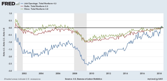
Looked at this way, the data is very telling. While the rate of job openings is at an all time high, the rate of actual hires isn't even at its normal rate during the several best years of the last, relatively anemic, expansion. Meanwhile quits are tied for their best level since 2001 (at the end of the tech boom).
In other words, in econospeak, "wages are sticky to the upside." In everyday language, there is an employer taboo against raising wages. In response, employees are reacting by quitting at high rates to seek better jobs elsewhere.
In short, the June JOLTS report confirms a thriving employment market, but a market that is not in wage equilibrium, as employers are failing to offer the wages that employees demand to fill openings.
Tuesday, August 7, 2018
Gimme credit for Q2 2018: conditions looser, demand improves, but acaution flag for housing
- by New Deal democrat
The Fed released its quarterly Senior Loan Officer Survey on credit yesterday. This is one of my long leading indicators. Let's take an updated look.
The first graph is of the percentage of banks tightening vs. loosening credit, for larger (blue) and smaller (red) firms. Thus a negative number, showing loosening, is a positive for the economy:

For large firms in particular, credit got very loose in the quarter just past.
Meanwhile, demand for those loans, which -- anomalously -- had been lackluster, picked up in the 2nd quarter:

For comparison purposes, here is credit provision for larger firms (blue below, as in the first graph above) vs. the weekly Chicago Fed National Financial Conditions Index (red):

You can see that the much more timely weekly measure is a good proxy.
Over the past 30 years, the provision of credit to firms has correlated well with corporate profits (both measured YoY in the graph below):

Finally, starting last quarter, I highlighted a few other measures in this survey which unfortunately have changed composition in the last decade. Since I've been watching housing closely, let me just republish the Fed's mashup of measures of tightening vs. loosening mortgage credit (first graph below), and demand for same (2nd graph):


This shows that mortgage conditions have been loosening for the last several years, and continued to do so last quarter. Meanwhile demand for mortgages has been declining in the last year, but if anything improved slightly.
An interesting comparison to watch in the future is how well this might correlate with consumer loan delinquency, which will be updated for the 2nd quarter next week by the NY Fed:

Delinquencies bottomed in Q1 2006 during the last expansion, a year or more after credit was tightened and demand decreased. They were improving as of the last report.
The bottom line is that the 2nd quarter Senior Loan Officer Survey continued to be a positive for the economy.
Monday, August 6, 2018
How close are we to "full employment"?
- by New Deal democrat
As I pointed out Friday, there was a lot of good news underneath the headline jobs gain -- primarily in labor force participation and underemployment. So, how close are we to "full employment," based on the last few expansions?
Let's start with the simple, straightforward unemployment rate of 3.9%. This is already considerably below the best reading of the 2000s expansion, and only 0.1% above the best reading of the 1990s expansion, which was tied two months ago in May:

But of course that isn't the end of it. Much attention has been paid to the U-6 underemployment rate, which reached a new expansion low of 7.5%.
To begin with, there are actually 6 "alternative measures of labor underutilization" in the jobs report, U-1 through U-6. U-6 consists of total unemployed (U-3, shown below in green) + "discouraged workers" (U-4) + "all persons marginally attached labor force" (U-5, blue) + those "employed part time for economic reasons" (red):

Even a cursory glance shows that U-3 and U-5 seem to move in tandem, with U-6 more variable. To show that better, the below graph takes the same three series and norms them to their readings at the peak of the 1990s tech boom:

You can see the U-5 is already right in line where it was then. It is only U-6 that remains elevated, i.e., only the percentage of those who are working part time involuntarily, which is about 0.8% higher than in 1999.
In addition to the higher percentage of involuntary part time workers, let's look at prime age labor force participation (first graph below, red is quarterly average) and the prime age employment population ratio (second graph, normed to zero at its current reading of 79.5%):


The prime age employment population ratio in particular is 0.8% below its level at the peaks of both the 1980s and 2000s expansion. It is 2.4% below that of the 1990s tech boom.
I doubt that we have to go all the way to the levels of the tech boom, which was after all only the second real boom of the last 60 years. Since the population of those age 16 through 64 is 206.5 million, increasing employment by 0.8% will take 1.65 million jobs over and above further population growth. If the prime age employment ratio continues to grow at the 0.9% rate it has in the last year, we should arrive at "full employment" participation levels in the next 10-12 months.
Further, if involuntary part time employment continues to shrink at the -1% YoY level it has in the last 12 months, or about 1.3 million growth in full time vs. part time jobs, we should arrive at "full, full-time employment" in about 9 to 10 months.
I don't know how much longer this expansion lasts before employment begins to fall at the outset of a recession, but based on my most recent long term forecast (slowdown but no recession in the next 12 months), it is a reasonable bet that, for at least some brief period, we will get to the above levels of "full employment."
Saturday, August 4, 2018
Weekly Indicators for July 30 - August 3 at Seeking Alpha
- by New Deal democrat
My Weekly Indicators post is up at Seeking Alpha. The old vaudeville sketch comes to mind: "Niagara Falls. Slowly I turn. Step by step ...."
Not only are these weekly posts intellectually edifying, but since clicking over and reading it puts a penny in my pocket, it is the epitome of polite etiquette.
Friday, August 3, 2018
July jobs report: booming jobs market, and a surge in participation continues to depress wage growth
- by New Deal democrat
HEADLINES:
- +157,000 jobs added
- U3 unemployment rate down -0.1% from 4.0% to 3.9%
- U6 underemployment rate down -0.3% from 7.8% to 7.5% (new expansion low)
Here are the headlines on wages and the broader measures of underemployment:
Wages and participation rates
- Not in Labor Force, but Want a Job Now: down -95,000 from 5.258 million to 5.163 million
- Part time for economic reasons: down -176,000 from 4.743 million to 4.567 million (new expansion low)
- Employment/population ratio ages 25-54: up 0.2% from 79.3% to 79.5% (new expansion high)
- Average Weekly Earnings for Production and Nonsupervisory Personnel: rose $.03 from $22.62 to $22.65, up +2.7% YoY. (Note: you may be reading different information about wages elsewhere. They are citing average wages for all private workers. I use wages for nonsupervisory personnel, to come closer to the situation for ordinary workers.)
Holding Trump accountable on manufacturing and mining jobs
Trump specifically campaigned on bringing back manufacturing and mining jobs. Is he keeping this promise?
Trump specifically campaigned on bringing back manufacturing and mining jobs. Is he keeping this promise?
- Manufacturing jobs rose +37,000 for an average of +29,000/month in the past year vs. the last seven years of Obama's presidency in which an average of 10,300 manufacturing jobs were added each month.
- Coal mining jobs were unchanged for an average of +100/month vs. the last seven years of Obama's presidency in which an average of -300 jobs were lost each month
The more leading numbers in the report tell us about where the economy is likely to be a few months from now. These were positive.
- the average manufacturing workweek was unchanged at 40.9 hours. This is one of the 10 components of the LEI.
- construction jobs increased by +19,000. YoY construction jobs are up +308,000.
- temporary jobs increased by +27,900.
- the number of people unemployed for 5 weeks or less decreased by -136,000 from 2,227,000 to 2,091,000. The post-recession low was set two months ago at 2,034,000.
Other important coincident indicators help us paint a more complete picture of the present:
- Overtime was unchanged at 3.5 hours.
- Professional and business employment (generally higher-paying jobs) increased by +51,000 and is up +518,000 YoY.
- the index of aggregate hours worked for non-managerial workers rose by 0.1%.
- the index of aggregate payrolls for non-managerial workers rose by 0.3%.
Other news included:
- the alternate jobs number contained in the more volatile household survey increased by +391,000 jobs. This represents an increase of 2,454,000 jobs YoY vs. 2,400,000 in the establishment survey.
- Government jobs decreased by -13,000.
- the overall employment to population ratio for all ages 16 and up rose +0.1% from 60.4% m/m to 60.5% and is up 0.3% YoY.
- The labor force participation rate was unchanged at 62.9% and is also unchanged YoY
SUMMARY
The bottom line from this report is that employment is booming; wages still aren't.
Although the headline number was average, the revisions to the last two months made them even more positive than the original great numbers. Meanwhile the prime age employment to population ratio, involuntary part time employment, and the underemployment rate all reached their best levels of this expansion. Based on the U6 number, we are probably only about 0.5% away from "full employment."
Meanwhile, that big wage growth that was supposed to come because of that big tax cut for the wealthy and corporations last December? Still hasn't happened. Don't hold your breath.
As I've written a number of times in the past year, an outsized jump in the rate of people entering the workforce -- which was very much in evidence in the numbers this month, and YoY is up almost 1% -- appears to be acting to depress wage growth in the short term.
Although the headline number was average, the revisions to the last two months made them even more positive than the original great numbers. Meanwhile the prime age employment to population ratio, involuntary part time employment, and the underemployment rate all reached their best levels of this expansion. Based on the U6 number, we are probably only about 0.5% away from "full employment."
Meanwhile, that big wage growth that was supposed to come because of that big tax cut for the wealthy and corporations last December? Still hasn't happened. Don't hold your breath.
As I've written a number of times in the past year, an outsized jump in the rate of people entering the workforce -- which was very much in evidence in the numbers this month, and YoY is up almost 1% -- appears to be acting to depress wage growth in the short term.
As consumer spending was very good during the second quarter, we should continue to get good employment reports for a few more months. Once that abates (and it will), so will the very good employment reports.
Thursday, August 2, 2018
Early August data potpourri-palooza!
- by New Deal democrat
As promised, here is a pithy rundown on the monthly data for July that was released earlier this week. As usual, let's take it in order of how it leads the overall economy.
Residential construction spending
This is the least volatile of any housing data, although it lags permits and starts by one to two quarters. The monthly number was down, but for now the positive trend is continuing, albeit not as strongly as in the past several years (blue is construction spending, red is single family permits):

A look at the same data as YoY% changes again shows the leading/lagging relationship. Single family permits have decelerated YoY. Residential construction spending hasn't decelerated much yet.

As interest rates have ticked higher in the last several months, I expect permits to continue to be flat, and residential construction should follow in a few months.
ISM manufacturing new orders
Manufacturing began to pick up over two years ago, and has been very strong over the last 18 months (h/t Briefing.com):

This month the leading new orders index cooled slightly -- from white hot to red hot. It's within the range of reasonable possibility that the "less hot" trend of the last few months is the beginning of the weakness in the long leading indicators beginning to bleed over into the short leading indicators -- something I expect to happen sooner or later -- so this is something to keep an eye on.
Motor vehicle sales
These tend to plateau during expansions, and meaningfully decline in the 6 to 12 months before a recession. This month wasn't so hot (h/t Bill McBride):

As I've said before, it would take a reading under 16 million units annualized for me to become concerned. Also, because GM is no longer reporting monthly, this metric has become much less reliable, so take with lots of grains of salt.
Personal income and spending
Everything I -- and every other -- observer has said about income over the last several years got thrown out the window last week courtesy of the GDP revisions. Ugh! *Nominal* GDP values for the last 5 years did not change significantly, but BEA decided that there was significantly less inflation than they had previously reported:

This is a classic coincident indicator, and confirms that the expansion is continuing.
As a result, "real" spending improved, and the decline in personal savings completely evaporated.

I hesitate to comment further, lest further revisions make those obsolete as well.
The Employment Cost Index
This is a quarterly report on *median* wages and benefits. As such it isn't subject to the "Bill Gates walks into a bar" type of distortion. BUT, it holds the distribution of jobs constant. In other words, it measures pay for, e.g., a constant percentage of engineers, or retail clerks, now vs. pay for engineers, or retail clerks, one quarter ago, and so on (h/t Briefing.com):

It is the one measure of wages that has consistently shown YoY improvements over the last few years, and continued to do so in the 2nd Quarter. Where it may be inadequate is to the extent that there are job distinctions based on seniority. Thus it may not be picking up on the very large demographic trend of Boomers retiring and being replaced by Millennials (old folks being replaced by young folks is a constant, but almost certainly has been happening disproportionately in the last decade).
Putting the data this week together, although several series declined month over month, all of them were indicative of an expansion that is continuing, and will continue in the next several quarters. And maybe even a little more spare change will be tossed in the direction of ordinary workers, which we'll find out more about in tomorrow's monthly jobs report.
Wednesday, August 1, 2018
Midyear update: long leading forecast through H1 2019 at Seeking Alpha
- by New Deal democrat
My midyear update of the 8 long leading indicators, taking the forecast all the way through the middle of next year, is up at Seeking Alpha.
Not only is it informative, but I get a few pennies if you click and read it. So click and read it!
Btw, I don't have a lot to add to whatever you've read elsewhere on the data releases so far this week. So tomorrow I'll do a potpourri with pithy comments on each, OK?
Tuesday, July 31, 2018
Mortgage rates probably have to top 5% to tip housing into a recession-leading downturn
- by New Deal democrat
I've pointed out many times that, generally speaking, mortgage rates lead home sales. It's not the only thing -- demographics certainly plays an important role -- but over the long term interest rates have been very important.
I have run the graph comparing mortgage rates to housing permits many times. In the graph below, I'm using a slightly different housing metric -- private residential fixed investment as a share of GDP, both nominal (blue) and real (green), current through last Friday's report on Q2 GDP. Here's the long term view:

We can see the leading relationship over the large majority of time frames in the last 50 years, with a few notable exceptions: the late 1960s and 1970s *huge* demographic tailwind of Baby Boomers reaching home-buying age, the 2000s housing bubble and bust, and 2014 (mainly due to the Millennial generation tailwind).
Here's a close-up of this same graph beginning in 2015:

The increase in mortgage rates since late 2016 (blue in the graph bleow) has had a larger effect on private residential investment than the 2013-14 episode, probably because house prices are higher in real terms, as shown in the below comparison with wages (red):

House prices were near their 2012 housing bust bottom the first time mortgage rates went up. Now they are about 20% higher in real terms.
Finally, here is a more granular view of Treasury and mortgage interest rates over the past 18 months:

The decline in mortgage rates back below 4% in the middle of last year is probably what sparked the big increase in housing permits, starts, and sales last autumn and winter.
But because mortgage interest rates have actually increased a little bit over the last six months, I'm not expecting a similar rebound in housing this autumn.
At the same time, I can't see much of a significant outright *decline* in YoY housing sale metrics -- on the order of what we saw in 1999 before the 2001 recession -- unless mortgage rates increase, at a minimum, to over 5%, and probably to 5.25%. We'll see.
Monday, July 30, 2018
Commercial bond yield inversions and recessions
- by New Deal democrat
When my article on the yield curve was posted at Seeking Alpha last week, I got feedback that I ought to look at commercial bond yields as well, with some specific suggestions.
I did that, and I thought I would share the results.
One series that goes all the way back before the Civil War is the yield on commercial paper in New York. After 1971, it was discontinued, but AA-rated commercial paper rates took its place. Meanwhile AAA-rated corporate bonds (lower-yielding and less volatile than other grades) have been tracked since 1919. That means that we can put together the relationship between short term and longer term corporate bond yields going back just one year short of a century.
In the below two graphs, AAA corporate bonds are shown in blue, the three sequential commercial paper rates shown in shades of red. I have overlapped those series as much as possible to show that the changeover makes no material difference.
Here is 1919 through 1971:

and 1971 to the present (sorry, I accidentally cut this off in 2015. Since the 3 month AA paper has risen gradually to 2% yields):

This gives us a result very similar to that of the Fed Discount and Funds rates vs. long term Treasuries. An inversion is always bad (except for 1966), but inversions don't always occur. Most importantly, note that commercial bond yield spread never did quite invert before the Great Recession.
Because it does seem that the difference in the two yields generally tightens before recessions occur, I also looked at the two time periods that way, by subtracting short term commercial rates from long term commercial rates:


It's noteworthy that even in those cases, a tightening by 1/2 of the highest term spread between long and short term yields always signals a recession within 2 years, with the very notable exceptions of the mid-1960s and the late 1990s. But again, there was no appreciable tightening before the 1938, 1945, and 1950 recessions.
Note, by the way, that this year corporate term spreads have decreased by more than 1/2 from their expansion high, indicating heightened risk (but not a certainty) of a recession within 2 years.
The bottom line I hope you take away from all of my writing about the yield curve is that, while it is a very useful metric, it is not foolproof, and ought to be used in conjunction with other reliable metrics emanating from other sectors of the economy.
Saturday, July 28, 2018
Weekly Indicators for July 23 - 27 at Seeking Alpha
- by New Deal democrat
My Weekly Indicators post is up at Seeking Alpha.
After the article was published, I noticed a couple of errors. Since, unlike with XE.com, at Seeking Alpha I can't go back and revise the article itself, I corrected in a comment, which I'm repeating below. I expect the kinks required by my tight publication schedule there to get worked out in short order. In the meantime, sorry for the errors.
First, the brief monthly/quarterly data recap should be updated as follows:
Data for June included new and existing home sales, which both declined. Durable goods orders rose. Consumer confidence as measured by the University of Michigan rose slightly, although the longer term trend in the leading "expectations" component has been generally flat for 18 months.
In the rear view mirror, Q2 GDP as expected came in quite strong, at +4.1%, although exports contributed roughly +0.5% more than usual to that number. The long leading indicator of proprietors income increased, but that of private fixed residential investment as a share of GDP declined.
Second, in the conclusion I accidentally wrote that mortgage rates were a positive. As I note in the body of the article, having risen back above 4.65%, they are a negative, which is what I factored into my long term forecast of neutral. It's worth noting, though, that had the yield curve been only 0.5% tighter, the only remaining positive would be the credit indexes, and that would be enough to have tipped the long term forecast to negative.
Friday, July 27, 2018
Q2 GDP: likely as good as it is going to get this year
- by New Deal democrat
[Note: FRED hasn't gotten around to updating the GDP data. I'll update this post once the graphs are available. UPDATE: Posted now.]
This morning's preliminary reading of Q2 2018 GDP at +4.1% was generally in line with forecasts. The coincident data, as I've reported in my "Weekly Indicators" column, as well as things like industrial production, the regional Fed reports, and real retail sales, have all been very positive for the past few months. So, "hurrah!" for the growth of one to four months ago.
One point widely notied, which I'll also repeat: exports added about 0.5% more than usual to the GDP number. This was almost certainly producers trying to get ahead of Trump's trade wars, and will likely subtract an equivalent percentage over the next quarter or two. In other words, GDP ex-frontrunning the trade war was about 3.6% annualized.
This morning's preliminary reading of Q2 2018 GDP at +4.1% was generally in line with forecasts. The coincident data, as I've reported in my "Weekly Indicators" column, as well as things like industrial production, the regional Fed reports, and real retail sales, have all been very positive for the past few months. So, "hurrah!" for the growth of one to four months ago.
One point widely notied, which I'll also repeat: exports added about 0.5% more than usual to the GDP number. This was almost certainly producers trying to get ahead of Trump's trade wars, and will likely subtract an equivalent percentage over the next quarter or two. In other words, GDP ex-frontrunning the trade war was about 3.6% annualized.
But will it last? As usual, my attention is focused not on where we *are*, or more properly, recently *were*, than where we *will be* in the months and quarters ahead.
There are two leading components of the GDP report: real private residential investment and corporate profits. Because the latter will not be released until the second or third revision of the report, I make use of proprietors' income as a more timely if less reliable placeholder.
So let's take a look at each.
Real private residential fixed investment actually declined slightly (blue). Measured by the more precise method of its share of the GDP as a whole (red), residential investment it was even more significant:

According to Prof. Edward Leamer, this typically peaks about 7 quarters before the onset of a recession. As it has not made a new high since five quarters ago, and must be considered a signficant leading indicator of recession at this point, although it is only down about half the percentage from its peak as the least amount prior to a recession (-3% vs. -6% before 2001).
On the other hand, proprietors' income rose about 1.3% nominally in the second quarter. The below graph compares it with the less timely but more accurate corporate profits:

In short: one long leading indicator declined, the other rose.
When discussing Q4 2017 GDP six months ago, I indicated that I wasn't expecting any big surge due to the relative flatness or restrained growth in housing for most of 2017. The below two graphs show the leading relationship between housing permits (using the less volatile single family measure) and GDP broken up into two roughly 30 year periods:


Since the YoY% change in permits for 2015-17 was roughly 10% (divided by 4 for purposes of scale in the above graphs shows a number of ~2.5%), I wrote that a continued roughly 2.5% YoY growth of GDP for the next few quarters is a reasonable projection.
Obivously that wasn't true for the second quarter, although YoY growth remains only +2.9%.
To reiterate what I said three months ago in response to Q1 GDP, while the economy is very likely to continue to grow through 2018, together this most recent data suggests a more questionable picture heading in 2019.
There is nothing in this morning's strong Q2 GDP that causes me to change that view. All of the long leading indicators with the possible exception of corporate profits (for which proprietors' income is a less reliable proxy) have continued to weaken, and there has been accumulating evidence in the monthly and even weekly reports that the important component of housing is at best very weakly positive and may even have tipped over to negative.
Thursday, July 26, 2018
Why a yield curve inversion is not a necessary precursor to a recession
- by New Deal democrat
For the last decade I have made a specialty of observing "long leading indicators" -- those metrics that turn at least a year before the economy as a whole does -- and of historical indicators that date as far back as the 1910s.
That specialty is particularly relevant in discussing the current obsession with the shape of the yield curve, slicing and dicing the modern data as it relates to the Fed funds rate, 3 and 6 month Treasuries, 2 year Treasuries, 10 year Treasuries, and the inflation rate.
Why? Because historically a yield curve inversion is not a necessary precursor to a recession.
To begin with, the Fed did not begin making use of the Fed funds rate until 1954. The Fed itself didn't exist until 1914, and for the first 40 years of its existence only made use of the discount rate, which itself was not made uniform nationwide until 1935.
And the Fed funds rate did *not* exceed the 10 year Treasury yield prior to either the 1957 or 1960 recessions. The first time that measure of the yield curve did invert was in 1965, which presaged a steep slowdown in 1966 which did not quite qualify as a recession:

So, next, let's compare the discount rate with long term government bonds going all the way back to the 1920s (the modern 10 year treasury data is also shown in green to show the very close correspondence between it and the archival series):

With the exception of the "great contraction" of 1929-32, the yield curve measured this way never inverted before 1959. That's *5* recessions which waiting for a yield curve inversion would have missed.
We also have data on short term government bonds in the 3-6 month range going back to the 1920s as well. Here's what they look like compared to long term bonds:

Again, no inversions whatsoever between 1929 and 1959, although it did come close, but did not invert, prior to the 1927 and 1957 recessions.
Finally, a number of commentators are stressing the necessity for the Fed funds rate to exceed the inflation rate for a recession signal. We can examine this, using the discount rate, going all the way back more than 100 years:

There are problems both ways with this argument. On the one hand, the Fed funds rate exceeded the inflation rate for most of the 1920s, 1960s, 1980s, and 1990s -- in short, the most prosperous decades during the last century! On the other hand, the Fed funds rate did *not* exceed the inflation rate prior to the 1918, 1920, and 1949 recessions -- and was moving the "wrong way" prior to the 1957 recession!
In short, once we go back before 1960 -- i.e., a low interest rate environment very similar to the one we have been in for the last decade -- although a yield curve inversions is very bad (1929!), neither an inversion nor a "tight" real Fed funds or discount rate is necessary at all for a recession to occur.
While it is far too long to get into here, here are several other historical graphs to consider.
First, the annual rate of nonfarm housing starts, dating all the way back to the 1800s:

Second, the monthly rate of nonfarm housing starts dating back to 1945 (and continuing through the 1960s to show that they accord very closely with the modern housing starts series, also shown):

The archival annual housing starts series turned negative during the year in which recessions began 11 out of 14 times. The archival monthly series turned negative before all 4 post-WW2 recessions leading up to and including 1960.
A detailed historical consideration of housing is far too long for this post. But consider that the common thread, going back almost 150 years, appears to be that something happens in the economy to cause consumers to pull back on their purchases of important durable goods like houses, of which the Fed raising interest rates (and inverting the yield curve) may only be one cause.
Subscribe to:
Posts (Atom)