Saturday, April 29, 2017
Weekly Indicators for April 24 - 28 at XE.com
- by New Deal democrat
My Weekly Indicators post is up at XE.com. Stagnant real wages helped make for a punk Q1 GDP report, but the nowcast and the forecast still look positive.


Friday, April 28, 2017
Two hits and a miss on GDP and wages
- by New Deal democrat
We got two pieces of good news from the GDP report this morning, and one piece of bad news for workers.
First, from the important long leading housing sector, real private fixed residential investment rose again to a new post-recession high:

This adds to the generally positive data coming out of that sector.
Second, proprietors income increased:

This is a good proxy for corporate profits, which won't be reported until next month. It isn't quite as reliable an indicator, but the two generally move in the same direction,
So the two long leading aspects of the GDP report were hits.
So the two long leading aspects of the GDP report were hits.
This miss was in the Employment Cost Index. Since this is a median measure, it is not distorted by outsized gains at the top of the distribution. While this measure rose +0.8% in the quarter, inflation increased at least as much, meaning that median real earnings were stagnant:

Had I used persoal consumption expenditures as my deflator, real wages would actually show a decline.
That inflation has been more than eating up nominal gains in wages for the last three quarters is not good news.
Wednesday, April 26, 2017
Declining positivity of background money and financial indicators
- by New Deal democrat
The supply, cost, and rationing of money and credit set the background for almost all other indicators. I take a look at what they look like now over at XE.com.
Tuesday, April 25, 2017
A high frequency indicator for credit conditions: the Chicago Fed'sFinancial Conditions Index
- by New Deal democrat
One particularly useful leading indicator that is handicapped by being reported only quarterly, and late, is the Senior Loan Officer Survey. This tells us whether banks have been tightening or loosening credit standards in the preceding quarter.
It has a 30 year history and has typically reported net tightening about 1 year before a recession, with a fair amount of variability, rapidly intensifying as the recession is about to start, typically showing net tightening about 1 or 2 quarters after corporate profits peak:

But the problem is, for example, that we won't learn about the first Quarter of 2017 for several more weeks. So I have been looking to find a proxy that is reported on a more frequent and timely basis. I have now found it: the Chicago Fed's Financial Conditions Index.
Here is the detailed explanation, according to the Chicago Fed:
The Chicago Fed’s National Financial Conditions Index (NFCI) provides a comprehensive weekly update on U.S. financial conditions in money markets, debt and equity markets, and the traditional and “shadow” banking systems. Because U.S. economic and financial conditions tend to be highly correlated, we also present an alternative index, the adjusted NFCI (ANFCI). This index isolates a component of financial conditions uncorrelated with economic conditions to provide an update on how financial conditions compare with current economic conditions
.....
A zero value for the NFCI can be thought of as the U.S. financial system operating at historical average levels of risk, credit, and leverage. The ANFCI removes the variation in these indicators attributable to economic activity, as measured by the three-month moving average of the Chicago Fed National Activity Index (CFNAI), and inflation, according to its three-month total based on the Personal Consumption Expenditures (PCE) Price Index. As such, a zero value for the ANFCI corresponds with a financial system operating at historical average levels of risk, credit, and leverage consistent with economic activity and inflation.
Positive values of the NFCI indicate financial conditions that are tighter than on average, while negative values indicate financial conditions that are looser than on average. Similarly, positive values of the ANFCI indicate financial conditions that are tighter on average than would be typically suggested by current economic conditions, while negative values indicate the opposite.
The NFCI is made up of over a dozen components, including 2 year Swaps and Libor vs. the TED spread, which also are components of the Conference Board's "leading credit index" that is one of the 10 components of the monthly Index of Leading Indicators.
Here is what the Financial Conditions Index, averaged quarterly, looks like compared with the Senior Loan Officer Survey:

This is a pretty close match, except that the Senior Loan Officer Survey's crossover point between tightening and loosening equates to a -0.5 reading on the NFCI.
When we compare the Adjusted Financial Conditions Index with the NFCI, we see that while it is more volatile, it appears to lead by about 6 months:
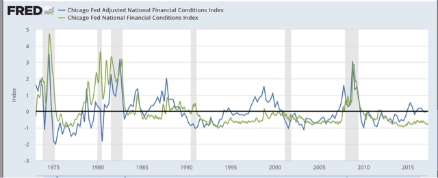
What this tells us is that background economic conditions tend to move in the direction of credit standards.
What this tells us is that background economic conditions tend to move in the direction of credit standards.
Additionally, the Chicago Fed also touts the Leverage subindex of the NFCI as leading GDP:

So in the next graph we can see the AFNCI (blue) compared with the Senior Loan Officer Survey (red) and the Leverage subindex (purple):

Both the AFNCI and the Leverage subindex appear to lead the Senior Loan Officer Survey by a year or more, but are noisy as for example in 1990 and 2001, where at least one of the two had already turned negative, indicating loosening compared with economic conditions, a year before the Senior Loan Officer Survey spiked coincident with recessions.
Putting this all together, the history of the Financial Conditions Indexes suggest that a positive value of the ANFCI or the Leverage subindex, or a reading higher than -0.5 in the NFCI, correlate with a tightening of credit conditions. Values above +0.5 (as adjusted in the case of the NFCI) should put us on higher alert for a recession, and values above +1.0 signal danger, in 1-3 years in the case of the ANFCI or the Leverage subindex, or 1 year or less in the case of the NFCI.
So in the next graph we can see the AFNCI (blue) compared with the Senior Loan Officer Survey (red) and the Leverage subindex (purple):
Both the AFNCI and the Leverage subindex appear to lead the Senior Loan Officer Survey by a year or more, but are noisy as for example in 1990 and 2001, where at least one of the two had already turned negative, indicating loosening compared with economic conditions, a year before the Senior Loan Officer Survey spiked coincident with recessions.
Putting this all together, the history of the Financial Conditions Indexes suggest that a positive value of the ANFCI or the Leverage subindex, or a reading higher than -0.5 in the NFCI, correlate with a tightening of credit conditions. Values above +0.5 (as adjusted in the case of the NFCI) should put us on higher alert for a recession, and values above +1.0 signal danger, in 1-3 years in the case of the ANFCI or the Leverage subindex, or 1 year or less in the case of the NFCI.
Finally, here is a close-up of the last two years of the weekly values of the ANFCI (blue), the NFCI (green), and the Leverage subindex (purple) [In this graph I have added +0.5 to the NFCI per my comment above]:

Note that the ANFCI did reach above +0.5 for one month two years ago. But all 3 have been below zero for the last six months. This suggests that when the Senior Loan Officer Survey is reported next month, it is at very least likely to be neutral, and more likely than not will show a slight loosening of credit. In broader terms, it means that we now have a useful weekly indicator that tells us that credit conditions are not forecasting a recession.
I will begin to report this each week.
Dear Jazz: The First Thing to Do When You're Digging a Hole ...

The above picture is Jazz Shaw, who continually makes the argument that raising the minimum wage will cost jobs.
Mr. Shaw believes that a recent report published by the Harvard Business Review supports his conclusion. As I wrote, it doesn't (see here and here). But, being that Mr. Shaw is, well, dumber than a post, he'll keep making the argument. So, here's a key excerpt from a report that he claims supports his position
Our results contribute to the existing literature in several ways. First, our findings relate to a large literature seeking to estimate the impact of the minimum wage, most of which has focused on identifying employment effects. While some studies find no detrimental effects on employment (Card and Krueger 1994, 1998; Dube, Lester & Reich, 2010), others show that higher minimum wage reduces employment, especially among low-skilled workers (see Neumark & Wascher, 2007 for a review). However, even studies that identify negative impacts find fairly modest effects overall, suggesting that firms adjust to higher labor costs in other ways. For example, several studies have documented price increases as a response to the minimum wage hikes (Aaronson, 2001; Aaronson, French, & MacDonald, 2008; Allegretto & Reich, 2016). Horton (2017) find that firms reduce employment at the intensive margin rather than on the extensive margin, choosing to cut employees hours rather than counts. Draca et al. (2011) document lower profitability among firms for which the minimum wage may be more binding
Put more directly: the report that Mr. Shaw says supports his position in fact doesn't. The data -- as noted above -- says the opposite.
Now, does this matter to Shaw or the editors at Hot Air? No. They, in fact, could care less. They just know in their bones that they're right, so that's it. The above citation from the report -- which contradicts Hot Air's "analysis" -- is meaningless academic drivel written by liberal economists who are secretly in league .... you get the idea.
Monday, April 24, 2017
Sunday, April 23, 2017
A thought for Sunday: the economy is on autopilot. Pray that it stays that way
- by New Deal democrat
It's Sunday, so I get to step out from nerdy analysis, and opine as I please.
Back in 2014, when there was another GOP "wave" election in the Congress, I wrote that the silver lining was that we were at the best point in the economic cycle for it to function on autopilot for the next 24 months. In other words, almost all of the long term indicators were positive, so if all the Congress did in 2015-16 was agree to continue to pay the country's bills, we would probably be OK. And we were.
So, a little over 3 months into the Trump Administration, what action has it taken to materially change the economic trajectory?
Basically, nothing. Yes, a bunch of executive orders have been signed promising to undo Obama regulations, and the telecoms have gotten the right to sell all of your data, but in terms of actual action, the economy is still on autopilot.
All of the mid-cycle indicators have made their highs, and a couple of the long leading indicators have vacillated between neutral and negative, and a few more of them are weakening, but are still positive. If the economy stays on autopilot, it probably doesn't have a bad accident until at least the middle of next year -- although I do expect things like job and real wage growth, while still positive, to weaken.
So, the good news is that if Trump and the GOP Congress continue to be unable to form a majority to enact actual policy, we're not in any serious economic danger for now.
The bad news is that something might happen within the next week. If stopgap funding is not passed, at least a partial government shutdown seems likely. Actually welching on our debts is apparently still a few months off.
And Obama's negotiating with the hostage-takers at the time of the 2011 debt ceiling debacle is coming back to bit us in the butt, now that it serves as a precedent. First Trump threatened to cut off funding for Obamacare. The Democrats responded by insisting that its statutory funding be codified in the debt ceiling resolution (something that probably a lot of GOPers silently want to happen as well). Now Trump has threatened to shut down the government and stop paying its bills if he doesn't get all of his legislative wishes, like a border wall and a big tax cut for the wealthy, as part of the deal.
Since the odds of a 2/3's majority in both Houses of Congress overriding any Trump veto are essentially zero, the Full Faith and Credit of the United States is in the hands of an ignorant narcissist. One week from now, the economy might be taken off autopilot and deliberately steered into a mountainside.
For the record, I see no reason for Democrats to go along with any of this. The GOP is in nominal controls of both Houses of Congress, and there is a nominally GOP president. Time to put on their big boy pants and govern. If they won't do that, there is no reasonable rationale for trying to negotiate a less awful, but still awful, outcome.
Saturday, April 22, 2017
Weekly Indicators for April 17 - 21 at XE.com
- by New Deal democrat
My Weekly Indicators post is up at XE.com.
No big change this week from the recent story, although one long leading indicator did flip negative this week, and another edged a little more towards neutral.
Friday, April 21, 2017
No, consumer debt service payments aren't signalling recession
- by New Deal democrat
When I see an article trumpeting an oncoming recession, I will usually take at least a quick look to see if maybe there is an indicator that I've been missing or discounting. Or if it is just the usual cherry-picking of data never relied upon before, and probably not to be relied upon again once it reverses.
So this morning I read that there was a "Gathering Storm of Recession Indicators."
One of the datapoints caught my eye: consumer debt service payments as a percentage of disposable personal income. Here's the graph in context:

I immediately focused on the limited time shown by the graph: the last 8 years, with a nice red line showing how the value now is the value then.
I wondered if maybe I was missing something. After all, this data series comes from the same quarterly report that gives us several other measures of household debt service that I've been following for 10 years, and which have, with one exception, risen into a recession, during and after which they turn down:

Both are pretty much going sideways as of the last report. Nothing exciting happening there.
So here's what happens when I take the reference graph and follow it all the way back to its beginning:

Consumer debt service as a percentage of disposable personal income has been *declining* in advance of 3 of the 4 recessions since the reports were initiated. In the 4th case, the rising debt level was much higher than it is now.
Oh.
Hey, pretty red line though!
Thursday, April 20, 2017
Real wages and spending: I don't think consumers will roll over that easily
- by New Deal democrat
This is the second part of a post about "hard data" and consumer spending.
Yesterday I noted that self-reported consumer spending, as measured by Gallup, has been running 10% or better YoY since the beginning of February, consistent with Amazon.com's earnings growth, but in contrast to a small slump in retail sales as reported for the last two months.
In fairness, real personal consumption expenditures have turned down slightly in the last several months:

Since this measures spending, there is clearly a divergence between this measure and Gallup.
Another contrary argument that the slump in consumer spending is real, is that the cause has been the decline in real wages since last July:

But over the last 50 years, a downturn in real wages has frequently not meant recession. Consumers can cope by refinancing debt at lower rates (not available now), by cashing in appreciating assets, if they have them (e.g., stocks or housing equity), or saving less, before they cut back saving. While there was a slight downturn in the savings rate in 2016, it was less than half of that we saw in 1998 and 2004 (and similar downturns in earlier cycles dnot shown in the below graph):

In the past, consumers have not caved in without saving less first. It could always be different this time, but my suspicion is that we will see a much more substantial decline in the savings rate before we see a real, sustained downturn in spending.
Maybe Jazz Shaw and John Hinderaker Should Read a Report Before Promoting its Result, Part II
Several days ago, both John Hinderaker and Jazz Shaw promoted a story from the Washington Examiner, which in turn covered a new Harvard Business Report study on the effect of San Francisco's $15 minimum wage increase on the restaurant industry. Yesterday, I observed that the report contained a key passage that essentially countered Mr. Shaw's and Mr. Hinderaker's assertion that "basic economics says the increase in the minimum wage is bad." Today, I want to look at the actual results of the report, because a nuanced reading shows that neither Mr. Shaw nor Mr. Hinderaker's points are validated.
Here is the first of two excerpts:
This paper presents several new findings. First, we provide suggestive evidence that higher minimum wage increases overall exit rates among restaurants, where a $1 increase in the minimum wage leads to approximately a 4 to 10 percent increase in the likelihood of exit, although statistical significance falls with the inclusion of time-varying county-level characteristics and city-specific time trends. This is qualitatively consistent but smaller than what Aaronson et al. (forthcoming) find; they show that a 10 percent raise in the minimum wage increases firm exit by approximately 24 percent from a base of 5.7 percent. Differences in sample and specifications may account for the differences between our study and theirs.
Next, we examine heterogeneous impacts of the minimum wage on restaurant exit by restaurant quality. The textbook competitive labor market model assumes identical workers and firms who therefore are equally likely to share in the minimum-wage generated employment and profit losses. However, models that depart from the standard competitive model to allow for heterogeneous workers and firms suggest that a minimum wage increase would cause the lowest productivity firms to exit the market (Albrecht & Axell, 1984; Eckstein & Wolpin, 1990; Flinn, 2006). We show that there is, in fact, considerable and predictable heterogeneity in the effects of the minimum wage, and that the impact on exit is concentrated among lower quality restaurants, which are already closer to the margin of exit. This suggests that the ability of firms to adjust to minimum wage changes could differ depending on firm quality. Finally, we provide evidence that higher minimum wages deter entry, and hastens the time to exit among poorly rated restaurants.
The report's conclusion is hardly breathtaking. According to the report, somewhere between 4 and 10 restaurants per hundred will close as a result of the increase in the minimum wage. And, that number may fall when other variables are added to the mix. In addition, so far only the lower rated restaurants are impacted. And considering the minimum wage is just going into effect, it's possible the techniques used by higher rated restaurants to limit the impact will be passed down to the lower rate restaurants -- which is a standard development in the market economy.
In fact, the findings are consistent with the literature. As this report conceded: even studies that identify negative impacts find fairly modest effects overall, suggesting that firms adjust to higher labor costs in other ways. Most economists would call a 4-10% closure rate (which has the potential to be lower when other factors are considered) of marginally efficient restaurants modest.
And a final point: the authors make no mention of San Francisco's restaurant bubble. That means that we could simply be seeing correlation, no causation.
What can we conclude from this little exercise:
First: Jazz Shaw doesn't read for comprehension.
Second: Jazz Shaw shouldn't be allowed to write about economics.
Third: Jazz Shaw will continue to do so, largely because he thinks he's an expert.
And so, we will continue to point out just how wrong he is.
Here is the first of two excerpts:
This paper presents several new findings. First, we provide suggestive evidence that higher minimum wage increases overall exit rates among restaurants, where a $1 increase in the minimum wage leads to approximately a 4 to 10 percent increase in the likelihood of exit, although statistical significance falls with the inclusion of time-varying county-level characteristics and city-specific time trends. This is qualitatively consistent but smaller than what Aaronson et al. (forthcoming) find; they show that a 10 percent raise in the minimum wage increases firm exit by approximately 24 percent from a base of 5.7 percent. Differences in sample and specifications may account for the differences between our study and theirs.
Next, we examine heterogeneous impacts of the minimum wage on restaurant exit by restaurant quality. The textbook competitive labor market model assumes identical workers and firms who therefore are equally likely to share in the minimum-wage generated employment and profit losses. However, models that depart from the standard competitive model to allow for heterogeneous workers and firms suggest that a minimum wage increase would cause the lowest productivity firms to exit the market (Albrecht & Axell, 1984; Eckstein & Wolpin, 1990; Flinn, 2006). We show that there is, in fact, considerable and predictable heterogeneity in the effects of the minimum wage, and that the impact on exit is concentrated among lower quality restaurants, which are already closer to the margin of exit. This suggests that the ability of firms to adjust to minimum wage changes could differ depending on firm quality. Finally, we provide evidence that higher minimum wages deter entry, and hastens the time to exit among poorly rated restaurants.
The report's conclusion is hardly breathtaking. According to the report, somewhere between 4 and 10 restaurants per hundred will close as a result of the increase in the minimum wage. And, that number may fall when other variables are added to the mix. In addition, so far only the lower rated restaurants are impacted. And considering the minimum wage is just going into effect, it's possible the techniques used by higher rated restaurants to limit the impact will be passed down to the lower rate restaurants -- which is a standard development in the market economy.
In fact, the findings are consistent with the literature. As this report conceded: even studies that identify negative impacts find fairly modest effects overall, suggesting that firms adjust to higher labor costs in other ways. Most economists would call a 4-10% closure rate (which has the potential to be lower when other factors are considered) of marginally efficient restaurants modest.
And a final point: the authors make no mention of San Francisco's restaurant bubble. That means that we could simply be seeing correlation, no causation.
What can we conclude from this little exercise:
First: Jazz Shaw doesn't read for comprehension.
Second: Jazz Shaw shouldn't be allowed to write about economics.
Third: Jazz Shaw will continue to do so, largely because he thinks he's an expert.
And so, we will continue to point out just how wrong he is.
Wednesday, April 19, 2017
The Amazon.com effect: retailers say they're not selling, but consumers report they are buying
- by New Deal democrat
This was originally one post but I think it works better divided into two parts.
One of the issues I keep reading about recently is the (alleged) divergence between "soft" and "hard" data. For example, consumer sentiment as measured by the University of Michigan (and the Conference Board, and Gallup) has been making new highs since the Presidential election last November (according to Gallup, mainly fueled by a massive gain in optimism among Republicans). while "hard data," chiefly industrial production but also including consumer spending, has failed to follow suit.
One problem with this thesis has been that manufacturing as measured by the industrial production index, turned up for five months in a row. It turned down in March, and one good measure of how intellectually honest the commentator is, is whether they have been using a consistent measure for industrial production:
One problem with this thesis has been that manufacturing as measured by the industrial production index, turned up for five months in a row. It turned down in March, and one good measure of how intellectually honest the commentator is, is whether they have been using a consistent measure for industrial production:

Production as a whole only fell in January and February because of utility production (warm winter in the eastern half of the US). In March, production only rose because utility production rebounded sharply (March was actually colder than February in much of the East).
So a Doomer who was all over the decline in industrial production for the last two months should be touting its advance in March. If the Doomer backs out utilities this month, take a look to see if they did the same thing last month -- almost certainly not.
Another problem with the soft/nard data dichotomy is that online retail appears to have reached a tipping point where it is causing big damage to brick-and-mortar retailers, who are laying off thousands of employees and even shutting down completely.
So a Doomer who was all over the decline in industrial production for the last two months should be touting its advance in March. If the Doomer backs out utilities this month, take a look to see if they did the same thing last month -- almost certainly not.
Another problem with the soft/nard data dichotomy is that online retail appears to have reached a tipping point where it is causing big damage to brick-and-mortar retailers, who are laying off thousands of employees and even shutting down completely.
I am concerned that the official real retail sales numbers might not be adequately picking up online retail:

But here is Amazon.com's sales numbers for 2016 vs. 2015:

And here is the number that really jumps out -- Gallup's consumer spending, here measured for the last two years:

Pay attention to that $100 line. Except for Christmas seaon 2015, that line wasn't breached at all in the 14 day average until December 2016. And spending has remained above that $100 line all during February, March, and April so far. Most often for the last 10 weeks, this measure has been up over 10% YoY. Now, before you criticize Gallup's measure, it earned its bones in 2011 at the time of the Debt Ceiling Debacle, when it was the only measure that accurately reported that consumers hadn't stopped spending.
So if retailers are reporting poor sales, but consumers are telling people that they are spending 10% this year vs. last year, then we have to wonder if the official measures aren't catching the full extent of the big secular increase in online sales.
But here is Amazon.com's sales numbers for 2016 vs. 2015:
And here is the number that really jumps out -- Gallup's consumer spending, here measured for the last two years:
Pay attention to that $100 line. Except for Christmas seaon 2015, that line wasn't breached at all in the 14 day average until December 2016. And spending has remained above that $100 line all during February, March, and April so far. Most often for the last 10 weeks, this measure has been up over 10% YoY. Now, before you criticize Gallup's measure, it earned its bones in 2011 at the time of the Debt Ceiling Debacle, when it was the only measure that accurately reported that consumers hadn't stopped spending.
So if retailers are reporting poor sales, but consumers are telling people that they are spending 10% this year vs. last year, then we have to wonder if the official measures aren't catching the full extent of the big secular increase in online sales.
Maybe Jazz Shaw and John Hinderaker Should Read Papers Before Promoting Their Results
Yesterday, the conservative blogsphere was on fire with a new report from the Harvard Business School that supposedly proved raising the minimum wage is forever damaging to the local restaurant industry. Rather than reading the actual report themselves, both Mr. Shaw and Mr. Hinderaker relied on the Washington Examiner as their media filter. This was a big mistake. In the words of the Princess Bride, "I don't think that report says what you think it says..

First, let's start with the following stunning rebuke of Mr. Shaw and Mr. Hinderaker, both of whom argue that simple economics shows raising the minimum wage is damaging:
Mr. Shaw:
There is an entire body of work in the progressive sphere dedicated to nothing but this particular propaganda effort. The premise makes no sense in terms of basic economics (or simply math, for that matter) but it keeps on being repeated. And yet, when the experiment is moved off of the chalkboard and out into the real world the opposite always seems to happen.
Mr, Hinderaker:
A number of cities across the country have enacted dramatic increases in the minimum wage. This has caused a great deal of harm, but on the plus side, it has enabled research on the economic consequences of mandating wages at higher than market rates.
However, the new report directly contradicts both statements. From page 6 of 33 of the report:
Our results contribute to the existing literature in several ways. First, our findings relate to a large literature seeking to estimate the impact of the minimum wage, most of which has focused on identifying employment effects. While some studies find no detrimental effects on employment (Card and Krueger 1994, 1998; Dube, Lester & Reich, 2010), others show that higher minimum wage reduces employment, especially among low-skilled workers (see Neumark & Wascher, 2007 for a review). However, even studies that identify negative impacts find fairly modest effects overall, suggesting that firms adjust to higher labor costs in other ways. For example, several studies have documented price increases as a response to the minimum wage hikes (Aaronson, 2001; Aaronson, French, & MacDonald, 2008; Allegretto & Reich, 2016). Horton (2017) find that firms reduce employment at the intensive margin rather than on the extensive margin, choosing to cut employees hours rather than counts. Draca et al. (2011) document lower profitability among firms for which the minimum wage may be more binding
The emboldened sentences are very clear. First, there is a large amount of academic support for arguing that raising the minimum wage to certain levels has no negative effect. But here's the kicker: the reports that supposedly support Mr. Shaw and Mr. Hinderaker don't provide the support they thought. The negative effects are "modest, suggesting that firms adjust in other ways." This is a point I made last spring,
Shaw's and Perry's reasoning run into two primary microeconomic problems. Both assume labor demand is elastic (a term I doubt Mr. Shaw is familiar with) -- that a change in cost will have a disproportionate impact on demand. However, this simply isn't true. For example, let's assume that a restaurant owner currently has 10 employees when wages increase. Let's assume he fires 4 people due to increase cost. At some point, he'll cut off his economic nose to spite his face -- that is, he'll lower his payroll to such an extent that he'll hurt customer service, lowering overall revenue. Given the profit maximizing principal underlying cost theory (again, I doubt Mr. Shaw is aware of this concept, either), the current level of 10 employees is probably already peak efficiency, which means he'll either, absorb the cost, cuts costs elsewhere, raise prices, or do some combination of all three.
And then there's the inherent problem of the production function graph:
As anyone who knows micro (which, it is painfully obvious Mr. Shaw doesn't) would note, when you lower your primary short-term variable cost (labor) you also lower your output. Now, it's possible you might not do too much damage, depending on a number of different factors, but the bottom line is that you're moving in the wrong direction.
In my next post, I'll look at the results. Because, like the above points, they don't support Mr. Shaw or Mr. Hinderaker nearly as much as either thinks.
Tuesday, April 18, 2017
Jazz Shaw Still Can't Make the Minimum Wage Argument Stick
Jazz Shaw desperately wants to make sure that his readers believe raising the minimum wage is a bad idea that will lead to job losses. Hot off the presses, he cites a new Harvard Business Review article that he things validates his position.
San Francisco’s higher minimum wage is causing an increasing number of restaurants to go out of business even before it is fully phased in, a new study by the Harvard Business School found.
The closings were concentrated among struggling, lower-rated restaurants. The higher minimum also caused fewer new restaurants to open, it found.
“We provide suggestive evidence that higher minimum wage increases overall exit rates among restaurants, where a $1 increase in the minimum wage leads to approximately a 4 to 10 percent increase in the likelihood of exit,” report Dara Lee and Michael Luca, authors of “Survival of the Fittest: The Impact of the Minimum Wage on Firm Exit.” The study used as a case study San Francisco, which has an estimated 6,000 restaurants in the Bay Area and is ratcheting up its minimum wage. Restaurants are one of the largest employers of minimum wage workers.
Except, it's not the minimum wage causing this. Instead, San Francisco's restaurant bubble is bursting. According to 2010 Census data:
Not only did San Francisco come in as number one with the most restaurants per capita, no other city even came close. At 39.3 restaurants per 10,000 households, San Francisco has nearly 50 percent more relative restaurants than the second place city.
That's an amazing large number of restaurants per capita -- a pace of growth the city maintained throughout the tech boom:
San Francisco's restaurant scene is outpacing New York — at least in terms of growth. That's according to a new study by conducted by international payment processing company First Data, which compares New York and San Francisco's restaurant scenes and delivers some intriguing insights about dining trends in both cities.
Here's the crux of the matter:
To do that I'm going to tell the story of the rise and fall of Matt Semmelhack and Mark Liberman's AQ restaurant in San Francisco. But this story isn't confined to SF. In Atlanta, D.B.A. Barbecue chef Matt Coggin told Thrillist about out-of-control personnel costs: "Too many restaurants have opened in the last two years," he said. "There are not enough skilled hospitality workers to fill all of these restaurants. This has increased the cost for quality labor." In New Orleans, I spoke with chef James Cullen (previously of Treo and Press Street Station) who talked at length about the glut of copycats: "If one guy opens a cool barbecue place and that's successful, the next year we see five or six new cool barbecue places... We see it all the time here."
Here's econ 101 for Mr. Shaw: San Franciso's large number of restaurants created a labor shortage. That means there were too few workers. It's called supply and demand. Combine that with sky high real estate prices and it's no wonder we have this problem. Mr. Shaw is making a classic rookie mistake: correlation does not equal causation.
So, once again, we have an analytical failure by Mr. Shaw. Does he care? Not at all. Retractions and corrections are for the liberal press, not conservative bloggers.
San Francisco’s higher minimum wage is causing an increasing number of restaurants to go out of business even before it is fully phased in, a new study by the Harvard Business School found.
The closings were concentrated among struggling, lower-rated restaurants. The higher minimum also caused fewer new restaurants to open, it found.
“We provide suggestive evidence that higher minimum wage increases overall exit rates among restaurants, where a $1 increase in the minimum wage leads to approximately a 4 to 10 percent increase in the likelihood of exit,” report Dara Lee and Michael Luca, authors of “Survival of the Fittest: The Impact of the Minimum Wage on Firm Exit.” The study used as a case study San Francisco, which has an estimated 6,000 restaurants in the Bay Area and is ratcheting up its minimum wage. Restaurants are one of the largest employers of minimum wage workers.
Except, it's not the minimum wage causing this. Instead, San Francisco's restaurant bubble is bursting. According to 2010 Census data:
Not only did San Francisco come in as number one with the most restaurants per capita, no other city even came close. At 39.3 restaurants per 10,000 households, San Francisco has nearly 50 percent more relative restaurants than the second place city.
That's an amazing large number of restaurants per capita -- a pace of growth the city maintained throughout the tech boom:
San Francisco's restaurant scene is outpacing New York — at least in terms of growth. That's according to a new study by conducted by international payment processing company First Data, which compares New York and San Francisco's restaurant scenes and delivers some intriguing insights about dining trends in both cities.
Here's the crux of the matter:
To do that I'm going to tell the story of the rise and fall of Matt Semmelhack and Mark Liberman's AQ restaurant in San Francisco. But this story isn't confined to SF. In Atlanta, D.B.A. Barbecue chef Matt Coggin told Thrillist about out-of-control personnel costs: "Too many restaurants have opened in the last two years," he said. "There are not enough skilled hospitality workers to fill all of these restaurants. This has increased the cost for quality labor." In New Orleans, I spoke with chef James Cullen (previously of Treo and Press Street Station) who talked at length about the glut of copycats: "If one guy opens a cool barbecue place and that's successful, the next year we see five or six new cool barbecue places... We see it all the time here."
Here's econ 101 for Mr. Shaw: San Franciso's large number of restaurants created a labor shortage. That means there were too few workers. It's called supply and demand. Combine that with sky high real estate prices and it's no wonder we have this problem. Mr. Shaw is making a classic rookie mistake: correlation does not equal causation.
So, once again, we have an analytical failure by Mr. Shaw. Does he care? Not at all. Retractions and corrections are for the liberal press, not conservative bloggers.
Good news or bad news, take your pick: March housing and industrial production
- by New Deal democrat
This morning's reports on housing permits and industrial production were good news or bad news, depending on the context in which you place them.
This post is up at XE.com.
Saturday, April 15, 2017
Weekly Indicators for April 10 - 14 at XE.com
- by New Deal democrat
My Weekly Indicators post is up at XE.com.
There is a major disconnect between now much retailers report they are selling and consumers report they are buying. I am calling it the Amazon.com effect.
Friday, April 14, 2017
Stallling gas prices --> March deflation --> higher real indicators
- by New Deal democrat
There were a number of important indicators that were nominally lower or flat for March that were up in real terms (including a big pop in wages), thanks to the effects of stalling gas prices on the consumer price index for March.
This post is up at XE.com.
Thursday, April 13, 2017
Five graphs for 2017: Q1 update
- by New Deal democrat
At the beginning of the year, I identified 5 trends that bore particular watching, primarily as potentially setting the stage for a recession next year. Now that we have the first 3 months of data, let's take a look at each of them.
#5 Gas Prices
One potential pressure point on the economy is gas prices, which appear to have made a long- bottom in January of 2016. As they began to rise, consumer inflation has increased from non-existent to almost 3%.So the issue is, will they rise even further and drive inflation even higher?
So far this year, that has not been the case. Typically it has taken a 40% YoY increase in gas prices to shock the consumer. While gas price increases did briefly approach that point, they have backed off considerably:

#4 The US$
Another potential pressure point on the economy is a big increase in the relative value of the US$, which was part of the shallow industrial recession of 2015. The $ started to rise again after the November election. Here the story is more mixed:

Against all currencies, the US$ has not risen too much, while against major currencies, it has risen just enough to have some negative effect.
#3 Residential construction spending vs. mortgage rates
Another data point which rose sharply after the November election was interest rates. Generally speaking, home building changes in the opposite direction of interest rates. So would the increase in interest rates (e.g., mortgages) cause new residential construction to back off?
Not yet:

The resilience of the housing data has been the most positive surprise of the year.
#2 The Fed Funds rate vs. consumer inflation
If consumer inflation rose past the magic 2% Fed target, would the Fed chase it? The Fed's preferrred measure is personal consumption expenditures, but consumer inflation YoY as of March was up +2.8%. The Fed did duly hike interest rates:

The expectation seems to be that unless there is some surprising slowing, several more interest rate hikes are in store. So far the yield curve (left graph below) isn't misbehaving (light red is last August, dark red is now):

But it will be difficult to avoid a compression if not an inversion in interest rates should the Fed stay on its current course with several more hikes.
#1 Real retail sales vs. real average hourly earnings
The final graph comes from my "alternate" recession forecasting model which turns on consumers running out of options to to continue increasing purchases (i.e., no interest rate financing, no wage real wage increases, and no increasing assets to cash in). The long term relationship has been that sales lead jobs, and jobs lead nominal wage increases, but real sales vs. wages are somewhat more nuanced. In the inflationary era, through the early 1990s, YoY wareal wage growth actually slightly led sales. In the deflationary era that dates from the alter 1990s, if anything the two are a mirror image, but in every case but 2001 (where real wage growth just decelerated rather than declined), both have been negative going into recessions:

Focusing on the last 20 years makging the deflationaary era, at present with inflation up, real wages are actually down YoY at this point:

I would expect to see both sales and wages stall out before the onset of the next recession. So far, sales are holding up.
Bottom line: with the exception of the US$ against major currencies, and the consumer inflation rate, for now the signals from the data series I have highlighted are all still green.
Wednesday, April 12, 2017
Labor Market Conditions Index and JOLTS: late cycle, but no imminent downturn
- by New Deal democrat
Time for the monthly update of the Labor Market Conditions Index and JOLTs report. Both of these give more in-depth data on the jobs market. The reported lags one month, so this week's reports were for February. While both of these have some merit as leading indicators, the former is recently constructed and back-fitted, so this is the first "real-time" business cycle it is reporting on. The latter is less than 20 years old, and covers only one complete labor market cycle. Bottom line: while both are useful, have grains of salt handy.
First, let's take a look at this morning's JOLTs report. While most people focus on openings (blue in the graph below), it is not really "hard" data, since companies can advertise openings solely for the purpose of collecting resumes. They might also not be receiving applicants because the pay they are offering is too low. Thus, I prefer to focus on actual hires (red). Anyway, here are both:

Both have trended up in the last couple of months, although not strongly. Overall, the trend in both has been sideways for about the last 18 months, reminiscent of 2005-06. Like so much else, late cycle but not indicative of any imminent downturn.
The trend in quits looks a little more positive:

So that's good.
Turning to the Labor Market Conditions Index, this has been weakly positive or even slightly negative since the beginning of 2016:

As constructed, it has typically had negative values for about a year before any recession, and usually at least to -5 before one is imminent. So no recession this year is indicated.
Oddly, FRED only shows the value of the m/m "change" in the index. Doug Short has the history of the absolute values:

Note in the 1980s and 1990s, there were brief downturns without there being any recessions. This coincided with Fed tightening and loosening within an expansion. What we've been seeing from this index looks once again like late cycle, but with no downturn imminent.
Tuesday, April 11, 2017
If Hot Air Had Any Journalistic Integrity, They'd Be Printing a Retraction
Jazz Shaw of the Blog Hot Air has routinely campaigned against the minimum wage. Like most non-educated commentators, he uses a simple supply and demand model to support his assumption. His logic works something like this: increasing the minimum wage means the cost of labor increases; increasing cost = declining demand.
Unfortunately, this model does not fully capture all the nuances of the minimum wage. Alan Krueger was one of the first economists to note that increasing the minimum wage has macroeconomic benefits, the most of important of which is to increase income. And consumers in the lower range of income are far more likely to increase spending in proportion to an increase in their wages. (BTW: this is Keynesian 101: it assumes the marginal propensity to consume among lower incomes is higher). You can read the full study here.
Now we have yet another study -- this time from the National Employment Law Project -- that finds the same thing. The entire study is here. But the following fact drives a stake through Mr. Shaw's argument:

If Hot Air had any policy regarding retractions or corrections, they would print one. Or, they would print their research that contradicts the above referenced papers. But they won't do either because they have no ethics nor supporting research. And while they have opinions, those opinions are clearly not supported by data.
Subscribe to:
Posts (Atom)