Saturday, March 4, 2017
Weekly Indicators for February 27 - March 3 at XE.com
- by New Deal democrat
My Weekly Indicators post is up at XE.com.
While the short leading indicators remain very positive, there are lot of neutral readings of both long leading indicators and coincident indicators.


Friday, March 3, 2017
More on money supply - could both fall into negative territory shortly?
- by New Deal democrat
I have a follow-up post at XE.com about real M1 and M2. Since last August both have really gone flat.
Thursday, March 2, 2017
How serious is the deceleration in real money supply?
- by New Deal democrat
Last week in my weekly column I noted that real M2 has decelerated close to the point where it would stop being a positive for the economy. Why? I explain that in a lot more detail over at XE.com.
Wednesday, March 1, 2017
Do "high pressure" low unemployment economies lead to more capitalinvestment?
- by New Deal democrat
The Atlanta Fed's Macroblog has an interesting article today on whether a "high pressure" low unemployment economy leads to more capital investment. At least based on surveys, they answer in the negative, with companies pulling out the old chestnut of being unable to find qualified help "(at the wage we want to pay").
But the article reports on one survey only, and does not delve into any long term historical data. So of cuorse I did.
Here's what I found. Annual data on real private fixed nonresidential data, and U-3 unemployment, can both be found back to 1948.
The first graph compares the YoY% change in investment vs. the YoY% change in the unemployment rate:

There is a high correlation, but there is no apparent leading relationship. In fact they look coincident. At best it appears that investment continues to expand even as the unemployment rate holds steady in mature expansions.
So how about when we measure by how "high pressure" the job market is? In the below graph I subtracted the unemployment rate from 6%, meaning that only unemployment rates lower than 6% show as positive numbers, with the lower the unemployment rate showing as the higher the number:

Lo and behold, it seems pretty clear that the unemployment rate doesn't lead capital investment at all. In fact, it appears that the reverse is true! Correlation is not causation, but one thing that seems obvious is that low unemployment does not cause higher capital investment.
This is just a preliminary look. If I can find quarterly data going back a long enough time, obviously that would be better than annual data.
I suspect that both investment and unemployment are primarily reacting to a third thing: namely, interest rates. So what we should be looking for is a sustained period of a "high pressure" economy with relatively low interest rates. Of the two possible "sustained high pressure" periods, the 1960s and 1990s, only the latter has relatively low interest rates. And there we do find that capital investment remained robust for a lengthy period of time. So the best case scenario appears to be that a sustained "high pressure" low unemployment economy with relatively low interest rates, will have relatively higher sustained capital investment.
Tuesday, February 28, 2017
No, commercial and industrial loans are not a leading indicator
- by New Deal democrat
There are a number of Doomer sites I typically read, among other reasons because a few of them do link to interesting data series that turn out to be useful. One such site is Wolf Street, where this morning I read the following:
C&I loans are a sign of what businesses of all sizes are doing – from the small company that is borrowing to buy a piece of equipment to the largest behemoth that is funding its inventories. These loans show whether companies in aggregate are expanding their investments or pulling in their horns.
....
This chart covers C&I loans going back to 1988, covering the last three recessions. The turning points are circled in red:

The turning point during the Financial Crisis was unique – a sudden deep collapse in credit, when the banking system began to seize, rather than a classic turning point that evolved over time, as the prior two turning points exemplified.
The timing of a turning point may not be perfectly aligned with the beginning of a recession, but it’s close.
Now, I was pretty sure that what happened during the Great Recession was actually pretty typical, but I had to go back and check.
So here is what C&I loans look like from 1948 to 1968:

And from 1968 to 1988:

Now we have expanded the number of recessions from 3 to 11. And what do we find? That in addition to 1991 and 2001, loans only turned down one other time in advance of a recession: in 1948. They turned down concurrent with the outset in 1972. The other 7 times, they only turned down after the recession started, if at all!
So much for a leading or concurrent indicator.
But, wait a minute, isn't the fact that they recently turned down still noteworthy?
Well, let's take a look at that too. So here is the m/m % change since 1988:

From 1948 to 1968:

From 1968 to 1988:

When we look at the complete record, we see sporadic small down months in the midst of nearly all expansions.
Here for the umpteenth time is the lesson: beware any claim that only covers the last few cycles, especially when the data series has a much longer history.
But just to show you how these data expeditions can be useful, look what I found when I decided to include the rate of delinquencies on C&I loans (red):

That, my friends, just like the unemployment rate, is a leading indicator for downturns in addition to being a lagging one for upturns. Only 3 cycles, so caution is warranted. After rising during the energy-led shallow industrial recession, delinquencies are now going sideways.
Monday, February 27, 2017
Larry Summers: genius economist, failure at Psychology 101
- by New Deal democrat
One of my recurring themes is how macroeconomic theory, no matter how elegant mathematically, consistently errs because it fails to take into account basic psychology -- i.e., how the human animal actually works.
A big component of this failure is that humans, like other primates and apparently like just about every other social species, are hard-wired to inflict punishment on "winners" from inequitable distributions, even at cost to themselves. For a hilarious example of this, see what happens when an experimenter rewards one monkey with a cucumber while feeding another a delicious grape.
One such failure to take into account elementary psychology was on display in an article a few days ago, wherein Larry Summers, in the course of lambasting the rubes for trying to undermine global trade, concluded:
Since the real answer to that question is "nothing," we know that you actually don't care. And there, the genius economist runs headlong into freshman level psychology.
Because, even if his defense of globalization is accurate, what the suffering middle/working classes have done is to serve notice that Summers' cherished economic progress will be destroyed until the benefits are equitably shared. There will be no "maintaining openness" until "help[ing] workers at home" is accomplished first.
One such failure to take into account elementary psychology was on display in an article a few days ago, wherein Larry Summers, in the course of lambasting the rubes for trying to undermine global trade, concluded:
A strategy of returning to the protectionism of the past and seeking to thwart the growth of other nations is untenable and would likely lead to a downward spiral in the global economy. The right approach is to maintain openness while finding ways to help workers at home who are displaced by technical progress, trade or other challenges.To which the appropriate response is something like: "Well, you f*****g genius, how many decades have you had to study the problem??? What have you ever proposed?"
Since the real answer to that question is "nothing," we know that you actually don't care. And there, the genius economist runs headlong into freshman level psychology.
Because, even if his defense of globalization is accurate, what the suffering middle/working classes have done is to serve notice that Summers' cherished economic progress will be destroyed until the benefits are equitably shared. There will be no "maintaining openness" until "help[ing] workers at home" is accomplished first.
In other words, the masses are saying, "Do we have your attention now?!?" Reading Summers in this article and Brad DeLong in virtually every article in the last several months, I would say, "yes, we do."
See, that animal behavior works!
See, that animal behavior works!
Sunday, February 26, 2017
Saturday, February 25, 2017
Weekly Indicators for February 20 -24 at XE.com
- by New Deal democrat
My Weekly Indicator post is up at XE.com.
The economic indicators for the next 6 to 8 months are turning even stronger. But real M2 . . . .
Friday, February 24, 2017
The Joke That is the Republicans Health Care Plan
Politico is reporting that they have a draft document of the Republican health care plan. The details are laughable.
Let's review the "three-legged stool" that is the ACA. To cover people with pre-existing conditions, we needed to expand the pool of insureds. This led to the individual mandate. And to help people buy insurance, the government provided subsidies.
How do the Republicans deal with this?
The legislation would take down the foundation of Obamacare, including the unpopular individual mandate, subsidies based on people’s income, and all of the law’s taxes. It would significantly roll back Medicaid spending and give states money to create high-risk pools for some people with pre-existing conditions. Some elements would be effective right away; others not until 2020.
...
In place of the Obamacare subsidies, the House bill starting in 2020 would give tax credits — based on age instead of income. For a person under age 30, the credit would be $2,000. That amount would double for beneficiaries older than 60, according to the proposal. A related document notes that HHS Secretary Tom Price wants the subsidies to be slightly less generous for most age groups.
Subsidies are the only reason why a majority of the current insureds can buy insurance. Without them, most people will be driven from the market. For example, in the program's second year, 90% of the participants qualified for some type of subsidy. The $2000 tax credit will only pay far -- at most -- a few months of coverage. Removing the subsidies means people will have to pay for insurance entirely out of pocket -- which most current participants can't do. So, they're gone from the market. And if people can't buy insurance, they have to pay a 30% penalty when they re-up their coverage. This penalty will guarantee that those who couldn't buy coverage before most certainly won't buy coverage again.
And high-risk pools -- an idea that has bever worked -- are back.
So, the Republicans clearly want people to not have health insurance. A
Let's review the "three-legged stool" that is the ACA. To cover people with pre-existing conditions, we needed to expand the pool of insureds. This led to the individual mandate. And to help people buy insurance, the government provided subsidies.
How do the Republicans deal with this?
The legislation would take down the foundation of Obamacare, including the unpopular individual mandate, subsidies based on people’s income, and all of the law’s taxes. It would significantly roll back Medicaid spending and give states money to create high-risk pools for some people with pre-existing conditions. Some elements would be effective right away; others not until 2020.
...
In place of the Obamacare subsidies, the House bill starting in 2020 would give tax credits — based on age instead of income. For a person under age 30, the credit would be $2,000. That amount would double for beneficiaries older than 60, according to the proposal. A related document notes that HHS Secretary Tom Price wants the subsidies to be slightly less generous for most age groups.
Subsidies are the only reason why a majority of the current insureds can buy insurance. Without them, most people will be driven from the market. For example, in the program's second year, 90% of the participants qualified for some type of subsidy. The $2000 tax credit will only pay far -- at most -- a few months of coverage. Removing the subsidies means people will have to pay for insurance entirely out of pocket -- which most current participants can't do. So, they're gone from the market. And if people can't buy insurance, they have to pay a 30% penalty when they re-up their coverage. This penalty will guarantee that those who couldn't buy coverage before most certainly won't buy coverage again.
And high-risk pools -- an idea that has bever worked -- are back.
So, the Republicans clearly want people to not have health insurance. A
Yet Another Economic Failure from Jazz Shaw of Hot Air
You have to give Ed Morrissey and Jazz Shaw of Hot Air some credit; despite a multiple year run of being completely wrong about all things economic and financial, they each continue to believe they have sufficient analytical capabilities to inform their readers on those topics. By now, most people would realize that they have no business writing stories in either discipline. But neither Shaw nor Morrissey have the requisite amount of self-awareness to make such an observation.
The latest comes from Shaw, who breathlessly proclaims, "The popularity of Starbucks has plunged since they decided to take on politics." But, let's take a look to see if that's hurt sales, shall we? Here's a look at annual sales from Morningstar.com:

For those of you paying attention, you'll notice that revenue continues to increase Y/Y. For Mr. Shaw, I would simply point out that this is exactly what companies are supposed to do.
This ended today's lesson for Mr. Shaw. Please realize that you have no idea what you're doing when it comes to economics and finance.
Housing: waiting for the pinch from higher interest rates
- by New Deal democrat
Over the last few months, new home sales have diverged significantly from housing permits and starts. It's possible that the recent higher mortgage rates have shown up already in sales, but not yet in permits or starts.
My updated look at housing sales, prices, and inventory is up at XE.com.
Thursday, February 23, 2017
Do healthier longevity and better disability benefits explain the long term decline in labor force participation?
- by New Deal democrat
A few weeks ago I took another deep dive into the Labor Force Participation Rate. There are a few loose ends I wanted to clean up (at least partially).
One of the most noteworthy things about the LFPR in the long term is that, for men, it has been declining relentlessly at the rate of -0.3% YoY (+/-0.3%) for over 60 years! Here's the graph, normed to 100 in 1948, showing the long term decline (blue) and also normed to 100 in 1948, showing the YoY% change +0.3% (red):

Once we add +0.3% to the YoY change, the LFPR always stays very close to 100.
But what is the *reason* for this very steady decline that has already lasted a lifetime.
I want to lay down a hypothesis for further examination later. I believe the secular decline in the LFPR for men, paradoxically, can be explained by two improvements in disability benefits and health:
1. expansions to the definition of disability; and
2. (a) better health care, leading to (b) an increased life span.
Here's the thesis: 60 years ago, men (whose life expectancy from age 20 was only to about 67 years old to begin with) went from abled to disabled to dead over a shorter period of time. Now at age 20 they can expect to live to about age 76, and if they get disabled, better health care will keep them alive for a much longer period of time. And more conditions can qualify them for disability. This means that a greater percentage of men qualify for disability, and once on it, they survive beyond working age. (Note that if somebody dies at say age 50 while on disability, they - ahem - are no longer part of the population).
That hypothesis would explain the long term and relentless decline in the LFPR for men.
And there is data in support. To begin with, the life span of males who make it to age 20 has increased by about 1 year over every decade:

And a much higher percentage of former workers are on disability compared with 35 years ago at least:

While applications for disability are sensitive to the business cycle, the percentage of awards (after a decline in the early 1980s) have been rising for 30 years:

Coverage at the St. Louis FRED only starts in 2008, but the current business cycle fits the description (note: not seasonally adjusted):

Following the recession, the number of men on disability who left the labor force declined almost trivially compared with the number of men not on disability who left the labor force. Those on disability bottomed first (2010-11) compared with the able-bodied (2011-12), and surpassed its 2008 level by 2015, whereas able bodied men not in the labor force just pulled even with their 2008 level in 2016.
Obviously more work needs to be done to flesh out this hypothesis, but I think it is a good fit for the data.
Wednesday, February 22, 2017
Prof. Brad DeLong must think that Chinese robots work more cheaply than American ones
- by New Deal democrat
Profs. Brad DeLong and Jared Bernstein continue to dispute whether the loss of American factory jobs is primarily a matter of efficiency or primarily a matter of offshoring.
Yesterday Prof. DeLong continued to beat the drum for the role of efficiency in the loss of American factory jobs:
[T]he big deal in terms of the changing shape of the American workforce--and, quite plausibly, changing life chances, the collapse of upward mobility, and wage stagnation--is technology: rampant improvement in manufacturing technology coupled with limited demand, for while nearly all of us want one few of us want too and only a minuscule proportion of us want three refrigerators ....
.... Globalization's big effect has been to enable the construction of intercontinental value chains and to create a much finer global division of labor. It has greatly weakened the bargaining power of unskilled manufacturing workers here in the United States, yes. But has it done the same to semi-skilled and skilled manufacturing workers? ....Unskilled manufacturing jobs are not good jobs. Semi-skilled and skilled manufacturing jobs are. I think that odds are at least 50-50 that Larry [Summers] has gotten the sign of the effects of globalization on bargaining power wrong for those manufacturing jobs that are worth keeping.
Note initially by the way that DeLong appears to be addressing why *wages* should have stagnated or worse. But a loss of bargaining power shouldn't necessarily mean fewer *jobs.*
More simply put: there are lots of Chinese and other asian robots that are much more efficient than American robots. Otherwise why would you need a robot-factory supplier half the way around the world as opposed to the robot-factory around the corner?
This morning Prof. Bernstein counters:
The data do not support the claim that there’s been an acceleration in labor-replacing technology displacing US workers. To the contrary, measures of capital investment and especially and most persuasively, productivity growth, have slowed, trends that point in the opposite direction..... . . . If automation were increasingly displacing workers, we’d be seeing more output produced in fewer labor hours, aka, faster productivity growth. But we see the opposite.
I think we are at the point where we can validly say to DeLong: Who should I believe? You or my lying eyes? If DeLong is correct, all of those empty American factories are an illusion. They are busily humming away, but now they are full of robots rather than humans. (Yes, that is hyperbole, but essentially valid.)
Put another way, if DeLong is correct, and American workers have simply been replaced by American robots, then factories have been made more efficient and thus producers' supply curves should have shifted to the right (I.e., they are willing to produce the same or more at lower cost). Thus they should be supplying more per capita to consumers.
And yet that is not what industrial production, or manufacturing production per capita show:

After great strides in the 1990s, except for one year or so, industrial production has declined. Eight years after the end of the Great Recession, manufacturing production per capita (red in the graph above) in particular is still down more than 10% from its peak.
There is simply no getting around that production has left America. Are foreign*robots* also cheaper?!?
Tuesday, February 21, 2017
Wages and household income vs. housing: which leads which?
- by New Deal democrat
Sometimes I look into a relationship that doesn't quite pan out, but it's still useful to flesh out the process. That's the story of real wage growth vs. housing.
In the last few months I 've pointed out that real wage growth has been slowing. In January, it went negative YoY. Since, all else being equal, having less money to save for a downpayment, or to pay the montly mortgage ought to lead to fewer new housees being built, So has that been the case historically?
Well, first of all, here are real wages (blue, left scale) vs. housing permits (red, right scale):
In the last few months I 've pointed out that real wage growth has been slowing. In January, it went negative YoY. Since, all else being equal, having less money to save for a downpayment, or to pay the montly mortgage ought to lead to fewer new housees being built, So has that been the case historically?
Well, first of all, here are real wages (blue, left scale) vs. housing permits (red, right scale):

It's hard to see any consistent relationship. If anything, it might be that housing permits turn before real wages. So leet's look at the YoY relationship, below:

Since the series started in the 1960s through the mid 1980s, permits appear to have led real wages.

But since the mid-1980s, the relationship if any is less clear, with coincident turns until 2001, and then if anything wages appearing to lead permits.
But a better measure might be real median household income, since as we know women entered the workforce in large numbers in the 1970s through the 1990s. Since household income is only measured annually, I've used that unit of comparison below:
But a better measure might be real median household income, since as we know women entered the workforce in large numbers in the 1970s through the 1990s. Since household income is only measured annually, I've used that unit of comparison below:

Again, if anything, permits seem to lead household income by about 2 years.
Finally, it occured to me that normalizing for labor force participatioin might give me a more granular look. So below is a comparison of median household income (red) vs. real wages normalized by labor force participation, both series set to a value of 100 in 1993:
Finally, it occured to me that normalizing for labor force participatioin might give me a more granular look. So below is a comparison of median household income (red) vs. real wages normalized by labor force participation, both series set to a value of 100 in 1993:

The 1980s do not appear to correlate at all. Since 1990, there is a broad correaltion, but with income ahead of wages by a year or two.
Just to fl esh this out, let's take a look at wages adjusted by labor force participation vs. housing:
Just to fl esh this out, let's take a look at wages adjusted by labor force participation vs. housing:

Here is the same relatinship YoY:
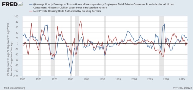
This at last does seem to give us a reasonably consistent relationship whereby the YoY change in real wages adjusted by partication either are coincident with or slightly lag housing, with the exception of ths housing bubble and bust. If this is true, then we should expect the recent slowdown in YoY growth in the housing market to give rise to a stagnation at least of participation as well as real wage growth.
Monday, February 20, 2017
Rents are still too d@*# high! (but may be abating a little)
- by New Deal democrat
[This is a post that got sidetracked for a few weeks. Sorry!]
Three years ago HUD warned of "the worst rental affordability crisis ever," citing statistics that
About half of renters spend more than 30 percent of their income on rent, up from 18 percent a decade ago, according to newly released research by Harvard’s Joint Center for Housing Studies. Twenty-seven percent of renters are paying more than half of their income on rent.This is a serious real-world issue, and big increases in rent may have completely eaten up the savings from gas prices among lower-income Americans. I have been tracking rental vacancies, construction, and rents ever since. The Q4 2016 report on vacancies and rents was released several weeks ago, so let's take an updated look.
Rent increases continue to outpace overall inflation, while there is some evidence that they may have peaked as a share of wages. Median asking rent rose from $842 to $864 in the last quarter of 2016, but is only up $14 from $850 YoY, an increase of 1.6%. At the same time, he entire year of 2016 averaged a 5.3% increase from all of 2015.
Below is the graph of nominal median asking rents by the Census Bureau. As you can see, after a big spike in 2015, in the last 3 quarters of 2016 rents stabilized:

Here is an updated look at real. inflation adjusted median asking rents, which similarly show that after setting an all-time record in Q1 2016, rent pressures on household budgets have abated just a bit:
The bad news is that vacancies remain extremely tight. The good news is that the vacancy rate appears to have been bottoming over the last two years, meaning that while there is still stress, the level of stress isn't increasing:
| Year | Median Asking Rent | Usual weekly earnings | Rent as % of earnings | |
|---|---|---|---|---|
| 1988 | 330 | 382 | 86 | |
| 1992 | 401 | 437 | 92 | |
| 1993 | 422 | 450 | 88 | |
| 2000 | 478 | 568 | 84 | |
| 2002 | 545 | 607 | 90 | |
| 2004 | 599 | 629 | 95 | |
| 2009 | 680 | 739 | 92 | |
| 2012 | 717 | 768 | 93 | |
| 2013 | 734 | 778 | 94 | |
| 2014 | 762 | 791 | 96 | |
| 2015 | 813 | 809 | 100 | |
| 2016 Q1 | 870 | 823 | 106 | |
| 2016 Q2 | 847 | 828 | 102 | |
| 2016 Q3 | 842 | 835 | 101 | |
| 2016 Q$ | 864 | 843 | 102 | |

Despite the big increase in rents in the last several years, the building of multi-unit housing has not realy risen to the demand (at least not yet). When the large Boomer generation hit adulthood 50 years ago, note how multi-unit construction quickly shot up to 1,000,000 a year, and remained above 400,000 almost continuously for 20 years thereafter, until the last Boomer hit adulthood:

Now here is the comparable look for the similarly large Millennial generation:

The increase has only been to the 400,000 level, and has been stuck in that neighborhood for going on 3 years. I expected the "apartment boom" to continue, with increased building of multi-family units. That didn't happen.
Meanwhile the CPI for owner's equivalent rent has continued to accelerate, and is now just over 3.5% YoY, one of the highest rates in two decades:

Renters are typically from the lowest 2 quintiles of the income distribution. As of the end of 2015, these two quintiles have had the poorest record of income changes since the recession as measured by real median household income (h/t Doug Short):

and that hasn't changed as of the latest update from the Consumer Expenditure Survey released several months ago:
and that hasn't changed as of the latest update from the Consumer Expenditure Survey released several months ago:

Rent increases probably sucked up much of the windfall lower income consumers got from declining gas prices. Now that gas prices are increasing again, I expect the consumer to start showing signs of distress.
There are two other median measures in addition to median asking rent from the HVS: the American Community Survey and the Consumer Expenditure Survey. Unfortunately both are only current through 2015. The below table shows their YoY increases, compared with median asking rent:
SURVEY: ACS CES HVS
SURVEY: ACS CES HVS
2009 -------- (817) ------- ------ (708)
2010 +2.9% (841) +1.4% +2.6% (698)
2011 +3.6% (871) +4.4% -0.6% (694)
2012 +2.1% (889) +5.2% +3.3% (717)
2013. +1.7% (904) +4.3% +2.4% (734)
2014 +1.8% (920) +9.2% +3.8% (762)
2010 +2.9% (841) +1.4% +2.6% (698)
2011 +3.6% (871) +4.4% -0.6% (694)
2012 +2.1% (889) +5.2% +3.3% (717)
2013. +1.7% (904) +4.3% +2.4% (734)
2014 +1.8% (920) +9.2% +3.8% (762)
2015 +0.9% (928) +4.3%* +6.7% (813)
*June 2014-June 2015 all shelter
HUD recently premiered a Rental Affordability Index, using the ACS data. Similar to my chart above, it compares renter income with median rent. Here are the premiere graphs:

Like the median household income data, this shows renters' income bottoming out in 2011-12, and rising since relative to rents as calculated by the ACS. That gives us the "renatl affordability index" shown below:
.

I'm not sold on HUD's method, mainly because it relies upon annual data released with a lag. In other words, the entire last year plus is calculated via extrapolation. I suspect we could get much more timely estimates using Sentier's monthly median household income series, compared with the monthly rental index calculated by Zumper.
But regardless of which method we use, it certainly appears that apartment rents as a share of renter income are quite high -- but the crisis probably has abated at least a little.
Sunday, February 19, 2017
Saturday, February 18, 2017
Weekly Indicators for Februrary 13 - 17 at XE.com
- by New Deal democrat
My Weekly Indicators post is up at XE.com.
Tax withholding is having a rocky February so far.
Friday, February 17, 2017
The shallow industrial recession is fading in the rear view mirror
- by New Deal democrat
A year ago the "shallow industrial recession" induced by the strong US$ and imploding oil patch was bottoming. At that time I described the historical pattern:
Typically new orders turn positive first (red, left scale in the graph below), followed by sales (green, right scale), and finally inventories (blue, right scale):

At that time I concluded:
If this is an incipient recession, then I would expect inventories to follow sales, which means that ISM new orders are giving a false signal. On the other hand, if this is simply a slowdown, like 1998 (far left in the first graph), then sales should turn positive, and like 1998 inventories will not decline, in which case it is elevated inventories that are giving the false signal.Since then, ISM has withdrawn permission for the St. Louis FRED to republish its data. Fortunately, the overall ISM index tends to follow the new orders component with a slight lag, and Doug Short keeps track of that:

And Doug's 3 month trailing average of the regional Fed indexes shows the same thing:

So, what has happened with total business sales (including manufacturer, wholesaler, and retailer) and inventories? Here's the graph:

Exactly like 1998, sales have taken off again, while inventories did not decline. Since one year ago, they have risen, but slightly.
As a matter of course, the total business and wholesaler inventory to sales ratios have declined. (I include the latter because it has been less influenced by secular "just in time" inventory issues):


The model worked just as I expected. The shallow industrial recession is fading in the rear view mirror.
Thursday, February 16, 2017
January was a good month for housing permits and starts
- by New Deal democrat
I wanted to make a brief comment on this morning's report on housing permits and starts. Bottom line: this was a very good report.
Here's why:
- 3 month rolling average of single family permits at a new post-recession high
- 3 month rolling average of starts at a new post-recession high
- 3 month rolling average of total permits less than 1% off post recession high from 18 months ago that was caused by a NYC-induced spike
Total permits improved while single family home permits declined slightly from last month's post-recession high for a single month, due to a big jump in multi-family permits.
I do expect housing growth to slow down and possibly stop by about mid-year due to both higher interest rates and negative YoY real wage growth. But in the meantime, housing is doing well, and this will contribute to good general economic growth throughout this year.
Industrial production: We're DOOO .... oh, wait, it's the global warming hoax
- by New Deal democrat
At first blush yesterday's negative industrial production print gives the lie to the proposition that the economy has left last year's "shallow industrial recession" behind, as it looks to be going mainly sideways:

But a closer examination shows that is not the case. Industrial production is broken up into three groupings: manufacturing (by far the biggest), utilities, and mining (including oil and gas).
So here is the information for manufacturing (blue. left scale) and mining (red, right scale):
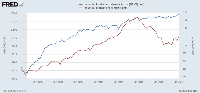
Although the trend is modest, manufacturing has broken out to new highs. And the energy patch is clearly seeing a rebound.
Which means that the *entire* reason for the decline is utilities:

Note this graph is seasonally adjusted. But whenever most of the country has an unusually warm winter -- as is the case this year -- it shows up as a decline in energy (i.e., heat) production.
So you can blame the downturn in industrial production on the Great Global Warming Hoax.
Subscribe to:
Posts (Atom)