Monday, March 1, 2010

The Bifurcated Recovery

- by New Deal democrat

On Friday I noted that the week's data about the American consumer and industrial economies was so different that you may as well be looking at statistics from two separate countries. Looking at other data series over the weekend, I was surprised to find that the stark bifurcation between the two economies - industrial vs. consumer - carried through almost all the data series. The recovery is indeed bifurcated. The industrial recovery is V-shaped and stronger than any recovery since 1983. The consumer economy is little better than L-shaped and in some cases isn't happening at all. What follows is a detailed look.

I. Let's start with the overall GDP, shown here in real, inflation-adjusted terms:
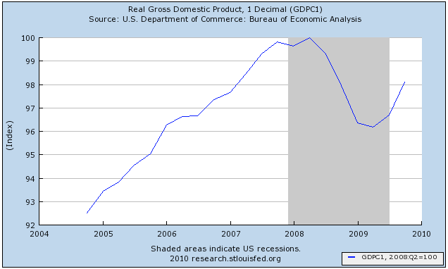
The economy as a whole declined about 4% in real terms from its peak in 2Q 2008. It is over half the way back, as V-shaped as could have been hoped for.

That V-shaped recovery also shows up in industrial production:
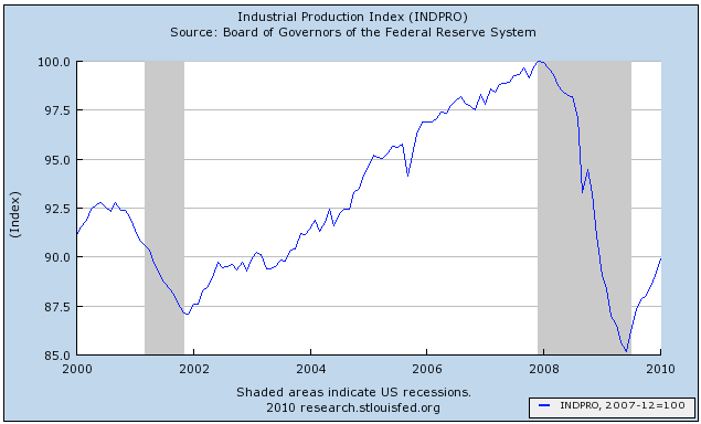
Industrial production declined 15% from its peak and has recovered 1/3 of its loss.

This is the strongest recovery in industrial production by far since 1983:


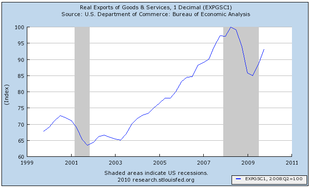
Exports have also regained over half of the ground they lost:

And V-shaped charts turn up in virtually every other aspect of manufacturing, for example, the latest ISM manufacturing report from January:
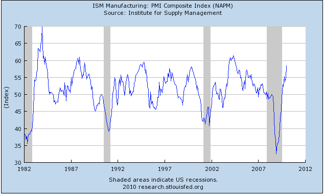
showing a much stronger recovery than either those from the 1991 and 2001 recessions, and showing an intensity of growth that has only been matched in 1994 and 2003 in the last 20 years.

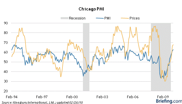
The Chicago PMI for February, which was just reported on Friday, shows a similar intensity:

Looking at some subparts of the industrial economy, this graph shows durable goods manufacturing and employees so employed:
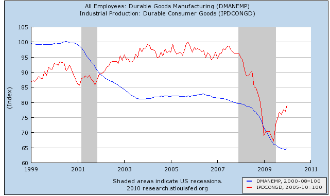
Durable goods declined almost 35% from their pre-recession peak and have come over 1/3 of the way back. That hasn't helped durable goods employment, which declined 20% and just turned positive on a preliminary basis in January.

The same story has played out in nondurable goods manufacturing and employees in that sector:
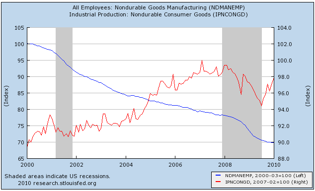
Nondurable goods manufacturing declined about 6% from its pre-recession peak (right scale) and has made 2/3 of that up. Employment in that area is still in decline.

The V-shaped recovery also shows up in average weekly hours (blue, left scale) and overtime (red, right scale) worked in manufacturing:
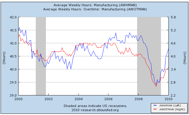

But if hours have gone up, the sector continued to hemorrhage jobs as shown on this graph of monthly gains and losses in industrial employment:
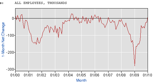
Industrial employment finally eked out an +11,000 gain on a preliminary basis in January's jobs report.

II. Over 100 years ago, Charles Dow (of the Dow Jones Industrial and Transportation Averages) theorized that the amount of goods produced should correlate with the volume of traffic moving those goods to market. Indeed, as we saw last week, the trucking industry has recovered about 2/3 of its volume:


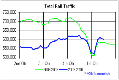
Total rail traffic declined almost 30% from peak to bottom in late 2008. Some of that was seasonal, but the fact remains that about half of that decline has been erased:
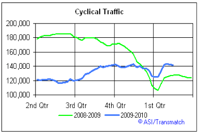
Cyclical rail traffic, which is most sensitive to economic conditions, and which did improve first following the 2001 recession, shows a similar pattern:
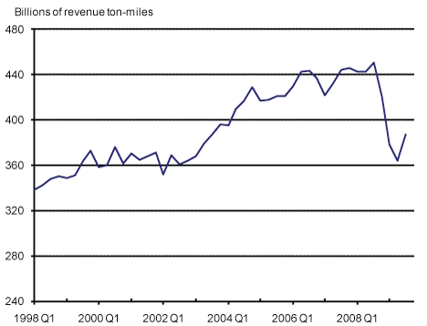
Railroad revenue ton-miles, which are reported quarterly, show about 1/3 of the lost ground recovered through December 2009:

Although I can't show you a graph, I can tell you that air cargo revenue ton-miles show a smaller rebound as well, having fallen 2/3 from 1.22 Billion in December 2006 to 0.75 Billion in February 2009, and as of November 2009 had increased to 0.92 Billion (note: like rail traffic, undoubtedly some of this is seasonal variation, but the YoY decline from Feb. 2008 - 09 was 50%. November 2009 showed the first YoY increase since April 2007-08).

But despite that improvement, employment in the transportation industries was still declining even in January:
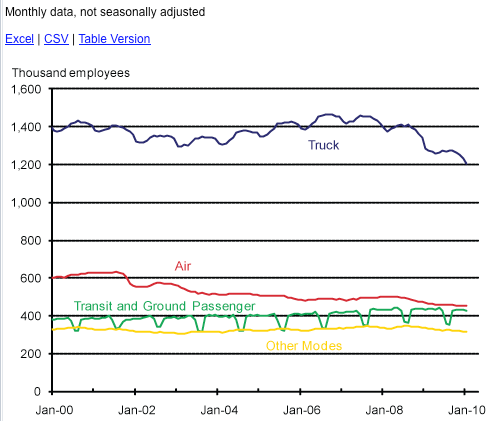

III. If industry and associated economic metrics show a strong V-shaped recovery, the best since 1983, then once we look at that part of the economy most closely associated with average American consumers, another picture emerges entirely.

Real residential spending has typically powered consumer recoveries. Housing permits, however, after collapsing nearly 80% from their levels during the boom, have made up only about 10% of that ground -- the weakest housing recovery on record, including the Great Depression:
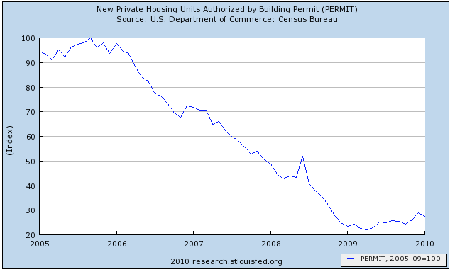
(note: I am addressing volume of new homes built, not prices of either new or existing houses, in this discussion. Foreclosures are likely to increase for several years yet, and prices are almost certainly going to resume their decline to the long term mean).

Courtesy of Calculated Risk, we can break out residential vs. non-residential construction spending:
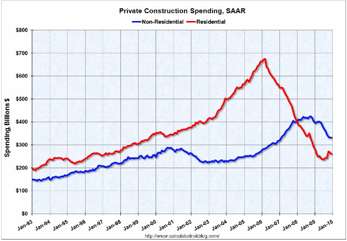
Rsidential spending has improved, but has relapsed somewhat due to the (believed) expiration of the $8000 housing credit. Commercial construction is still in strong decline, and probably will be so at least until later this year (CR notes that historically commercial spending has usually bottomed about 16 months after residential spending).

Reflecting that, construction employment continues to decline relentlessly (it was one of two areas responsible for January's preliminarily negative jobs report):
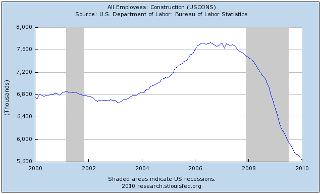
Over two million jobs have been lost in construction since its late 2005 peak. (note: there is no data breaking this down between residential vs. commercial construction jobs)

If houses are typically the largest and most important purchases made by consumers, autos are second. Auto sales declined from about 16 million a year to 9 million in early 2009, and have since rebounded to about 11 million, or about 25% of the way back to their peak:
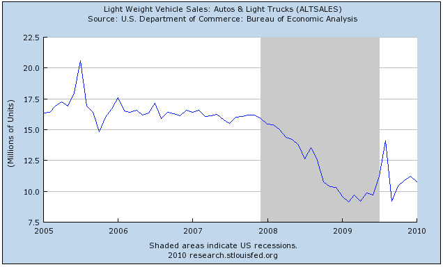
This is a better situation than housing, but not nearly as strong a rebound as in the industrial economy.

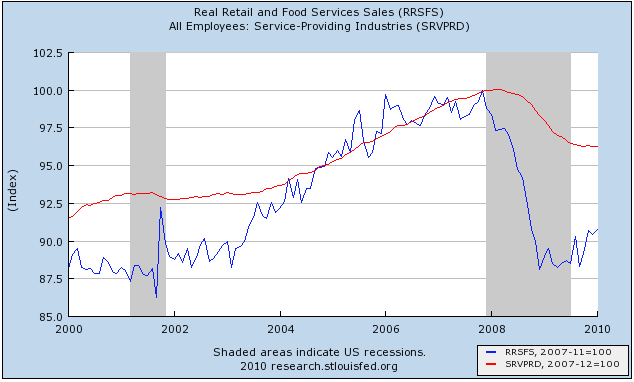
Real retail sales (blue) which make up about 70% of consumer spending, declined about 12.5% from their pre-recession peak, also increased from their bottom, but only made up about 1/5 to 1/4 of that loss. Employment in the service part of the economy (red) declined almost 4%, and just started to eke out small gains in November's jobs report:

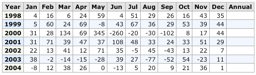
Government employment now includes more workers than all goods-producing employment. It is typically the last to turn down in a recession, and the last to turn up, sometimes not doing so until a year later. For example, here is the graph of gains and losses in government employment on a monthly basis during the 1970s:


and here is the chart of the same data, showing that even after the economy began to recover from the deep recessions of 1973-74 and 1981-82, employees in government continued to be laid off:


Here is the same graph as to the 2001-03 recession and "jobless recovery":

and here is the chart of the same data, showing again that government employees continued to be laid off even into 2004, even after employment as a whole turned up in late 2003:
In the last 8 months, there have been signficant layoffs in government. This undoubtedly is due to the steep decline in revenues, which is reflected in the US Treasury receipts for withholding taxes, shown here (h/t to RDan at Angry Bear):
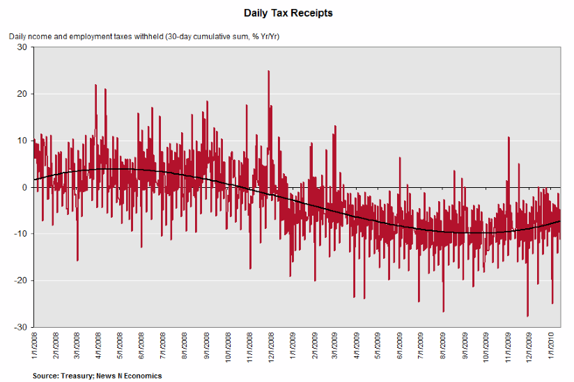
Daily fluctuations in YoY receipts are in red, the 30 day YoY moving average is the black dotted line. While as of February 25, 2010, this had improved to about -2% YoY, there is every reason to believe that there will be significant layoffs of government workers for the foreseeable future. Government was the second area responsible for the continuing job losses in the economy reported preliminarily in January.

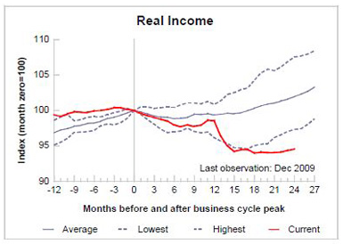
IV. Finally, I would be remiss if I did not look at income and wages. Because of high unemployment and slack in production capacity, there was been much downward pressure on wages and salaries. As a result, after a big decline, real income has stagnated, just barely turning up in the last few months, and lagging the turnaround in all post-WW2 recessions:

Wages are in more severe trouble. In the graph below, average hourly earnings are in green, and the employment cost index (which is a median measure which does not get upwardly distorted by salaries at the upper end of the income scale) is in blue:
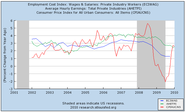
As you can see, both have been under intense downward pressure since the onset of the recession, and when one takes into account inflation (in red), both are now negative on a year-over-year basis. Quite simply, wages - which had a respite during the brief interval of low gas prices a year ago - aren't undergoing any recovery at all.

But if wages are in real decline, there is yet one more graph that is probably the most V-shaped of them all. S&P 500 earnings, which almost entirely disappeared during the past recession - for the first time since the worst days of the 1929-32 contraction - have almost all been made up (h/t chartoftheday):
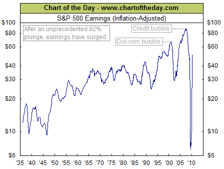
In real terms, profits at America's largest companies are the highest they have even been with the exception of the dot-com and housing bubbles.

In summation, we really do have two separate economies:
(1) an industrial and export economy, which is in a strong, full, V-shaped recovery;
(2) an economy consisting of
- a commerical construction subpart, which is still in sharp decline,
- and consumer related goods and services (residential construction, vehicles, and retail), which are barely growing.
- employment, which even in the industrial sector, is either still declining or just barely growing.

Wall Street and industrial companies are showing near record profits, while employment, wages and salaries for ordinary workers/consumers are totally stagnant or in actual decline.

A bifurcated recovery indeed.

Market Mondays

First off -- congratulations to Canada's Hockey team for their gold medal -- and thanks to both teams for one of the most exciting hockey games I've see in some time. It was one of those games where you don't want anyone to win, only so it will continue for as long as possible.


Are the SPYs moving into an A/B/C (up/down/up) pattern? Let's take a look.

A.) Prices rose from their early February lows.

B.) Prices consolidated in a downward sloping pennant pattern.

C.) Notice the EMA picture: The 10 day EMA has moved through the 50 day EMA and the 20 is about to do so. The 10 and 20 day EMAs are moving higher as is the 50 and prices are above the EMAs


Let's see if the transports are confirming the possible uptrend.

A.) Prices continue to move higher. Last week they corrected sideways rather than lower.

B.) The EMA picture is bullish: All the EMAs are moving higher, the shorter EMAs are above longer EMAs and prices are above all the EMAs.

Saturday, February 27, 2010

In Response to Mr. Scott's Rebuttal

I response to my article "No, Virginia, Manufacturing Isn't Dead" Mr. Scott has published as article titled The Myth of the Manufacturing Recovery." Regrettably, his rebuttal is deeply flawed both in tone and substance.

First, he notes that I plotted a non-logarithmic chart of productivity growth instead of a logarithmic one, the implication being that a logarithmic chart would somehow arrive at a different conclusion. Of course, the first question a reader of Mr. Scott's article should ask is, "if this chart is so damning, why did Mr. Scott not include it is his article? Here, Mr. Scott is engaging in a standard legal defense tactic: when the data is against you, question it in some manner without showing proof. This is also a very popular tactic among right wing radio personalities, especially in regards to global warming data. The answer is clear: the chart in logarithmic scale and normal scale show the exact same situation: a chart that shows a clear expanssion of US manufacturing output. See this on page 5 of the complete PDF's from the Federal Reserve. Secondly, according to the Federal Reserve, growth in manufacturing output did not decrease after 2000 as Mr. Scott claims. According the the same source (the Federal Reserve's industrial production chart), manufacturing output increased from 2000 until the end of 2007. At the same time, manufacturing jobs dropped by about 5 million. This eviscerates the root of his argument.

Next, Mr. Scott notes that my co-blogger and I used a chart of manufactured imports and manufacturing jobs compared same to to demonstrate there is no relationship between the trade deficit and manufacturing employment. What Mr. Scott fails to recognize is this: if the US were replacing manufactured goods produced in the US with manufactured imports from other countries, there would be a relationship between imports of manufactured goods and manufacturing jobs. Yet as the US started to import more manufactured goods there were not a concomitant decrease in employment jobs. In addition, my co-blogger Silver Oz demonstrates this lack of causal relationship between the trade deficit and manufacturing in this article, titled, Free Trade Is Not the Job Killer.

Finally, while I am sure that Mr. Scott is a fine economist, it is patently obvious he engages little with real-world manufacturing executives. As a tax attorney, I am regularly consulted on the question of adding physical infrastructure to factories at the expense of employees. When asked these questions, I usually ask why. And the answer is always the same: "more output per unit of input." The classic John Henry story is playing out across all industries with remarkable alacrity. In fact, if you look at the change of physical infrastructure in manufacturing over the last 20 years, you will see the exact same pattern across all industries: an increase in equipment at the expense of employees.

In short, Mt. Scott has a preconceived view of the world (all trade is bad) and is attempting to fit the facts to his view. I would encourage him to broaden his horizons, leave his ivory tower and engage some business owners to see what they think. However, I would also encourage Mr. Scott to use the services of a third party in his interactions, as people skills are obviously not his strong suit.

Friday, February 26, 2010

Weekend Weimar and Beagle

Sorry I haven't posted pictures of the kids in a few weeks. Anyway -- it's that time of the week -- stop thinking about the economy or the markets. See you on Monday -- to that end --- think about taking a nap sometime soon ......


Weekly Indicators: Sometimes the Bear eats you Edition

- by New Deal democrat

Sometimes you eat the bear. Sometimes the bear eats you. When it comes to struggling average Americans, this week the data showed the bear having a feast. The Conference Board's consumer confidence measure slipped a full 10 points, a very dramatic move, although at week's end that was not confirmed by a generally sideways move in the University of Michigan's consumer sentiment report. The reason may have to do with politics, specifically the Democratic party's collective pearl-clutching fainting spell after they were reduced to a 59-seat "minority" in the Senate:

"Consumers have been getting more impatient with the slow progress of the stimulus program, and confidence in the Obama administration's economic policies has begun to wane," Richard Curtin, director of the [Michigan] surveys, said in a statement.
New and existing home sales both tanked, with new home sales setting a record low. Existing sales were essentially exactly where they were when they bottomed a year ago. Unlike "cash for clunkers", it appears that the $8000 home buyer credit did only pull demand forward. If so, however, we should expect a rebound in a few months as that plays out.

If that wasn't bad enough, initial jobless claims rose to 496,000, the highest weekly number in 3 months. The 4-week moving average also increased to 472,750, and that number cannot be explained by snowstorms several weeks ago. My best guess is that we are seeing municipal and state government layoffs, but we'll find out more about that in a week.

When you get away from American consumers and start talking about manufacturing, it's like you are in a different country. The Chicago PMI "posted a surprise increase from 61.5 in January to 62.6 in February." This reading is among the highest in the last 20 years, and confirms all of the other manufacturing reports out in the last several months. Strip away those pesky people, and industries are having a terrific recovery.

For another example, here is a graph of the American Trucking Association's index for January, which was reported this week:

The graph shows that trucking loads have increased 2/3's of the way from their recession bottom to their pre-recession top, and are now virtually equal to where they were in January 2007, the last January before the recession began. The American Trucking Association noted that this "gain boosted the SA index ... to ... its highest level since September 2008."

One leading Doomer at Daily Kos was sure that the GDP report for 4Q 2009 would be revised, and he was right - just not in the direction he thought: it was revised upward 0.2% to 5.9% annualized. If this revision holds up, we only need Q1 2010 GDP to be +0.5% for YoY GDP to be 2.0%, and if Q1 2010 GDP is +2.5%, the YoY GDP will also be +2.5%, which strongly supports at least some job growth.

Turning to the high-frequency weekly numbers, the ICSC same store retail sales for the week ending February 20 increased 4 0% YoY and 2.3% WoW. Similarly, ShopperTrak "reported that year-over-year GAFO retail sales increased 6.2 percent for the week ending Feb. 20 while sales rose 4.4 percent versus the previous week ending Feb. 13," saying:
Sales reached a seasonal peak as Valentine’s and President’s Day spending spurred shopping early in the week providing both a year-over-year and week-over-week boost. Additionally, ShopperTrak reported GAFO sales levels increased last week as the Eastern markets recovered from blizzard like conditions and consumers dug out to visit various retail locations and spend.
This week, at least, points to a better real retail sales report for February, but we will see in a few weeks.

If truck traffic was increasing briskly, rail traffic was more mixed, as cyclical, intermodal, and total traffic remained up year over year, but cyclical traffic declined compared with last week. Baseline traffic is again below where it was a year ago, a real conundrum.

Gasoline demand last week was up from a year ago, the first YoY increase this year. Prices at the pump increased to $2.66/gallon. Oil on Friday was just below $80/barrel.

The Daily Treasury Statement for February 24, 2010 showed $129.7B in withholding taxes paid this month vs. $126.0 for the same date last year. February 2009 ended with $142.9B paid. We have two more days of reporting this year (vs. three last year), so the jury is out as to whether this month will show an actual YoY increase for the first time since a year into the Recession.

Finally, following my blog Tuesday, Tim Iacono of The Mess that Greenspan Made updated his CS-CPI graph, and here it is:


Will consumers drag down the economy, or will the economy pull up consumers? My bet is on the second: as several bloggers noted this week, developing economies, in particular in Asia, are leading the recovery. The average American consumer is no longer the locomotive, but the caboose.

P.S.: This week, this blog posted its 4,000th entry. Thanks to all who read and comment!

GDP Revised Higher

From the WSJ:


U.S. economic growth accelerated to the strongest pace in over six years late last year, with the Commerce Department Friday revising up its fourth-quarter estimate as businesses slowed inventory reduction and boosted spending, but consumers spent less than first thought.

Gross domestic product rose at a 5.9% annual rate October through September, the fastest rate since the third quarter of 2003, the Commerce Department reported. GDP expanded by 2.2% in the third quarter of 2009.

A month ago, the department first estimated that GDP -- a measure of all goods and services produced in the economy -- rose by an annual 5.7% in the fourth quarter.


I'm sure the upward revision will be commented on by all the doom and gloomers .....

Free Trade Is Not A Job Killer

A recent debate elsewhere interested me enough to do some research on the effects trade has on goods producing employment in the US. Now, I want to state upfront that this is a look at the aggregate and that there are obviously anecdotal cases of individual companies/plants moving to overseas locations for competitive reasons, however, I want to separate the publicized and emotional loss of individual plants from the broad case that free trade is a job killer.

As we all know, the trade deficit has ballooned in recent decades as is evidenced by the following graph (all graphs are thumbnails due to the quantity in this piece):
tradebalance
We can clearly see that really beginning for good at the end of the 1991 recession the trade balance went down dramatically, with the only sustained recoveries occurring during recessions. So, let's look at how goods producing employees have been affected by this trade deficit by decade.

The trade deficit really got its start during the early 80's recessions when high interest rates by the Fed created a strong dollar really hurt exports causing their nominal dollar value to flat line from 1981 through 1986 before they took off again in 1987. The following graph shows goods employment vs. the trade deficit for the 80s:
goodstrade80s
This graph shows no link between the increasing trade deficit and goods employment in the 80s with goods employment rebounding even while the deficit grew following the end of the 81 recession.

Next up are the 90s; the decade of grunge, the stock market bubble, and NAFTA. One would expect to see massive declines in goods employment following the implementation of NAFTA and a ballooning trade deficit towards the end of the decade, but as you can see by the following graph the opposite actually occurred. Following goods jobs reaching their post-recession trough (the first jobless recovery) in late 1992, the exploded up 10% from that bottom at the same time that the trade deficit went from essentially -$18 billion to over -$90 billion.
goodstrade90s

Now let us move on to our most recent decade; where trade with China exploded, we endured two recessions (both with jobless recoveries), and an enormous increase in national debt. AS you can see from the following graph, the goods employment trough didn't occur until about 2 years after the first recession ended, which also coincided with a huge increase in the trade deficit, yet once again goods jobs held their own during the massive trade imbalance.
goodstrade2000s
Then, during the most recent recession, goods jobs dropped like a rock (down nearly 20% from the pre-recession peak) and yet the trade deficit actually decreased (and yes, oil was a part of this, but it has also been a big part of our trade deficit all along.

So then, what does can account for our decline in goods employment over recent years, especially over the last decade where it really dropped off a cliff? The most simple answer seems to be that our productivity has reached a point where it can outstrip production demands, which leads to a decline in the labor intensity needed for goods production.
indprovprodvgoods
Let's examine this a bit further. From the end of the 1990 recession to the pre-2001 recession peaks productivity was up about 47%, industrial production was up about 61%, and goods employment was up about 9.3% (I used the end of 1990 recession value and not the trough in actual goods employment here). So during the 90s, production outstripped productivity (although both were up a ton), while job creation came in at only +9.3%, obviously lagging. However, from their 2001 recession troughs (again using the end of the recession for jobs), productivity was up about 25%, industrial production was up about 15%, and jobs declined by about 4.3%. This graph demonstrates that when productivity outstrips production goods jobs decline, but that even when production outstrips productivity job growth can be anemic so long as the productivity growth is still substantial. The current recession is showcasing productivity's effects on jobs very well, as while production has dropped about 13% during this recession, productivity is actually up over 5%, and industrial production is now at it's 2002 levels, but with roughly 20% fewer workers making those goods.

In conclusion, the data appear to show that the real factor in goods job creation (or loss) is the relationship between productivity and production, which unfortunately leaves little room for protectionism (even sans the trade war implications that would create), as unless productivity falls precipitously we would see no net job creation from any such endeavor.

And just so we don't define this as a US problem, I will direct you to a conference board study that highlights China's loss of manufacturing jobs to productivity too.

More on Initial Unemployment Claims


A.) From the late Spring to the end of last winter, we've seen initial unemployment claims drop from 650,000 to 450,000. The drop was consistent.

B.) Since that time, we've seen initial unemployment claims bounce between 450,000 and 500,000.

Since the beginning of the year we've seen two periods when there were distortions in the data. The first was about a month ago. The second was this report, which Bloomberg noted:

The number of jobless filing for initial unemployment claims increased in February, pointing to trouble for the February employment report and sending equities and commodities lower in immediate reaction. Initial claims jumped to 496,000 in the Feb. 20 week, the highest level since November. The four-week average, up 6,000 to 473,750, is also the highest since November and is more than 15,000 higher than January levels. In an ominous note for the monthly jobs report, claims offices said heavy weather increased the number of claims in the week. Continuing claims, where data lags by a week, were slightly higher at 4.617 million and are little changed from January levels. The unemployment rate for insured workers is unchanged at 3.5 percent.

Initial jobless claims unexpected jumped a sizeable 31,000 to 473,000 in the week ended February 13 week after dropping 41,000 the prior week. There are important special factors possibly affecting the data but the Labor Department offered no explanation. An obvious probable factor was extremely heavy weather through most of the nation in the reporting week, and results from four states had to be estimated including the key states of Texas and California with holiday backlog in the latter having skewed prior reports. Count on lots of speculation on how snow storms over the past two weeks affected the numbers.


I'm not sure how much credence I give to that statement regarding weather. For example, I live in Houston, Texas, where the winter has been really cold by Texas standards. We've even had snowfall in Northern Texas cities like Dallas. For a city that is not equipped to deal with this (no snow removal, inability to deal with driving on ice etc...) it can be a big problem. But I'm just not sure I buy the argument that the weather is the reason for the skewed data. I'm not saying it's impossible, but not possible.

I think there are some fundamental factors at work here which, if they continue for more than a few (say, through March), will have some negative implications for the recovery.

Forex Fridays


A.) Prices are at a top, have broken an uptrend but have not moved lower.

B.) The EMA picture is strong. The shorter EMAs are above the longer EMAs, all the shorter EMAs are moving higher and prices are above the EMAs.

Today's Market


The same analysis applies to the SPYs and the QQQQs


A.) Note that prices are floating around the EMAs. Also note that prices are in a pennant formation. Finally, the EMA picture is fairly bullish -- all the EMAs are rising and the shorter EMAs are about to move over the longer EMAs.

B.) Momentum is increasing and

C.) Money is flowing into the market


A.) The transports printed a strong bar yesterday on the news of increased transportation sales in the durable goods report. Also note the bullish EMA picture -- the shorter EMAs are moving higher and the shorter EMAs have moved through the longer EMAs.

B.) Momentum is increasing and

C.) Money is flowing into the security.
B.)

Thursday, February 25, 2010

Today's Market ... Will Be Up Tomorrow AM

Welcome to Campaign for American's Future Readers

The bloggers over at Campaign for America's future have asked to use the manufacturing post from a few days who. So, welcome and I hope you enjoy the site.

New Home Sales Drop

From Reuters:

The Commerce Department said on Wednesday sales of newly built single-family homes dropped 11.2 percent to an annual rate of 309,000 units, the lowest level since records started in 1963, from 348,000 units in December.

It was the third straight monthly drop and the largest percentage decline in a year. Analysts, who had expected a 360,000 unit pace, said bad weather was partly to blame and warned of more of the same for February.

"There is no doubt that January and February are going to be messy months for housing, given the severe weather conditions, but that does not take away from the fact that the housing sector has taken another big step back, even with government aid," said Jennifer Lee, a senior economist at BMO Capital Markets in Toronto.

Let's go to the data:

This look more like a continuation of the bottom forming in New Homes sales. I described the situation like this a few weeks ago:

The pace of new home sales is still at the bottom. It rebounded a bit, but in reality the best way to describe the current pace of new home sales is "bumping along the bottom."

This is in line with new home construction whose chart is similar.

Jobless claims, Durable goods show worrying bifurcation

- by New Deal democrat

This morning Initial Jobless claims were reported at 496,000, the highest in nearly 3 months. The 4 week moving average increased to 473,750.

Up until now, the jobless claims data had not broken the downward trendline since March 2009. They have now done so. Add this to the surprise strong drop in the Conference Board's consumer confidence number (not confirmed at this point by the similar, older U of Michigan survey), and you have a worrying setback on the jobs and consumer front.

On the other hand, durable goods orders were reported up 3% this month, and last month's report was revised up to +1.9%. While ex-transportation there was a -0.6% decline, last month's data ex-transportation was also revised up to +2.0%. Nondefense capital goods were up 4.7%. This completely turned around YoY Capital goods readings to a positive reading over 10%!

Besides the durable goods data, all of the regional Fed reports - New York, Philadelphia, and Chicago - have also come in strong. Industrial production came in good. The American Trucking Association's report for January showed a very strong increase -- to the point where trucking is back about 2/3 of the way from its recession bottom to its pre-recession top. All of these show a very strong manufacturing rebound that is continuing.

Bonddad and I have both suggested that exports and manufacturing may lead the way in this recovery, and both of us have noted that the US consumer, formerly the locomotive of the world economy, is now the caboose.

We are seeing - at least in one month's data - an amplification of that bifurcated pattern. The economy ex-people is having a V-shaped recovery, while the consumer - especially those in the bottom half of the income distribution - may not be seeing any improvement at all.

Reading Comprehension 101

Welcome a a new class at the Bonddad Blog. It's called reading comprehension -- a skill shortly lacking in the blogsphere. Consider the argument advanced by many that US economic statistics are horribly off -- it's proof I tell you of a massive conspiracy to quell the masses! The proof is supposedly contained in a NY Times article from November 9:

A widening gap between data and reality is distorting the government’s picture of the country’s economic health, overstating growth and productivity in ways that could affect the political debate on issues like trade, wages and job creation.

The shortcomings of the data-gathering system came through loud and clear here Friday and Saturday at a first-of-its-kind gathering of economists from academia and government determined to come up with a more accurate statistical picture.

This is proof -- IMHO -- of how rigged the data is.

Except for one point -- also contained in the article and usually not quoted:

The statistical distortions can be significant. At worst, the gross domestic product would have risen at only a 3.3 percent annual rate in the third quarter instead of the 3.5 percent actually reported, according to some experts at the conference. The same gap applies to productivity. And the spread is growing as imports do.

The very worst that would happen with the data is a .2% alteration in the GDP number -- and that is assuming the worst possible outcome.

This is the Ann Coulter school of footnotes -- the article sort of says what I want it to say, so I'll cite it as a source and hope no one notices.

People notice. This argument is an epic fail. Try again.


Thursday Oil Market Round-Up


In general, the oil market is still in a channel, between lines A and B.


A.) Prices are consolidating above the 61.8% Fibonacci level. In addition,

B.) Note the EMA picture. The 10 and 20 day EMA are rising. The 10 day EMA has moved through the 50 day EMA and the 20 is about to do so. All three shorter EMAs are rising.

Today's Market


A.) Prices are consolidating between the 50% and 61.8% Fibonacci level.


A.) Also note the price/EMA picture. Prices are consolidating on top of the EMAs. The shorter EMAs are moving higher, although at a smaller angle. However,


Notice the overall position of the microcaps. Instead of falling to the EMA for technical support, they are holding steady, as are


The Transports.