Wednesday, December 18, 2024

The housing sector now hoists a red flag recession warning


 - by New Deal democrat


The very important construction data from the long leading housing sector was mixed this morning for November.

The most leading datapoint, permits, increased 86,000 on an annualized basis to 1.505 million. Even more importantly, single family permits, which have the least noise and most signal of any of the datapoints, continued their rebound from their recent June low, increasing 1,000 to 972,000, their highest level since April. Measnwhile starts, which are noisier and tend to lag permits by one or two months, declined another -23,000 to 1.289 million, their second lowest reading since 2020:


Starts did rebound in the hurricane-stricken South, but that was counterbalanced by a steep decline in the Midwest. Again, this series has a lot of noise, so I am not terribly concerned about a one month pothole.

But if housing permits suggested a near term increase in construction, units presently under construction continued to plummet, down -27,000 to 1.434 million, -16.2% down from their peak, and the lowest number since August 2021:


This is very important, because in the past it has declined on average -15.1% and by a median of 13.4% before the onset of recessions:


Three months ago I hoisted a yellow flag “recession watch” for housing construction. I held off hoisting a red flag last month because of the hurricane effects in the South. With that dissipated, I am hoisting the red flag now: housing is forecasting recession.

Nevertheless, as I cautioned last month, in our present situation it appears permits have bottomed. Because starts, following permits, should start trending back upward in the next several months, and housing units under construction follow starts:


I still think housing units under construction will not decline too much further before bottoming as well. 

Additionally, employment in residential construction, which typically follows units under construction with a lag, has continued to increase so far:


Residential construction employment should decline before any recession were to occur.


Finally, recall that mortgage rates (change YoY, inverted) lead all of this data, including both measures of permits:


So the issue becomes whether mortgage rates continue to head back higher - in which case recession risks increase - or are at the top of their range going forward.

While the housing sector is now forecasting recession, focusing on it alone is not enogh. Focusing on manufacturing or residential construction employment alone is not enough. As I wrote last month, it is only when there is a more broad-based downturn across multiple goods-producing sectors that a recession typically occurs. Employment in goods producing jobs did decline slightly from two months ago, but it is not significant at this point. As I pointed out on Monday, corporate profits also stalled in Q3, but have not turned down; and if they did peak it would not forecast recession until later next year. Additionally, as we saw yesterday consumption is still going strong.

So while the housing sector is forecasting recession in the near future, it has not been joined by other critical components yet.

Tuesday, December 17, 2024

Industrial production continues to slide


 - by New Deal democrat


Industrial production declined for the third month in a row in November, down -0.1%, while October was revised downward another -0.2%. Manufacturing production on the other hand increased 0.2% in November, but September and October were revised downward a combined -0.3%, so on net this was another -0.1% decline. They are now down respectively -1.5% and -2.0% from their late 2022 highs:


Before 2001 and especially before the Great Recession, any YoY decline *always* coincided with or at least immediately heralded a recession. But since the accession of China to regular trading status in 1999, downturns of even -5% or more, as in 2015-16 and 2018-19 have not necessarily meant recession.

And as this close-up of the post pandemic record show, on a YoY basis production is only down about -0.9%:


The economy continues to be powered forward by consumption of services, and also by construction spending. Increasingly that does not include residential construction, which as I have written a number of times recently is down from its most recent peak to a level which typically in the past has meant recession. We’ll find out more about that tomorrow.

Real retail sales on the cusp of breaking out of their multi-year doldrums


 - by New Deal democrat


Consumption leads employment, and as I reiterated yesterday real per capita retail sales has a history as a long leading indicator.


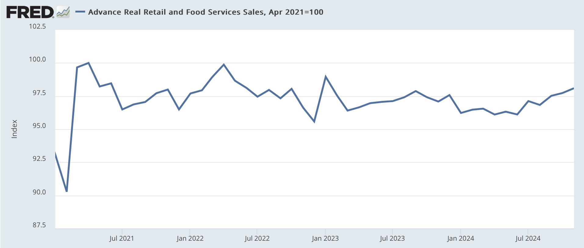
Which means that retail sales for November, which rose 0.7% nominally, continues its recent strong string of positives, increasingly looking like it is finally breaking out of its 2 year plus doldrums.

Since consumer prices rose 0.3% in November, real retail sales were up 0.4% for the month. While real retail sales are still -1.9% below their all time peak right after the 2021 stimulus package, with today’s report they are the highest since May 2022 except for one month:


On a YoY basis, they are also higher by 1.0%:


This is another positive since recessions typically occur with sales negative YoY. Here’s what the past 30 years before the pandemic look like, subtracting 1% from the YoY measure so that it shows at the zero line:


It’s a weak result, but for a change a non-recessionary one.

Finally, real retail sales are a good short leading indicator for the trend in jobs growth. Yesterday I speculated that real retail sales per capita might be distorted in the past several years by the outsized importance to CPI of the sharp increase in the shelter component. So in the graph below I also include real sales ex-shelter (light blue):


Either way, real retail sales are forecasting continued deceleration - which at this point translates into increased weakness - in hiring in the months ahead. Because, as I have pointed out in several posts in the past few weeks, YoY jobs gains are likely to be revised significantly downward for late 2023 and 2024 when we get the annual benchmark revisions in a couple of months, we may be closer to the trend line forecast by real retail sales already.

Monday, December 16, 2024

Updating the nonfinancial long leading indicators


 - by New Deal democrat


I haven’t “officially” updated my take on the long leading indicators - those that forecast a recession at least one year beforehand - in almost two years. That’s because the hurricane force tailwind of the supply-side deflationary unlinking of the global supply chain completely swamped everything else. So if I were to examine, e.g., corporate bond prices, is the appropriate comparison with 2021, or with 2023, after the supply chain had unlinked? Since there’s no clear answer to that, I haven’t seen the point.


But the same isn’t really true of the non-financial indicators. These detail producer and consumer well-being out in the real world. If their fortunes are waxing, the economy should continue doing well; if they are waning, there’s likely trouble ahead.

So I thought now might be a good time to look at those. Below I’ll look at five such long leading indicators. Two have to do with the housing market, two with corporate health, and one with consumer spending. (The three financial indicators I’ve eliminated are the yield curve, corporate bond prices, and money supply, all of which are more or less under the control of the Fed, and are strictly financial).

Let’s start with housing. Housing permits have long been known as a long leading indicator. Below I show total (blue) and single family (red) housing permits:


With the sole exception of the 2001 recession, which was focused on producers, housing permits have declined over 10% - and usually over 20% before the onset of recessions, with the peak occurring over one year before. In our present situation, both total and single family permits are down almost -25% since their peaks in January 2022. As I’ve written several times in the past couple of months, this is recessionary, although in a recession I would expect them to decline even further. We’ll get the next update of these numbers on Wednesday.

A similar tale is told by private residential fixed investment as a share of GDP. Calculated both in real and nominal terms, this metric also turned down typically between one and two years before a recession. In real terms the ratio peaked in 2021; in nominal terms in 2022:


So, both of our housing metrics are telling us to beware of recession.

Now let’s turn to the producer sector. Corporate profits deflated by unit labor costs also typically turn down a year or more before a recession. This makes sense, because once profits turn down, executives start looking for ways to cut costs, and frequently that means cutting staff.

With the exception of 1974, this metric has always declined at least one year before the onset of a recession. It did decline from the last quarter of 2021 to the last quarter of 2022, but has risen since then to an all time high in Q2 of this year, before declining a tiny -0.2% in Q3:


If this is generally positive, the picture of corporate borrowing is more mixed.

Corporate demand for loans has been declining for several years. The nadir of its decline was in 2022. While still negative, it had generally been improving since then - a typical marker of an economy coming *out* of a recession - until this past quarter:


We won’t know for several more months whether or not this is the beginning of a new slide.

The closest I’ll get to a financial indicator in this series is the percentage of banks tightening vs. loosening standards for corporate loans. Banks have progressively been making conditions less tight for the past year. Again, this is something we typically see coming out of recessions:


If corporate profits recover from their slight decline in Q3, then this is all just a blip, and producer health is very positive. If they don’t, then I’d want to see if loan demand continues to slide.

Finally, let’s look at the consumer side. In the modern era, real per capita retail sales have generally turned down at least one year before a recession. This is typically the sale of goods more than services. If consumers are pulling in their horns buying actual stuff, then producers react - with a lag - by cutting production and/or staff.

Here the news has been relentlessly negative since 2021, and in the past two years in all but three months real sales have actually been lower YoY:


This has looked very recessionary for several years.

But because similar measures, like real personal consumption expenditures for goods have been very positive, it made me wonder if the difference was all about the deflator, because shelter costs are 1/3rd of the entire CPI measure, but are a much smaller share of the personal spending deflator. So this next graph deflates retail sales by CPI less shelter, and there the story is quite different:


Basically, take out rent and the fictitious owners’ equivalent rent, and real sales per capita have been increasing off and on for over two years. Shelter costs are squeezing consumers, but they’re spending their money on other stuff just fine.

The conclusion I come to looking at the above nonfinancial long leading indicators is that the economy, excluding the housing sector, is not poised to enter a recession in the next few quarters. What happens with the housing sector will depend very much on mortgage interest rates. The next crucial measure to watch is whether corporate profits resume growth, or whether Q2 of this year was their high water mark for the cycle. Even in the most negative case, that would suggest no recession until at least the latter part of next year at the earliest.

Saturday, December 14, 2024

Weekly Indicators for December 9 - 13 at Seeking Alpha


 - by New Deal democrat


My “Weekly Indicators” post is up at Seeking Alpha.

While the short term forecast and nowcast have remained relatively constant, the “action” has been in the long leading indicators - some things good, some bad.

The biggest thing that happened this week is that the 10 year minus 3 month Treasury yield spread re-normalized, joining the 10 year minus 2 year spread.

As usual, clicking over and reading will bring you up to the virtual moment as to the state of the economy, and reward me a little bit for my efforts in organizing the information for you.

Friday, December 13, 2024

Good news on real aggregate payrolls, but an additional yellow flag on jobs


 - by New Deal democrat


With the update on inflation earlier this week, let’s take a look a real average wages and real aggregate payrolls. Plus there is a significant update to my yellow flag caution on the employment situation.


First, nominally nonsupervisory wages rose slightly under 0.3% in November, while consumer prices rose slightly more than 0.3%. Thus real average hourly wages declined slightly, but rounded to unchanged:


Real hourly wages remain at their all-time record high excluding the two months of pandemic lockdowns, where the result was heavily skewed by the layoffs of low income workers.

Aggregate nonsupervisory payrolls rose slightly under 0.4%, so after inflation real aggregate payrolls rounded to up 0.1%:


This is yet another all time record high. I pay a lot of attention to this metric, because it has almost always turned down at least several months in advance of any recession. 

That’s the good news. Now the bad news.

On Monday I wrote that the Establishment jobs Survey started flashing some yellow caution signals, partly in the downturn in manufacturing jobs, and its spread to a slight downturn in goods producing jobs sector. Beyond that, the YoY% gain for jobs as a whole was a little under 1.5%. I pointed out that in the past a gain that low has typically presaged a recession. I further wrote that the latest preliminary release for Q2 of this year of the comprehensive QCEW, a nearly full census of all employment, showed a gain of only 0.8% for the entire 12 month period, vs. a gain of 1.6% for the official nonfarm payrolls report.

One drawback of the QCEW is that it is not seasonally adjusted. But the Philadelphia Fed has a series called the Early Benchmark, which does undertake a seasonal adjustment based on some 75% of the entire employment universe.

This was released yesterday, and the news was not good. According to the Phildelphia Fed, there was an actual decline of -0.1% in Q2 of this year, vs. a gain of 0.3% in the official monthly reports, mainly due to a downturn in the month of June:


An important word of caution: a similar episode happened in 2022, which gave rise to a number of recession forecasts. And then when the preliminary QCEW was finalized, the decline was completely revised away. We won’t get that for 2024 for several more months, so as usual take this with a grain of salt. But it does add to the yellow flags.

Thursday, December 12, 2024

Jobless claims: seasonality strikes again


 - by New Deal democrat


As is so often the case this time of year, seasonality likely played havoc with this week’s new jobless claims. Last year Thanksgiving was November 23rd; this year it was the 28th, putting it in a different week for many statistics.


So the jobless claims this morning were for the first full week after Thanksgiving, whereas last year the equivalent week was one week before. And on a non-seasonally adjusted basis, claims jumped from 211,000 last week to 310,000 this week, as we moved from a 3 day workweek back to a 5 day workweek.

With that massive helping of salt, here are the seasonally adjusted numbers. 

Initial claims rose 17,000 to 242,000, a seven week high. The four week moving average rose 5,750 to 224,250, still below average for the past two months. With the typical one week delay, continuing claims rose 15,000 to 1.886 million, right in the middle of their range for the past two months:


On the YoY basis more important for forecasting purposes, initial claims were up 18.0%, while the four week moving average was only up 5.9%. Continuing claims were up 3.7%:


This is a case where the four week average is giving a much truer reading. In fact, I think it is best to average several of the past weeks even in that metric together. And I doubt the seasonality will completely abate next week either.

Also, because this is the first full week of the month, I’ll dispense with any look at what this might mean for the unemployment rate in the next monthly jobs report.

The takeaway here is to beware any one week’s number in this season of seasonality. Both the four week average and continuing claims say that the situation is a little weaker than one year ago, but nowhere near being negative. Score this week as another neutral reading. 

Wednesday, December 11, 2024

November consumer inflation remains well-contained except for the two most lagging sectors of shelter and transportation services


 - by New Deal democrat


Let me pick up where I left off yesterday discussing trends in consumer prices.

One thing I have done every month for the last couple of years is to review all the categories for any “hot” numbers showing price increases of 4.0% a year or more. And a propos of yesterday, as of this morning we are now down to 2: shelter and transportation services. There are a couple of areas where inflation has picked up in the last few months; namely new and used car prices and also medical care, but so far they remain behaved on a YoY basis.


Probably most of the analysis you will read today will be about the firming of both the headline and core CPI readings, so for the record both increased 0.3% for the month. On a YoY basis, headline prices are up 2.7%, an increase of 0.3% from their 2.4% low two months ago. Core prices excluding food and energy are up 3.3% YoY:

Now let’s look at CPI for shelter vs. ex-shelter:


Shelter prices increased 0.3% for the month. *Everything* else all together *declined* -0.2%. On a YoY basis, shelter increased a little under 4.8%, its lowest such reading in almost 3 years. All other prices increased 1.6% YoY, the 19th month in a row they have risen less than 2.5%.

In the broadest terms, high inflation remains almost all about shelter.

Within shelter, rents increased 0.3%, while “owners equivalent rent,” the fictitious measure of house prices, increased 0.2%. On a YoY basis, rent increased 4.4% while OER increased 4.9%. YoY OER is at a 2.5 year low, while actual rent YoY is close to a 3 year low:


The decline in apartment rents as shown in the Apartment List National Rent Report, as well as the moderation in house price increeases, have both finally shown up in the official CPI. Additionally, the Philadelphia Fed’s experimental new and all rent indexes, which are designed to lead the CPI for rents, for the last two quarters have been forecasting a decline below 4% YoY, and at the current pace of deceleration, that forecast could come to fruition within the next 2 to 3 months.

Now let’s discuss the other remaining problem child, transportation services. 

As I wrote yesterday, transportation services (mainly insurance and repair costs) lag vehicle prices. In November, vehicle prices increased a strong 0.9%, while transportation services increased less than 0.1%. On a YoY basis, vehicle prices remain *down* -2.2%, while the increase in transportation services costs slowed to 7.1%, which is bad, but still the lowest in nearly 3 years:


Within transportation services, motor vehicle repairs increased 0.2% for the month, and are 5.7% higher YoY:


This comparison has risen in the last several months, but is still within the range of noise. The real problem child is motor vehicle insurance (for which unfortunately FRED does not provide a graph), higher by only 0.1% for the month, but higher 12.7% YoY!

What the above all means is that if we were to take out the two areas that we know lag, shelter and transportation services, consumer inflation would probably be up only something like 1% YoY.

Although I won’t bother with a graph, the former problem children of food away from home and electricity both waned this month, with the former increasing 0.3% for the month and the latter declining -0.4%. On a YoY basis they are now up less than 4%, at 3.6% (nearly a 4 year low) and 3.1% respectively.

But as indicated above, there are several emerging areas where prices are firming.

The first is new and used vehicle prices. While these remain lower YoY, in the past few months the prices for each have risen again. In November new car prices increased 0.7% and used cars 2.0%. Both of these are near or at their highest monthly increases in the past two years:


On a YoY basis, while new car prices are still down -0.7%, used car prices are up 2.0%.

So this sector will bear watching more closely.

The second emerging sector of concern is medical care services, which increased 0.4% for the month, and are up 3.7% YoY:


In the context of the last 10 years, this increase is not unusually high, but they have been in an uptrend for the past two years.

To summarize: while the much-covered headline and core inflation measures firmed, this was nearly all about two lagging sectors: shelter (especially fictitious house rents) and motor vehicle insurance and repairs. Aside from that, prices remain well behaved, although there are several new sectors to watch, namely vehicle and medical service prices.

Tuesday, December 10, 2024

The case for accelerating inflation is weak


 - by New Deal democrat


No economic news again today. Tomorrow we will get the CPI report for November. As to which, I have read a few posts in which the claim is made that inflation, especially core inflation, is picking up again. It certainly could happen, but in my opinion the evidence for such a claim at present is pretty weak.


Let me start with the below graph that arrives from Apollo Investments via Carl Quintanilla:


Notice the emphatic arrow at the far right. But then take a look at the actual lines on the graph. Neither the 3, 6, nor YoY averages are moving up. The only basis for the arrow is the one month change, annualized. So in the next graph below I have decomposed the one month changes in core inflation (blue) into shelter (red) and core services less shelter (gold):


At root, the basis for that upward arrow is a one month very low reading for shelter in June, and an increase especially in services less shelter in September and October.

Another graph I came across puts this in good perspective, decomposing the contributions to headline CPI into food and energy, goods, shelter, and services ex-shelter:


Since food and energy aren’t included in core inflation, we can ignore those bars. And goods obviously are not contributing to inflation at all. So what we see is that the decelerating contribution by shelter (blue) has slowed, while the contribution from services ex-shelter (green) has held steady and actually increased a little.

As to shelter, here is the most recent update of house prices vs. owners equivalent rent:


There is simply every reason to believe that OER is going to continue to decelerate, although the YoY comparisons are more challenging.

As to rent of primary residence, here is the latest Apartment LIst National Rent Report:


Rents on new leases are simply not going up. As multi-year leases from 2021 and 2022 continue to roll off, this portion of CPI ought to continue to decelerate as well.

Finally, core services ex-shelter are dominated by transportation costs, in particular motor vehicle insurance and repairs. As I have written in the past, these are if anything even more lagging than OER:


They respond to previous increases in car prices, as the parts used for repairs of those vehicles also increase in price, and insurers respond to those collision and repair claims with increased premiums.

As to which, I saw another piece yesterday suggesting (used) vehicle prices were starting to rise again. Here’s the most updated graph of average hourly wages vs. new and used car prices:


It’s true that car prices are finally stabilizing again, as new vehicle production has ramped up to that prior to COVID, but any sustained surge looks unlikely. Used vehicle prices are somewhat noisy, so the one month increase in October doesn’t yet look like it is terribly significant.

Meanwhile, for what it’s worth, gas prices just made a new 3 year low:


Although by definition that doesn’t fit into core inflation, it’s still very good news for headline inflation.

The bottom line is that, excluding shelter, inflation is about average compared with the decade before the pandemic. Shelter remains the big issue, and there is every reason to believe it will continue to decelerate:


We’ll see tomorrow.

Monday, December 9, 2024

Yellow flags from the November jobs report


 - by New Deal democrat


Most of the commentary about Friday’s jobs report for November was positive. By contrast, my summary - in which I averaged the two last reports to take into account the hurricane whipsaw - was much more cautious, as were the takes by a few other commentators I respect, like Ernie Tedeschi.

 
In this post I am going to delve into more detail into why I believe it is now prudent to raise the yellow caution flag about employment.

Let’s start with the totals. For many months I and many others have written that the trend in the Household Survey (red in the graph below) has been frankly recessionary - but is probably skewed to the downside by failing to take into account the surge in new jobs entrants caused by the post-pandemic immigration spike. On a YoY% basis, for the second time in three months, the Household Survey recorded a net *decrease* in jobs.

Meanwhile the Establishment Survey (blue) has been much more positive, showing jobs gains in every single month. As of November, the YoY% growth rate was 1.45%. The below long term graph subtracts 1.45% from the Establishment number and adds 0.4% to the Household number to show both current YoY levels at the zero line: 


Unsurprisingly, with the exception of one month in 1952, any time the YoY change in jobs in the Household Report has been this low, it has been because of a recession. 

What is more concerning is that, with the exception of 1952 and a number of months in the decade before the pandemic, the same has been true of gains of only 1.45% YoY in the Establishment Survey as well. Here’s a close-up of that decade:


YoY employment gains of the current magnitude or less were only measured for one month in 2013, several months near the end of 2017, and during 2019 when contemporaneously I was worried about whether a recession was in the offing.

One important consideration is population growth over this long period of time. A gain of 100,000 jobs in a month now is likely very different than a 100,000 gain back when the US population was half of what it is now.

The next graph corrects for that, subtracting the YoY% gain in the prime working at population from the YoY% in job growth. The result is the net YoY% gain over and above the prime working age population for the period:


Except during the 1970s and 1980s, when women were entering the labor force by the millions, a 0.9% YoY net gain has almost always meant a recession. Even during the 10 years before the pandemic, there were only 4 months during 2018 when the YoY gain was so low.

If that weren’t concerning enough, there is good reason to believe that job gains in the Establishment Survey are going to be revised lower for 2024. That’s because the QCEW, which is not a sample but an actual census of about 95% of all firms, and to which the jobs survey is benchmarked twice a year, has shown a great deal more slowing in the past 18 months. Here’s Prof. Menzie Chinn’s most recent update from Econbrowser:


The QCEW unfortunately is not seasonally adjusted, so the best way to compare that and the 2024 payrolls numbers is YoY. This shows a stark difference.

In June 2023, the QCEW showed a 2.5% job gain. As benchmarked, nonfarm payrolls show a 2.4% gain. But the latest QCEW report through June 2024 shows only a 0.8% YoY job gain, vs. 1.6% for payrolls through that month. If nonfarm payrolls are similarly re-benchmarked, then the *only* month going back 75 years when such a meager gain did not coincide with a recession was one month in 1952.

Further, every month I update the leading components of the jobs report, which mainly are manufacturing and components of construction jobs, as well as goods-producing jobs as a whole. And for the first time during this recovery, goods-producing jobs as a whole have stopped growing over the last two months. Here’s what they look like post-pandemic:


Since July, only 7,000 goods producing jobs have been added, or only a .03% increase. In the past 8 months, only 39,000 goods producing jobs have been added, an increase of .18%. That isn’t necessarily recessionary. As the longer-term graph below shows, there have been similar stalls in 1995, 1999, and 2016 without recessions following:


But on the other hand, outright declines in goods producing jobs have occurred for at least six months, and sometimes over a year, before about 3/4’s of all recessions going back 75 years:


Indeed, even the current 0.7% YoY gain has almost always in the past meant a recession (blue in the graphs below):


The exception is the 10 years before the pandemic:


Further, if we simply continue the trend growth for the last eight months, that would be a 0.27% job gain in goods producing jobs YoY by March 2025, which would be lower than at any point in the 10 years before the pandemic.

But as the graphs just above also show, job growth in services remains robust, at present up 1.57% YoY. While up until 2000 even that would have typically only occurred in recessions, it has been an average rate of growth since throughout the expansions as well. 

Finally, the stalling out in goods-producing jobs has been exclusively a manufacturing story. As the below graph shows, job gains in construction (dark red, right scale) and residential construction (light red, right scale, *8 for scale) continue:


As I have pointed out many times in discussing housing, residential construction jobs have almost always turned down well in advance of recessions. While housing units under construction are down -15% or so, which typically in the past has coincided with layoffs in residential construction, as of now they certainly have not.

In conclusion, there is sufficient cause for concern to raise a yellow caution flag about the trend in employment growth. But there are nowhere near sufficient reasons to hoist a red warning flag.