Wednesday, April 20, 2022

Coronavirus dashboard for April 20: there’s a new subvariant in town


 - by New Deal democrat


Let me start with the current overview. As of today, Nationally cases are now rising sharply, up to 41,500, an increase of 25% in the past week:


Hospitalization are generally flat at slightly over 10,000, but new admissions have risen steadily, by 8% over the last 11 days:


Deaths have continued to decline, to 452, a level lower than all times during the pandemic except for 7 weeks last June and July:


But, conditions have changed.

Up until this week, my paradigm has been that cases in the US would follow the pattern in Europe, where once the BA.2 subvariant of Omicron reached roughly 90% of all cases, typically 2.5-3.5 weeks after the onset of the BA.2 wave, they peaked and then declined more or less rapidly.

Except . . . the Northeastern part of the US did not follow the pattern. Cases bottomed 5 weeks ago, starting in New York State, and have continued to rise ever since, and are now 2.6x the number they were at their trough:


The reason why the Northeast has been different from Europe, with cases continuing to rise for over a month, was first reported by the New York State Department of Health five days ago, in a press release that stated in relevant part:

“The New York State Department of Health today announced the emergence of two Omicron subvariants in New York State, BA.2.12 and BA.2.12.1.... The subvariants have been estimated to have a 23% – 27% growth advantage above the original BA.2 variant. Over the past few weeks, the Department has been investigating higher than average infection rates in Central New York.... State health officials have determined that these highly contagious new variants are likely contributing to the rising cases. For the month of March, BA.2.12 and BA.2.12.1 rose to collectively comprise more than 70% prevalence in Central New York and more than 20% prevalence in the neighboring Finger Lakes region. Data for April indicate that levels in Central New York are now above 90%.”

In other words, here was a new subvariant with a 25% advantage even over BA.2, and displaced it almost entirely - by more than 90%! -  in the region where first reported within  just a few weeks.

The US had just become to BA.2.12.1 what South Africa was to the original Omicron, and Central NY was like South Africa’s Gauteng region, where BA.1 was first identified.

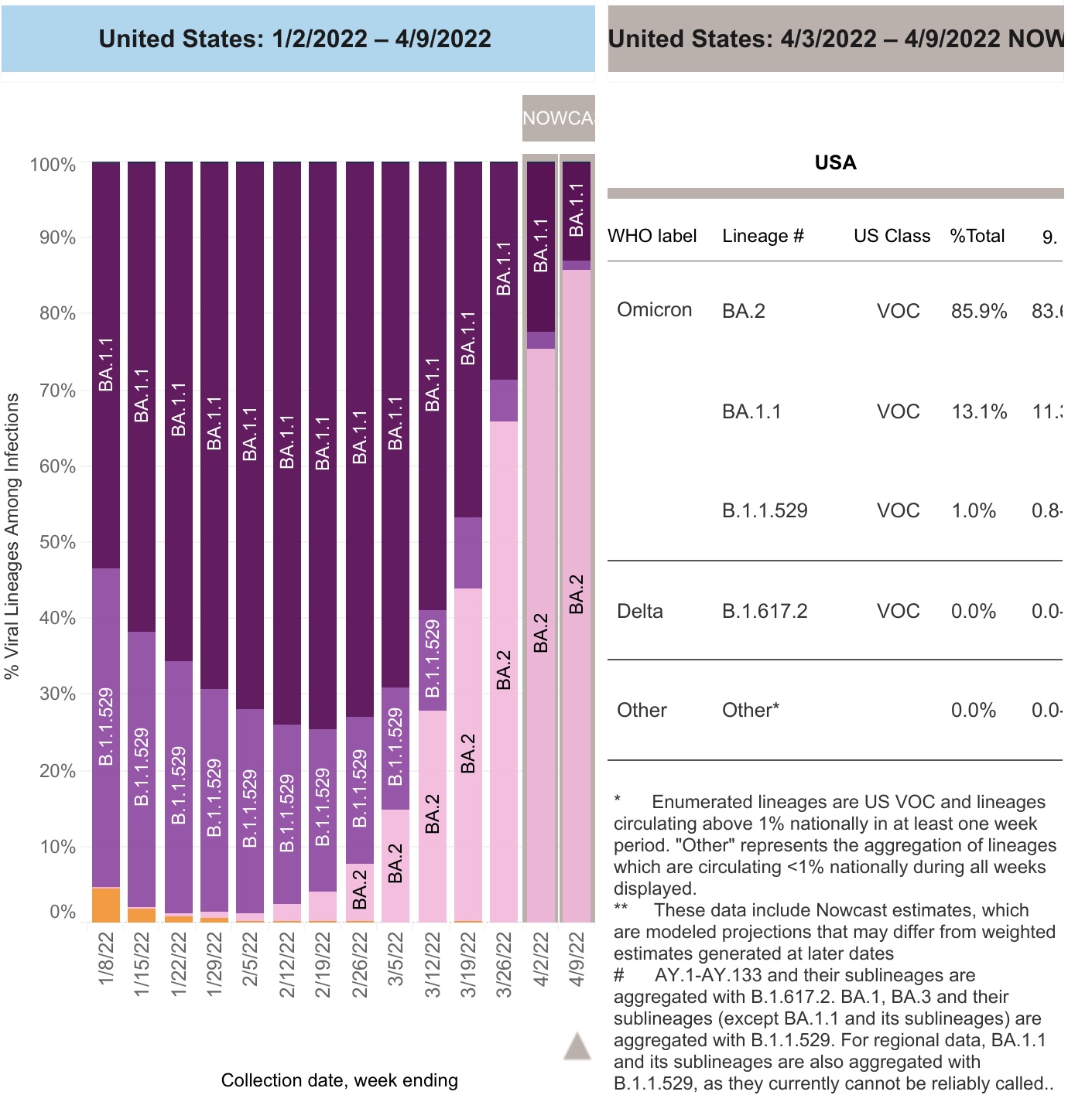
Yesterday the CDC updated their variant tracker, and for the first time included BA.2.12.1 as a separate subvariant. Here is their chart of variant proportions nationwide:


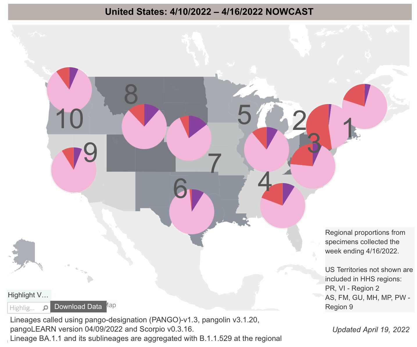
And here is the graph of the regional breakdowns:


Per the report, as of last week BA.2 and it’s subvariants constituted 93.4% of all US cases. BA.2.12.1 already constitutes 19% of all US cases (up from 3.3% just 3 weeks ago, and on a trajectory equal to that of the original BA.2). At its current rate of growth, BA.2.12.1 will be over 90% of cases in the US in just 5 weeks.

Regionally the BA.2 variants are 95% in the Northeast and over 90% along the West Coast. Further, BA.2.12.1 is already over half of all cases in NY and NJ:


Fortunately, Trevor Bedford, whose genetic work has been invaluable whenever new variants have appeared, weighed in yesterday after a three month silence. Here’s the most relevant portions of his thread:

 “Variant “fitness” will depend on intrinsic transmissibility and escape from existing population immunity…..  BA.2’s advantage over BA.1 appears to be due to intrinsic transmissibility…. [T]he one to watch just based on mutations is B.2.12.1 which has spike mutations S704L and L452Q on top of BA.2 background. Previously, L452R appeared to have an important role in promoting the spread of Delta and also showed up in Epsilon and Lambda…. The hypothesis is then that 452R/Q is conferring some additional intrinsic transmission advantage…. This sort of accumulation of mutations that drive further host adaptation and antigenic drift is my general expectation for evolution in the coming months. It’s possible we may have additional ‘Omicron-like’ events, but my baseline is this steady ‘flu-like’ scenario.”

In short, the template of Europe’s experience with BA.2 no longer holds for the US, because of the emergence of BA.2.12.1. The US itself is the new template.


Fortunately, we have the Northeast generally, NY and NJ more specifically, and even more specifically than that the counties of the Finger Lakes and Central regions of NY State as canaries in the coal mine.

In that regard, there is some good, or at least “less bad” news. While cases in both NY and NJ are still growing, the 7 day rate of growth in NY has decelerated from 45% one week ago to under 20%, and in NJ from 35% to 12%. It is even possible cases peaked in NJ several days ago:


Further, cases have peaked already in 8 of 14 counties in the Central and Finger Lakes regions of NY region. Here’s the graph of cases for the Central NY region, where cases bottomed on March 9, and rose to their peak on April 15, a little over 5 weeks later:


So here’s the paradigm going forward: using the “ground zero” regions of NYS as our new template, most likely cases will rise in each State until BA.2.12.1 reaches roughly 90% of all cases. We’ll get there in a couple of weeks in the Northeast, but only in about 2 months in the interior Deep South and Great Plains, where BA.2.12.1 is only about 3% of cases now. Nationwide cases began to rise 4 weeks after they did in Central New York, only two weeks ago. Thus the nationwide peak may come in about 3 to 5 weeks, by which time this new subvariant should be 90% of all cases. But in Central New York, cases tripled during their wave. A tripling of cases nationwide would be roughly 90,000.

Further, since organized public health strategies have all but disappeared in the US, the course of the pandemic will depend on the regularity of the emergence of more efficient strains. In the past 10 months, such new strains - Delta, Omicron BA.1, BA.2, and now BA.2.12.1 - have arisen about every three months. The only good news has been that the  death rate has continued to decline, as gradually the population as a whole develops a level of resistance due to vaccination and/or prior infection. 


Tuesday, April 19, 2022

Housing starts show continued strength in March, while single family permits indicate softness ahead


 - by New Deal democrat

The continued strength in total housing permits and starts shown in this morning’s report for March was surprising; but the series with the most signal and least noise, single family permits, betrayed weakness. 

While typically permits, especially single family permits, lead the series, in the past year, however, there has been a unique divergence between permits and starts, as supply shortages resulted in a delay in actually building houses that had been approved.

Housing authorized but not started increased to yet another 50+ year record last month, at 290,000: 


In 2021 permits soared then sank, while starts held much more steady, due to the above delay in the actual start of construction, as shown in the below graph of total housing starts (blue), total permits (gold), and single family permits (red, right scale) for the last 3 years:


A longer term look shows the continued growth in actual starts, while also showing underlying weakness in single family permits:


The three month average for starts is the highest since 2006. Note, by the way, that a similar thing happened several times in the past decade, notably in early 2014 and 2016, as potential buyers rush to close before rates climb even higher. 

Two months ago, I wrote that “after this surge, which may persist another month or so, I fully expect housing starts and permits to decline, and substantially, in accord with the big increase in mortgage rates to over 4%, about 1.3% above their 2021 lows.” In terms of starts, the surge has certainly persisted.

But this look at the YoY% change in starts (blue, averaged quarterly to cut down on noise) and single family starts (red), vs. the YoY change in mortgage rates (inverted, *10 for scale), shows that, while starts have held up, still 5% higher YoY, single family permits, now down -4% YoY, have not:


In the coming months, I still expect to see a substantial decline in permits. Ordinarily that would be a major negative long leading indicator. But actual construction starts are likely to continue to show strength until the near record backlog has been cleared. Since starts are the actual, hard economic activity, this indicates that housing is still going to make a positive to the economy looking out ahead 12 months.


In fairness, this is an amendment to what I wrote yesterday. Then I noted that there was no “pent-up demand” or “demographic tailwind” present anymore. That is true; but the backlog in construction due to supply shortages will delay any actual downturn affecting economic activity. 

Monday, April 18, 2022

The worst interest rate upturn since 1994 is likely to produce the worst housing downturn in over a decade


 - by New Deal democrat

No economic news of note today; but tomorrow we will see housing permits and starts for March, and on Wednesday existing home sales. So let’s take an important look at housing.

The recent increase in mortgage rates to over 5% is the most serious interest rate threat to housing in at least the past 30 years. As the below graph shows, the increase in over 2% is the biggest jump in mortgages since 1994:


But additionally, in 1994, when interest rates jumped from 6.75% to 9.25%, that was a 37% increase in monthly mortgage costs. The jump in the past year from 2.65% to 5.00% makes for an 89% increase in monthly costs. In other words, in 1994 a $1000/month interest payment jumped to $1370; in the past year a $1000 payment would jump to $1890!

And housing is very responsive to mortgage payments. Here’s a graph I have run many times before: the YoY change in mortgage rates (inverted, so that an increase in rates shows as a decrease; and *10 for scale), compared with the YoY% change in housing permits. Typically I only run this graph for the last 10 years; this time I’m taking it all the way back to before 1994:


The YoY change in mortgage interest rates now has only been matched by the 1994 change. In response, in 1995 housing permits were down -10% YoY, and 15% from peak to trough, as shown in the graph below of permits for the last 30 years:


The question, of course, is a 10% YoY decline from where. From the recent 1.9M high, the 1.6M low last summer, or somewhere in between? If the decline is 15%, as in 1994, that would take us back down to 1.7M permits. 

And I do expect a downturn. In 2013-14, there was less of a downturn than would be typically expected, partly because of pent-up demand from the Housing Bust, and partly due to the demographic tailwind of the Millennial generation reaching home-buying age. Neither of those buffers exist any more.

Because of the effect on monthly interest payments, as discussed above, I suspect it will be worse. And that would almost certainly have enough impact on the economy next year to put us close to if not in a recession, all by itself. 

Sunday, April 17, 2022

Paul Krugman on the Great Illusion of economic rationality and war — in 2008


 - by New Deal democrat

Paul Krugman wrote an article this past week about how free trade can enable authoritarians, and how Russia’s invasion of Ukraine may be putting an end to globalization. I went looking for an excerpt that wasn’t behind a paywall, and look what I found instead: the below article from Krugman in 2008, helpfully copied in the old Economist’s View blog.


In retrospect, it is an amazing read. I’ve highlighted In bold portions of particular interest.
——

“Is the ‘second great age of globalization’ about to end?”

The Great Illusion, by Paul Krugman, Commentary, NY Times: So far, the international economic consequences of the war in the Caucasus have been fairly minor, despite Georgia’s role as a major corridor for oil shipments. But as I was reading the latest bad news, I found myself wondering whether this war is an omen — a sign that the second great age of globalization may share the fate of the first. 

If you’re wondering what I’m talking about,... our great-great grandfathers lived, as we do, in a world of large-scale international trade and investment... Writing in 1919,... John Maynard Keynes described the world economy ... on the eve of World War I. “The inhabitant of London could order by telephone, sipping his morning tea in bed, the various products of the whole earth ... he could at the same moment and by the same means adventure his wealth in the natural resources and new enterprises of any quarter of the world.” 

And Keynes’s Londoner “regarded this state of affairs as normal... The projects and politics of militarism and imperialism, of racial and cultural rivalries, of monopolies, restrictions, and exclusion ... appeared to exercise almost no influence at all on ... internationalization ... which was nearly complete in practice.” 

But then came three decades of war, revolution, political instability, depression and more war. By the end of World War II, the world was fragmented economically as well as politically. And it took a couple of generations to put it back together. 

So, can things fall apart again? Yes, they can. 

Consider ... the current food crisis. For years we were told that self-sufficiency was ... outmoded..., that it was safe to rely on world markets for food supplies. But when the prices of wheat, rice and corn soared, Keynes’s “projects and politics” of “restrictions and exclusion” made a comeback: many governments rushed to protect domestic consumers by banning or limiting exports, leaving food-importing countries in dire straits. 

And now comes “militarism and imperialism.” ...[T]he war in Georgia ... mark[s] the end of the Pax Americana — the era in which the United States more or less maintained a monopoly on the use of military force. And that raises some real questions about the future of globalization. 

Most obviously, Europe’s dependence on Russian energy, especially natural gas, now looks very dangerous... After all, Russia has already used gas as a weapon...

And if Russia is willing and able to use force to assert control over its self-declared sphere of influence, won’t others do the same? Just think about the global economic disruption that would follow if China ... were to forcibly assert its claim to Taiwan. 

Some analysts tell us not to worry: global economic integration itself protects us against war,... successful trading economies won’t risk their prosperity by engaging in military adventurism. But this, too, raises unpleasant historical memories. 

Shortly before World War I another British author, Norman Angell, published ... “The Great Illusion,” in which he argued that war had become obsolete, that in the modern industrial era even military victors lose far more than they gain. He was right — but wars kept happening anyway. ...

Most of us have proceeded on the belief that ... we can count on world trade continuing to flow freely simply because it’s so profitable. But that’s not a safe assumption. 

Angell was right to describe the belief that conquest pays as a great illusion. But the belief that economic rationality always prevents war is an equally great illusion. And today’s high degree of global economic interdependence, which can be sustained only if all major governments act sensibly, is more fragile than we imagine.

___

Fourteen years later, I wonder if Krugman himself even remembers writing this.

For years I have been pounding on the theme Krugman relates in the second to last sentence of the article:
“the belief that economic rationality always prevents war is an equally great illusion.”

Economic rationality is an assumption. And it’s an assumption that is only approximately correct if you have a large set of economic decision-makers, whose decisions fall along a typical distributional curve, with its center on the most “rational” decision. Once you have a more limited set of decision-makers, some of whom have market power, now the market is only as “rational” as those individual decision-makers. 

Further, the assumption is that people will pursue their preferences. You’re a vegetarian, I like beef. Economic rationality does not assert that either you or I have to change our preferences.

One hundred years ago, the monarchs of Central Europe were the decision-makers who counted, and what they wanted was to expand their influence into one another’s territory. It would have been meaningless to explain to Kaiser Wilhelm II, who was the only relevant decision-maker in Germany, that spending Germany’s treasury on a military build-up was economically wasteful. He pursued his preference.

Now Vladimir Putin, who is the only decision-maker who counts in Russia, has decided that Ukraine does not deserve a separate existence.

In 2008, Krugman was powerfully prescient. And yet how much folly has been loosed by  the modern neoliberal assertion that free trade is always good?

Saturday, April 16, 2022

Weekly Indicators for April 11 - 15 at Seeking Alpha


 - by New Deal democrat

My Weekly Indicators post is up at Seeking Alpha.

There was good news and bad news this week.

The good news is that the yield curve decisively un-inverted this week. The bad news is that it happened because Treasury yields at the long end rose to close to 5 and 10 year highs, reflected in mortgage rates tied for 10 year highs. This is going to wreak havoc in the housing market.

As usual, clicking over and reading will bring you up to the virtual moment on all of the important economic trends. Also as usual, it will reward me just a little bit for the effort I put in to producing the report.

Friday, April 15, 2022

Real aggregate payrolls and sales


 - by New Deal democrat

There seems to be some pushback against the narrative that real wages have declined, based on compositional effects (lower pay occupations vs. higher pay occupations). While some of that is true (for example, 5/6’s of all leisure and hospitality losses have been recovered, vs. 3.4% actual job *gains* since February 2020 in professional and business services; and a 91% rebound among total payrolls) - it is far less a factor than it was 18 or even 12 months ago.

Another way around that is to look at *aggregate* payrolls, particularly for nonsupervisory employees. This takes out the distortions introduced by outsized pay increases for the bosses, and also takes into account the total hours of pay earned in the economy. Since aggregate real payrolls are also a good, fundamentals based coincident indicator for the economy as a whole, let’s take a look at them, and compare them with the consumption side as represented by real retail sales.

Here is the YoY% change in both real aggregate retail sales (blue) vs. real aggregate payrolls over 3 time periods going back 75 years:

1948-1994 (old retail sales index):


1994-2020 (new index, pre-pandemic):


2020-present (pandemic era):


In general, although both are noisy, real sales slightly lead (by several months) real aggregate payrolls, with the one notable exception of the late 1990s tech boom.

As I noted yesterday, a YoY decline in real retail sales has been a very reliable indicator of an oncoming recession during the past 75 years. YoY real aggregate payrolls have generally turned down right at the beginning of the recession itself. Thus the YoY decline in March in real sales would ordinarily be very concerning. I am discounting it somewhat because it is in comparison with the March and April 2021 stimulus splurge. If the YoY decline were to continue into May, that would be a very real concern.

For now, as shown in the graph below, real aggregate nonsupervisory payrolls are up 2.6% from one year ago, and the trend has been higher:


While the consumer may not be as strong as they were a year ago, they aren’t rolling over yet either.


The production side of the economy remained solid in March


 - by New Deal democrat

Industrial production, the King of Coincident Indicators, increased in March by 0.9%. February was also revised higher by 0.4%, but January was revised lower by the same percentage, for a wash. Manufacturing production also  increased 0.9%. Total production thus made another new record high, while manufacturing is still below its record levels of 2007 and early 2008:


On a YoY basis, total production is up 5.5%, while manufacturing is up 5.2%. Compared with the last 50 years, and particularly the last 20, this continues to be solid growth:


Of course, industrial production still lags when it is compared with either population growth or GDP growth over the past 25 years (i.e., the China shock is still very impactful).

But still, in summary, while there may be some weakening of the consumer side of the economy, as we saw with yesterday’s real retail sales number, the production side of the economy continues to perform well.

Thursday, April 14, 2022

Real retail sales in March continue to show a weaker consumer sector, forecast weaker jobs reports and GDP


 - by New Deal democrat

For the past few months, I have suspected that a sharp deceleration beginning with the consumer sector of the economy was more likely than not. The retail sales report for March was consistent with that suspicion.

Nominally retail sales rose +0.5% in March, but since consumer prices rose 1.2%, real retail sales declined -0.7%. Further, they are up only 0.2% from last May (using that month because March and April were the stimulus months): 


Typically a YoY decline in real retail sales is a recession indicator. Since compared with last March, sales were down -1.5%:


ordinarily I would be worried. But since last March and April were temporary post-stimulus spending sprees, I think the comparison with last May is a better one.

Thus the big takeaway is that real retail sales have been esssentially flat beginning last May. That’s not recessionary, but it’s not good either. In other words, this report remains consistent with a slowdown in the consumer sector of the economy.

Next, let’s turn to employment, because real retail sales are also a good short leading indicator for jobs.

As I have written many times over the past 10+ years, real retail sales YoY/2 has a good record of leading jobs YoY with a lead time of about 3 to 6 months. That’s because demand for goods and services leads for the need to hire employees to fill that demand.  The exceptions have been right after the 2001 and 2008 recessions, when it took jobs longer to catch up, as shown in the graph below, averaged quarterly through last month: 

Through February recently the two have been in near-perfect sync, at roughly +4.5% YoY. With real retail sales now essentially flat for the last 10 months, I continue to expect the string of monthly jobs reports averaging 500,000 or more will end in several more months. Whether we get a negative print at some point before the end of summer will depend on whether sales continue to go sideways, improve, or deteriorate.

Finally, real retail sales per capita is one of my long leading indicators. Here’s what it looks like for the past 30 years:


These are down -2.7% since last April, and down -0.6% since last May, although unlike the year immediately before both of the last two recessions the trend is also higher by +1.6% since last July. On a mechanical basis this remains a negative signal, and continues to reinforce the long leading forecast of a stall or near-stall in the economy by about the end of this year.


Jobless claims: the employment sector of the economy continues to do just fine


 - by New Deal democrat

[Note: I’ll comment on this morning’s retail sales report for March separately]

Initial jobless claims rose 18,000 to 185,000 from their 50+ year last week. The 4 week average rose 2,000 from last week’s all-time low to 172,250. Continuing claims declined -48,000 this week to 1,475,000, a new 50 year low (but still higher than the 1960s):


Essentially nobody is getting laid off. We’re still about 1.6 million shy of “full employment,” by my calculation, but with that exception, the jobs part of the economy is doing just fine.


Wednesday, April 13, 2022

Coronavirus dashboard for April 13: watching the BA.2 “bump”


 - by New Deal democrat

The BA.2 “bump” (h/t Dr. Eric Topol) is upon us (and hopefully a “bump” is all it is). Let’s take a look at where we stand.


Cases bottomed 8 days ago at 28,378. As of yesterday they had increased to 32,835:


Hospitalizations have continued to decline, and at 9859 are the lowest since March 2020 when the pandemic was just beginning:


Deaths are at 527, just above their 10 month low of 498 the previous day. Only in June and July 2021 have deaths been lower than this. The below graph shows the long term view of both deaths (bold line) and cases (thin line), scaled separately:


Each successive wave has been *relatively* less lethal (i.e., deaths vs. cases) than the previous one, with the exception (slightly) of Delta last summer. Note there was a slight increase - a “bump” in Topol’s terminology - last April, during Alpha, that was focused on Michigan.

I suspect this is because ever increasing percentages of the population have been  vaccinated and/or infected, priming the body’s immune system for a better response.

The CDC reported yesterday that as of last week BA.2 accounted for 86% of all new infections:


Regionally, in the Northwest and Southwest BA.2 is 88% of new cases; in the upper Midwest it is 84%; in New England it is 90%; and in NY and NJ it is 92%:


Here’s what the level of new cases looks like broken down by Census Region:


As you can see, cases are rising in every region (except for the South, where the last few days’ increase is due to a data dump by Texas - otherwise it is still decreasing). Cases started increasing in the Northeast first, 4 weeks ago, and that region has the biggest increase.

Because BA.2 started earlier and has been furthest along in the Northeast, and because in Europe BA.2 cases have typically peaked once BA.2 in the country reached 90% of all cases, here is a more detailed breakdown of the Northeastern States over the past 8 weeks:


So far there is no sign of BA.2 peaking in any of those States. Since in European countries the turnaround tended to occur quickly, as in within a week, hopefully we will start to see signs of a peak in some Northeastern States shortly.

Tuesday, April 12, 2022

March consumer inflation part 2: I told you so; the Fed *must* start paying attention to house price indexes


 - by New Deal democrat

This is the second part of my take on the March consumer inflation report.


As you may have already read, total inflation clocked in at +1.2% for March alone! YoY consumer prices are up 8.6%, the highest 12 month rate since 1981. As anticipated, gas prices were a huge contributor; less energy, prices were up 0.4%; less both food and energy they were only up 0.3%:


The spike in gas prices may be - to use a recently dreaded word - transitory. In the past 4 weeks, gas prices are down 5%; as of this morning oil prices, which had been as high as $123/barrel on March 8, are back under $100.

There was some small good news in one sector: the price of used cars and trucks fell -3.8% in March:


 but prices are still up 35% YoY:


And of course, used vehicle prices are down because they have become unaffordable for enough people that sales of such vehicles has also turned down.

But I want to focus on the housing component of CPI, which constitutes over 33% of the total input. There, both rent, and the much larger CPI component of owner’s equivalent rent, which is how house prices are figured into inflation, rose 0.4% for the month, and are up 4.4% and 4.5% YoY, respectively. This is the highest YoY rate of housing inflation for either measure since 2002.


Further, I fully expect the housing component of inflation to continue to worsen considerably. That’s because, as I first pointed out half a year ago, the major house price indexes - the FHFA index and the Case Shiller index - lead owners equivalent rent by roughly 12 to 24 months, particularly in major moves.

The below graph shows the YoY% change in both house price indexes in shades of blue, compared with the YoY% changes in the CPI measures of rent of primary residence, and owners’ equivalent rent in shades of red:


There have been 3 major pulses of house price increases in the last 25 years: in 1997-98, 2004-06, and 2020-present. In each case, after roughly a 12-24 month lag, both CPI rent measures surged as well. That’s because big surges in house prices make renting more attractive (or necessary for those on more limited budgets); this drives more demand for apartments, which drives rent increases. And the current rise in house prices of nearly 20% YoY, is significantly worse than either of the previous two. With CPI housing inflation already at a 20 year high, we can further record CPI housing increases as this year progresses.

As I have also pointed out before, before owners equivalent rent is fully passed through into CPI, total inflation has normally cooled, as shown in the graph below:


But that is because, faced with surging inflation, the Fed has embarked on a series of rate hikes (shown in black above) that culminated before owners equivalent rent peaked. The economy buckled, recessions started, and total inflation subsided as a result, before owners equivalent rent had fully peaked.

Unfortunately, even after the record surge in house prices was in full swing over a year ago, the Fed stayed on the sidelines. Now rents, and owners’ equivalent rents, are surging as well, and the Fed has only made one 1/4 point rate hike. Now the Fed is almost certainly going to stomp on the brakes, with a hard landing to follow.

It’s too late for this cycle. But with three examples of surging house prices feeding through with a delay into the CPI in the past 25 years, in the future the Fed simply *must* pay attention to house prices as reflected in those indexes. Better a small tamping down of the economy early than a major sudden stop later.

March consumer inflation part 1: real wages decline sharply


 - by New Deal democrat

The March consumer inflation report was particularly important, and particularly bad. So much so that I am going to divide my comments into two separate posts.


First, the news on real wages was terrible. While nominally nonsupervisory wages rose 0.4% in March, since inflation rose 1.2%, “real” wages declined -0.8% in March alone. On a YoY basis, real wages were down -1.8%:


Aside from the outset of the pandemic during April and May 2020, this is the worst number since 2011, and one of the 4 worst months since 1991.

Further, on an absolute scale, real wages were the lowest since March 2020; they were also down -1.6% since July 2020:


Finally, real aggregate payrolls are only up 1.5% YoY, and only up 0.3% in the past 7 months. Since real aggregate payrolls turning negative YoY is frequently something that happens shortly before recessions (and likely is a causative agent), although there are some false positives, this is also not good news:


We really need real wages to turn up. But the signs are not good that inflation may abate in the absence of the Fed slamming on the brakes. I’ll discuss that separately in part 2 of this update.

Monday, April 11, 2022

Housing affordability update: prices vs. mortgage payments; and ramifications for the economy


 - by New Deal democrat

No economic news today, and most States didn’t report new COVID cases over the weekend, so let’s take a look at something else; namely, housing affordability, which I’ve been meaning to update for several weeks.


The first graph below compares 4 measures of house prices: the FHFA purchase index, the Case Shiller national index, and the Census Bureau’s measures of median prices for new and all houses sold. The best way to get to the “real” inflation adjusted cost of housing would be to divide by median household income, but since that is only officially calculated once a year, a good monthly proxy is average hourly wages, which is what I use below. All 4 measures are normed to 100 as of January 2006, at or close to the peak of the housing bubble for all of them:


You can see that all 4 are at, close to, or even higher than they were at their bubble peaks. They range from 94.7% for Case Shiller to 104.9% for median new home prices.

While the NAR doesn’t permit FRED to publish historical data on the median price for existing home sales, their most recent report for February lists that price as 357,300. The median in January 2006 was 217,400. That’s a 64% increase. Since average hourly wages have increased 65% in the same period, that means that the “real” price of existing homes now is virtually identical to what they were at the peak of the bubble.

But if prices are equal to their bubble peaks, the story is different with mortgage rates. In 2006, they got as high as 6.8% in July, and were 6.51% in April. By contrast, the most recent weekly update pegs a 30 year fixed rate mortgage at 4.72%; the daily update has the rate at 5.08% - nearly tied for a 10 year high:


Since house prices in real terms are almost identical to their 2006 highs, let’s compare a $250,000 mortgage then and now at the prevailing mortgage rates. Here’s the monthly payment for each:

April 2006: $1865.
July 2006: $1913.
April 2022: $1583.

The bottom line is that the average monthly mortgage payment now is a little over 80% in real, wage-adjusted terms, of what it was at the peak of the bubble.

I do not expect prices and mortgage rate to continue to rise together, as they did up until the peak of the bubble. That’s because what made the bubble was the reckless “fog the mirror” mortgages, sold to just about anybody, bundled into phony “AAA-rated” mortgage bonds, and in turn sold to equally reckless “investors.” 

Lending is much more responsible now. So if mortgage rates increase, I expect sales to tumble, followed in pretty quick succession by prices.

Let me close by updating one of my favorite housing graphs, comparing the YoY change in mortgage rates, (inverted, *10 for scale) with the YoY% change in housing permits and starts:


Mortgages are about 1.5% higher than they were a year ago, the biggest YoY change in 10 years. A 15% YoY decline in housing permits and starts would hardly be surprising, and a 10% decline seems almost certain. Such a decline will be a big negative for the economy going forward into 2023.