Wednesday, May 17, 2017
Housing permits and starts: hint of an autumn chill in the air?
- by New Deal democrat
Yesterday morning's report on April housing permits and starts disappointed. Does the report have wider significance?
This post is up at XE.com.


Tuesday, May 16, 2017
Is the "rental affordability crisis" abating?
- by New Deal democrat
Three years ago HUD warned of "the worst rental affordability crisis ever," citing statistics that
About half of renters spend more than 30 percent of their income on rent, up from 18 percent a decade ago, according to newly released research by Harvard’s Joint Center for Housing Studies. Twenty-seven percent of renters are paying more than half of their income on rent.This is a serious real-world issue. I have been tracking rental vacancies, construction, and rents ever since. The Q1 2017 report on vacancies and rents was released several weeks ago, so let's take an updated look.
The bottom line is that rent increases have stopped in the last year, and with increased wages, the effect is that rent has become a little more affordable. Median asking rent was unchanged at $864 in the first quarter of 2017, and is actually down $6 from $870 YoY, a decrease of -0.75%. Median asking rent has not made a new high in a year, as you can see in the below graph:

Here is an updated look at real. inflation adjusted median asking rents, which similarly show that after setting an all-time record in Q1 2016, rent pressures on household budgets have abated just a bit:
While vacancies remain tight, the vacancy rate appears to have bottomed over the last two years, so while there is still stress, the level of stress is decreasing a little:
| Year | Median Asking Rent | Usual weekly earnings | Rent as % of earnings | |
|---|---|---|---|---|
| 1988 | 330 | 382 | 86 | |
| 1992 | 401 | 437 | 92 | |
| 1993 | 422 | 450 | 88 | |
| 2000 | 478 | 568 | 84 | |
| 2002 | 545 | 607 | 90 | |
| 2004 | 599 | 629 | 95 | |
| 2009 | 680 | 739 | 92 | |
| 2012 | 717 | 768 | 93 | |
| 2013 | 734 | 778 | 94 | |
| 2014 | 762 | 791 | 96 | |
| 2015 | 813 | 809 | 100 | |
| 2016 H1 | 859 | 826 | 104 | |
| 2016 Q3 | 842 | 835 | 101 | |
| 2016 Q4 | 864 | 843 | 102 | |
| 2017 Q1 | 864 | 865 | 100 | |

It is worthwhile to note that the CPI for owner's equivalent rent, the major component of inflation, remains near the highest levels in a decade, although it has backed off a little in recent months:

There are two other median measures in addition to median asking rent from the HVS: the American Community Survey and the Consumer Expenditure Survey. Unfortunately both are only current through 2015. The below table shows their YoY increases, compared with median asking rent:
SURVEY: ACS CES HVS
2009 -------- (817) ------- ------ (708)
2010 +2.9% (841) +1.4% +2.6% (698)
2011 +3.6% (871) +4.4% -0.6% (694)
2012 +2.1% (889) +5.2% +3.3% (717)
2013. +1.7% (904) +4.3% +2.4% (734)
2014 +1.8% (920) +9.2% +3.8% (762)
2010 +2.9% (841) +1.4% +2.6% (698)
2011 +3.6% (871) +4.4% -0.6% (694)
2012 +2.1% (889) +5.2% +3.3% (717)
2013. +1.7% (904) +4.3% +2.4% (734)
2014 +1.8% (920) +9.2% +3.8% (762)
2015 +0.9% (928) +4.3%* +6.7% (813)
*June 2014-June 2015 all shelter.
Finally , HUD recently premiered a Rental Affordability Index,, using the ACS data. Similar to my chart above, it compares median renter income with median asking rent. Please note, however, that this has only been updated through Q4 of last year:
Finally , HUD recently premiered a Rental Affordability Index,, using the ACS data. Similar to my chart above, it compares median renter income with median asking rent. Please note, however, that this has only been updated through Q4 of last year:
Like the median household income data, this shows renters' income bottoming out in 2011-12, and rising since relative to rents as calculated by the ACS.

That gives us the "renatl affordability index" shown below:
.

.
I'm not sold on HUD's method, mainly because it relies upon annual data released with a lag. In other words, the entire last year plus is calculated via extrapolation. I suspect we could get much more timely estimates using Sentier's monthly median household income series, compared with the monthly rental index calculated by Zumper.
But regardless of which method we use, while it continues to appear that apartment rents as a share of renter income are quite high, the crunch has prbably passed peak, and the "rental affordability crisis" appears to be abating at least a little.
Saturday, May 13, 2017
Weekly Indicators for May 8 - 12 at XE.com
- by New Deal democrat
My Weekly Indicators column is up at XE.com. This week is "steady as she goes."
Friday, May 12, 2017
This week's jobs and real wage reports continue to show late cycle improvement
- by New Deal democrat
Let's catch up on some of the jobs information we got this week.
I seem to be nearly alone in my analysis that JOLTS reports from the last year have been largely underwhelming. The report for March, released earlier this week, doesn't change my opinion.
My perennial complaint has been that job openings aren't necessarily real, and that the more important metric is actual hires. But now, both are going sideways:

Here's the YoY view, showing the complete lack of progress in the past year:

This looks very late cycle to me.
The story is only a little better on Quits, which have also flattened out:

But quits haven't turned down YoY:

Taken together, this looks very much like the "mature" expansion as of 2006.
Turing to the Labor Market Conditions Index, it has recently turned up:

Last year never got negative enough for me to be really concerned. The recent strength is inconsistent with any imminent downturn in the economy.
Finally, yesterday I wrote that the recent downturn in gas prices appeared to herald at least a mild resurgence in real wage growth. This morning's CPI report means that wages for average American workers rose slightly more than inflation last month, i.e., real wages grew slightly. to a level less than 0.1% under last July's high:
I seem to be nearly alone in my analysis that JOLTS reports from the last year have been largely underwhelming. The report for March, released earlier this week, doesn't change my opinion.
My perennial complaint has been that job openings aren't necessarily real, and that the more important metric is actual hires. But now, both are going sideways:
Here's the YoY view, showing the complete lack of progress in the past year:
This looks very late cycle to me.
The story is only a little better on Quits, which have also flattened out:
But quits haven't turned down YoY:
Taken together, this looks very much like the "mature" expansion as of 2006.
Turing to the Labor Market Conditions Index, it has recently turned up:
Last year never got negative enough for me to be really concerned. The recent strength is inconsistent with any imminent downturn in the economy.
Finally, yesterday I wrote that the recent downturn in gas prices appeared to herald at least a mild resurgence in real wage growth. This morning's CPI report means that wages for average American workers rose slightly more than inflation last month, i.e., real wages grew slightly. to a level less than 0.1% under last July's high:

We've had some signs of consumer retrenchment in the last few months, but that may be passing, as evidenced by the increase in real retail sales also reported this morning:

The overall picture remains that of a late cycle expansion.
Thursday, May 11, 2017
Real wage growth looks set to resume
- by New Deal democrat
Since nominal nonsupervisory wages have been growing at a rate of between 2.2%-2.6% for the last 18 months, all of the variation in *real* wages has been because of changes in the rate of inflation. And that, in turn, has been primarily due to changes in the price of gas:

When gas prices plummeted beginning in late 2014, real wages started to rise. When gas prices started to rise again one year ago, real wages went flat, and even declined a little.
This lack of real wage growth is the prime culprit behind the recent downturn in spending, as measured both by real retail sales, and real personal consumption expenditures:

That looks likely to change, and for the same reason: gas prices.
In the last several months, oil prices at first flattened, and in the last several weeks have turned down significantly:

Oil prices are actually *down* now YoY.
Gas prices aren't negative YoY at this point, but have also started down (h/t GasBuddy):

As I've pointed out numerous times over the last few years, gas prices are the chief determinant in the variance in the headline inflation rate. In the below graph, I've divided the change in gas prices by 16, and subtracted -1.8% for the typical underlying core inflation rate, for the last 20 years:

The relationship isn't perfect, but it's pretty darn good.
Note the recent deceleration in YoY gas prices, now up only about 7%. That translates to a continued abatement in YoY inflation to just a little over 2%. And that doesn't even count the effect of the downdraft in oil prices last week.
In short, the downturn in oil prices suggests that at least mild real wage growth is about to resume.
Tuesday, May 9, 2017
Credit conditons eased up slightly in Q1
- by New Deal democrat
Yesterday the Senior Loan Officer Survey results for Q1 were reported, validating the much more timely weekly forecasting of the Chicago Fed Financial Conditions indexes.
This post is up at XE.com.
Monday, May 8, 2017
Strong growth in labor force participation is correlated with weak realwage growth
- by New Deal democrat
Prof. Jared Bernstein has a piece in the Washington Post today (and at his blog) noting that, even with much improved unemployment and underemployment rates, wage growth is still subpar.


One item I wanted to add to the conversation is the inverse correlation between the prime age labor force participation rate and wage growth. As I I've pointed out several times in the last few months, most recently on Friday, more than 1% of the prime working age population has left the sidelines and entered the workforce since the beginning of 2016. This surge of participation has only been equalled twice in the last 30 years -- in 1989 and 1995, as shown in the graph below:
In terms of supply and demand, this surge in participation means a big increase in the supply of potential workers. If the demand for labor has not changed materially, then we ought to expect lower wages to be paid to the new workers hired than would otherwise be the case.
So I created a scatterplot, shown below, of the YoY% change in prime wage labor force participation (left scale) vs. the YoY% change in real wages (bottom scale), averaged quarterly:
While in the middle part of the range, there does not appear to be any relationship, at the more extreme parts of the range, there clearly is. Big increases in real wages (the far right of the graph) only happen in situations where there is a decline in labor force participation, or at best a slight increase. Similarly, big decreases in real wages only happen when there is a big increase in labor force participation.
In short, while correlation does not necessarily mean causation, it certainly looks like the surge in labor force participation we have seen since the beginning of last year is part of the reason why nonsupervisory wages have grown so meagerly.
Saturday, May 6, 2017
Weekly Indicators for May 1 - 5 at XE.com
- by New Deal democrat
My Weekly Indicators post is up at XE.com.
Despite some flat or faltering monthly data, we are down to only 3 negative high frequency indicators.
Friday, May 5, 2017
Just How Economically Clueless is Ed Morrissey? Pretty Darn Clueless
Once again, ol' Ed has written about the jobs report. And, as usual, he complains about the "status quo" job growth that is unimpressive.
Overall, this looks like pretty good news, but not spectacular and probably not a sign of a coming boom — yet, anyway. Excluding the big miss in March, it’s the weakest report in 2017 by a slight amount, and not a large amount over the maintenance rate for population growth (~125-150K). It’s certainly better than last month, and better than the last quarter of 2016, but it’s not gangbusters
But that's not what the averages say:

Overall, this looks like pretty good news, but not spectacular and probably not a sign of a coming boom — yet, anyway. Excluding the big miss in March, it’s the weakest report in 2017 by a slight amount, and not a large amount over the maintenance rate for population growth (~125-150K). It’s certainly better than last month, and better than the last quarter of 2016, but it’s not gangbusters
But that's not what the averages say:

The chart above shows the average 3, 6 and 12 month rate of change in total establishment jobs. The current pace has gone on longer than the Bush expansion (which I'm sure Ed argued was the greatest thing since sliced bread) while maintaining a similar pace. The current expansion's levels are slightly below the pace of the previous 2 expansion.
So, we know (once again) that Ed really doesn't know much about economics. But that wont' stop him from writing about.
Scenes from the employment report
- by New Deal democrat
As I described in my detailed post on the April jobs report, below, almost everything moved in the right direction, and significantly so. Let me lay out a few graphs to show the longer-term stronger and weaker points.
In the good news department, the U6 underemployment rate has been falling at a good clip in the last few months, and at 8.6%, is about 0.6% from representing a reasonably "full" employment situation:

Part of the U6 calculation is those employed part time for economic reasons. This isn't down to normal yet, but continues to make good progress:

What is particularly good news is that both the U3 and U6 un- and under-employment rates are falling, even though people in the prime working age demographic are coming off the sidelines in substantial numbers:

The only other times in the last 30 years there has been a 1%+ increase in prime age labor force participation (red line above) were 1988 and 1995.
This *relatively* stout increase in participation is probably an important reason why nominal YoY wage gains for nonsupervisory workers have stalled:
This *relatively* stout increase in participation is probably an important reason why nominal YoY wage gains for nonsupervisory workers have stalled:

Finally, we still have about 1 million or more people who aren't even bothering to look for work, but would like a job now:

This equates to roughly 0.7% of the prime age population.
In sum, we still need to move this +0.7% off the sidelines and into actual employment, and also add another +0.6% or so from underemployment to complete employment before we can say that the the economy is operating at "full employment." And we are almost 8 years out from the beginning of this expansion, and probably a lot closer to the beginning of the next downturn. This is simply not an economy that in secular terms is working for the average American.
In sum, we still need to move this +0.7% off the sidelines and into actual employment, and also add another +0.6% or so from underemployment to complete employment before we can say that the the economy is operating at "full employment." And we are almost 8 years out from the beginning of this expansion, and probably a lot closer to the beginning of the next downturn. This is simply not an economy that in secular terms is working for the average American.
April jobs report: a blowout -- except (sigh) for wages
- by New Deal democrat
HEADLINES:
- +211,000 jobs added
- U3 unemployment rate down -0.1% from 4.5% to 4.4%
- U6 underemployment rate down 0.3% from 8.9% to 8.6%
Here are the headlines on wages and the chronic heightened underemployment:
Wages and participation rates
- Not in Labor Force, but Want a Job Now: down -74,000 from 5.781 million to 5.707 million
- Part time for economic reasons: down -281,000 from 5.553 million to 5.272 million
- Employment/population ratio ages 25-54: up +0.1% from 78.5% to 78.6%
- Average Weekly Earnings for Production and Nonsupervisory Personnel: up $.06 from $21.90 to $21.96, up +2.3% YoY. (Note: you may be reading different information about wages elsewhere. They are citing average wages for all private workers. I use wages for nonsupervisory personnel, to come closer to the situation for ordinary workers.)
Holding Trump accountable on manufacturing and mining jobs
Trump specifically campaigned on bringing back manufacturing and mining jobs. Is he keeping this promise?
Trump specifically campaigned on bringing back manufacturing and mining jobs. Is he keeping this promise?
- Manufacturing jobs rose by +6,000 vs. the last severn years of Obama's presidency in which an average of 10,300 manufacturing jobs were added each month.
- Coal mining jobs rose by +200 vs. the last severn years of Obama's presidency in which an average of -300 jobs were lost each month
The more leading numbers in the report tell us about where the economy is likely to be a few months from now. These were positive with one exception.
- the average manufacturing workweek rose +0.1 from 40.6 hours to 40.7 hours. This is one of the 10 components of the LEI.
- construction jobs increased by +5,000. YoY construction jobs are up +173,000.
- temporary jobs increased by +5,800.
- the number of people unemployed for 5 weeks or less increased by +1,000 from 2,334,000 to 2,335,000. The post-recession low was set nearly 18 months ago at 2,095,000.
Other important coincident indicators help us paint a more complete picture of the present:
- Overtime fell -0.1 from 3.3 to 3.2 hours.
- Professional and business employment (generally higher- paying jobs) increased by +39,000 and is up +612,000 YoY.
- the index of aggregate hours worked in the economy rose by 0.5 from 106.3 to 106.8
- the index of aggregate payrolls rose by +0.7 from 132.8 to 133.7 .
Other news included:
- the alternate jobs number contained in the more volatile household survey increased by +156,000 jobs. This represents an increase of 2,128,000 jobs YoY vs. 2,237,000 in the establishment survey.
- Government jobs rose by +17,00.
- the overall employment to population ratio for all ages 16 and up rose +0.1% from 60.1% to 60.2 m/m and is up +0.5% Yo Y.
- The labor force participation rate fell -0.1% m/m and is up +0.1% YoY from 62.8% to 62.9%.
SUMMARY
This was an excellent report in almost all respects. Not only were the headlines very positive, but so were most of the internals. Hours rose, aggregate payrolls rose, and the employment to population ratio continue to rise as well. People are coming off the sides maybe not in droves but pretty vigorously -- and they are finding jobs. Involuntary part-time employment is declining sharply.
There were a few pockets of softness, in short-duration employment, which hasn't made a new low in 18 months, and those outside of the labor force but who want a job, which also hasn't made meaningful progress in nearly 4 years (although recently it has declined sharply as well). The labor force participation rate also declined this month.
The other soft spot remains wages, which are only up +2.3% in nominal terms for nonsupervisory workers. This is probably in part due to the YoY increase in prime age participation (up over 1% from ages 25-54 in the last year), which means more competition for available jobs.
So, while this month is very good news, we are still at least 0.5%, and probably more like 1%, from reasonably "full" employment, and wages are still really soft. I will repeat, as I do every month now, that the biggest danger I see in the next downturn, whenever it hits, is that we have the first actual wage deflation since the 1930s.
Postscript: Is this employment report an affirmation of Trump and the GOP? Yes -- if by that you mean that they haven't really done anything to affect the economy as of yet, and so it continues on autopilot.
Thursday, May 4, 2017
Holding Trump to account on manufacturing and mining jobs: setting the benchmarks
- by New Deal democrat
Tomorrow is the April employment report, and at this point we can begin to hold Trump and the GOP Congress at least somewhat (but not fully for about 3-6 more months) accountable for the trend. For example, by this point 8 years ago, Obama and the Democratic Congress had passed the stimulus program, and the hemorrhaging of jobs, while continuing, gradually lessened before completely turning around 9 months later.
On the campaign trail last year, Trump made some pretty specific promises to bring back both manufacturing and mining jobs. Those promises were a major part of his economic appeal to the working class. So, beginning tomorrow, it's time to start holding him to account.
Today let's set the benchmarks. As noted above, the economy finally started to add jobs at the beginning of 2010. So let's calculate how many jobs were gained or lost in the Obama recovery, as a monthly average, for those 7 years.
Here is the Obama record on manufacturing jobs annually beginning in 2010:

In December 2009, 11.475 million people were employed in manufacturing. eighty-four months later, in December 2016, 12.343 million people were, for a gain of 868,000, or 10,300 a month.
Now here his the Obama record on coal mining jobs annually beginning in 2010:

In December 2009, 77,700 people were employed in coal mining. After rising to almost 90,000, by December 2016, only 49,700 people were so employed, for a loss of -28,000, or -300 a month.
For Trump to do better than Obama, he needs to add 11,000 manufacturing jobs a month, and simply not lose any jobs in coal mining.
For Trump to do better than Obama, he needs to add 11,000 manufacturing jobs a month, and simply not lose any jobs in coal mining.
The accounting starts tomorrow.
Wednesday, May 3, 2017
Monthly update on housing and cars
- by New Deal democrat
First of all, sorry for the lack of posting this week. Occasionally real life intrudes, and so it did for the last few days, demanding my full-time (and more!) attention. Posting should return to nearly normal.
If the consumer economy were really in trouble, the first two places I would expect to see that manifesting is in housing and cars. Now that the latest monthly results have been reported, we have an updated look.
This post is up at XE.com.
Saturday, April 29, 2017
Weekly Indicators for April 24 - 28 at XE.com
- by New Deal democrat
My Weekly Indicators post is up at XE.com. Stagnant real wages helped make for a punk Q1 GDP report, but the nowcast and the forecast still look positive.
Friday, April 28, 2017
Two hits and a miss on GDP and wages
- by New Deal democrat
We got two pieces of good news from the GDP report this morning, and one piece of bad news for workers.
First, from the important long leading housing sector, real private fixed residential investment rose again to a new post-recession high:

This adds to the generally positive data coming out of that sector.
Second, proprietors income increased:

This is a good proxy for corporate profits, which won't be reported until next month. It isn't quite as reliable an indicator, but the two generally move in the same direction,
So the two long leading aspects of the GDP report were hits.
So the two long leading aspects of the GDP report were hits.
This miss was in the Employment Cost Index. Since this is a median measure, it is not distorted by outsized gains at the top of the distribution. While this measure rose +0.8% in the quarter, inflation increased at least as much, meaning that median real earnings were stagnant:

Had I used persoal consumption expenditures as my deflator, real wages would actually show a decline.
That inflation has been more than eating up nominal gains in wages for the last three quarters is not good news.
Wednesday, April 26, 2017
Declining positivity of background money and financial indicators
- by New Deal democrat
The supply, cost, and rationing of money and credit set the background for almost all other indicators. I take a look at what they look like now over at XE.com.
Tuesday, April 25, 2017
A high frequency indicator for credit conditions: the Chicago Fed'sFinancial Conditions Index
- by New Deal democrat
One particularly useful leading indicator that is handicapped by being reported only quarterly, and late, is the Senior Loan Officer Survey. This tells us whether banks have been tightening or loosening credit standards in the preceding quarter.
It has a 30 year history and has typically reported net tightening about 1 year before a recession, with a fair amount of variability, rapidly intensifying as the recession is about to start, typically showing net tightening about 1 or 2 quarters after corporate profits peak:

But the problem is, for example, that we won't learn about the first Quarter of 2017 for several more weeks. So I have been looking to find a proxy that is reported on a more frequent and timely basis. I have now found it: the Chicago Fed's Financial Conditions Index.
Here is the detailed explanation, according to the Chicago Fed:
The Chicago Fed’s National Financial Conditions Index (NFCI) provides a comprehensive weekly update on U.S. financial conditions in money markets, debt and equity markets, and the traditional and “shadow” banking systems. Because U.S. economic and financial conditions tend to be highly correlated, we also present an alternative index, the adjusted NFCI (ANFCI). This index isolates a component of financial conditions uncorrelated with economic conditions to provide an update on how financial conditions compare with current economic conditions
.....
A zero value for the NFCI can be thought of as the U.S. financial system operating at historical average levels of risk, credit, and leverage. The ANFCI removes the variation in these indicators attributable to economic activity, as measured by the three-month moving average of the Chicago Fed National Activity Index (CFNAI), and inflation, according to its three-month total based on the Personal Consumption Expenditures (PCE) Price Index. As such, a zero value for the ANFCI corresponds with a financial system operating at historical average levels of risk, credit, and leverage consistent with economic activity and inflation.
Positive values of the NFCI indicate financial conditions that are tighter than on average, while negative values indicate financial conditions that are looser than on average. Similarly, positive values of the ANFCI indicate financial conditions that are tighter on average than would be typically suggested by current economic conditions, while negative values indicate the opposite.
The NFCI is made up of over a dozen components, including 2 year Swaps and Libor vs. the TED spread, which also are components of the Conference Board's "leading credit index" that is one of the 10 components of the monthly Index of Leading Indicators.
Here is what the Financial Conditions Index, averaged quarterly, looks like compared with the Senior Loan Officer Survey:

This is a pretty close match, except that the Senior Loan Officer Survey's crossover point between tightening and loosening equates to a -0.5 reading on the NFCI.
When we compare the Adjusted Financial Conditions Index with the NFCI, we see that while it is more volatile, it appears to lead by about 6 months:
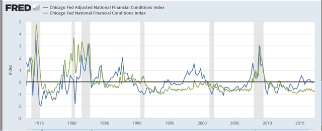
What this tells us is that background economic conditions tend to move in the direction of credit standards.
What this tells us is that background economic conditions tend to move in the direction of credit standards.
Additionally, the Chicago Fed also touts the Leverage subindex of the NFCI as leading GDP:

So in the next graph we can see the AFNCI (blue) compared with the Senior Loan Officer Survey (red) and the Leverage subindex (purple):

Both the AFNCI and the Leverage subindex appear to lead the Senior Loan Officer Survey by a year or more, but are noisy as for example in 1990 and 2001, where at least one of the two had already turned negative, indicating loosening compared with economic conditions, a year before the Senior Loan Officer Survey spiked coincident with recessions.
Putting this all together, the history of the Financial Conditions Indexes suggest that a positive value of the ANFCI or the Leverage subindex, or a reading higher than -0.5 in the NFCI, correlate with a tightening of credit conditions. Values above +0.5 (as adjusted in the case of the NFCI) should put us on higher alert for a recession, and values above +1.0 signal danger, in 1-3 years in the case of the ANFCI or the Leverage subindex, or 1 year or less in the case of the NFCI.
So in the next graph we can see the AFNCI (blue) compared with the Senior Loan Officer Survey (red) and the Leverage subindex (purple):
Both the AFNCI and the Leverage subindex appear to lead the Senior Loan Officer Survey by a year or more, but are noisy as for example in 1990 and 2001, where at least one of the two had already turned negative, indicating loosening compared with economic conditions, a year before the Senior Loan Officer Survey spiked coincident with recessions.
Putting this all together, the history of the Financial Conditions Indexes suggest that a positive value of the ANFCI or the Leverage subindex, or a reading higher than -0.5 in the NFCI, correlate with a tightening of credit conditions. Values above +0.5 (as adjusted in the case of the NFCI) should put us on higher alert for a recession, and values above +1.0 signal danger, in 1-3 years in the case of the ANFCI or the Leverage subindex, or 1 year or less in the case of the NFCI.
Finally, here is a close-up of the last two years of the weekly values of the ANFCI (blue), the NFCI (green), and the Leverage subindex (purple) [In this graph I have added +0.5 to the NFCI per my comment above]:

Note that the ANFCI did reach above +0.5 for one month two years ago. But all 3 have been below zero for the last six months. This suggests that when the Senior Loan Officer Survey is reported next month, it is at very least likely to be neutral, and more likely than not will show a slight loosening of credit. In broader terms, it means that we now have a useful weekly indicator that tells us that credit conditions are not forecasting a recession.
I will begin to report this each week.
Dear Jazz: The First Thing to Do When You're Digging a Hole ...

The above picture is Jazz Shaw, who continually makes the argument that raising the minimum wage will cost jobs.
Mr. Shaw believes that a recent report published by the Harvard Business Review supports his conclusion. As I wrote, it doesn't (see here and here). But, being that Mr. Shaw is, well, dumber than a post, he'll keep making the argument. So, here's a key excerpt from a report that he claims supports his position
Our results contribute to the existing literature in several ways. First, our findings relate to a large literature seeking to estimate the impact of the minimum wage, most of which has focused on identifying employment effects. While some studies find no detrimental effects on employment (Card and Krueger 1994, 1998; Dube, Lester & Reich, 2010), others show that higher minimum wage reduces employment, especially among low-skilled workers (see Neumark & Wascher, 2007 for a review). However, even studies that identify negative impacts find fairly modest effects overall, suggesting that firms adjust to higher labor costs in other ways. For example, several studies have documented price increases as a response to the minimum wage hikes (Aaronson, 2001; Aaronson, French, & MacDonald, 2008; Allegretto & Reich, 2016). Horton (2017) find that firms reduce employment at the intensive margin rather than on the extensive margin, choosing to cut employees hours rather than counts. Draca et al. (2011) document lower profitability among firms for which the minimum wage may be more binding
Put more directly: the report that Mr. Shaw says supports his position in fact doesn't. The data -- as noted above -- says the opposite.
Now, does this matter to Shaw or the editors at Hot Air? No. They, in fact, could care less. They just know in their bones that they're right, so that's it. The above citation from the report -- which contradicts Hot Air's "analysis" -- is meaningless academic drivel written by liberal economists who are secretly in league .... you get the idea.
Monday, April 24, 2017
Sunday, April 23, 2017
A thought for Sunday: the economy is on autopilot. Pray that it stays that way
- by New Deal democrat
It's Sunday, so I get to step out from nerdy analysis, and opine as I please.
Back in 2014, when there was another GOP "wave" election in the Congress, I wrote that the silver lining was that we were at the best point in the economic cycle for it to function on autopilot for the next 24 months. In other words, almost all of the long term indicators were positive, so if all the Congress did in 2015-16 was agree to continue to pay the country's bills, we would probably be OK. And we were.
So, a little over 3 months into the Trump Administration, what action has it taken to materially change the economic trajectory?
Basically, nothing. Yes, a bunch of executive orders have been signed promising to undo Obama regulations, and the telecoms have gotten the right to sell all of your data, but in terms of actual action, the economy is still on autopilot.
All of the mid-cycle indicators have made their highs, and a couple of the long leading indicators have vacillated between neutral and negative, and a few more of them are weakening, but are still positive. If the economy stays on autopilot, it probably doesn't have a bad accident until at least the middle of next year -- although I do expect things like job and real wage growth, while still positive, to weaken.
So, the good news is that if Trump and the GOP Congress continue to be unable to form a majority to enact actual policy, we're not in any serious economic danger for now.
The bad news is that something might happen within the next week. If stopgap funding is not passed, at least a partial government shutdown seems likely. Actually welching on our debts is apparently still a few months off.
And Obama's negotiating with the hostage-takers at the time of the 2011 debt ceiling debacle is coming back to bit us in the butt, now that it serves as a precedent. First Trump threatened to cut off funding for Obamacare. The Democrats responded by insisting that its statutory funding be codified in the debt ceiling resolution (something that probably a lot of GOPers silently want to happen as well). Now Trump has threatened to shut down the government and stop paying its bills if he doesn't get all of his legislative wishes, like a border wall and a big tax cut for the wealthy, as part of the deal.
Since the odds of a 2/3's majority in both Houses of Congress overriding any Trump veto are essentially zero, the Full Faith and Credit of the United States is in the hands of an ignorant narcissist. One week from now, the economy might be taken off autopilot and deliberately steered into a mountainside.
For the record, I see no reason for Democrats to go along with any of this. The GOP is in nominal controls of both Houses of Congress, and there is a nominally GOP president. Time to put on their big boy pants and govern. If they won't do that, there is no reasonable rationale for trying to negotiate a less awful, but still awful, outcome.
Subscribe to:
Posts (Atom)