- by New Deal democrat
An important reason I focus on whether or not the economy is heading into recession, is that during recessions income and jobs both decline for the middle and working classes as a whole.
In that regard, Jared Bernstein, a member of Biden’s Council of Economic Advisors, posted two graphs over the weekend contra the panic about a potential negative Q2 GDP reading.
He tweets (slightly cleaning up his abbreviations):
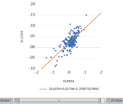

“Macroeconomists have long recognized the high, + correlation between aggregate hours worked and real GDP. Here's a scatter[plot] of these two var[iable]s (ann[ualized] q[uarterly] growth rates”:

Here is his graph of real GDP vs. aggregate hours averaged quarterly:

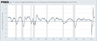
Here is a longer term graph of the YoY% change in aggregate hours:

Over the weekend I had a question on Seeking Alpha about whether I was worried about another negative GDP print. I replied that the NBER themselves have written that they primarily weight real personal income and nonfarm payrolls, and that history shows they actually put a lot of weight on industrial production - all 3 of which have been positive all year so far.
Bernstein is essentially arguing that Q1 GDP was out of sync with hours, and Q2 hours were also very positive, which is very similar to my point above.
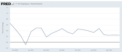
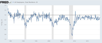
For the past 4 months, jobs have been added at a fairly steady pace of .25% per month, as shown in the graph below:

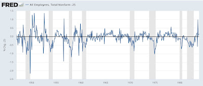
Historically, as shown in the next two graphs, with the exception of 1960 it has taken *at least* 6 months after such jobs readings for a recession to have begun (1970 and 1974)(note: subtracting -.25 so that the current level shows at the zero line):


While monthly readings are noisy, over a longer moving average basis the trend in jobs tends to be much smoother. And what the above suggests is that it is unlikely for there to be such small job gains, or declines, consistent with the onset of a recession through the end of this year.
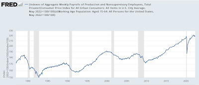
On the negative side, one important indicator I track shows the aggregate income per capita available to working and middle class families at any time. I derive this by taking nominal aggregate income of nonsupervisory workers, adjusting for inflation, and then adjusting by the working age population (ages 16-64 in the above graph; I’d like to measure ages 0-65 but that isn’t available):

Real income per capita for workers is down -1.5% since the end of last year. As you can see, this isn’t good and has reliably happened - and *only* happened for more than a month or two - in the 6-12 months before the onset of all recessions in the past 50 years.