- by New Deal democrat
The headline news in Friday’s employment report was excellent. But underneath those headlines, all is not well.
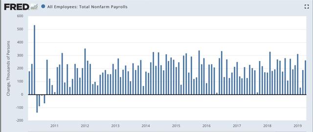
Let’s celebrate the excellent headlines first. Adding 263,000 jobs in April was one of the dozen best reports of this entire expansion:
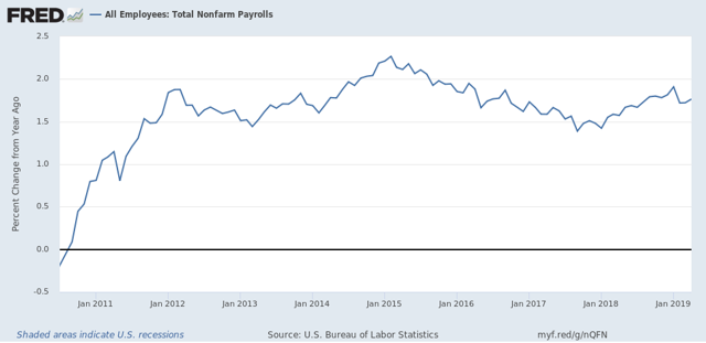
Next, here is the YoY% change in nonfarm payrolls, showing an uptick after the deceleration in the prior two months:
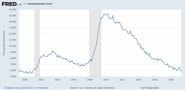
The total number of unemployed was at the lowest level in 20 years:
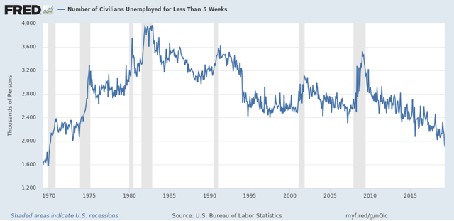
The number of short term unemployed people (less than 5 weeks) reached its lowest level in 49 years:
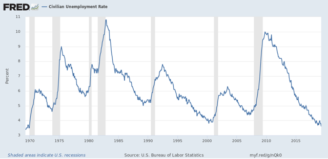
And the unemployment rate was the lowest in 50 years:
This is great news. But before you break out into a cheer of “Happy Days are Here Again!” Let’s look under the hood.
I’m going to start with the household survey, that gives us the unemployment rate. As was widely noted already Friday, both the labor force participation rate and the employment to population ratio for prime age 25-54 workers declined:
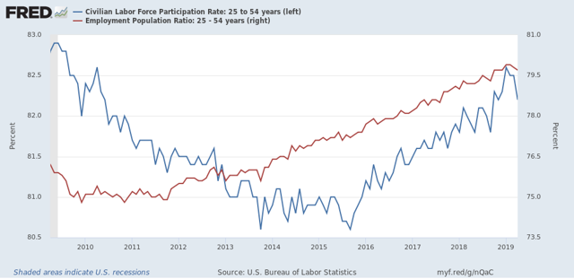
Had the participation rate simply remained at the level it was in March, the unemployment rate would have risen to 3.9% rather than declining to 3.6%.
And as I also already noted on Friday, when we measure by the household survey, only 63,000 more people are employed than half a year ago:
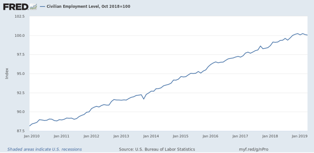
Sometimes this is a harbinger of things to come in the payrolls survey. Sometimes it is just noise.
In short, in the household survey, there were 103,000 fewer people who held jobs. There were also 387,000 fewer people who were unemployed. But there was a jump of 646,000 people who weren’t even in the labor force. This discrepancy will most likely resolve itself one way or the other in the next few months.
Now let’s turn to the employers’ payrolls survey, from which we get the headline jobs number. For the past few months, I have been forecasting a jobs slowdown. That has been based in part on the natural progression from long to short leading indicators to coincident indicators.
Further, even when the spread between short and long term bonds simply gets tight, historically employment growth has almost always faltered. And goods-producing employment - inclu ding manufacturing and construction jobs - *always* has.
So what I’m going to look at here is which sectors in the April report improved outright, and which either declined or showed deceleration. Because there’s an important difference.
First, Jared Bernstein typically compares the 3-, 6-. And 12-month average in employment growth to show the trend. Here’s his graph:
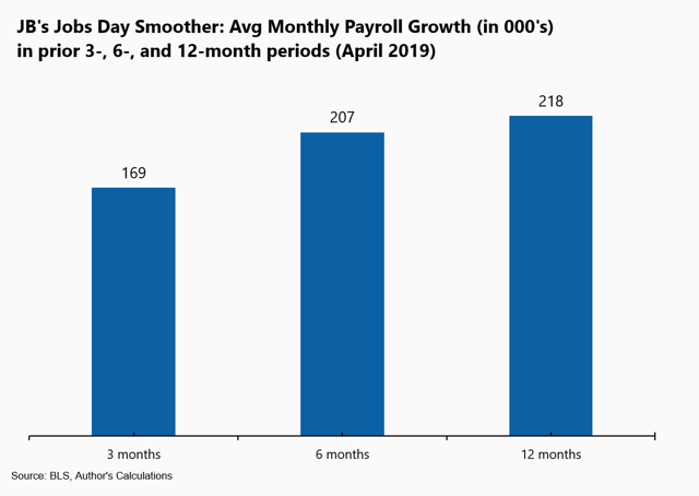
This shows a decline in the job growth trend overall. For this trend to continue next month, May’s number basically must be under 200,000.
Next, just as I did last month, let’s break out the monthly gains or losses among manufacturing (blue), residential construction (red), and temporary jobs (green):
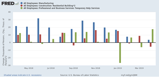
In the past four months, two of the three have faltered, with sharp deceleration in manufacturing and residential construction. Temporary jobs bucked the trend in April with the biggest gain in over twelve months. Since the American Staffing Association’s index of temporary jobs has been in a steepening YoY decline since January, I am anxious to see what happens next month with this number.
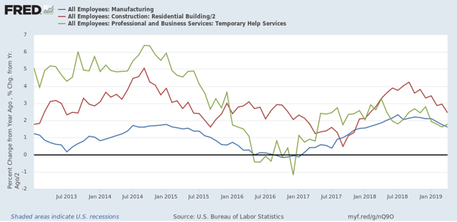
Here is the YoY look at the same three sectors, showing that all three have decelerated substantially - although none is negative YoY:
Here is the YoY look at the same three sectors, showing that all three have decelerated substantially - although none is negative YoY:
Next, here are goods-producing jobs (which include but are not limited to manufacturing and construction). At the beginning of March I wrote that I expected these to slow down to a rate of +7000/month. Here is what they look like since the jobs expansion began:
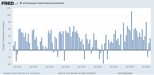
My forecast didn’t happen, at least not this month! But even with April’s 34,000 gain, the average of the past three months is +12,000, the lowest since mid-2017, and are three of the four lowest in the past twelve.
Here is the YoY look:
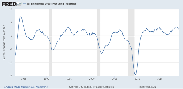
Again, we see deceleration, but certainly not a negative number. For there to be real trouble, I would expect this to fall to less than 1/2 of its recent best YoY% gain of 3.4%, in other words, 1.7% or less.
Again, we see deceleration, but certainly not a negative number. For there to be real trouble, I would expect this to fall to less than 1/2 of its recent best YoY% gain of 3.4%, in other words, 1.7% or less.
In contrast, the three sectors that contributed the most to April’s big payrolls number were professional and business jobs, education, and federal government employment.
What is important about those three is that they are definitely *not* leading sectors. Federal government employment, for example, frequently goes *up* during recessions:
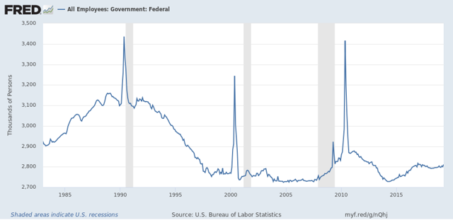
(Unfortunately, FRED doesn’t give me a way to separate out census employment, which is those huge spikes.)
And here is what professional jobs plus education look like as m/m% gains over the past 30 years:
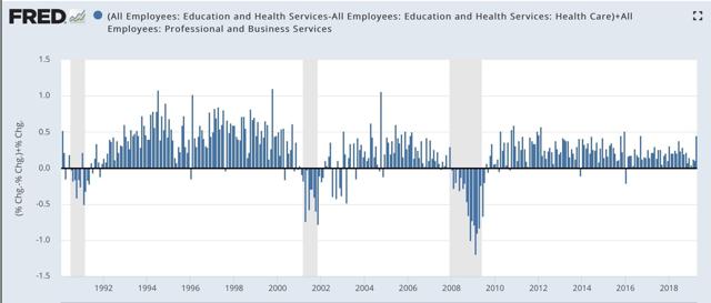
April was one of the 10 best gains of this entire expansion for these two sectors. But note that employment gains in these two sectors typically continues right up until one or two months before a recession, and in the case of 2001, a month or two after it began.
Finally, here’s look at nominal YoY wage growth for non-supervisory workers. (We don’t have inflation yet for April):
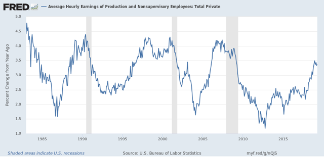
This has declined slightly since December. Since gas prices have headed higher, dragging. Inflation with them, workers’ real wage growth is decelerating as well.
In summary, the employment situation for April is that:
1. The headline jobs and unemployment numbers are excellent.
2. Higher paying professional and educational jobs led the way.
BUT
3. There was a significant drop off in labor market participation, without which the unemployment rate would have risen, not fallen.
4. The trend in total jobs is decelerating gains.
5. This trend is especially pronounced among several of the leading sectors, including manufacturing and residential construction jobs.
6. Meaning that the outsized gain was among more lagging job sectors.
7. Finally, wage growth is leveling off.