- by New Deal democrat
Earlier this week new home sales for March were reported, soaring to a new expansion high bar one month (November 2017). Something else that a few other writers picked up on: the median *prices* for new homes fell to a level not seen in the past two years, off -11.8% from their peak, also in November 2017:
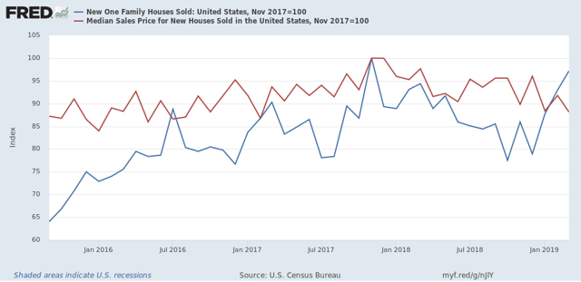
With mortgage rates also down at approximately where they were in January 2018, the carrying cost of a new house has declined by over 10% overall, enticing lots of new potential buyers into the market.
All well and good. But my reaction went a little beyond that: “Holy crap! Builders can slash their prices by almost. 12% and still make a profit?!?”
That kind of pricing power smacks of a market that isn’t competitive. In a truly competitive market, the kind of big price increases we saw until 2018 — at sales levels well below any time in the decade between 1995 and 2005 — would have called forth new supply at lower prices. It turns out, I’m not the only one who thought that. Two economists, Jacob Cosman and Luis Quintero, presented a paper, Fewer players, few homes: concentration and the new dynamics of housing supply, to the American Economic Association last winter, documenting just how much local oligopolization has distorted the market.
Let me cut to the chase. Here are the two graphs that show their primary points. The solid line in the first graph shows the number of firms that account for 90% of all homebuilding in the median local market (dotted lines are the first and third quartile of local markets):
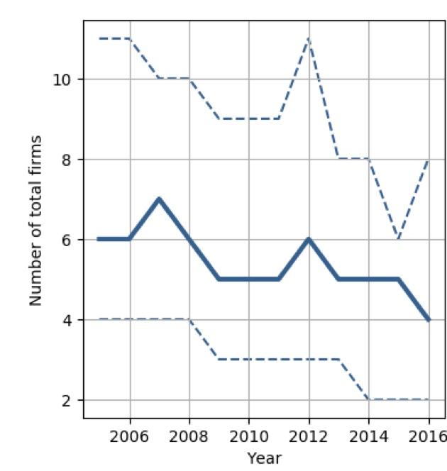
This has declined from 6 to 4 firms in the decade since the bursting of the housing bubble.
The second graph shows the share of production accounted for by the largest 3 and 5 firms in typical housing markets:
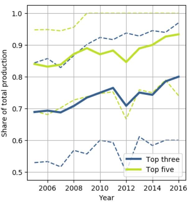
Each has increased by roughly 10% since the bursting of the housing bubble.
The authors conclude that:
“[compared with] a counterfactual scenario where housing market competition remains at its high pre-recession level across the United States[, ...] market outcomes [are] very different. The annual level of new housing would be $106 billion higher (equivalent of 3.4% of private fixed investment or 0.6% of gross domestic product. Approximately 150,000 additional housing units would be built each year. Housing price volatility would decline by over 50%.”
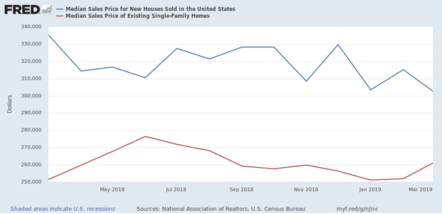
To give you an idea how dramatic an effect this market concentration may have had on housing in the past decade, here is a graph showing the typical pricing premium for a new house vs an existing house:
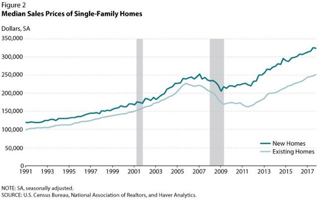
Historically, the premium was 10%. Since the bursting of the bubble, however, that premium went up to 30%! Even now, as of March 2019, although it has closed somewhat, the premium is still 14%:
An alternative explanation that has been offered for the decline in median house prices since the end of 2017 is the square footage of the median new house that builders are offering is smaller. But a comparison of median prices and median square footage suggests that, while there is an effect, the market power of local oligopolies appears to be the primary driver in both the big increase in new home prices through 2017, and the big decline since.
Here is a graph of the median sales price for new houses (blue) and the median square footage of new houses (red) on a quarterly basis. Each is normed to 100 as of their respective peaks:
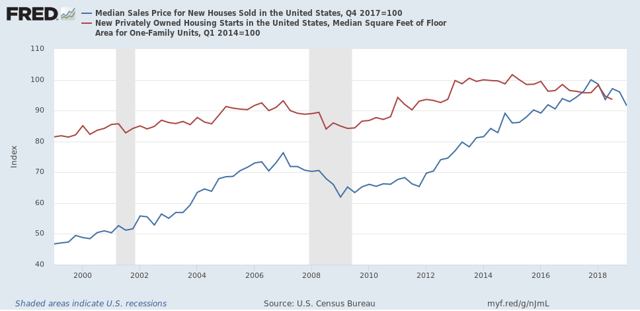
As you can see, house prices continued to rise by over 15% (!) in the nearly 3 years after the median square footage of a new house began to decline after Q1 of 2015. This certainly *isn’t* a decline in square footage driving a decline in prices!
Further, there’s very little evidence that the rate of decline in square footage accelerated after prices peaked in Q4 2017, as shown by the same data graphed as YoY% change:
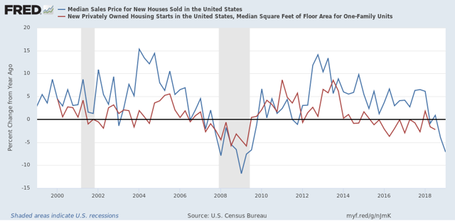
The square footage of the median new house has varied between unchanged and -3% in the past four years, both when prices were still increasing, and since prices started decreasing. For some reason FRED hasn’t gotten around to posting the Q4 2018 data for median house sizes (the last quarter for which data is available), but even that is only -2.4%. During that same period (Q4 2017 - Q4 2018) median house prices declined -3.9%. At the most, the decline in square footage explains no more than 60% of the decline in house prices.
An alternative explanation — and mind you, I am speculating here, I don’t have data — is that builders have been increasing their profits by decreasing lot sizes, thereby increasing the number of single family houses they can build on any given footprint of land.
Note further in the second graph above that median house prices appear to lead median square footage by about 1 to 2 quarters, suggesting that it is the change in prices which is driving the change in square footage, rather than changes in square footage driving prices. A good test of this hypothesis will be if median square footage declines by more than -3% YoY by the 3rd quarter of this year.
The bottom line is that the increasing concentration, and attendant local market power, among home builders has distorted the housing market in the past decade, increasing substantially the cost of the typical new home while holding down the number of units constructed. Because new homes have been so much more expensive, this distortion has also been an important reason for the relative unaffordability of existing homes compared with historical norms, and by keeping both new and existing home prices higher than they would otherwise be, also been an important reason behind soaring rents, which are also at all time highs compared with median renters’ incomes. (UPDATE: In that vein, median asking rent for Q1 2019 was just reported, up +4.4% q/q and +5.5% YoY, continuing to show pressure in excess of income growth.)