- by New Deal democrat
This is the second of four installments looking at whether and by how much people who are out of the labor force decide to seek employment as an economic expansion continues. This is part of a broader issue of how close we are to full employment.
In the first installment, I showed that once we separate labor force participation into men and women, then we see two separate but equally stable long term trends. Men's participation has declilned at a fairly steady -0.3% YoY over the long term, while women's participation increased by about +0.5% YoY over from 1955 to the late 1990s. Once we account for that secular trend, in both cases we find that within any given business *cycle,* both men's and women's participation has increased compared with that trend as the economy improves, and deteriorates compared with the long term trend during and around recessions.
In short, as an economy improves, people are drawn off the sidelines into the labor pool.
In this installment, I'll look at whether this increase in participation correlates with real wage growth.
Once again, I'll separate men's and women's participation. Here is the YoY% change in men's participation, +0.3%, compare with the YoY% change in real wage growth (green) from 1955 to the present:

There is no particular correlation. In particular if anything real wage growth and participation go in opposite directions during the early 1970s, almost all of the 1980s, the mid 2000s and around the end of the Great Recession.
Here is the same graph for women, first subtracting -0.5% YoY from 1955 through the late 1990s:

and with no adjustment YoY thereafter:
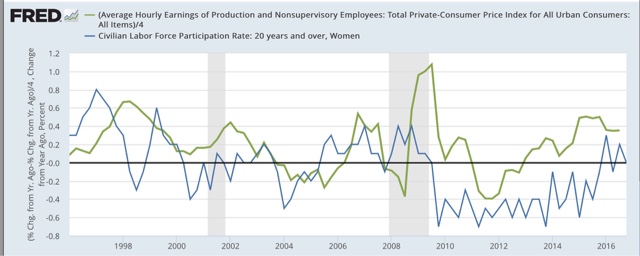
Once again, it is hard to see any definitive relationship. Throughout the 1970s, and again in the later 1990s, there is almost an inverse relationship, although since about 2002 there may be some broad and noisy convergence.
If anything, over the long term there may be a slight correlation between an increase in labor force participation and decreasing real wages!

The above graph shows the overall age 25-54 participation rate for both sexes, inverted (so an increase in participation shows up as a decrease on the graph) compared with real wages. Note that the period showing the biggest jump in participation (the 1970s) showed the biggest YoY declines in real wages, while the periods with the biggest declines in participation (the several years after each of the last 3 recessions) coincide with the subsequent recoveries showing the biggest real wage gains.
So, the hypothesis that, as real wages improve, more and more people will be drawn into the labor force is tenuous at best. If anything, the relationship may be the opposite, and causation run the other way. In any event, surprisingly watching real wages does not appear to give us any insight as to what may happen with labor force participation.
In the next installment, I will look at the relationship between labor force participation and the unemployment rate.