In the last several years, I have written a number of posts documenting the stagnation in average and median wages, for example here and here. Several of the series were just updated for the first quarter, so now is a good time to take another look.
We have a variety of economic data series to track both average and median wages:
- The most commonly known measure is that of average hourly pay for nonsupervisory workers, which is part of the monthly jobs report.
- The Bureau of Labor Statistics, which conducts the household employment survey, also reports "usual weekly earnings" for full time workers each quarter.
- The BLS also measures the Employment Cost Index quarterly.
- The BLS also measures "business sector real compensation per hour" quarterly.
First, the good news: the below graph tracks monthly average (mean, not median) hourly wages (blue), median wages from the employment cost index (red), real compensation per hour (brown), and median usual weekly earnings (green). All are adjusted for inflation. Since the quarterly index of median wages only started in Q1 2001, I have normed the indexes to 100 at that time:
And here is a longer term view. The ECI only started in 2001, but the other 3 go back in time at least into the 1960s:
With the exception of average hourly earnings (blue line), the other three are at all time record highs. I don't want to oversell this, because it has been a very slow process, but it is still certainly positive and worth two cheers anyway.
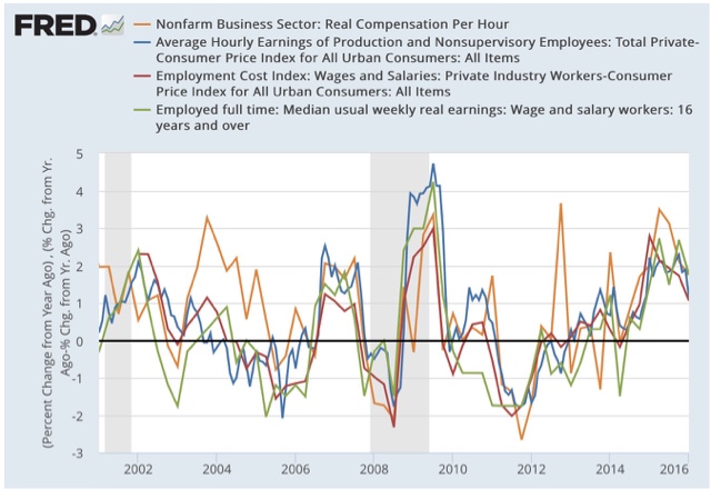
Now, the bad news. Here is the same information YoY:
All 4 series made YoY% highs for this expansion in the first half of 2015, and have showed decelerating growth since then. This shows us how dependent real wage growth has been on the price of gas really ever since the start of the Millennium. Gas prices have probably bottomed, and YoY wage growth has probably peaked for this cycle. And with just under 10% underemployment, we have yet to reach full labor utilization.


