It's been quite a while since I looked at detailed metrics of future job growth, something I devoted a lot of time to a couple of years ago. With a divergeance in forecasts between recession vs. continued growth, this is a good time to take another look. Some of the metrics have performed better than others. Many continue to support optimism, but at least one is downright ominous and may be telling us that revised jobs data will show substantial job losses from earlier this year.
1. V shaped real retail sales and industrial production recoveries vs. jobs:
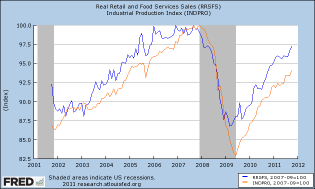
One point I frequently made is that this is a "bifurcated recovery", where manufacturing and sales are performing much better than job and income growth. Although we've had a recent slowdown in some ISM series, the description of a "bifurcated recovery" is still valid.
Real retail sales and Industrial production are still in V shaped recovery mode. Real retail sales have recovered 80% from their trough, and industrial production two-thirds:
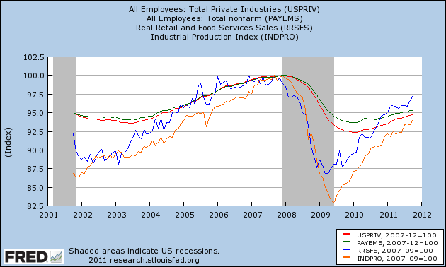
Comparing those with private jobs (red) and total payrolls (green), we can see that the percentage losses in sales and production were steeper, and have made up nearly or more than all of their ground compared with jobs. Meanwhile, private jobs have regained only slightly over 30% of their losses. When government employment is added for the total jobs picture, less than 25% of the losses have been regained:
2. Comparing improvements in aggregate hours and jobs:
Another point I have frequently made is that aggregate hours worked are recovering faster than new jobs. Since more hours were lost than jobs during the recession, if past was prologue then we would have to wait for aggregate hours to regain their lost comparative ground before job growth would match the growth in hours. This is still the case:
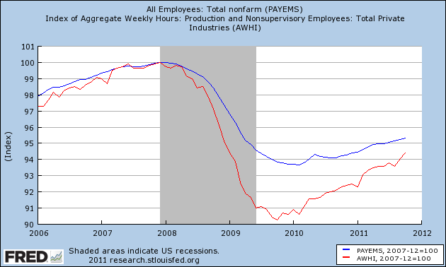
If the trend continues then by about next summer aggegate hours (red) will have made up all of their comparative losses with jobs (blue) and we can start to expect job growth to fully reflect growth in hours.
3. Comparing real retail sales with jobs:
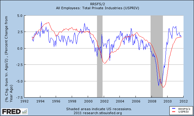
The closest thing I found to a "holy grail" leading indicator for future job growth when I took a thorough look over 2 years ago was real retail sales. Real retail sales tended to lead turning points in jobs by about 4 to 8 months. Since sales are still rising, we should expect continued job growth over the next few months as well. (This metric has also recently been touted by Prof. Karl Smith of UNC - Chapel Hill at Modeled Behavior).
I also found that over the last 40 years, the YoY% growth in real retail sales, divided by two, gave a reasonably close forecast to YoY% growth in jobs, at least over a longer horizon if not every month. Since real retail sales were averaging 6% YoY growth at the end of 2009, this led me to expect strong job growth in 2010. It didn't happen, although measuring by private jobs, the metric is at the moment almost in perfect alignment:
When we add government jobs into the mix, and compare real retail sales with total jobs (green), the metric still falls considerably short:
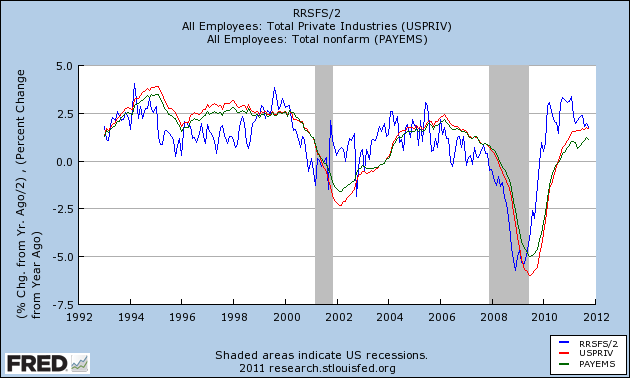
This is yet another indication of just how significant government job losses have been to the relatively poor jobs recovery. At the same time, because real retail sales are a leading indicator for jobs, this reinforces that we should expect to continue to see positive job growth in the economy, with private jobs at least being added at something like a 2% YoY rate.
4. Comparing initial jobless claims with jobs added:
In 2010 I thoroughly debunked the idea that we needed 400,000 or less in initial jobless claims to be consistent with job growth. It simply makes a lot of difference how deep the recession is, and also the pattern declining into a recession is quite different from the pattern during a recovery. I pointed out half a year ago that if we were to descend into a "double dip", I would expect to see a break in trend in the scatter graph comparing these two series, with a new trend line to the left of the recovery trend line developing. Here is the updated graph (using private jobs vs. all jobs to avoid the 2010 census distortions) , with the last 6 months' data in brown:
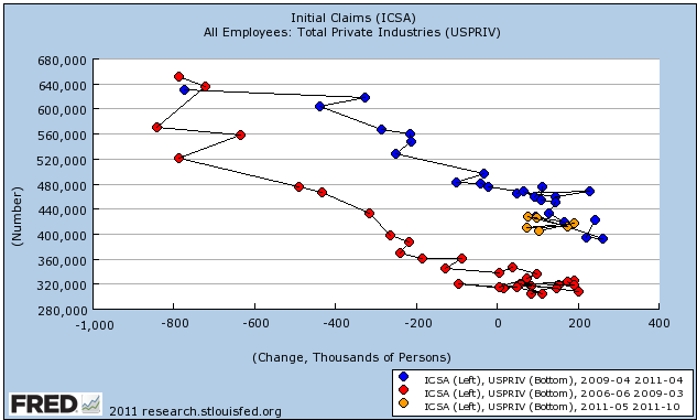
No break in trend happened. Since this scatter graph ends with October, it doesn't show the decline in the 4 week moving average below 400,000 in the last couple of weeks. Should that continue through the end of November, I would expect a very good November employment report, with something like 175,000 private jobs being added.
5. Okun's Law
Okun's law is actually a rule of thumb that holds that for every 2% YoY increase in GDP, there should be a 1% decline in the unemployment rate. Generally speaking, 2% YoY GDP growth equals no change in unemployment. A 4% GDP increase gives you a 1% decrease in unemployment. Contrarily a 0% YoY change in GDP gives you a 1% increase in unemployment.
I make use of a corollary, which is the YoY% growth in GDP minus 2% approximately equals the YoY% change in job growth 3 to 6 months later. Here is the graph of this relationship going back 65 years, and it has ominous implications:
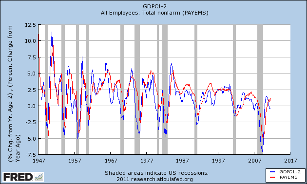
Since 1948 there has never been a period of 2 or more quarters where YoY GDP% growth was under 2%, that has not equated actual YoY job losses in the next few months. If this relationship holds true now, then contra all of the other above data, we should have already been seeing outright job losses, and they could continue through the winter.
As I said, this contradicts virtually all of the previous indicators we have discussed. A possible explanation comes via Jeff Miller of A Dash of Insight, who informed us yesterday that the BLS's Dynamic Business Report of actual job data collected from the states showed that in the first quarter of this year only 250,000 jobs were created, rather than the 500,000 previously reported. If this revision is applied to all of the 2011, it would mean that the pathetic job gains of this past summer turn into outright significant losses. Not only would this tend to vindicate Okun's law, it would affect all of the data sets above. For example, the scatterplot graph above would probably then show that we did indeed break trend in the direction of a "double-dip."
6. Forecasts of the unemployment rate:
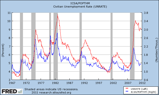
Finally, let's update a few metrics forecasting the unemployment rate. The premise here is that initial jobless claims are a leading indicator of the unemployment rate. The best way to measure initial claims, however, is to adjust for population, which is done in this first graph:
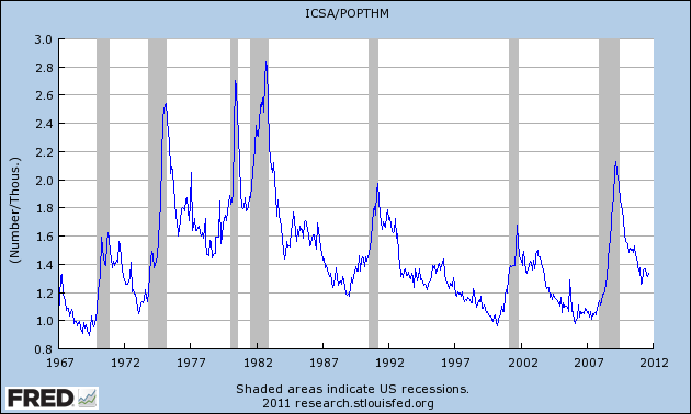
So adjusted, the recent initial claims levels aren't so bad. In fact, they are better than most readings during the last 50 years.
This metric had an excellent record for predicting the unemployment rate several months out -- until this recovery. It predicted an unemployment rate of under 7%, and needless to say were are far above that:
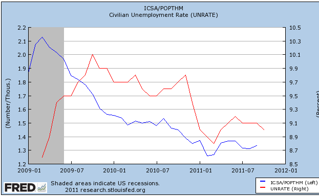
Taking a closer view of the last several years, it appears that the big disconnect occurred in 2009, when initial claims steeply declined, yet unemployment remained stubbornly high. Since then, the two series have tracked one another rather well. This suggests we should see the unemployment rate drop slightly to about 8.8% in the next few months:
Finally, here is a slightly different metric from Thumbcharts. This compares the last six month period with the same six month period one year before. In this longer term metric, initial claims also have an excellent record predicting the unemployment rate -- although like the metric above it shows that the YoY decline in initial claims considerably outpaced the decline in the unemployment rate a year ago:
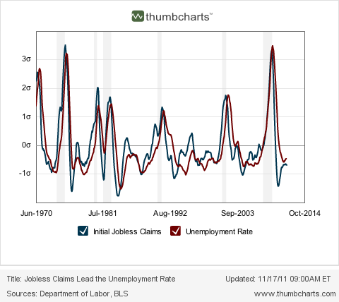
This metric likewise predicts a continued decline in the unemployment rate over the next few months.
Summary
Continued job losses in government continue to have a depressing impact on job growth during this recovery, causing distinctly subpar growth compared with previous recoveries. Undoubtedly as I have pointed out just a few days ago, that housing until recently did not participate in the jobs recovery also has had an effect.
At the same time, most of the above metrics suggest that we should see continued job growth in the months ahead, and a continuing decline in the unemployment rate compared with a year ago. If present underlying economic trends continue (as to which there is obviously no guarantee), then by next summer or so we may see stronger job growth as the deficit in aggregate hours is completely made up.
The contrary indicator is Okun's law, which suggests we should already be in the throes of actual job losses. It is possible that we will find when the jobs data is revised that we did lose a significant number of jobs earlier this year, but that the situation will improve going forward from here, which would be more consistent with all of the data sets above.