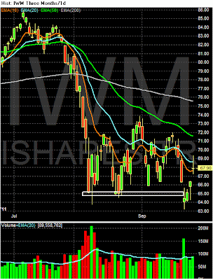
The above charts show why it is so important to look at several equity markets rather than just one. The news stories will focus around the SPYs (the lower chart). Prices there have bounced from a technical level (the 112 area) and moved through the 10 and 20 day EMA. Volume could be better, but the end result is prices are now above the 20 day EMA However, the IWMs (the top chart) represent equity risk appetite. Notice that prices have moved below previous support levels, bounced a but higher but printed very weak bars to get there. Prices are just above the 10 day EMA and have printed a spinning top -- a very weak candle. In short, until we see the risk based equity market advance on strong volume and strong bars, I'm not impressed.
This is another concerned chart: copper has literally fallen off a cliff on very high volume. Prices have also gapped lower several times over the last few weeks. All the shorter EMAs have moved sharply lower and are through the 200 day EMA. In short, this is a very bearish chart which is very concerning considering copper's overall economic importance.
The longer end of the Treasury curve is moving higher in a channel. The IEFS channel has a slight angle, while the TLS is pretty sharp. However, notice the IEFs have advanced in a very small range -- a range of 2 points. These charts also indicate the equity market rally is weak, as there is not a significant flight from the Treasury market into equities.


