Saturday, September 29, 2018
Weekly Indicators for September 24 - 28 at Seeking Alpha
-by New Deal democrat
My Weekly Indicators post is up at Seeking Alpha.
No surprise that the Fed rate hike took center stage this week.
As usual, not only is this a good up to the moment look at the economy, but clicking through and reading puts a few pennies in my pocket.
Friday, September 28, 2018
Housing: comprehensive review of August reports
- by New Deal democrat
I pay particular attention to housing because it is ian important long leading indicator for the economy.
And more and more evidence is accumulating -- although it is not universal -- that housing may have passed its peak in this cycle. Last year housing was resued by an autumn surge. I don't think that will happen this year, but there are conflicting signals.
My comprehensive review of that evidence is up at Seeking Alpha.
As usual, your clicking over and reading hopefully will be educational. It will also reward me, ever so slightly, for the work I do putting this stuff together.
Thursday, September 27, 2018
Contracts for existing homes declined in August for the fourth time in the last five months
- by New Deal democrat
This is something that I don't normally bother to cover, because it deals with existing homes, but since Bill McBride a/k/a Calculated Risk is off hiking, let's take a look.
The NAR reported this morning that pending home sales, i.e., contracts to buy existing homes, declined by 1.8% in August. This was the fourth decline in the last five months. This metric has now been negative YoY for the last eight months.
Since pending contracts become existing home sales one or two months later, this strongly suggests that existing home sales will continue their recent decline for the next several months.
According to the NAR's spokesman, Lawrence Yun:
The greatest decline occurred in the West region where prices have shot up significantly, which clearly indicates that affordability is hindering buyers.
So far, that makes perfect sense. But then he added,
and those affordability issues come from lack of inventory, particularly in moderate price points
which is somewhat misleading. Inventory has increased YoY for the last several months, which means that if we could seasonally adjust, it would probably have bottomed earlier this year. And yet prices have continued to rise.
Elsewhere, the report suggests that inventory will continue to rise, and that potential sellers haven't gotten the message that prices are too high, because Yun also said:
According to the third quarter Housing Opportunities and Market Experience (HOME) survey, a record high number of Americans believe now is a good time to sell. Just a couple of years ago about 55 percent of consumers indicated it was a good time to sell; that figure has climbed close to 77 percent today.
That 77% number isn't because they expect to have to sell at lower prices.
The takeaway from today's Pending Home Sales report is that the decline in existing home sales from its peak a year and a half ago is going to continue.
Wednesday, September 26, 2018
New home sales show further signs of rolling over
- by New Deal democrat
New home sales, despite a month over month increase, continued their slowdown in August. Here's the graph supplied by the Census Bureau:

Since new home sales are extremely volatile month over month, the best way to look at them is on a three month average basis, and on that basis new home sales made an 11 month low.
Note that the YoY comparison is with the worst levels of last year. Last autumn there was a surge in sales. The question is, will a similar surge come to the rescue of the housing market this year? My belief is, it will not.
Last week existing home sales also continued unchanged at 12 month lows. Existing home sales have not made a new high since March 2017.
Further, inventory of new homes continues to climb slowly. Combined with the slowdown in sales, this is at very least another yellow flag that the housing market may be rolling over.
I'll have a more detailed look at both sales and prices tomorrow at Seeking Alpha, and will link to it once it is up.
I'll have a more detailed look at both sales and prices tomorrow at Seeking Alpha, and will link to it once it is up.
Tuesday, September 25, 2018
How close are we to full employment? September update
- by New Deal democrat
A couple of months ago, I estimated that we were about 0.8% away from "full employment." Theoretically, that should be when everyone who wants a job has one, but more realistically, the benchmark would be peak employment from the last few cycles.
We've had a couple more good employment reports since then, so where are we? In the below graphs, I'm going to compare our situation with the best situation in the last 50 years: the tech boom of 1999-2000.
First off, the primary difference between the U3 unemployment rate and the U6 underemployment rate is people who are working part time but would like a full time job. At its best in 1999, 2.2% of the labor force were in this condition, so I've subtracted that in the graph below:

Notice that despite the big drop in the last couple of months, at the far right, we are still slightly above 2007 levels, and a little more above 1999 levels. Here is the close-up:

Currently the level of involuntary part-times is about 0.5% above its 1999 bottom.
Next, above the underemployment level are those who aren't even looking for a job, and so aren't counted in the labor force at all, but say they want a job now. This is roughly 5 million people. Even at its best level in 1999, when we include these people as well, and add them into the labor force, it totaled 9.8%, so that level is subtracted in the below graph:

Again, currently we are about 0.8% above the 1999 "full employment" level.
Put these two together, and we can calculate that if about 750,000 involuntary part-timers were to get full time jobs, and another 1.2 million people who aren't even in the labor force got jobs now, we would equal the best level of the "enhanced underemployment rate" 1999. That's one good estimate of how close we are to "full employment."
Notice that is the same level I caluclated two months ago.that's because, despite the progress on *under*employment, there's been no progress at all on those who are not in the labor force but want a job now (in fact that number has risen slightly since March).
Notice that is the same level I caluclated two months ago.that's because, despite the progress on *under*employment, there's been no progress at all on those who are not in the labor force but want a job now (in fact that number has risen slightly since March).
But now, let's look at the prime age employment population ratio:

Even if we added the 0.8% of people who want a job now, and the underemployed 0.5% got full time jobs, that would just put us at the levels of the 1989 and 2007 peaks. The level would still be roughly 1.5% below the 1999 peak.
This 1.5% comes from the population who aren't in the labor force, and indicate that they *don't* want a job now. Mainly these people are disabled, or raising children at home, or younger people who are in school. But, especially among the first two groups, if wages were higher, some would decide it was financially advantageous to join the labor force.
As I said yesterday, the signature of our current economy is the dual extremes of very low unemployment, and very low wage growth, and I did not think that was a coincidence. If wages were higher, some of those 1.5% out of the labor force would enter it, and not all would find jobs, meaning that the unemployment rate would be higher.
Monday, September 24, 2018
The *rate* of new jobless claims, at all-time lows, forecasts even lower unemployment
- by New Deal democrat
It's a slow news week, so I thought I'd start out with something I haven't looked at in awhile: initial jobless claims as a share of the population and as a leading indicator for the unemployment rate.
This economic expansion has featured two contrary extremes in the labor market: low wage growth and increasingly vanishing layoffs (I don't think that's a coincidence, but that's a subject for another post!). Let's take a look.
The first graph below is of weekly jobless claims as a share of the entire labor force. To generate this, I also take into account "covered employment." That is, not all jobs are eligible for unemployment insurance, and because of part time work and the gig economy, that share is less than it had been previously. So, first I divide the average number of jobless claims over a month by the percent of covered employment. The lower the share of covered employment, the higher the adjusted layoffs number. Then I divide that in turn by the number of people, both employed and unemployed, in the labor force. Here's what I get, through August:

We are now experiencing the lowest percentage of people getting laid off as a share of the labor force, for the entire 50 year plus history of the data. As of August, only 138 out of 100,000 people were getting laid off each week (obviously, given that employment is growing, a bigger number were getting new jobs). Put another way, you almost have to work at getting laid off these days!
Secondly, initial jobless claims tend to lead the unemployment rate by a few months. Here's the 50 year+ graph:
Secondly, initial jobless claims tend to lead the unemployment rate by a few months. Here's the 50 year+ graph:

If jobless claims decline, then over the next 2-3 months it's a good bet that the monthly unemployment rate will decline too.
Here's a close-up of the last nine years:

Not every zig and zag is followed, but the general relationship is clear. Note that initial jobless claims have continued to make new 48 year lows this month (September).
The unemployment rate made its most recent low of 3.8% in May. Based on the relationship with initial jobless claims, we should expect it to go even lower by the end of this year.
Saturday, September 22, 2018
Weekly Indicators for September 17 - 21 at Seeking Alpha
- by New Deal democrat
My Weekly Indicators post is Up at Seeking Alpha.
A number of indicators that have been on the cusp of changes have rebounded. But a byproduct is, that if interest rates are moving further away from Scylla, they are moving closer to crashing into Charybdis.
As usual, clicking over and reading is not only hopefully informative to you, but also ever so slightly renumerative to me!
Friday, September 21, 2018
A bold forecast: there will be no autumn surge in housing this year
- by New Deal democrat
The big issue this year in housing is whether increased mortgage rates and higher prices have merely resulted in a deceleration in the increase in new housing sales and construction, or whether housing is actually rolling over.
As I've written several times in the last month, there is accumulating evidence that it is actually the latter: housing has at very least plateaued. The acid test will be what happens in the next four months. Here's why.
(As an aside, as I recently learned from reading a biography of Mark Twain, who hid out during the Civil War in Nevada and California, the "acid test" is a real thing. Real gold does not dissolve in acid, but "fool's gold" a/k/a iron pyrite, does. So there.)
(As an aside, as I recently learned from reading a biography of Mark Twain, who hid out during the Civil War in Nevada and California, the "acid test" is a real thing. Real gold does not dissolve in acid, but "fool's gold" a/k/a iron pyrite, does. So there.)
Let's start by going back seven years, which is the last time mortgage rates were higher than they are now, and before house prices bottomed. Here's what mortgage rates (blue, left scale) and the least volatile housing metric, single family housing permits (red, right scale), look like:

Note a few things:
- mortgage rates declined nearly 2%, from 5% to 3.3%, from 2011 through mid-2013.
- during that big decline, single family permits rose over 60%.
- during the "taper tantrum" of 2013, mortgage rates rose back to 4.6%
- permits stalled for a year after the tantrum, and established a new, less steep trend line that was broken to the downside by this week's August housing permits report.
- after mid-2013, mortgage rates established three meaningful intermediate lows: in early 2015, mid-2016 (due to "Brexit"), and mid-2017.
- each of these three intermediate lows in mortgage rates coincided with a temporary acceleration of the growth in housing permits
- mortgage rates have just made a new 7 year high, reaching 4.87% this week.
Now let's zoom in on the last 2 years. This second graph is the same data as the one above, except I have normed single family permits to 100 as of July 2016:

Note that permits rose 13% between July and December 2016, and rose another 9.7% between August and December of last year. Both of these surges took place during the temporary declines in mortgage rates, and stopped when rates ratcheted higher.
In other words, despite jumps in mortgage rates in late 2013 and early 2017, the trendline in permits only decelerated compared with its longer term trend. Aside from this month's permits report, they never actually rolled over.
The difference this year is that there has been no decline in interest rates: in fact, since March, mortgage rates have actually headed slightly higher. Further, depending on the measure, house prices, as shown in the graph below, are roughly 40% to 50% higher than they were at their bottom in 2011 -- far in excess of household income growth:

So, here is my bold forecast: unless mortgage rates decline below 4.5% in the next few months, there will be no autumn surge in permits such as there was in the last two years. Similarly, at very least no meaningful new high will be established in single family permits (more than 2% above February's number), and more likely than not, there will be no new high at all.
And since the Fed seems bent on raising interest rates next week, unless there is to be a yield curve inversion, mortgage rates are quite unlikely to decline below 4.5%. They may even go higher.
Thursday, September 20, 2018
Housing has at very least plateaued
- by New Deal democrat
First of all, my extended take on yesterday's report on August housing permits and starts, "The most important single housing report in the last 7 years," is up at Seeking Alpha.
While housing starts remain in a weak uptrend, I have downgraded housing permits overall to neutral, and single family permits to a slight negative.
This morning's report on existing home sales for August just adds more confirmation that housing is at very least plateauing.
While month over month sales were unchanged, they were tied for a 12 month low. Further, existing home sales have not made a new monthly high since last November, 9 months ago. The 3 month average has not made a meaningful new high since April of last year.
The median price of an existing home, at $264,800, continues to outpace wage growth, up 4.6% YoY, and a slight YoY% increase from last month.
(The NAR is picky about other sites posting graphs of their statistics, but if you want to see graphs of the above information, they are at this link on the NAR site.)
The recent further increase in mortgage rates is also only going to put more pressure on housing.
This quote from this morning's report sums up the situation pretty well:
“Rising interests rates along with high home prices and lack of inventory continues to push entry-level and first time home buyers out of the market,” said [NAR spokesman Lawrence] Yun. “Realtors continue to report that the demand is there – that current renters want to become homeowners – but there simply are not enough properties available in their price range.”Unless next week's new home sales report contains an unexpected positive surprise, the rating on the overall housing market is a slight negative, meaning downward pressure on the overall economy beginning next summer.
Wednesday, September 19, 2018
Housing: a big miss in permits with important ramifications
- by New Deal democrat
NOTE: I'll have a more comprehensive report up at Seeking Alpha later, and will link to it once it is posted.
Despite a smart month over month increase in starts, this morning's report on housing permits and starts, taken as a whole, was a sharp negative.
It's true that starts, both in total and for single family units only, were higher than their readings from the last two months. This is something that I forecast one month ago, because permits had had a couple of good months, and starts tend to follow permits with about a one month lag. But they were below every other reading but one for this entire year.
Permits were another story entirely. Last month I said that I expected them to stagnate, based on higher mortgage rates this year. They did even worse than that. Total permits came in at a 12 month low, and are down -5.7% YoY, and down -12% from their March high. This is recession watch territory. The less volatile single family permits came in at an 11 month low. While they are still up +2.1% YoY, they are down more than -7% from their February high. This is also enough to turn this important long leading indicator negative, as we have gone 6 months without a new high and are down over -5%.
The data isn't up on FRED yet, so here is the Census Bureau's graph:

This, by the way, is in line with the recent weekly data on purchase mortgage applications, which has been running essentially flat YoY.
Bottom line: this is big news with important ramifications
Tuesday, September 18, 2018
A hypothesis for Prof. Krugman: the transmission method was FEAR
- by New Deal democrat
In his recent column disagreeing with Ben Bernanke, Paul Krugman asks for an explanation as to how a financial panic could lead to years thereafter of a slow recovery. Specifically, Krugman says that he "really really wants to hear about the transmission mechanism."
After all, the financial panic eased in 2009. And yet, outside of the very noteworthy exceptions of corporate profits generally and Wall Street bank profits specifically, the economic recovery was lethargic.
Now, to a great extent, the debate between "credit event" and "housing event" is somewhat a semantic one. You simply don't get a housing bubble unless there is a credit bubble to enable it. Similarly, absent a credit bubble in consumer lending for either housing (the 2000s) or appliances and furniture (the 1920s), you don't get a big consumer downturn (see, e.g., 2001, in which consumers sailed right through a brief and shallow recession brought on in large part by a stock market bubble. See also the quick late 1980s recovery from the 1987 stock market crash).
But if you are looking for a transmission mechanism that lasted after 2009, as usual you have to look beyond narrow-minded neoclassical economy orthodoxy. Because from a behavioral point of view, the answer looks pretty simple: FEAR.
Behavioral economists have shown that people in general react twice as strongly to the fear of a loss vs. the anticipation of an equivalent gain. A good example in the everyday economy is that consumers cut back spending twice as sharply in the face of an oil price spike, as they loosen their spending in the face of a steep decline in gas prices.
It is crystal clear that the financial panic of September 2008 instilled fear in the vast mass of households. I believe that there is very good evidence that it persisted for most of this decade.
To begin with, here is a graph of consumer confidence as measured by the University of Michigan:

I have zoomed in on 2007-2015, because i want to emphasize that consumer confidence did not rebound meaningfully at all once it crashed in 2008, until about 2014. Furthermore, any time there was a whiff of renewed crisis during that timeframe, confidence plummeted, in the case of the 2011 "debt ceiling debacle," all the way back to its bottom, but also in response to the Deepwater Horizon massive oil spill (2010), the "fiscal cliff" (end of 2012) and the GOP's government shutdown (2013).
That, ladies and gentlemen, is fear.
Meanwhile, households didn't just deleverage out of debt during the 2008 financial panic, but they continued to deleverage and deleverage and deleverage all the way until late 2014 -- well after housing prices had bottomed (red in the graph below):

and they haven't meaningfully increased their exposure to debt since.
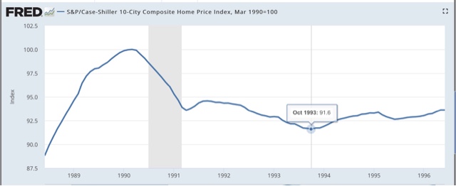
Further, there was a housing boom from 1986-88 without a credit bubble. Afterward house prices declined 10% into the early 1990s:
But the below graph of the personal savings rate shows that, unlike the 1990s, when the household savings rate went into a sustained decline, as household debt levels increased (see first graph above), following the great recession, the savings rate maintained its higher level, with the exception of 2012-13 when a one year 2% rebate of Social Security withholding taxes that resulted in higher spending, which resulted in a one year decline in saving when it expired:

So, I believe a good case can be made that the "transmission mechanism" that Krugman seeks is that the trauma of the 2008 financial crisis instilled a continuing sense of fear in consumers that there might be a repeat, leading to a shunning of debt and a resulting more subdued increase in the consumption that is 70% of the U.S. economy.
Monday, September 17, 2018
A detailed look at Industrial Production during this expansion
- by New Deal democrat
In the past week there's been a little highbrow relitigation of the drivers of the "Great Recession" between Paul Krugman and Ben Bernanke. Bernanke plumps for it having been a "credit event" -- and as to the crisis of 2008, he is clearly correct -- while Krugman says it was primarily a "housing event," although Krugman also acknowledges that he is mainly speaking of the aftermath from 2009 onward.
Since neither the 10% decline in housing prices between 1989 and 1992, nor the NASDAQ internet bubble of 1999-2000 managed to cause the worst downturn in 75 years, my own view is that it was precisely because there was a credit bubble in the biggest asset that is owned by a majority of Americans -- for which there was no financial help forthcoming to the middle class -- that the effects were so longstanding. Had the government -- as it did for the 1930s Dust Bowl -- bought up or crammed down existing mortgages, and took repayment of the loans out of housing appreciation whenever the owners eventually sold, it is likely that the consumer rebound from the recession bottom would have been much more "V"-ish.
But neither Krugman nor Bernanke, so far as I can tell, mentions a third important reason for the slowness of the recovery: the second installment of the China shock. Because it is crystal clear that businesses decided, once demand picked up beginning in late 2009, to move plants and hiring overseas.
This is plain when we look at how employment recovered. Services employment recovered in relatively "V"-ish fashion: two years down and three years up. Even goods employment ex-manufacturing came back in more delayed fashion, and is at 97% of peak 2007 levels. But manufacturing employment only began to turn very late and, at 92.5% of peak 2007 levels, is still far behind:

When we look at industrial production itself, a similar pattern unfolds: mining production, led by fracking, took off quickly, while manufacturing industrial production turned more slowly, and has never recovered all the way back to where it was in 2007. In other words, IT'S NOT JUST ROBOTS!!!

At the beginning of this year, I said that a big question for 2018 would be whether the US economy was booming. At that time, I concluded it was not because, while unemployment was very low, wage measures were lackluster, and industrial production had not reached a sustained level of at least 4% that typified the 1960s or late 1990s.
Well, while wages have improved a little, they are still lackluster. But industrial production, measured as a whole, has finally exceeded 4% YoY, at 4.9%, as of August:

But, alas, it turns out that this surge in production is also narrow. When we sort out production between manufacturing and mining, here's what we get:

Manufacturing production growth exceeded 5% per year for almost all of the 1960s, and for much of the 1990s. But even now it is only up 3.1% YoY, while mining has exceed 10% growth YoY for much of the past 10 years.
In short, the "boom" in industrial production is really just an energy sector boom. US manufacturing is only showing mediocre growth.
Saturday, September 15, 2018
Weekly Indicators for September 10 -14 at Seeking Alpha
- by New Deal democrat
My Weekly Indicators post is up at Seeking Alpha.
An anomalous surge in demand deposits led to one of the 5 biggest weekly jumps in M1 money supply ever as reported by the Federal Reserve this week.
By clicking on the link and reading, you help reward me for my work by putting a penny or two in my pocket.
Friday, September 14, 2018
Subdued inflation helps gains in real average and aggregate wages
- by New Deal democrat
With the consumer price report yesterday morning, let's conclude this weeklong focus on jobs and wages by updating real average and aggregate wages.
Through July 2018, consumer prices are up 2.7% YoY, while wages for non-managerial workers are up 2.8%. Thus real wages have finally grown, ever so slightly, YoY:

In the longer view, real wages have still been flat -- up only 0.5% -- for 2 1/2 years:

But because employment and hours have increased, real *aggregate* wage have continued to grow:

Real aggregate wages -- the total earned by the American working and middle class -- are now up 26.1% from their October 2009 bottom.
Finally, because consumer spending tends to slightly lead employment, let's compare YoY growth in real retail sales, first measured quarterly (red), with that in real aggregate payrolls (blue):

Since we are two months into the next quarter, here's the monthly close-up on the last 10 years (excluding this morning's decline of -0.1% in real retail sales):

Since late last year real retail sales growth has accelerated YoY, and again further this morning, as last August's -0.3% monthly number was replaced by the less negative -0.1% this morning, bringig the YoY% change up to +3.8%. So we should expect the recent string of good employment reports to continue for at least a few more months.
Thursday, September 13, 2018
August JOLTS report: thriving jobs market, and still-thriving Taboo against raising wages
- by New Deal democrat
Tuesday's JOLTS report once again confirmed the very good employment report from one month ago:
- Quits made a new all-time high
- Hires are just below their expansion high of two months ago
- Total separations made a new expansion high
- Layoffs and discharges improved, but not to their expansion low made in March
- Job openings made yet another all-time high
Let's update where the report might tell us we are in the cycle, remaining mindful of the fact that we only have 18 years of data. To do that, I am varying my past presentations to focus instead on hiring, quits, layoffs, and openings as a percentage of the labor force. Here's what they look like since the inception of the series (layoffs and discharges are inverted at the 1.5% level, so that higher readings show fewer layoffs than normal, and lower readings show more:

Note the data is averaged quarterly to cut down on noise.
During the last expansion:
- Hires peaked first, from December 2004 through September 2005
- Quits peaked next, in September 2005
- Layoffs and Discharges peaked next, from October 2005 through September 2006
- Openings peaked last, in Spril 2007
- Layoffs and Discharges troughed first, from January through April 2009
- Hiring troughed next, in March and June 2009
- Openings troughed next, in August 2009
- Quits troughed last, in August 2009 and again in February 2010

While only Quits made a new expansion high, the trend in quits and Openings has been very positive, while that of actual Hirs and Layoffs has been more mutedly so.
Next, here's an update to the simple metric of "hiring leads firing," (actually, "total separations"). Here's the long term relationship since 2000, quarterly:

Here is the monthly update for the past two years measured YoY:

In the 2000s business cycle, hiring and then firing both turned down well in advance of the recession. Both are still advancing, but the YoY% rate of growth is decelerating.
In the 2000s business cycle, hiring and then firing both turned down well in advance of the recession. Both are still advancing, but the YoY% rate of growth is decelerating.
Finally, let's compare job openings with actual hires and quits. As you probably recall, I am not a fan of job openings as "hard data." They can reflect trolling for resumes, and presumably reflect a desire to hire at the wage the employer prefers. In the below graph, the *rate* of each activity is normed to zero at its July 2018 value:
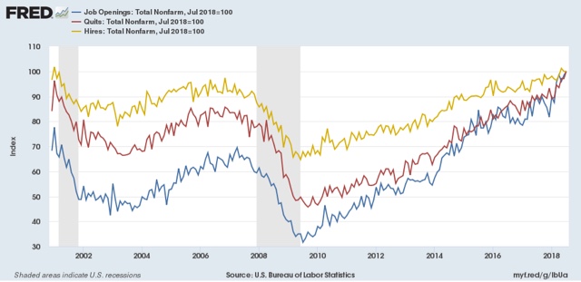
As I noted a month ago when I first presented this graph, while the rate of job openings is at an all time high, the rate of actual hires isn't even at its normal rate during the several best years of the last, relatively anemic, expansion. Meanwhile one month ago quits tied their best level of 2001 (at the end of the tech boom).
In other words, as we saw when we looked at the NFIB data earlier this week, the employer taboo against raising wages is continuing. In response, employees have reacted by quitting at high rates to seek better jobs elsewhere.
So in summary, the July JOLTS report continues to show a thriving employment market, but a market that is not in wage equilibrium, as employers are failing to offer the wages that employees demand to fill openings.
Wednesday, September 12, 2018
Real median household income rose 1.8% in 2017; poeverty rate declined
- by New Deal democrat
The Census Bureau reported this morning that *real* median household earnings rose 1.8% in 2017. Here's their presentation graph:

This is another score by Sentier Research, whose monthly estimates have accurately forecast the Census Bureau's (very tardy) annual reports and showed, on an annualized basis, growth in 2017, but on an averaged basis less than that from 2014 to 2015, or 2015 to 2016:

Remember a couple of caveats:
- "households" includes *all* households, including, e.g., year-round college roommates and, especially, retirees. Retirees' income is typically only about 1/2 of that of workers, so hoardes of retiring Boomers are affecting the median.
- "income" is more inclusive than "wages." For example, stock dividends interest on bonds are forms of income.
That being said, real income from full-time employment actually *declined* in 2017:

The difference between the rise in "all workers'" incomes on the left, and that of full-time employees on the right, is the increase in the number of hours worked by part-time workers, including transitioning to full-time employment. Recall that involuntary part-time employment has been declining sharply over the last 18 months:

The poverty rate did decline, so that is a definite plus:

What I still haven't found, and will update when I do, is real median household income by age cohort (that will take care of the issue of the increasing percentage of retiree households).
Tuesday, September 11, 2018
Decelerating trends in 5 long leading indicators
- by New Deal democrat
I have a new post up at Seeking Alpha, "Five Long Leading Indicators 'On the Cusp'."
The post follows up on my "Weekly Indicators" paradigm with graphs showing what the trends look like for aforesaid five series which have been hovering at the borderlines of being positive to neutral, or neutral to negative, over the past few months.
If you like my work, putting a little jingle in my pocket by clicking the link and reading is a nice thing to do.
The Taboo against raising wages is still thriving among small businesses
- by New Deal democrat
The National Federation of Independent Businesses (NFIB) put out its monthly confidence and hiring reports over the past few days.
The confidence report soared to new high, so the economy is Teh Awesome and happy days are here again! Right?
And look! It's confirmed by the hiring report, which also shows record high plans to hire new workers:

So how have those record hiring plans been working out? Ummm, not so well ....

When it come to, you know, actual hires, small businesses have not added any more workers than they have since 2013. With a big *actual decline* in the month of record desires to hire.
Leading to record numbers of unfilled openings:

Oh.
So what could possibly be behind this market failure, where employers can't seem to be able to find workers to fill those record openings?
Well, do you see anything in the below chart that sticks out like a sore thumb? You know, the only things with a dash or red arrow:

Yeah. *Lowering* compensation plans, and *zero* actual changes to compensation. That will do the trick.
Forget "monopsony" employers. The Taboo against raising wages is very much alive and thriving in small business.
Monday, September 10, 2018
Scenes from the August jobs report
- by New Deal democrat
1. The strong trend of people entering the jobs market and getting jobs remains intact
Here's a nice graph put together by Kevin Drum at Mother Jones showing both a linear and curvilinear trend line (which are nearly identical) (red) with the prime age employment to population ratio (blue):

The trend is intact and quite positive, despite the one month decline.
2. Involuntary part-time employment is near 25 year low levels
The below graph is of involuntary part time employment as a share of the entire labor force, from which I have subtracted 2.7% to norm the rate at zero:

Involuntary part time employment -- the primary addition forming the basis of the broad U6 underemployment rate -- has dropped to levels only seen for two months in the 2000s expansion, and exceeded for 3 years at the end of the 1990s internet boom.
3. But the percent of those who aren't even looking for work but want a job remains slightly elevated and has started to increase
The below graph is of those "not in the labor force who want a job now" as a percent age of the entire labor force, from which I have subtracted 3.15% to norm the recent low from March to zero:

This has never returned to either 1990s or 2000s levels, and has risen in the last 5 months. It might just be noise, or it might not.
4. Goods-producing employment has been soaring . . . BUT
This graph comes from Matt O'Brien at the Washington Post. Goods producing jobs have recently risen at 35 year highs:

This is mainly due to two things: (1) the post-2016 recovery in the Oil Patch; and (2) truck and railcar production. The latter is *extremely* pro-cyclical, as a mere slowdown in growth at the final goods levels means a sharp downturn in the orders for new trucks and railcars to support that growth.
One important note of caution about this trend: in the past, even a two month sequential decline in the rate of growth of goods producing jobs has usually meant a sharp cyclical slowdown at minimum. I counted only 3 occasions in the last 50 years where that was not the case.
And on that note, August growth slowed down from 3.75% YoY to 3.5% YoY. Since I am expecting a sharp slowdown in the economy by about midyear next year, if a second straight month of deceleration were to be reported next month, that would be a significant yellow if not red flag.
Saturday, September 8, 2018
Weekly indicators for September 3 - 7 at Seeking Alpha
- by New Deal democrat
My Weekly Indicators post is up at Seeking Alpha.
We have 4 long leading indicators fluctuating around the points where their ratings change. This past week they fluctuated in a positive direction.
As usual, clicking over and reading doesn't just inform you about the likely path of the economy going forward, but it rewards me a little bitty bit for putting together the information.
Subscribe to:
Posts (Atom)