- by New Deal democrat
As I wrote Friday, the May employment report was deeply bifurcated, with a strong Establishment survey, but a weak Household survey.
Let’s take a look at some of that bifurcation, focusing on the leading indicators.
There are 4 leading indicators in the Establishment portion of the report: manufacturing, residential construction, and temporary help jobs; plus the manufacturing work week. These are not my discoveries; they have been known for decades. In the Household survey, short term unemployment is also a leading indicator.
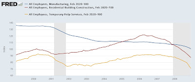
Here’s what these 3 sectors looked like before the 2001 ad 2008 recessions:
While there is no fixed pattern, in both cases they declined beginning about a year before the onset of the recession, and they declined significantly, generally by substantially more than 5%.
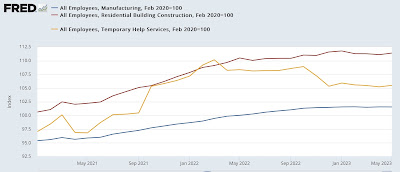
Turning to our present situation, in May, manufacturing jobs declined slightly, the manufacturing work week was unchanged, and both residential construction and temporary help jobs gained. Here is what their trends look like in the past 2 years:
All three have likely peaked, perhaps manufacturing just now. But with the exception of temporary help jobs, the scope of the decline is far less than before both of the above recessions. In great part, this is due to the continuing effects of supply bottlenecks in the construction and vehicle manufacturing industries.
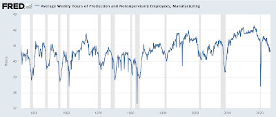
Next, here is the long term view of the manufacturing work week:
I don’t need a closer-in view for.this metric, because it is easy to see that it has declined by close to 1.0 hour, totally consistent with its declines before nearly every recession in the past 75 years.
Note that until 1980, hours normally had to decline below 40 to be consistent with the onset of recession. Since then, “leaner and meaner” factory production has meant fewer staff with more overtime. But the present level is consistent with its level before the last 3 recesssions before the pandemic.
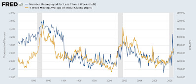
Now let’s turn to the Household survey. Here’s a long-term view of short term unemployment of fewer than 5 weeks (blue, left), with the 4 week average of initial jobless claims (gold, right):
Both are somewhat noisy, but initial claims are far less noisy than the 0-5 week unemployment metric, and initial claims also tend to lead by a short period of time.
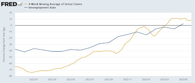
Here is the present situation:
While initial claims have turned higher, there is no discernable trend to the short term unemployment metric in the jobs report - at least not yet.
On the other hand, the unemployment rate turned 0.1% higher YoY, just as I suggested last week that it might in my discussion of initial jobless claims, which turned higher YoY in March:
Once again, initial claims have led the unemployment rate.
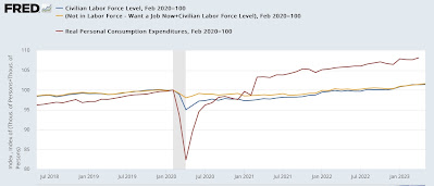
Finally, one graph giving the most important Big Picture reason of why the weakness in the above leading indicators hasn’t translated into negative or even objectively weak job growth.
Below shows the number of people in the civilian labor force (blue), plus additionally those not in the labor force but who nonetheless say they want a job now (gold). By definition, everybody else is out of the labor force and doesn’t want a job at present (e.g., they are retired). This is contrasted with real personal consumption expenditures (red). All are normed to 100 as of the onset of the pandemic:
Even including those who want a job but haven’t actively sought one, the potential labor force has only grown about 2% since then. But consumption, even after adjusting for inflation, has grown over 8% and the trend is still higher.
Typically over time real consumption has increased annually about 2% faster than the labor force. But in the last 3 years, it has grown about 3% faster on average.
There are simply a lot more jobs available to take care of that increased demand. But there still aren’t enough potential employees to fill the slots, even though the imbalance has gotten much less extreme (see also the continuing elevated “job openings” level in the last monthly JOLTS repot). Since in the aggregate employers can make more money by filling those slots, even at higher wage rates, employment has continued at a strong if decelerated pace.
