Saturday, April 27, 2019

Weekly Indicators for April 22 - 26 at Seeking Alpha


 - by New Deal democrat

My “Weekly Indicators” post is up at Seeking Alpha

The data has been improving since the beginning of March, and continued to improve this week. Although at the moment the prevailing sentiment, based on new stock market highs, and yesterday’s surprise 3.2% Q1 GDP, seems to be “happy days are here again!”, my suspicion is that the intermediate and lagging data is going to fade.

One reason for my suspicion is that most of the long leading data (except for interest rates) continues to point down, as in the two leading components of yesterday’s GDP report, as to which my post is also up at Seeking Alpha, here.

As usual, clicking over and reading helps reward me with a $ or 2 for my efforts.

Friday, April 26, 2019

Both leading components of GDP declined


 - by New Deal democrat

While overall GDP increased at a 3.2% annualized rate in the first quarter, personal consumption expenditures increased by a much more lackluster 1.2% annualized rate.

But the big news from my point of view is that private residential investment declined for the fifth quarter in a row, and proprietors’ income (a somewhat less leading proxy for corporate profits, which won’t be reported for another month) declined as well. Corporate profits had declined in Q4 of last year as well.

This means that both leading components of GDP are in confirmed declines.

Once FRED has the graphs, I will put up a more detailed analysis at Seeking Alpha and link to it here.

Thursday, April 25, 2019

How increasing local oligopolization has distorted the housing market


 - by New Deal democrat

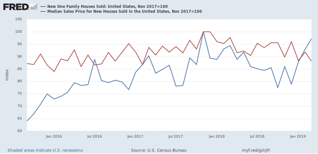
Earlier this week new home sales for March were reported, soaring to a new expansion high bar one month (November 2017). Something else that a few other writers picked up on: the median *prices* for new homes fell to a level not seen in the past two years, off -11.8% from their peak, also in November 2017: 


With mortgage rates also down at approximately where they were in January 2018, the carrying cost of a new house has declined by over 10% overall, enticing lots of new potential buyers into the market.

All well and good. But my reaction went a little beyond that: “Holy crap! Builders can slash their prices by almost. 12% and still make a profit?!?” 

That kind of pricing power smacks of a market that isn’t competitive.  In a truly competitive market, the kind of big price increases we saw until 2018 — at sales levels well below any time in the decade between 1995 and 2005 — would have called forth new supply at lower prices. It turns out, I’m not the only one who thought that. Two economists, Jacob Cosman and Luis Quintero, presented a paper, Fewer players, few homes: concentration and the new dynamics of housing supply, to the American Economic Association last winter, documenting just how much local oligopolization has distorted the market.

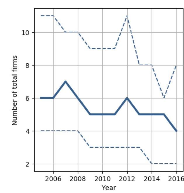
Let me cut to the chase. Here are the two graphs that show their primary points. The solid line in the first graph shows the number of firms that account for 90% of all homebuilding in the median local market (dotted lines are the first and third quartile of local markets):


This has declined from 6 to 4 firms in the decade since the bursting of the housing bubble.

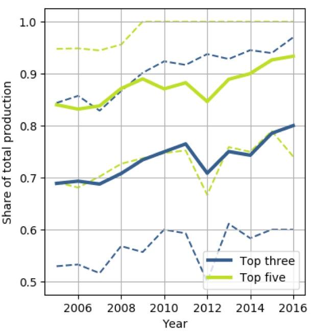
The second graph shows the share of production accounted for by the largest 3 and 5 firms in typical housing markets:


Each has increased by roughly 10% since the bursting of the housing bubble.

The authors conclude that:
“[compared with] a counterfactual scenario where housing market competition remains at its high pre-recession level across the United States[, ...] market outcomes [are] very different. The annual level of new housing would be $106 billion higher (equivalent of 3.4% of private fixed investment or 0.6% of gross domestic product. Approximately 150,000 additional housing units would be built each year. Housing price volatility would decline by over 50%.”
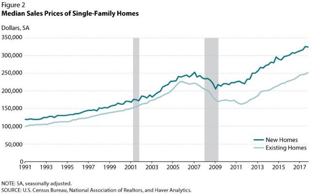
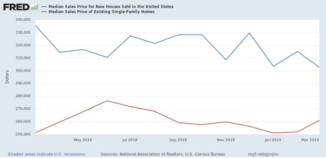
To give you an idea how dramatic an effect this market concentration may have had on housing in the past decade, here is a graph showing the typical pricing premium for a new house vs an existing house: 


Historically, the premium was 10%. Since the bursting of the bubble, however, that premium went up to 30%! Even now, as of March 2019, although it has closed somewhat, the premium is still 14%:


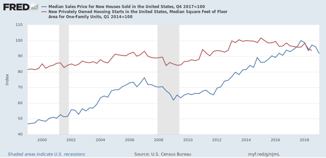
An alternative explanation that has been offered for the decline in median house prices since the end of 2017 is the square footage of the median new house that builders are offering is smaller. But a comparison of median prices and median square footage suggests that, while there is an effect, the market power of local oligopolies appears to be the primary driver in both the big increase in new home prices through 2017, and the big decline since.

Here is a graph of the median sales price for new houses (blue) and the median square footage of new houses (red) on a quarterly basis. Each is normed to 100 as of their respective peaks:


As you can see, house prices continued to rise by over 15% (!) in the nearly 3 years after the median square footage of a new house began to decline after Q1 of 2015. This certainly *isn’t* a decline in square footage driving a decline in prices!

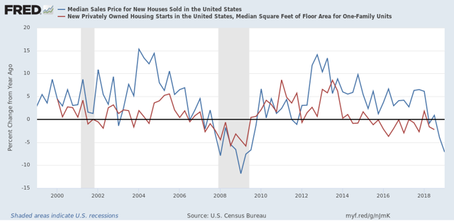
Further, there’s very little evidence that the rate of decline in square footage accelerated after prices peaked in Q4 2017, as shown by the same data graphed as YoY% change:


The square footage of the median new house has varied between unchanged and -3% in the past four years, both when prices were still increasing, and since prices started decreasing. For some reason FRED hasn’t gotten around to posting the Q4 2018 data for median house sizes (the last quarter for which data is available), but even that is only -2.4%. During that same period (Q4 2017 - Q4 2018) median house prices declined -3.9%. At the most, the decline in square footage explains no more than 60% of the decline in house prices.

An alternative explanation — and mind you, I am speculating here, I don’t have data — is that builders have been increasing their profits by decreasing lot sizes, thereby increasing the number of single family houses they can build on any given footprint of land.

Note further in the second graph above that median house prices appear to lead median square footage by about 1 to 2 quarters, suggesting that it is the change in prices which is driving the change in square footage, rather than changes in square footage driving prices.  A good test of this hypothesis will be if median square footage declines by more than -3% YoY by the 3rd quarter of this year.

The bottom line is that the increasing concentration, and attendant local market power, among home builders has distorted the housing market in the past decade, increasing substantially the cost of the typical new home while holding down the number of units constructed. Because new homes have been so much more expensive, this distortion has also been an important reason for the relative unaffordability of existing homes compared with historical norms, and by keeping both new and existing home prices higher than they would otherwise be, also been an important reason behind soaring rents, which are also at all time highs compared with median renters’ incomes. (UPDATE: In that vein, median asking rent for Q1 2019 was just reported, up +4.4% q/q and +5.5% YoY, continuing to show pressure in excess of income growth.)

Wednesday, April 24, 2019

Commercial and industrial loans: another sign of a slowdown?


 - by New Deal democrat

There are lots of cross-currents in the economy right now. At the absolute tip of the spear is the decline in interest rates since November, which has led to an improvement in some of the housing market metrics. In the shorter-term outlook, a simple quick-and-dirty metric of initial jobless claims (new 49 year lows) and the stock market (just made new all-time highs) suggests all clear. But there are contrary signs as well. For example, the weekly measure of temporary jobs by the American Staffing Association just fell to -1.8%, its worst YoY comparison since the 2015-16 shallow industrial recession. 
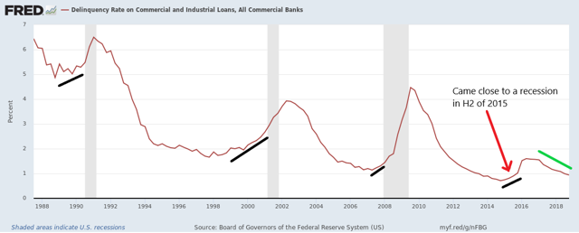
Here’s one other little tidbit. Yesterday I read an article elsewhere about how a near-term recession isn’t in the cards, citing among other things a declining delinquency rate for commercial and industrial loans. Here’s their accompanying graph:


True enough, although if you look carefully, in the lead up to both the 1990 and 2008 recessions there were only two quarters of significant increases off the bottom before the recessions began. Since the latest data in the graph is for Q4 2018, a similar pattern wouldn’t rule out a recession beginning as soon as Q3 of this year, i.e., July.

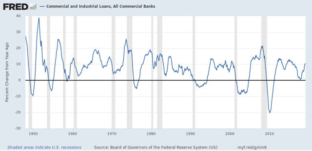
The value of commercial and industrial loans is a lagging indicator, typically not bottoming on a YoY basis until after a recession is already over:


But here’s the interesting thing. The same graph shows that YoY volume of such loans significantly *decelerated* from its YoY peak before 8 of the 11 recessions since 1945, as well as for all of the significant slowdowns, e.g., 1966 and 1995.

No big deal, right? At the far right of the graph, the YoY volume of loans was increasing as of March.

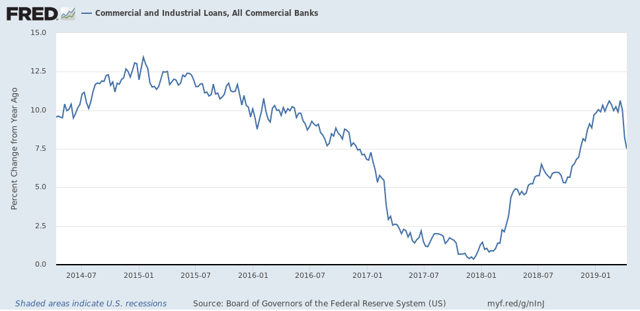
Except for this: when we zoom in on the recent weekly, rather than monthly data, we get this:


A very sharp deceleration over the past three weeks.

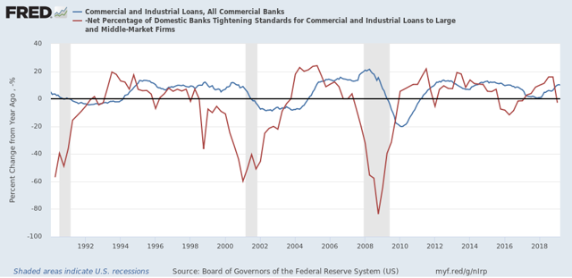
Of course, this could reverse with this Friday’s report. And since loans tend to follow bank tightening by about 5 quarters:


I tend to doubt the deceleration will go too far.

But nevertheless something to keep an eye on in terms of another sign of a slowdown.

Tuesday, April 23, 2019

New home sales suggest housing bottom is in


- by New Deal democrat

New home sales are extremely volatile, and extremely revised, but they do have the advantage of probably being the single most leading housing statistic, ahead of permits and starts.

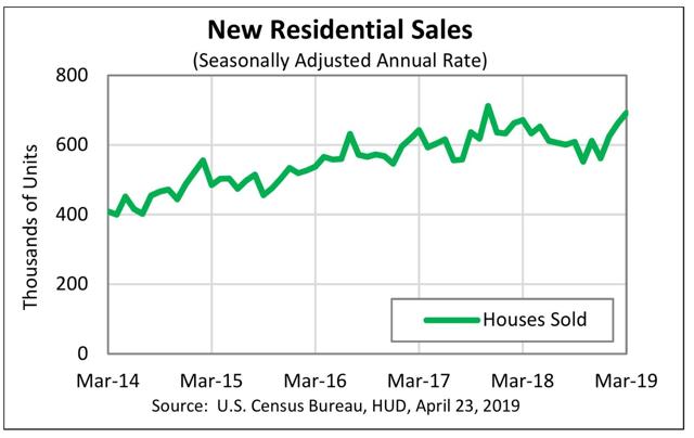
So it is noteworthy that new home sales for March rose to 692,000, below only one month in late 2017 when they hit their expansion high of 712,000:


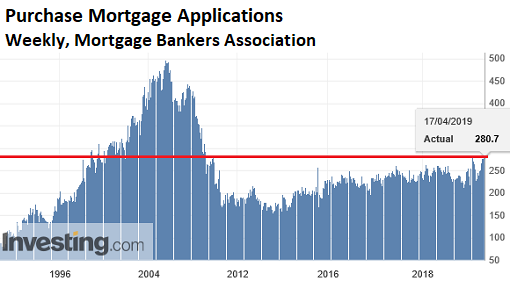
I have been looking for the bottom in housing, as mortgage interest rates have fallen in the past 5 months, and purchase mortgage applications have risen to new expansion highs:


Subject to revisions(!) —this morning’s data indicates we’ve already made the bottom in new home sales, and adds to my confidence that we either have just made or will shortly make the bottom in housing permits and starts.

My guess is that interest rates have now stayed lower long enough for new expansion highs to be set in all of the metrics, although because of continuing increases in the price of houses, there is not much room for advances beyond that.

Monday, April 22, 2019

When will residential construction employment start to decline?


 - by New Deal democrat

Because the long leading indicators turned down in 2018, over the last few months, I have repeatedly looked at the leading employment sectors of temporary jobs, manufacturing, and construction, to check for that weakness feeding through. Today I am taking a closer look at construction jobs.
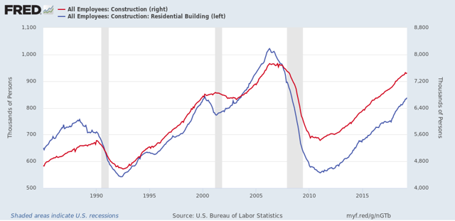
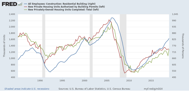
To begin with, while construction jobs as a whole do lead, residential construction jobs have been the most leading sector of construction jobs, as shown in the graph below:  

Although, interestingly, construction employment is down slightly from January, while residential employment has continued to increase.
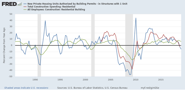
Next, here’s a comparison of the YoY% change in single family permits (blue), residential construction spending (red), and residential construction employment (green), averaged quarterly to cut down on noise:

To cut to the chase, the peak in YoY construction spending follows permits with usually a one quarter lag. Residential construction employment, in turn, follows spending with one more quarter lag. Both permits and spending are down YoY as of the most recent data. Employment is merely decelerating.
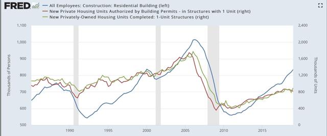
So when might we expect residential construction employment to turn down meaningfully? I next broke out permits vs. housing completed, and compared both of those to residential construction employment. Here’s what I got.
Measured by single family units:
Measured by total units:

In both cases, residential construction employment coincided most closely with housing completions.

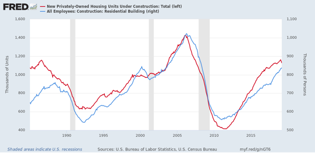
 It appears that, usually, employers keep employees on the books even as units under construction begin to decline, until the decline goes all the way to completions:

Note that in the 1980s, this most closely tracked single family homebuilding. It  be tracking total units more closely now.
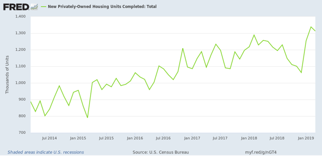
In any event, here is a close-up on total housing completions through March:

This may explain why residential construction employment has not turned down meaningfully yet.
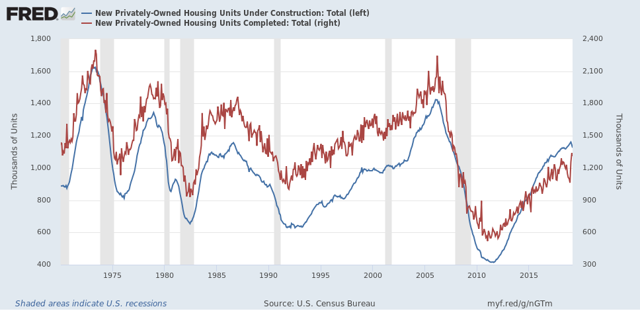
Finally, I looked at historically how long it took after units under construction peaked for completions to peak:


In the past 50 years, with the exception of one outlier - 1978, in which completions actually led by 4 months - the peak in units under construction has led the peak in completions by between 1 and 5 months.

Note that units under construction, for now, last peaked in January. Completions may have peaked in February.That means, if January was the peak for units under construction, we should expect completions, and residential construction employment, to turn down meaningfully no later than June.


Sunday, April 21, 2019

Nailed it!


 - by New Deal democrat

Three weeks ago I wrote No, the Meuller report ***DID NOT*** “find no collusion!” in which I lambasted and parsed Barr’s conclusory snippet of the Mueller report, to wit, that “[T]he investigation did not establish that members of the Trump Campaign conspired or coordinated with the Russian government in its election interference activities.”

I pointed out that: 
 ... the bracketed [T] in Barr’s quote of Mueller is doing a lot of work. Because it means that there was a first part of the sentence that was omitted. Put that together with the fact the Mueller’s quote then specifically references that “the investigation did not establish ...” and there is compelling evidence that the first part of the actual sentence was a qualifier. .... Almost certainly the first part of the sentence is something like “Although...’” “Since ...’” or “Despite ...” followed by “the investigation...”,  or a formulation like “The grand jury’s work is incomplete, and so the investigation ...”
(Emphasis added)
Now that we have (most of) the actual Mueller report, we know that the complete sentence reads:

Although the investigation established that the Russian government perceived it would benefit from a Trump presidency and worked to secure that outcome, and that the Campaign expected it would benefit electorally from information stolen and released through Russian efforts, the investigation did not establish that members of the Trump Campaign conspired or coordinated with the Russian government in its election interference activities.”
(Emphasis added)
Exactly as I thought, and said. The first part of the sentence Barr quoted severely qualified the portion he chose to highlight. 

I also wrote:
While the “no finding” formulation is consistent with a “finding of no collusion,” it is also consistent with other readings: 
 1. The investigation isn’t complete yet (which is almost certainly a correct statement). 
2. The evidence is inconsistent, weak, or contradictory. 
3. There are too many unknowns to come to a conclusion. 
4. While the evidence of collusion is strong, it is not strong enough to support a jury verdict beyond reasonable doubt.
 Mueller’s report makes clear that, first of all, he made “no finding” as to the narrower question of criminal conspiracy, which requires an actual or tacit agreement, rather than encouragement and coordination, I.e., “collusion.” Further, he explicitly qualifies his “no finding” by noting gaps in the evidence, in the form of witnesses who refused to testify under oath, and/or deletions of crucial  communications  Mueller’s report leaves open the possibility that the conclusion could change if the missing evidence were provided.

Saturday, April 20, 2019

Weekly Indicators for April 15 - 19 at Seeking Alpha


 - by New Deal democrat

My Weekly Indicators post is up at Seeking Alpha.

The data has been very mixed in the past few weeks. Either the slowdown is already over, or else this is a rebound from a "mini-recession" caused by the government shutdown, after which the slowdown will be resumed. We'll see!

Friday, April 19, 2019

Sales rebound from government shutdown-induced “mini-recession;” March housing lays an egg


 - by New Deal democrat

While March retail sales rose strongly, total business sales for February - also released yesterday - which includes manufacturers’ and wholesalers’ sales in addition to retail sales, continued to languish. This adds to the evidence that there was a “mini-recession” for several months likely brought about by the lengthy government shutdown, and there has been a rebound since (including blockbuster new lows in jobless claims).

This post is  up at Seeking Alpha.

But I’ve been reluctant to conclude that the slowdown this year is off. This morning’s housing permits and starts for March were solid evidence in support of that position, showing that the recent decline in mortgage rates hasn’t filtered through to new housing construction yet. Housing may be bottoming, but it’s at near-recessionary levels.

I have a post in the queue at Seeking Alpha on that as well. Once it is posted, I’ll put up a link.

UPDATE: And, it’s already up Here.

Thursday, April 18, 2019

March real retail sales very strong, but no “all clear” yet


 - by New Deal democrat

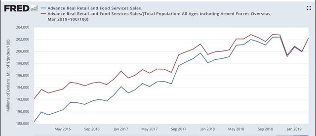
This morning’s retail sales report for March was very strong on both a nominal basis, up +1.6%, and also on a real, inflation-adjusted basis, up +1.2%. At the same time, it is still ever so slightly below its peak of five months ago, and YoY real sales have not recovered to those typical for this expansion. Let’s take a look.

Below are real retails sales for the last few years, and because it is a long leading indicator, real retail sales per capita (in red): 


As revised, both of these last made new highs last October. So the good news is, the weakness of the last few months has been entirely reversed. The caution is, we still don’t have a new high, although this data series is notoriously noisy.

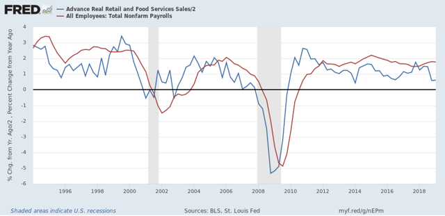
Although the relationship is noisy, because real retail sales measured YoY tend to lead employment (red in the graph below) by a number of months, here is that relationship for the past 25 years (averaged quarterly to cut down on noise):

Although there has been some recovery in the YoY real retail sales measure, the prior weakness has not been revised away. As a result, I continue to think that employment gains are likely to downshift significantly over the next several months.

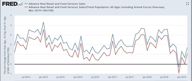
Next, here are both forms of real retail sales YoY recently:


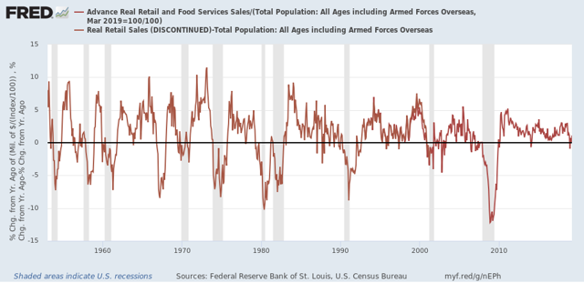
And here are real retail sales per capita YoY, going all the way back to 1948:

In the last 70 years, this measure has always turned negative at least shortly before a recession has begun. There are no false negatives. While there are about a dozen false positives for a single negative month, there are only four false positives for consecutive negative readings — 1966, 1995, 2002, and early 2006. Since there has only been one month - last December - where this was negative YoY, this was probably a false positive as well.

To sum up, this was a very good reading that, together with yet another 49 year low in initial jobless claims this morning, negatives any imminent recession. At the same time, while we are certainly headed in the right direction, because we have not exceeded the highs of nearly half a year ago, there are still signs of weakness.

Wednesday, April 17, 2019

YoY Industrial production and structural changes to the US economy since 1980


 - by New Deal democrat

No big economic releases today, so let me follow up further with a few long-term comments on industrial production.

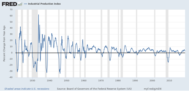
This series goes back 100 years to the beginning of 1919. Since that time it has turned negative YoY 25 times:
Of those 25 times, 17 have been during recessions, sometimes having started shortly beforehand. On only 8 occasions have negative YoY readings not been associated with recessions. That’s better than a 2:1 rate of correct readings vs. false positives, with no false negatives.
But it gets better. If you take out the 4 times industrial production has been negative YoY for only one month — July 1954, July 1967, July 1989, and January 2014 — that’s 17 correct calls and only 4 false positives, a ratio of better than 4:1.
The four remaining times were 2 occasions of 4 months’ duration: July through October 1934, October 1989 through January 1990; I occasion of 12 months’ duration: August 1951 through July 1952. And the biggest false positive of all: March 2015 through October 2016, the recent “shallow industrial recession:”

As the above shows, while the Oil patch bore the brunt of that downturn, manufacturing turned down as well. But there was no recession, because the rest of the economy held up.
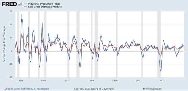
Which brings me to a second point. Here’s the long-term graph of industrial production vs. real GDP, both measured YoY:

Until the 1980s, both moved in tandem. While there were differences in scale in steep downturns or upturns, both moved together.
Since the 1980s, though, there have been lengthy periods of industrial malaise where the economy still remained quite positive: twice in the 1980s, 2002-03, and the recent shallow industrial recession. This reflects the transformation of the US into a service economy.
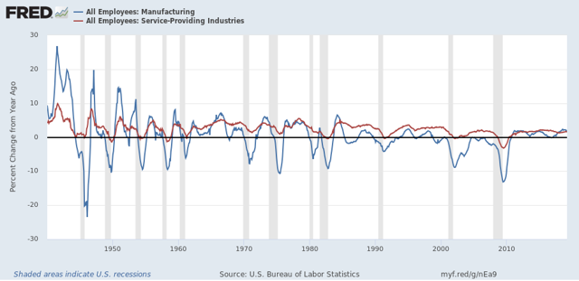
One of the things that made the “Great Recession” so “great” was that it had the biggest ever downturn in jobs in the services sector, over -3%:

No other recession in the past 70 years even came close. In the runner-up, 1949, only -1.4% of services jobs were lost YoY. 
The difference in manufacturing vs. service jobs and the fact that the big industrial production declines in 2015-16 failed to produce a recession together  show us how much the economy has changed since 1980.

Tuesday, April 16, 2019

Industrial production continues to decelerate


 - by New Deal democrat

Industrial production is the King of Coincident Indicators. In dating the onset and end of recessions, in practice the NBER relies upon industrial production more than any other measure.
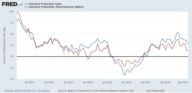
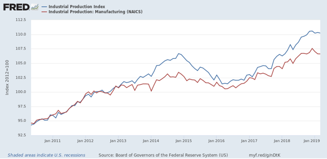
March 2019 production continued a string of recent disappointments, with overall production declining -0.1%, and manufacturing production unchanged. For the first quarter of 2019 in total, overall production declined -0.3%, and manufacturing declined -0.8%. Here’s the graphic look at the past nine years:

Note that the recent flatness is on par with, e.g., 2012, which was nowhere near to recession.
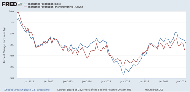
But on the other hand, after a surge last summer, leading some to conclude that we were in a “boom,” both total and manufacturing production have decelerated sharply on a YoY basis. Both levels YoY were last seen in late 2017:

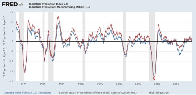
The below graph subtracts the current YoY measure from each of the two so that the current level shows as zero on the historical graph. As of now both are at typical YoY levels for most of this expansion, but at or below YoY levels which in the past have typically been seen during slowdowns, e.g., 1966, 1985, 1996, and 2002, not to mention the “shallow industrial recession” of 2015-16:

In short, by long term historical standards, industrial production is in a slowdown. By the standards of this expansion, it has slowed down from last summer’s “mini-boom” to more normal levels.

Monday, April 15, 2019

The three best arguments against an economic slowdown


 - by New Deal democrat

I still think I’m right that there will be a worsening economic slowdown that shows up by about summertime and continues towards the end of the year.

But there is one long leading indicator and two important short leading indicators that are going the other way. Rather than ignore them, I accept them and explain why I don’t think they negate my forecast. This article is up at Seeking Alpha.

——-

On a more somber note, Today We Are All Parisians.

And now, watch me tap dance!


 - by New Deal democrat

So I was going to post a piece on “why I could be wrong” here this morning. But then, because it is strictly about economic forecasting, I decided it really belonged over at Seeking Alpha, where I can earn my lunch money.

So I got nuttin’. Well, ok, the new orders subindex of the Empire State Manufacturing Index rose a little bit this month.

Aside from that, watch me tap-dance . . . .

When SA puts up my piece, I’ll link to it here for your reading enjoyment!

Saturday, April 13, 2019

Weekly Indicators for April 8 - 12 at Seeking Alpha


 - by New Deal democrat

My Weekly Indicators post is up at Seeking Alpha.

Lower interest rates have to some extent been offset by weaker real money supply. In any event, they haven’t fed through into other, shorter term indicators just yet.

As always, clicking over and reading should bring you up to date on the economy, and reward me a little for my efforts.

Friday, April 12, 2019

The economy in 2019: a look at the “big picture”


 - by New Deal democrat

Although I have a bunch of nerdy forecasting models, I view my primary mission as trying to explain what is going on in the economy for ordinary middle and working class American workers and consumers.

I’ve been meaning to do a “30,000 foot perspective” on the economy for awhile, to draw together all the information into a Big Picture narrative. Well, I finally got around to it, and it is up at Seeking Alpha. This is something that should be of particular interest to those who have followed me all the way back from my Daily Kos days.

The most overlooked feature of the economy in the past five years has been the way low gas prices have allowed room for the economy - and real wages - to grow without being strangled by high interest rates.

Thursday, April 11, 2019

February JOLTS: a mirror of the poor jobs report


 - by New Deal democrat

The JOLTS report on labor is noteworthy and helpful because it breaks down the jobs market into a more granular look at hiring, firing, and voluntary quits. Its drawback is that the data only goes back less than 20 years, so from the point of view of looking at the economic cycle, it has to be taken with a large dose of salt. 
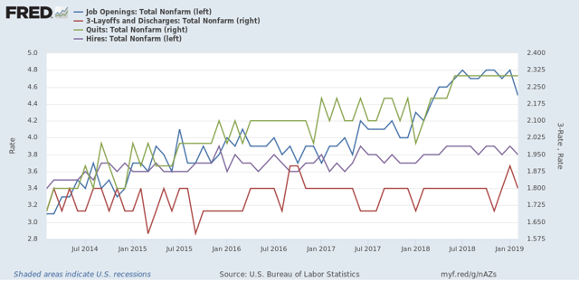
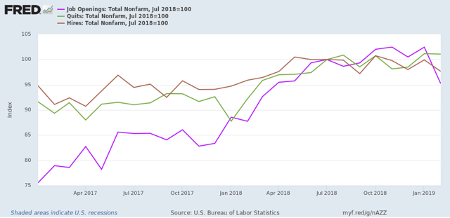
With that disclaimer out of the way, Tuesday’s JOLTS report for February generally mirrored the poor jobs report (+20,000, revised to +33,000) for that month. With the exception of one new high, the other series are off their best levels, and two continued to decline:
  • Quits declined -0.1% from their peak of one month ago.
  • Hires declined and are -3% off their October peak.
  • Total separations rose slightly but remain about -2% off their peak in last July.
  • Job openings declined about -7% from their October all time high, which was virtually tied one month ago. While this is a sharp decline, it has typically happened once or twice a year in this series even during expansions.
  • Layoffs and Discharges rose slightly and remain about 9% higher than their September 2016 low, although well below their levels of most of the past 18 months.
Let's update where the report might tell us we are in the cycle.
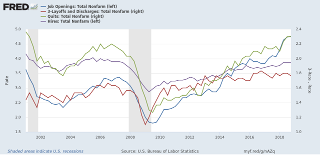
First, below is a graph, averaged quarterly through the fourth quarter, of the *rates* of hiring, quits, layoffs, and openings as a percentage of the labor force since the inception of the series (layoffs and discharges are inverted at the 3% level, so that higher readings show fewer layoffs than normal, and lower readings show more):

During the 2000s expansion:
  • Hires peaked first, from December 2004 through September 2005
  • Quits peaked next, in September 2005
  • Layoffs and Discharges peaked next, from October 2005 through September 2006
  • Openings peaked last, in Spril 2007
Now here's what the four metrics look like on a monthly basis for the last five years:

With the exception of layoffs and discharges, only hires and total separations  *possibly* show signs of having made a cyclical peak at this point.
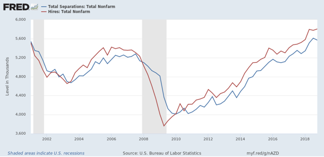
Next, here's an update to the simple metric of "hiring leads firing," (actually, "total separations"). Here's the long term relationship since 2000 through Q4 of 2018:
 

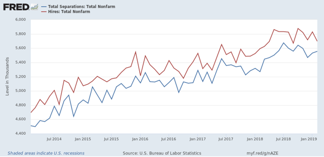
 Here is the monthly update for the past five years: 
     
In the 2000s business cycle, hiring and then firing both turned down well in advance  of the recession. Hires *may* have made their cyclical peak last July. If so, that would be sin line with what happened during the 2000s expansion, when hires peaked first, but it is obviously too soon to know for sure. 

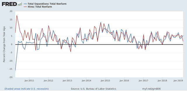
Further, while gains in each have decelerated on a YoY basis, as shown in the graph below, there is no sign of a significant downturn:


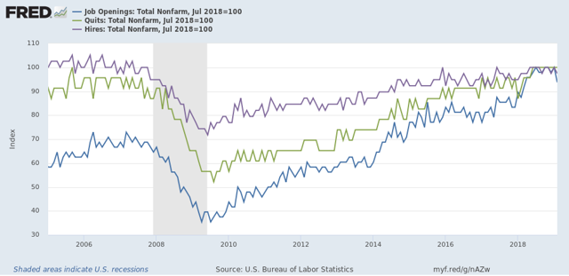
Finally, let's compare job openings with actual hires and quits. As you probably recall, I am not a fan of job openings as "hard data." They can reflect trolling for resumes, and presumably reflect a desire to hire at the wage the employer prefers. In the below graph, the *rate* of each activity is normed to 100 at its July 2018 value:
 
Now, here is a close-up of the last two years:
In 2018, my take was that employees have reacted to the employer taboo against raising wages by quitting at high rates to seek better jobs elsewhere.  If the dam were finally breaking, we should see the hiring rate increase, and quit rate level off. With the most recent revisions, that is not the case, as quits have continued to increase slightly, while hires have decreased slightly.  
In summary, the February JOLTS report reflected some of the same weakness we saw in that month’s jobs report, but there is no evidence of significance of any more profound downturn. 

Wednesday, April 10, 2019

Real wages got gassed in March


 - by New Deal democrat

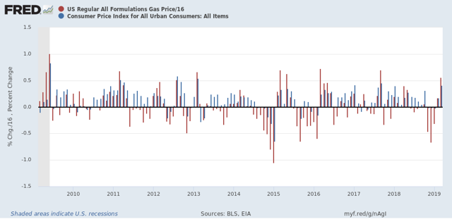
The consumer price index rose +0.4% in March, mainly as a result of a big monthly increase in gas prices. That really shouldn’t have been a surprise, since almost every time gas prices have increased by as much as they did in March — up 9% for the month — consumer prices as a whole have gone up at least +0.4%. I’m showing just the last 10 years in the graph below:

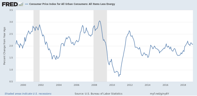
In fact, ex-gas, consumer inflation ex-energy has been remarkably stable between 1.5% and 2.5% YoY ever since gas prices made their long term bottom in early 1999. The only big exceptions were in the year before each of the last two recessions:


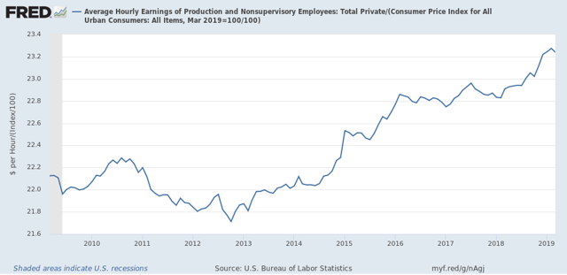
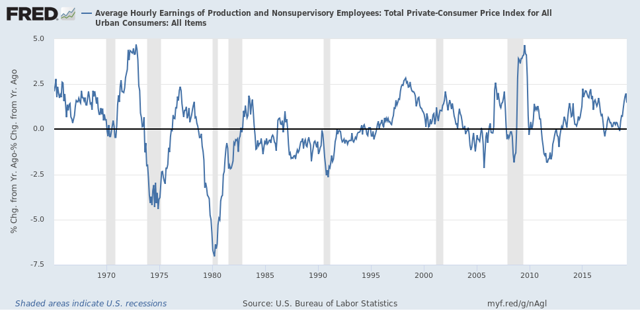
As a result of the 0.4% jump in inflation, real wages for non-supervisory employees, which went up +0.3% last month, actually declined slightly:

On a YoY% basis, real wages also decelerated slightly, down to +1.4%. Here’s the big picture look going back over 50 years:

Just one month, so not a big deal. Unless gas prices continue to increase at this rate for several more months, in which case headline inflation will be significantly over 2%, and the Fed may feel compelled at very least not to lower rates. In that regard, it’s worth noting that, as shown in the above graph, the typical late cycle pattern over the past 50 years is for wages to increase more than earlier in the cycle, but for the inflation rate to rise even more.

Tuesday, April 9, 2019

Downturn in manufacturing new orders adds to evidence of slowdown


 - by New Deal democrat

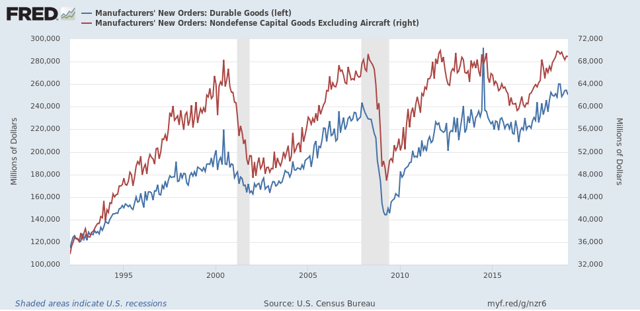
I don’t normally pay much attention to the new factory orders report, because it is simply too noisy to be of much use. But as of February’s report, released yesterday and showing a -0.1% decline in “core” new orders, there is enough to at least take notice.

Here are overall new factory orders (blue, left scale) and “core” new orders (red, right scale) for the past 25 years:
 

In the first place, while they clearly turned down in advance of the 2001 recession, which was a producer-led recession, that wasn’t the case at all, especially for “core” new orders, in the 2008 recession, which was consumer-led. Further, there is so much monthly noise that monthly readings don’t give you reliable signal until the turn is well underway.

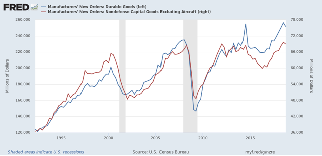
To tease out more signal from noise, here is the same data as above, but on a quarterly basis (note since March data hasn’t been released yet, this ends with Q4 2018):


Much less noisy, but even here a one quarter downturn happens often enough in the middle of expansions that it really doesn’t give us helpful information.

Even two negative quarters in a row, while more helpful, still shows us negative readings in 1998 and 2015-16:


This can tell us that manufacturing is indeed in a downturn, but not enough to reliably forecast a recession.

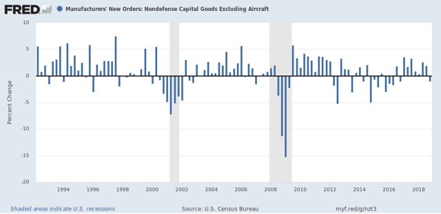
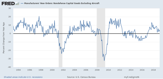
Finally, here is the YoY% change in core new orders:


While a YoY decline for several quarters in a row has occurred before both of the last two recessions, that was also true of 1998 and 2015-16.

That neither overall new orders nor core new orders have made a new high in 6 months as of February, and are likely to be down two quarters in a row once we have March’s data, is certainly evidence of a slowdown in manufacturing. Only in conjunction with indicators from other sectors like construction and consumer spending could we draw any conclusions about an economic slowdown vs. something worse. 

Monday, April 8, 2019

I told you so: the March employment report showed a slowdown in the leading sectors


 - by New Deal democrat

For the past few months, I have been forecasting a jobs slowdown. That has been based in part on the natural progression of a downturn in long leading indicators, then short leading indicators, and finally to coincident indicators of which jobs along with industrial production are the Queen and King, respectively.

Further, I have pointed out that, even when the spread between short and long term bonds simply gets tight, even if there is no outright inversion, employment growth almost always falters. And goods-producing employment - including manufacturing and construction jobs - has *always* faltered in the past 60 years.

Finally, since temporary jobs are a well-known leading indicator for jobs as a whole, I have been expecting them to slow down if not turn down.

March’s jobs report  delivered all of this in spades.

But I received a little blowback on this point, suggesting that the declines were trivial or that I was retrospectively cherry-picking to support a Doomish hypothesis. Far from it: this is something I’ve been forecasting for months in specific sectors, and in the last three months, even in the face of big overall employment gains, it has shown up.

So, to set the record straight, before I get to the March graphs, let me recap the literally 15 times I warned of a coming slowdown in manufacturing, construction, and temporary jobs, and in the goods sector  generally. If you don’t want to read the “I told you so” part, just scroll right past number 15 to the bolded headline and you’ll get right to the March jobs graphs.

The 15 times I forecast an oncoming slowdown in leading employment sectors

1. Last August: the simple tightening of the yield curve suggests a subsequent jobs slowdown
Four times during the 1980s and 1990s the difference in the interest yield between 2 and 10 year treasury bonds got about as low as it is now [Note: i.e., August 2018] (blue in the graphs below). That occurred in 1984, 1986, 1994, and 1998.   
Even though on none of those 4 occasions a recession followed, on 3 of 4 of those occasions YoY employment gains ... subsequently declined ...  
In other words, even if the Fed stops raising rates now [as of August 2018], and the yield curve does not get tighter or fully invert, my expectation is that monthly employment gains will decline to about half of what they have recently been -- i.e., to about 100,000 a month -- during the next year or so.
2.  In January, discussing The consumer nowcast and economic forecast
Keep an eye on these three areas (new orders, temp hiring, and new jobless claims). If these turn outright negative, that will be a very strong sign that poor public policy is causing what otherwise would just be a slowdown to tip all the way into recession.


Unsurprisingly, building permits lead construction employment. The lead time between the former turning negative YoY vs. the latter has varied between 5 and 23 months, but usually has been between 10 and 14 months. Currently, with the exception of one month, permits have been negative YoY since August.  
[C]onstruction employment has usually turned down YoY before a recession....

The number of manufacturing jobs themselves has also turned down in advance of recessions ever since 1974. 

...the absolute number of manufacturing jobs reliably decelerates from peak before a recession begins, and usually declines, even if the YoY change does not turn  negative.
At present, while the manufacturing work week has declined in recent months, the absolute number of manufacturing jobs has not followed.
The second conclusion, building on my last post concerning construction jobs, is that with the sole exception of the oil shock of 1974, no recession has ever started without at least one of the two - construction or manufacturing jobs - having moved down first.

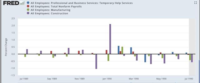
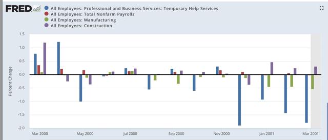
5. I followed that up with a post showing how manufacturing, construction, and temporary jobs have led the overall jobs numbers prior to each of the last three recessions, including the following three graphs .


1989-90

2000-01


2006-07
If the poor December ( retail sales) number isn’t revised away, or reversed by a big gain in the next months’ report, this portends a significant deceleration in jobs growth in the monthly employment reports over about the next 6 months.
All of which makes me think that the deceleration of temp jobs in the monthly report for the last three months, ... hasn’t just been noise, but - while still positive - is demonstrative of real weakness.
The bottom line is that almost all of the other economic data has been validating the “slowdown” forecast I made beginning last summer, and I expect employment to follow — and temporary jobs will probably lead the way.
Tomorrow I am looking for continued gains in both manufacturing and construction, but a cooling in manufacturing vs. continued trend growth to a slight deceleration in construction.  In both cases this means gains of less than 30,000, and possibly as low as 5,000. Because the economy is slowing, and this should show up in jobs numbers, if there is a surprise in either or both, it will likely be to the downside.
Finally, I expect YoY overall jobs growth to begin to decelerate from its peak last month:

this month’s report actually went beyond taking back January’s report. The YoY change in construction, manufacturing, and total jobs for the last two months combined are all lower than they were in December.  

In summation, I suspect this month marked the first month in which the economic slowdown showed up in the jobs report.


The bottom line is that, even averaging January with February, all of the leading employment indicators show some deterioration, but none of them are at a point where I would expect them to be if a recession were imminent.

...Even if the Fed starts to lower rates soon, I strongly suspect that January was the YoY peak in employment, and we have started down the road to roughly 100,000/month employment gains - if not worse - later this year. 

After the 2015-16 shallow industrial recession, the growth in temp jobs picked up decently. But in the last four months, only about 2250 temp jobs per month have been added. I am looking for this decelerating trend to continue, and the decline in the Staffing Index indicates we shouldn’t be surprised if there is an outright loss in temp jobs in the report on Friday.

15. Pointing out that A tight or inverted yield curve has always led to a stall or downturn in goods-productions jobs, in the context of what to watch for in the March jobs report: 

Note that in *every* case that the interest rate spread has inverted, or just decreased to nearly zero, within about 18 months YoY growth in goods-producing jobs has declined to less than 0.5%, and usually outright declined. That translates to an annual pace of not more than 7000 goods producing jobs a month. By contrast, in the past several years at least 20,000 goods productions jobs have been addedvirtually every month ...

So if history is a guide, a sharp slowdown in goods producing jobs growth should begin  very soon, if not having already begun in February.

To the graphs:  the jobs reports in the last three months have borne out my forecast for a deceleration or decline in the leading semployment sectors


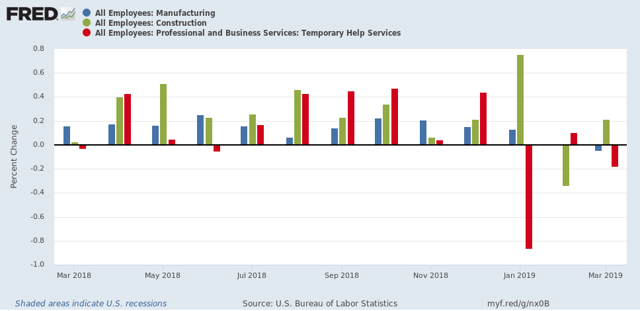
First, here is a m/m graph of manufacturing, construction, and temporary jobs, all of which are leading sectors for jobs as a whole:


In the past three months, all three have faltered, with decelerating or outright declines in jobs. Note how similar this looks to the trend in the three pre-recession graphs of these sectors I posted under article #5 above.

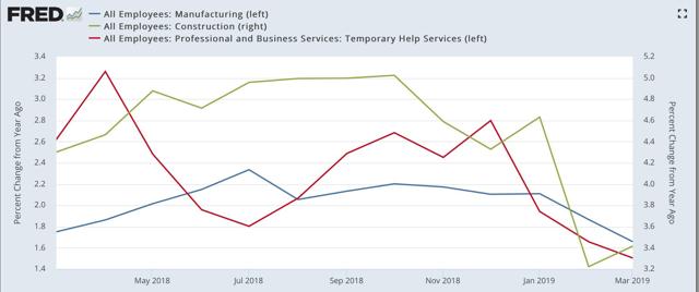
Here is the YoY look at the same three sectors, showing that all three have decelerated substantially:


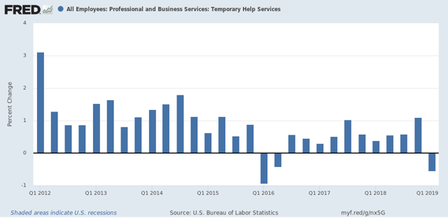
On a six month basis, temporary jobs are up by 500 out of 3 million! Here are the quarterly numbers, showing that Q1 of this year marked the first decline, aside from the downturn of 2015-16, since the end of the Great Recession: 

By the way, if you don’t believe me that temporary jobs are a leading sector for jobs overall, then how about University of Oregon Professor Tim Duy, who wrote in connection with Freiday’s report that it contained “A Hint of Weakness;”

 On the surface, this is another “Goldilocks” report – strong job growth, low and steady unemployment and nothing in the wage data to support inflation concerns. A hint of weakness, however, is visible in the temporary help numbers:

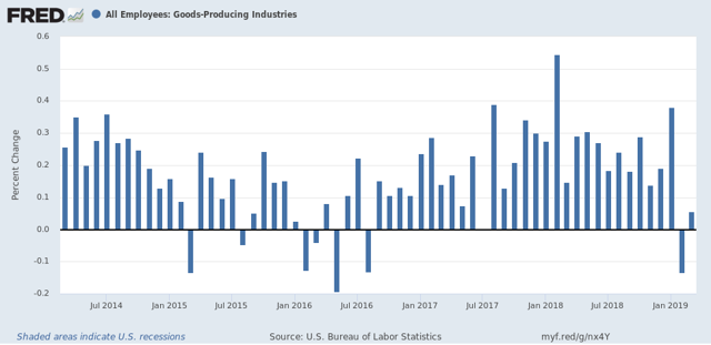
Next, here are goods-producing jobs (which include but are not limited to manufacturing and construction). Last week I wrote that I expected these to slow down to a rate of +7000/month. In the past two months, there was a loss of -28,000 in February, followed by a gain of +12,000 in March:


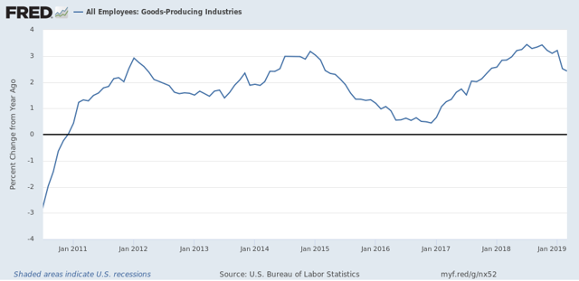
Here is the YoY look:


The last two months average to -8,000 per month.

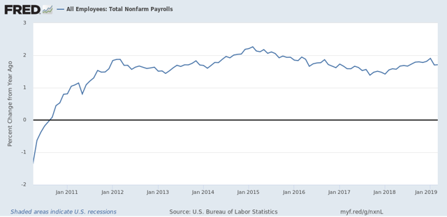
Next, here is the YoY% change in nonfarm payrolls, showing a deceleration in the past two months:


This is as I forecast.

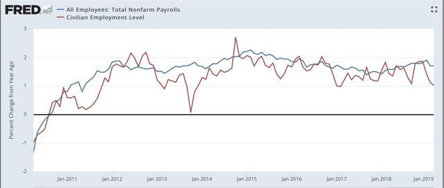
Here is a comparison of YoY changes in nonfarm payrolls as measured b the establishment report vs. jobs as measured by the household report:


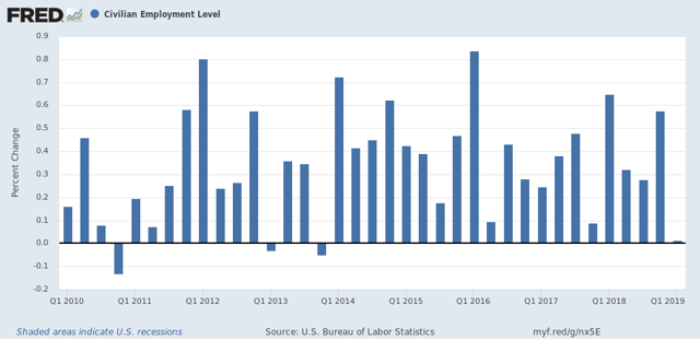
What is noteworthy is that, at turning points, it appears to be the case that the household report gives warning first. in that regard, this past month was one of the worst 4 months in the past 9 years:


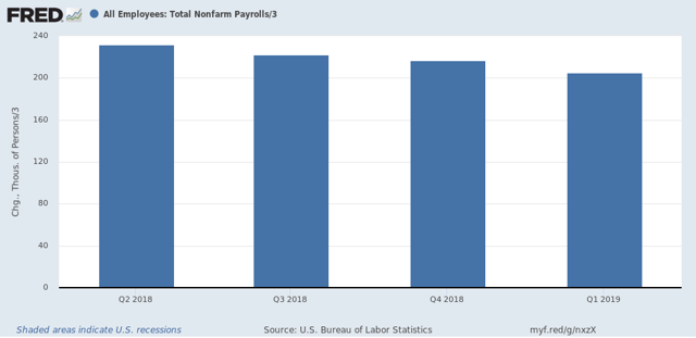
Finally, here is a graph of the quarterly changes in employment since the beginning of 2018.  Jared Bernstein, who is convalescing from a stroke, typically compares the 3-, 6-. And 12-month average in employment growth to show the trend:


Here are the numbers:

3 month average: 205,000
6 month average: 208,000
12 month average: 219,000

This shows a slow decline in the job growth trend overall.

In sum, for three months I have been pounding the table to watch the leading sectors of manufacturing, construction, and temporary jobs.  The three months since, including Friday’s jobs report, give every appearance of heralding the jobs slowdown I have been forecasting.