Saturday, January 26, 2013

Weekly Indicators: positive at mid-winter edition


- by New Deal democrat

December monthly data reported this past week featured the index of Leading Indicators, up 0.5. This was anticipated as initial claims rebounded from their Hurricane Sandy-induced increase in November. On a 6 month basis, these are now significantly positive. On the other hand, both new and existing home sales declined from November.

Let's start this look at the high frequency weekly indicators by checking out how the increase in tax withholding may be affecting consumer spending.

Consumer spending
  • ICSC -1.5% w/w +3.2% YoY

  • Johnson Redbook +1.8% YoY

  • Gallup daily consumer spending 14 day average $75 up $10 YoY
Gallup remains very positive. The ICSC varied between +1.5% and +4.5% YoY in 2012. Johnson Redbook is also in its generally YoY growth range from 2012.

Housing metrics

Housing prices
  • YoY this week. +2.8%
Housing prices bottomed at the end of November 2011 on Housing Tracker, and have averaged an increase of +2.0% to +2.5% YoY for the last year, so this is a particularly positive reading.

Real estate loans, from the FRB H8 report:
  • 0.0% w.w

  •  +2.4% YoY

  • +2.6% from its bottom
Loans turned up at the end of 2011 and averaged about 1% gains YoY through most of 2012, and have recently shown somewhat more YoY strength. This week was at the top of its recent range.

Mortgage applications
  • +9% w/w purchase applications

  • +26% YoY purchase applications

  • +8% w/w refinance applications
Purchase applications have been going sideways for 2 years. This week's reading finally moved above that range, and was the best reading since April 2011. Refinancing applications were very high for most of last year with record low mortgage rates, and after a brief retreat, are once again very strong.

Interest rates and credit spreads
  • -0.01% to 4.69% BAA corporate bonds

  • -0.03% to 1.87% 10 year treasury bonds

  • +.02% to 2.82% credit spread between corporates and treasuries
Interest rates for corporate bonds have been falling since being just above 6% two years ago in January 2011, hitting a low of 4.46% in November 2012. Treasuries have fallen from about 2% in late 2011 to a low of 1.47% in July 2012. Spreads have varied between a high over 3.4% in June 2011 to a low under 2.75% in October 2012. That weak was slightly negative, although the YoY changes remain very positive.

Money supply

M1
  • +1.4% w/w

  • +0.7% m/m

  • +9.4% YoY Real M1

M2
  • -0.2% w/w

  • +0.9% m/m

  • +6.2% YoY Real M2
Real M1 made a YoY high of about 20% in January 2012 and has generally been easing off since. This week's YoY reading bounced off last week's new low. Real M2 also made a YoY high of about 10.5% in January 2012. Its subsequent low was 4.5% in August 2012. Both are still quite positive in absolute terms.

Oil prices and usage
  •  Oil $95.88 up $0.32 w/w

  •   gas $3.32 up $.02 w/w

  • Usage 4 week average YoY +4.1%
Gas prices remain seasonally low. Unusually for the last year plus, the 4 week average turned positive YoY.

Employment metrics
Initial jobless claims
  •   330,000 down 5,000

  •   4 week average 351,750 down 7500
American Staffing Association Index
  • up 2 from 87 to 89 w/w up 3.7% YoY
Daily Treasury Statement tax withholding
  •  $162.0 B (adjusted for 2013 tax changes) vs. $161.2 B +0.5% YoY last 20 days

  •  $139.0 B (unadjusted) vs. $135.1 B up $3.9 B 1st 16 days of January monthly YoY
Employment metrics were in stark contrast this week. On the one hand, initial claims made another 5 year low this week. The increase in the ASA Index is normal in January. In the second half of 2012 the index's performance compared with 2011 declined significantly, although the absolute index was higher. This week, however, the Index equalled 2007 and only trails 2008. It is up 3.2% YoY. Tax withholding was again particularly weak for the second week in a row. Please note I am adjusting my YoY figures to reflect the increase in personal withholing tax rates since the first of the year.

Transport

Railroad transport
  •  -10,200 or -3.5% carloads YoY

  • +5700 or +3.5% carloads ex-coal

  • +29,700 or +13.5% intermodal units

  • +19,500 or +3.9% YoY total loads

  • 9 of 20 types of carloads up YoY, a decrease of 4 from last week
Shipping transport
  • Harpex up 3 to 359

  • Baltic Dry Index down 39 to 798
Rail transport has been whipsawing between very positive and very negative readings over the last month. This may well be the aftermath of the dock strikes. This week returned the data to its pre-strike pattern, although intermodal traffic was very stong. The Harpex index is still near its 3 year low of 352, but the Baltic Dry Index is well above its 52 week low, although still far off its 52 week high of 1100.

Bank lending rates
  • 0.230 TED spread down -0.002 w/w

  • 0.2037 LIBOR down .001 w/w
The TED spread is near its 52 week low. LIBOR is again at a new 52 week low and is close to a 3 year low.

JoC ECRI Commodity prices
  • up 1.40 to 129.53 w/w

  • +2.06 YoY
The most important negative this week was the Daily Treasury Statement, which, after accounting for the withholding tax increase, was for the second week in row, just barely positive YoY. Bond spreads were slightly negative for the week.

Almost everything else was slightly to very positive. Consumer spending remains quite positive, despite the increased tax withholding in their paychecks, although ever slightly less so than in the past month. Initial jobless claims were once again very positive. Bank lending rates and interest rate spreads also stayed very positive. Gas prices remain accomodative. House prices, loans, and especially mortgage applications are all positive, suggesting that the positive housing trend reflected in starts and permits will continue. Railroad and shipping data were up slightly.

The most important issue at the moment is when or whether the 2% increase in withholding tax rates will have an effect on consumers, although there's no significant evidence that it has shown up yet. Once again, this week the high frequency indicators show continued economic expansion.

Have a nice weekend.

Friday, January 25, 2013

Predicting the next recession: a reply to Calculated Risk


- by New Deal democrat

Last weekend, Bill McBride a/k/a Calculated Risk wrote about "Predicting the Next Recession".  As it happened, I had just finished writing a post that appeared Tuesday, "A note about the next recession"" which was markedly more pessimistic than Bill's view.

In this note, I want to explain where I disagree with Bill and the reasons why. The bullet point explanation is (1) I simply don't think we can reliably see that far ahead, so we shouldn't assume an optimistic outlook; (2) the odds of any expansion lasting 8 years as a general statement aren't good, and this one has been pretty weak for households; and (3) to the extent we can see murkily more than a year or so ahead, several adverse conditions are reasonably likely to occur.

I should begin by saying that CR and I have been generally on the same page for most of the last 5 years.  The only other time I recall a specific disagreement was about the NBER dating the end of the last recession, and what would be required (CR thought new peaks in all the coincident metrics would be required to avoid a "double-dip."  Citing past data, including from the Great Depression, I disagreed.  In the end, the NBER did what I expected it to).

CR and I also see eye-to-eye about 2013, although I am more concerned about the impact of the 2% increase in tax withholding.  Here's the summary conclusion for my 2013 forecast:
[T]he resurgeance of the housing market, and the continuing accomodation in interest rates and moentary policy, look like they will come to the rescue again later in the year, provided Washington can avoid burdening the consumer with further austerity measures taking effect this year.
And here is CR:
I expect a pickup in growth over the next few years (2013 will be sluggish with all the austerity.
In general, both of us agree that if Washington can avoid further weighing down the economy with immediate austerity measures, 2013 should see overall growth.

Where our views diverge is 18 months to 4 years out.  Bill is optimistic, because he sees housing continuing to improve:
So right now I expect further growth for the next few years (all the austerity in 2013 concerns me, especially over the next couple of quarters as people adjust to higher payroll taxes, but I think we will avoid contraction). I think the most likely cause of the next recession will be Fed tightening to combat inflation sometime in the future - and residential investment (housing starts, new home sales) will probably turn down well in advance of the recession. In other words, I expect the next recession to be a more normal economic downturn - and I don't expect a recession for a few years.
I think it is more likely that a new recession will begin before Obama's second term ends, and will start out from an already depressed state, much like 1938:
in my opinion the odds are not very good that this recovery, which is already going on 4 years old, is going to last 3 more years or longer. It's close to the weakest recovery on record in terms of restoring us to the prior peaks of employment and personal income and wealth. The cold, hard, fact is that at some point in the next few months, or in a year or two, or in any event almost certainly at some point in Obama's second term, we are going to have the next recession.
CR and I agree that most pundits miss turning points, either because they are incentivized to do so (bullish Wall Street forecasters, Pied Pipers of Doom on the internet), or because they tend to simply project existing trends into the future.  The use of long and short leading indicators to instruct our opinions helps avoid that pitfall.  But that also means that we should not project that long leading indicators will continue their current trend -- i.e., they don't predict themselves.

Yet a lynchpin of CR's analysis appears to be a tacit assumption that housing booms and busts tend to be long cycle events, and that long term interest rates will not increase.  He refers us to a prior piece where he said growth will be due to:
a combination of growth in the key housing sector, a significant amount of household deleveraging behind us, the end of the drag from state and local government layoffs, ... some loosening of household credit, and the Fed staying accommodative....
My differences with CR's argument are two. First of all, since housing itself is a long leading sector, I have very little idea what housing starts and permits will show 3, 6, 12, or 24 months from now.  They may be up or down.  Thus our ability to use them to forecast the economy out past about 12 to 18 months almost completely fades away.

Secondly, to the extent we can see beyond 12 to 18 months, the Fed remaining accomodative is not enough. Either real household income most increase, or the ability or willingness to refinance existing debt or take on new debt must increase - i.e., inerest rates cannot simply remain stable, they must actually decrease. This leads me to discuss two data series that actually do seem to lead housing: long term interest rates and the real personal savings rate.

Let's first look at long term interest rates.  Here is the 10 year treasury bond vs. 30 year conventional mortgage rate since 1983:
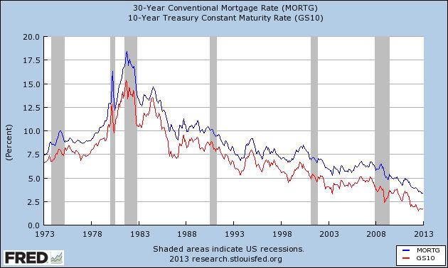


Note that they almost always move in tandem.

Now here is a comparison over the last 40 years of the YoY change in mortgage rates (inverted so a higher mortgage rates means the line is lower)(blue) vs. housing permits (red):
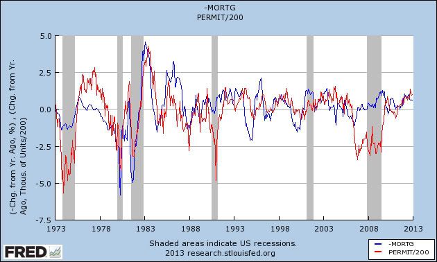


Note that the blue line leads the red line by a short time, i.e., the YoY change in mortgage rates is almost always reflected by a move in the same direction by housing permits some months later.

The use of a YoY measure automatically cuts down on the leading relationship.  When we measure the actual mortgage rates (blue, inverted) and compare them with permits (red), we see that the leading period tends to be several years:
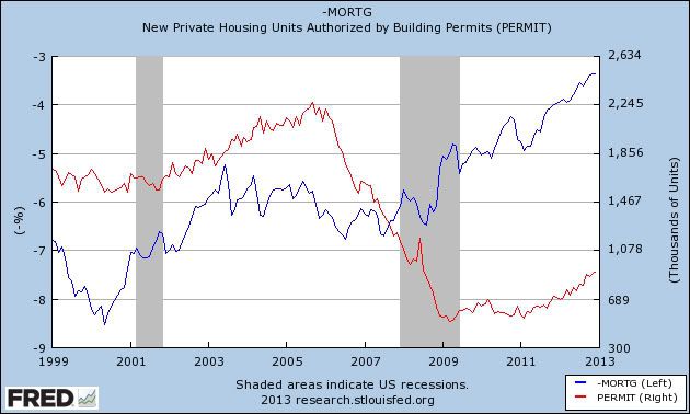


At the moment, mortgage rates are slightly out of phase with long term treasuries, which have not made a new bottom for 6 months.  One or the other should move back in tandem shortly.

Most important of all for this analysis, since 1983, a recession has always been preceded by a 3 year period when long term interest rates have not established a new low:
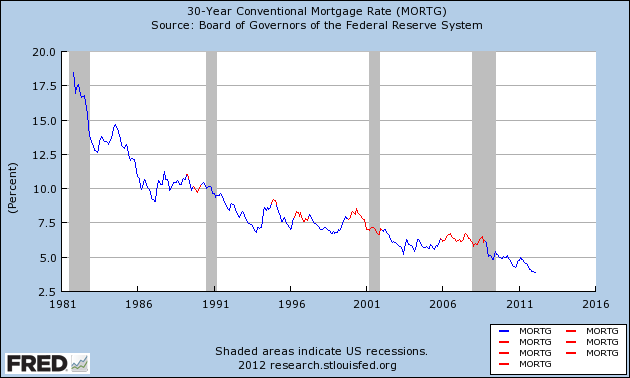


At some point, interest rates really can't move much lower.  And since interest rates tend to move in very long, ~60 year cycles, and we've had a down cycle for just over 30 years, a secular, long-term shift towards increasing interest rates is very likely. In summary, (1) mortgage rates tend to lead housing permits and starts, and (2) it is more likely that over the next 3 years mortgage rates will rise, or at very least not decline significantly further from here.

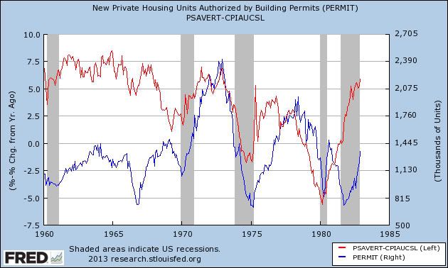
Now let's look at the second data series which has a tendency to lead housing permits and starts, albeit noisily: the real personal savings rate. In my 2013 forecast, I noted that the signal from the real personal savings rate (the savings rate minus inflation), which generally measures household optimism or pessimism about spending, was more ambiguous than other long leading indicators, and actually was consistent with a slight contraction early this year.  Let's go further, and let me show you a comparison of the real personal savings rate (red) with housing permits (blue) for the last 50 years.  First, here' s the period from 1963 to 1983:


and here is 1983 to the present:
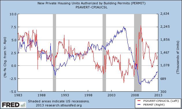


Note that the real personal savings rate tends to peak well ahead of housing permits (1965 vs. 1969, 1971 vs, 1973, 1975 vs. 1978, 1993 vs. 1998, 2002 vs. 2005, the two exceptions being 1980 and 1984 vs. 1982).  The same pattern is true, and usually closer in time, for troughs (1969 vs. 1970, 1974 vs. 1975, early in 1980 vs. later 1980, early in 1991 vs. later in 1991, and 2006 vs. 2011, the exception being 2001 vs. 2000).

The real personal savings rate made a post recession peak in 2009, and at least an interim trough at the end of 2011.  This tells us that the increase in housing permits might not last that much longer, although whether it is this year or a year or two from now is impossible to know.  With wage increases only averaging 1.5% a year, it seems that households are likely to become more stingy, rather than more carefree, about spending, and thus more likely that the real personal savings rate will increase rather than decrease from here.

Now let me make a few concluding comments. CR's analysis has several important points in its favor. First of all, with 30 year mortgage rates just having made new lows, and 10 year treasuries having made new lows 6 months ago, that suggests expansion could go on another 2 1/2 to 3 years. If households do not retrench their spending, and the real personal savings rate either decreases or at least does not increase, that too will allow further expansion. finally, if real household incomes actually increase over the next few years, this would allow the expansion to continue. Note that YoY wages just had a sharp increase in the last month:
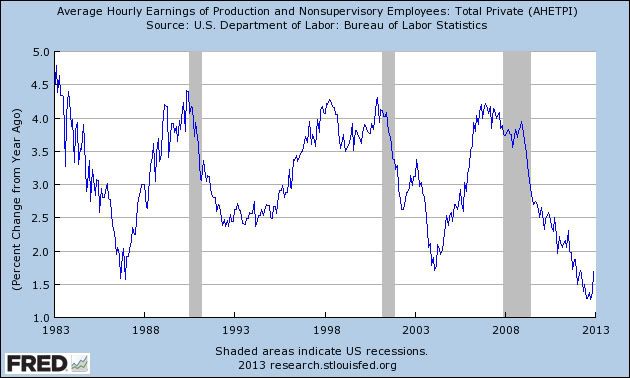


In the past several expansions, there were positive sharp reversals in 1986 and 2004. I would like that to be the case now, but unfortunately I suspect it is simply noise.

I remain more pessimistic about the longer term. To reiterate, beyond about 12 to 18 months out, we really can only surmise the most murky outlines of the economy. That being said, unlike CR, I am not at all confident that housing permits will continue to increase over the next several years.  A move to near 3% or even higher in long term interest rates for a sufficient period of months - or even a mild increase for a sustained enough period of time - would be enough to halt the advance of the housing market; as will any sustained move by households to increase their savings rate.  Since I view one or both of these as reasonably likely events, that would cause a top to form in housing permits, and then the long leading indicators will start to forecast deterioration in sufficient time to bring on a recession at some point in Obama's second term -- and, I repeat, a recession that will probably start with depressed levels of unemployment, household income, and wage growth. 

The Non-Issue Of the Spending Explosion Of The Last 4 Years

I'm traveling so I haven't had the time to do a market wrap.  However, I did want to highlight this point, which has been made by several others.  The following graph is from the Monthly Budget Review issued by the CBO:


Total federal outlays increased between 2007 and 2009.  The reason?  We had a recession and the federal government increased spending to prevent mass starvation.  However, notice that for the three years since 2009, spending has been stable.  Total outlays were $3,518 trillion in 2009 and is $3,538 trillion in 2012.  Also note that the deficits percentage of GDP decrease from 10.1% in 2009 to 7% in 2012.  No, this is not great, but it does show there has been an improvement. 

Let's look at what we've spent that money on:


Defense outlays have been stable, as have medicare and Medicaid payments.  We do see an increase in Social Security benefits, but that is to be expected considering the baby boomers are starting to retire. 

Also consider this graph from the same report (which I've preveiously shown using data from the St. Louis FRED system):


The big issue of this graph is that taxes as a percent of GDP are low.  (Also note that this is not leading to robust growth as predicted by Art Laffer and his band of idiots.)


Thursday, January 24, 2013

Coffee At Key Long-Term Support


Above is a 25 year chart of coffee, with each bar representing a month.  Last week, coffee prices rebounded off of key long-term (as in five year) technical support.  A bounce like that is to be expected after a long and sharp sell-off like the one experienced last fall.


Morning Market Analysis


The daily oil chart (top chart) shows that oil is still in the middle of a rally that started in mid-December.  Prices have advanced through the 200 day EMA and has also pulled the 10 and 20 day EMA through that line.  The MACD continues rallying and the CMF shows a strong move into the market.  The next line of resistance is in the 97-98 price level.  Most importantly, the weekly chart (lower chart) shows that prices have moved through the upper line of resistance in the consolidation triangle that started forming early next year.  The big key to this chart is the MACD which, while negative, have given a buy signal.

It looks as though oil is getting ready to rally right as the summer driving season starts.  


The daily euro chart (top chart) shows that the euro is near a six month high.  It's been rallying since the beginning of August and is currently above the 200 day EMA.  However, the MACD shows that momentum is dwindling, probably because prices are nearing resistance on the weekly chart (now chart).  The euro started rallying mid-summer 2012 and is now in an area established by price movement in early 2012, when prices stayed in the 130-132.5 area for a few months.  The MACD on the weekly chart shows a clear upward trend in momentum, which may pull the daily chart higher.


The technology sector is usually the area of the market the pulls stocks higher.  However, thanks to Apple, this is not the case.  This sector bottomed in mid-November and has been moving higher since.  Currenly, prices are right at the 61.8% Gib level from the sell-off.  They have advanced above the 200 day EMA with a good, bullish reading from the CMF.  The only drawback is the MACD, which shows a weak momentum reading.


The corporate bond market is still in a generally strong position. The short end (top chart) and the intermediate sector (middle chart) have both broken trend, but are simply moving sideways now.  The only weakness we're seeing is in the long end of the market (bottom chart) which is currently drifting lower, headed towards the 200 day EMA.


Let's Shoot Ourselves In the Foot; Investment Edition

The following two graphs are from Mike Konzcal over at the Next New Deal (see links here and here) and they highlight a terrifying trend in the US:


First, notice that the amount of money spent on public education has been declining since the recession.  Second,


We are also seeing a large decline in the number of teachers who are actually teaching.

So, we're seeing a sharp decrease in educational spending at the national level, while the teachers who have been fired are not being replaced by the private market.  That means we'll be seeing things like increased class size -- a terrible idea for educating children -- increased stress on teachers and in general a very bad situation overall.

I can speak to this from the experience of my state, Texas.  We have a biennial legislative session that lasts a few months.  In the last session, the state cut $5.4 billion from the education budget.  While the educational system was very vocal about this this, it passed through the legislature because it's extremely conservative.  In the latest budget proposals, we're seeing a projected surplus but there has been no talk about making up the deficit in financing even though the population of the state has increased since then.   The following summation is from the El Paso Times:

Texas lawmakers -- primarily Republicans -- two years ago passed a $173.5 billion budget that cut spending and services and did not fully fund inflation or population growth. The budget sliced $5.4 billion from public education and put off nearly $5 billion in Medicaid costs. Only one member of El Paso's delegation in Austin, then-Republican state Rep. Dee Margo, voted for the budget two years ago.

The proposed 2014-15 House budget uses about $187.7 billion in state and federal funds, which is $2.2 billion less than the current budget. The Senate version is about $186.8 billion, or $3.1 billion less than the current budget.

But while the proposed budgets would use $2.2 billion to pay for the projected enrollment growth of 85,000 students in the state in 2014-15, neither would include money for the enrollment growth that was not fully funded in the last budget cycle. The proposed budgets also do not restore the $5.4 billion in budget cuts to public education that the Legislature approved last session. 

We're seeing the same problem at the national level with infrastructure spending.  As I've noted ad nauseum, the US' infrastructure is in terrible shape and needs a massive amount of investment to bring it up to speed. Yet, we continue to implement stop gap measures that only put a band-aid over the problem.

The basic  problem is that investment in education and infrastructure is neither politically sexy nor are the benefits immediately apparent.  However, by not making these investments now, we are shooting ourselves in the foot regarding long-term economic growth.


Wednesday, January 23, 2013

Where's the Inflation?

Last week, the BLS released both the PPI and CPI.  Both showed tame numbers.  However, that leads to a question: despite all the money printing by the Federal Reserve, there is literally no inflation in either the producer or consumer numbers.  Let's take a look at the data.


Above is a five year chart of the the year over year percentage change in producer prices.  Notice that coming out of the recession we see large increases (which is actually pretty standard).  However, over the last 8 months, we see minuscule increases, as better shown in the following chart:


For four of the last twelve months we see a decrease in PPI.  And for the last 9 months the increases are tiny by historical comparison.


The two charts above show the most volatile components of the PPI.  Energy prices (top chart) have been contained for the last twelve months, actually printing solid decreases for most of the readings.  The real inflation at the producer level is in food prices (bottom chart) which are showing a decent increase.  However, these are not bleeding through to the composite readings.

Turning to CPI, we see the following graphs:


The top chart shows the last 10 years' year over year data.  Notice that for most of the last 12 months, the readings have been right below the 2% level.  The red line shows that this is a very low reading when compared to the last expansion.  The lower chart shows the data in a 5 year time frame.  From 2011-2012 we see increases rising to nearly 4%, but that number has clearly decreased since then.  Over the last 10-12 months, we see very tame readings for this number.


Finally, we see a graph that shows the relationship between the year over year increase in PPI and CPI for the entire duration of the great moderation (1980-2007).  We can break this chart into two periods.  The first occurs between 1981 and the late 1990s.  During this time, PPI (the red line) was very tame and spent a fair amount of time printing negative numbers.  The second period (late 1990s-now) shows PPI numbers that are far more volatile.  However, during both of these periods, CPI (the blue line) was remarkably tame.

This chart shows that PPI's volatility so far has not led to a massive spike in CPI.  The reason is producers appear to be absorbing the cost increase.  Considering the current state of very weak demand, it's doubtful we'll see producers attempt to pass on any increase they see in prices. 


Why housing permits keep me optimistic about 2013


- by New Deal democrat

In the past I've said that if there were only one piece of economic data I could have, it would be housing permits. They are a very reliable long leading indicator for the economy, not just in the post WW2 period, but in the Roaring Twneties and Great Depression as well.

In fact Professor Edward Leamer of UCLA has gone so far as to say that Housing IS the business cycle. He has shown that the business cycle almost always proceeds in a reliable order: first housiing peaks/troughs, then conusmer durable goods peak/trough, then consumer nondurables (think general retail) peak/trough, and finally commercial durable goods investment peaks/troughs.

That cycle certainly held true going into the "great recession." First the housing bust started, then car sales declined, then real retail sales peaked, and finally commercial goods peaked. Coming out of the recession, the model didn't fit quite so well. Housing, cars, and real retail sales all bottomed or at least stabilized in the first few months of 2009. Most likely part of this was the massive government intervention in the form of the $800 billion stimulus enacted at the end of February 2009. Instead it was manufacturing and exports that were the leading sector.

In the last 12 months manufacturing has stalled or even gone into a slight contraction. But housing, cars, and real retail sales continue to make new highs (as do the short leading indicators of the stock market and inverted initial jobless claims).

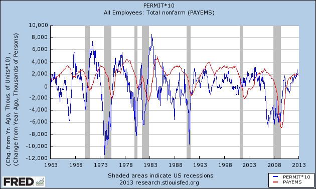
Here is the latest update, starting 50 years ago, of housing permits, measured YoY (blue line), compared with YoY job growth (red line)


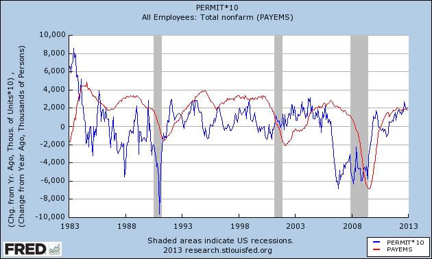
Here is the same graph, but starting in 1983 instead, to make the pattern somewhat more clear:


While the relationship isn't perfect, note first of all that every single recession has been preceded by a YoY decline in the number of housing permits. Secontly, note that the percent of YoY payroll growth (or losses) follow permits, generally with a 12 to 30 month lag.

About 200,000 more housing permits were issued on an annualized basis in December 2012 vs. December 2011. I fully expect the leading relationship vs. jobs to continue, so even if I am concerned about the impact of the payroll tax hike, I expect the trend of job growth to continue YoY throughout 2013.

Morning Market Analysis


Yesterday, the big move lower came from the Malaysian market, which dropped over 3% on concerns regarding the upcoming election.  Notice how in one trading session, prices moved through three of the EMAs and found support at the 39.2% Fibonacci level.  Finally, notice the incredibly heavy volume on the session, telling us this was a "Katy, bar the door" session.


On the other hand, we have the Argentinean market, which has now moved through upside resistance and is at six month high.  Prices are now over the 200 day EMA, pulling the shorter EMAs (10 and 20) with it.   Also note the strong volume reading on yesterday's session.  The only drawback to the chart is the weak technical reading from both the MACD and the CMF.


Most importantly, the weekly chart shows us that prices are right at the top of a trading range that's been in place for about nine months.


On the bulls side are the transports.  The daily chart (top chart) shows that this average has been on a tear since mid-November, rising a little over 17%.  The lower chart shows us that prices broke out of a near year-long consolidation pattern and are through levels established in 2011.  Both charts have strong underlying technicals, with the only drawback being the weak CMF reading on the lower (weekly) chart.


Tuesday, January 22, 2013

A note about the next recession


- by New Deal democrat

No, my magic crystal ball hasn't told me the date it will begin. This is a more general post about the state of what passes for serios mainstream economic discourse and how it is utterly unprepared for the firestorm that may await in the next economic downturn.

Charlie Pierce of Esquire has taken to ending his posts on the economy with "Fk the deficit. People got no money. People got no jobs." That ought to be, front and center, our main concern. Maybe for one day, every single blogger and every single newspaper and every single cable news channel should run that one thought:

"Fk the deficit. People got no money. People got no jobs."

Maybe then the Very Serious People in the MSM and Washington might have a glimmer of a clue.

I've been especially bothered about the fact that our five year plus unemployment rate of over 6% had disappeared from the priorities of the Washington and media elites since I read a column by Ezra Klein shortly after the election -- sorry, I can't find the link -- remarking that the GOP could no longer afford to try to block Obama initiatives because by 4 years from now, come the next election, the economic recovery would probably be really strong.

Huhnh??? Unless Ezra's crystal ball is orders of magnitude stronger than anybody else's, nobody has a clue how strong, or not, the economy will be 4 years from now.

Beyond that, in my opinion the odds are not very good that this recovery, which is already going on 4 years old, is going to last 3 more years or longer. It's close to the weakest recovery on record in terms of restoring us to the prior peaks of employment and personal income and wealth. The cold, hard, fact is that at some point in the next few months, or in a year or two, or in any event almost certainly at some point in Obama's second term, we are going to have the next recession. And in all likelihood it is going to start with an unemployment rate in excess if 6% or 7%. It is going to start with personal income not having recovered fron the last recession. It is going to start with median household income and net worth less than what it was 14 years ago, in 1999.

Perhaps worst of all, although there are very recent signs of improvement, the next recession could start with wage growth already a paltry 1.5% YoY. Meaning, among other things, a significant possibility of a wage deflationary spiral:


And is going to get worse from there.

And none of our political or media elites appear to give a damn. _____________________________

Addendum: After I wrote this and put in the publication queue, Bill McBride a/k/a Calculated Risk published his ruminations on Predicting the next recession. In general we have been on the same page for the last several years, and remain on the same page about this year, although he is more sanguine about the impact of the withholding tax increase than I am. After that, our thoughts diverge somewhat, and as this post indicates, I am more pessimistic than he is looking out 24-48 months. I'll give my reasons as a response to his longer term forecast in another post.

Cattle Prices Are Near 25 Year Highs


The top chart is a 25 year chart of live cattle prices.  From 1988 until 2002, prices were relatively stable, with fairly tame price swings (remember that each bar on the top chart represents a month, which the space between the horizontal lines represents two years).  The first big price move occurred between 2004 and 2008, when prices generally started trading between the 80 and 100/105 level.  We see the next big move beginning in 2008 when prices rallied from the 80 price level to their current level of 124.

The second chart is a five year chart, and it places the latest rally in perspective.  Prices have rallied pretty consistently from 2008 until today, with the exception of a gap down in 2012. 

So -- why the increase?  There are two reasons.  First, as the number of middle class people increases world wide, their tastes and preferences change.  This means they want to start eating meat more often.  The second reason is the spike in the grains complex, which is the primary food source for cattle.  As the cost of grains has increased, the cost of raising and producing cattle has increased.  This has led to an increase in the selling costs as ranchers have sought to protect their profits. 

Morning Market Analysis


The Australian dollar (top chart) is currently one of the strongest of the reserve currencies.  It has rallied since early October and is currently near 6 month highs.  The overall EMA and CMF picture are storng as well.  The only negative on the chart is the declining MACD, which is to be expected after the latest run.  I wouldn't be surprised to see prices move a bit lower from here.

In contrast, we have the US dollar which is one of the weakest of the reserve currencies.  Prices are below the 200 day EMA and are currently tangled with the shorter EMAs.  Also note the declining momentum.


In Indian market's weekly chart shows that prices are right at important technical levels.  A move through the 62.5 area would make the next logical price target the upper 60s/lower 70s.


The gold ETF is still trading between the 150 and 175 price level.


Monday, January 21, 2013

Bob Dieli responds re deflationary recessions


- by Bob Dieli

A brief note by New Deal democrat: Last week I wrote about how, in my opinion, deflationary recessions are different. In so going I highlighted the model of Bob Dieli. I said it appeared not to catch the length or depth of the 1929-32 contraction, or the 1938 recession. Because our current economic climate also has deflationary elements, I believed that his model might very well miss the next recession also. Dieli tried to post a comment in response, but it apparently got spit out in the site's spam filter. It's only fair to let him defend his model, so below is his response in full.
____________________________________

First off – nice research on this post!  I read it with great interest.    Your efforts will now allow me to answer a question that is often asked by some of my subscribers: “How would the model have done in the Great Depression?”

Just as an aside, I want everyone to know that this is not a magic formula.  As you can see from the videos in Jeff’s post, there is context on each occasion.  I try to add value each month by providing this context.  It is an early warning for a cycle turning point (nine months – I think you had a typo with nine weeks) but it is not a strength signal and we should all be vigilant.  

If I were asked the best accomplishment of the model, it would be the successful forecast of every peak and trough since 1969.  The same four variables – no changes – and always a nine-month horizon. The results are often startling for my clients, but my additional indicators are also important.  

In the interest of scholarly discourse, let us take a deeper look at the 1937 recession, which you conclude would have been missed by the model.  I am not comfortable with your conclusion for two reasons.  

First, we did not have a Federal Reserve with the same powers and mission as we do now, e.g. (the Fed Funds rate).

  Second, the ’37 recession was in part caused by policy actions taken by the Treasury and the Federal Reserve to sterilize gold inflows, some of which were induced by a “flight-to-quality” syndrome similar to the one we have now, but then due to rising war fears and the need to ship gold to a safer place.  The monetary shock to a weak economy played a key role. Further discussion can be found here:  http://www.voxeu.org/article/what-caused-recession-1937-38-new-lesson-today-s-policymakers  

Because of this, I am much more confident about the future predictive powers of the model.  While I only take it as a starting point (and I hope that Jeff will elaborate on this as he has promised to do) it has proven to be an excellent foundation.  Each month I consider additional information, as do all of us trying to analyze business cycle conditions.  We are all acutely aware of the impact of structural changes.  Even a model that has worked for decades might have some erosion in its power.  

I am flattered that you would devote as much time as you did to something based on my work.  Everyone benefits with a discussions like this.

Concerns About the Effects of Health Care On Hiring Predate the ACA


The above chart is from the latest Philadelphia Federal Reserve Manufacturing report. 

Let's look at this from two perspectives.  First, look at the red line, which shows the first answer given.  Here, by far the two most often given answers are "demand is too low" and "want to keep costs down."  While the former is directly caused by the overall high level of global economic malaise, the latter is simply a standard business concern.

When the total top three answers are given, the above are still the top two answers given, totaling about 5%-6% more than health care concerns.

I do think that the health law objections/concerns are far more real than many given them credit for.  The bottom line is these new laws cut a deep and wide swath through corporate decision making.  And the fact that these rules are still evolving and have only recently been found to Constitutional add to the uncertainty.  

But health care cost concerns are hardly a new development.  Since roughly 2000, there has been a constant discussion about the rising trajectory of health care costs and what can be done about it.  For example consider this chart of the annual percentage change in health insurance premiums over the last 10 years:


Looking at this data in more detail, we see the following costs of health insurance:


To argue that "uncertainty" over health care is a primary driver of high unemployment ignores the history of this issue, and the fact that rising costs have caused a headache for human resource and accounting departments for far longer than the ACA has been in existence.  In addition, the ACA was passed in response to the fact that higher costs were hindering overall economic health and growth.   It's primary focus to change the nature of our health care system from responding to serious medical situation to preventative care would help to seriously alleviate upward cost pressures.  As to whether or not the ACA lowers US health care costs, only time will tell.


A Quick Note On Auto and Housing From The Latest Beige Book

From the Beige Book:

Reports of auto sales were steady to stronger in ten Districts. Richmond, Atlanta, and San Francisco noted strong sales. New York and Dallas cited mixed sales that were generally positive, while auto sales in Kansas City slowed but remained higher than a year ago. Some dealers in the Chicago and Kansas City Districts reported high levels of inventory. Contacts in Philadelphia, Cleveland, Kansas City, and Dallas expect consumers to react to ongoing fiscal uncertainty, thus dimming a positive outlook for future sales. Chicago auto dealers were more upbeat, expecting stronger new car sales due to pent-up consumer demand, easing credit conditions, and rising used vehicle prices. 


Existing residential real estate activity expanded in all Districts that reported; growth rates were described as moderate or strong in nine Districts. Contacts in the Boston District attributed their strong sales growth to low interest rates, affordable prices, and rising rents. All Districts reporting on price levels saw increases; New York and Chicago reported only very minor increases. The five Districts that reported on housing inventories all reported falling levels. New residential construction (including repairs) expanded in all but one District of those Districts that reported. Contacts in the Kansas City District reported that increased lumber and drywall costs limited construction, causing a slight decline this period. Hurricane Sandy disrupted construction activity initially in New York, but this has since led to increased work for subcontractors on repairs and reconstruction. 

Consumer durable goods sales are an important indicator of confidence in future economic prospects.  The above points tell us that there is at least enough confidence in the economy overall to engage in long-term financing.

Morning Market Analysis


The SPYs are in a gentle upswing right now.  The 60 minute chart (top chart) shows the beginning of the year gap, along with the general tenor of the upswing.  The 30 minute chart (middle chart) shows that prices consolidated between 146.5 and 147.25 for about a week, until they broke through resistance on Thursday.  At the end of last week, we see the break-out, fall to support and then rally on Friday.  The daily chart (bottom chart) shows that price are using the 10 day EMA as technical support.  All the the EMAs are rising, daily volume is rising and money is flowing into the market.


At the same time as the stock rally we also see a slight treasury rally.  The 60 minute chart (top chart) shows the IEFS selling off sharply at the beginning of the year, but moving slightly higher since January 4, rising about a point from 106.2 to 107.2.  At the same time, the daily chart (middle chart) shows that prices have been declining since the beginning of December.  Current market action is in fact a bounce off the 200 day EMA.  And the weekly chart (bottom chart) shows that prices are moving sideways, approaching the 50 week EMA and contained from above by the 10 and 20 week EMAs.