Saturday, March 3, 2012

Weekly Indicators: strong crosscurrents edition

- by New Deal democrat

In the rear view mirror Q4 2011 GDP was revised up to 3.0%. Monthly releases were sharply mixed with some significant advances and some jarring declines. Consumer confidence was up strongly to a near 1 year high. This is a large component of the Conference Board's revamped LEI. Residential spending continued to increase. Vehicle sales were up sharply to nearly a 4 year high. The Chicago PMI increased strongly as well. On the other hand, the ISM manufacturing index unexpectedly fell, although still showing expansion. Personal income and spending were up only weakly. Personal consumption expenditures were flat for the fourth month in a row. Nonresidential construction spending fell. Durable goods fell strongly in January, wiping out December's similar increase and then some.

I watch the high frequency weekly indicators because, even if there is more noise, if there is a turning point, it will show up in these indicators first. In addition to the chronic issue of gasoline costs, with one or possibly two exceptions, no such turning point is evident.

Let's turn first to the negative statistic. The American Association of Railroads reported a decline in weekly rail traffic for the week ending February 25, 2012, with U.S. railroads originating 281,644 carloads, down 5 percent compared with the same week last year. Intermodal volume for the week totaled 214,402 trailers and containers, down 2.8 percent compared with the same week last year. Last week I noted that Railfax is back with some free graphs. One of them is particularly helpful in interpreting the recent swings in the AAR weekly reports. Here is a graph of the 13 week average of carloads for the last two years (black=total, green = intermodal, orange = cyclical, blue= baseline):
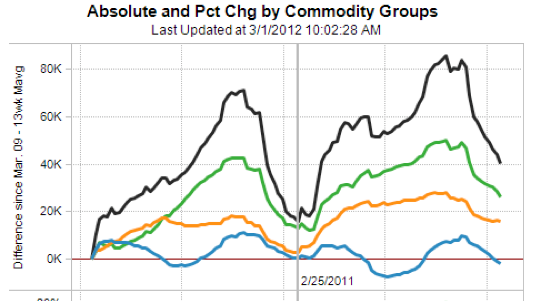


The YoY comparisons may have been decidedly erratic this winter because of the batch of winter storms that hit in 2011, skewing weekly comparisons. The Railfax graph shows that rail traffic continues to trend higher on a YoY basis measured over 13 weeks. If this graph does not begin to turn up in the next few weeks, we'll know that we have a problem. Until then, the jury is out.

Employment related indicators were neutral to positive:

The Department of Labor reported that Initial jobless claims remained at 351,000 last week. The four week average declined by 5000 to 354,000. This is the lowest reading since spring 2008.

The American Staffing Association Index fell by 1 to 86 last week. It remains almost midway between its levels of 2011 and 2007. Seasonally we want to see this move slightly higher over the next 4 weeks.

The Daily Treasury Statement showed that for the 20 reporting days of February 2012, $158.3 B was collected vs. $144.9 B for February 2011. Because this year had one more day of reporting than last year, the reports are not truly comparable. For the 20 reporting days ending Wednesday March 2, 2011, $154.9 B was collected, meaning the most comparable 20 day increase this year was +2.2%. This is positive but quite weak.

Gasoline prices are more than 10% higher than one year ago while usage continues to be much lower: Oil fell about $2 this week to close at $106.70. Gas at the pump rose another $.13 to $3.72. Both of these are significantly above the point where they can be expected to exert a constricting influence on the economy. Gasoline usage, at 8363 M gallons vs. 9162 M a year ago, was off -8.7%. This is one of the weakest weekly comparisons since the YoY declines began last March. The 4 week moving average is off -6.7%.

Housing reports were positive:

The Mortgage Bankers' Association reported that the Refinance Index decreased -2.2% from the previous week, still close to its highest level in over half a year. The seasonally adjusted Purchase Index increased +8.2% from the prior week, and was -4.8% lower YoY. This is a rebound from the bottom of its 21 month overall flat range.

YoY weekly median asking house prices from 54 metropolitan areas at Housing Tracker were again up +4.1%. This number has stabilized on a YoY basis in the last month, which is what I would have expected. I expect this series to continue positive, but it will be interesting to see if it drifts lower as we hit the peak selling season. It remains at odds with the Case-Shiller reports of worsening YoY declines in price for comparable sales. One of the two is going to turn.

Sales remained positive. The ICSC reported that same store sales for the week ending February 25 were off -1.0% w/w, but increased 2.7% YoY. Shoppertrak reported +2.8% YoY gains. Johnson Redbook reported a 3.4% YoY gain. These reports have taken on added significance. If the consumer is beginning to fold, I would expect to see YoY comparisons under 2% as a warning signal. There's no such signal yet.

Money supply was mixed and Credit spreads narrowed:

M1 declined -0.3%t last week, but was up +0.1% month over month. On a YoY basis it fell to +18.6%, so Real M1 is up 15.7%. YoY. M2 fell -0.1% week over week, but was up +0.3% month over month. It was up 10.0% YoY, so Real M2 was up 7.1%. In short, real money supply indicators continue strongly positive on a YoY basis, although not so much as in previous months.

Weekly BAA commercial bond rates were flat at 5.15%. Yields on 10 year treasury bonds rose .04% to 2.01%. The credit spread between the two, which had a 52 week maximum difference of 3.34% in October, tightened again this past week to 3.14%. Narrowing credit spreads are not at all what I would expect to see if we were going into a recession.

Finally, the JoC ECRI industrial commodities index continued to increase, from 127.52 to 128.13. This is almost certainly the most heavily weighted component of ECRI's WLI, and is consistent with an increase in that index again next Friday.

Turning now to high frequency indicators for the global economy:

The TED spread is at 0.410 down from 0.420 week over week. This index is back slightly below its 2010 peak, and has declined from its 3 year peak of 2 months ago. The one month LIBOR is at 0.243, down .002 from one week ago. It is well below its 12 month peak set 2 months ago, remains below its 2010 peak, and ihas now completely returned to its typical background reading of the last 3 years.

The Baltic Dry Index at 771 was up 54 from 717 one week ago, and up 121 from its 52 week low of 3 weeks ago, although still well off its October 52 week high of 2173 (please note that even so this is nothing even remotely close to its decline during the Great Recession. This type of decline has happened 4 times since March 2009 without triggering any "double dip."). The Harpex Shipping Index rose by 1 to 376 in the last week, off of its 52 week low. Please remember that these two indexes are influenced by supply as well as demand, and have generally been in a secular decline due to oversupply of ships for over half a decade. The Harpex index concentrates on container ships, and led at recent tops and lagged at troughs. The BDI concentrates on bulk shipments such as coal and grain, and lagged more at the top but turned up first at the 2009 trough.

Just like last year, I believe that Oil's choke collar is beginning to be felt. Nevertheless, the overall tone remains positive for now. Weekly retail sales reports and gasoline usage have assumed increased importance as warning signals for any further deterioration.

Have a nice weekend.

Friday, March 2, 2012

Weekend Weimar, Beagle and Pit Bull

For those of you who are new readers, a few points. First, with the exception of NDD's weekly indicators column, we usually go dark on the weekends, largely to write material for the coming week.  In addition, I used to put up pictures of my dogs every Friday.  It's been a long time since I've done that, and I want to get back in the practice because, well our dogs are really good pups.  Plus -- we have a new addition to the pack -- a pit bull who we rescued.  We found her in our alley sometime last summer, starving and mange-ridden.  We nursed her back to health and she's just the greatest dog.  Anyway, without any further adieu, here's the weekend dog pictures again.

Have a good and safe weekend.  NDD's column will be up tomorrow; we'll be back on Monday.


Memo To Political Bloggers: Please Stop Writing About Economics; You Really Suck At It

I read a fair number of conservative and liberal blogs.  While each is pretty good at explaining their respective political philosophy, they all are absolutely terrible at economics.  By terrible, I mean that, without a doubt, they are abject failures of the highest order.   Let me give you a few examples.

Over at Hot Air, Ed Morrissey has argued that real inflation is in fact 8% according to an organization named the "American Institute for Economic Research."  Mr. Morrissey states that AIER's methodology is "robust and scholarly."  There is one slight problem with this analysis (along with the "robustness" of the AIER model): the entire US Treasury market, where the 10 year treasury is trading right around 2%. You see, Mr. Morrissey, bonds are extremely sensitive to inflation.  When inflation is high, bond yields have to rise to compensate investors for the loss of income. Someone who has the ability to determine whether an economic model is "robust" surely knows the interest rate/inflation relationship. 

Either the entire US Treasury market is wrong or AIER is.  I'm putting my money on the Treasury market.

John Hinderacker at Powerline recently posted the following chart from the Republican Study Committee (which made its way around to a bunch of conservative sites):


I could just as easily make this argument:


Or this one with total establishment jobs:


It took about 9-12 months for the stimulus to take effect.

Yet both Mr. Hindraker's statement and mine suffer from the same problem (which is classic in statistics): correlation does not mean causation.

What's even more telling is what's absent from Powerline's analysis -- there is a dearth of information explaining the effect of retiring baby-boomers on the LPR -- which the Chicago Fed did nicely over the last few months.   My guess is Mr. Hinderaker has absolutely no idea what the LPR really measures, probably never heard of it until the he saw that chart, has no idea about the how its calculated, can't name the survey from which its derived or the effects of an aging population on that calculation. 

And before the political left thinks they've gotten off without a hitch, consider this.  Let's start with this: they missed the first two years of the economic recovery because they were addicted to disaster porn.  First there was no turnaround.  Then there was something inherently fishy about the government data (unless the data was bearish).  Then we were in a "black swan" environment.  Then it was something else.  In short, the left lives by the "if it bleeds, it leads" moto of journalism.  Calm, reasoned economic analysis has absolutely no place.

Then there is this: the left wants to think of itself as "champion of manufacturing."  Really? Then why has there been a complete dearth of writing about this chart:


Manufacturing is one of the primary drivers of this expansion.  And I forgot to mention, the importance of exports as well:


That's a record high for real exports. And yet, when it comes to the political left, they're absolutely silent on the issue, even though, according to most, we need to "become a net exporter again."  Hint -- we already are.

So, if you're a political blogger and you want to write about economics, please answer the following questions prior to writing on economics.

For the political right.

1.) During the 1950s, the highest marginal tax rate was over 90%.  In addition, Congress raised taxes to pay for the Korean War.  Yet, this decade was incredibly prosperous for the US economy with GDP growing at incredibly strong rates.  Why didn't this high rate of taxation cause a recession (in fact, why did the economy thrive) and why didn't it lead to people "going Galt?"

2.) The overall rate of taxation is currently near its lowest level in 60 years.  Why isn't this having a tremendously stimulative effect, as theorized by supply-side economists?

3.) The GDP annual growth for the years 1934-1936 was 10.9%, 8.9% and 13.1%, respectively.  The annual GDP growth rate for 1937 was 5.1%.  By 1937, real GDP had attained the same approximate level as that of 1929.  Please explain why the above growth rates are bad.

For the political left.

1.) According to the CBO, expenditures for entitlements have increased from a little over 35% of federal expenditures to a little over 60%.  Please explain why this does not mean entitlement reform is mandatory.  

2.) In 2010. the world experienced a series of weather events that severely limited global good supplies.  In addition as countries such as India and China have increased their standard of living, demand has increased.  However, by 2012, world output of agricultural goods has increased thereby lowering cost pressures.  Please explain why this example does not indicate that a market based system is the most efficient way to allocate resources, nor the fact that demand and not speculation was the primary driver of prices.

3.) Please explain why the removal of corporate personhood would not lead to a complete shutdown of the US economy.

In case you were wondering, the preceding questions are basically "un-answerable" from each sides respective political position.  It's like the old Star Trek episode where Spock tells the computer to compute pi to the last digit or states, "I always lie; I am lying."  That's the point. Both sides have taken political positions which are inherently at odds with reality and economics.  In other words, their political desires trump economic analysis, making their economic analysis completely and utterly useless.

So, if you're a political blogger and you write about economics, please realize that you have absolutely no idea what you're talking about.  Really.  You don't -- not one clue.  Please -- in the name of all that is holy -- please stop.


Morning Market Analysis


Both the QQQs and SPYs are still in an uptrend.  The volume indicators are still positive, as are the EMAs.  However, momentum is dropping, although not at an alarming rate.

However, the IWMs are right at their trend line.  In addition, the MACD is dropping.  As this is the market with the highest risk profile, the levels are important.  Also, consider this chart in relation to the transports:


The transports broke trend near the beginning of February.  They've fallen since then, finding support at the 50 day EMA.  They've been rising with the EMA for a little more than a week.  Also note the drop in inflowing volume and the overall increased volume over the last few weeks.

As I stated on Monday, I think the stock averages are closer to a correction at this time.  The IWMs approaching their support add to that concern.  If they break support, my concerns will increase.


The treasury market may be abovut to change.  First, note the IEIs have broken support.  This is the 5-7 year area of the market.  However, the IEFs and TLT s are still in a trading range.  A move lower by either the IEF or TLT should provide more fuel for a stock rally.


The industrial metals ETF has approached previous highs established in early February, but hasn't quite made it higher.  Prices are in a clear uptrend with EMA and MACD support.  However, the A/D and CMF are bearish.


 The 60 minute industrial metals charts shows prices are in a clear uptrend.  However, as I previously noted, the lack of follow-through in the early part of the move higher is a bit concerning (prices fell in the second have of trading for the February 21-25).

The above charts are sending interesting signals.  The IWMs are close to being the second equity index to move through a trend line support (with the transports being the first).  However, the IEIs trend break and the rally in industrial metals is encouraging news for the bulls.  It could be this is a situation where we have to think in multiple time frames: the equity indexes will correct in a disciplined manner over a 1-3 month time period, while we get encouraging/bullish developments in the treasury and industrial metals market that prevent too much of an equity sell-off.


Thursday, March 1, 2012

The Beige Book

Instead of the link fest, here is the opening statement of the latest Beige Book.  This is one of my favorite documents, because it's a near real time analysis of the US' current economic condition.  I'll be going into more detail from the report next week, but for now, here's the main thrust of the latest release:


Reports from the twelve Federal Reserve Districts suggest that overall economic activity continued to increase at a modest to moderate pace in January and early February. Activity expanded at a moderate pace in the Cleveland, Chicago, Kansas City, Dallas, and San Francisco Districts. St. Louis noted a modest pace of growth and Minneapolis characterized the pace of growth as firm. Economic activity rose at a somewhat faster pace in the Philadelphia and Atlanta Districts, while the New York District noted a somewhat slower pace of expansion. The Boston and Richmond Districts, in turn, noted that economic activity expanded or improved in most sectors.

Manufacturing continued to expand at a steady pace across the nation, with many Districts reporting increases in new orders, shipments, or production and several Districts indicating gains in capital spending, especially in auto-related industries. Activity in nonfinancial services industries remained stable or increased. Reports of consumer spending were generally positive except for sales of seasonal items, and the sales outlook for the near future was mostly optimistic. Tourism remained strong in some reporting Districts, but declined in the Minneapolis and Kansas City Districts because of reduced snowfall. Residential real estate market conditions improved somewhat in most Districts, with several reports of increased home sales and some reports of increased construction. Commercial real estate markets also showed positive results in some Districts. Banking conditions generally improved across the Districts. Agricultural conditions were mixed, while extraction activity generally increased.

Hiring increased slightly across several Districts, and contacts in a variety of industries faced difficulties finding skilled workers. Wage pressures were generally contained, and prices of final goods remained stable, although contacts in some Districts anticipate passing rising input prices through to consumer prices.

Will Oil Cause A Slowdown?

From the NY Times:
With no clear end to tensions with Iran and Syria and rising demand from countries like China, gas prices are already at record highs for the winter months — averaging $4.32 in California and $3.73 a gallon nationally on Wednesday, according to AAA’s Daily Fuel Gauge Report. As summer approaches, demand for gasoline rises, typically pushing prices up around 20 cents a gallon.

And gas prices could rise another 50 cents a gallon or more, analysts say, if the diplomatic and economic standoff over Iran’s nuclear ambitions escalates into military conflict or there is some other major supply disruption. 

“If we get some kind of explosion — like an Israeli attack or some local Iranian revolutionary guard decides to take matters in his own hands and attacks a tanker — than we’d see oil prices push up 20 to 25 percent higher and another 50 cents a gallon at the pump,” said Michael C. Lynch, president of Strategic Energy and Economic Research.
Consider the following chart from This Week in Petroleum:


Over the last week, we see a large spike in gas at the pump. According to the above report, prices increased 13 cents last week.

Here is a summation of the market, again from This Week in Petroleum:


EIA estimates that the world oil market has become increasingly tight over the first two months of this year. Oil prices have risen since the beginning of the year and are currently at a high level. Global liquid fuels consumption is at historically high levels. While the economic outlook, especially in Europe, remains uncertain, continued growth is expected. Unusually cold weather in Europe contributed to tighter markets by increasing the demand for heating oil, particularly during February.

With respect to supply, the world has experienced a number of supply interruptions in the last two months, including production drops in South Sudan, Syria, Yemen, and the North Sea. Both the United States and the European Union (EU) have acted to tighten sanctions against Iran, including measures with both immediate and future effective dates. There is some evidence that these measures may already be causing some adjustments in oil supply patterns. For example, there is emerging evidence that some shipments of Iranian crude oil under existing contracts are being curtailed due to the unwillingness of U.S. and EU insurance providers to cover them, even though the EU sanctions only require existing oil contracts to be completely phased out by July 1, 2012.

Finally, spare crude oil production capacity, while estimated to be higher than during the 2003 to 2008 period, is quite modest by historical standards, especially when measured as a percentage of global oil production and considered in the context of current geopolitical uncertainties, including, but not limited to, the situation in Iran.

Crude oil prices have been generally rising over the past two months, particularly in recent weeks. This is reflected in price movements on the most commonly traded oil futures contracts. Comparing the 5-day periods ending December 30, 2011 and February 27, 2012, the price of the front month of the New York Mercantile Exchange (NYMEX) light sweet crude oil contract (WTI) rose from $99.77 per bbl to $107.66 per barrel. The Brent front month price, which is widely viewed as being more representative of global prices for light sweet crude oil, rose from $108.04 to $123.56 over the same period.

For the five days ending February 27, the average price of the June 2012 WTI crude oil futures contract was $108.64 per bbl and the average price of the June 2012 Brent contract was $121.91 per bbl. The WTI and Brent prices for June 2012 have increased by about $8 per bbl and $15 per bbl respectively since the end of December. Based on implied volatilities calculated from options and futures prices over the 5 days ending February 27, the probability of the June 2012 WTI futures contract expiring above $120 per barrel is 23 percent, a 4 percentage point increase relative to the same calculation made using price data from the 5-day period ending December 30. Given the higher absolute level and greater upward movement of Brent prices relative to WTI prices over the last two months, the change in the probabilities that the June Brent contract will exceed specified dollar thresholds are higher and have increase more over the past 60 days.

Gasoline prices have also generally been rising over the past two months, particularly in recent weeks. Reformulated blendstock for oxygenate blending (RBOB) is often traded instead of finished motor gasoline that already has been blended with ethanol, since oxygenate blending typically takes place at terminals along the distribution chain.

Comparing the 5-day periods ending December 30, 2011 and February 27, 2012, the price of the front month of the NYMEX RBOB contract, which calls for delivery in New York Harbor, rose from $2.68 per gallon to $3.11 per gallon. RBOB prices reflect pricing at the wholesale-level that do not include motor fuel taxes, or costs and profits associated with the distribution and retailing of gasoline. However, increases in RBOB prices are typically reflected in higher pump prices.

The average price of the June 2012 RBOB futures contract for the 5-day period ending February 27 was $3.25 per gallon, an increase of 49 cents per gallon from the 5-day period ending December 30. Based on implied volatilities calculated from options and futures prices over the 5 days ending February 27, the probability of the June 2012 RBOB futures contract expiring above $3.35 per gallon (comparable to a $4.00 per gallon national average retail price for regular grade gasoline) is 39 percent, a 23 percentage point increase from the result of the same calculation made using data for the 5-day period ending December 30.
 .....
The U.S. average retail price of regular gasoline jumped 13 cents to $3.72 per gallon, about 34 cents per gallon higher than last year at this time. Prices were up across all regions, with the largest increase coming on the West Coast for the second consecutive week. The California price has surged more than 45 cents per gallon over the last two weeks. The Rocky Mountain price increased almost 10 cents to reach $3.20 per gallon, but remains the lowest regional average price in the Nation. Moving eastward, the Gulf Coast average price is $3.56 per gallon, and in the Midwest regular gasoline averages $3.62 per gallon. The East Coast price is the closest it has been all year to the national average, at $3.74 per gallon.


Here's the basic translation: demand is strong and supply is extremely tight.

Let's take a look at the daily and weekly price charts:


This week, oil prices have moved lower.  But they have done so in a disciplined way, forming a downward sloping pennant pattern.  Also note momentum is still positive and money is flowing into the market (rising A/D and CMF).  About the only bearish news on this chart is the decreasing angle of the shorter EMAs (10 and 20 day EMA).  However, given the geo-political background and the chart, if I were a serious oil trader, I'd be placing by orders right above the pennant's top line, in roughly the 108/109 area.


The weekly chart is very bullish.  Momentum is positive and rising, money is flowing int the market, all the EMAs are rising and there is no resistance for prices on the way to the 115 level. 

Finally, for more information on the oil market in general, please see this page from the Oildrum.com.  It's a list of what the various authors this is their best work for the last 7-8 years of posting. 

Calling BS on ECRI's recession call defense

- by New Deal democrat

Last Friday ECRI spokesman Lakshman Achuthan appeared on CNBC, CNN and Bloomberg television to defend his firm's 5 month old recession call. In the face of almost universal agreement that economic data has improved in the last few months, Achuthan insisted that it was beyond dispute that the real indicators had weakened, saying:


Since our recession call five months ago, the definitive, hard data used to determine official recession dates have gotten worse, not better, despite the consensus view that things have been improving. Okay? Since we made that call in late September, not a forecast, just looking at the incoming data.... those [are] key, hard facts. Nobody can get away from these no matter what you try to do.....

.... the hard data -- not a forecast, these are facts -- in plain English, economic growth is at its worst reading since early 2010. We are not cherry-picking the data. This is what is used to officially date the business cycle. They're the official, specific determinants of the business cycle.

.... the continued weakening in economic growth is consistent with our recession call from five months ago.
I call Bullshit.

Achuthan based his argument on the performance of GDP and also the NBER's coincident measures of recession vs. expansion -- output, sales, income, and jobs. He also rightly noted that the monthly payrolls report actually lags slightly (note: specifically, it has always lagged real retail sales, which turn first), thus he focused on industrial production, sales, and income, saying that these as well as the GDP figures were hard data, not forecasts, and they were getting worse.

So here is a graph of GDP, normed at 100 at the bottom of the great recession:


Does that look like it's getting worse to you?

Now, here is a graph of industrial production, real retail sales, and real disposable personal income, averaged together, also normed at 100 at the bottom of the great recession:


Does that look like it's getting worse to you?

In fact, the real coincident data doesn't look like it's getting worse because it's not getting worse!

Achuthan's argument was based entirely on the second derivative of the coincident indicators. In other words, they're getting better, but they're getting better at a worse rate. Not only that, instead of relying on real-time month over month or quarter over quarter data, his argument was based on year over year trends.

Frequently it is necessary to use YoY data because much data is seasonal (e.g., housing sales, rail carloads). Other times it is useful to describe longer term trends by smoothing out the data. But where seasonally adjusted data exists, the use of YoY trends badly lags turning points -- exactly the opposite of what ECRI claims to be doing. And it makes a crucial difference in analysing their argument.

To show you how, let's first look at YoY% growth in GDP, a graph used by Achuthan:


This seems to support ECRI's claim that the coincident indicators are getting worse (although, as others have already shown, similar declines have happened as recently as 1987, 1993, and especially 1996 without demonstrating any imminent recession).

Now let's look at the same data, not YoY but quarter over quarter:


The real-time non-lagging GDP data shows improvement since the dismal first quarter of 2011.

Finally, let's compare the two. In the graph below, quarter over quarter GDP growth, annualized, is again shown in red exactly as above, and compared with the YoY% GDP growth in blue:


It is crystal clear that the red series of q/q GDP change turned first before and after both the 2001 and 2008 recessions. And yet Achuthan is basing his case that we are on the cusp of a recession not on the more forward looking red q/q series but on the lagging blue YoY series!

Let's do the same thing with sales (blue), output (red), and income (green). First, here's the graph of YoY% change


All of these show a decline in the second derivative, in the case of real disposable income, all the way to zero.

Now here is the same data, not YoY, but month over month (added together for simplicity):


Again, quite a different picture emerges. Last spring in particular was weak, but there has been improvement since then.

This, then, is the core of the argument Achuthan made: we're going into a recession because, after a stall last spring, the rebound since hasn't been as strong as the months that immediately preceded the stall.

This is as backward-looking an argument as can be, and hardly something I would expect from a group that prides itself on its forward looking indicators. Let me be more blunt: contrary to Achuthan, "the definitive, hard data used to determine official recession dates" by the NBER are not the YoY lagging metrics he relied upon, but rather the month over month and quarter over quarter metrics I have compared them with above. They are not "getting worse" as claimed by Achuthan, but improving as I have shown.

In fact during the Bloomberg and CNN interviews, leading indicators weren't mentioned at all. In response to a direct question during the CNBC interview, there was only one brief mention of leading indicators "in the aggregate" still supporting ECRI's call, with no further elucidation.

This is a severe problem with ECRI's black box methodology. Since he doesn't want to give away any of his firm's secrets, he is reduced to making his public argument by relying on lame lagging data.

With gas prices nearing $4 a gallon already, ECRI may yet get their recession before the end of 1H 2012, but if they do it won't be for the reasons cited by Achuthan. As I pointed out yesterday, there's is a very good bearish case to be made, based on a consumer who is probably near exhaustion, and ECRI does apparently believe in that argument, based on the headline to a proprietary article on their site. Too bad Achuthan didn't actually make that argument, and couldn't show why he believes it will prove correct.

Morning Market Analysis


Several weeks ago, I noted that the home building sector was doing well.  The chart above shows that since then, prices have moved sideways and are right at support.  Most importantly, the MACD is is declining.  I price break support, expect a move to the 50 day EMA.


Grains have moved through the 38.2% Fib level and are now just about the 200 day EMA.  The move started with a fairly decent gap higher two days ago, but on weak volume.  And while the MACD has given a buy signal, it is pretty much a straight line right now, indicating little to no momentum in the market.


The above three charts of the three largest EU markets show prices have stalled at resistance.  The good news in these charts is we haven't seen a major move lower.  This means the bearish case of a recession and Greek slowdown have been ruled out for now.  But a stalling at resistance means traders are thinking before taking the market higher.


Finally, we have the euro.  It has rallied since right after the beginning of the year.  However, yesterday we see a big drop as it approaches the 200 day EMA.

Wednesday, February 29, 2012

Bonddad Linkfest

  1. ECB makes additional loans (WSJ)
  2. Japanese industrial production bears estimates (WSJ)
  3. EU inflation drops in January (WSJ)
  4. Yesterday's drop in durable goods shouldn't worry you (Real Time Economics)
  5. FDIC's quarterly banking profile (FDIC)
  6. Is housing really recovering (Dr. Ed)
  7. Richmond Fed's manufacturing index increases (Richmond Fed)
  8. Factors in recent oil prices (EconBrowser)
  9. Four Fiscal Phonies (Krugman)\
  10. Highest yielding stocks continue to outperform (Bespoke)

The case for economic pessimism: exhausted consumers

- by New Deal democrat

Recently most important items of economic data -- housing permits, car sales, new jobless claims, payrolls, consumer confidence, etc. -- have all moved substantially in the right direction. But there is always a bearish case to be made, and the best one, it seems to me, focuses on the consumer.

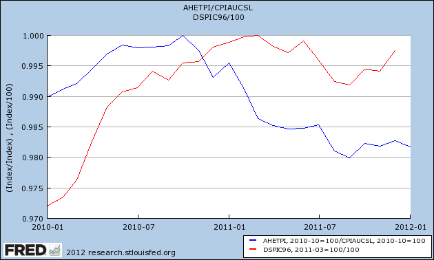
Here's a graph of real hourly wages (i.e., wages minus the CPI) (blue) and real disposable income (red) for the last year:


As you can see, real wages declined by about 2% since late 2010. Real disposable income also declined beginning last spring and so far has not made up all of the loss.

Primarily but not solely due to gasoline prices, consumers have had to dig into savings accumulated during the "great recession" to continue spending, causing a decline in both savings (blue) and the savings rate (red):


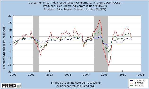
In the past, a spike in inflation has always led to economic weakness - shown in a decline in measures of inflation. Note that in 2001 and 2008, when commodity prices (red) and finished goods prices (green) declined to the same level as consumer prices (blue), we were about midway through the recession:


Even the two cases where commodity prices did not weaken significantly more than consumer prices (2003 and 2006) coincided with brief periods of especially weak GDP growth.

This is consistent with the fact that a number of long leading indicators -- Real M2, housing permits, and bond prices -- bottomed after a period of significant weakness about 12 months ago. Typically that weakness is most manifest in the consumer economy in about 1 year or so -- i.e., now.

In that regard it's worth noting that the most recent proprietary article on ECRI's site is entitled, "Can the US consumer keep spending?" Based on last Friday's round of interviews, obviously they think not.

Barring a reversal of fortune, ECRI is probably right about the US consumer. But note that none of the above graphs are predictive rather than explanatory. In fact real wages and real disposable income have rebounded slightly since autumn, and there is nothing inherent in any of the above graphs indicating that this rebound will not continue.

1954: PCEs


The above chart shows the percentage contribution PCEs made to to GDP for the four quarters of 1954, along with the contribution of various sub-parts of PCEs. Note the incredible strength of PCEs -- consumers are spending a lot of money on an assortment of items.


The above chart is from the Economic Report to the President, 1955.  It simply highlights the incredible growth in a variety of conumer goods that were purchased by consumers during this time.  As the report highlighted:


Also consider the following chart:


 The above chart shows PCEs, income and sales.  Notice that we don't see an increase in disposable personal income until the end of the year.  This is due to the recession which lasted until July 1954.  However, thanks to a well-executed policy to limit the impact of the of the slowdown, the recessions overall effect was mild (from the ERP):


The above chart highlights now consumers continued to purchase a constant amount of durable goods, but expanded their purchases of both services and non-durable goods.

Also helping this process was the consumer finance sector, as noted by the Federal Reserve:


Morning Market Analysis

A few people have noted that they are having trouble viewing images.  Not being the most tech savvy person, I'm not exactly sure why this is happening.  However, over the last few weeks, I've been copying images from various websites and pasting them into the blog as opposed to saving them on my computer and uploading them.  Today, I'm uploading to see if this makes a difference.  Please let me know if you continue to have problems.


Silver has been forming a downward sloping channel over the last 9-10 months.  Prices are now approaching key resistance levels relative to that.  In addition, the MACD -- which negative -- is moving higher.


Yesterday, prices broke through resistance on the daily chart.  Also note the MACD buy signal and the fact that the EMAs are bullishly aligned, with all moving higher.  Finally, yesterday's price action was a nice gap higher with prices printing a strong candle.


The 5-minute silver chart shows prices rallied strongly until about 1PM and then consolidated gains.  The best part of this chart for the bulls is the lack of a sell-off.


The 60 minute silver chart shows strong resistance at the 33.50 level.  Once price moved through that level, they consolidated around the 34.50 area, which they moved through yesterday.


The gold ETF has also rallied, moving through resistance at the 171 area.  Now we see resistance at the 175 level.


The above chart is a reason for the rally in both gold and silver: the dollar is moving lower.  After rallying through the early part of the year in response to the EU crisis, the dollar has moved lower, first hitting support at the 200 day EMA and now moving below that level.