Friday, July 24, 2009
Weekend Beagle and Weimar
See you on Monday.
Bull or Bear Market
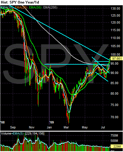
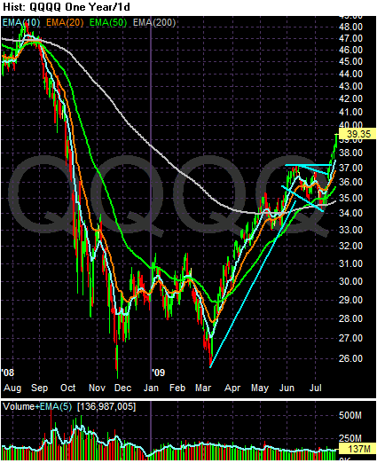
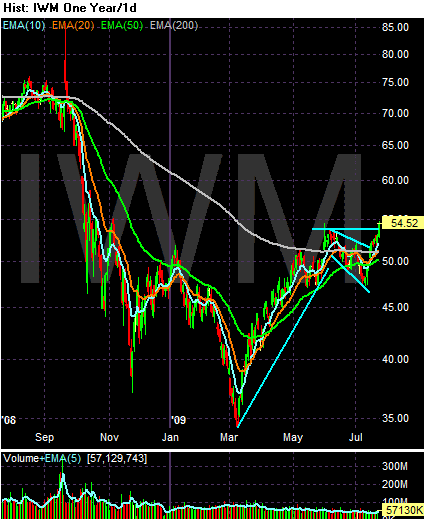
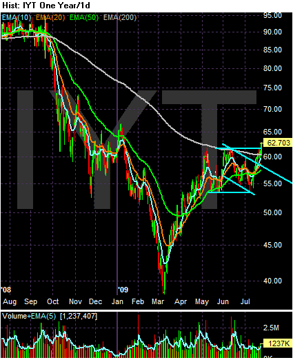
Five major indexes have all commenced a primary up-trend, signaling the start of a bull market. A word of caution: the recovery is exceedingly fragile. I will only feel comfortable with the bull signal when the Fed and other central banks start raising interest rates. And that is unlikely to occur for some time — without risking a second contraction. Keep your guard up — and your stops tight.
From Tim Knight:
Your crooked friends in Washington and in the Goldman Sachs building are the only reasons for this rally. Maybe the market won't collapse until Q3 earnings start coming out, and until then you will keep snickering. But my faith that:
1. The truth about the economy will, sooner or later, emerge;
2. Like prayers, technical analysis may be "delayed, but not denied" in its projections
3. The fortitude of those strong enough to stick by their intellect-based conclusions will, in the end, win the day, even if the bullies and fraudsters managed to fool the public for a while longer.
While only time will tell who is right or wrong, the bottom line is both are very sharp individuals who have a great deal of insight. Read and follow both of them.
What Are the Markets Doing?
Corey's one of the best technical analysts on the web.
A Few Observations on Existing Home Sales
Notice that before all of the really big financial problems of last summer/fall sales had been more or less stable for about a year. Then sales dropped again to a slightly lower level. However, notice that gray lines have been increasing for three months and again appear to be stabilizing. However,
Click for larger image
What is the more normal level of home sales? Notice on the longer chart we can eyeball two areas of possible "normal" existing home sales. Which one of those areas would apply to a period of massive household de-leveraging and high unemployment? In that situation I would lean towards the lower level. But we are also now in an environment where housing is growing more and more affordable, sellers want to make deals and there is a massive tax credit for buyers. In addition, the rate of annual existing home sales has been within a fairly small range for almost two years now. Given those factors maybe its the higher level.
Housing got us in this mess and its going to take a long time to get us out. As a result, I'm reluctant to make any predictions about the housing market.
However, the tight range of sales for the last two years is cause for hope.
Forex Fridays
Click on all images for a larger image
Prices are consolidating in a triangle pattern. In addition, we have a declining MACD and RSI along with a bearish EMA picture (The short EMAs are moving lower, the 10 day EMA has moved through the 50 day EMA, the 20 day EMA is about to move through the 50 day EMA and prices are below all the EMA).
The daily chart shows more detail regarding the consolidation pattern. Note that prices have been moving lower for over a week. While the MACD has given a sell signal notice the lack of sharpness in the overall direction of the indicator. A true sell signal would occur at a sharper angle. That does not make this signal less valid but it is something to consider. Also note the EMA picture is very bearish -- all the EMAs are moving lower, the shorter EMAs are below the longer EMAs and prices are below all the EMAs.
Thursday, July 23, 2009
Today's Market
Click for a larger image.
Also -- if you see something I don't, please chime in.
"Jobless" Recovery?
Though today's disparity between growth and jobs is especially stark, a jobless recovery wouldn't be new: The past two recessions were marked by firms reluctant to resume hiring right away after demand recovered. The current disconnect could reflect an unanticipated surge in productivity -- companies finding ways to increase output with fewer workers. That could set up the economy to grow rapidly in future years. Rising productivity is the linchpin of economic growth and rising living standards.
But there are darker scenarios. Struggling workers, whose wages also are being squeezed, could drag a fragile economy back into deep recession.
"Final demand and production have shown tentative signs of stabilization," Mr. Bernanke told lawmakers this week as part of the Fed chairman's semiannual report to Congress. "The labor market, however, has continued to weaken."
Job insecurity could lead consumers to further pull back spending, he said, calling it "an important risk to the outlook."
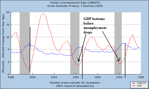
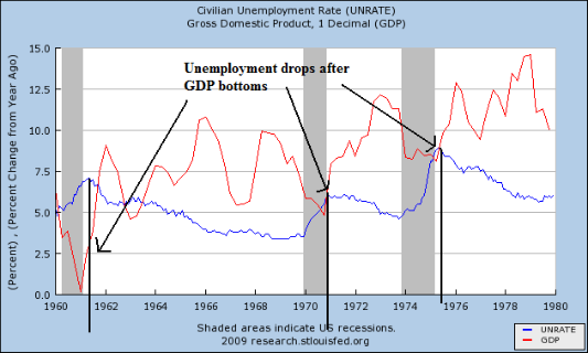
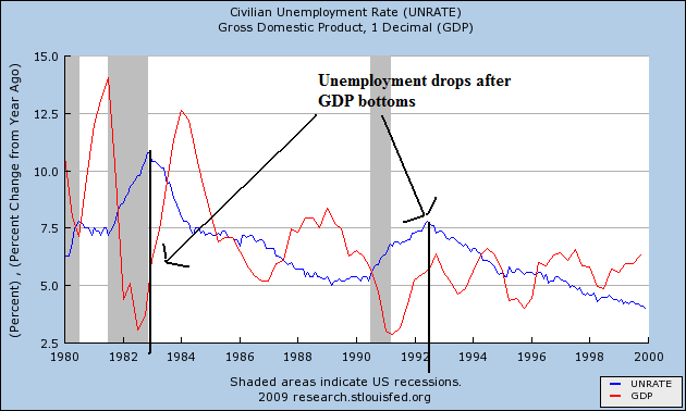
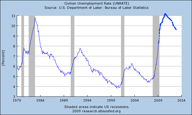
First, below are three charts that show the relationship between the year over year change in GDP and the unemployment rate.
These graphs make two important points.
1.) The year over year rate of change in GDP must turn positive before we even think about talking about a drop in the unemployment rate. In short -- first we need growth.
2.) The length of time between the turnaround in GDP and the drop in the unemployment rate has been increasing. Simply put, companies are waiting for longer and longer periods before they start hiring people.
The Journal article has this illuminating graphic.
This is why we are (again) hearing talk about a jobless recovery. The San Francisco Federal Reserve recently studied this situation and came to this conclusion:
What does all this mean for the course of the labor market? We combine data on involuntary part-time workers with the standard unemployment rate to arrive at an alternative measure of labor underutilization. We plot this measure in Figure 3, which shows that the labor market has considerably more slack than the official unemployment rate indicates. The figure extends this labor underutilization measure using the Blue Chip consensus forecast for the unemployment rate as a benchmark and then adding a share of involuntary part-time workers based on the proportion of workers in that category to the unemployed during the current recession. This projection indicates that the level of labor market slack would be higher by the end of 2009 than experienced at any other time in the post-World War II period, implying a longer and slower recovery path for the unemployment rate. This suggests that, more than in previous recessions, when the economy rebounds, employers will tap into their existing workforces rather than hire new workers. This could substantially slow the recovery of the outflow rate and put upward pressure on future unemployment rates.
So -- what does this all mean?
1.) While anger about the high unemployment rate is justified, it is pointless to talk about a drop in the unemployment rate until we see GDP growth.
2.) Unemployment benefits must be extended to prevent widespread problems related to joblessness. This is the humane policy (and also imminently practical).
3.) Given the low number of hours worked and capacity utilization along with the high measures of labor under-utilization I don't see how we avoid the "jobless" recovery scenario, at least for the first year or so of recovery. In addition, businesses are going to be reluctant to rehire people simply because of the severity of the recession -- business will be thinking "we're too close to a serious recession event to think about going full bore on hiring right now."
Thursday Oil Market Round-Up
The overall trend is still up but there are important caveats to that statement. First, prices are literally hanging on to the trend line. Secondly, prices have fallen from above the 50 day EMA to the 10 day EMA and are now running into resistance at the 50 day EMA. In addition, prices may be consolidating in a bear market flag pattern (which would be confirmed if the MACD gives a sell signal). Bottom line, this is a conflicted chart.
The daily chart only compounds the confusion. First, prices and the EMAs are in a tight range indicating a lack of overall direction. While the MACD has given a buy signal prices are currently in a bear market pennant pattern.
Short version -- this is a very conflicted market right now.
Wednesday, July 22, 2009
Today's Markets
Click for a larger image
I boxed in an area around 95 where the SPYs had a really difficult time technically about a month ago. To make further moves they need to decisively get through this area.
The QQQQs may pave the way. Notice the strength of their rally right now -- prices are basically up, up and away.
Will Trade Lead Us Out of Recession?
LARGE TRADE DEFICITS have bedeviled the U.S. for much of the past 20 years. Although puritanical critics have attributed these imbalances to a nation content to live beyond her means, Paulsen sees other factors at work. For one thing, most U.S. administrations over that period, and even during the 1980s, favored a strong-dollar policy (at least until 2002). This was in reaction to the economic traumas of the '70s when the U.S.'s weak-dollar policies helped spur hyperinflation.
Likewise, the U.S. also closely hewed to free trade, even though the policy, along with a strong dollar, cost the nation dearly in terms of manufacturing jobs. Foreign goods displaced U.S. products both here and abroad. This was a major reason why real annual GDP growth from 1982 through the end of 2006 averaged about 3.3%, while such growth from 1950 to 1980, when trade deficits weren't a problem, approached 4%. According to Paulsen, foreigners in recent decades were capturing some fruits of the U.S.'s consumer spending binge.
Yet Paulsen sees a silver lining to this leakage of U.S. demand to overseas.
In the process of gorging on overseas goods and services, the U.S. by happenstance fired up emerging economies such as China, Korea, Taiwan, India, Brazil and Mexico to build their productive capacities and spawn their own middle classes and consumer cultures. Paulsen has long called this trend the U.S.'s "emerging-market Marshall Plan."
In the strategist's view, the emerging-market demand will constitute "an incredible asset" for U.S. and other developed nations' goods and services. So far, the post-2002 weakening of the dollar has only helped U.S. trade competitiveness versus developed trading rivals such as Japan, the European Union and the U.K. That is because many emerging-world nations have been allowed to peg their currencies to the dollar -- or, like China, have made only desultory moves to strengthen their currencies. But U.S. trade competitiveness should benefit mightily from the likelihood that these currencies will no longer be able to maintain their pegs at ridiculously low levels.
Bernanke's Testimony
Aggressive policy actions taken around the world last fall may well have averted the collapse of the global financial system, an event that would have had extremely adverse and protracted consequences for the world economy. Even so, the financial shocks that hit the global economy in September and October were the worst since the 1930s, and they helped push the global economy into the deepest recession since World War II. The U.S. economy contracted sharply in the fourth quarter of last year and the first quarter of this year. More recently, the pace of decline appears to have slowed significantly, and final demand and production have shown tentative signs of stabilization. The labor market, however, has continued to weaken. Consumer price inflation, which fell to low levels late last year, remained subdued in the first six months of 2009.
To promote economic recovery and foster price stability, the Federal Open Market Committee (FOMC) last year brought its target for the federal funds rate to a historically low range of 0 to 1/4 percent, where it remains today. The FOMC anticipates that economic conditions are likely to warrant maintaining the federal funds rate at exceptionally low levels for an extended period.
At the time of our February report, financial markets at home and abroad were under intense strains, with equity prices at multiyear lows, risk spreads for private borrowers at very elevated levels, and some important financial markets essentially shut. Today, financial conditions remain stressed, and many households and businesses are finding credit difficult to obtain. Nevertheless, on net, the past few months have seen some notable improvements. For example, interest rate spreads in short-term money markets, such as the interbank market and the commercial paper market, have continued to narrow. The extreme risk aversion of last fall has eased somewhat, and investors are returning to private credit markets. Reflecting this greater investor receptivity, corporate bond issuance has been strong. Many markets are functioning more normally, with increased liquidity and lower bid-asked spreads. Equity prices, which hit a low point in March, have recovered to roughly their levels at the end of last year, and banks have raised significant amounts of new capital.
Many of the improvements in financial conditions can be traced, in part, to policy actions taken by the Federal Reserve to encourage the flow of credit. For example, the decline in interbank lending rates and spreads was facilitated by the actions of the Federal Reserve and other central banks to ensure that financial institutions have adequate access to short-term liquidity, which in turn has increased the stability of the banking system and the ability of banks to lend. Interest rates and spreads on commercial paper dropped significantly as a result of the backstop liquidity facilities that the Federal Reserve introduced last fall for that market. Our purchases of agency mortgage-backed securities and other longer-term assets have helped lower conforming fixed mortgage rates. And the Term Asset-Backed Securities Loan Facility (TALF), which was implemented this year, has helped restart the securitization markets for various classes of consumer and small business credit.
Earlier this year, the Federal Reserve and other federal banking regulatory agencies undertook the Supervisory Capital Assessment Program (SCAP), popularly known as the stress test, to determine the capital needs of the largest financial institutions. The results of the SCAP were reported in May, and they appeared to increase investor confidence in the U.S. banking system. Subsequently, the great majority of institutions that underwent the assessment have raised equity in public markets. And, on June 17, 10 of the largest U.S. bank holding companies--all but one of which participated in the SCAP--repaid a total of nearly $70 billion to the Treasury.
Better conditions in financial markets have been accompanied by some improvement in economic prospects. Consumer spending has been relatively stable so far this year, and the decline in housing activity appears to have moderated. Businesses have continued to cut capital spending and liquidate inventories, but the likely slowdown in the pace of inventory liquidation in coming quarters represents another factor that may support a turnaround in activity. Although the recession in the rest of the world led to a steep drop in the demand for U.S. exports, this drag on our economy also appears to be waning, as many of our trading partners are also seeing signs of stabilization.
Despite these positive signs, the rate of job loss remains high and the unemployment rate has continued its steep rise. Job insecurity, together with declines in home values and tight credit, is likely to limit gains in consumer spending. The possibility that the recent stabilization in household spending will prove transient is an important downside risk to the outlook.
Short version: consumer spending is the primary variable we're looking at. While spending has stabilized, it has stabilized at low levels. In addition, the conditions in the job market will exert downward pressure on consumer sentiment which will in turn lower consumer spending.
Here is the story in pictures. Consumer spending has stabilized at low levels:
However, consumer sentiment is dipping:
Wednesday Commodities Round-Up
The industrial metals weekly chart is still bullish. The MACD and RSI are rising and prices are still in an uptrend. The 10 and 20 day EMA are still rising and prices are above all the EMAs. Finally, notice the RSI still has room to move higher before it is in the overbought territory.
The daily chart also shows prices are in a rally. First, prices are still in an uptrend that has been in existence for the last six months. Also notice that along the way prices have consolidated in several triangle patterns. All the the EMAs are also moving higher. However, on the bearish side, prices have been in a narrower range over the last month or so. In addition, price advances over the 290 area seem to be causing strain.
There are four points with the agricultural prices weekly chart.
1.) The MACD has given a sell signal.
2.) Prices are below the trend line and have consolidated there.
3.) The 10 and 20 day EMAs are moving lower
4.) Prices are below all the EMAs
However, the daily chart is different -- and in fact is givng a buy signal according to its MACD. In addition the RSI is inreasing. However, prices are conolidating in a triangle pattern and are using rh 10 day EMA for technical resistance right now. Until we know otherwise, I would let the weekly chart dictate and predicitions about the future.
Tuesday, July 21, 2009
Today's Markets
From Invictus: My Favorite Metric
I’ve written elsewhere on many occasions about a fascinating metric compiled by the Chicago Fed – the Chicago Fed National Activity Index (CFNAI). The CFNAI is an amalgam of 85 distinct data points:
“The index is a weighted average of 85 indicators of national economic activity. The indicators are drawn from four broad categories of data: 1) production and income; 2) employment, unemployment, and hours; 3) personal consumption and housing; and 4) sales, orders, and inventories.
“A zero value for the index indicates that the national economy is expanding at its historical trend rate of growth; negative values indicate below-average growth;
and positive values indicate above-average growth.”
Historically, a 3-month MA reading less than -0.70 has signaled the onset of recession and, in fact, this time around we printed -0.83 in February of 2008.
The folks at the Chicago Fed advise that the 3-month moving average provides a better look at the economy than any single month’s release:
“Month-to-month movements can be volatile, so the index’s three-month moving
average, the CFNAI-MA3, provides a more consistent picture of national economic growth.”
The June number was released today at 8:30 eastern, and here’s what the 3-month MA looks like:
The trough was almost certainly the -3.67 print we saw in January 2009, a truly horrific reading.
Today’s -2.12 (3-month MA) is a step in the right direction, but in historical terms doesn’t signal an economy that’s emerged from recession. A couple more months of continued improvement (I write with fingers crossed) would probably signal the recession’s end, and then we can really get down to the business of worrying about what the recovery will look like.
More info on the CFNAI can be found here. It is among my favorite – and most definitely under-publicized – measures.
What is Obama's Manufacturing Policy?
Though manufacturing has long been in decline, the loss of factory jobs has been especially brutal of late, with nearly two million disappearing since the recession began in December 2007. Even a few chief executives, heading companies that have shifted plenty of production abroad, are beginning to express alarm.
“We must make a serious commitment to manufacturing and exports. This is a national imperative,” Jeffrey R. Immelt, chairman and chief executive of General Electric, said in a speech last month, while acknowledging that G.E. was enriched by its overseas operations too.
President Obama, agreeing in effect, has declared, “The fight for American manufacturing is the fight for America’s future.”
The United States ranks behind every industrial nation except France in the percentage of overall economic activity devoted to manufacturing — 13.9 percent, the World Bank reports, down 4 percentage points in a decade. The 19-month-old recession has contributed noticeably to this decline. Industrial production has fallen 17.3 percent, the sharpest drop during a recession since the 1930s.
So far, however, Mr. Obama’s administration has not come up with a formal plan to address the rapid decline. Instead, it has pursued ad hoc initiatives — bailing out General Motors and Chrysler, for example, and pushing green energy by supporting the manufacture of items like wind turbines and solar panels.
Read the whole article.
Leading Indicators Up
The Conference Board LEI for the U.S. increased for the third consecutive month in June. Most of the components contributed positively to the index this month except real money supply* and manufacturers' new orders for nondefense capital goods*. The six-month change in the index has risen to 2.0 percent (a 4.1 percent annual rate) in the period through June, up substantially from - 3.1 percent (a –6.2 percent annual rate) for the previous six months, and the strengths among the leading indicators have remained balanced with the weaknesses in recent months.
This is welcome news -- especially as this is the third straight monthly increase. Here is the chart:
Click for a larger image
Treasury Tuesdays
The IEFs rallied from roughly mid-June to mid-July. But the rally hit upside resistance at the 200 day EMA. This is an important technical point because the 200 day EMA separates bull and bear markets. After hitting the 200 day EMA prices moved lower. Now notice that prices are below all the EMAs and the shorter EMA (the 10 and 20) are moving lower as well. In short, the IEFs have moved into a bear market stance.
The TLTs rallied from mid-June to mid-July but have since fallen as well. While they didn't reach the 200 day EMA they did break the uptrend started in mid-June. Prices are now below all the EMAs and the shorter EMAs are heading lower. In additon, the shorter EMAs are now below the longer EMAs -- a very bearish orientation.
Monday, July 20, 2009
Today's Markets
I will add that one of the main problems with this rally is the ever declining volume on the rally -- as prices have increased starting from early March to the current level volume has decreased. I think some of that is due to the summer months also called the summer doldrums. I also think there is a fair amount of concern about the validity of the rally in light of the economic backdrop.
However, it's important to note that no rally is technically perfect -- you're never going to get everything you want in a rally.
Click on all images for a larger image.
The Case for a V-shaped Jobs Recovery
This post originally began as an examination of whether trends in the leading indicator of new jobless claims could give us useful information to predict when the number of unemployed will peak -- and then took several totally unexpected turns.
Ultimately what I discovered -- and I'm not saying it will happen, only that there is a surprisingly decent case to be made that it might -- is that contrary to the accepted wisdom, the recovery from this recession may not be "jobless" at all, but particularly in its earlier portion may feature quite robust job growth. There are three separate metrics supporting such an outcome: (1) "jobless" recoveries have only happened when manufacturing hours have not slipped significantly below full time employment; (2) the steeper the inventory correction, the more robust the snap-back; and (3) pent-up consumer demand can support a very robust snap-back recovery.
Let's take the arguments in order:
I. Offshoring and Recovery: Slack manufacturing employment has in the past snapped back quickly
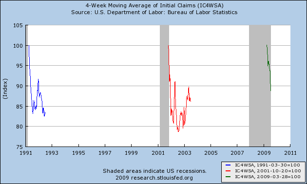
In the course of researching the relationship between declines in initial jobless claims and peaks in unemployment, I found that (1) in those recessions and recoveries where jobless claims fell steeply, peak unemployment occurred within 2 months of the point where jobless claims fell 12% from the peak; but (2) in those recessions and recoveries where jobless claims fell slowly, peak unemployment occurred not at the 12% mark, but only when new jobless claims were more than 16% less than peak claims, and stayed more than 16% off for at least 3 months thereafter. What was totally unexpected, was that in both the 1991 and 2001 recessions, as soon as the 16% marker was reached, the recovery in jobs stalled. Something was happening that was interfering with the hiring of more workers exactly at the point where new hiring, and plant expansion, should have kicked in. I suspected, and still do, that what was really happening was that once the economy began to pick up -- and only then -- employers took advantage of the situation not to hire more Americans, but instead to offshore jobs and plants to low wage countries.
Here's the chart, showing the year, and months from the peak in initial jobless claims that they retreated 12%, 16%, and the month of peak unemployment. In the case of the two "jobless recoveries" I also show the range from peak of initial jobless claims during the time of +GDP with increasing unemployment:
Year | Mo./-12% | Mo./-16% | Mo./peak unemployment | range/ jobless claims |
---|---|---|---|---|
1970-71 | 1/71 | 2/71 | 11/70 | n/a |
1974-75 | 5/75 | 7/75 | 5/75 | n/a |
1980 | 7/80 | 8/80 | 7/80 | n/a |
1982 | 10/82 | 11/82 | 12/82 | n/a |
1991-92 | 9/91 | 7/91, 6/92 | 6/92 | -8% to -16% |
2001-03 | 12/01 | 2/02, 6/03 | 6/03 | -7% to -21% |
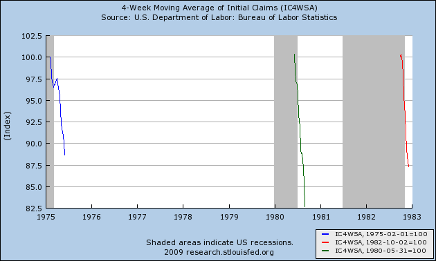
For those who prefer visual aids, here is the graph showing the quick falloff in jobless claims until unemployment peaked in the 1974, 1980, and 1982 recessions:
and the second one showing the very long "jobless recoveries" just as the falloff hit the 16% mark at the end of the 1991 and 2001 recession, as well as the most recent data from the April 2009 high in initial jobless claims:
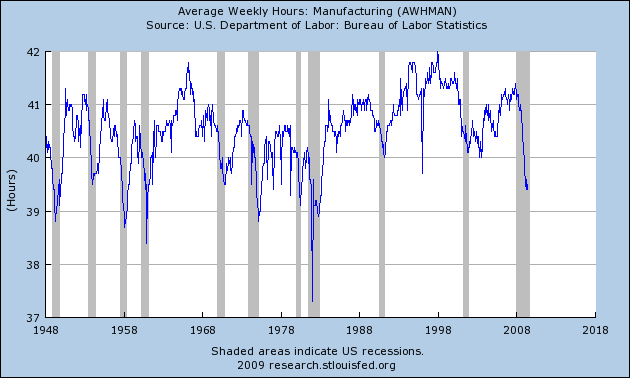
Since there is no "smoking gun" of data from manufacturers' advertising their intent to offshore jobs, I looked at one place where it might show up -- in the statistic for average weekly hours in manufacturing. In other words, rather than increase hours, employees' hours worked would be flat, as offshoring occurred instead of rehiring and expansion. What I found was more complex. Here's a graph of manufacturing hours since 1949:
In general, over that entire time period, the deeper the "V" in hours (i.e., more than a 1.5 hour decline, to a level below 39.5 hours), the quicker the snap-back in hours worked once the recession ended. (The one ambiguous case is the tepid hours recovery from the 1970 recession, during which time not only were the mass of baby boomers for the first time entering the full-time job market, but 500,000 of them were being withdrawn from Vietnam for an extra surge of workers.) In the above graph, the 1991 and 2001 recessions stand out like a sore thumb: In neither case did hours worked ever fall below 40! Once the recession ended, there was no slack to be picked up by rehiring laid off workers and increasing production at the plant. Instead, the offshoring (I hypothesize) began immediately.
Let's return to jobless claims and our current recession. Right now, 3 1/2 months after peak initial jobless claims, we are just at 12% off from the peak. Should our present rate of decline be sustained after the midsummer anomalies -- not a sure thing of course -- we will cross the 16% mark (~550,000 new claims per week) in one more more month. If we are to have a "jobless recovery", the number should quickly (with a couple of months) stall there and increase again. If, on the other hand, we will have a "V" shaped recovery, the marked decline in new unemployment claims should continue. If past patterns are prologue, then what the graph of average hours worked in manufacturing argues is that at least over a substantial period thereafter, we will have a quick snap-back in hiring as opposed to a "jobless recovery."
In addition to the pattern of recoveries from past sharp manufacturing employment slumps, there are two other reasons why a "V" shaped jobs recovery might occur.
II. Rapid inventory reduction can give rise to a rapid snap-back. Dr. James Hamilton has laid out this aspect of the case for a V Shaped Recovery. I encourage you to read the entire article, but it can be summarized as follows:
"[O]ften a sharp economic downturn is followed by an equally sharp economic recovery. One reason for that is the liquidation of inventories that accompanies any recession and restocking that takes place in recovery.
"The typical pattern is for inventory investment to fall well below trend during an economic downturn. ...[S]ince the current recession began in 2007:Q4 ... the level of inventories is lower than you would have expected in the absence of a recession by about ... 0.91% of one year's GDP. Add that restocking to the normal [ ] inventory investment that we'd expect ..., and you get a possible contribution of inventory investment of ... 1.12% of GDP during the first year of the recovery.
"If we are looking at the growth rate of real GDP, which is how we usually think about these numbers, the potential contribution of inventory investment is even more dramatic. If inventory investment goes from subtracting 0.49% from GDP (as it did over the last 4 quarters) to adding 1.12% to GDP ..., the contribution to the growth rate of real GDP would be 1.12 - -0.49 = 1.61%."
In layperson's terms, "just-in-time" inventory systems will jump start any recovery just as they accelerated the 2008 downturn. Interestingly, Dr. Hamilton supplies a chart indicating that inventory replenishing was significantly higher during the recoveries after 1974, 1980, and 1982, than it was for those after 1970, 1991, and 2001 -- in other words, correlating exactly with the graphic support from average manufacturing hours during and post recessions I laid out above in Part I.
III. This leads us to the third and final argument in favor of a "V" shaped jobs recovery: pent-up consumer demand, especially for durable goods.
In the same article above, Dr. Hamilton further notes that
"similar dynamics also apply to a number of other components of GDP. For example, recent sales levels for motor vehicle appear to be significantly below normal scrappage rates, and this is another area where a big rebound effect is quite possible."Similarly, Calculated Risk has noted that the
"turnover ratio for the U.S. fleet [of cars] ... for January [2009] is 27 years, by far the highest ever. The actual in December was close to 24 years. This is an unsustainable level...."
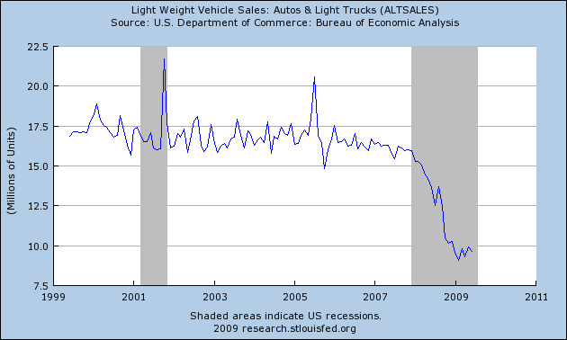
Here is the graph of auto sales for the last 10 years:
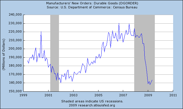
And here is the same graph for durable goods produced:
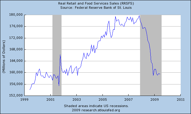
And finally for real retail sales:
You can see that auto sales have fallen from 16m to 9m, or roughly 40%. Durable goods have fallen off 30%. Retail sales in general fell over 10% in the last year. Compare that with the complete non-event of the 2001 recession.
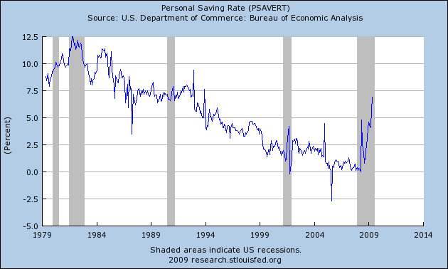
Yet, despite the steep fall in all kinds of sales, as late as April 2008, the unemployment rate was only 5%. Even with a 10% unemployment rate, that means that American consumers have roughly 94%-95% of the purchasing power from their income that they had a year ago. We know where the missing 5% has gone -- into savings, as shown by the personal savings graph below:
I pointed out in my essay, "Black September", how much of the free-fall of late last year was due to the complete destruction of confidence accomplished by Paulson, Bernanke, Bush and Congress last September, when Americans were warned that the economic world faced Armageddon in only a matter of days. What happened then was typified by this quote from a prominent auto dealer:
on about September 10, we saw our business fall off 30-35%.
As Calculated Risk said at the time, after one particularly panicky speech by George Bush,
it might motivate people that haven't been paying attention to say: "Wow, this is bad. Let's make sure our money is safe, and watch our expenditures." And that could lead to a deeper recession."And indeed American families abruptly and severely cut spending.
As a result, while Americans as a whole only lost 5%-6% of their income, but car sales did not go down 6% -- they went down 40%! In short, fearful of losing their jobs, and fearful of the future, Americans panicked and started to save, much more in the aggregate than the immediate risks called for (because no individual or family knew if they were going to be among the ones thrown out of jobs or not). Once that fear passes -- once Americans feel confident that the economy is growing instead of contracting -- there is a 5% boost to consumer spending that is immediately available (I'm not advocating for a 0% savings rate, merely pointing out that some of that savings can in fact be released). There is no necessary reason that such a boost cannot happen very quickly. In other words, a mirror image increase in demand to the "Black September" plunge of last year cannot be ruled out.
Compare again with the 2001 recession. Consumers sailed through that recession, so there was no snap-back of increased consumer spending once it ended.
If auto sales, durable goods sales, and general retail sales begin to pick up quickly, the above discussion of manufacturing hours suggests that, unlike the jobless recoveries of 1991 and 2001, there could be a very robust rehiring of workers in the residential, auto, and other durable goods producing industries, at least until such point as plants are operating at full capacity.
Putting the three points above together, and to summarize, if there is a relatively rapid uptick in consumer demand, that coincides with relatively depleted inventories of durables and consumer goods, and factories have cut employees to the bone, then employees in all sorts of industries might be hired back quickly, causing a "V" shaped Jobs Recovery.
How will we know if a "V" shaped jobs recovery is occurring? First, I would want to see Year over Year Leading Economic Indicators turn positive. Barring another sudden downdraft, this is likely to happen no later than September. Once that happens then I suggest that 4 series -- all of which have the virtue of being released within a week after the end of the month on which they report -- will tell us pretty quickly whether we are having a "V" shaped or "jobless" recovery:
- (1) monthly nonfarm payrolls: a gain of under 50,000 a month means a jobless recovery, gains over 100,000 within 3 months support a more "V" shaped recovery.
- (2) monthly auto sales: annual sales rising less than 125,000 a month means lackluster consumer durables spending, over 200,000 supports a "V" shaped recovery.
- (3) monthly manufacturing hours worked: an average rise of only 0.1 hours per month means a lackluster increase in plant use, over 0.15 supports a "V" shaped recovery.
- (4) the ISM manufacturing index: a quick expansion of manufacturing should be supported by the index rising to at least 60.
I still believe the government should move to create a new WPA. Additionally, so long as wage growth remains weak, any recovery will not be robust in the longer term. Let me repeat that I am not saying that we will have a "V"-shaped jobs recovery -- only that a surprisingly substantial case can be made in favor of one If so, I have set forth a road map in this essay to test whether fortune might favor us.
Some Inconvenient Truths -- Invictus
Question of the day: Does being a supply-sider mean that you pay no attention whatsoever to the demand side of the equation or other factors that may be at play?
Taking a page from Art Laffer's June Wall St. Journal op-ed, Jerry Bowyer is sounding the inflation alarm because of all the money that's "sloshing around the system."
Laffer used the following chart in his Journal op-ed to make his point:
Instead of YoY percentage change, Bowyer looks at the same data (or something very close to it) in terms of dollar change from year-ago levels:
Mr. Bowyer asks: "But what happens when the floodgates open? At some point the banks will have to release a river of liquidity. Consumers are demanding it, Congress is demanding it, and even President Obama is demanding it. (That last one may well be the clincher.)"
(Let's leave aside for the moment that consumers are demanding no such thing and that no matter how much pressure Congress or the president put on the banks, no one can force consumers to borrow.)
It's pretty scary stuff, eh, all this liquidity sloshing around the system?
Before I even get to the gist of the matter, let's just dispense with Mr. Bowyer's nonsensical claim that "consumers are demanding" that banks open their "floodgates" and begin lending again.
As Exhibit One and Exhibit Two (and I probably don't need to go any further), I offer up – via the Federal Reserve – the delinquency rates on residential real estate loans and credit cards:
Yup. Consumers, who are delinquent on their obligations in record numbers, are clamoring for more credit. How some folks are so comfortable writing fact-free pieces is simply beyond me.
Anyway, here's the point that Mr. Laffer and Mr. Bowyer are apparently missing (as evidenced by the two charts above): There's no demand for the money that's "sloshing around the system," and there likely isn't going to be for some time to come – and by that I mean years, not months or quarters.
Our 25 year experiment with debt and leverage is over. Done. Finished. Not coming back any time soon. As you read what follows, read it in the context of the fact that the US consumer has, for the past 8 years, represented approximately 70% of our nation's GDP (roughly $10 out of $14 trillion).
I wrote about our debt-to-income ratio here in February 2008. At that time, the level was 138%, and I asked if that was sustainable. Clearly it was not, as it peaked at 139%, before turning down, and sits now at 131%:
The mean of this metric is 77%. To get back to that mean – and I'm not suggesting we'll get there – in the absence of an increase in DPI implies a decrease in liabilities of $5.8 trillion dollars. Not the stuff of which inflation is made, and not the stuff that has me worried about an $800 billion increase in the monetary base. Now, keep in mind that "organic" income has not been growing, in fact it has been shrinking. The only component of income that has been growing is Government Benefits.
Other metrics tell a similar story. Here is Household Debt Service Payments as a Percent of Disposable Personal Income:
As I've mentioned before, Baby Boomers – defined as those born between 1946 and 1964 – will not be coming to the rescue, as the median boomer (born 1955) was 52 when this recession started. He (or she) will not be propping up the economy as was the case in previous recessions when s/he was much younger and still consuming and/or trading up:
Look at the growth of the accumulation of "stuff" – consumer durable goods – over the past 29 years:
(Number of Households: Census.gov. Durable Goods: Flow of Funds, Table B.100, Line 7)
Not only will we not be buying much more stuff than we've already got, we've begun storing our current stash of belongings at an alarming rate. Some tidbits from the Self Storage Association (the first two are truly staggering):
- It took the self storage industry more than 25 years to build its first billion square feet of space; it added the second billion square feet in just 8 years (1998-2005)
- During the peak development years (2004-2005) 8,694 new self storage facilities (approximately 480 million square feet of space) were added
- At year-end 1984 there were 6,601 facilities with 289.7 million square feet (26.9 million square meters) of rentable self storage in the U.S. At year end 2008, there are 51,250 "primary" self storage facilities representing 2.35 billion square feet -- an increase of more than 2.0 billion square feet
- The average (mean) size of a "primary" self storage facility in the US is approximately 45,800 square feet
- There is a self storage space inventory of 20.8 sq.ft. per U.S. household
- There is 7.4 sq.ft. of self storage space for every man, woman and child in the nation; thus, it is physically possible that every American could stand – all at the same time – under the total canopy of self storage roofing
- 83.9 percent of all US counties (or 2,634 out of 3,141) have at least one "primary" self storage facility
It's been fascinating over the past many months to read the commentary that has treated this recession as a typical garden-variety type that will resolve itself as most of those in the post-war era have. Doing so severely understates the magnitude of the changes we are undergoing, from a secular change in the way we view and use credit to the adverse effects of our demographics.