See you on Monday.
Friday, June 25, 2010
Weekend Mashup: Blondie and Jim Morrison
See you on Monday.
Weekly Indicators: Good News and Really Bad News edition
First, the Really Bad News: the NAR reported that new home sales cratered, falling from 450K to 300K on an annualized basis. Meanwhile, existing home sales fell slightly from 5.79M to 5.66M on an annualized basis. They will crater in turn next month.
This bad news is only augmented by the MBA mortgage indexes for the week ending June 18. The Market Composite Index declined 5.9%, the Refinance Index declined 7.3% and the seasonally adjusted Purchase Index declined 1.2%, all compared with the previous week. by 1.0 percent. This index is back to its housing crash lows of 2 weeks ago. (Side note: a commenter asked me what I thought of ECRI's long leading index going negative. Since we know that the MBA index is part of ECRI's separate index - and apparently a fairly big part - this tells us that if mortgage applications don't improve, we will have a double-dip, at least for one quarter. It all depends on whether the new home market bounces back from this low, or flatlines.)
Since housing is a pre-eminent leading indicator, the ongoing steep decline mortgage applications is not good at all. For the icing on the cake, Congress told the states and the jobless to go somewhere and die -- the last of 5 indicators of a possible double-dip coming in negative. I agree with Bonddad that this is one of the stupidest things the Congress has ever done.
In other news, the final estimate of 1st quarter GDP was revised lower, from 3.0% to 2.7%. Durable goods orders also fell -1.1% (well within the range of noise in this series), while core capital goods rose by 2.1%, showing that manufacturing is still the engine of the growth we do have. Consumers reported more confidence than at any point since January 2008 in the University of Michigan survey.
Edmund's prelimary estimate of June 2010 new vehicle sales is for a 16.6% increase from lasst year but a 9.5% decrease from May, at 11.2 million vs. 11.6 last month. Jessica Caldwell, the spokesperson for Edmunds.com blamed the decline on March's incentives! I'm a little skeptical of that, given the good performance of May in particular.
Turning to the other weekly indicators:
The ICSC reported same store sales for the week ending June 19 were up 2.5% YoY but down -0.5% WoW as the summer doldrums set in. This series has been up between 2.5% to 3.0% YoY for the last month. Meanwhile, Shoppertrak reported YoY sales increased 4.6% and also up 11.0% WoW. Whether these generally good numbers get translated into an improved Census Bureau Retail Sales reading for the month of June remains to be seen.
Gas increased for the fist time since the end of April, up $.04 to $2.74. The 4 week average of usage is very slightly ahead of last year.The price of a barrel of Oil remained at about $76/barrel as of Friday morning, up less than 10% from a year ago. It remains disconcerting that, despite the Euro remaining near its multiyear lows, Oil has nevertheless made up about 50% of its decline from nearly $90/barrel.
The BLS reported 457,000 new jobless claims this week. I continue to suspect that the continuing elevated level of layoffs consists of construction jobs post expiration of the housing credit, and state and municipal workers. Laid off Census workers may also now be contributing to this total.
Railfax showed an improvement in cyclical and intermodal loads this week, mainainting the advance compared with last year.
Weekly M1 and M2 were both down to 4 week lows. M1 is still up about 3% YoY in real terms, and "real" M2 most likely remains ever so slightly positive.
Finally, let's turn to the good news. First, the American Staffing Association reported that for the week of June 7–13, 2010, temporary and contract employment increased 1.96%, pushing the index up one point to a value of 90. This leading employment index continues to point to good news on that front.
Secondly, the Daily Treasury Statement continues to show strong gains vs. last year, 17 days into June. For the month, this year we have $115.2B paid in withholding taxes compared with $106.3B last year, a gain of $8.9B, or 8.5%. For the last 20 reporting days, withholding taxes for 2010 are $125.4B vs. $118.2B a year ago, a gain of 6.5%. Since this very strong showing in payment of withholding taxes coincides with over 200,000 layoffs of census workers (only about 2/10 of 1% of the workforce), it will be very interesting to say the least how June nonfarm payrolls plays out. A strong upside surprise certainly looks possible.
In summary, we have very bad news in a big leading indicator, but good news in the most important coincident indicator of jobs.
Have a nice weekend!
Let the Double Dip Begin and The Costs of Austerity
Spooked by concern about deficits, the Senate shelved a spending bill that included an extension of unemployment benefits, suddenly cutting off a federal cash spigot opened by President Barack Obama when he took office 18 months ago.The collapse of the wide-ranging legislation means that a total of 1.3 million unemployed Americans will have lost their assistance by the end of this week. It will also leave a number of states with large budget holes they had expected to fill with federal cash to help with Medicaid costs.
This is perhaps one of the dumbest, most short-sighted things I have ever seen Congress do.
So -- what will this lead to? From the Financial Times:
Much like Spain, Ireland and the UK, the Baltic states were badly hit by the bursting of a credit bubble in 2008 that sent their economies into freefall and their budget deficits soaring.
While others cushioned the impact with stimulus spending, the Baltic trio plunged straight into austerity. As a result, they suffered the deepest recessions in the European Union last year, with Latvia’s economy shrinking by 18 per cent.
The region has since stabilised but, for many ordinary people it still feels like a depression. Wages have plummeted while unemployment has rocketed, with more than a fifth of the Latvian labour force out of work.
Again, let's look at the GDP equation, shall we?
C+I+(x-i)+G= GDP
C=Consumer spending
I=Investment
x-i= net exports
G=government spending
In other words, government spending is part of he equation, and always has been part of the equation.
Business Investment Picking Up
From the WSJ:
Companies are stepping up spending on equipment as the recovery that first took hold in manufacturing broadens to other areas of the economy.
.....
A Commerce Department report Thursday showed that orders for durable goods—items expected to last at least three years—fell 1.1% in May from April, a drop that was driven by a decline in often-choppy aircraft orders. But a key measure that economists watch to gauge capital-spending plans—nondefense capital-equipment orders excluding aircraft—rose 2.1% and was 18.4% above its year-earlier level.
.....
This has been an untalked about part of the recovery -- how inventory restocking and foreign demand is helping US manufacturing to grow which in turn leads to more investment.
However, here is the basic chain of events:

The ISM manufacturing index is at strong levels. As a result,

durable goods orders have turned around. In addition, the increase productivity

Firms have increased their investment in equipment and software.
In addition, this is not just a story about manufacturing:

increased non-manufacturing orders are helping as well.
Yesterday's Market

For the entire week, the market has been in a clear downtrend (a). When it has moved though key technical support (b, c and d) it has broken support and continued to move lower.

On the daily chart, first note that prices are gravitating around the 200 day EMA (in box f) and have been for the last month. This means that bulls and bears are evenly matched. Prices have tried to rally from this level but found resistance at the 50 day EMA (a). Note the MACD is about to give a sell signal (b) as well. While the A/D line has essentially been moving around a fixed number and therefore really hasn't moved in a big way in either direction for the last two months (c) it has recently moved lower from a slight peak (e).

After breaking key support (a), the dollar has since stabilized right about support levels (b).

For almost two weeks, the dollar has been trading in a pretty narrow range (a).

From a technical perspective, the gold chart has two problems. First, it has made three attempts to cross the 122-123 area and failed (a). In addition we have declining volume (b) for the last part of the rally, indicating weaker participation.

Looking at other indicators, the EMA picture is still very bullish (a), but momentum has decreased (b). The A/D line (c) shows that participation has been about even, but the CMF is decreasing (d).

And the Treasury market is still in an upward trend.
Thursday, June 24, 2010
More From the Fed
From the Fed:
Information received since the Federal Open Market Committee met in April suggests that the economic recovery is proceeding and that the labor market is improving gradually. Household spending is increasing but remains constrained by high unemployment, modest income growth, lower housing wealth, and tight credit. Business spending on equipment and software has risen significantly; however, investment in nonresidential structures continues to be weak and employers remain reluctant to add to payrolls. Housing starts remain at a depressed level. Financial conditions have become less supportive of economic growth on balance, largely reflecting developments abroad. Bank lending has continued to contract in recent months. Nonetheless, the Committee anticipates a gradual return to higher levels of resource utilization in a context of price stability, although the pace of economic recovery is likely to be moderate for a time.
Let's break this down into smaller parts:
Household spending is increasing but remains constrained by high unemployment, modest income growth, lower housing wealth, and tight credit.
We've seen PCEs and retail increase for the better part of a year. But these increases are coming off of very low levels caused by the recession. In addition, there is little reason to think we'll see robust increases in this number given the unemployment and income situation.
Business spending on equipment and software has risen significantly; however, investment in nonresidential structures continues to be weak and employers remain reluctant to add to payrolls.
About half of the investment equation is solid. Businesses are increasing in capital areas that increase productivity. Commercial real estate is still in poor shape and businesses are still reluctant to hire.
Housing starts remain at a depressed level.
And they will for the foreseeable future. As NDD and I highlighted a few days ago, housing is still suffering from a massive inventory overhang.
Financial conditions have become less supportive of economic growth on balance, largely reflecting developments abroad.
Europe is a problem. I think we figured that out. The real question is what is the depth of the problem. Should the EU's policy response continue to develop positively, I think we'll be OK. The main problems is they are trying to coordinate a $1 trillion dollar plan by building a consensus in the EU community -- an obviously difficult task.
Bank lending has continued to contract in recent months
Yes it has. But that is normal. Consider this chart from the St. Louis Federal Reserve:

First, the chart is in logarithmic scale. While the depth of the latest contraction is sharper, it is normal for credit to contract at the beginning of the expansion. In other words, the latest contraction is hardly a new or historical development.
In Defense of German Austerity
Consider the raft of stimulating measures the German government adopted in late 2008 and early 2009 to stabilise the economy and mitigate the impact of the financial crisis on other sectors; not to mention our automatic stabilisers, which acted to the full, cushioning the labour market and domestic demand from the steep downturn. Some of those who are pointing fingers at Germany on Thursday hail from countries where such built-in mechanisms to tackle economic slowdowns are much weaker.As we acted, we saw our budget turn from a nearly balanced position to a deficit of 5 per cent of gross domestic product. Just as it would be dangerous to remove such support abruptly, governments should not become addicted to borrowing as a quick fix to stimulate demand. Deficit spending cannot become a permanent state of affairs. We need carefully considered exit strategies.
Germany has such a strategy. We will launch it next year (unlike most of its European peers, Germany still has an expansionary budget in 2010) with saving measures representing less than 0.5 per cent of GDP.
These steps are not only moderate in scale, but they are also economically sensible because they will increase incentives for the jobless to find work, reduce subsidies and trim the civil service. This controlled and measured approach to reducing our deficit is hardly what one would call “slamming on the brakes”. Indeed, one of its objectives is to strengthen our growth potential. Our course could be described as one of “expansionary fiscal consolidation”.
Behind the calls for us to pursue a more expansionary fiscal course lie two different approaches to economic policymaking on each side of the Atlantic. While US policymakers like to focus on short-term corrective measures, we take the longer view and are, therefore, more preoccupied with the implications of excessive deficits and the dangers of high inflation.
So are German consumers. This aversion to deficits and inflationary fears, which have their roots in German history in the past century, may appear peculiar to our American friends, whose economic culture is, in part, shaped by deflationary episodes. Yet these fears are among the most potent factors of consumption and saving rates in our country. Seeking to engineer more domestic demand by raising government borrowing even further would, here at least, be counterproductive. On the contrary, restoring confidence in our ability to cut the deficit is a prerequisite for balanced and sustainable growth.
Demography is another reason why we must work harder at reducing deficits in the medium term than many others. Not only are Germans getting older, but our population is also shrinking year after year. This will make it harder for future generations to service our debts and, in time, will reduce our growth potential to about 1.5 per cent a year. Whereas the US, with its more vital demographic trends, can hope to “grow” its way out of its public debt, this is not an avenue that is open to us.
Although we have no alternative to consolidating, we can do it in an intelligent way that will foster growth in the long term. One way to do this is by focusing our efforts on the expenditure side rather than increasing taxes. Meanwhile, we plan to maintain or even increase public investments in education and research.
The German government knows it has a responsibility to promote growth in Europe and the world. We will rise to it not by piling up public debt but by fulfilling our traditional role as an anchor of stability. The “debt brake” – a sophisticated set of fiscal rules now enshrined in our constitution – will provide the framework for our exit from the emergency fiscal measures adopted to combat the economic fallout of the financial crisis.
Far from being a straitjacket, the “brake” provides flexible rules that give governments fiscal leeway in cyclically hard times and encourage consolidation in good times. While it will force us to reduce our structural federal deficit to 0.35 per cent of GDP by 2016, it will not prevent the deployment of automatic stabilisers in case of a renewed economic slowdown.
We will abide by the rules of the “debt brake” and by its European equivalent, the stability and growth pact, not for prestige reasons, not just because we are legally bound to, nor, as has been comically suggested, out of masochism, but because it is the best way to inspire confidence in our citizens and investors that the state can cope with the current situation.
Without this confidence there can be no durable growth. This is the lesson of the recent crisis. This is what financial markets, in their unambiguous reaction to excessive budget deficits, are telling us and our partners in Europe and elsewhere.
I disagree, but I thought his point was incredibly well articulated.
Yesterday's Market
Treasury prices rose on Wednesday, pushing short-term yields towards the lowest on record, after the Federal Reserve downgraded its assessment of the economic outlook.Yields had been down before the Fed's decision following dismal May sales results for newly built homes as well as lackluster demand for 5-year notes.
Yields on 10-year notes /quotes/comstock/31*!ust10y (UST10Y 3.08, -0.04, -1.34%) declined 6 basis points to 3.11%, after having touched the lowest level in a month earlier.
Markets are inter-related; what happens in one market bleeds through to other markets. For the last few weeks I've been very attentive to the bond market, watching the chart very closely. The reason is the market is currently in an upswing, riding a very strong trend. We've had several possible topping signals, only to have prices continue to move higher. Now we see that short-term rates are near the lowest on record, which indicates traders are deeply concerned about the economy. Therefore, they are putting their money into the safest investment they can think of: Treasury bonds.
Let's take a look at the long-term chart of the IEFs to get an idea of where we are:
Notice the market was in a long-term head and shoulders pattern. The head represented the panic of 2008, with everybody flocking into Treasuries in a big way. Then we hit point (a) where it looked as though prices were going to exit the panic stage and sell-off as the economy healed. That didn't happen. Instead we saw a second rally in Treasury prices.
The upward trend is line (a). Also note the EMAs are in a very bullish posture -- the shorter are above the longer, prices are above the EMAs and all the EMAs are moving higher. In addition, note that prices are using the shorter EMAs as technical support in the rally.
The technical indicators are now mixed. Yesterday, the MACD gave a buy signal (a) but we're still seeing weaker A/D and CMF numbers (b and c).
The good news is that shorter rates are not at crisis levels. But, they are elevated, indicating there is concern.
Gold has also benefited from the flight to safety, rising from the neckline of the reverse head and shoulders formed in 2008-2009.
Industrial metals formed a double top at the end of last year and the beginning of this year. However, prices have retreated to the Fibonacci area (the area between 38.2% and 61.8%) where they should find natural support.
The good news here is that volume has been declining on the sell-off indicating the worst is probably over.
Wednesday, June 23, 2010
From the Fed
The Committee will maintain the target range for the federal funds rate at 0 to 1/4 percent and continues to anticipate that economic conditions, including low rates of resource utilization, subdued inflation trends, and stable inflation expectations, are likely to warrant exceptionally low levels of the federal funds rate for an extended period.
Not really a surprise.
A Closer Look At the Euro

Click for a larger image
While prices have broken key resistance (a), we're not out of the woods yet. While the 10 and 20 day EMAs are moving sideways, the 10 is still below the 20 (b). In addition, the 50 is still moving lower. On the positive side, prices are using the shorter EMAs (the 10 and 20) for technical support. The MACD has given a buy signal and is moving higher (c), but we're not seeing a meaningful increase in flows into the market yet (d and e). That is my big concern right now.
Yuan's Rise Will Be Gradual
The Chinese central bank on Wednesday set a key rate for the renminbi at a level that appeared designed to signal that Beijing is engineering only a very gradual appreciation of the Chinese currency against the U.S. dollar.
See also -- glacial.
Yesterday's Market

Let's start with a two-day look at the SPYs, which have been in a clear downtrend (a). Also note that once they moved through key support levels (b and c) the price decline accelerated. Finally, there was strong end-of-the-day selling, indicating traders did not want to keep shares overnight.

On the daily chart of the SPYs, notice that prices hit resistance at the 50 day EMA. The MACD is approaching the signal line (b) and we're seeing some money move from the market (c and d). In short, the market is in a short-term (less than a week) sell-off. The 200 day EMA is a key level to watch for.

While the SPYs have been dropping, the IEFs (and other Treasuries) have been rallying (a). Note that prices have moved through two key resistance levels (b and c) over the last few days.
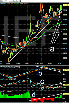
On the daily chart, prices are still in a clear uptrend with the EMAs in a very bullish posture (a). While momentum is dropping (b), we're seeing money flow into the market (c and d). I've been watching this market very closely as a result of the recent "flight to safety" in the markets. Most importantly, I've been watching the longer trend line in the chart and looking/waiting for prices to more through that level as a sign the flight to safety is over. So far that has not happened.
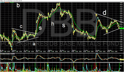
Industrial metals have been trading between ~17.75 (a) and 19.00 (b). Along the way we've seen two triangle consolidations (c and d) and a head and shoulders pattern.

On the daily DBB chart, note the area in the box (a) was described in more detail in the chart above. Also note that while the MACD is rising (c), money is flowing out of the security (d and e) -- never a good sign. Also note the EMAs -- the 10 day EMA is moving sideways, but the others are still moving lower.
Overall, the markets are still very defensive -- stocks are losing the steam in their rally, Treasuries are still moving higher and industrial metals are moving sideways.
Tuesday, June 22, 2010
A Closer Look At Housing
So, let's start with the existing home sales market.

The pace of sales appears to have hit bottom. We're been at/near the 5 million units/year level now for nearly two years (b)-- the same pace we saw in the late 1990s (a).

However, the inventory level is still horribly out of line with the historical norm. In the early 2000s, the level stood at 2 - 2.5 million (a), whereas now we're at 4 million (b). In other words, there is still a ton of supply.

In addition, the pace of sales is still way to slow. The historical norm is between 4-5 months of inventory (a), whereas now we're at the 8 level (b).
Let's move onto the new home market -- by far the smaller of the two.

The sales pace is incredibly low -- it's at/near the lowest level in over 40 years.

Inventory levels are also more in line with the historical average as is

the pace of new home sales
What got me thinking about this market was this article from the Financial Times:
Now the tax credit has run out, that momentum has slowed dramatically. “In the last four weeks I’ve seen very weak traffic and weaker activity,” says Mr Romeyn. “It’s not encouraging and it means we’ll have to work even harder to convince people to move forward with their purchases.”I've seen the pro and con arguments about the tax credit. Frankly, it appears we need to extend it indefinitely at this point simply to clear inventory.In May, new residential home construction in the US fell by 10 per cent to a seasonally adjusted rate of 593,000 units, its lowest level in five months, the commerce department said last week. Economists expected to see an impact from the ending of the tax credit, but not such a steep drop.
If the weakness continues, the likely conclusion will be that the tax credit brought forward demand from aspiring homeowners but failed to spur a more fundamental improvement in the housing market. The next big test will be new home sales data out on Tuesday. Economists fear the US housing market could be on the verge of a “double dip” – or even a “triple U”, given the fall in new construction over the winter.
“We are going to have a very sluggish time over the summer,” says Kevin Logan, chief US economist at HSBC in New York.
Housing: Prices are Still a Long Way from Bottoming
By 2008, just about every month Bonddad would write a post entitled "Housing is Nowhere Near Bottom". Eventually, wondering when housing sales if not prices, would hit bottom, I did some research and wrote a few posts back at the blog I used to be at entitled "Housing is Nowhere Near Bottom BUT ..." By early 2009 I concluded that once housing sales broke their trend (which had it continued would have taken new home sales to zero by this year!), that would be a marker of the end of the Great Recession. And so it was, as the series flattened out last spring, and the Great Recession ended last summer.
With the expiration of the $8000 housing tax credit which had stabilized sales and slowed price declines, we have seen a sudden decline in purchase mortgage applications, housing permits and starts. Prices look primed to resume a sharp decline, and there is talk of a double-dip recession as a result. With April and May housing permits plummeting over 100,000, from 681,000 to 576,000, we must wait at least one more month to see if that is the bottom.
2. Housing always leads
Three years ago I wrote about the very significant research paper entitled "Housing and the Business Cycle" (pdf) presented by Prof. Edward Leamer of UCLA at the Federal Reserve's annual summer retreat in Jackson Hole. What follows is a copy of the salient points I made in that post.
Leamer demonstrated that almost every recession since the end of World War II was preceded by a slowdown in housing construction and secondarily in major consumer purchases like cars. According to Leamer, of the 10 recessions that have occurred since World War II:
We have experienced 8 recessions preceded by substantial problems in housing and consumer durables....In terms of timing, housing typically begins to decline 5 quarters before recession, with durables and nondurables hitting their peak 4 quarters before the recession, and gently declining until the recession hits. The only two times since World War II that a substantial housing decline did not presage a recession were in the midst of the Korean War and the Vietnam War.
....
Residential investment consistently and substantially contribute[d] to weakness [in GDP growth] before [ these 8 ] recessions....
....
After residential investment as a contributor to prior weakness come consumer durables, consumer services, and then consumer nondurables. Those are all consumer spending items -- it's weakness in consumer spending that is a symptom of an oncoming recession.... The timing is: homes, durables, nondurables, and services. Housing is the biggest problem in the year before a recession... durables is the biggest problem during the recession [although consumer durables declined even more than housing before 2 of the 10 post World War II recessions]
After a housing slump, the next part of the economy to turn negative before a recession is consumer durables, meaning big-ticket items that consumers purchase to last a long time. The biggest example of that is cars. As Leamer explained:
The same interest rate or other variables [mainly employment] drive both the housing cycle and the durables cycle.... It turns out that much of the ampitude inconsumer durables comes from vehicles not furnitureand he explained why this is so:
Both durable manufacturing and residential construction have four special features:In other words, the economy can only sustain X amount of cars and houses in any given period. Overbuilding in one period (a boom) means that in the next period, there will be underproduction (a bust). It is this absollute decline in activity that forms the basis for the recession.
Previous production of new homes and cars create a stock of existing assets that compete with current production....
The asset prices of both homes and new cars suffer from downward price rigidities
Leamer also pointed out that it appeared that the pattern also fit with the Great Depression. Subsequently I was able to track down the annual statistics kept by the Census Bureau at that time, and in Housing During the Roaring Twenties and Great Depression, confirmed that annual new housing sales did peak in 1925 (at a population-adjusted number very close to the top number in 2005) before declining to a bottom in 1933. No doubt to his everlasting chagrin, Leamer nevertheless predicted in 2007 that the accelarting downturn in housing would be an exception, and would not result in a recession. We know how that turned out!
Nevertheless, just as predicted by Leamer's model, housing permits, starts, and sales did bottom before the end of the Great Recession, and increased thereafter -- albeit at a lackluster pace:
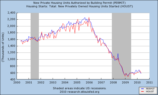
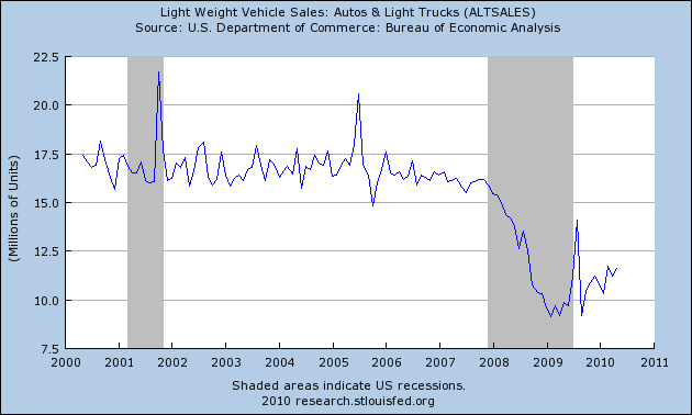
The Great Recession was a deflationary bust that was more akin to the old-fashioned panics and deflationary busts last seen in the 1920s and of course the 1930s. Along with Bonddad, I saw signs of a bottom, but at the same time cautioned that there would be No Sustained Economic Growth without Real Wage Growth. The next couple of paragraphs are copied from that post over a year ago.
[In early 2009 I examined] Economic Indicators during the Roaring Twenties and Great Depression. I examined those indicators because our current situation more closely resembles those debt-deflationary downturns, as opposed to post-World War 2 inflationary recessions. That data from the Deflationary period of 1920-1950 showed that all of those deflationary recessions followed a pattern. The CPI declined from the beginning of the recession and its YoY rate of decline bottomed immediately before the recession's end. M1 money supply followed a similar pattern, sometimes coincidentally, sometimes leading slightly. In all 6 of those deflationary recessions, once M1 and CPI began to decline at a decreasing rate, the recession was about to end.
For example, looking at the Great Depression of 1929-32:
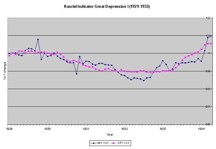
we see that in this, the biggest of all economic contractions of the last century, like all other deflationary recessions, there was a clear pattern of M1 and CPI on the graphs --both money supply and inflation contracted at an increasing rate, then at a constant rate, before simultaneously or with M1 leading the way before CPI, both turn back up (meaning, prices and money supply are still declining, but at a decreasing rate) near the end of the deflationary recession. In other words, these deflationary recessions began to end once demand picked up. As demand picked up (recall Econ 101) inflation reappeared.
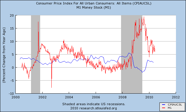
In the last few months, there has been another deflationary pulse, driven by steep declines in commodity prices, especially gasoline, and by the very slow decline in "owner's equivalent rent" (which is the controversial way in which the BLS measures housing prices). Coincidentally, because of the expiration of the $8000 housing credit, housing permits and starts, and home sales, have fallen again. Although we cannot say for sure that May marked the end of that decline, it does appear that new home sales will not fall all the way back to the early 2009 bottom. But a large and sustained decline is nevertheless a cause for concern.
Housing is a "long" leading indicator for the economy in general, and jobs and unemployment in particular (as opposed to a "short" leading indicator like real M1. Here is a graph of the year-over-year increase or decrease in housing starts vs. year over year percent increase or decrease in jobs over the last 50 years. Notice that the peaks and troughs for housing construction (blue) generally occur well in advance of the growth and decline in jobs (red):
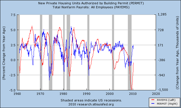
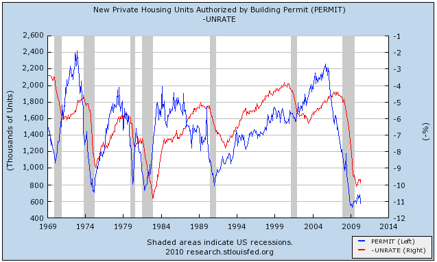
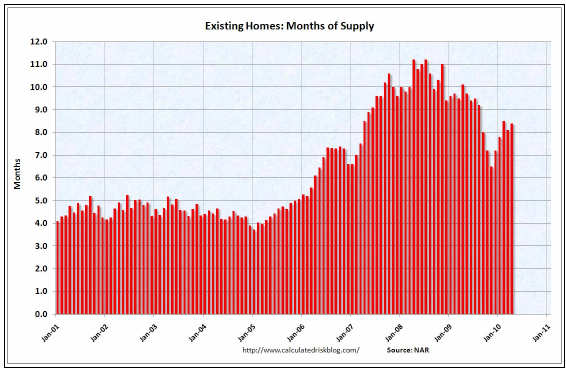
The bottom line is, for there to be a sustained and strong Recovery, we would need sustained and strong growth in housing construction. BUT, there will not be a sustained and strong rebound in housing construction so long as there are many 100,000s of houses for sale or in foreclosure, hanging over the market. One benchmark is that this overhang will not revert to norm until there is no more than 6 months of inventory on the market. As of the last few month, there was more than 8, as depicted in this graph:
4. House Prices
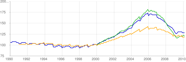
Here is where the continuing data from Housing Tracker, the web site that was so instrumental 4 and 5 years ago in showing the turn of the housing market, is so essential. The following graph, from that site, shows the relationship between median household income and housing prices, normed to 100 in the year 2000. The three lines make use of the Case-Schiller, FHFA, and First American Indexes:
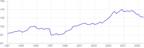
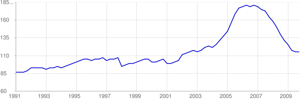
Variances is metropolitan areas help show us the relationship between prices and clearing out the overhang of houses on the market from the bubble. On the one hand, prices in Seattle Washington peaked late -- about 2008, and have not declined nearly as much as the norm, in terms of income, as the national average:


Eventually, however, housing will return to its long term norm. Here is a graph I ran a few months ago, showing housing starts as a fraction of population:
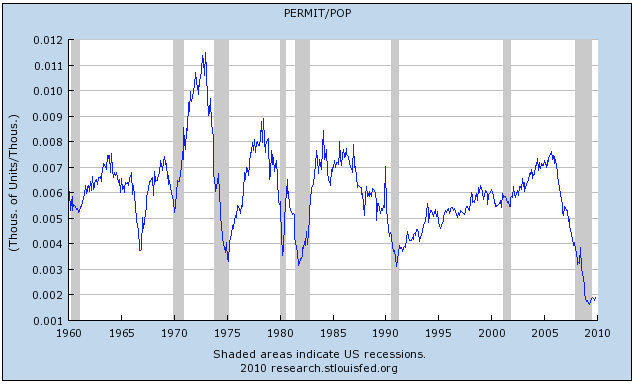
On a per capita basis, the housing boom of a few years ago doesn't look that outlandish at all! In fact, at least 3 prior booms in the last 40 years were bigger. On the negative side, the current housing bust is even more clearly the worst in the post WW2 era. For the last couple of years, housing starts have come nowhere near where they need to be to keep even with population growth. At some point, prices will fall enough and there will be enough pent-up demand, that the housing bust will end.
Yesterday's Market

Let's start with the gold ETF, because I find this chart really interesting right now. First, the price/EMA situation is very bullish. prices are in a clear upward sloping channel and the EMA picture is about as bullish as you can get. But notice that prices have found a tremendous amount of resistance in the 122/123 area. They have tried to move through that are three times, only to be rebuffed. Then look at the technical picture -- the MACD is dropping as prices rise (c) the A/D line printed a lower high on the second set of tops (d) and the CMF is dropping. All of these say that prices are getting weaker, despite what the chart says.

On the daily chart, notice the severity of the price drop (a) after price made a new high.
All of these factors lead me to seriously wonder about the strength of Gold's rally. What we need is a convincing move through the 122/123 area on really good volume.

Yesterday, the markets gapped higher at the open (a), but then moved lower for most of the day (b). Once prices crossed support in the late afternoon (e) they moved lower (c) on very high volume (d).
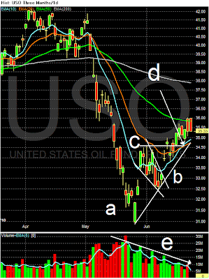
Oil is still in an uptrend (b) that started after the high volume bottom (a). We've seen prices consolidated (c) along the way along with an important EMA crossover -- with the 10 crossing over the 20 a few days ago (d). However, notice the decreasing volume of the rally (e).

However, oil's rally has been anything but clean. In fact, it has been extremely fractured. Notice there are three distinct upward trends. The first (a) has two gaps higher. On the second (b) prices are again extremely volatile. For the last three days prices have been consolidating in a narrower area (c). But the overall image is hardly clean in any way shape or form.

And finally, yesterday we see that the 7-10 year area of the Treasury curve moved lower, through the trend line, but rallied throughout the day to hit a higher price.


