Saturday, May 11, 2013

Weekly Indicators: the sunny blue skies of May edition


 - by New Deal democrat

Absolutely no monthly data of any significance was reported during the last week, except for the actual surplus the US government ran last month. So let's get directly to the high frequency weekly indicators and start again with transport:

Transport

Railroad transport from the AAR
  • +7700 or +2.8% carloads YoY

  • +5200 or +3.1% carloads ex-coal

  • +6700 or +2.8% intermodal units

  • +14,400 or +2.8% YoY total loads
Shipping transport Rail transport had its best week in over a month, after it had turned negative for three recent weeks.  The Harpex index continues to improve slowly from its January 1 low of 352, and the Baltic Dry Index remains above its recent low.

Consumer spending Gallup's YoY comparisons have been very positive since last December. They got less positive in the early part of April, but have rebounded again, and this week had one of the most positive comparisons all year.  The ICSC varied between +1.5% and +4.5% YoY in 2012. In the past two weeks it has rebounded from prior results near the bottom of this range. The JR report this week also rebounded the upper part of its typical YoY range for the last year.

Employment metrics

Initial jobless claims
  •   323,000 down 1,000

  •   4 week average 336,750 down 5,500
American Staffing Association Index
  • 93 up 1 w/w, up +0.2% YoY
Initial claims established a new lower bound to their recent range of between 330,000 to 375,000. The spring increase of the last two years has not materialized this year.  The ASA is still running slighty below 2007, but now essentially unchanged from last year as well. In other words, the comparison has been generally deteriorating on a YoY basis.

Daily Treasury Statement tax withholding
  • $130.5 B (adjusted for 2013 payroll tax withholding changes) vs. $135.1 B, or -3.4% YoY for the last 20 days.  The unadjusted result was $151.5 B for a 12.4% increase.

  • $56.2 B was collected for the first 7 days of May vs. $50.0 B unadjusted in 2012, a $6.2 B or a +12.4% increase YoY.
These are very good YoY comparisons compared with the last three months. While my best estimate is that collections should be up 15% due to the payroll tax increases that took effect on January 1, that appears not to be accurate, so now that we have enough data from this year I am making comparisons with earlier this year, and this week's comparison is one of the two best.

Housing metrics

Housing prices
  • YoY this week +6.6%
Housing prices bottomed at the end of November 2011 on Housing Tracker, and averaged an increase of +2.0% to +2.5% YoY during 2012. This weeks's YoY increase makes a new 6 year record.

Real estate loans, from the FRB H8 report:
  • up 9 or +0.3% w/w

  • up 16 or +0.5% YoY

  • +2.4% from its bottom
Loans turned up at the end of 2011 and averaged about 1% gains YoY through most of 2012.  In the last several months the comparisons have softened significantly.

Mortgage applications from the Mortgage Bankers Association:
  • +2% w/w purchase applications

  • +12% YoY purchase applications

  • +8% w/w refinance applications
This year purchase applications have finally established a slightly rising trend, and this week's number was the best in 3 years.  Refinancing applications were very high for most of last year with record low mortgage rates, but decreased slightly since then. Nevertheless this was the best week for refinancing in 5 months.

Interest rates and credit spreads
  •  4.52% BAA corporate bonds down -0.01%

  • 1.70% 10 year treasury bonds down -0.03%

  • 2.82% credit spread between corporates and treasuries up +0.02%
Interest rates for corporate bonds have generally been falling since being just above 6% two years ago in January 2011, hitting a low of 4.46% in November 2012.  Treasuries have fallen from about 2% in late 2011 to a low of 1.47% in July 2012. Spreads have varied between a high over 3.4% in June 2011 to a low under 2.75% in October 2012.  The  last several months saw a marked increase in rates and credit spreads widened, followed by a reversal in the last few weeks.

Money supply

M1
  • +1.0% w/w

  • +3.0% m/m

  • +11.8% YoY Real M1

M2
  • +0.3% w/w

  • +0.2% m/m

  • +5.4% YoY Real M2
Real M1 made a YoY high of about 20% in January 2012 and has generally been easing off since.  This week's YoY reading increased sharply.  Real M2 also made a YoY high of about 10.5% in January 2012.  Its subsequent low was 4.5% in August 2012. It has increased slightly in the last month or so.

Oil prices and usage
  •  Oil $96.04 up +$0.43 w/w

  • Gas $3.54 up +$0.02 w/w

  • Usage 4 week average YoY -2.4%
The price of a gallon of gas, after declining sharply in March and April, has risen slightly in May. The 4 week average for gas usage remained negative after previously spending nine weeks in a row being positive YoY.

Bank lending rates The TED spread recently increased again, but is still near the low end of its 3 year range.  LIBOR remained at its new 52 week low and is close to a 3 year low.

JoC ECRI Commodity prices
  • up 0.15 to 125.58 w/w

  • +2.25 YoY
After months of gradual deterioration, there were absolutely NO negatives in the weekly indicators this past week. The closest were several positive but deteriorating indicators: temp services are barely above last year, and Oil and gas prices have started climbing again, with less gas usage. Bond spreads were neutral. Commodities were muted.

Positives included house prices, and both purchase and refinancing mortgage applications. Initial claims continued their terrific recent run. Money supply was positive. Overnight bank rates are somnolent. Consumer spending as mesured by same store sales is decent. Gallup consumer spending continues on a tear. Rail traffic had the best week in over a month. Even tax withholding, when compared with its adjusted YoY results over the last four months, had its best comparative weekly result yet.

This is about as good a weekly batch of statistics as could be hoped for, and I'll take it. Have a nice weekend.
Friday, May 10, 2013

An updated look at the long leading indicators


. - by New Deal democrat

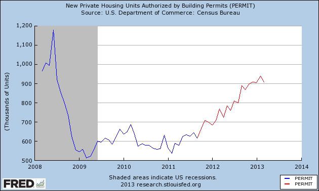
It's been a really slow news week, so now is a good time to step back and update a look at the long leading trends In the economy.  These are the four long leading indicators Prof. Geoffrey Moore identified in the 1990's just before he founded ECRI.  Each of these tends to peak more than one year before the economy as a whole does, and in particular before industrial production, spending, and payrolls turn.

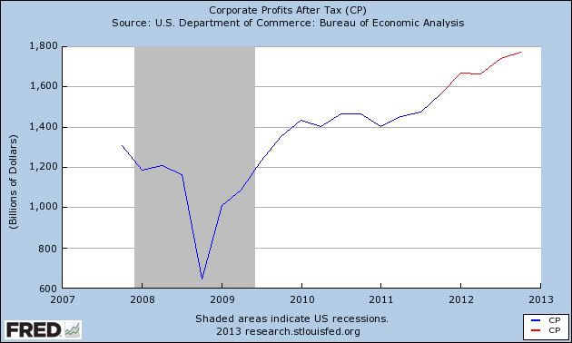
In the graphs below, the last 5 years for each indicator - housing permits, corporate profits, real M2 money supply, and yields on BAA corporate bonds (inverted) are shown in blue, with the last 18 months highlighted in red.

Here are housing permits:


These started rising about two years ago and have remained in a strong uptrend over the last 18 months,

Next, here are corporate profits after taxes.  The first quarter of this year hasn't been added yet, but since we are mainly concerned with 12+ months ago, the relevant trend still shows:


Corporate profits have risen to all time highs.

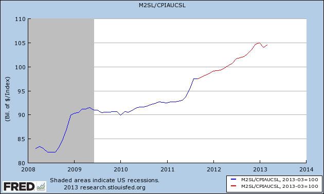
Next, here is real M2 money supply:


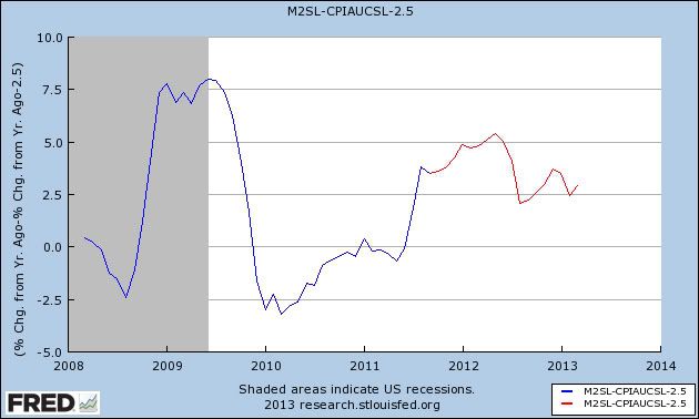
Real money supply has also been rising sharply over most of the last few years with several exceptions.  Because recessions have occured when real M2 has slipped below +2.5%, here is the YoY% growth in real M2 minus 2.5%:


Real M2 did fall into the recession warning area in 2010 and early 2011, but that signal is now waning.

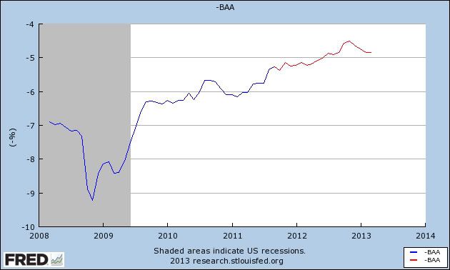
The last of Moore's  four indicators is inverted yield on corporate bonds:


Here again the rising signal is unambiguously positive.

In summary all four long leading indicators signal that, left to its own devices (i.e., without idiotic austerity imposed by Washington), the economy and with it payrolls and consumer spending, should continue to be positive this year.

Despite the above, there are two very big flies in the ointment.  The first, of course, is that Washington hasn't left the economy to its own devices.  Consumers have been forced to stump up an additional 2% of their pay due to the expiration of the payroll tax cut; and austerity via sequestration has been added on top of that.  The two times in the past when many leading indicators gave the least warning is when the Arab oil embargo was imposed in late 1973 and the economy almost immediately went into recession; and when the recovery from the 1980 recession was strangled by the Fed's sharp and abrupt increase in interest rates.

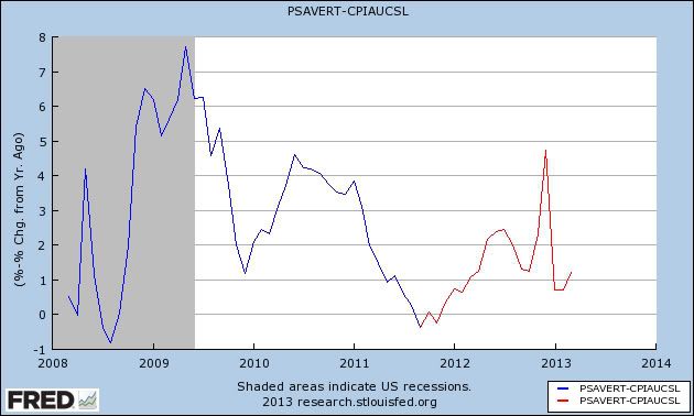
The second concern is the very low real personal savings rate:


The real personal savings rate tends to be a very long leading indicator.  It can remain low for a long period of time, but once consumers worry that the must save more, a recession typically occurs.  Both warnings from this indicator have been triggered - it has fallen more than 5%, and it is close to zero.  The increase that began 18 months ago is probably feeding through the economy now.

While none of the other long leading indicators have rolled over, several - permits, Baa corporates - have hit soft spots, and bear watching more closely.

Regular Blogging Will Resume on Monday

I'm on the last day of a two week travel fest, moving from San Francisco last week to New Jersey this week.  To put it simply, I'm beat.  Regular blogging will start back up on Monday.  NDD will be here this weekend. 


Thursday, May 9, 2013

EU Is Still a Basket Case

Continuing my look at recent central bank action that occurred during my absence, we have the EU dropping its rate from 75BP to 50BP.  The reason is simple: the region is still in a recession with the numbers being reported getting worse.

Let's turn to the recent data to get a better idea for the deteriorating fundamentals, starting with the still worsening employment situation:

The euro area1 (EA17) seasonally-adjusted2 unemployment rate3 was 12.1% in March 2013, up from 12.0% in February4. The EU271 unemployment rate was 10.9%, stable compared with February4. In both zones, rates have risen markedly compared with March 2012, when they were 11.0% and 10.3% respectively. These figures are published by Eurostat, the statistical office of the European Union.

Here's a chart of the data:


Starting in the 1Q12, we see the unemployment rate start to tick up consistently.  Also notice how there has been absolutely no pause in the rise.  This alone would be of concern to any central bank.  But the news continues to get worse.

The EUs manufacturing sector's problems are worsening.  From the latest Markit manufacturing report:

  • Final Eurozone Manufacturing PMI at four month low of 46.7 (flash: 46.5)
  • German output contracts for first time in 2013, joining ongoing downturns elsewhere
  • Job losses recorded across the currency union, as March recoveries in Germany and Austria prove short-lived
Here's a chart of the Markit data:


All the major economies are now below 50.  Some have been at that level for over a year, indicating a prolonged contraction.

Finally, retail sales contracted in the latest report:

In March 2013 compared with February 2013, the volume of retail trade1 fell by 0.1% in the euro area2 (EA17) and by 0.2% in the EU272, according to estimates from Eurostat, the statistical office of the European Union. In February3 retail trade decreased by 0.2% in the euro area, but rose by 0.1% in the EU27.

And a chart of the data shows the deteriorating condition of the sector:


 Simply put, the EU remains mired in recession with little to no indication of getting out anytime soon.


Initial jobless claims in normal expansionary range


- by New Deal democrat

For the second week in a row, initial jobless claims were under 330,000, at 323,000. Furthermore, the 4 week average, at 336,750, is only 750 above what I consider a population-adjusted normal expansionary range. The 4 week average is also the lowest since November 2007, before the onset of the great recession.

Should next week's number be below 350,000, that ought to be enough to move the 4 week average under 336,000.

If Atrios calls this "good news," I think we are officially there.

India Drops Rates 25 BP

I've written previously that I'm bearish on the Indian economy (see here and here).  They're got numerous problems -- an incredibly poor infrastructure, a terribly bloated and inefficient government, lower overall growth and high inflation.  All in all, it's not a very promising picture from a short or medium term perspective, barring a big change in the way the government regularly goes about its business.

Let's turn to the decision by the central bank and it's statement on release of the news of the change in rates:

10. Today’s decision to further cut the repo rate carries forward the measures put in place since January last year towards supporting growth in the face of gradual moderation of headline inflation. Nevertheless, it is important to note that recent monetary policy action, by itself, cannot revive growth. It needs to be supplemented by efforts towards easing the supply bottlenecks, improving governance and stepping up public investment, alongside continuing commitment to fiscal consolidation.

11. Upside risks to inflation in the near term are still significant in view of sectoral demand supply imbalances, the ongoing correction in administered prices and pressures stemming from increases in minimum support prices. In view of this, monetary policy cannot afford to lower its guard against the possibility of resurgence of inflation pressures. Monetary policy will also have to remain alert to the risks on account of the current account deficit (CAD) and its financing, which could warrant a swift reversal of the policy stance.


Translating out of central bank speak we get the following points.
  • We're doing our part to help the economy.  But we can't do it alone.  It would be really nice if the government would change the way it goes about setting policy.
  • Inflation is still a really big problem and it limits our ability to continue lowering rates.  
Here is how the bank described the India economy :

16. Moving on to the domestic economy, with output expansion of only 4.5 per cent inthird quarter of last year, the lowest in 15 quarters, cumulative GDP growth for the period April-December 2012 declined to 5.0 per cent, down from 6.6 per cent a year ago. This was mainly due to the protracted weakness in industrial activity aggravated by domestic supply bottlenecks, and slowdown in the services sector reflecting weak external demand.

17. The Central Statistics Office (CSO) put out the advance estimate of GDP growth for last year, 2012-13, of 5.0 per cent, lower than the Reserve Bank’s January 2013 baseline projection of 5.5 per cent. The CSO’s lower estimate reflects slower than expected growth in both industry and services.

18. Looking ahead, economic activity during the current year is expected to show only a modest improvement over last year, with a pick-up likely only in the second half of the year. Agricultural growth could return to trend levels if the monsoon is normal as recently forecast. The outlook for industrial activity remains subdued because the pipeline of new investment has dried up and existing projects remain stalled by bottlenecks and implementation gaps. Growth in services and exports may remain sluggish too, given that global growth is unlikely to improve significantly from 2012. Accordingly, the Reserve Bank’s baseline projection of GDP growth for 2013-14 is 5.7 per cent.

  • Notice that growth is slowing down.  This is due to both internal and external factors.  Also note the internal factors are difficult to change, implying we'll see these problems continue for the foreseeable future.
  • The slowdown is broad based and has a diverse set of causes, making a change in policy difficult.
  • The age of the massive Indian growth story appear to be over
The bank's discussion about inflation had the following points:

19. Let me now turn to inflation. Headline inflation, as measured by the wholesale price index (WPI), moderated to an average of 7.3 per cent last year from 8.9 per cent in the year before. The easing was particularly significant in the fourth quarter of last year. We ended the year with WPI inflation of 6.0 per cent in March 2013, the lowest in the last three years.

20. Even as headline inflation eased, there were upside pressures on food inflation through the year owing to an unusual spike in vegetable prices early in the year followed by rise in cereal prices.

21. Fuel inflation averaged in double digits during 2012-13, largely reflecting upward revisions in administered prices and the pass through of high international crude prices to freely priced items.

22. Non-food manufactured products inflation ruled above the comfort level in the first half of 2012-13 but declined in the second half, reflecting easing of input price pressures and erosion of pricing power.

23. Even as WPI inflation eased, retail inflation, as measured by the new consumer price index, averaged 10.2 per cent during 2012-13, largely driven by food inflation. Even after excluding food and fuel groups, CPI inflation remained sticky, averaging 8.7 per cent.

24. In the Reserve Bank’s assessment, WPI inflation is expected to be range-bound around 5.5 per cent during 2013-14. This assessment factors in the domestic demand-supply balance, the outlook for global commodity prices and the forecast of a normal monsoon.

25. It is critical to consolidate and build on the recent gains in containing inflation. Accordingly, the Reserve Bank will endeavour to condition the evolution of inflation to a level of 5.0 per cent by March 2014.

Notice how non-core inflation (food and energy) is starting to bleed into core inflation -- notice the description of inflation as "sticky" in point number 23.  This would be a great concern to any central bank and is a primary reason why the bank doesn't have a great deal of room to lower rates further.

Let's turn now to the chart of the India ETF:


The chart really hasn't meaningfully moved in the last 6 months, trading between 55 and 62 -- a roughly 11% range.  Over that time frame, we've seen very little meaningful movement in the MACD which has been flat for a majority of the time.  Volume flow into the ETF is still positive, however.

Obviously a break about 62 or below 55 would be the key developments to this chart moving forward.


Wednesday, May 8, 2013

Are affluent democrats boosting the economy?


- by New Deal democrat

The title of this post isn't a partisan statement. It actually seems to be a fact that there has been disproportionate spending particularly by more affluent democrats for about the last half year, that has given a boost to the economy.

Let me lay out my thought process. Yesterday David Atkins of Digby's blog put up a post entitled, Things are looking up for the rich as usual. He wrote that:
The official unemployment rate is still hovering over 7.5%. The real unemployment and underemployment rate is far, far higher. But no worries: the Dow Jones index just shot above 15,000 for the first time today, reaching a new record high.

And as it turns out, the economic confidence of the wealthy is soaring. 

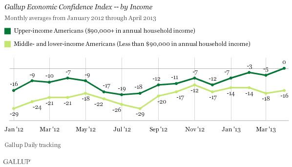
Upper-income Americans' economic confidence in April pushed out of negative territory for the first time [in five years]. Middle- and lower-income Americans' economic confidence remained in negative territory at -16 in April, compared with -18 in March and -14 in February.

Sure, everyone else still thinks the economy is terrible. But what do those middle-class moochers matter? The people whose homes in the Hamptons depend on a soaring stock market are doing fabulously. That's all that counts, right?
Now, about 90% of the time I agree with the political material David posts. But this is a classic example of what I wrote about on Sunday, whereby some in the left blogosphere conflate "the top 20%" (in Gallup's case, at a $90,000 cutoff as we'll see below, about the top 25%) with Wall Street Brahmins like Jamie Dimon. As I noted Sunday, "the top 20%" frequently go by the names of "mom and dad." According to a recent report by the Census Bureau the median stock ownership by households age 55 to 64 is about $25,000. For households age 65 and above, the median is about $50,000.

Still, I was curious as to what he was referring, so I clicked through to find this story and this accompanying poll of economic confidence from Gallup:


So the first thing I noticed is that the dividing line between upper income consumers and the rest is $90,000 annual income. David lives in southern California, so he may not be aware, but the only way somebody with a $90,000 income is getting into a home in the Hamptons is as a caterer or landscape contractor.

But the next thing that got my attention, being a total data nerd, is that big spike upward in the confidence of the lower 75% back in September 2012, that continued upward through November and seems to have had a lasting effect. So I did some searching of archived Gallup reports, and lo and behold, Gallup found a very specific reason for that spike:
Because the Gallup Economic Confidence Index is based on daily tracking of consumer attitudes, we can pinpoint the day that confidence increased. That day was Sept. 4, the first night of the Democratic National Convention. [NDD note: the night of Bill Clinton's keynote address] After averaging -27 in August, and registering -28 on Sept. 3, the Gallup Economic Confidence Index jumped to -18 on Sept. 4, and has mostly remained at or near that improved level.

Because Gallup Daily tracking includes political questions as well as economic ones, we can analyze whose confidence changed in an effort to understand why it changed. The data show that the rise in confidence this month has been almost exclusively due to soaring optimism among Democrats and independents who lean Democratic.
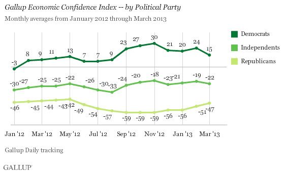
And indeed, while they didn't this month, usually Gallup also includes a breakdown of economic confidence by party affiliation. Here it is from one month ago:


Note that democrats have been positive about the economy since the beginning of 2012, and moreso ever since the democratic convention in September. So in fact David is wrong: "everybody else" besides the top 25% doesn't think the economy is terrible. Democrats in general are positive - a bigger determinant of being positive than having an affluent income.

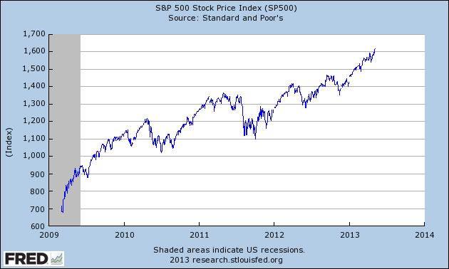
And although there's no smoking gun, it seems likely that that confidence has translated into spending. Here I believe David is correct: the rising stock market is having an effect (specifically, a "wealth effect"). Anecdotally in the last few months I've heard (older middle class) people discussing how their 401(k)'s are doing - for the first time since before the great recession. And a few graphs of the S&P 500 suggest that's very much the case.

First, here's a graph of the S&P 500 since the bottom in March 2009:


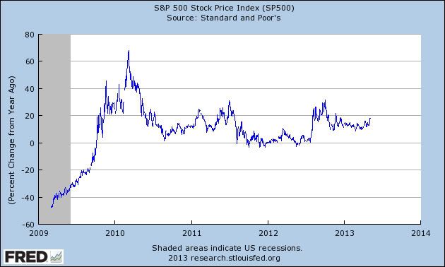
But to see the reason for the wealth effect, looking at the S&P 500's YoY% growth shows it better:


After spending 2 years barely ahead YoY, since last summer the S&P has not just been rising, but it has consistently been up 10% or 20% YoY.

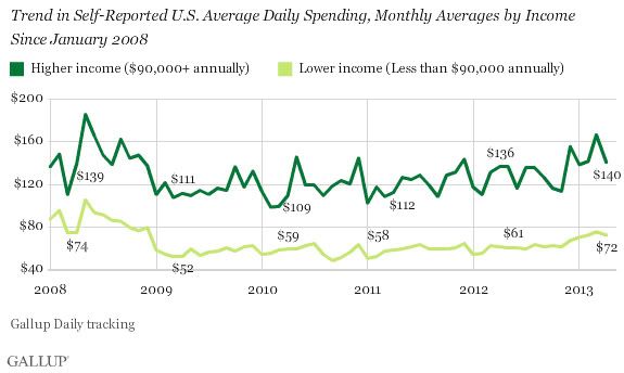
Finally, let's look at Gallup's latest monthly consumer spending graph:


Consumer spending really started to pick up especially for higher but also for lower income consumers in late November, after the stock market had made impressive gains, as it was beginning to close in on its old 2007 records, and just after Obama got re-elected. By Gallup's measure, it has remained strong all through the first 4 months of this year, despite the payroll tax increase, and despite sequestration.

Hence the title of this post, and why it isn't a partisan comment at all. Correlation is not causation and all that, but it does seem likely that democrats, especially affluent democrats, have played a disproportionate role in boosting the economy ever since Bill Clinton's stemwinding speech on the first night of the democratic convention.

Australia Lowers Rates

Hey all -- this is Bonddad.  I'm back after vacation.  First, many thanks to NDD for the fine work he did while I and the Bondspouse vacated in San Francisco for a week.

During my time off, there was plenty of economic news which I'll be catching up on.  Let's start with some of the big news from yesterday -- Australia's dropping its rates 25 basis points.  First, remember that I'm bearish on the Australian economy as I've noted several times (see this link).   The big reason is they're dependent on Chinese growth for most of their growth.  So as China rebalances their economy, Australia should see a decrease in growth.

Here are the important points from the bank's interest rate decision:

Growth in Australia was close to trend in 2012 overall, but was a bit below trend in the second half of the year, and this appears to have continued into 2013. Employment has continued to grow but more slowly than the labour force, so that the rate of unemployment has increased a little, though it remains relatively low. 

With the peak in the level of resources sector investment likely to occur this year, there is scope for other areas of demand to grow more strongly over the next couple of years. There has been a strengthening in consumption and a modest firming in dwelling investment, and prospects are for some increase in business investment outside the resources sector over the next year. Exports of raw materials are increasing as increased capacity comes on stream. These developments, some of which have been assisted by the reductions in interest rates that began 18 months ago, will all be helpful in sustaining growth. 

Australia's central issue -- as with China -- is a need to diversify their overall economy.  Over the last 10 years, Australia's primary economic growth has come from exporting raw materials to China.  But as China has slowly started to move their growth model to one that is more driven by internal demand, raw material exporters like Australia have to change their respective growth models.  But turning an economy in a different direction is a bit more difficult than you'd think, hence my bearishness on Australia.

There are a few more data points from Australia over the last few weeks that should be highlighted.

First, retail sales dropped .4% month to month on a seasonally adjusted basis.  From the report:
  • The trend estimate rose 0.4% in March 2013. This follows a rise of 0.4% in February 2013 and a rise of 0.4% in January 2013.
  • The seasonally adjusted estimate fell 0.4% in March 2013. This follows a rise of 1.3% in February 2013 and a rise of 1.3% in January 2013.
  • In trend terms, Australian turnover rose 3.3% in March 2013 compared with March 2012.
  • The following industries rose in trend terms in March 2013: Food retailing (0.5%), Household goods retailing (0.6%), Cafes, restaurants and takeaway food services (0.4%), Other retailing (0.3%), Department stores (0.4%) and Clothing, footwear and personal accessory retailing (0.1%).
  • The following states and territories rose in trend terms in March 2013: New South Wales (0.5%), Queensland (0.6%), Victoria (0.4%), Western Australia (0.2%), the Australian Capital Territory (0.7%), Tasmania (0.5%) and the Northern Territory (0.2%). South Australia (0.0%) was relatively unchanged in trend terms in March 2013.
 Overall, we see an decent increase over the last few months in this metric.

Total housing permits issued has been decreasing:
  • The trend estimate for total dwellings approved fell 1.2% in March and has fallen for three months.
  • The seasonally adjusted estimate for total dwellings approved fell 5.5% in March following a rise of 3.0% in the previous month.
Here's a chart of the relevant data:


And we also have this from the Conference Board:

The Conference Board LEI for Australia increased again in February for the second consecutive month, with rural goods exports and stock prices making the largest positive contributions to the index. The leading economic index has been flat over the six months between August 2012 and February 2013, an improvement over its decline of 1.1 percent (about a -2.3 percent annual rate) during the previous six months. Additionally, the strengths and weaknesses among the leading indicators have become balanced in the last six months.
The Conference Board CEI for Australia, a measure of current economic activity, also increased in February. In the six-month period ending February 2013, the coincident economic index increased by 0.5 percent (about a 1.0 percent annual rate), down from the 0.9 percent increase (about a 1.8 percent annual rate) for the previous six months. Nevertheless, the strengths and weaknesses among the coincident indicators have been fairly balanced in recent months. Meanwhile, real GDP increased at a 2.4 percent annual rate in the fourth quarter of 2012, slightly down from the 2.6 percent (annual rate) in the third quarter of the year.

The LEI for Australia increased again in February, and its six-month change emerged from negative territory for the first time in more than a year. Meanwhile, the CEI also increased in February, and its six-month grow rate has improved somewhat from the second half of last year. Taken together, the recent improvement in both the LEI and CEI and their components suggests that the economy should continue to grow at a steady pace.

However, consider that news in context:


The overall trend in the LEIs is still down.  The coincident indicators have been level for a bit with only the recent increase to show economic expansion.


And finally notice that while the overall uptrend of the Australian ETF is still intact, the market has not been making new highs with the rest of the world. 

The fact that the bank lowered rates indicates they're concerned about the economy's growth prospects enough to continue goosing growth forward.  That should tell us a great deal about the future.  And while we've seen some positive numbers (retail sales and the LEIs), I still think that the need to rebalance their economy from raw materials to consumer led growth will be more difficult than they anticipate.


Tuesday, May 7, 2013

The oil choke collar is always a constraint


. - by New Deal democrat

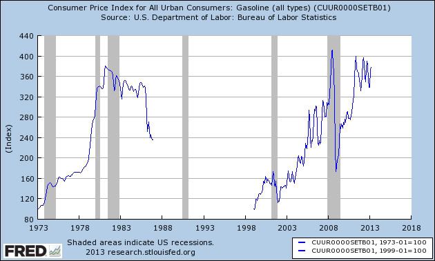
I keep harping on the oil choke collar because it is something that is always going on, at least in the background. We certainly continue to have major and ongoing problems with average consumer households being worse off than they were 15 years ago, with the continuing need for households to deleverage, and with virtually all of the productivity gains in the economy going to corporate suppliers and not being shared with workers at all. But the constriction of sharply elevated energy prices is another long term negative trend.

Here are a couple of graphs to remind you just how negative it has been.

In this first graph, the price of gasoline is normed to 100, both in 1973 right before the first energy crisis, and again at its low point in early 1999:


You can see that the price of gasoline had a similar trajectory on both occasions, rising to about 4 times its original cost, in about 7 years in the 1970's, and in about 9 years at the turn of the Millenium.

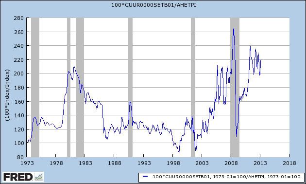
The second graph takes this same information, normed at 100 in 1973, for the entire duration since, and divides it by average hourly earnings to show how expensive gasoline is per unit of labor:


The impact of gasoline prices on the average wage earner was even more drastic in the run-up last decade than it was in the dismal 1970's. And that impact has continued at a level even worse than the 1970's right up until the present.

Ultimately OPEC lost control of the market in 1986. While I am confident that the oil choke collar will loosen, I doubt we'll ever get back to the levels of the 1990's. More likely substitute sources of energy will continue to make inroads. And I can't at all be sure whether the decline in prices we've seen this spring heralds a secular change or is just a brief respite.

US GDP Overview: Gross Investment

Let's now turn to US gross private investment, another component of the GDP equation.


Total investment peaked at high levels before the last recession, only to drop substantially during the recession.  Since then, we see a strong uptrend, with total investment now at the level of the peak from the 1990s expansion.


It should come as no surprise that residential investment has cratered after the housing bubble, falling from a little under $800 billion to a little above $300 billion.  Also note that the overall trend of residential investment has been rising for about a year now.


In contrast, we see that non-residential investment is actually doing very well.  It has been consistently rising for nearly three years and is almost at levels seen at the peak of the last expansion.


And finally, also note that equipment and software investment is now higher than it was at the end of the last recession.  This area of investment has also been growing solidly for the last three years.

With the exception of the residential investment situation, overall investment has bounced back to fairly decent levels.


Monday, May 6, 2013

US GDP Overview: Manufacturing

Continuing with our look at the current state of the US economy, let's turn to the manufacturing sector, starting with the latest ISM report:

"The PMI™ registered 51.3 percent, a decrease of 2.9 percentage points from February's reading of 54.2 percent, indicating expansion in manufacturing for the fourth consecutive month, but at a slower rate. Both the New Orders and Production Indexes reflected growth in March compared to February, albeit at slower rates, registering 51.4 and 52.2 percent, respectively. The Employment Index registered 54.2, an increase of 1.6 percentage points compared to February's reading of 52.6 percent. The Prices Index decreased 7 percentage points to 54.5, and the list of commodities up in price reflected far fewer items than in February. In addition, the Backlog of Orders, Exports and Imports Indexes all grew in March."

Overall, the sector is still in expansion, albeit at a slower pace in the latest report.  Here's a graph of the relevant data:


Overall, the ISM index has been above the 50 mark for over three years, with the exception of a few data points.  Put another way, manufacturing has been doing well for a majority of the expansion.


With the exception of a few dips, the new orders index has also been showing expansion for about three and a half years.


And the overall business activity index has been strong as well, printing between 55 and 60 for over three years.

Let's turn to the ISMs anecdotal quotes:
  • "Beginning to feel the seasonal upswing in business — energy and resin remain a concern." (Food, Beverage & Tobacco Products)
  • "Medical reimbursements from insurance companies, particularly Medicare, are slowing." (Miscellaneous Manufacturing)
  • "While the second half of 2013 looks promising, the first half is a mixed bag." (Computer & Electronic Products)
  • "Things seem slightly better than last year, but still not great." (Printing & Related Support Activities)
  • "Automotive is still very strong." (Fabricated Metal Products)
  • "Post-election in the U.S. — companies within the oil and gas sector are still waiting for signs of some regulatory certainty or stability." (Petroleum & Coal Products)
  • "Reduced government spending in the defense sector lowers business output." (Transportation Equipment)
  • "Business is continuing to be brisk." (Furniture & Related Products)
  • "Market continues to be strong, and our production is exceeding plans at this time." (Wood Products)
  • "Sales are low, even adjusted for seasonal variation." (Chemical Products)

The quotes are a mixed bag.  Some sectors are hurting (defense, oil and gas, computer and electronics, chemical products), while others are doing a bit better (food and beverage and furniture and related products).  However, the report also noted that 14 of 18 industries reporting were expanding.

Let's turn to the latest Markit manufacturing report, starting with their summation:
  • PMI signals modest improvement in manufacturing business conditions during April
  • New order growth slows sharply
  • Weakest rise in output in five months
  • Rate of input price inflation eases to eight-month low
While the number is still positive it's showing a potential slowing.  Here's a reading of the data:


Overall, all the major categories are still in positive territory; we need to see a few more months of data before we can confirm that the trend is dropping into negative territory.

The bottom line is the manufacturing sector is still expanding.  There may be some clouds on the horizon according to the Market report, but we definitely need more data to make that call official.


Understatement of the day


- by New Deal democrat

From the AP's Martha Irvine, via Talking Points Memo:
Experts say that inability to fit into either world is a common predicament for immigrants who came here as teens, though many of them eventually adapt much more successfully than Tamerlan Tsarnaev did.
Gee, I sure hope so.

Actually, hiring isn't weak. Jobs have lagged because firings remained elevated


- by New Deal democrat

The most interesting results are the ones you don't expect to find, the ones that contradict your beliefs going in (Doomers really ought to give it a try sometime, as opposed to just searching for graphs that point down). Over the weekend, I decided to update my scattergraph comparing firing (via initial claims) vs. hiring (via nonfarm payrolls) to see if the relative weakness in job numbers compared with initial claims that started a year ago has persisted. The answer is, it has.

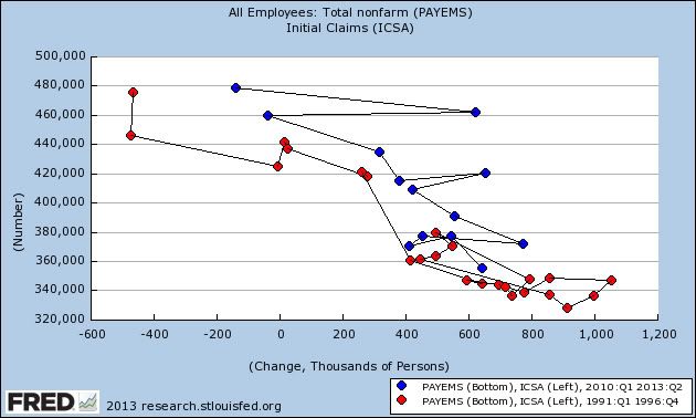
Here's the updated scatterplot graph. The monthly average of initial jobless claims is the left scale, the monthly nonfarm payrolls number is the bottom scale. This allows us to compare how much hiring we've been getting for any given level of firing during this recovery. The graph starts at the peak of initial claims in March 2009. Blue is the first three years, red is the last twelve months:


As you can see, the data points moved to the left and have remained there. That tells us that for any given level of firings, we've had less hiring in the last year. That was the result I expected.

But the surprise happened when I decided to compare the current recovery with the recoveries from the 3 previous recessions. I fully expected to find that for a given level of layoffs, there was more hiring in the previous recoveries, especially as layoffs declined under about 400,000. But that wasn't what I found at all.

The below scattergraphs compare the current recovery (blue), measured from the level when layoffs first declined to about 480,000 to the present monthly average of about 340,000, with each of the past three recoveries (red) during the period of time when layoffs were in the similarly declining 480,000 to 340,000 (or slightly less) range. Since the monthly data is noisy, there is a second graph for each recovery, totalled on a quarter to quarter rather than month to month basis, the better to show the comparison (Remember, for any given level of layoffs, left is weaker hiring, right is stronger hiring).

First, here is the comparison with 2000's economic expansion:


And here is the same data averaged quarterly:


Next, here is the 1990's tech boom:


Here is the tech boom compared quarterly:


Finally, here is the 1980's expansion:


Here is the 1980's expansion averaged quarterly:


Notice the startling results:
  • For any given level of layoffs, hiring has consistently been better during the current recovery than during the economic expansion 10 years ago.

  • In the current recovery hiring has also been equal to or better than hiring during the early part of the 1990's expansion. Only when layoffs declined to a level slightly below our current level did hiring really take off in the 1990's.

  • Only during the first two years of the 1980's expansion was hiring for any given level of layoffs better than it has been during this recovery. After that the levels were about the same.

So why hasn't the current recovery generated more net jobs? Because it has taken so long for firings to decrease to a level consistent with strong hiring:
  • In October 1982, initial jobless claims peaked at nearly 700,000. They were down to 333,000 27 months later.

  • In March 1991, initial jobless claims peaked at just over 500,000. They were down to 313,000 21 months later.

  • In September 2001 just after the terrorist attacks, initial jobless claims peaked at 517,000. They were under 400,000 only 9 months later, and were down to 335,000 43 months later.

By contrast, during the great recession initial jobless claims peaked at 670,000 in March 2009. It took 30 months before they declined to under 400,000, and they finally were down to 334,000 48 months later.

So the real story of the relatively poor payroll growth during this recovery hasn't been a dearth of hiring. Rather it has been the very long tail of elevated if slowly declining firing, that appears finally to have run its course.

UPDATE: And right on cue, Dean Baker alerts us to WaPo pundit Robert Samuelson, who writes Employers lack confidence, not skilled labor, claiming:
So, what explains more vacancies at given unemployment levels...? The answer almost certainly involves employers, not workers. Businesses have become more risk-averse. They’re more reluctant to hire.
The nice thing about doing raw research and relying on hard data is that I can say beyond reasonable doubt that as to his wankery today, Robert Samuelson is a complete jackass.

Sunday, May 5, 2013

A thought for Sunday: the best jobs program = allow Medicare eligibility at age 55


- by New Deal democrat

Regular economic blogging will resume tomorrow (and I know, because the post is already cued up). In the meantime, consider the following thoughts over my Sunday morning coffee, which hopefully aren't too incoherent....

One of the many ranting points I see on progressive blogs is against "the top 20%" who are apparently presumed to be the functional equivalent of Jamie Dimon. Not so. Many of "the top 20%," in terms of wealth as opposed to income, are also known as "mom and dad." If you look at the Census Bureau's breakdown of average wealth by age group, the most prosperous are those on the verge of retirement. They've had 30 or 40 years to gradually build up savings. For example, a couple who each have $50,000 jobs (in today's dollars) and live frugally by spending half of their net earnings and saving the other half (roughly giving them $30,000 savings per year) will become millionaires in about 25 years (thanks to compounding and return on investments). Obviously this isn't the majority - the median wealth of people in the 55 - 64 cohort is something like $200,000 - but a non-trivial percentage of middle class workers ultimately reach this milestone.

And you know what they would like to do more than anythings else? Retire! I know this not only from personal conversations with my fellow fossils, but also through a discussion with an accountant recently in which he told me that the number one reason most of his older clients haven't retired yet is because they are afraid to before they are eligible for Medicare. Or they have to continue to work after age 65 themselves because they need their health insurance to cover their spouse until their spouse reaches age 65.

Meanwhile, people like David Leonhardt in the New York Times are writing about Today's Idled Youth," describing how the ongoing Hard Times have hit the young perhaps harder than any other group. They bought into the American Dream of studying for a degree, becoming a professional of some sort, and hoping for a decent middle class existence. Instead, they are taking clerical or entry level service jobs, or even worse, unable to find a job.

You can see where I'm going with this now, right? Here we have the older workers, hobbling to the finish line, but unable to end the race. And here we have young workers, itching to get started, and they can't because there are no jobs, or no middle class jobs, for them.

And the one thing that would cause the many older workers who have saved for retirement to be able to leave the workfoce, and clear the way for those frustrated younger workers, is guaranteed medical care.

Fortunately, we have a program that provides exactly that: it's called Medicare, and according to those already on it, it works really really well. And it works at much lower administrative costs than for-profit private coverage (If I recall correctly, Medicare's administrative costs are something like 3%, vs. 15% for for-profit plans)(UPDATE: According to the CBO, Medicare's administrative costs are 2%, vs. 17% for for-profit plans. And Medicare premiums have consistently risen less than private health insurer premiums) . And also unlike for-profit plans, in Medicare there's no incentive to deny coverage. As in, yes you can buy into a private plan at age 60 for example, but it will be very expensive and you'd better pray they don't come up with an exclusion if a disease of age catches up with you.

Atrios has written a number of times about increasing Social Security payments. Balderdash, say I. If you really and truly want to make a dent in the persistent employment problem facing younger workers, allow anyone age 55 or above to buy into Medicare. Charge them annual premiums equal to what they would have to pay into Medicare at their same wage or salary until age 65 if they continued to work. You would be amazed to see how quickly Boomers can still move, cleaning out their offices and cubicles, when properly motivated. And then younger workers could move right in.

It'll never happen, of course, because it smacks of the New Deal, not the "21st Century" privatized solutions Barack Obama has touted since 2009. And of course the GOP will never allow it, not just because it smacks of the New Deal, but because if Obama came out in favor of it, they would oppose it for the simple reason of opposing everything Obama wants.

But that doesn't mean we shouldn't acknowledge that it is a real solution to a real problem, and collectively rub Washington's Very Serious People's noses in it.