Friday, July 16, 2010

Weekly Indicators: Psssst! Deflation is Here edition

- by New Deal democrat

This is the week we found out that we have actually already started into deflation with PPI declining 0.5% and CPI declining for the third month in a row, albeit by only 0.1%. Virtually every piece of monthly economic data released -- retail sales, industrial production, capacity utiilization, consumer confidence, the Empire State and Philly Fed reports -- all pointed to a marked slowdown. Whether it actually tips into negative GDP and if so for how long remains the question.

The single most important weekly leading indicator continued to worsen, increasing the odds yet again of an outright contraction in GDP. The MBA mortgage indexes for the week ending July 9 both fell. According to the MBS, the purchase index fell yet another 3.1% to its lowest measure since December 1996. Even the refinance index fell slightly, although clearly there is a lot of refinancing being done at the extremely low mortgage rates now being offered.

Since house prices look like they may be falling quickly, between the end of the "spring selling season" and the expiration of the $8000 credit, deflationary expectations in this market may be feeding on themselves. I'll look into this more shortly.

The ICSC reported same store sales for the week ending July 9 rose 3.2% in the July 3 week vs. a year earlier, although down -1.5% from the last week. This is the third week in a row of 3%+ YoY comparisons. Shoppertrak did not issue a public report this week.

Gas fell back slightly to $2.72. The 4 week average of usage remians up substantially from last year, about +2%-4% YoY in the last several weeks. Apparently consumers like cheaper gas. Hoocoodanode?

The BLS reported 429,000 new jobless claims this week. And now, {drum roll}, let me repeat a quote from this very post last week:
In the next 3 weeks, we may finally break out of the range these have been in since the beginning of the year -- but if so the reason is most likely that GM in particular is keeping its auto plants open in July, so typical seasonal layoffs aren't happening.
As I say from time to time, you're reading the right blog.

Railfax was, frankly, a poor report. Both intermodal and cyclical traffic turned down slightly, and decreased their improvement over last year's report. Worse, baseline traffic is now all the way back to where it was a year ago. Raiflfax has recently started highlighting motor vehicle and scrap metal carloads, and both of these declined sharply in the last week. As I frequently counsel, please click through and take a look at their very revealing graphs.

M1 fell 1% in the week, but the 4 week average in Real M1 is still about +3.5% YoY. M2 also fell about 0.4%, but Real M2 is up about 1.5% YoY (due to declining YoY CPI growth). Monetary indicators aren’t out of the woods yet (I would want to see real M2 up more than 2.5%), but are looking better.

The American Staffing Association reported a decrease of 1.86% in its index for the week ending July 4, 2010. They ascribed to the decline to the shortened workweek.

There is good news in the Daily Treasury Statement. July is continuing the pattern of improvement over last year's numbers, $57.6 B vs.$49.0 B last year, a gain of over 18%. For the last 20 reporting days, we are also up 6%, $129.3 B vs. $121.6 B.

This week repeated the pattern from last week. Coincident indicators continue to show some strength, but leading indicators -- especially purchase mortgage applications, which are the most important metric of all right now-- are of real concern.

Next week I hope to post my semi-awaited updated outlook for the second half and the beginning of next year. Deflation will certainly play a role in that outlook.

In the meantime, in the immortal words of Nat King Cole:

Roll out those lazy, hazy, crazy days of summer,
those days of soda and pretzels and beer...

(and some really good German white brots that I'll be wolfing down tomorrow!)


Empire State and Philly Fed Show Slowing Growth


From the NY Fed:

The Empire State Manufacturing Survey indicates that while conditions for New York manufacturers continued to improve in July, the pace of growth in business activity slowed substantially over the month. The general business conditions index remained positive but fell 15 points, to 5.1.The new orders and shipments indexes were also positive but lower than last month’s levels. Employment indexes dipped as well, with the average workweek index falling below zero for the first time this year. The prices paid index was positive and held steady, while the prices received index declined to a level just below zero. The future general business conditions index was little changed, remaining close to its May and June levels but below the highs seen earlier in the year. The index for future number of employees fell markedly, although it remained above zero. The capital spending and technology spending indexes were also positive, but both were well below the peak levels reached in May.
Here's a chart of the data:


From the Philly Fed:

According to the firms polled for July's Business Outlook Survey, regional manufacturing activity continues to expand but at a slower pace than in June. The general activity index decreased to 5.1 this month, down from 8 in June.

The firms reported a decline in new orders this month compared with June. However, employment showed a slight improvement over last month. Firms do expect to see growth in business over the next six months but are less optimistic than in previous months.


Here's a chart of the data:

With both of these regional indicators, the indexes are still positive. But they are coming close to contraction areas which is not comforting.

No Really -- Austerity Doesn't Work

From the AP:

China rebounded quickly from the global downturn, powered by a 4 trillion yuan ($586 billion) stimulus and a flood of bank lending. But communist leaders worry about surging home prices and a possible spike in bad loans at state-owned banks. They have imposed curbs on lending and investment, key drivers of growth and demand for raw materials.


But government spending is bad -- or at least I thought it was. But then the Chinese government spent 4 trillion in stimulus and got a growth rate of 11.9%. Surely that can't be due to the government spending, can it?

Yesterday's Market


Let's start with agricultural prices. Over the last few days they have been in a clear uptrend. There are three gaps higher (a, b and c). Also note that prices have risen throughout the trading day on two days (d and e).


On the daily chart, prices are through the 200 day EMA. The shorter EMAs are rising with the shorter EMAs above the longer EMAs.


The SPYs are trapped at the 200 day EMA


The QQQQs are trapped at the 10 day EMA.


The 200 day EMA is acting as a magnet for the IWMs, keeping them from rallying.


On the SPYs, take a closer look at the incredibly strong resistance the 200 day EMA is giving prices. Also note the volume is a bit weak (b).


The 10 day chart really shows how prices have stalled (a).


Treasury prices have moved back over the long-term trend line.

Thursday, July 15, 2010

Retail Sales Drop .5%


From the Census Bureau:

The U.S. Census Bureau announced today that advance estimates of U.S. retail and food services sales for June, adjusted for seasonal variation and holiday and trading-day differences, but not for price changes, were $360.2 billion, a decrease of 0.5 percent (±0.5%)* from the previous month, but 4.8 percent (±0.7%) above June 2009. Total sales for the April through June 2010 period were up 6.8 percent (±0.3%) from the same period a year ago. The April to May 2010 percent change was revised from -1.2 percent (±0.5%) to -1.1 percent (±0.2%).


Here is a chart of the last year of data from the St. Louis Federal Reserve:


That is not the most inspiring data trend. In corresponds to the results of the latest Bloomberg poll:

More than half say they are responding to the economic climate by hunkering down. Fewer than a quarter say they are getting back to normal and only 16 percent are seeing opportunity and taking risks. The public’s posture is more pessimistic than the view of global investors polled a month earlier. In a poll of Bloomberg customers conducted June 2-3, more than twice as many respondents -- 35 percent -- said they are seeing opportunities and taking risks.

Rockefeller Institute report confirms Mish's reasoning a Mirage

- by New Deal democrat

When the latest installment of the Rockefeller Institute's report on state finances [pdf] came out a couple of days ago, I read the whole thing, saw a few items I figured would be catnip to Mish, and wondered how long it would be until he took the bait. It turned out it was all of two days. His conclusion:
Improvements in revenue collection are mostly if not entirely due to tax increases and other legislative changes such as California speeding up income tax collection rather than an increase in retail sales as widely touted.
Wrong. The Rockefeller report does not confirm Mish's assertion that retail sales have failed to pick up. In fact, quite the reverse, it validates the May increases I wrote about last week.

As an initial matter, Mish sets up a straw man. Nobody said that the increase in general state revenues was due to increased retail sales, and Mish cites no such source. Rather, Mish had claimed that increases in retail sales were an illusion, and proven by (unexamined) state sales tax revenues. As we saw last week, that blew up in his face once we examined actual May revenues -- and the tax increases he cited in rebuttal didn't actually apply.

Secondly, if you read Mish's article carefully, despite the fact that he allegedly discusses the issue of retail sales and sales taxes, the vast majority of the text dicsusses income taxes as well as property and corporate taxes and general revenues. Very little attention was actually paid to what he claimed to be discussing, namely, sales taxes. In fact, the text of the Rockefeller Institute report spends just three paragraphs on sales tax revenues:
State sales tax collections in the January-March 2010 quarter showed a modest growth at 0.4 percent from the same quarter in 2009, but a decline of 7.9 percent from the same period two years earlier. This is the first time since mid-2008 that sales tax collections report a growth in nominal terms for the nation.Most of the growth is attributable to sales tax growth in California, where collections grew by $1.1 billion, or 15.4 percent due to tax increases. If we exclude California, sales tax collections show a decline of 1.9 percent for the nation in the first quarter of 2010.

.... [discussion of individual states]....

Preliminary figures for the 37 of 45 early reporting states with broad-based sales tax indicate that sales tax collections saw some positive growth at 6.0 percent in April-May 2010 compared to the same period of 2009. While June data could change the picture, sales tax growth in the April-June quarter is not unexpected, as a result of stabilizing retail sales and consumption as well as legislated changes in several states.

Here are most important bullet facts you need to know:

1. What month is it now? (I'll wait while you check): July 2010.
2. What month sales tax returns did I report on last week? May 2010.
3. What months does the Rockefeller Institute report cover? January-March 2010
4. When did the tax increases, especially in California, take place? April 2009

Armed with these facts, let's look at the Rockefeller report.

The first item to notice is how the year-over-year comparisons continue to get better. This is one of four graphs Mish cites, and the only one actually relevant to sales taxes:


That graph plainly shows that there has been a turnaround in the trend of YoY sales tax revenues. But the graph itself is even more lagging than that. It show the YoY change in a rolling 4 quarter period of revenue collections. In other words, the last data point covers the entire period of Q2 2009 through Q1 2010, including the very trough of the recession.

The actual YoY change quarter by quarter is not shown in any graph, but only in this chart:


and the chart is very clear. The bottom of collections of sales tax YoY was in Q3 2009, at -10.0% By Q1 2010 it had turned positive.

As Mish himself acknowledged when he first wrote about this in February, you have to compare sales tax receipts year over year, because there is a lot of seasonality, making month over month comparisons very dicey. The Rockefeller Institute agrees with this. Nevertheless, note that mathematically the actual bottom month had to be at some point during that 12 month period, not at the end (or by definition there could not have been a YoY increase). Most likely the actual bottom in sales tax collections was during the worst YoY quarter, i.e., Q3 2009, and sales tax receipts have been growing since then -- lagging retail sales as measured by the census bureau by 3 to 6 months, which was to be expected (given the lag in reporting sales, and the fact that sales tax is usually not paid on necessities).

So the trend in year over year tax collections was getting better and better, and slightly positive by the time the first quarter ended. That's as far as the actual data in the Rockefeller Institute report takes us. If the year over year trend simply continued, it would mean that state sales tax revenues would rebound nicely in the second quarter.

And of course, by now we have reports of state revenue collections through May. When I originally blogged about Mish's mistake, it was right in the middle of the first quarter, about which the Rockefeller Institute is now reporting. So I dug out the year over year comparisons of sales tax revenues at that time and showed the year over year trend for those months. So I can now add in May to that trend, for the same 11 states that Mish made use of back in February. Here's what the state sales tax receipt data shows:

New York
October -3.3%.
November -4.3%
December +5.0%
January -2.0%
May +7.8%

Indiana
October =11.1%
November -5.1%
December -4.3%
May +5.5%

Texas:
October -12.8%
Noember -15.4%
December -11.6%
January -14.2%
May +1.5%

Tennessee
November -4.5%
December -2.9%
January -1.8%
Tennessee +3.7%

Alabama
January +7.2%
May +2.1%

Georgia
December -20.2%
January -8.7%
Georgia +9.0%


California up 13%

Florida
November -8.1%
December -4.9%
January -4.3%
May +6.0%

Pennsylvania
November -6.1%
December -1.7%
January -1.1%
May +7.5%

Ohio
"January +5.2%
May +5.5%


New Jersey
January +1/9%
May -3.3%.

There is simply not the slightest doubt that the year over year trend of improving sales tax receipts from the first quarter continued to improve in the second quarter.

But,,, but,,, but,,, Mish countered last week, there were sales tax increases in places like New York City and California, so the May increases shouldn't count. Except, as I pointed out in rebuttal, those tax increases came into effect in April 2009. Therefore the DO affect year over year comparisons that include both March and April 2009 (included in the period covered by the YoY comparisons in the Rockefeller Institute report, but DON'T affect the comparisons for tax receipts that started thereafter, such as May 2009-May 2010, because the same tax rates were in effect for the entire period!

So, let's review:

1. The increasing YoY trend of state revenues has been confirmed by the Rockefeller Institute through March 2010.
2. We know from the raw data from the states that the trend DID continue through May 2010.
3. We know that the May 2010 data is unaffected by tax increases that took place before May 2009.

The increase is state sales tax revenues is real. Mish's "rebuttal" to that fact is a mirage.

=====

While in California "through December, the state’s tax revenue take was down 13.7 percent to $7.25 billion," January's tax receipts were UP YoY, and in particular "Sales Tax came in about 80% higher than January 2009." which one California blogger called "finally a ray of hope that California is turning the corner on the recession."
NOTE: This post went up a little early. I'll update in a subsequent post with all of the state tax information, better formatted. The bottom line remains, unless and until someone finds huge tax increases that started after April 2009, the YoY comparisons of May 2009-10 are valid, are in accord with the Rockefeller Institute's analysis, and refute Mish. - NDD

The Foreclosure Wave appears to have crested

- by New Deal democrat

Long long ago and far far away on a foreign-flagged vessel outside the territorial limits of US waters, as I was sitting next to William F. Buckley, Jr., sharing a mind-altering substance and observing the behavior of the parents and children around us, I had the profound if alienating insight that "They think they're so different. But they're really just apes."

Sometimes it helps to think of people as just feindishly smart, nimble, and clever chimpanzees -- and worse, chimpanzees who share their clever shortcuts with every other chimpanzee on the savannah. Give them a seemingly insurmountable obstacle and they will nevertheless find some cunning way around it.

Save that thought as we examine latest from RealtyTrac, which released its midyear report this morning.

According to Realty Trac:

a total of 1,961,894 foreclosure filings ... were reported ... in the first six months of 2010, a 5 percent decrease in total properties from the previous six months but an 8 percent increase in total properties from the first six months of 2009. The report also shows that 1.28 percent of all U.S. housing units (one in 78) received at least one foreclosure filing in the first half of the year.
....

Foreclosure filings were reported on 895,521 U.S. properties during the second quarter, a decrease of nearly 4 percent from the previous quarter and an increase of less than 1 percent from the second quarter of 2009. Default and auction notices were down on a quarter-over-quarter and year-over-year basis in the second quarter, but bank repossessions (REOs) increased 5 percent from the previous quarter and 38 percent from Q2 2009 to 269,962 — a new quarterly high for the report.

“The second quarter was a tale of two trends,” said James J. Saccacio, chief executive officer of RealtyTrac. “The pace of properties entering foreclosure slowed as lenders pre-empted or delayed foreclosure proceedings on delinquent properties with more aggressive short sale and loan modification initiatives. Meanwhile the pace of properties completing the foreclosure process through bank repossession quickened as lenders cleared out a backlog of distressed inventory delayed by foreclosure prevention efforts in 2009.
In summary, old foreclosures were being completed at a very high rate, while new foreclosures were slowing down.

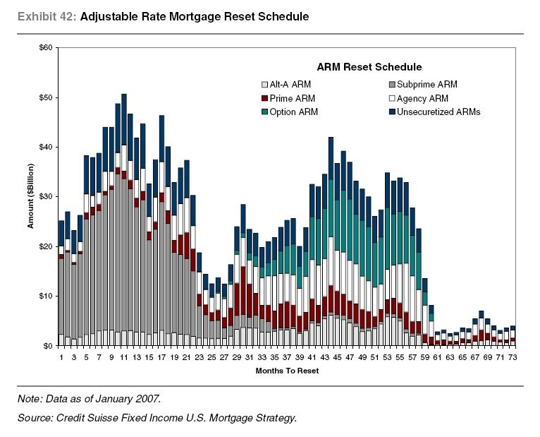
Readers may recall that three months ago I had a brief debate with another blogger who viewed the March increase in foreclosures over February as the beginning of a new "tsunami." The genesis of this story goes back to this graph and others like it that made the rounds beginning in 2006:

showing that mortgage recasts and resets were coming in two waves: the first in 2007-08, and the second this year and 2011. If foreclosures had followed the pattern of this graph, the YoY rate should have bottomed in about last November (month 35) and have been skyrocketing again since.


As I have previously stated, I always been a little chary of that notion, because, by 2008 and certainly 2009, a lot of those homeowners (who were already probably deeply underwater), let their houses go into foreclosure, or else worked out a refinancing. Thus in my exchange with the other blogger, I countered that the data actually was more consistent with the crest of the foreclosure wave than the beginning of a new one.

Three months later, it looks like we have our answer. Here is the updated chart of year over year changes in foreclsoure activity for the last 15 months:

MonthYoY % changeactual foreclosures
04/2009+32 342,038
05/2009+18 321,480
06/2009+33 336,173
07/2009+32 360,149
08/2009+18 358,471
09/2009+29 343,638
10/2009+19332,292
11/2009+22 306,627
12/2009+15 349,519
01/2010+15 315,716
02/2010+6 308,524
03/2010+8 367,056
04/2010-2 333,837
05/2010+1322,920
06/2010-7313,841

We are now only two months before the absolute peak of the second set of resets on the graph above. If any new tsunami was going to develop, it certainly ought to be noticeable by then.


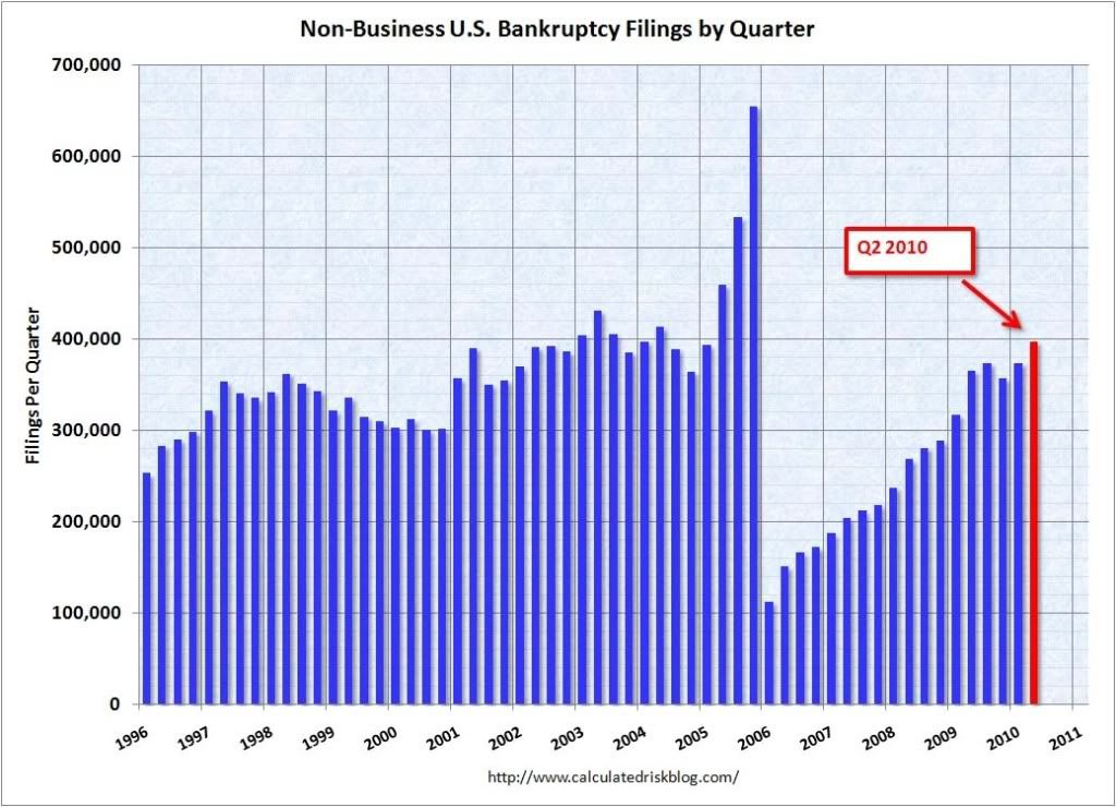
Last month I speculated that it is also possible that a second hump in foreclosures, probably a small echo of the first, could occur not because of resets but because of further price declines, now that the $8000 home buyers' credit has ended. It turns out there is a counterargument to that, and the counterargument may already be in evidence, in this graph of Chapter 13 bankruptcies (h/t Calculated Risk):


Citing the NY Post, CR argued:


Underwater homeowners are jumping onto an unexpected financial life raft that lets them escape crippling second mortgage debts and keep their homes -- Chapter 13 bankruptcy.
...
How it works is this: If the home is appraised at less than the value of the first mortgage, the owner can apply for permission in bankruptcy court to reclassify the second mortgage debt. That changes it from a secured debt, which must be repaid, into an unsecured debt, which does not have to be paid in full. The homeowner can then focus on paying off the first mortgage.
For many borrowers, this makes a Chapter 13 bankruptcy a better choice than a foreclosure. With a foreclosure, the borrower loses the house - and the 2nd lien holder might still pursue the borrower (unless they release the lien for some compensation, like under HAFA).

With a bankruptcy - under certain circumstances - the borrower keeps the house, and the 2nd lien is converted to unsecured debt and does not have to be paid in full. This is probably part of the reason for sharp increase in bankruptcy filings.

In other words: D#*@ed clever chimpanzees!

Yesterday's Market

It's always important to remember there is more than one equity average. For example,


While the SPYs are in a clear consolidation phase over the last two days


The QQQQs were still rallying according to the primary trendline (a) until about mid0day yesterday (b).

And the Russell 2000 is still in an uptrend (b), although yesterday's price action is bearish (b).

Also note the risk factor part of the previous three charts: the riskier part of the market (IWM) are still rallying and the QQQQs were rallying until mid-day yesterday. This tells the risk trade is more alive than previously thought.


The SPYs are right at the 200 day EMA.


The QQQQ are through the 200 day EMA


The IWMs are through the 200 day EMA, although they are under the 10 day EMA.

The point of the above information is the equity averages are improving technically pretty quickly.


The long-end of the yield curve rallied into the long-term trend line yesterday. The next week or so of price action will be very important. Will the trend lower continue or not?


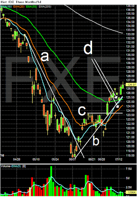
A big reason for the increase in risk tolerance is the euro's recent rise. Notice that prices have broken the downtrend (a) and are clearly in an uptrend (b). Prices have broken through important technical resistance levels (c) and the EMA picture is turning positive -- the 10, 20 and 50 day EMAs are rising, the 10 day EMA has moved through the 50 day EMA and prices are above all three.

Wednesday, July 14, 2010

Yields Curves, Recessions and Double Dips

From Caroline Baum of Bloomberg:


Just because nominal long rates can’t go below zero, does that mean the U.S. won’t go into recession?

The yield curve has inverted prior to all of the last seven recessions, with no false signals since 1967, according to Estrella, whose website provides all kinds of research and data for the uninitiated.

Estrella uses the monthly average spread between the 3- month Treasury bill and the 10-year Treasury note to filter out the noise. The lead time between the appearance of a negative monthly spread and recession can be anywhere from three to 18 months. In the most recent instance, the spread turned negative in July 2006, and the U.S. economy slipped into recession in December 2007, according to the National Bureau of Economic Research, the official arbiter of the business cycle.

Under normal circumstances, the current spread of almost 300 basis points between short and long rates would be highly stimulative. Banks can borrow at next to nothing and lend to the U.S. Treasury, pocketing the difference. No fuss, no muss, no credit risk. The profit goes right to the bottom line, helping to recapitalize the banks, which will be in a better position to make loans to creditworthy borrowers.

.....

While a steep yield curve is a sign of an expansionary monetary policy, the Fed needs the banks to get in the game. Instead they’re content to earn the equivalent of the funds rate on the $1 trillion of excess reserves they are holding in their accounts at the Fed.

In this way, the current cycle resembles the aftermath of the 1990 recession when banks, burdened with losses on commercial real estate, weren’t able to expand their balance sheets.

So the best thing the Fed can do if it is concerned about a faltering recovery is keep the funds rate at zero. The short rate is the more powerful tool when it comes to moving the economy. (If it weren’t, why does every central bank in the world target a short rate?) That’s true even though most of us can’t borrow at the interbank lending rate of 0 to 0.25 percent.

“If corporations and banks can fund themselves at zero, credit would not be a problem,” Estrella says. “You could have slowdown for some other reason.”

Slowdown, yes; recession, no. That’s the message of the yield curve. Its track record is impeccable. It beats forecasters, econometric models, even the Fed, which seems to resist the inherent message in the spread.

For all those double-dippers still splashing around in the pool, it’s time to get out, towel off and learn to love a slow recovery.


Why Aren't Banks Lending?


As the chart above indicates (which is in log scale), loan volume typically drops after a recession. In addition:

To accuse banks of engaging in highly profitable “curve trades” in lieu of private-sector lending misses the point. That’s how it always works. When the economy goes into recession, the Fed lowers the short rate and steepens the yield curve. Private sector credit demand is weak while the government’s appetite is strong. Banks are happy to lend to Uncle Sam. Those loans expand the money supply, which gooses demand in the short run.

Yesterday's Market


The big news yesterday was the long-end of the Treasury market finally falling below its long-term trend line.


Note the 7-10 year part of the curve is approaching this level as well.


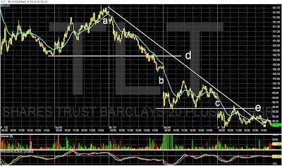
The daily chart of the TLTs shows a large amount of negative information. Since topping at point (a), prices have only rallied twice -- at points (b) and (c). The rally at point (c) was quickly revered intra-day. Also note there have been three downward gaps at points (d), (e) and(f). In short, there are a lot of negative technical developments.


On the SPYs daily chart, take a closer look at the last few week's candles. After printing a really strong candle (a), prices have mainly advanced through inter-day movement as evidenced by the two gaps higher (b and c). The actual candles for the last few days (d) are pretty small.


Take a look at 5-minute chart. After the big bump at (a) prices have really moved into more of a consolidation mode. Notice the lack of intra-day movement in areas (b) and (c).


After falling through support, gold appears to be consolidating.


Gold's consolidation is better seen on this chart. Notice the lack of direction involved over the last 8 days -- prices are jumping from point to point, but primarily moving sideways.

Tuesday, July 13, 2010

CSX Sees Growth

From Reuters:

Railroad company CSX Corp (CSX.N) expects to follow up its better-than-expected second-quarter profit with good gains in the current quarter as the economic recovery gains momentum, company officials said on Tuesday.

"Each quarter we see a little more strength," said CSX Chairman Michael Ward. "As we look to the second half of the year, we think almost all our major markets are going to continue to see that gradual recovery. We expect to have a very good 2010."

Jacksonville, Florida-based CSX reported late Monday that net income for the railroad, one of the largest in the United States, rose 36 percent in the second quarter, beating analysts' expectations.

Volume improved across the varied markets the company serves, and its revenue grew 22 percent to nearly $2.7 billion.

Company officials said they were seeing evidence that the industrial economy was expanding as inventories remain low.

Strong growth is seen in the company's intermodal business, both internationally and domestically, and increased automotive production should spur higher shipping volumes related to that sector, Ward said. Automotive volume jumped 63 percent in the second quarter.

Being a fan of DOW theory, this is good news indeed.

And Speaking of The Stupidity of Austerity

From Bloomberg:


The planned squeeze in U.K. government spending increases the chance of the economy slipping back into recession, said Geoffrey Dicks, who heads economic forecasting at Britain’s new fiscal watchdog.

Responding to questions during a parliamentary hearing in London today, Dicks said measures proposed by Chancellor of the Exchequer George Osborne in the June 22 budget led his office to shave 0.5 percentage points from its growth forecast in the “near term,” increasing the chances the economy will shrink.

“There are some budget measures which will have reduced demand,” Dicks told the Treasury Committee, which scrutinizes economic policy. “The near-term outlook for GDP is not as good as it was before the budget. I still don’t think that will mean a double dip, but logically the chances of that happening have increased.

And therein lies the rub. He's using logic. That's what throws people off.

About This Austerity Movement

Read this from Barry.

Here's my two cents.

This new argument for "austerity" is bullshit. First, the US has had a severe structural deficit for the last 10 years. Here is the total debt outstanding from the Bureau of Public Debt for the years 2000-2009:

09/30/2009 11,909,829,003,511.75
09/30/2008 10,024,724,896,912.49
09/30/2007 9,007,653,372,262.48
09/30/2006 8,506,973,899,215.23
09/30/2005 7,932,709,661,723.50
09/30/2004 7,379,052,696,330.32
09/30/2003 6,783,231,062,743.62
09/30/2002 6,228,235,965,597.16
09/30/2001 5,807,463,412,200.06
09/30/2000 5,674,178,209,886.86

Notice this started a long time ago. Yet suddenly everyone is up in arms about the deficit. Please.

Secondly, the complete denial about the important beneficial effects of government spending (especially infrastructure spending and unemployment benefits) is maddening. Regrettably, everyone now talks in sound bites instead of facts. So here's a few inconvenient facts.

1.) The US economy grew at a solid rate in the 1960s. Why? A big reason was the US government building the highway system. Now goods and services could move between cities in a far easier manner. If you think that wasn't a big deal then you obviously don't get out much.

2.) Since 1970, government spending has accounted for about 20% of all US GDP growth.

There will be a time to deal with this problem. To deal with it, both parties will have to compromise on core issues: the Democrats will have to cut some spending and the Republicans will have to raise some taxes. That's the reality of the budget (for a closer look at some of the macro numbers, see here, here and here.) Simply put, both sides will have to give.

But the real question is this: should we be cutting spending now. The answer to that is an unqualified no. As has been reported in several publications, austerity does not work. Period.

Yesterday's Market


Let's start with a look at the SPYs EMAs. First, the 10 and the 20 are rising, indicating the short-term trend is positive. The 50 (along with the 10 and 20) is just below the 200. Most importantly, notice the EMAs are moving into a bunched pattern -- a place where they are in an extremely tight range. This indicates lack of decision on the part of traders.


Notice the QQQQs are in a similar position. However, they are above the 200 day EMA (a) but on a very weak volume reading (b).


On the IWMs, notice the A/D line is declining, indicating people are leaving the market. However,


We have only recently seen a similar dip in the IWCs -- the micro-caps.

Overall what I find interesting about the A/D readings is they don't indicate a mass exodus from the market. Instead, there is a slight decrease in participation.


Both the IEFs and TLTs are approaching important technical points. Considering how important the flight to safety trade has been over the last few months, these are very important charts.


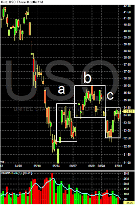
The primary story with the oil market is there is no clear trend, either on the 5-minute or daily chart. Prices are jumping around, gapping up and down, but here is no clear trend up or down. Instead, prices are simply meandering. Over the last 10 days we have three (a, b and c) trading areas; we have the same situation with the daily chart.

Monday, July 12, 2010

Will It Be the Latin American Decade?

From the FT:

While Latin Americans have been fixated on the ups and downs of their football teams in South Africa, financial analysts point to a more impressive set of indicators that should capture the world’s attention.

Economic growth in Latin America and the Caribbean is forecast to average 4.5 per cent this year, twice the estimated US rate and four times faster than the eurozone. Fiscal deficits in Latin America are expected to average 2.3 per cent of gross domestic product in 2010, compared with 6.8 per cent in the euro area and 10.6 per cent in the US. The region’s total public debt is roughly only half the level of Europe and the US.

This economic role-reversal is no accident. Although problems such as drug-trafficking and emigration still dominate and distort public perceptions of Latin America, over the past 20 years the region has undergone a quiet but profound transformation.

Brazil is the most visible example: it has emerged as an industrial and agricultural powerhouse while lifting some 30m of its citizens out of poverty, and is on track to grow more than 7 per cent this year. But Brazil’s progress is echoed, to varying degrees, by most of its neighbours.

Dear Congress: *LOAN* the States the Money

- by New Deal democrat

Honorable Ladies and Gentlemen:

I certainly hope you all had a wonderful Fourth of July recess, and enjoyed the long summer holiday with your family, friends, and the contributors to your campaign chests.

If I might, though, I'd like to raise something else. You see, while you were enjoying the financial perquisites of power last week, a couple of other things happened: first, the long-term unemployed ran out of benefits. I'm not sure what you expect them and their children to do. Maybe roll up under a bridge somewhere out of sight and die? I'm not sure.

The second thing is, most states started a new fiscal year. State revenues collapsed by 20% in this recession, and while you helped them out last year, this year you've refused and so they are feeling the full brunt of that fall-off in revenue. And since the states, unlike you, can't just decide to print money, and many have gotten to the point where they just can't issue new bonds that will be soaked up by willing foreign backers, that means they have to cut. Severely. We're talking libraries and summer swimming pools and teachers and road maintenance and even fire stations and police. The estimates of jobs lost are all over the place, but all of them are in the six-figures.

I'm sure you'll agree -- well, I certainly hope you'll agree -- that sustaining several hundred thousand new job losses is the last thing that the still-fragile recovery needs to see. Back when you passed the economic stimulus plan in the first months of Obama's term, you may remember hearing testimony about a "multiplier effect". You put a lot of money into the system, and built a lot of new roads and made other improvements, and that money doesn't stop there, it suffuses throughout the community, creating new demand wherever it goes. Well, I hate to tell you but the reverse happens too. When you drain money out of the system, that too suffuses throughout the community, destroying demand. That isn't good. That's what all this talk of a "double-dip" is all about, and having that kind of talk in the months right before voters decided whether or not to rehire you for the next term is probably the last thing you want.

I understand, you are reluctant to just give states another round of money. You've awakened after 10 years and discovered that we are running some tremendous budget deficits. You've also noticed, again after a 10 year hiatus, I'm not sure what that was all about, that the National Debt of $13 Trillion and counting, is a long-term structural problem and must be dealt with sometime soon. So, you've decided that the cupboard isn't exactly bare, but it's looking a little sparse, and you have refused to give the states any more money.

OK. I may not agree, but I understand where you are coming from. But what if I told you that you could help the states, you could save hundreds of thousands of jobs, and it wouldn't add a single penny to the National Debt? Would you be interested in that? Do I have your attention? Because it's true.

Ladies and Gentlemen of the Congress: ***LOAN*** the states the money. Don't give away a single dime. For example, if New York State was going to be given $5 billion, change it over to a $5 billion *loan*, and get it out the door now. New York gets the money immediately, doesn't have to close libraries or swimming pools or fire teachers or maintenance crews or firemen or police, it can continue to repair its infrastructure, and the United States of America will get the money back.

How should the loan work? Well, you can always K.I.S.S. You can simply require that after one or two years, the money must be paid back in quarterly installments over the next five years thereafter. Hopefully after a year or two, the states' balance sheets are fully repaired, and they will be paying the funds back during an economic expansion, when they can afford the cost in the budget. If you want to make it slightly more palatable, you can put in the proviso that the funds will be paid back on a schedule of 20 quarters - five years - for each quarter that (1) the GDP is growing; and (2) the GDP is higher than GDP has been in the 2nd quarter of 2010. That way you guarantee that states only have to pay back the money during an economic expansion, when their budgets can best take the hit.

You can charge interest too. The interest should accumulate at the same rate as inflation. That way you aren't getting paid back with inflated dollars, but real hard currency.

And it's as close to a sure thing as could be, that the Federal government will be paid back every penny. The Rockefeller Institute, that keeps track of state finances, estimated that the states' revenues probably bottomed out in about March. Incoming state revenues have been improving too. Here's the situation in May 2010 from 11 of them, including the biggest. Only one of them hasn't seen growth. And I can tell you that month after month, the comparisons have been getting better:

New York State: up 7.8%

Indiana up 5.5%

Texas up 1.5%

Tennessee up 3.7%

Alabama up 2.1%

Georgia up 9.0%

California up 13%

Florida up 6.0%

Pennsylvania up 7.5%

Ohio up 5.5%

Of all the states I was able to check, only New Jersey reported a decrease in YoY sales tax revenues, down -3.3%.


So, here's what you are going to be able to tell the voters of your state, just before you stand for re-election: You rode to their rescue. Your state is getting $billions to avoid layoffs and shutdowns. And in the process of doing so, not a single dime will be added to the long-term National Debt. The ultimate beauty of it is, it is what economists' call "counter-cyclical". You spend during recessions and save during expansions. That's how Keynesian economics is supposed to work, and that's exactly what you are doing. Not just left wing economists like Krugman, but even right wing economists from the American Enterprize Institute who agree that we've got to continue stimulating the economy now, will support you.


It appears, by the way, that I am not the only one floating this idea. Last Thursday in the New York Times, Berkeley Law School Dean Christopher Edley Jr., who was a Clinton White House official, wrote that
the failure to recognize the states as macroeconomic players [ ] helps explain our sluggish recovery.

[S]tates are managing huge budget crises with the only tools they have, cutting spending and raising taxes — both of which undermine the federal stimulus.

[ T]he best booster shot for this recovery and the next would be to allow states to borrow from the Treasury during recessions. We did this for Wall Street and Detroit, fending off disaster. It’s even more important for states.

Here’s how this would work.... Congress should pass legislation that would allow a state to simply get an “advance” on these future federal dollars expected from entitlement programs. The advance could then be used for regional stimulus, to continue state services and to hasten our recovery.

....

What would this cost the federal government? Nothing. There would be zero risk of default, and a guarantee of full repayment plus interest equal to what Treasury pays in the bond markets to borrow. Congress would need only to appropriate the administrative costs of this program, which would be minimal.


Edley's piece was widely seen as a "trial balloon." I strongly recommend that you endorse it. Would you rather do that, or would you rather face hostile questioning from your constituents at home in October about all the cutbacks in state and municipal services?

And while you are at it, you might want to think about the unemployed. If you are bound and determined not to directly create jobs in another WPA style program, and bound and determined not to give out any more extended unemployment benefits, you could at very least turn extended unemployment benefits into a loan that has to be paid back in full over time once they get a job and the economy is growing. Some states do that with their welfare benefits. It isn't what I'd want, but it's better than the alternative of asking them and their children to please go somewhere where you can't see them and die.

Peace and love, New Deal democrat


Yesterday's Market

Every week I use the performance chart function over at Stockcharts.com to see what areas of the market are rising relative to others etc.. Last week stocks and commodities were the clear winners while bonds -- especially the long-end of the curve -- sold-off. While this is only a week of data, it is the first time we're seen the risk trade top the charts for the last few months.
So, let's start with the equity markets.


Prices gapped high on Tuesday's open (a) but then fell for most of the day (b). The real move last week came on Wednesday when prices rallied for most of the day (c) and ended the day at a peak on strong volume. Prices gapped higher at the open on Thursday (d), traded modestly lower for most of the day but then rallied to close near the open (e). On Friday, prices were in a very tight range for most of the day (f), but broke through resistance (g) near the end of trading.


Last week's rally shows strong candles, but notice the declining volume for the small rally. That indicates weaker participation, which is technically bearish.


From a technical side, notice the 10 day EMA is rising and should cross the 20 soon (c). However, this is a fairly regular occurrence and therefore has less technical significance. The A/D line is remarkably stable (a) indicating a lack of flow from the market. But the CMF (b) dropped over the last sell-off. However, the drop was not that large. Bottom line: we're not seeing the huge out of market move you would expect for a sell-off, at least according to the volume indicators.


The long-end of the Treasury market is still above its upward trend line (a), but prices have fallen below important technical support (b).


Last week prices gapped lower three times (a, b, and c) and moved through important technical support (d and e).


Gold has fallen through its trend line (a) after its inability to get through the 122-123 area (b). Prices are now consolidating below the trend line (c).


Notice that industrial metals are still in a trading range as well, stuck between areas (a) and (b).