Friday, November 19, 2010

Weekend Weimar and Beagle

We'll be back on Monday


Weekly Indicators: le 2010 Beaujolais Nouveau est arrivee Edition

- by New Deal democrat

This week's big data had to be the very strong retail sales number on Monday, the 4th positive number in a row. Retail sales for the last 4 months have been growing at an annualized rate of 10%, which may be helping jobless claims, which dropped to their lowest 4 week average in over two years. Housing permits and starts declined, but were within their flat range for the last 20+ months. The good Philly Fed index balanced last week's poor Empire State index, but Induystrial Production and Capacity Utilization flatlined. Leading Indicators were up .5, and last month's number was also revised to a +.5.

Here is this week's high frequency data:

The price of a barrel of Oil fell to about $82 a barrel. But Gas at the pump rose to $2.89 a gallon. If gasoline goes over $3/gallon, I expect consumers will react, and not in a positive way. Gasoline usage declined compared with last year, 8.952 vs. 9.015. Gasoline stocks have plummeted right back into their normal range for this time of year. Over the longer term, gasoline usage has remained about 6% below its rate from the first half of the past decade.

Meanwhile the Mortgage Bankers' Association reported that its seasonally adjusted Purchase Index decreased 5.0% last week, taking back the gain of the prior week.Purchase applications have stabilized generally in the last few months at a level about 20% lower than 2009. Meanwhile, the Refinance Index decreased 18.5% from the previous week, reacting sharply to higher mortgage rates.

The ICSC reported same store sales for the week ending November 13 decreased =0.1% week over week, but for the ssecond week in a row increased 3.4% YoY, the best comparison in several months. Shoppertrak once again did not report for the week, but did report that sales have been up 3.2% for the last six weeks compared with the same period in 2009.

The BLS reported 437,000 new claims, the third week in the last four that claims have broken out under 440,000, resulting in t he lowest 4 week moving average in over 2 years.

Railfax for the second week in a row showed outright decline in the advance over last year's loads for all sectors. As I indicated last week, some of this may be due to retailers ordering and receiving holiday goods early, after last year some were left without merchandise due to shipping delays, but we will see.

The American Staffing Association failed to report this week. Obviously the temp they hired to prepare the report failed to show up.

This week M1 is all about Quantitative Easing. It increased 5.0% in the last week alone (!), and is up 5.5% month over month and 12.5% YoY, hence “real M1” is up 11.3%. M2 increased .2% last week, +0.4% month over month, and 3.1% YoY, so “real M2” is up 1.9%. Real M2 had been up about 2.2% in the last few weeks so this is a slight setback.

Weekly BAA commercial bond rates increased 0.15% last week to 5.95%. This compares with yields on 10 year bonds up +.07%. There is a small degree of stress in this comparative movement.

The Daily Treasury Statement showed $91.5 B in receipts vs. $85.8 B a year ago, a gain of about 6.5% for the first 12 days of November. For the last 20 days, receipts are up $132.7 B vs. $125.7 B a year ago, a gain of about 5.7%. Seasonality is beng felt in these November numbers, which also mark the first time that we are comparing YoY with an advance from the recession bottom in withholding.

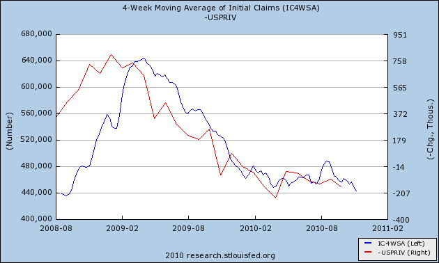
The LEI, retail sales, and initial jobless claims all tell us that not only is the dreaded double-dip not making an appearance, but a re-energized recovery may show increasing job creation as well, as to which I offer you the following (hopefully) thought-provoking graph, showing initial jobless claims in blue, left scale, and private nonfarm payrolls, inverted, in red, right scale :


We'll see in a couple of weeks.

I will be enjoying some of this year's vintage this weekend, and I wish everybody else an enjoyable weekend as well..

Philly Fed Screams Higher


From Bloomberg:

Philly Fed data have been lagging regional and national data but not in November. The report's November index on general business conditions jumped from a zero-flat trend to a prodigious 22.5 to indicate very sharp month-to-month growth. New orders rose more than 15 points to 10.4. Shipments also rose more than 15 points, to 16.8. The region's manufacturers are showing commitment by adding to their workforces as the jobs index rose more than 10 points to 13.3.

Other readings confirm strength: unfilled orders rose while delivery times and inventory contraction slowed. Input prices show steep month-to-month pressure at an accelerating rate yet output prices, that is prices manufacturers receive for their finished goods, continue to contract though now only slightly.

This report points to accelerating strength for what is already solid growth for the national manufacturing sector. Interestingly, these results contrast with Monday's weak Empire State report from the New York Fed, a report that had been significantly stronger than Philly's. Month-to-month swings in regional data shouldn't cloud what is generally a positive outlook and continued leadership for the nation's manufacturing sector.


Here is a chart of the data:


That is one heck of a huge print. This report stands in stark contrast to the Empire state from earlier this week. Given how close these regions are, I'd average them out and call the month a wash for the NY and Philly areas.

A Closer Look At Inflation


This week, the BLS issued CPI and PPI. Let's take a look at these numbers in more detail.

Let's start by defining what we're looking at with PPI

A family of indexes that measure the average change over time in selling prices received by domestic producers of goods and services. PPIs measure price change from the perspective of the seller. This contrasts with other measures that measure price change from the purchaser's perspective, such as the Consumer Price Index (CPI). Sellers' and purchasers' prices may differ due to government subsidies, sales and excise taxes, and distribution costs.
In other words, what we're looking at is what people selling goods and services are getting for their goods and services.

Let's start by looking at overall PPI:
The Producer Price Index for Finished Goods increased 0.4 percent in October, seasonally adjusted, the U.S. Bureau of Labor Statistics reported today. This advance followed a 0.4-percent rise in both September and August. At the earlier stages of processing, prices received by manufacturers of intermediate goods moved up 1.2 percent in October, and the crude goods index increased 4.3 percent. On an unadjusted basis, prices for finished goods advanced 4.3 percent for the 12 months ended October 2010, their largest year-over-year gain since a 5.1 percent rise in May 2010.
Here is a chart of the overall index


I've broken this down into three sections. (a) represents the month to month change in PPIs before the big commodity price spike in 2008. Section (b) represents the big spike and (c) shows where prices are now on a month to month basis. Notice that section (a) and (c) are fairly similar, but section (a) still has higher levels of month to month increases. So while we are seeing increases in producer prices, they aren't that large.


Above is a chart of the year over year percentage change in PPI. Notice it's more or less at levels that occurred in the last expansion.

Let's look at various stages of production.


I've also broken crude goods down into three sections like above. Notice that crude goods A and C sections are a bit more similar. Also note that we've seen bigger increases three of the last four months.


The (a) section of the intermediate goods chart is still more inflationary. However, notice that the last three months we've seen increasing PPI numbers.


PPI finished goods are still too low. Compare (b) with (a) -- (a) is still far higher.

In short, it looks as though crude and intermediate price increases are getting absorbed in the manufacturing process, leading to low finished goods readings. While the finished goods readings are still printing positive numbers, ideally we'd like to see these numbers a bit higher.

Let's turn to CPI:

The Consumer Price Index for All Urban Consumers (CPI-U) increased 0.2 percent in October on a seasonally adjusted basis, the U.S. Bureau of Labor Statistics reported today. Over the last 12 months, the all items index increased 1.2 percent before seasonal adjustment.

As has frequently been the case in recent months, an increase in the energy index was the major factor in the all items seasonally adjusted increase. The gasoline index rose for the fourth month in a row and accounted for almost 90 percent of the all items increase; the household energy index rose as well. The food index rose slightly in October with the food at home index unchanged.

The index for all items less food and energy was unchanged in October, the third month in a row with no change. The indexes for shelter and medical care rose, but these increases were offset by declines in an array of indexes including new vehicles, used cars and trucks, apparel, recreation, and tobacco.

Over the last 12 months, the index for all items less food and energyhas risen 0.6 percent, the smallest 12-month increase in the history of the index, which dates to 1957. The energy index has risen 5.9 percent over that span with the gasoline index up 9.5 percent. The food index has risen 1.4 percent, with both the food at home index and food away from home index rising the same 1.4 percent.

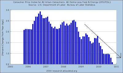
Let's look at the data, starting with core CPI


The month over month percentage change in CPI is clearly moving lower. Also note how rare a decrease is -- we've seen four prints in the last five years.


The pace of change from year ago levels is clearly moving lower and is now in dangerous territory. This chart is very dangerous for the economy as a whole.


The index for all items is clearly printing at lower rates than the month to month pace before the expansion (compare sections a and b).


The year over year percentage change in overall CPI is also moving lower.

These charts indicate that prices are still a concern and need to be addressed quickly.

Thursday, November 18, 2010

Yesterday's Market


The dollar broke trend yesterday (c), breaking a strong uptrend that has been in place for the last ten days. While the uptrend is over, it's important to remember why this rally happened: the dollar is still seen as a safe haven currency.


The equity markets gapped higher at the open (a), rallied in the early part of trading (b), then consolidated their gains for most of the day (c). Prices moved a bit lower at the end of trading (d), but not enough to really threaten the rally's gains.


I wouldn't be surprised to see equity prices consolidated between lines (a )and (b) on the top and (c) on the bottom.


The Treasury market has broken trend (a). Also note the EMA picture is becoming more and more bearish -- the 10 and 20 day EMAs have moved through the 50 and all are moving lower.


There are two ways to look at the chart for cattle. The first is as a triangle consolidation (A and B). The second is as a sideways consolidation between roughly 97 and 102. I would prefer the latter, largely because it has been going on for longer and it more closely resembles the EMA picture. However, it would be possible that both are correct; it simply depends on your time frame.


Gold finally broke the long-term trend line (a) at point (b). Also note the MACD is printing a sell signal right now (c).

LEIs Increase .5%


From the Conference Board:

Says Ataman Ozyildirim, economist at The Conference Board: “The LEI remains on an upward trend, suggesting the modest economic expansion will continue in the near term. The LEI’s growth has been slowing this year, but gains in the financial components helped its pickup in October.”

Says Ken Goldstein, economist at The Conference Board: “The economy is slow, but latest data on the U.S. LEI suggest that change may be around the corner. Expect modest holiday sales, driven by steep discounting. But following a post-holiday lull, the indicators are suggesting a mild pickup this spring.”

Let's take a look at the data:

The LEIs are continuing to increase, and are doing so at a steeper rate.


Only two of ten components decreased; all others (obviously) increased.


"Holy Grail" update

- by New Deal democrat

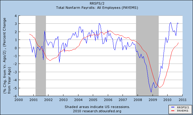
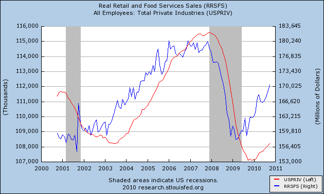
Over a year ago I identified real (inflation-adjusted) retail sales as the "Holy Grail," i.e., best single leading indicator for job growth. With Monday's retail sales and yesterday's inflation reports, we can update the graph comparing real retail sales and jobs.

First, here are the absolute numbers (note in this first graph I am using private jobs rather than full payrolls to take out the census distortions):


As of October, real retail sales have made up more than half of their losses during the Great Recession.

Here are the year over year percentage comparisons:


In 4 of the last 7 months, real retail sales have been up over 6%. Based on 65 years' worth of data, this translates into, at minimum, 2% (or about 2.5 million jobs) year over year job growth, sometime soon. Whether "soon" is more like 6 months or 24 months is impossible to tell, but the trend is unequivocally positive.

The Housing Bust: Is it time to start looking for the end?

- by New Deal democrat

Way back in 2004 (if not earlier), Ben Jones' Housing Bubble Blog started, dedicated to the proposition that there was a housing bubble that would eventually burst, with very bad consequences. Although the peak of the bubble did not occur until the beginning of 2006, the signs were there to see for the discerning.

The other day, with the release of the most recent Case-Shiller housing indexes, I decided to take a look at what the "real", inflation-adjusted cost of housing was in the cities surveyed. Some of the results were stunning. Prices in about half of the 20 cities surveyed are at the lowest they have been, in "real" terms, in nearly a quarter century -- and that's before taking into account mortgage interest rates.

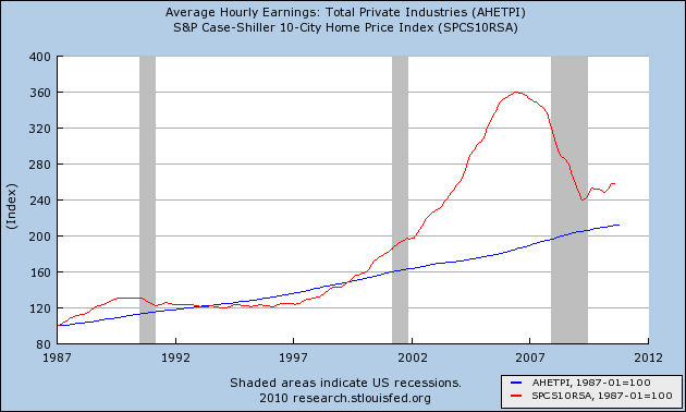
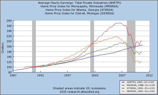
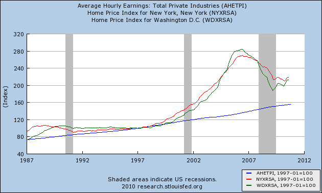
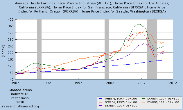
Below are the results in graphic form. Since housing itself is a component of inflation, rather than use the CPI, I have compared housing prices with the growth of average hourly earnings in private industry since 1987 (blue line in each of the graphs below).

This compares average hourly earnings with the overall 10-city Case Shiller housing index:


As you can easily see, in the aggregate housing prices are still a good 20% above their long term average, suggesting that prices as a nationwide average have a substantial way to fall. Based on that, upon release of the most recent Case Shiller data a few days ago, Standard and Poors opined that they expect house prices to fall another 7 to 10% through the end of 2011.

On a national scale, that is probably close to the mark. But look what happens when we start looking at different cities.

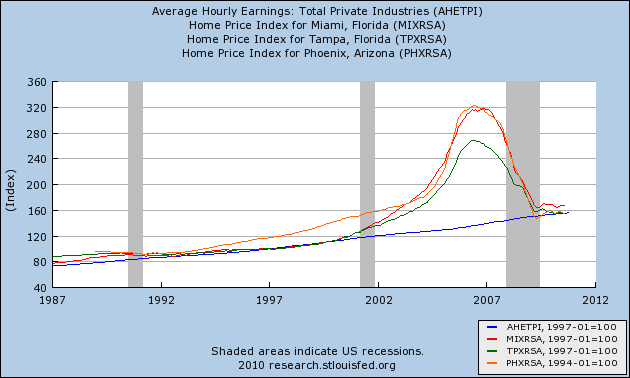
Here are three cities at the epicenter of the housing bubble: Tampa, Miami, and Phoenix:


These three cases all had smaller housing booms in the late 1980s that did not bottom out until the mid-1990s. Housing prices in each locale now are as low as they were at that mid-1990s nadir in real terms.

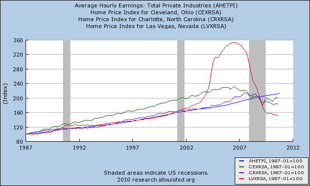
Here are three more cities -- Las Vegas, Charlotte, and Cleveland -- that did not have mini-busts in the 1990s, but in the case of Las Vegas, was another epicenter of the housing bubble:


In all three of these cases, prices are actually lower now in real terms than they were 23 years ago or at any time since.

Atlanta, Minneapolis, and Detroit likewise have the lower prices now than at any time since this series started:

Detroit, of course, more than any other large city, has suffered from de-industrialization.

So, where are prices still elevated?

It is good to be the seat of the financial or political Empire, respectively. Here are New York City and Washington, DC:


No regression to the mean in either of those two cities. Nor is there any along the West Coast:


Los Angeles, San Francisco, Portland, and Seattle still show highly elevated "real" prices. Although I haven't graphed it, so does San Diego which is also part of the Case Shiller sample.

In short, fully half of the cities examined in the Case Shiller index have house prices now that are equal to or lower than any other prices in real terms in the last 20+ years. The bubble has fully burst in those cities.

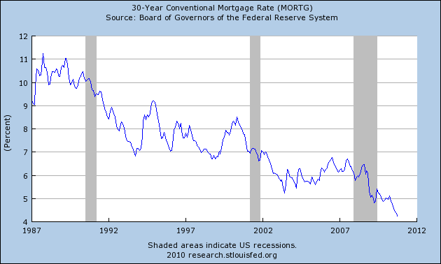
The low absolute home prices are only amplified by mortgage rates, which were about 11% in 1987, 7% or so in the mid-1990s, but only a little above 4% now.


So the monthly mortgage payment now is only about 40% of what it would have been in real terms back in 1987.

Of course, the fact that housing prices in the above referenced 9 locales are at quarter-century lows does not mean that they won't go lower. Some of them have been low for several years, and yet continued to decline.

Courtesy of Ben Engebreth's Housing Tracker, here are housing inventories for 5 of the metropolitan areas referenced above.

Here's Tampa:


Here is Phoenix:


Here is Atlanta:


Here is Cleveland:


Finally, here is Washington, D.C.:


In all five of the above metropolitan areas, inventory of houses for sale has declined from peak. But in none of the cases is the inventory back where it was in 2005 when the market in the most bubblicious areas started to turn. It is when this inventory goes back down to its 2005 levels or lower that we can expect a bottom in house prices. My best guess is that the national low for the Housing Bust is still several years away.

Yet the low real prices and declining inventory in some of the most severely impacted cities argues that we should start to look for a bottom in at least some of those locales within the next 6 to 12 months.

Wednesday, November 17, 2010

Yesterday's Market


Price action yesterday was pretty straightforward: prices rose a bit in the early morning (a) then traded ins a very tight range for most of the day (b) before falling a bit at the end of trading (c).


On the daily chart, prices formed a very thin and narrow candle at the end of a sell-off (a). Narrow trading days at the end of a sell-off can be signs the selling is over.


The dollar continued higher (a), although prices today hugged the trend line very tightly (b).

Today, prices traded in a very tight range.


After consolidating in a tight range (A), lumber has rallied a bit. Notice there are two uptrends: a shorter one (B) which prices have already violated and a longer one (C) which is currently acting as support for prices. Also note the shorter EMAs are starting to move lower (D)


Soy beans also have several uptrends. The longer one (A) is still firmly intact, but the second one (B) has been broken (D). Also note the MACD has given a sell signal.

No, Virginia, Raising Marginal Tax Rates Won't Kill Growth

In talking about the budget, I have mentioned that taxes have to increase. Some people would argue this will kill growth. I hate to break it to you, but raising marginal tax rates a few percentage points is pretty minor. Barry over at the Big Picture debunked this line of thought a little bit ago.

Here are the links.

Link 1

Link 2

In talking about raising taxes, I am not talking about jacking rates up a gazillion percent. I am talking about raising them 3-4% on top earnings and increasing the amount of income subject to social security tax.

I should also add -- no one has ever produced a real world laffer curve -- that is, no one has even been able to take the US economy, its population and tax rates and determine where the optimum rate of taxation is based on Art Laffer's "logic." As such, I put it down in the pure crappola bin.

The Washington Lobotomy Factory is Working Overtime

Yesterday, I argued that somewhere in Washington is a lobotomy factory where all people in government go when they arrived in Washington. I am now convinced -- to the core of my being -- that is what occurs.

From the WSJ:

A panel of Democrats, Republicans, economists and other experts is set to say Wednesday that a complete overhaul of the U.S. tax code is the best way to address the nation's fiscal problems—a new and likely controversial idea aimed at tackling the growing deficit.

The report, co-authored by Democratic budget veteran Alice Rivlin and former Sen. Pete Domenici (R., N.M.), follows a separate proposal last week by the two chairmen of President Barack Obama's deficit commission. The many similarities between the two offer a window into the types of proposals that might win backing as Washington launches into what is likely to be a protracted debate on deficit cutting.

The most recent report, put together by a group called the Bipartisan Policy Center, will call for a one-year payroll-tax holiday in 2011 that it says will create between 2.5 million and 7 million jobs.

The plan would lower income and corporate tax rates and offset them with a 6.5% national sales or "consumption" tax as well as an excise tax on sugar drinks like soda.

The Bipartisan Policy Center was created in 2007 by former Senate Majority Leaders Howard Baker, Tom Daschle, Bob Dole and George Mitchell with the aim of finding solutions to major national issues.

Here's the deal.

The U.S is running a deficit. That means two things.

1.) Taxes have to increase.

2.) Spending has to drop. As I demonstrated last week, the real issue there is medical costs We need to find some way to lower medical spending. I have no idea what that entails,but that is the central issue going forward for the US deficit.

This magical thinking that a reworking of the tax code will solve the problem is utter crap. It's a nice idea, but the tax code is full of special interest giveaways. The only way to make simplification work is to eliminate every single giveaway and not let any return. Politically, in an age of massive lobbying by everybody and their dog, that is simply not going to happen.

So far, all we've gotten is really stupid solutions that effectively say, "we don't want to make hard decisions because we might not get re-elected."

This isn't that hard or complicated. However, it does require grown-up solutions to answers. And that is where we come up short. Washington is full of stupid people.


Copper Takes a Hit


Copper is a very important industrial metal, used in practically everything. As such, it's price direction is very important. Here is a daily chart of copper:


Prices have broken the primary long-term uptrend (A). Over the last four days, prices have printed two strong downward moving bars (B). Also note the 10 day EMA is about to move through the 20 day EMA -- a bearish development short-term.

Right now, this looks like a standard correction. However, we're been hammered with China and EU problems for the last week. Both news stories are potentially longer-term bearish, meaning we have to keep our eyes open for continued weakness.

Tuesday, November 16, 2010

Yesterday's Market


Let's start with the dollar. Over the last 10 days it has been in a clear uptrend.


The daily chart shows the move in a bit more detail (a). Also note the 10 day EMA has crossed over the 20 day EMA (b) and bother the shorter EMAs are moving higher.

The dollar is catching a safety bid from the EU situation. This has bearish implications for commodities as they are priced in dollars.


Yesterday the market opened lower (a) and moved sideways before it found resistance at the 10 minute EMA and moved lower (c). After a big move lower, prices consolidated for the rest of the day in a fairly tight range (d).


Notice that prices are still moving lower (a) and are now through the 10 and 20 day EMAs. The 50 day EMA is the next logical support level.


Oil has fallen back through key areas (A and B). Once again we see oil pulled back to lower levels. The inventory report is out on Thursday which should be interesting (to say the least).


After spiking due to the Russian situation (A), wheat prices dropped a bit and consolidated in a rectangle pattern (B). Now prices have moved through the 50 day EMA (C) while the MACD has given a sell signal (D). This is partially the result of the stronger dollar as mentioned above.