Saturday, May 4, 2024

Weekly Indicators for April 29 - May 3 at Seeking Alpha


 - by New Deal democrat


My “Weekly Indicators” post is up at Seeking Alpha.

Very little change this week in any of the indicators, but what there was had everything to do with the frame of reference, because all gas prices under $3/gallon have now dropped out of the three year reference period. Which means that - *relatively* speaking - gas prices are currently cheap!

As usual, clicking over and reading will bring you up to the virtual moment as to the state of the economy, and reward me with some pocket change for organizing it for you in a coherent format.

Friday, May 3, 2024

April jobs report: counterbalancing March’s blockbuster good report, the first significant “ding” to the soft landing scenario in months


 - by New Deal democrat


In the past few months, my focus has been on whether jobs gains are most consistent with a “soft landing,” i.e., no further deterioration, or whether deceleration is ongoing; and more specifically: 
  • Whether there is further deceleration in jobs gains compared with the last 6 month average, vs. a “soft landing” stabilization - and even whether the recent increase in monthly jobs numbers signifies a re-strengthening.
  • Based on the leading relationship of initial and continuing jobless claims, whether the unemployment rate is neutral or decreasing; or whether there is further weakness.
  • Based on the leading relationship of the quits rate to average hourly earnings, whether YoY wage growth would continue to decline slightly. It did continue to decline to a new post-pandemic low - but still at 4%.

All three of these metrics came in negative, in the sense of the lowest gain in jobs since last October, and the 4th lowest in over 3 years. The unemployment rate increased. And average hourly wage growth decreased to its lowest rate in almost 3 years as well.

Here’s my in depth synopsis.


HEADLINES:
  • 175,000 jobs added. Private sector jobs increased 167,000. Government jobs increased by 8,000. 
  •  February was revised downward by -34,000, while March was revised upward by 12,000, for a net decline of -22,000. This continues the pattern from nearly every month in the 16 months of a steady drumbeat of downward net revisions.
  • The alternate, and more volatile measure in the household report, showed a paltry 25,000 increase. On a YoY basis, in this series only 529,000 jobs, or 0.3%, have been gained. This is the lowest YoY increase since the pandemic lockdowns.
  • The U3 unemployment rate rose 0.1% to 3.9%, tying February’s 2 year high.
  • The U6 underemployment rate also rose 0.1% to 7.4%, 0.9% above its low of December 2022.
  • Further out on the spectrum, those who are not in the labor force but want a job now rose 194,000 to 5.637 million, vs. its post-pandemic low of 4.925 million set just over 12 months ago.

Leading employment indicators of a slowdown or recession

These are leading sectors for the economy overall, and help us gauge how much the post-pandemic employment boom is shading towards a downturn. These were very mixed:
  • the average manufacturing workweek, one of the 10 components of the Index of Leading Indicators, declined -0.1 hours to 40.7 hours, and is still down -0.8 hours from its February 2022 peak of 41.5 hours.
  • Manufacturing jobs rose 8,000.
  • Within that sector, motor vehicle manufacturing jobs declined -2,100. 
  • Truck driving declilned -300.
  • Construction jobs increased 9,000.
  • Residential construction jobs, which are even more leading, rose by 2,800 to another new post-pandemic high.
  • Goods producing jobs as a whole rose 14,000 to another new expansion high. These should decline before any recession occurs.
  • Temporary jobs, which have generally been declining late 2022, fell by another -16,400, and are down almost -500,000 since their peak in March 2022. This appears to be not just cyclical, but a secular change in trend.
  • the number of people unemployed for 5 weeks or fewer rose 73,000 to 2,262,000.

Wages of non-managerial workers
  • Average Hourly Earnings for Production and Nonsupervisory Personnel increased $.06, or +0.2%, to $29.83, for a YoY gain of +4.0%. With revisions, the YoY growth in these have been sliding almost relentlessly since 2 years ago. This is the lowest YoY gain since June 2021, vs. its post-pandemic peak of 7.0% YoY in March 2022.

Aggregate hours and wages: 
  • the index of aggregate hours worked for non-managerial workers declined -0.2%, and is up 1.4% YoY.
  •  the index of aggregate payrolls for non-managerial workers rose 0.1%, and is up 5.5% YoY, the second lowest YoY advance since the end of the pandemic lockdowns. This is 2.0% above the most recent YoY inflation rate, and despite the decline in growth remains powerful evidence that average working families have continue to see gains in “real” spending money. On the other hand, most likely once April’s CPI is reported, there will be a month over month decrease.

Other significant data:
  • Professional and business employment declined -4,000. These tend to be well-paying jobs. This series had generally been declining since last May, but in the previous 4 months had resumed their increase; but are still only higher by 0.4% from one year ago.
  • The employment population ratio declined -0.1% to 60.2%, vs. 61.1% in February 2020.
  • The Labor Force Participation Rate remained steady at 62.7%, vs. 63.4% in February 2020.


SUMMARY

After last month’s extremely strong report, it was perhaps inevitable that this month’s report would be relatively disappointing. And disappoint it did, as the Establishment survey was very mixed, and the Household report was *very* weak.

There were some good points, as job growth continued in manufacturing, construction, and goods production in general. I would expect all of these to turn down before.- in the case of the first two, well before - any recession were to hit. And the reason for the relatively poor headline jobs number was the paltry growth in government jobs. Growth in the private sector was actually average for the past 18 months.

But these were overwhelmed by most of the bad points. In the Establishment Survey, auto, trucking, and temporary help jobs declined. Revisions were once again net negative. The manufacturing workweek declined slightly. Worse, the aggregate number of hours worked declined. And aggregate payrolls rose a paltry 0.1%. In the Household Survey, only 64,000 jobs were gained, while unemployment increased by 25,000, driving an increase in the unemployment and underemployment rates. The YoY gain of 0.3% in jobs in this survey historically has been recessionary. 

On net, this report mainly balances last month’s great report. It doesn’t set off any alarm bells, but it’s the first significant ding in the “soft landing” hypothesis in many months.

Thursday, May 2, 2024

The snooze-a-than in jobless claims continues; what I am looking for in tomorrow’s jobs report


 - by New Deal democrat


 The snooze-a-thon in jobless claims continues, as both initial and continuing claims are well-behaved within the narrow range where they have been generally for the past six months.


Initial claims were unchanged least week at 208,000, while the four week moving average declilned -3,500 to 210,00. With the usual one week delay, continuing claims were unchanged at 1.774 million, which is tied for the lowest level in nearly 9 months except for a three week period right at the turn of the year:


Ask per usual, the YoY% change is more important for forecasting purposes. On that basis initial claims were down -2.8%, the four week average down -3.1%, and continuing claims higher by 4.0%, just above last week’s 14 month low point for that metric:


As has been the case for a number of months, since jobless claims lead the unemployment rate with a several month lag, plugging these numbers into the Sahm rule indicates that we should expect the unemployment rate not to rise from 3.8% in tomorrow’s report, and it is more likely to decline to 3.7% or even 3.6% in the next few months:


The forecast is for continued economic expansion.

Turning to several more metrics that guide my thinking on tomorrow’s employment report, here’s a look at the status of the “consumption leads employment” indicator. The YoY% change in both real retail sales and real personal consumption have improved in recent months, but nevertheless I would expect a slow deceleration in the YoY comparisons of monthly job growth to continue:


Since last spring we were running close to 300,000 monthly, I would expect less than that but probably greater than 200,000 tomorrow. Lots of monthly noise! But that should be the trend.

Here is a repeat of yesterday’s graph of the quits rate vs. YoY wage gains:


I expect the trend of deceleration to continue with wage gains as well. I am looking for a range of between 4.1% to 4.4% YoY.

Continuing as to wages, the below historical graph of the YoY% change in wages is what is behind my not being alarmed about the recent monthly upticks in inflation:


Note that with the exception of twice in the 1970s stagflation era, YoY wage growth has always increased as the expansion wears on. If I saw wage growth turn around and start to rise again, I would be alarmed. But that simply isn’t happening.

Finally, earlier this week the Employment Cost Index for Q1 was reported, showing an uptick to 1.1% q/q for wages and 1.2% q/q for all compensation including other benefits:


These series are both a little noisy, and I interpret the quarterly wage increase as being within the normal range of fluctuation. Benefits compensation, on the other hand, definitely jumped. This index is important because, as the BLS’s explanation indicates:

“The Employment Cost Index measures the change in the hourly labor cost to employers over time. The ECI uses a fixed ‘basket’ of labor to produce a pure cost change, free from the effects of workers moving between occupations and industries and includes both the cost of wages and salaries and the cost of benefits.”

In other words, the ECI is not affected by the change in the make-up of the job market (such as we had during the pandemic, when many more low wage workers were laid off in comparison with high-wage workers).

The E.C.I. Is telling us that workers still have a very strong “hand” compared with the past 50 years, if not quite as strong as several years ago.

This is the template of what I will be particularly looking for in tomorrow’s jobs report.

Wednesday, May 1, 2024

March JOLTS report: declines in everything, fortunately including layoffs


 - by New Deal democrat


After almost half a year of general stabilization, or very slow deceleration, the JOLTS report for March featured multi-year lows in almost all of its components. 

Job openings (blue in the graph below), a soft statistic that is polluted by imaginary, permanent, and trolling listings, declined -325,000 to a three year low of 8.488 million. Actual hires (red) declined -281,000 to 5.500 million, the lowest level since the pandemic lockdowns. Voluntary quits (gold) declined -198,000 to a more than three year low of 3.329 million. In the below graph, they are all normed to a level of 100 as of just before the pandemic:


As has been the case for a number of months now, hires are below the level they were at just in early 2020 just before the pandemic hit, and this month they were joined by quits as well.

The reason the above situation has not been bad is that layoffs and discharges (blue in the graph below) also made a fifteen month low, and are still running 20% below the level they were at just before the pandemic, and indeed (not shown), at *any* point before :


The more leading weekly initial jobless claims (red) suggest that layoffs and discharges will remain in this range at least for several more months.

Finally, the quits rate also declined -0.1% to a new 3.5 year low as well. Since, as I have noted for a number of months now, the quits rate (blue in the graph below, right scale) tends to lead average hourly earnings (red) [and here’s the long-term view]:


this suggests that the deceleration in wage growth will continue in coming months as well, as shown in the below post-pandemic close-up:


Needless to say, if such a further deceleration in wage growth coincides with an upturn in inflation, that is going to put a dent in real consumer income and spending. So I will pay even more attention to those two numbers on Friday and later in the month. It also highlights the continuing importance of very low initial jobless claims.

Manufacturing treads water in April, while real construction spending turned down in March (UPDATE: and heavy truck sales weren’t so great either)


 - by New Deal democrat


A preliminary programming note: In addition to the manufacturing and construction reports, today we also get the JOLTS report for March, and updated motor vehicle sales reports. Yesterday we also got the Employment Cost Index for Q1.

I will comment on the JOLTS report later today. I’ll comment on the ECI along with jobless claims tomorrow. Additionally, Wolf Richter made an interesting point yesterday about the sharp increase in repeat home sales prices in the Case Shiller and FHFA reports yesterday. He noted that the reports coincided with the December through early February decline in mortgage rates to 6.6%, which presumably prompted a lot of potential buyers to “strike while the iron is hot,” thereby driving up competition for the limited supply of existing homes on the market. Since mortgage rates have subsequently increased back over 7%, that strongly suggests the spike will reverse in the next couple of months.

With that out of the way, let’s turn to the ISM manufacturing and construction spending reports.

As I’ve noted often this year, these are the two sectors that I would expect to turn down if the continued effects of the Fed rate hikes will start to hit the economy,  now that there is no further tailwind from declining commodity prices.

The ISM manufacturing report has diminished in importance as manufacturing has mades up a smaller share of the total US economy. Thus, even though it had been in contraction for the last 16 months, to levels that before 2000 would always have meant recession, that didn’t happen in 2023. 

In March both the headline and the more leading new orders numbers were both above the 50 line demarcating expansion vs. contraction. In April they both declined slightly below that level, to 49.2 and 49.1 respectively. Still that is better than their readings for virtually all of 2023. More generally I would say this points to a manufacturing sector that is neither expanding nor contracting, but treading water (Updated with current graph):


UPDATE: Further on manufacturing, a few days ago the BEA updated its series on light vehicle (blue, left scale) and heavy truck (red, right scale) sales. Here’s the longer term view:


The important thing to note is that truck sales are less noisy and tend to turn down first.

Now here is the post-pandemic close-up:


While light vehicle sales have been noisy, but seem to be in a slight downtrend, the downturn in heavy truck sales is far more pronounced, on the order of -20%. While there have been at least three similar downturns in the past (1986, 1996, and 2015-16) without recessions occurring, and as to 2019-20 we’ll never know for sure what would have happened minus the pandemic, there have been other similar downturns that were very much harbingers of recessions roughly one year later. So this is definitely a cautionary signal.

The story was similar as to construction. Nominally total spending declined -0.2% in March, and was down -0.8% from its recent December peak. The more leading residential construction component declined -0.7% for the month, and was down -1.0% from its December peak as well (graph below normed to 100 as of December 2023): 


The good news is that the cost of construction materials (red) declined sharply in March, by -1.4%, so in real terms both total and residential construction spending increased. But since December costs have increased 1.7%, which makes the “real” downturn since December more significant.

So our score for the first data of the month is, manufacturing neutral and construction negative. If this persists, it will be important to see how it affects income, spending and employment. The JOLTS report will shed some light on that.

Tuesday, April 30, 2024

Repeat home sale prices accelerated in February (but don’t fret yet)


 - by New Deal democrat


Our final housing statistics of the month are the FHFA and Case Shiller repeat sales indexes. As usual, keep in mind that mortgage rates lead home sales, which in turn lead prices. Which, in turn, lead the official CPI measure of shelter by a year or more.

This morning the FHFA purchase only price index through February spiked a sharp 1.2% (!) on a seasonally adjusted monthly basis, causing the YoY gain to accelerate from 6.3% to 7.0% YoY. Meanwhile the Case Shiller National index rose 0.4% for the month of February, and aLeo accelerated from 6.1% to 6.4% YoY. Since the FHFA index (dark blue) has frequently led the Case-Shiller index (light blue) at turning points by a month or two, I put more weight on that Index.

But first, here’s what the monthly numbers look like for the past five years:


Next, here is the long term graph of both of them below, compared with the CPI for shelter (red, *2.5 for scale) which shows that despite this month’s acceleration, the YoY gains are actually not out of line compared with gains during the majority of the past 25 years outside of recessions:


Here’s the close-up view of the last five years, better to show the current trend in both prices and shelter inflation:


Last month I wrote that “for the next seven months the comparisons will be against an average 0.7% increase per month in 2023. Because house price indexes have shown a demonstrated lead over shelter costs as measured in the CPI, if present trends continue, as these YoY comparisons drop out, the YoY deceleration in OER in the CPI index should continue towards its more typical rate of between 2.5% to 4% YoY in the ten years before the pandemic.”

This remains the case for the Case-Shiller Index, where the favorable YoY comparisons will start next month. The FHFA’s increase was the biggest monthly jump in nearly two years. While the FHFA did not note any special factors in its release, the huge increase looks like an outlier or artifact, possibly due to the very warm February weather that was experienced almost everywhere in the US. So I’ll wait to see what happens next month before I get very concerned.

Another reason I am not fretting is that the Apartment List National Rent Report for May, which was just released, showed another YoY decline in new asking rents, of -0.3%:


Here’s what the absolute trend (non-seasonally adjusted) looks like:


Although new asking rents increased 0.5% for the month, Apartment List noted that increases at this time of year are normal, and further that Month-over-month rent growth is typically picking up steam at this time of year, so it’s notable that growth stalled out this month” compared with a 0.6% increase one month ago. So unless we are seeing a secular move out of apartments and into houses - which seems unlikely with mortgage rates continuing to be high - there is no reason for house prices to remain out of step with rents.

Bottom line: I continue to believe that CPI for shelter will continue to decelerate on a YoY basis, but more slowly than before. Any significant acceleration in CPI will be driven by gas prices and/or other services.

Monday, April 29, 2024

Looking at historical “mid cycle indicators” - what do they say now?


 - by New Deal democrat


About 10 years ago, I went looking for what I called “mid cycle indicators.” In other words, I wanted to go beyond leading or lagging indicators to find at least a few that tend to peak somewhere near the middle of an expansion.

That synapse was jangled when I read the title of a recent update by financial analyst Cam Hui, “Relax, it’s just a mid-cycle expansion.” 

Since I hadn’t looked at the mid-cycle indicators I identified last cycle* during this one, I thought I’d take a look. So here we are. (*incidentally, those peaked in 2014, about 5 years after the expansion’s start, suggesting the next recession would occur in about 2019 or so…Hmmm, I don’t think they foretold a pandemic, but still ….)

Anyway, there were 4 such mid-cycle indicators I identified back then, some with more noise than others. They were:
 - YoY% jobs growth
 - YoY% growth in nominal wages
 - YoY% growth in real retail sales vs. real personal consumption expenditures
 - a sharp decline in the personal saving rate adjusted for inflation

Let’s take a look at each in turn.

YoY% jobs growth

HIstorically his series has tended to be quite smooth and to peak near the midpoint of economic expansions, except in those cases like the 1980s and 1990s, when the Fed goes through two loosening and tightening cycles:


In this expansion, YoY employment growth peaked in March 2021 (one year after the sudden lockdowns due to the pandemic). It’s pretty clear that is a false positive. But if we look further out, after virtually all laid off employees were recalled to work, YoY payrolls growth peaked in February 2022:


YoY% growth in nominal wages

This indicator (blue in the graphs below) was a lot noisier, and might be thought of more as a long leading indicator, because it often has peaked about 3/4’s of the way through an expansion, but it was useful enough to group with the series. Here’s the historical look:


Because in the past several years I have discovered that real aggregate nonsupervisory payrolls have been an event better indicator, I’ve included their nominal YoY% growth (red) as well.

Here’s what the current expansion looks like:


Again, both of these appear to have peaked in early 2022.


YoY% growth in real retail sales vs. real personal consumption expenditures

Ten years ago I identified a consistent pattern whereby retail sales grew faster than the broader category of personal consumption expenditures early in an expansion, but slower later in an expansion.  Retail sales constitute about 50% of PCE's and are more volatile, but as the graph below comparing the YoY% growth in the two, they vary in a very specific and non-random way:


Real retail sales are always decelerating, and lower than YoY PCE's before the economy ever tips into recession. That's 11 of 11 times in over 50 years. Further, in 10 of those 11 times (1957 being the noteworthy exception), the number was not just negative, but was continuing to decline for a significant period before we tipped into recession.

Essentially these graphs tell us that, in the later part of a business cycle, consumers cut back on discretionary purchases of goods to preserve other recurring spending on services.

Here’s what the current expansion looks like:


In the past 10 years, I’ve refined my analysis somewhat, because real retail sales and real personal consumption on goods tend to follow nearly identical trajectories. Thus the big difference is spending on goods vs. services. Here’s what that historical graph looks like:


And here is the current expansion:


Once again, the dividing line appears to be in 2022, in this case summer of 2022.

The real personal savings rate

This is essentially a measure of economic confidence. How much of their paychecks do consumers feel they need to save over and above the rate of inflation? This has also been a noisier and less reliable indicator.

Here is the historical look:


Note that in every single economic expansion prior to the last one, except the 1980-81 double-dip, at some point from about the middle to 3/4 mark, there is a steep decline in the real personal savings rate from its peak of about 5%.  Further note that in every single recession, the real personal savings rate increases as consumers seek to buttress their balance sheets.  Generally speaking, as an economic expansion goes on, consumers expose themselves to too much risk, either due to overconfidence, or the need to stretch their finances to keep up. In the last expansion, there was no clear signal before the pandemic hit.

Here is the current expansion:


There was a big dip in the real savings rate in 2022, followed by a rebound and recently a renewed fade. The point is, that consumers are much more vulnerable to an economic shock now than they were in either 2021 or 2023.

IN CONCLUSION, our mid-cycle indicators seem to be unanimous in picking out 2022 as the most likely midpoint of this expansion. That would suggest that the next recession is probably pretty near at hand.

Given the distortions introduced by fiscal and monetary stimulus to counter the effects of the pandemic, and the clogging and un-kinking of supply lines that took place over 2020-23, all of this has to be treated with several extra helpings of salt.

But there they are.


Sunday, April 28, 2024

Coronavirus dashboard, 4 years into the pandemic: all-time low in hospitalizations, deaths likely to follow


 - by New Deal democrat


On Friday the CDC updated its COVID death statistics through March 31, which means that we now have 4 full years of data. It also updated its hospitalization data through April 20, and to cut to the chase, last week saw a record low hospitalizations for COVID - 5,615 - since its onset. So this is a good time to look at the state of the now-endemic pandemic.


When it comes to both hospitalization and death statistics, the first two years and the last two years look entirely different by scale. 

Let’s start with hospitalizations. Here are the first two years:


The worst hospitalizations ever were just over 150,000 in the week of January 15, 2022 during the original Omicron BA.1 wave. The lowest week until the end of the first two years was 12,821 during June 2021. At the very end, in the week of April 2, 2022, a new all-time low of just over 10,000 was set.

Now let’s look at the last two years:


Note the complete difference in scale. The same week of April 2, 2022 is nowhere near the lowest number, which as I wrote at the outset, was set last week at 5,615. The worst week was just under 45,000 in July 2022.

And it isn’t just the extremes that were lower. Below is the 52 week cumulative average of hospitalizations for the last 3 years (since the CDC didn’t start reporting this data until August 2020, I’ve excluded the first year:

4/1/21-3/31/22 2.660 million
4/1/22-3/31/23 1.150 million
4/1/23-3/31/24 0.855 million

The trend of declining hospitalizations YoY has been continuing throughout the past year. Here are some of those numbers:

10/1/22-9/30/23 1.020 million
1/1/23-12/31/23 0.910 million
2/1/23-1/31/24 0.880 million
3/1/23-2/29/24 0.850 million

This is a story of almost relentless decline.

And it’s the same story with the data on deaths. Here are the first two years:


There were almost 26,000 deaths in the first week of January 2021 alone, the worst week of the entire pandemic. The lowest number were 1,543 in the first week of July 2021 (when we all hoped that mass immunization might work to end the pandemic). During the week ending April 2, 2022, there were still just over 1,900 deaths.

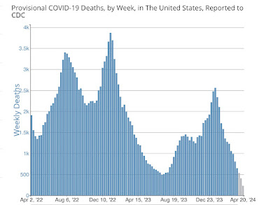
Now here are the last two years. Once again, notice the complete difference in scale:


April 2 of 2022 was a comparatively high week. The highest number of deaths were 3,869 during the week of January 7, 2023. The lowest were 491 during the week of July 7, 2023. As of March 30 of this year (the last week of complete data), there were 648. As I’ll describe further below, we will probably set a new all-time record low for deaths as well once all of April’s data is in.

The same pattern of ever fewer deaths YoY appears as we saw for hospitalizations:

4/1/20-3/31/21 504,000
4/1/21-3/31/22 433,000
4/1/22-3/31/23 128,000
4/1/23-3/31/24 64,000

Once again, the deceleration has been ongoing in the past year. Here are YoY cumulative deaths for some of the last 6 months:

10/1/22-9/30/23 83,000
1/1/23-12/31/23 75,000
2/1/23-1/31/24 70,000
3/1/23-2/29/24 67,000

Because COVID expresses seasonality, with worse waves during the cold weather and generally lower numbers during warm weather, below I’ve divided deaths into two 6 month periods. 

Here’s the cold weather period:

10/1/20-3/31/21 353,000
10/1/21-3/31/22 267,000
10/1/22-3/31/23 66,000
10/1/23-3/31/24 40,000

And here’s the warm weather period:

4/1/20-9/30/20 211,000
4/1/21-9/30/21 166,000
4/1/22-9/30/22 62,000
4/1/23-9/30/23 23,000

As you can see, in each year there are more deaths during cold than during warm weather. And the pattern of YoY improvement is apparent for each period.

This is all good news.

So where do we go in the near term? The trends continue to be positive. Recall that wastewater counts lead hospitalizations by several weeks, which in turn lead deaths by several weeks.

So here is the latest wastewater count from the CDC:


Wastewater particles are down 87% since their Holiday season peak, and continued to decline last week. This means that both hospitalizations - as of last week down 84% from their Holiday peak - and deaths - as of March 30 down 75% from their post-Holiday peak - should both continue to decline.

And if deaths decline to a number 87% below their post-Holliday peak, that would mean only 333 deaths in a few weeks.

Finally, how does this compare with the flu? Well, the typical flue season gives rise to about 35,000 deaths +/-10,000. So even at 64,000 COVID is presently the equivalent of a very bad flu season. If the trends of the past several years continue, then in 1 or 2 years we will be down in the vicinity of 35,000 deaths per year.

I am cautiously hopeful that is where we are headed. Because every single variant in the past 2+ years has been a descendant of the original Omicron BA.1 strain - including BA.2, BA.2.12.1, BA.4, BA,5, XBB, JN.1, and the newest variants, KP.1&2. So long as that remains the case, I will remain optimistic.