Saturday, June 29, 2013

Weekly Indicators: one year into ECRI's recession edition


 - by New Deal democrat

According to ECRI, tomorrow will mark the end of the first year of a recession. During that time, GDP, real consumer spending, real incomes, industrial production, and employment have all risen (perhaps explaining why there hasn't been an update to their "telltale chart" in over half a year). Turning to May monthly data, last week only the Chicago PMI was down, to a point just slightly into expansion. All the other monthy data was positive: personal income, spending, savings, durable goods, consumer sentiment, Case-Shiller house prices, and new home sales.

Turning to the high frequency weekly indicators, last week I noted that two of the long leading indicators, interest rates and mortgage applications, had turned negative, while money supply remained positive. That pattern modified a little this week:

Interest rates and credit spreads
  •  5.11% BAA corporate bonds up +0.12%

  • 2.33% 10 year treasury bonds up +0.13%

  • 2.90% credit spread between corporates and treasuries down -0.01%
Interest rates for corporate bonds had generally been falling since being just above 6% in January 2011, hitting a low of 4.46% in November 2012. Treasuries previously were at a 2.4% high in late 2011, falling to a low of 1.47% in July 2012, but have retreated back to that high. Spreads have varied between a high over 3.4% in June 2011 to a low under 2.75% in October 2012. After being close to that low 6 weeks ago, interest rates have backed up significantly.

Housing metrics

Mortgage applications from the Mortgage Bankers Association:
  • +2% w/w purchase applications

  • +16% YoY purchase applications

  • -5% w/w refinance applications
Refinancing applications have decreased sharply in the last month due to higher interest rates. Purchase applications have also declined from recent highs, although they continue their slightly rising YoY trend established earlier this year.

Housing prices
  • YoY this week +7.9%
Housing prices bottomed at the end of November 2011 on Housing Tracker, and averaged an increase of +2.0% to +2.5% YoY during 2012. This weeks's YoY increase remained close to their new 6 year record.

Real estate loans, from the FRB H8 report:
  • unchanged w/w

  • up +0.9% YoY

  • +2.7% from its bottom
Loans turned up at the end of 2011 and averaged about 1% gains YoY through most of 2012.  In the last several months the comparisons have completely stalled, although this week was positive.

Money supply

M1
  • -0.6% w/w

  • +1.8% m/m

  • +8.9% YoY Real M1

M2
  • unchanged w/w

  • -0.5% m/m

  • +5.4% YoY Real M2
Real M1 made a YoY high of about 20% in January 2012 and had generally been easing off since, but recently has increased again.  Real M2 also made a YoY high of about 10.5% in January 2012.  Its subsequent low was 4.5% in August 2012. It increased slightly in the first few months of this year and has stabilized since.

Employment metrics

American Staffing Association Index
  • 93 unchanged w/w, unchanged YoY
Initial jobless claims
  •   346,000 down -8,000

  •   4 week average 345,750 down -2500
Tax Withholding
  • $143.1 B for the first 19 days of June vs. $132.0 B last year, up +$11.1 B or +8.4%

  • $148.1 B for the last 20 reporting days vs. $139.4 B last year, up $8.7 B or +6.2
In the last two months, the ASA has deteriorated to being flat or negative compared with last year. Daily tax withholding was relatively weak compared with its YoY average comparison in the last 5 months, but has improved from early in June. Initial claims remain within their recent range of between 325,000 to 375,000, and have flattened out just as they have in the last 3 springs and summers.

Transport

Railroad transport from the AAR
  • unchanged carloads YoY

  • +3100 carloads or +1.8% ex-coal

  • +6600 or +2.7% intermodal units

  • +6400 or +1.2% YoY total loads
Shipping transport Rail transport has been both positive and negative YoY in the last several months. This week it was positive again. The Harpex index has been improving slowly from its January 1 low of 352, although it declined slightly this week. The Baltic Dry Index increased sharply for the second week in a row and is at a 52 week high.

Consumer spending Gallup's YoY comparisons have extremely positive, as they have been since last December. The were slightly weaker than usual this week compared to that standard, but still very positive.  The ICSC varied between +1.5% and +4.5% YoY in 2012, while Johnson Redbook was generally below +3%. The ICSC was below the lower part of that range this week, but Johnson Redbook has been close to the high end of its range.

Oil prices and usage
  •  Oil $96.56 up +$2.87 w/w

  • Gas $3.57 down -$0.06 w/w

  • Usage 4 week average YoY -0.3%
The price of a gallon of gas steadied in early June and has declined sharply for the last two weeks, although it is not as low as it was at the end of April. The 4 week average for gas usage remained slightly negative.

Bank lending rates The TED spread is still at the low end of its 3 year range.  LIBOR returned to its new 3 year low established two weeks ago.

JoC ECRI Commodity prices
  • down 0.53 to 120.75 w/w

  • +5.43 YoY
As indicated at the beginning of this article, this week saw the continuing spike in interest rates. Purchase mortgages were up for the week, but refinancing activity is dying. The third long leading indicator, real money supply remains positive. The only other outright negative indicator once again this week was temporary staffing, which has been problematic for going on two months.

Consumer spending remained positive, but less so than recently. More positives included house prices, YoY purchase mortgage applications, overnight bank rates, both rail and shipping transport. Weak positives included jobless claims, tax withholding, and real estate loans. Gas prices and commodity prices rate as neutrals this week.

My conclusion this week is the same as last week: the sharp rise in interest rates is definitely of concern, but it hasn't lasted long enough to seriously signal a recession next year. Housing is weakening but still positive. In terms of coincident indicators of the economy, consumer spending and initial jobless claims, while trending more weakly positve and sideways, respectively, for the last month or so, show no signs of rolling over.

Have a nice weekend.

Friday, June 28, 2013

Weekend Weimar, Beagle and Pit Bull

It's that time of the week.

I'll be back on Monday (for a holiday shortened week).  NDD will be here over the weekend.
Until then:


Emerging Market Slowdown May Not Hurt US Much

The following chart is from Dr. Ed's blog:

Tightening global credit conditions and weakening commodity prices threaten also to depress emerging economies. How important are they to the US? More so than in the past, but not enough to hurt the US economy much at all. Total exports of goods and services account for 14% of nominal GDP. Merchandise exports to emerging economies account for 67% of total exports currently, up from about 50% in 1990. The good news is that US commodity imports have gotten cheaper.

Muni and Mortgage Market Sell-off in Perspective


The municipal bond market (MUB, top chart) and the mortgage bond market (MBB lower chart) have both broken support as a result of the recent Fed moves.  But both of these moves were have been telegraphed for the last 9-12 months by the declining MACD.  Also note the both have bounced backed fairly strongly this week as traders have clearly found some degree of value in the levels from last week.

The point to this chart is that when we pull back the lens to the weekly charts, we notice that the panic caused by the Fed's announcement was a bit overdone. 

Thursday, June 27, 2013

And right on cue ...


- by New Deal democrat

Yesterday I warned against wage and income comparisons made between the last quarter of 2012 and the first quarter of 2013. Because of the "fiscal cliff" and the general expectation that some if not all of the Bush tax cuts were going to expire at the start of this year, lots of compensation that would have been paid in the first quarter of this year was moved forward into the last quarter of last year. In fact, when you averge the two quarters together, by the end of the first quarter of this year, real wages and real income were at new highs. But cherry-picking the quarter over quarter comparisons is making for lots of Doomer nonsense.

So I was cruising the progressive blogosphere to see if anyone had yet noticed the likley negative impact of the Fed taper, when lo and behold, somebody finally did. Kudos to him for doing so, and by and large I agree with his opening few paragraphs. But because it is getting lots of hits, because it does fall into several Doomer traps, and because I know many of our readers read there also, let me set the record straight.

Here's the several paragraphs I disagree with:
The fact that [personal consumption expenditures][are] lower than [they were during the height of the 2008-09 panic should give people some cause for concern.

The explanation for this crash in spending can be found here:
Real per capita disposable incomes took yet another hit. The astonishing annualized contraction of real per capita disposable income has now reached -9.21%....
....
Quantitative easing's function is to make it easier to borrow, thus increasing the level of debt in the economy and the amount of deflationary forces.

Ummm, no.

The first mistake is that personal consumption isn't lower than it was during the last recession. It has been consistently rising.


The writer uses this same graph but showing YoY% changes, i.e., personal consumption expenditures aren't "crashing" at all, merely improving at a decelerating rate.

The second mistake is the same mistake we saw with regard to real wages yesterday: citing the decline in the first quarter without reference to the even bigger increase in Q4 2013. Here's real per capita discposable income for the last ten years, measured monthly (red) and quarterly (blue) (Note that since the second quarter isn't finished, there is no measurement for this quarter, although April and May are shown on the monthly data):


Real per capita disposable income is actually higher in April and May than it has ever been since the recession, with the exception of the November and December spike. The "astonishing annualized contraction" is nonsense. It only exists in comparion with the "astonishing annualized rise" in the same metric in 4Q 2012.

The final mistake is that households haven't increased their debt at all. Consumer debt is down about 14% from its peak a few years ago, and the household debt burden is at its lowest rate, ex one quarter, since the series was started over 30 years ago:


And it isn't just the ratio of debt payment to income, the total amount of debt payments, per capita, adjusted for inflation, is also down about 14% since its peak in the last recession:


Whatever other flaws it may have, quantitative easing has allowed households to refinance debt, or pay down debt, and considerably lower interest rates. The problem with the "taper" is that if it causes a sustained risse in intereest rates, that source of oxygen to the consumer will be shut off. Since no significant improvement in real wages looks likely soon, that could cause a recession (but probably not for another year or even two) and with that might come real wage deflation. That is my biggest longer term fear.

So, although the writer gets lost along the way - i.e., things are by no means "crashing" now - I think he winds up at the correct destination.

The Treasury Market Sell-Off in Perspective

Let's take a step back and put the recent market action into perspective by looking at the weekly charts.


Both the IEIs (5-7 year) and IEFs (7-10 year) have similar charts, with perhaps the biggest feature the declining MACDs, which have been moving lower for about a year each.  Also of importance are the weakening CMF readings displayed on both charts.  Finally, both charts broke through key supprt levels during the recent sell-off (for the IEIs it was 122 and IEF it was 105).

Right now, the key line of support for both is the top Fib fan.


The TLHs (top chart, 10-20 years) and TLTs (bottom chart, 20+ years) have very similar structures.  Both broke support in the recent sell-off, but both have support from either a Fib level (TLHs, top chart) or a previous price level (TLTs, bottom chart).  One of the main features of both charts is the declining MACD which has been falling for the last year.


Market/Economic Analysis: India

last week, the Indian ETF lost nearly 6% in the emerging market sell-off.  As I've noted previously, I'm bearish on the economy (see also here).  Let's look at the latest Central Bank policy statement to get an overview of the current economic environment.

In May, the Central Statistics Office (CSO) reported India’s GDP growth in Q4 of 2012-13 of 4.8 per cent, a marginal improvement over the previous quarter. During the current financial year, the growth of industrial production decelerated to 2.3 per cent in April after picking up in the preceding month. All constituent categories of industry have slowed, with a persistent contraction in mining activity. The sharp weakening in the growth of capital goods production points to still damped investment demand whereas a pick-up in consumer non-durables could be indicative of a fragile return of consumer confidence. On the other hand, the services sector purchasing managers’ index rose in May on order flows. The onset of the south-west monsoon has been strong and on time.

Let's place this slowdown into historical perspective:

The economy has definitely slowed from a 9% annual growth rate to 4.8% -- nearly a halving in output.  For a country that is trying to life hundreds of millions out of poverty, that is the wrong direction.

Headline WPI inflation eased for three months in succession with the May reading at 4.7 per cent, down from an average of 7.4 per cent in 2012-13. All constituent categories, barring food, have moderated. In the fuel category, coal and mineral oil prices declined, partly offsetting the upward revision in administered prices of electricity. Non-food manufactured products inflation too ebbed, driven by metal prices which fell for the eighth successive month in response to softening of global prices. Still elevated food inflation, particularly in respect of cereals and vegetables, sustained upside pressures on overall inflation. Retail inflation, as measured by the new combined (rural and urban) CPI, edged down from an average of 10.2 per cent last fiscal year to 9.3 per cent in May.


This is one piece of good news: over the last three months there has been a marked drop in the inflation rate.  This may allow them to lower rates further:

However, let's not get too excited about growth prospects just yet.  India has done little to nothing to alter their primary problems: a dilapidated infrastructure system, poor political environment, high budget deficit and current account deficit.

Let's turn to the market.


The Indian ETF was trading in a range between ~55 and ~62 for a period of 8 months.  Prices broke through support at the 56 level in early June and have been moving lower since.  Notice the two gaps lower on the chart, indicating big volume moves lower.  Now the shorter EMAs have moved through the 200 day EMA, with negative momentum and CMF readings.

Wednesday, June 26, 2013

No, real wages are not falling


- by New Deal democrat

About a month ago, I came across a post on Mish's blog claiming we were DOOMED because real wages had plummeted by 5% in the first quarter of this year alone, based on productivity and unit labor costs. As I normally do, I actually clicked through on the link to find the source data. A few minutes of poking around showed decisively that Mish's reasoning was fallacious. Since a lot of his own commenters called him on it, I didn't see any need to pile on.

Unfortunately, this claim has just come back big time, being touted by a Pulitzer Prize winning journalist, David Cay Johnston, and picked up by Prof. Brad DeLong. It is utter nonsense. I left a couple of comments at Prof. DeLong's blog, but I wanted to back up my claims with the graphical truth.

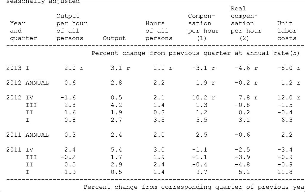
To begin with, as the BLS makes clear, it's definition of "wages" in this report includes non-standard compensation, i.e., things like bonuses. This turns out to be important, because when you examine the table helpfully provided with the report, particularly the sixth column from the left, "real compensation per hour," you see the -4.6% statistic for the first quarter of this year touted by Mish and Johnston. And literally directly below it, you see the increase of +7.8% for the 4th quarter of last year. Don't believe me? Here's a copy of the table:


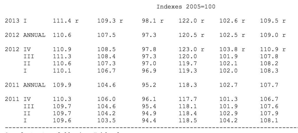
And here is the table with the raw index values:


Notice that the index bottomed in 4Q 2011 and rose since then, but just as with the similar statistic of real personal income, there is a big spike from discretionary income being moved forward to the last quarter of last year to minimize any impact from the expiration of the Bush tax rates. And just like real personal income, compensation after the spike is still higher than compensation before it.

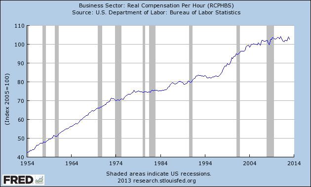
Here's the longer term graph of real compensation per hour for the last half century:


The best case to make is that real wages in this series have stagnated for over 5 years. They peaked in Q1 2011, declined almost 3% over the next 3 quarters, and have increased roughly 1% since then.

The second claim made by Johnston is:
It is not like this new wage news can be dismissed as an anomaly, either. It is evidence of a troubling trend – falling incomes for the 99 percent.
....
From 2007 to 2011 the average pretax income of the bottom 90 percent fell from $35,173 to $30,437. That is a drop of more than $4,500. It is also a decline of nearly 13 percent.
Did you notice the subtle change? Johnston starts by implying that falling wages are part of a trend, but then cites an income statistic. But there's a big difference, since income includes things like bank interest and Social Security benefits.

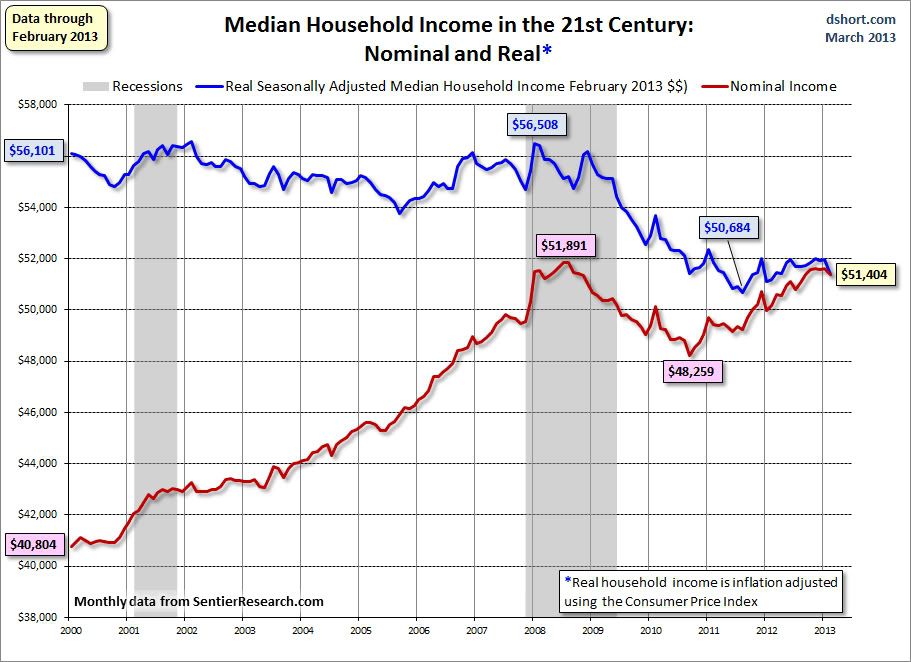
This too is nonsense as alleged proof of falling real wages, and I saw it coming a month ago, after Doug Short posted an update about median household income. It got picked up widely, and was widely misinterpreted by Doomers as a decrease in *wages.* It ain't so. Here's Doug Short's graph:


Notice that median household income declined about 10% into 2011, and since then has slowly risen, although it is still about 7% under its 2007 pre-recession peak.

The data Johnston uses is similar to that tracked by Doug Short. Ultimately it comes from a study by Saez and Piketty on worsening income inequality. They make the case - and I have no reason to doubt that it is absolutely true - that income inequality has worsened since the onset of the great recession. Just like the "median household income" tracked by Doug Short, Saez and Piketty find a large drop in "average pretax income" from 2007 through 2011.

But the index isn't measuring wages. It is measuring income, which includes in that mix households with wage-earners, households where one or more adults is unemployed, and households where one or more adults is retired. Here's the relevant passage from Sentier Research, which compiles the data used by Doug Short:


Just to be sure, I contacted them directly and they confirmed the above to me.

Similarly, footnote 3 to the paper reported by Saez and Piketty indicates that data from all households was used.

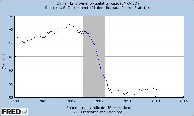
Well, as you probably already know, there is a major demographic shift as Boomers retire, meaning that a larger number of persons and households are non-wage-earning households. Further, we know from the employment to population ratio, a lot of people have dropped out of the workforce:


Note that even in the case of retirement, salary or wage income stops and is replaced only by Social Security and pension income plus any income of past savings or investment, such as certificates of deposit, return on which has functionally fallen to zero in the last 5 years. In other words, it's almost always a lot lower than the previous wage and salary income. So the decline in income as measured by Doug Short and by Saez and Piketty mirrors the downward change in the employment to population ratio, because they are measuring very similar things.

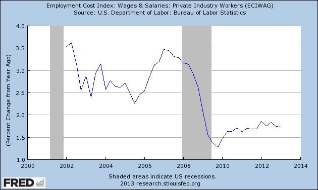
What we really want to know is what is happening with the median wage, and something about the spread in wages. And as it happens, there is a statistic that comes out every quarter that tell us what the median wage is. It's called the Employment Cost Index, and here it what it shows as to wages:


With median wages rising only about 1.5% YoY or so, even a 2% YoY inflation rate causes most Americans to lose ground.

Don't get me wrong. As I've hopefully made clear many times on this blog, I consider real wage stagnation to be one of the biggest problems we face. Creating more jobs and increasing real wages ought to be Washington's highest priority.

But what we have here is a Pulitzer prize winning journalist who apparently either isn't following up on his sources - or in the case of first quarter unit wages, hasn't even looked 1/4 inch further down the column. Or else we have intellectually dishonest Doomer scaremongering, grafting together income data of questionable relevance to actual wages, with one cherry-picked subsequent quarter of wage data showing a decline from a previous high. I want to hope it is just the former, but given the evidence, it's hard for me to entirely dismiss the idea that it's the latter.

Chinese Markets Are Now At Critical Support


Above is a weekly chart of the Shanghai index.  Last week it fell sharply; it dropped lower earlier this week, but has since rallied to key support levels.  The 1950 level is of obvious technical importance to the index; a solid move below that level, confirmed by several days closing below that level would have a profound negative impact on world markets.

Copper Is At Critical Support


Notice the incredibly weak position of the copper ETF.  It's trading near 1-year lows; prices are below the 200 day EMA (which is also moving lower).  All the shorter EMAs are below the 200 and moving lower.  Momentum is incredibly weak. 


On the weekly chart, prices are right around the 36-37 level, which has provided critical technical support for the last three and a half years. 

Tuesday, June 25, 2013

BOJ's Initial Actions Effective


The above charts shows the currency problem faced by the BOJ: even as their interest rates were at record lows and their economy was barely growing, the yen was strengthening.  The ETF rose from 90 in mid-2008 to 130 at the end of 2011, for a percentage gain of 44%.  The banks recent moves to double the currency base has effectively told the markets the central bank intends to have the yen drop in value -- which it clearly has.  It's moved from from the high of 130 to 94 earlier this year, for a drop of 27.4%. 

1% increase in interest rates: necessary but not sufficient for recession


- by New Deal democrat

At this point probably everybody who pays attention knows that interest rates have backed up a full 1% in the last month. That it will have a strong negative impact on mortgage refinancing and some negative impact on the purchase of houses also has been widely remarked.

But is it enough to bring on a recession? No, or at least, not yet.

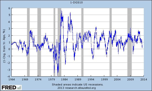
As it turns out, while recessions in the last 50 years have always been preceded by a 1% YoY increase in interest rates, a backup in interest rates is not a sufficient signal by itself to forecast a recession. I've shown this in the below graph of 10 year treasuries. The values are inversted so an increase shows up as a decrease. I've also added 1 to the values, so that a +1% increase in interest rates shows up exactly at zero:


Interest rates have backed up at least 1% YoY 15 times in the last 50 years. In 7 of those cases, a recession has folloed within the next 2 years. So the increase in rates is a necessary but not sufficient marker of recession.

What has made a difference is the duration of the increase, at least since the beginning of the great decline in interest rates over 30 years ago. Below is a graph that I posted a little over one year ago, showing conventional mortgage rates since their peak in 1980. The red sections represent those periods of time where mortgage rates have failed to make a new low for at least 3 years:


As you can see, all three of the recessions since 1982 have been immediately preceded by a 3 year or longer period where interest rates failed to make new lows.

Interest rates on mortgages made new lows about 1 year ago. So while the rise in interest rates is a definite concern, it hasn't lasted long enough to trigger a warning of a new recession. We'd need to see the increased rates continue for another year or even two before a recession would likely occur.

Market/Economic Analysis: Australia

While I've previously been bearish on Australia, my position is now changing to neutral.  There are two reasons for this change.  First, the ETF has already fallen 20%, which is a bug move for an economy that is still printing decent GDP growth.  Second, the LEIs have now printed a positive number for four straight months.  This is from the latest Conference Board release:

The Conference Board LEI for Australia increased in April for a fourth consecutive month, with money supply and stock prices making the largest positive contributions. Between October 2012 and April 2013, the leading economic index increased 0.7 percent (about a 1.5 percent annual rate), up from a decline of 0.4 percent (about a -0.8 percent annual rate) during the previous six months. Additionally, the strengths among the leading indicators have remained more widespread than the weaknesses in recent months.

Here is a copy of the components:


In general, we see a positive contribution from most components over the last 4-5 months with two exceptions: building approvals and the sales to inventory ratio.  All other points are doing well.  Let's now turn to the CEIs:


Like the LEIs, the CEIs are now printing mostly positive numbers.

Here's the assessment of the economy from the latest meeting minutes of the central bank:

Exports had grown further in the March quarter. Resources exports, particularly of bulk commodities, had grown strongly over the past year, while services exports had resumed growth more recently. 

Available information indicated that business investment had declined in the March quarter. According to the latest ABS capital expenditure survey, the decline had been in both the mining and non-mining sectors. The fall in capital imports since the beginning of the year was consistent with a decline in investment in the first quarter, although recent data showed that capital imports had bounced back somewhat in April.

According to the ABS survey of firms' capital expenditure plans, non-mining investment was expected to show moderate growth over the next year or so. While the survey also continued to imply further growth in mining investment, in the past actual annual capital expenditure by mining companies had often differed by a wide margin from their forecasts as reflected in the ABS survey. Based on public statements by mining companies and information from the Bank's liaison, it seemed likely that mining investment was near its peak but would probably remain at a high level for the next year or so. However, members observed that there was considerable uncertainty about mining investment beyond that period. In particular, changes in production and exports of energy commodities in other countries were making it more difficult to assess the potential for new projects in the gas sector in Australia. Overall, conditions in the business sector remained somewhat subdued, with survey measures for all industries at, or below, average levels.

Household spending appeared to have picked up early in 2013, after having slowed late in 2012 and having been supported by higher asset prices. In the March quarter, growth of retail sales volumes was strong across most categories, amid a decline in retail prices. Liaison suggested that the pace of retail spending might have eased somewhat more recently, while measures of consumer confidence fell back to around average levels in May.

Members observed that the effects of low interest rates had been evident in a range of housing market indicators. Building approvals for both higher-density and detached dwellings had increased over recent months. The Bank's liaison contacts were generally becoming more positive about the outlook for dwelling investment. Also, loan approvals had grown more strongly in recent months, including for new housing, and auction clearance rates were well above average in Sydney and had picked up to be a bit above average in Melbourne. While measures of dwelling prices had been relatively flat over recent months, they were still higher than the previous year.

Labour market conditions remained somewhat subdued. The monthly employment data continued to be volatile, with a large increase in employment in April following a sizeable decrease in March. Looking through this volatility, employment growth had not been as fast as growth of the labour force, which had led to the unemployment rate drifting higher over the past year, to 5½ per cent. Job advertisements had stabilised earlier in the year, but had edged down in recent months. Overall, leading indicators of employment pointed to continued moderate employment growth.

The wage price index had increased by 0.7 per cent in the March quarter, a little less than had been expected, and year-ended wage growth was below the average of the past decade. The easing in wage growth had been broad based across industries and states, with notable declines in areas related to the mining sector. While the decline in the pace of wage growth in recent quarters had been most pronounced in the private sector, growth in public sector wages continued to slow in the March quarter and remained relatively subdued, consistent with ongoing fiscal restraint.

What we see in general is a business sector split between natural resource and non-natural resource sectors.  The former is in flux as a result of the Chinese re-balancing, while the latter is OK.  Consumers are still spending thanks to the wealth effect of higher asset prices.  The Central Bank also has room to lower rates further if needed.

Let's turn to a few Australian ETFs, starting with the equity markets.


Prices have dropped almost 20%, from their high of 28.15 to yesterday's close of 22.60/  Prices are now below the 200 day EMA; they've brought the shorter EMAs with them.  Also note the slight increase in volume and negative MACD and CMF.  Prices are right at the 38.2% Fib reading from the June-May rally.


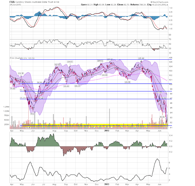
Like the equity markets, the Aussie dollar has also dropped sharply, falling about 12.66%.  Like the equity market, the technicals are very negative.  However, prices have made a 100% retracement from their May move last year, indicating this might be the end of the sell-off.

Monday, June 24, 2013

Did the Fed move the target?


. - by New Deal democrat

There's been some blowback in the last few days about whether the Fed actually introduced any uncertainty, or changed from a data-responsive to a calendar-responsive regime. After all, Bernanke must understand the consequences of higher long term interest rates, so he will hold off, or reverse course, if it looks like the economy is faltering.

But this confidence ought to evaporate if, in fact, the Fed has moved the goalposts, as a writer at Naked Capitalism thinks:
For those who arent refinancing their mortgages and without financial investments, it’s hard to say what the Fed has accomplished; their earlier stated targets were to lower unemployment to 6.5%, and to allow short term inflation to reach 2.5% in order to stimulate growth. Now, however, ..., they say they’ll be satisfied with 7% unemployment, and despite inflation fears accompanying the quadrupling of the Fed’s balance sheet, core PCE inflation was at a record low in April. From here, it seems they just want to get out ....
If the Fed has moved its unemployment and inflation targets, that hardly inspires confidence that it is being data driven. It sounds more like the Fed wants to get out of the QE business, and soon, and is willing to lower the standards however necessary to get there.

So, has the Fed moved the goalposts? Here's the Fed statement from half a year ago establishing the unemployment and inflation markers:
...the Committee decided to keep the target range for the federal funds rate at 0 to 1/4 percent and currently anticipates that this exceptionally low range for the federal funds rate will be appropriate at least as long as the unemployment rate remains above 6-1/2 percent, inflation between one and two years ahead is projected to be no more than a half percentage point above the Committee's 2 percent longer-run goal, and longer-term inflation expectations continue to be well anchored.
Did you catch the distinction? The Fed hasn't necessarily changed the standards for raising interest rates.. What is different is that the Fed has established new, looser criteria for ending QE. So if you thou thought the Fed was going to keep its entire zero lower bound regime in place till its previously disclosed criteria were met, silly you! You weren't reading closely enough.

Feel reassured now?

Yes, Handoffs Are Messy

The Reformed Broker makes the following point about the markets:

Should rates get totally out of control, the Fed will come right back in and swamp the bond market with cash. Should stocks pick up more steam to the downside, Treasurys will get a bid out of fear and this will halt the fear over rising rates (because rates will come down as a result of the panic buying). To some extent then, this will be a self-correcting spiral in the end, even if it is an unpleasant one.

This is a very well-articulated point that deserves further development and explanation.

The Fed has influenced a number of market aspects.  Perhaps more importantly is the impact on market psychology, as traders knew the Fed was on their side and was attempting to have a positive impact on the economy as a whole.  It is difficult to understate the importance of this effect; when the market had fallen out of bed, it literally got brokers back in the game willing to take on risk when the economy was weak.  As the market rose, this effect did not wear off; in fact, it increased as the Fed upped its game, adding programs as they saw fit.  And finally, the public communication of hard targets for their interest rate decision (the 6.5% unemployment, 2.5% inflation factors) have had the effect of putting their foot on the market's gas pedal.

These support programs have become a fundamental component of market psychology for the last 3-4 years.  In the economic world, that's a hell of a long time.  More importantly, we can look at this time period with an asterisk, reminding us the market's rise was aided by a Fed that was literally doing everything it could and then some to help the economy.  Asset purchases are hardly part and parcel of standard Fed policy; they only occur when the Fed is trying to keep the economy out of the economic abyss.   But these programs have altered the psychological make-up of market participants in a very atypical way.  As a way of explaining it, imagine starting the semester with a professor telling you the lowest grade you'll get is a "B."  It's an action that simply changes the way you view things in a very fundamental way. 

Regardless of whether you agree or disagree with the Fed's decision (and I strongly agree with it), there is no mistaking that we now have a fundamentally different market environment.  The biggest effect is on the bond market, which has had a permanent bid for the last three years, which in turn has kept yields low.  The stock market has also had a profound rally from these programs.  And the dollar has been weaker -- although it has hardly crashed as some commentators speculated.  All of these markets will now readjust to a new reality -- one potentially without the Fed helping it along.

But Josh makes a key point; there seems to be an assumption that if things go to hell the Fed will simply say, "we told you we were backing off now; go it without us."  That's not the case.  If the economic and market fundamentals really start to deteriorate, the Fed will jump back in the market with something.  Bernanke has already said as much in his statements.  The question, or course, is when that will happen.  Frankly, I don't think Bernanke knows at this point.  But the possibility is always there.


Market/Economic Analysis US

Let's review last week's economic news and market action, starting with the numbers:

The Good

The  NAHB index hit a milestone: Builder confidence in the market for newly-built single-family homes hit a significant milestone in June, surging eight points to a reading of 52 on the National Association of Home Builders/Wells Fargo Housing Market Index (HMI) released today. Any reading over 50 indicates that more builders view sales conditions as good than poor.  This number indicates the housing market is definitely improving.

Inflation is contained: The Consumer Price Index for All Urban Consumers (CPI-U) increased 0.1 percent in May on a seasonally adjusted basis, the U.S. Bureau of Labor Statistics reported today. Over the last 12 months, the all items index increased 1.4 percent before seasonal adjustment.  While I'm sure there will still be the clarion calls for a massive bought of inflation from the typical idiots, the data indicates that inflation is well contained and under control.

Housing continues to be a strong component of the recovery:  Housing starts increased 6.8%.  While permits declined 3.1%, remember there was a big bump (12.9%) in the previous month's number, meaning we're simply seeing a natural drop after a period of heightened activity.  Existing home sales increased 4.2%.  Perhaps more importantly, inventory increased for the fourth straight months.
 
The Philly Fed manufacturing index increased from -2 to 12.5.  Unlike the NY Fed number, the internals of this number also increased.  "The demand for manufactured goods as measured by the current new orders index increased, from ‑7.9 to 16.6. The shipments index also moved back into positive territory, rising 13 points to 4.1." 

The LEIs increased .1%.  However, the increases were all attributable to financial market developments: a positive credit spread, a positive credit indicator and a strong stock market.   The non-financial numbers (ISM, average workweek, initial claims) were neutral in the index.

The Markit "flash" index for US manufacturing came in at 52.3%.  The internals for this report were also positive.  I do not know why this number is stronger than the ISM number.


The Bad:

Although the headline number was positive, the internals were very weak.  "New orders, at minus 6.69, are down for a second straight month with contraction in backlog orders very deep, at minus 14.52. Shipments are at minus 11.77 with inventories at minus 11.29 in what are also deep rates of monthly contraction." 

Let's turn to the markets:


Despite all the panic and concern exhibited last week, prices were actually pretty disciplined.  There's a large red candle on Thursday, but a far smaller on on Friday, but of which find support at the early April level around 159.  This level also has support in the form of the top Fib fan.  There is noticeably higher volume, indicating the depth of the sell-off is strong.  Finally, the MACD and CMF readings are very weak.


The is where the real action occurred last week.  The belly of the treasury curve finally broke key through support in a meaningful way.  The IEIs moved through the 122 level and the IEFs moved through the 105 level.

 
The dollar rallied at the end of last week, largely because of higher US interest rates and the potential for stronger growth.

Market outlook: slightly negative.  Stocks are still dealing with the Fed pulling back QE.

Sunday, June 23, 2013

Two questions for Sunday: in re Fed policy...


- by New Deal democrat

I have two questions that I would really like to see academic economists answer, based on past and intended Fed policies:

1. Professor Brad DeLong this morning faults Ben Bernanke for failing to create credible inflation expectations significantly over 2%.

My question is, What would an average wage-earner, who has seen his/her wages go up on average 1.5% or so for the last few years, do if they actually believed that 3%, 4%, or 5% price inflation was around the corner? I believe they would actually spend less and save more to guard against the coming diminution of their earning power. Does anybody have any historical examples of what has happened when wages stagnated in the face of increasing inflation? I seem to recall reading that this has happened a number of times in Latin America, and the outcomes were not pleasant. If so, why do you believe the outcome would be different here?

2. There's a reason Mish is on the sidebar, even though I disagree with a large majority of his opinions. And that is because, especially when he digs into the data, he always makes me think. Three weeks ago he posed a challenge specifically to Prof. Paul Krugman: "When does it [quantitative easing] stop Paul? When?"

I think this is actually an excellent question. Is there an academic model for when quantitative easing should end? Empirically the Fed can ease off, and if the economy falters, start back in, but that is rather like feeling around in an unfamiliar room in the dark.

Krugman and others have quantiative academic models for when quantitative easing is necessary (the zero lower bound) and the forms it might take. But at what level or trend in employment, unemployment, wages, interest rates, or other relevant parameters should it be scaled back? How should it be scaled back? When can it be completely ended? I'm not aware of any such mathematical model, and if one doesn't exist, now would be an excellent time for academic economists to consider one.