Friday, June 20, 2008
Back on Monday
Mr$. Bonddad and I are still doing the unpacking thing while also working and going to graduate school. As such, there are no new pictures of the kids this week. I promise to have pictures of the Beagle and Weimars at the end of next week. Until then, have a good weekend.
Manufacturing Looking Weak
Over the last few weeks we've seen three important manufacturing reports released: industrial production from the Federal Reserve, the Empire State index from the NY Fed and the Philadelphia Index from the Philadelphia. All three point to a continued slowdown in the manufacturing sector.
First up is overall industrial production:
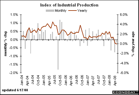
The year over year chart indicates this indicator has been in a downward trend for some time. In addition, the overall report was weak with declines in a variety of sectors. In other words, there wasn't one number within the report the sent it lower; it was all the individual parts of the report sending it lower.
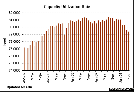
Also note the capacity utilization has been dropping. That means we're using less of our productive capacity to make stuff. That means manufacturing facilities are slowly cutting resources to save money. That's not a good development either.
The individual reports were not good either. From the Empire State survey:
This report shows a double whammy. First, overall activity is dropping right now. At the same time, prices are increasing. That places policy makers in a serious bind. To stimulate activity they need to lower interest rates (which they already have). However, to do so would increase the possibility of inflation.
Here is a chart of the Empire and Philly indexes:
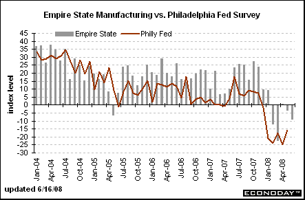
Note the Empire state number has been down 4 of the last 5 months.
The Philly report is not much better:
Notice the exact some conditions as the Empire state number: declining activity and increasing price pressures. Not a good combination.
Short version: there is an overall slowdown underway right now.
First up is overall industrial production:
U.S. industrial production fell unexpectedly by 0.2 percent in May as output at utilities shrank, while capacity use slipped to the lowest level in almost three years, the Federal Reserve said on Tuesday.
Economists polled by Reuters were expecting a 0.1 percent rise in output at the nation's factories, utilities and mines after a 0.7 percent fall in April.
Manufacturing output was unchanged during the month after a 0.9 percent decrease in April. Utilities output dipped by 1.8 percent.
Overall industrial production is 0.1 percent below its year-earlier level.
In further evidence of the slowing economy, total industry capacity use fell to 79.4 percent, the lowest since September 2005, from 79.6 percent.

The year over year chart indicates this indicator has been in a downward trend for some time. In addition, the overall report was weak with declines in a variety of sectors. In other words, there wasn't one number within the report the sent it lower; it was all the individual parts of the report sending it lower.

Also note the capacity utilization has been dropping. That means we're using less of our productive capacity to make stuff. That means manufacturing facilities are slowly cutting resources to save money. That's not a good development either.
The individual reports were not good either. From the Empire State survey:
The Empire State Manufacturing Survey indicates that manufacturing activity in New York State continued to deteriorate in June. The general business conditions index fell 5 points, to -8.7. The indexes for new orders, shipments, and unfilled orders were negative and lower than their May levels. The prices paid index remained elevated, falling only slightly below last month’s record high. The prices received index rose markedly and, at 26.7, approached a record level; the future prices received index also rose sharply, reaching a record high of 47.7. Employment indexes hovered around zero. Future indexes generally improved only slightly from the relatively low levels of the past several months, although the capital expenditures index rose several points.
This report shows a double whammy. First, overall activity is dropping right now. At the same time, prices are increasing. That places policy makers in a serious bind. To stimulate activity they need to lower interest rates (which they already have). However, to do so would increase the possibility of inflation.
Here is a chart of the Empire and Philly indexes:

Note the Empire state number has been down 4 of the last 5 months.
The Philly report is not much better:
The region’s manufacturing sector continued to contract this month, according to firms polled for the June Business Outlook Survey. Indexes for general activity, new orders, shipments, and employment were all negative this month and registered lower readings than in May. There was an appreciable increase in the share of manufacturers reporting price pressures this month, and about one-third of the firms continued to report higher prices for their own products. The region’s manufacturing executives remained optimistic about future activity, but most future indicators fell back from their May readings.
Notice the exact some conditions as the Empire state number: declining activity and increasing price pressures. Not a good combination.
Short version: there is an overall slowdown underway right now.
What Inflation?
From Bloomberg:
Considering the spike in commodity prices, this news should not be surprising. There are several things to note from this article.
1.) Spiking commodity prices are hitting everyone -- not just the US
2.) There has been a fair amount of discussion about "de-linking", meaning the US slowdown will not effect the rest of the world. This news should indicate that idea is a fantasy. One of the US primary problems right now high commodity prices which are a prime cause for India's and China's problem.
3.) As long as commodity prices remain high, expect more and more upward pressure on worldwide interest rates
Also consider this news, also from Bloomberg:
Trichet has consistently stated that price stability is his primary concern. In addition, EU rates are still higher than US levels -- adding to the euro's overall strength right now.
India's inflation accelerated to a 13-year high and economists forecast higher consumer prices in China after record crude oil forced both nations to increase the regulated cost of fuel.
India's wholesale prices jumped 11.05 percent in the week to June 7, the government said today, more than the median 9.79 percent increase in a Bloomberg News survey of 18 economists. China's fuel price increase today may lift consumer prices by as much as 1 percentage point this year, a separate survey showed.
A near doubling of crude oil prices has pushed up subsidy costs and threatened to erode profits of refiners such as Indian Oil Corp., prompting governments from Indonesia to Sri Lanka to raise fuel prices. That's adding pressure on central banks to increase interest rates and cool inflation, risking growth.
``If China and India are going to continue to roll back subsidies, then clearly we have not seen a peak in inflation,'' said Joseph Tan, a strategist at Fortis Bank SA in Singapore. ``They need to tighten monetary policy, which means that growth is going to slow.''
Considering the spike in commodity prices, this news should not be surprising. There are several things to note from this article.
1.) Spiking commodity prices are hitting everyone -- not just the US
2.) There has been a fair amount of discussion about "de-linking", meaning the US slowdown will not effect the rest of the world. This news should indicate that idea is a fantasy. One of the US primary problems right now high commodity prices which are a prime cause for India's and China's problem.
3.) As long as commodity prices remain high, expect more and more upward pressure on worldwide interest rates
Also consider this news, also from Bloomberg:
German producer-price inflation, an early indicator of price pressures in the economy, accelerated to the fastest pace in almost two years in May on energy costs.
Prices for goods from newsprint to plastics increased 6 percent from a year earlier, the most since July 2006, the Federal Statistics Office in Wiesbaden said today. Economists expected a 5.8 percent gain, the median of 27 estimates in a Bloomberg News survey shows. Prices rose 1 percent from April.
Inflation has been pushed up by record energy and food prices, crimping consumers' spending power and clouding the outlook for economic growth across the 15-nation euro region. European Central Bank President Jean-Claude Trichet said on June 5 that the bank may increase its benchmark rate next month to rein in inflation expectations.
``The pressure in the inflation pipeline is still very high and will rise in coming months,'' said Andreas Rees, chief economist Germany at UniCredit Markets & Investment Banking in Munich. ``The ECB will point to inflation dangers to justify an interest-rate hike in July.''
Energy prices rose 15 percent from a year earlier and oil products were 25.9 percent more expensive, the statistics office said. Excluding energy, producer prices rose 2.9 percent.
Trichet has consistently stated that price stability is his primary concern. In addition, EU rates are still higher than US levels -- adding to the euro's overall strength right now.
One Reason For High Oil Prices
From IBD:
Keep prices at an artificially low lever and you'll also keep demand at that level. Raise prices by removing the subsidy and you'll see demand drop.
The interesting question is why is China doing this now? They have more than enough currency reserves to maintain the subsidy for the foreseeable future. In addition, they have experienced a fair amount of civil unrest lately which this decision is not going to help. Finally, this is right before the Olympics which many people are speculating Beijing will use as its official "coming out" party on the world stage. So, again, we ask the question: why now?
Oil prices swooned after China's National Development and Reform Commission said it will hike the price of gasoline, diesel, aviation fuel and electricity.
The Chinese government lifted fuel prices by 11% in November but had kept them frozen at that level, part of an effort to avoid boosting already-high inflation rates.
Chinese gas prices are well below the levels seen in the U.S. and other nations, thanks largely to heavy subsidies. The government said it would lift some of those subsidies, effectively boosting prices by as much as 18%.
Scorching demand in China for refined crude products has been one of the biggest drivers of the global surge in crude prices. Thursday's announcement of higher prices in China sent the price of U.S.-traded crude oil falling sharply. July crude dropped $4.75 to $131.93 a barrel.
Keep prices at an artificially low lever and you'll also keep demand at that level. Raise prices by removing the subsidy and you'll see demand drop.
The interesting question is why is China doing this now? They have more than enough currency reserves to maintain the subsidy for the foreseeable future. In addition, they have experienced a fair amount of civil unrest lately which this decision is not going to help. Finally, this is right before the Olympics which many people are speculating Beijing will use as its official "coming out" party on the world stage. So, again, we ask the question: why now?
Forex Fridays
This week I'm going to start with the yen because of an important development on its weekly chart.
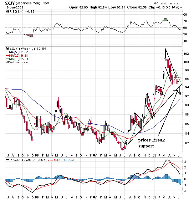
The yen has been rallying since last summer, although it has been a very "spikey" rally -- it has moved up, then down sharply. This week the yen broke through support established over the last year. The primary reason for this is a general weakening of the Japanese economy. A weaker economy means the currency is less desirable. It also means the possibility of the Central bank increasing interest rates is less likely to happen.
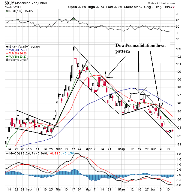
On the yen's daily charts, notice the following:
-- Prices are dropping
-- Prices are below all the SMAs
-- All the SMAs are heading lower
-- The shorter SMAs are below the longer SMAs
Short version -- this is a very bearish chart
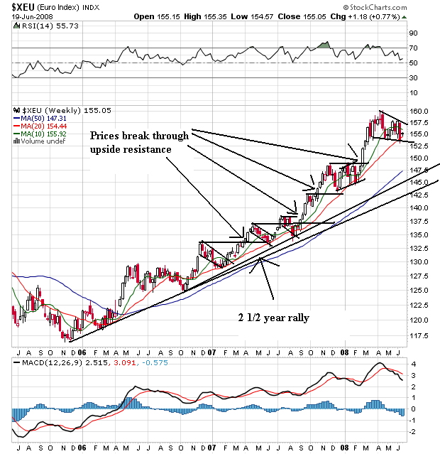
The weekly euro is the strongest chart. Notice it has been rising for two and a half years. As it has risen it has continually moved through resistance and then consolidated those gains after the rise. Also notice the 20 and 50 SMA are moving higher and the shorter SMAs are above the longer SMAs. While the 10 week SMA is moving down, this is a standard alignment in a bull market. It's not until the SMA crossed below the 20 week SMA that we should get concerned.
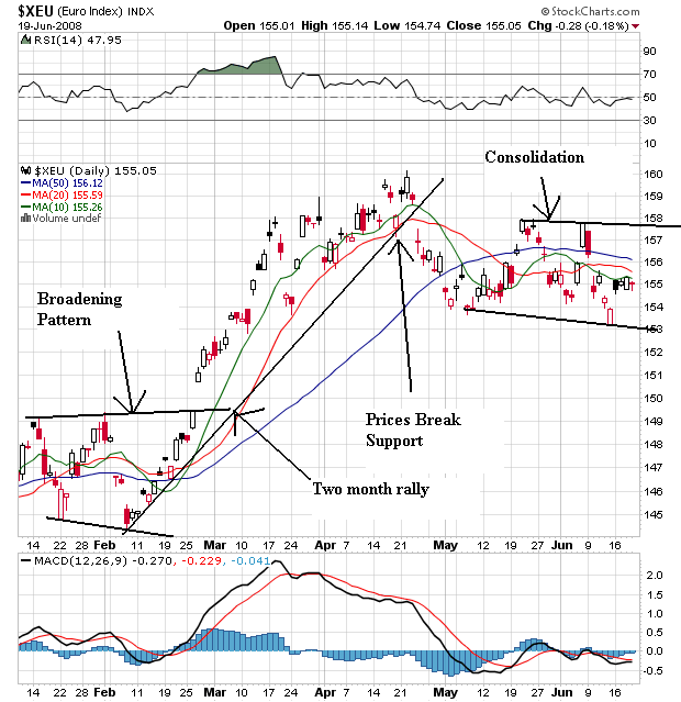
The Euro started the year in a broadening consolidation pattern. Then is rallied from mid-February to mid-April. It broke through support in mid-April and has since been trading pretty much sideways. Notice that prices and all the SMAs are bunched up in a big way with no clear direction one way or the other.
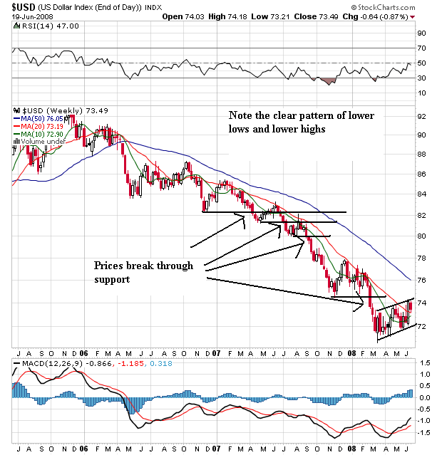
Finally we have the dollar, which is one of the best examples of a bear market chart I have ever seen. Notice that prices have been dropped for the better part of two years. Also notice that
-- The 20 and 50 say SMA are both moving lower
-- The 10 week SMA is moving higher and is about to cross over the 20 day SMA
-- Prices are currently in a consolidating pattern, waiting to see what will happen next.
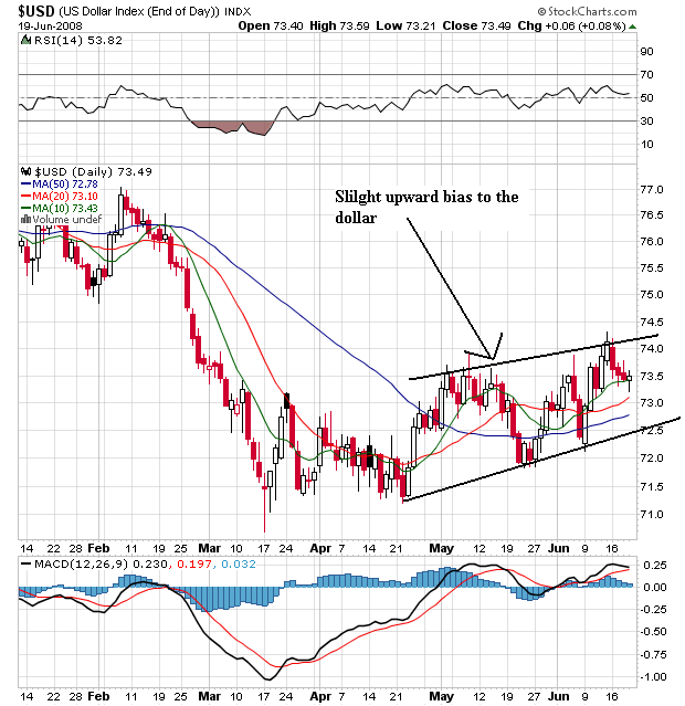
On the daily chart, notice the following positive developments:
-- Prices have been moving higher for a few months.
-- The SMAs are bullishly aligned
-- The shorter SMAs are above the longer SMAs
-- All the SMAs are moving higher
-- Prics are just above all the SMAs
This move is largely from the government officials talking up the dollar. However, the dollar will probably need some action (as in interest rate increases) for this trend to continue.

The yen has been rallying since last summer, although it has been a very "spikey" rally -- it has moved up, then down sharply. This week the yen broke through support established over the last year. The primary reason for this is a general weakening of the Japanese economy. A weaker economy means the currency is less desirable. It also means the possibility of the Central bank increasing interest rates is less likely to happen.

On the yen's daily charts, notice the following:
-- Prices are dropping
-- Prices are below all the SMAs
-- All the SMAs are heading lower
-- The shorter SMAs are below the longer SMAs
Short version -- this is a very bearish chart

The weekly euro is the strongest chart. Notice it has been rising for two and a half years. As it has risen it has continually moved through resistance and then consolidated those gains after the rise. Also notice the 20 and 50 SMA are moving higher and the shorter SMAs are above the longer SMAs. While the 10 week SMA is moving down, this is a standard alignment in a bull market. It's not until the SMA crossed below the 20 week SMA that we should get concerned.

The Euro started the year in a broadening consolidation pattern. Then is rallied from mid-February to mid-April. It broke through support in mid-April and has since been trading pretty much sideways. Notice that prices and all the SMAs are bunched up in a big way with no clear direction one way or the other.

Finally we have the dollar, which is one of the best examples of a bear market chart I have ever seen. Notice that prices have been dropped for the better part of two years. Also notice that
-- The 20 and 50 say SMA are both moving lower
-- The 10 week SMA is moving higher and is about to cross over the 20 day SMA
-- Prices are currently in a consolidating pattern, waiting to see what will happen next.

On the daily chart, notice the following positive developments:
-- Prices have been moving higher for a few months.
-- The SMAs are bullishly aligned
-- The shorter SMAs are above the longer SMAs
-- All the SMAs are moving higher
-- Prics are just above all the SMAs
This move is largely from the government officials talking up the dollar. However, the dollar will probably need some action (as in interest rate increases) for this trend to continue.
Thursday, June 19, 2008
Today's Markets
-- Over 400 people have been arrested on mortgage fraud charges.
-- Oil prices drop on news that China will raise fuel prices.
-- Leading indicators increased for the second straight month
-- The Philly Fed index dropped
-- Regional banks are taking a nasty hit
-- The median home price in California dropped 30% in May
Technically, this was a very interesting day because the indexes traded in a different manner.
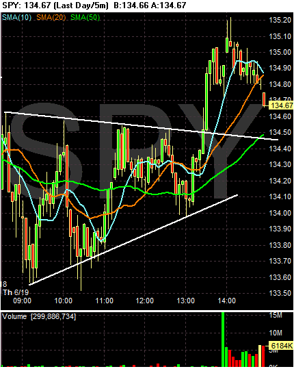
Note the SPYs spent the first 2/3 of the day trading in a triangular pattern. Then they broke out on strong volume but sold-off at the end of trading.
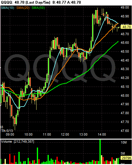
The QQQQs consolidated in the morning. They rallied at 11 AM, consolidated, and then rallied again at 1:30 CST.
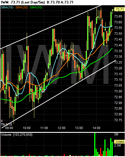
The IWMs were in a nice and gently upward sloping channel for the entire trading day.
-- Oil prices drop on news that China will raise fuel prices.
-- Leading indicators increased for the second straight month
-- The Philly Fed index dropped
-- Regional banks are taking a nasty hit
-- The median home price in California dropped 30% in May
Technically, this was a very interesting day because the indexes traded in a different manner.

Note the SPYs spent the first 2/3 of the day trading in a triangular pattern. Then they broke out on strong volume but sold-off at the end of trading.

The QQQQs consolidated in the morning. They rallied at 11 AM, consolidated, and then rallied again at 1:30 CST.

The IWMs were in a nice and gently upward sloping channel for the entire trading day.
Financials Still Under Pressure
From Bloomberg
Consider this in light of this news from yesterday:
The bottom line is we're nowhere near the end of the problems in the financial sector. Anyone who tells you otherwise is lyning through their teeth.
Let's look at the XLF chart to see what it says

On the yearly chart, notice the following:
-- Prices are below the 200 day SMA
-- Prices have been dropping for the better part of the year, continually making lower lows and lower highs.

On the three month, SMA chart, notice the following:
-- All the SMAs are moving lower
-- The shorter SMAs are below the longer SMAs
-- Prices are below all the SMAs
-- Remember that prices are below the 200 day SMA
This is bearish chart, plain and simple.
Citigroup Inc., the bank that's lost more than any other in the collapse of the mortgage market, fell in New York trading after predicting ``substantial'' additional writedowns and more losses on consumer loans.
The company, whose value has dropped by a third this year, declined 4 percent on the New York Stock Exchange after Chief Financial Officer Gary Crittenden made the forecast in a conference call with investors.
Citigroup has booked more than $42 billion of credit losses and writedowns since last year because of the credit market contraction, or about 10 percent of the $396 billion racked up by banks worldwide. Vikram Pandit, who took over as chief executive officer in December, has raised $44 billion in capital and outlined plans for the company to reduce assets by $400 billion over the next two to three years.
``We will continue to have substantial additional marks on our subprime exposure this quarter,'' Crittenden said on the call, which was sponsored by Deutsche Bank AG. ``We may continue to see the magnitude of the marks decline, as the exposures that we have have declined.''
Consider this in light of this news from yesterday:
U.S. stocks fell on Tuesday as Goldman Sachs warned that banks may need to raise an additional $65 billion, stoking worries about further fallout from the mortgage crisis.
Goldman said the global credit crisis will not peak until 2009 and lowered its price targets for 14 banking companies. It also cut 2008 earnings-per-share forecasts for 11 banks.
The bottom line is we're nowhere near the end of the problems in the financial sector. Anyone who tells you otherwise is lyning through their teeth.
Let's look at the XLF chart to see what it says

On the yearly chart, notice the following:
-- Prices are below the 200 day SMA
-- Prices have been dropping for the better part of the year, continually making lower lows and lower highs.

On the three month, SMA chart, notice the following:
-- All the SMAs are moving lower
-- The shorter SMAs are below the longer SMAs
-- Prices are below all the SMAs
-- Remember that prices are below the 200 day SMA
This is bearish chart, plain and simple.
Housing is Nowhere Near Bottom
From Reuters:
This is from a company whose livelihood depends in part on a healthy housing industry. In addition, it's important to remember that CEOs are trained in the art of public relations. it's rare to hear a CEO say "things are tough". Instead, you hear things like, "this is a challenging environment, but we're still doing well" or something to that effect.
In addition, consider this chart of lumber futures.

Notice that prices are near multi-year lows. Simply put, demand is dead right now.
Putting these two factors together you get a market that is nowhere near bottom.
Whirlpool Corp (WHR.N: Quote, Profile, Research, Stock Buzz), the world's biggest appliance maker, said on Wednesday that it expects the U.S. housing downturn to extend into 2009 as many newly built homes sit waiting for buyers.
"Right now, the best guess that you can have is it (housing slump) will go through 2009," Michael Todman, president for Whirlpool North America, told the Reuters Consumer and Retail Summit in New York.
"At one point in time we thought we would see some recovery toward the end of the year," Todman said. "We don't think that now."
This is from a company whose livelihood depends in part on a healthy housing industry. In addition, it's important to remember that CEOs are trained in the art of public relations. it's rare to hear a CEO say "things are tough". Instead, you hear things like, "this is a challenging environment, but we're still doing well" or something to that effect.
In addition, consider this chart of lumber futures.

Notice that prices are near multi-year lows. Simply put, demand is dead right now.
Putting these two factors together you get a market that is nowhere near bottom.
More Upward Pressure on Oil Prices
The following charts are from This Week in Petroleum."
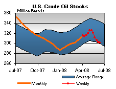
Oil inventory is at the lower end of its historical range.
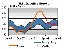
Gas stocks are at the low end of their historical range.
As a result of lower supplies....
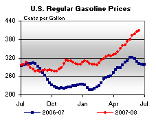
Gas prices are at record highs, as are
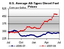
Diesel prices.
Consider the following news from the same report:

Oil inventory is at the lower end of its historical range.

Gas stocks are at the low end of their historical range.
As a result of lower supplies....

Gas prices are at record highs, as are

Diesel prices.
Consider the following news from the same report:
The U.S. average retail price for regular gasoline moved up to yet another record high. The jump of 4.3 cents was the twelfth consecutive weekly increase, bringing the price to 408.2 cents per gallon, a surge of 82.3 cents since March 24. The average price for the East Coast increased 3.3 cents to 405.2 cents per gallon. The Midwest price rose 1.5 cents to 399.7 cents per gallon. The Gulf Coast price grew 2.8 cents to 393.7 cents per gallon, once again remaining the lowest of any region. In the Rocky Mountain region, the price jumped 5.3 cents to 399.4 cents per gallon. The price rise on the West Coast was sharply higher than the other regions, surging 12.7 cents to hit 445.2 cents per gallon. The average price in California soared 15.5 cents to reach a record 458.8 cents per gallon.
Oil Market Roundup
Oil is the 800 pound gorilla in the economic run. Oil prices drip into every area of the economy. As such, they are incredibly inflationary. In addition, oil prices have been negatively impacting consumer sentiment in a big way. In short -- high gas prices are really hurting right now.
Let's go to the charts.
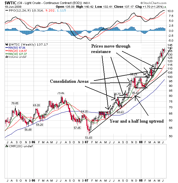
Oil prices have been rallying since the beginning of 2007. They have continually moved through upside resistance and consolidated gains. In addition, the price/SMA alignment is the most bullish possible. Prices are above all the SMAs. The shorter SMAs are above the longer SMAs. All the SMAs are moving higher.
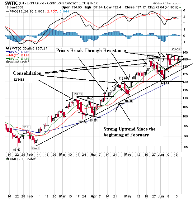
On the daily chart, notice the following:
-- Prices are higher than all the SMAs (although just barely in the case of the 10 day SMA).
-- The shorter SMAs are above the longer SMAs
-- All the SMAs are moving higher
This is a bullish chart, plain and simple.
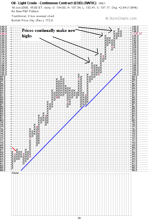
On the P&F chart, notice that prices have continually made new highs.
The bottom line is this: despite all the price fluctuations we've read about over the last few weeks, oil is still in a solid bull market. In addition, it's going to take a lot for that to change at this point.
Let's go to the charts.

Oil prices have been rallying since the beginning of 2007. They have continually moved through upside resistance and consolidated gains. In addition, the price/SMA alignment is the most bullish possible. Prices are above all the SMAs. The shorter SMAs are above the longer SMAs. All the SMAs are moving higher.

On the daily chart, notice the following:
-- Prices are higher than all the SMAs (although just barely in the case of the 10 day SMA).
-- The shorter SMAs are above the longer SMAs
-- All the SMAs are moving higher
This is a bullish chart, plain and simple.

On the P&F chart, notice that prices have continually made new highs.
The bottom line is this: despite all the price fluctuations we've read about over the last few weeks, oil is still in a solid bull market. In addition, it's going to take a lot for that to change at this point.
Wednesday, June 18, 2008
Today's Markets
-- Fed Ex reported a terrible quarter.
-- President Bush asked Congress to life the ban on offshore drilling.
-- Morgan Stanley reported a 50% drop in earnings.
-- Regional banks are not looking that good
-- The US and China agreed to negotiate an investment treaty
Let's take a look at the chart to see what they say
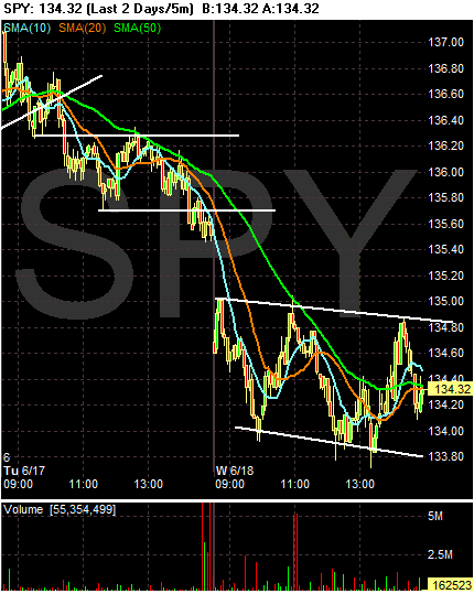
The SPYs gapped down at the open and continued to move lower until about 9:30. Then they turned around and rallied until they ran into the 50 minute SMA at 11. The PSYs dropped until a bit after 1PM CST. Then they tried to dally, failed, but rose until about half an hour before the close. They dropped a bit over the last few minutes of trading.
Mostly, notice that prices consolidated today.
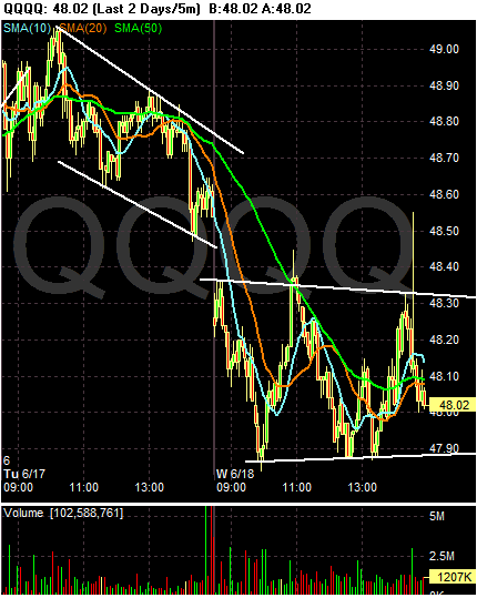
The main difference with the QQQQs is they rallied into the 50 minute SMA twice, then broke through to the upside. Aside from that, they consolidated as well.
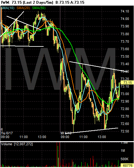
An awful lot of "ditto" on this chart as well.
-- President Bush asked Congress to life the ban on offshore drilling.
-- Morgan Stanley reported a 50% drop in earnings.
-- Regional banks are not looking that good
-- The US and China agreed to negotiate an investment treaty
Let's take a look at the chart to see what they say

The SPYs gapped down at the open and continued to move lower until about 9:30. Then they turned around and rallied until they ran into the 50 minute SMA at 11. The PSYs dropped until a bit after 1PM CST. Then they tried to dally, failed, but rose until about half an hour before the close. They dropped a bit over the last few minutes of trading.
Mostly, notice that prices consolidated today.

The main difference with the QQQQs is they rallied into the 50 minute SMA twice, then broke through to the upside. Aside from that, they consolidated as well.

An awful lot of "ditto" on this chart as well.
Oil Prices Are Killing the Airlines
From the WSJ:
The charts for this industry are downright ugly: they way we're looking at the possibility of at least one bankruptcy and maybe more.
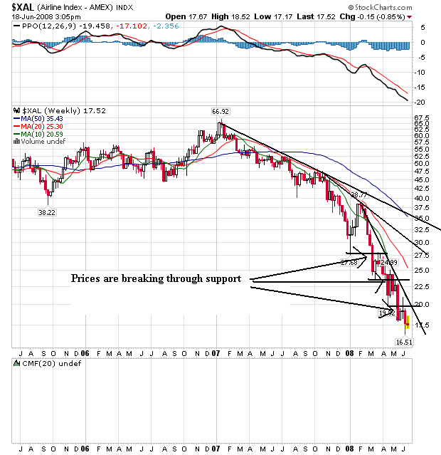
On the weekly chart, notice the following:
-- Prices have been dropping hard since last summer
-- All the SMAs are moving lower
-- The shorter SMAs are below the longer SMAs
-- Prices are below all the SMAs
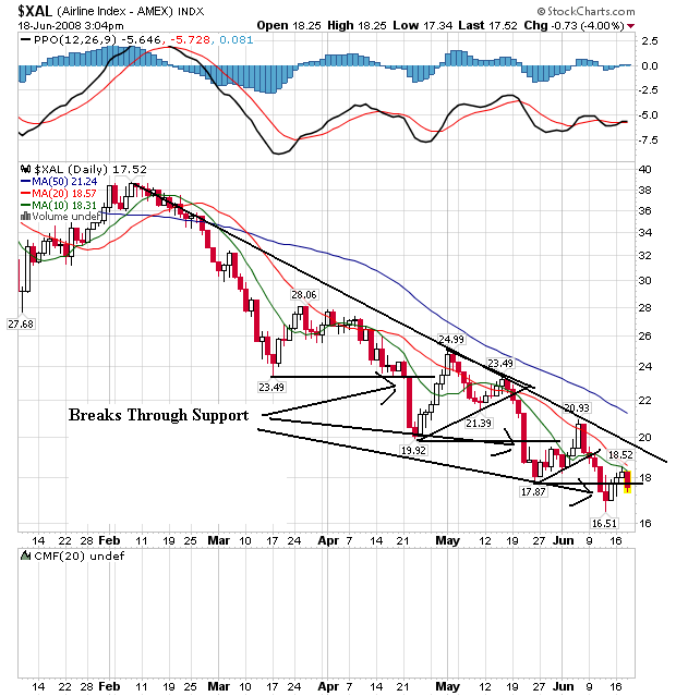
On the daily chart, notice the following:
-- Prices have been dropping hard since the beginning of the year
-- All the SMAs are moving lower
-- The shorter SMAs are below the longer SMAs
-- Prices are below all the SMAs
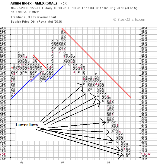
On the P&F chart, notice we've seen a series of lower lows.
Bottom line: this is an industry is deep trouble.
Major carriers Northwest Airlines Corp. and ACE Aviation Holdings Inc.'s Air Canada on Tuesday joined the growing roster of airlines saying they plan to ground planes, reduce capacity and, in some cases, cut jobs this fall and winter. Discount carriers Virgin America Inc. and AirTran Airways, a unit of AirTran Holdings Inc., also weighed in with plans to reduce seats.
Also Tuesday, UAL Corp.'s United Airlines said its 2008 fuel bill, at current prices, will be $9.5 billion, a jump of more than $3.5 billion from last year. The carrier recently said it will cull 100 jets from its 460-plane fleet, trim capacity and cut its work force.
Even those seemingly prudent steps will lead to "significant" noncash charges in the second quarter related to impairment of assets, employee severance and the termination of contracts, United said. Those charges will swell what is expected to be a large loss for the Chicago-based airline.
As crude oil stubbornly clings to prices well above $130 a barrel, airlines of all stripes are finding many of their routes unprofitable, even as fares contime to climb incrementally. More bad news could surface Wednesday, when many airline executives are slated to speak at a Merrill Lynch global transportation conference in New York.
The charts for this industry are downright ugly: they way we're looking at the possibility of at least one bankruptcy and maybe more.

On the weekly chart, notice the following:
-- Prices have been dropping hard since last summer
-- All the SMAs are moving lower
-- The shorter SMAs are below the longer SMAs
-- Prices are below all the SMAs

On the daily chart, notice the following:
-- Prices have been dropping hard since the beginning of the year
-- All the SMAs are moving lower
-- The shorter SMAs are below the longer SMAs
-- Prices are below all the SMAs

On the P&F chart, notice we've seen a series of lower lows.
Bottom line: this is an industry is deep trouble.
Midwest Flooding Spiking Corn and Soybean Prices
From the WSJ:
And from the WSJ:
From Bloomberg:
Considering corn and soybeans are grown in the Midwest, this news should not be surprising. In fact, it should be downright predictable.
Let's take a look at some charts to see how they play out.
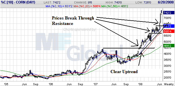
On corn's weekly chart, notice the following:
-- The chart is a classic up down up pattern. Prices rose from the end of 2006 to the middle of 2007. Then they consolidated from mid-2007 to the beginning of 2008. Since then they have been in a clear rally, breaking though upside resistance on several occassions.
-- Also note the very bullish alignment of all three SMAs. The shorter are above the longer, all three are moving higher and prices are above all the SMAs.
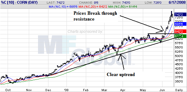
On the daily chart notice the following:
-- Prices have been in a clear uptrend since the end of last year.
-- All the SMA are moving higher
-- The shorter SMAs are above the longer SMAs
-- Prices are above all the SMAs
-- Prices have broken through upside resistance on several occassions
This is a very bullish chart.
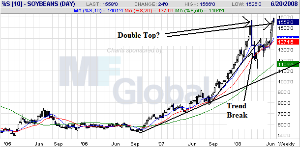
On soy beans weekly chart, notice the possible double top forming right now. That means the recent price spike could be nothing more than a temporary development.
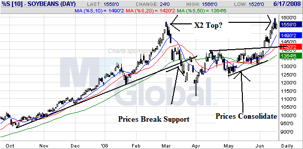
On the daily chart, notice the following:
-- Prices formed their first top at the end of March. Since then then fell through support, consolidated in a triangle pattern and have since risen to a high near the previous high in late March.
-- While prices and the SMAs have formed a very bullish pattern, the fact we're looking at a double top takes some of the upside excitement away from this chart.
Flooding in the Midwest could mean drivers will be getting a bigger soaking at gasoline pumps nationwide.
In recent days, corn-based ethanol prices have risen along with floodwaters as commodities traders worry about damage to corn crops. Ethanol futures are up 17% over the past week, to $2.89 a gallon, mirroring the price of corn, which has risen 13% during the same period, according to Thomson Reuters.
Since refiners blend ethanol into gasoline, higher ethanol prices mean higher costs for refiners, which could be passed on at the pump as Americans enter the summer driving season.
"It's coming at the worst possible time," said Stephen Schork, editor of the Schork Report, a newsletter on energy.
Drivers already are paying record prices. The average price of gasoline cracked $4 a gallon for the first time earlier this month, and prices are up 36% from a year ago, according to the Energy Information Administration. (Please see related article on page A4.) Nonetheless, gasoline's rise hasn't been nearly as dramatic as crude oil's, which is up 94% over the past year.
.....
The bigger question is the long-term impact. The Iowa Farm Bureau estimates Iowa, usually the largest corn-producing state, has already lost up to 10% of its corn crop, and a study from Ball State University in Muncie, Ind., estimates total crop damage in the state could amount to $2.7 billion.
And from the WSJ:
Corn prices continue to climb on concerns about Midwestern flooding and crop damage but avoided taking out records.
Nearby July corn at the Chicago Board of Trade rose 9.75 cents to $7.4225 a bushel Tuesday. It had previously hit highs for eight straight days, most recently at $7.60 intraday on Monday.
The market shook off early assessments by some observers that a government report Monday showing 57% of the crop was rated good to excellent was bearish. That was down three percentage points from last week, but some traders expected a steeper drop, given the extent of the flooding, particularly in Iowa, the top corn-producing state.
But analysts said regardless of expectations, the report, from the Agriculture Department, paints a dire picture.
"This is the lowest-rated corn crop since 1996, the lowest-rated soybean crop since 1993," said Brian Hoops, president of Midwest Market Solutions. "That doesn't sound bearish."
From Bloomberg:
Soybeans for November delivery rose as much as 13.75 cents, or 0.9 percent, to $15.6675 a bushel and last traded at $15.5125. The price rallied 2 percent yesterday. Soybeans have gained 28 percent this year and reached a record $15.865 on March 3.
``The jet stream will help to steer severe storms on the western Plains away from the flooded Midwest. However, more rain could hit the flood zones on Thursday,'' said private forecaster AccuWeather.com in State College, Pennsylvania.
About 57 percent of the corn crop was in good or excellent condition as of June 15, down from 60 percent a week earlier and 70 percent a year ago, the U.S. Department of Agriculture said June 16 in a report. About 56 percent of soybeans got the top ratings, compared with 57 percent a week earlier and 65 percent a year ago, the agency said.
Considering corn and soybeans are grown in the Midwest, this news should not be surprising. In fact, it should be downright predictable.
Let's take a look at some charts to see how they play out.

On corn's weekly chart, notice the following:
-- The chart is a classic up down up pattern. Prices rose from the end of 2006 to the middle of 2007. Then they consolidated from mid-2007 to the beginning of 2008. Since then they have been in a clear rally, breaking though upside resistance on several occassions.
-- Also note the very bullish alignment of all three SMAs. The shorter are above the longer, all three are moving higher and prices are above all the SMAs.

On the daily chart notice the following:
-- Prices have been in a clear uptrend since the end of last year.
-- All the SMA are moving higher
-- The shorter SMAs are above the longer SMAs
-- Prices are above all the SMAs
-- Prices have broken through upside resistance on several occassions
This is a very bullish chart.

On soy beans weekly chart, notice the possible double top forming right now. That means the recent price spike could be nothing more than a temporary development.

On the daily chart, notice the following:
-- Prices formed their first top at the end of March. Since then then fell through support, consolidated in a triangle pattern and have since risen to a high near the previous high in late March.
-- While prices and the SMAs have formed a very bullish pattern, the fact we're looking at a double top takes some of the upside excitement away from this chart.
Wednesday's Commodities Roundup
From the WSJ:
This shouldn't surprise anybody. With the Midwest -- the US' (and the world's) breadbasket) flooding, we're looking at the possibility of higher food prices. Let's go to the charts to see how this is playing out:
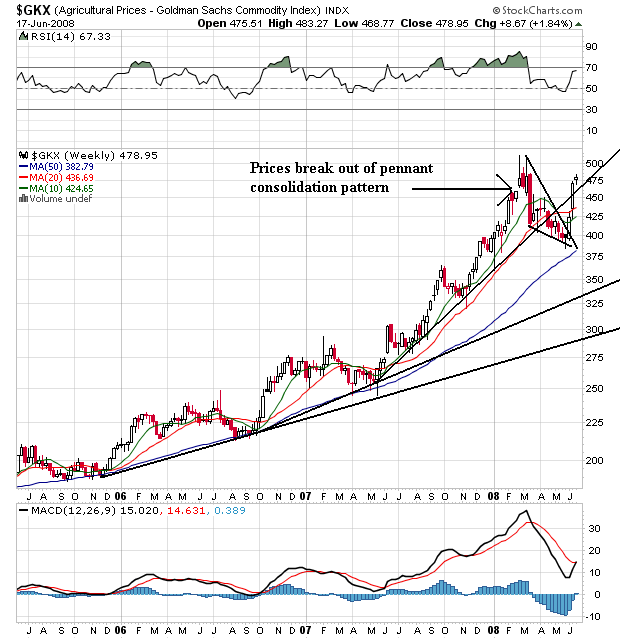
On the long-term chart, notice that agricultural prices formed a pennant pattern over the last few months. But since the flooding started in the Midwest prices have moved out of the pennant pattern and rallied higher.
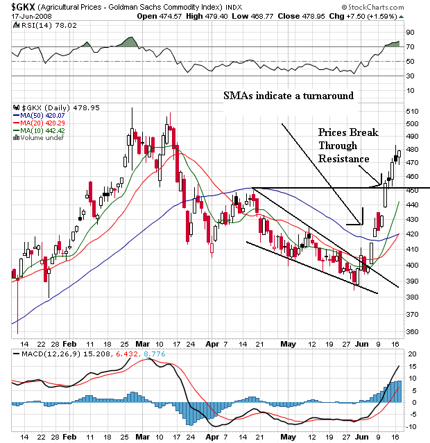
On the daily chart, notice the following:
-- Prices have moved through the SMAs
-- The 10 and 20 day SMA are both moving higher.
-- The 10 day SMA has moved through the 50 day SMA
-- The 20 day SMA is about to move through th 50 day SMA
-- The 50 day SMA is neutral.
This chart says turnaround.
Throughout the day I'll be focusing on agricultural commodities.
The Midwest floods are raising the inflationary tide rippling through the nation's supermarkets and restaurants -- and meat prices may soon start rising along with prices for bread, eggs and breakfast cereals.
Economists are again raising their forecasts of how much food prices will climb, and for how long, because heavy rains have washed out millions of acres of prime farmland at a time when soaring demand is draining U.S. grain supplies to low levels.
"The U.S. consumer has gotten used to cheap, affordable food," said Fiona Boal, a food-industry analyst at the U.S. arm of Dutch financial firm Rabobank Group. "Now the goal posts are moving."
Ms. Boal said Monday she expects U.S. food prices to climb between 7% and 9% this year, and to continue rising in 2009. The government's Consumer Price Index for all food rose 4% in 2007 after increasing at a 2.4% annual rate during the two years before that.
Paul Prentice, president of Farm Sector Economics in Colorado Springs, Colo., Monday raised his food CPI forecasts for 2008 and 2009 by 1.5 percentage points to 7% and 7.4%, respectively.
Likewise, Michael Swanson, an economist at Wells Fargo & Co., said Monday he expects food prices to climb 5% to 7% next year, compared with his forecast for a 6% rise in food prices this year.
This shouldn't surprise anybody. With the Midwest -- the US' (and the world's) breadbasket) flooding, we're looking at the possibility of higher food prices. Let's go to the charts to see how this is playing out:

On the long-term chart, notice that agricultural prices formed a pennant pattern over the last few months. But since the flooding started in the Midwest prices have moved out of the pennant pattern and rallied higher.

On the daily chart, notice the following:
-- Prices have moved through the SMAs
-- The 10 and 20 day SMA are both moving higher.
-- The 10 day SMA has moved through the 50 day SMA
-- The 20 day SMA is about to move through th 50 day SMA
-- The 50 day SMA is neutral.
This chart says turnaround.
Throughout the day I'll be focusing on agricultural commodities.
Tuesday, June 17, 2008
Today's Markets
PPI increased at a high rate and housing starts hit a 17-year low. Goldman Sachs said banks may have to raise an addition $65 billion in capital. T. Boone Pickens said oil production has peaked. US airlines said they may lose $13 billion this year.
I'm going to pull back on the charts and show a 3-month chart to give you an idea of where prices are in the bigger picture.
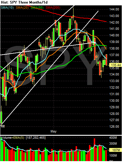
In mid-May, prices hit the 200 day SMA and have since retreated. Since the index hit that level:
-- The 10 and 20 day SMA have moved lower
-- The 10 and 20 day SMA crossed below the 50 day SMA
-- Prices are below all the SMAs
-- The 50 day SMA has moved into a horizontal position.
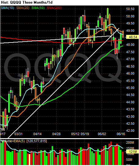
The QQQQs formed a double top in May and June. Since prices have retreated from those levels, notice the following:
-- Prices dropped to the 50 day SMA, but have risen above the 200 day SMA since then.
-- The 10 day SMA has crossed below the 20 day SMA
-- The 10 and 20 day SMA have both moved lower
-- Today prices bounced off the 20 day SMA
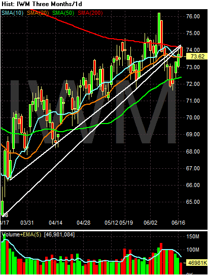
The IWMS broke above the 200 day SMA, but have since fallen below that level. A quick retreat below a strategically important line is not a good development.
I'm going to pull back on the charts and show a 3-month chart to give you an idea of where prices are in the bigger picture.

In mid-May, prices hit the 200 day SMA and have since retreated. Since the index hit that level:
-- The 10 and 20 day SMA have moved lower
-- The 10 and 20 day SMA crossed below the 50 day SMA
-- Prices are below all the SMAs
-- The 50 day SMA has moved into a horizontal position.

The QQQQs formed a double top in May and June. Since prices have retreated from those levels, notice the following:
-- Prices dropped to the 50 day SMA, but have risen above the 200 day SMA since then.
-- The 10 day SMA has crossed below the 20 day SMA
-- The 10 and 20 day SMA have both moved lower
-- Today prices bounced off the 20 day SMA

The IWMS broke above the 200 day SMA, but have since fallen below that level. A quick retreat below a strategically important line is not a good development.
What Inflation? Part II
Here are two charts that show the year over year increase in CPI and PPI
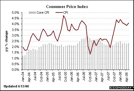
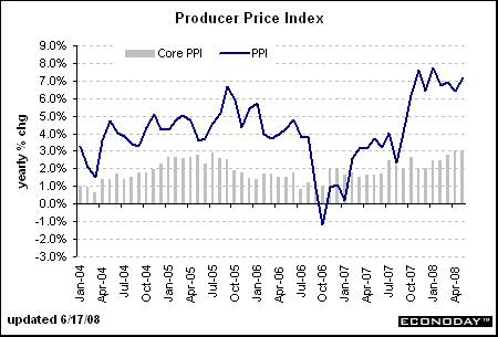
Things aren't looking that good right now.


Things aren't looking that good right now.
What Inflation?
I have a mixed feeling about the possibility of future inflation. On one hand, commodity prices are still increasing. Oil is touching new highs nearly every day and agricultural prices are spiking thanks for floods in Iowa. On the other side, there's an old adage: "nothing cures high prices like high prices." In other words, high prices (in and of themselves) create incentives for people to purchase cheaper substitutes (if they exist) or to produce more of the high-priced good in an attempt to make money.
So, with the two stories listed below the question to ask is, "are these the type of price spikes that will create incentives for lower prices down the road?"
From Bloomberg:
From Bloomberg:
So, with the two stories listed below the question to ask is, "are these the type of price spikes that will create incentives for lower prices down the road?"
From Bloomberg:
U.K. inflation reached the highest since at least 1997 in May, and Bank of England Governor Mervyn King predicted it will exceed 4 percent later this year, adding to speculation that the economy will fall into a recession.
The Monetary Policy Committee ``is concerned about the present and prospective period of above-target inflation,'' King wrote in a letter to the government, after the Office for National Statistics said consumer prices climbed 3.3 percent from a year earlier last month. ``The path of bank rate that will be necessary to meet the 2 percent target is uncertain.''
.....
Policy makers ``are going to sit on their hands for the time being since there's not really much they can do for the moment,'' said George Buckley, chief U.K. economist at Deutsche Bank AG in London. ``They need to see what the economy does first.''
From Bloomberg:
European inflation accelerated to the highest in 16 years last month as food and energy costs soared, intensifying what finance ministers from the world's richest nations said is becoming a ``more complicated'' dilemma.
The inflation rate in the euro area rose to 3.7 percent, the highest since June 1992, from 3.3 percent in April, the European Union's statistics office in Luxembourg said today. The rate for May is higher than the 3.6 percent estimate published on May 30.
Soaring commodity prices have pushed up costs for companies and consumers and at the same time are posing a ``serious challenge'' to economic growth, officials from the Group of Eight nations said yesterday after a meeting in Japan. European Central Bank President Jean-Claude Trichet this month said the ECB may raise its benchmark interest rate a quarter point in July, signaling he is setting aside concerns about the economy's expansion to combat inflation.
With inflation accelerating ``it becomes increasingly difficult to argue against an ECB hike in July,'' said Carsten Brzeski, an economist at ING Group in Brussels. ``However, we still believe that a July rate hike would be a one-off, mainly to flaunt the ECB's willingness to fight any second-round effects.''
Treasury Tuesdays
Let's look at the Treasury market charts to see what they're telling us.
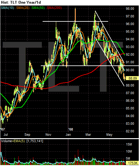
The TLTs consolidated in a rectangular pattern from the beginning of December 2007 to the end of May 2008. Since then they have dropped below the key support level established at the beginning of the consolidation.
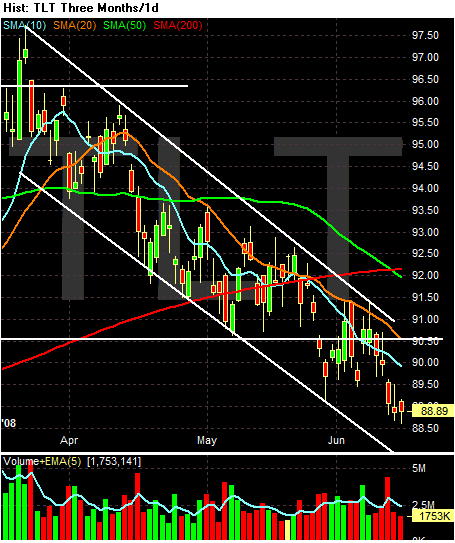
The SMA chart gives us a much better picture of what is going on. Notice the following:
-- Prices are below the 200 day SMA
-- The 10, 20 and 50 day SMA have crossed below the 200 day SMA
-- The 10, 20 and 50 day SMA are all heading lower
-- Prices are below all the SMAs
The only positive point to make about the SMAs is the 200 is moving higher. That's it. Everything else is negative.
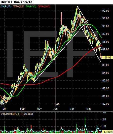
On the 1 year chart of the 7-10 year part of the curve, notice the market caught a huge bid at the beginning of the credit crunch and kept on rally until the beginning of April 2008. Since then the market has clearly been in a sell-off.
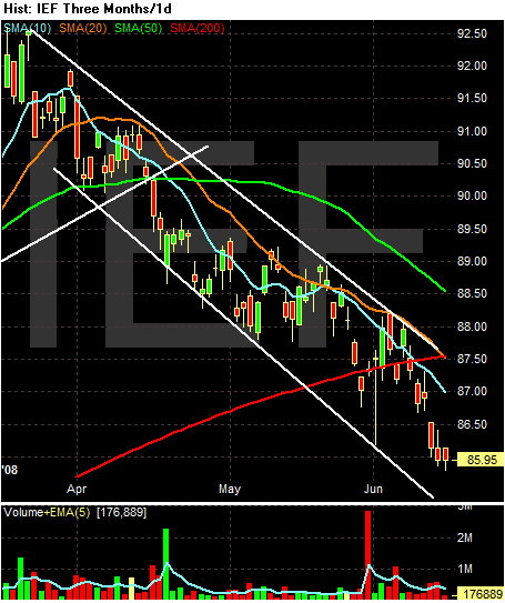
On the three month SMA chart, notice the following:
-- Prices are below all the SMAs
-- The 10 day SMA has moved below the 200 day SMA
-- The 20 day SMA is about to move below the SMA
-- The 10, 20 and 50 day SMA are both moving lower
The only good point on this chart is the 200 day SMA is moving higher. But that's it.
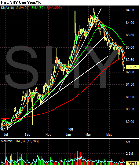
On the one year chart, notice the short-end of the curve had a strong rally since the beginning of the credit crunch. However, they have since sold-off.
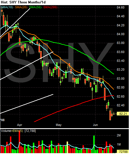
On the SMA charts, notice the following:
-- Prices are below all the SMAs
-- Prices are below the 200 day SMA
-- All the shorter SMAs (10, 20 and 50 day) are heading lower
-- The 10 day SMA has moved below the 200 day SMA
The bottom line is the Treasury market is selling off, largely as a reaction to higher inflation. In addition, we've had numerous statements from government officials that imply rates are going higher.

The TLTs consolidated in a rectangular pattern from the beginning of December 2007 to the end of May 2008. Since then they have dropped below the key support level established at the beginning of the consolidation.

The SMA chart gives us a much better picture of what is going on. Notice the following:
-- Prices are below the 200 day SMA
-- The 10, 20 and 50 day SMA have crossed below the 200 day SMA
-- The 10, 20 and 50 day SMA are all heading lower
-- Prices are below all the SMAs
The only positive point to make about the SMAs is the 200 is moving higher. That's it. Everything else is negative.

On the 1 year chart of the 7-10 year part of the curve, notice the market caught a huge bid at the beginning of the credit crunch and kept on rally until the beginning of April 2008. Since then the market has clearly been in a sell-off.

On the three month SMA chart, notice the following:
-- Prices are below all the SMAs
-- The 10 day SMA has moved below the 200 day SMA
-- The 20 day SMA is about to move below the SMA
-- The 10, 20 and 50 day SMA are both moving lower
The only good point on this chart is the 200 day SMA is moving higher. But that's it.

On the one year chart, notice the short-end of the curve had a strong rally since the beginning of the credit crunch. However, they have since sold-off.

On the SMA charts, notice the following:
-- Prices are below all the SMAs
-- Prices are below the 200 day SMA
-- All the shorter SMAs (10, 20 and 50 day) are heading lower
-- The 10 day SMA has moved below the 200 day SMA
The bottom line is the Treasury market is selling off, largely as a reaction to higher inflation. In addition, we've had numerous statements from government officials that imply rates are going higher.
Monday, June 16, 2008
Today's Markets
Oil hit a new record, but then retreated from it's all time highs. Part of the reason for the new high is Saudi Arabia announced a production increase, but the dollar's drop after a the G8 failed to announced a policy of intervention didn't help. Home builder sentiment hit a new low. In the US, the Empire State survey showed another quarter of contraction.

On the SPY's chart, there are two important points to note.
-- Prices were in a rally since about 1PM CST on Friday.
-- Prices broke that day+ rally right near the close.

The QQQQs opened a touch higher and then consolidated until right around 10 EST when they made a big move higher on decent volume. Then they formed a reverse head and shoulders formation until right after lunch when they again moved higher. The average formed a pennant formation in the last hour or so of trading.

The IWMs opened a bit higher, and then like the QQQQs moved sharply higher right around 10 AM CST. Then notice they moved higher and consolidated gains after their move. Also note the upward trend that started in the afternoon on Friday is still intact.

On the SPY's chart, there are two important points to note.
-- Prices were in a rally since about 1PM CST on Friday.
-- Prices broke that day+ rally right near the close.

The QQQQs opened a touch higher and then consolidated until right around 10 EST when they made a big move higher on decent volume. Then they formed a reverse head and shoulders formation until right after lunch when they again moved higher. The average formed a pennant formation in the last hour or so of trading.

The IWMs opened a bit higher, and then like the QQQQs moved sharply higher right around 10 AM CST. Then notice they moved higher and consolidated gains after their move. Also note the upward trend that started in the afternoon on Friday is still intact.
Market Mondays
Finally, let's turn our attention to the Russell 2000, or the IWMs.
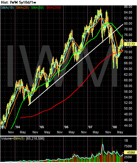
On the five year chart, we can see a strong and very clear uptrend that started in mid-2004. The IWMs continued on this path until the end of 2007/beginning of 2008 when they fell through support.
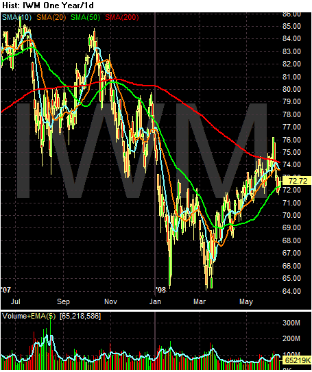
On the one year chart, notice the clear downward trajectory of the chart.
On the three month chart, notice the following:
-- There are several upward sloping channels and trend lines, all of which the average has broken
-- Prices got beyond the 200 day SMA, but fell back quickly unable to maintain upward momentum
-- The 10 day SMA just turned lower and is about to cross below the 20 day SMA
-- Prices have fallen to the 50 day SMA which is the last possible technical support line from the SMAs
-- Prices are below three of the 4 major SMAs
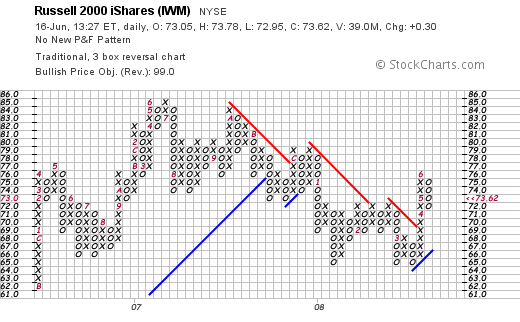
On the IWM P&F chart, notice the lower highs on the chart.
The bottom line is this chart is deteriorating, but it has not completely fallen apart yet.

On the five year chart, we can see a strong and very clear uptrend that started in mid-2004. The IWMs continued on this path until the end of 2007/beginning of 2008 when they fell through support.

On the one year chart, notice the clear downward trajectory of the chart.
On the three month chart, notice the following:
-- There are several upward sloping channels and trend lines, all of which the average has broken
-- Prices got beyond the 200 day SMA, but fell back quickly unable to maintain upward momentum
-- The 10 day SMA just turned lower and is about to cross below the 20 day SMA
-- Prices have fallen to the 50 day SMA which is the last possible technical support line from the SMAs
-- Prices are below three of the 4 major SMAs

On the IWM P&F chart, notice the lower highs on the chart.
The bottom line is this chart is deteriorating, but it has not completely fallen apart yet.
Subscribe to:
Comments (Atom)