Saturday, June 23, 2012

Weekly Indicators: America, the world's least worst economy edition


  - by New Deal democrat

The monthly data released this past week was much better than last week's.  Housing permits rose to a new 3+ year high, over 250,000 higher than their all time low in 2009.  This boosted the index of Leading Economic Indicators to +0.3.  Existing home sales fell slightly.  The very erratic Philly Fed index plunged to -16.6 (it is worth remembering that 9 months ago it plummeted below -30 before rebounding).

The high frequency weekly indicators remained generally positive, but the recent comparative weakness in a number of the indicators remains, especially in new jobless claims, so let's start there.

Employment related indicators were mixed:

The Department of Labor reported that Initial jobless claims rose 1,000 to 387,000 last week.   The four week average rose another 4250 to 386,250, to the highest level all year.   The rise in jobless claims is a serious concern, but there remains some question of whether there is a seasonal adjustment issue or whether something more ominous is going on, as we had a similar rise during the second quarter of 2011.  This is a yellow flag for now.  If the weakness persists into July, it will become a red flag.

The American Staffing Association Index rose back to 93.  It has generally leveled off for the last two months.

The Daily Treasury Statement for the first 15 days of June showed $103.5B vs. $98.8B for the same period in 2011.  For the last 20 reporting days, $134.1B was collected vs. $127.6B a year ago, an increase of $6.5B, or +5.1%.    

Housing reports were softer than recently, but still positive:

The Mortgage Bankers' Association reported that the seasonally adjusted Purchase Index fell 9% from the week prior (which had been up 12.8%), and was down 2%  YoY, still at the upper end of its two year range.  The Refinance Index rose 1%. Refinancing is at a 3 year high. 

The Federal Reserve Bank's weekly H8 report of real estate loans, which turned positive YoY in March after having been negative for 4 years, this week fell -0.4%, and the YoY comparison declined to +0.5%.  On a seasonally adjusted basis, these bottomed in September and remain up +0.9%.  The growth rate has weakened in the last few weeks.

YoY weekly median asking house prices from 54 metropolitan areas at Housing Tracker  were up + 1.9% from a year ago, the weakest such reading in several months.  YoY asking prices have been positive for over 6 months, are higher than at any point last year, and at their maximum seasonal point  on a seasonally adjusted basis.  Barring the appearance of the long-in-coming foreclosure tsunami (which, per Calculated Risk, may only occur in judicial states and be counterbalanced by the winding down of foreclosures in non-judicial states, which never had any delays), the bottom in prices is here.  The Case-Shiller repeat sales index will be reported in the coming week.  It remains negative YoY, but has increased on a seasonally adjusted basis for the last two reports in a row.

Same Store Sales were mixed.

The ICSC reported that same store sales for the week ending June 16 were flat w/w, but were up +3.0% YoY.  Johnson Redbook reported a 2.4% YoY gain.  Shoppertrak, which has been reporting erratically, and with erratic numbers, showed a +1.4% YoY gain and also a -0.3% YoY decline for the week prior.  The 14 day average of Gallup daily consumer spending  at $70 was equal to last year's average on this date for the second week in a row.  I am struggling with how best to report Gallup's numbers, which tend to ebb and flow over 3 to 5 week periods.  Average spending over 14 days peaked at the end of May at $78, which is considerably above any number in spring 2011, while we just off a short cyclical peak in the 2011 comparison.  Still, June spending has been weak during the entire  month, so this is another yellow flag.         

Bond prices fell slightly and credit spreads increased again:

Weekly BAA commercial bond rates increased by .02% to 5.05%.  Yields on 10 year treasury bonds  rose .01% to 1.62%.  The credit spread between the two incresed again to 3.43%, a new 52 week high.  The recent collapse in government bond yields screams of fear of deflation.  An uptick in corporate yields begins to signal increasing fear of default.  This pattern frequently occurs on the cusp of a recession. 

Rail traffic turned more positive this week.

The American Association of Railroads  reported a +0.9% increase in total traffic YoY, or +4,900 cars, at 537.0.  Non-intermodal rail carloads were down 2.5% YoY at 287.0. Intermodal traffic was up 5.2% YoY at 250.0.  Eight of the 20 carload types were negative YoY vs. 10 types one week ago.

Money supply was positive:

M1 increased +0.9% last week, and also rose +0.6% month over month.  Its YoY growth rose to +16.3%, so Real M1 is up 14.6%. YoY.  M2 rose +0.6% for the week, and was up 0.3% month/month.  Its YoY growth increased to +9.6%, so Real M2 increased to +7.9%.  Real money supply indicators continue to be strong positives on a YoY basis, and after slowing earlier this year,  are increasing again.

The energy choke collar has almost completely disengaged:

Gasoline prices fell for the ninth straight week, down another .04 to $3.53.  Oil prices per barrel fell over $4 to $79.76.  Oil hit a new 12 month low on Thursday, and has only been less expensive for about 2 months in the last 3 years.  Oil prices are now well below the point where they can be expected to exert a constricting influence on the economy, and gasoline is following.  The 4 week average of Gasoline usage, at 8851 M gallons vs. 9321 M a year ago, was off  -5.0%.  For the week, 8693 M gallons were used vs. 9319 M a year ago, for a decline of -6.7%.  This is a serious YoY decline; however, June and early July of 2011 were the only months after March 2011 where there was a YoY increase in usage, so the YoY comparison now is especially difficult.  If this decline persists past the middle of July, it will be a red flag.

Turning now to high frequency indicators for the global economy:

The TED spread rose 0.1 to 0.39, in the middle of its recent 4 month range.  This index remains slightly below its 2010 peak.  The one month LIBOR rose another 0.002 to 0.245.  While it has risen slightly above its recent 4 month range, it remains well below its 2010 peak, and has still within its typical background reading of the last 3 years.  It is interesting that neither of these two measures of fear have moved significantly despite the chronic Europanic.

The Baltic Dry Index rose 54 from 924 to 978.  It remains 308 points above its February 52 week low of 670.  The Harpex Shipping Index fell slightly for the third straight week from 451 to 447, but is still up 72 from its February low of 375. 

Finally, the JoC ECRI industrial commodities index continued its recent cliff-dive, down from 115.34 to 113.89.  This is a new 52 week low.  The nearly 15 point collapse in this indicator during the last few months is is the strongest sign of all that the globe taken as a whole is slipping back into recession.

We have severe weakness in commodities.  This suggests that Asia as well as Europe is contracting.  On the other hand, this ends the profit margin squeeze on US producers, and puts more money in the pockets of US consumers.  Global transport is weakening again slightly.  Credit spreads continue to widen, which may show a flight to US assets, comparatively greater to Treasuries.

In the US, initial jobless claims are rising.  Rail traffic remains mixed.  Gallup is showing stalling consumer sales, but is not supported by either ICSC or Johnson Redbook which remain resolutely positive.  Gasoline usage is significantly negative YoY again, but this may simply reflect the tougher comparisons with June last year.  Bank real estate loans have hit a little soft patch, although mortgage purchases and refinancings are positive.  Temporary help is starting to trend sideways.  Withholding tax payments and money supply remain positive.

The overall picture is of an incipient global recession, with the US remaining in growth but weakly so for now.  I continue to watch consumer spending especially carefully, and in July the picture with gasoline usage and initial claims should become clearer.

Have a nice weekend!

Friday, June 22, 2012

Household Deleveraging In Pictures; Or This Is Why Debt Deflation Recoveries Suck

A few weeks ago, the Federal Reserve issued the Flow of Funds report.  This is a great document, as it comprehensively looks at the US economy and the "flow of funds" between business, individuals and the financial markets.  There are two charts that really highlight the effect of this recession and household deleveraging:


First, in the nearly 60 years history of this data series, we have never seen households de-leverage like they are now.  That tells us about how different this current situation is relative to all other times.


 The above chart shows the last ten years of this data series.  Since 2008, the US household sector has shed nearly $1 trillion in debt -- the total drop has been from $13.8 to about $12.9 trillion.  That's 5.8% of the US' nominal GDP.

Think about this from an economic perspective.  $900 billion dollars -- that could have gone to spending -- went to paying down debt (either in the form of actually paying the debt down or letting it be extinguished through legal means). Think of the multiplier that would have on the economy had it occurred -- we certainly would have had stronger growth without it.


Morning Market Analysis


The charts show yesterday's sell-off in several time frames.  First, the top chart (a 5 minute chart) shows prices moving lower continually throughout the day.  The second chart (a 60 minute chart) shows that prices are now at support in the 133 area.  The third chart shows that prices have broken an upward sloping trend line and are now at the 61.8% level from the April - June sell-off.  A move through this level will make the 200 day EMA the next logical target.

While the magnitude of the sell-off is concerning (it was the second worst daily performance of the year), note the underlying technicals are still in decent shape.  However, also note the negative tenor of yesterday's data is what led to the sell-off.


The transports also sold-off.  However, notice that prices here are above the 200 day EMA, and were in the process of rallying to heights from previous rallies.


The copper ETF still has a negative bias.  Prices are consolidating between 42 and 44 and are near a 6 month low.  While momentum is increasing, it's still negative.  The shorter EMAs (10 and 20 day EMAs) are trying to level out.


Thursday, June 21, 2012

Bonddad Linkfest

  1. FOMC statement
  2. More easing likely if jobs market weakens (BB)
  3. DeLong on the Fed's move (BB video)
  4. FOMC's new projections (FRB)
  5. EU PMI at 35 month low (Markit)
  6. Australia's LEIs drop and are now moving consistently lower (CB)

Inflation is Definitely Under Control -- And Is Actually Signaling Bad Things


The above chart shows all four major inflation measures on a year year over year basis: producer prices (raw, intermediate and final) and consumer price.  Think of this as a series: raw materials are converted into intermediate goods, which are then converted into final goods and sold.  CPI captures some of the final PPI.

Let's start with the red line, which is raw producer prices.  On the good side, we've seen prices for commodities drop over the last few months.  That means there is little inflationary pressure.  It also means traders are betting on slower economic growth.  The red line captures the swings we've seen in raw materials, especially over the last few months.  Now we're in negative YOY comparisons, which is not good from an economic perspective.

Also note that the gold line (intermediate goods) and green line (final goods) are now partially below the CPI line.  Again, from a consumer's perspective this is good because it means we're not under a threat of massive inflation.  But it also means a slowing economy.  Finally, the last time we say this alignment was before a recession -- definitely not a good development on the statistics front.


The Problem With India

Consider the following from the latest Reserve Bank of India policy statement:
Growth

5. Economic activity in 2011-12 moderated sequentially over the quarters to take growth to a low of 5.3 per cent in Q4, though for the year as a whole it was 6.5 per cent. Deceleration in industrial production from the supply side and weak investment from the demand side have, in particular, contributed to the growth slowdown. The index of industrial production (IIP) increased by just 0.1 per cent in April 2012. Even as the manufacturing Purchasing Managers’ Index (PMI) for May suggested that industrial activity remains in an expansionary mode, there is no question that the pace of expansion has slowed significantly.

6. In this context, it is relevant to assess as to what extent high interest rates are affecting economic growth. Estimates suggest that real effective bank lending interest rates, though positive, remain comparatively lower than the levels seen  during the high growth phase of 2003-08. This suggests that factors other than interest rates are contributing more significantly to the growth slowdown.

7. Further, one implication of the rupee depreciation over the past several months is that domestic producers have gained in competitiveness over foreign producers. Over time, this should result in expanding exports and contracting imports, thus acting as a demand stimulus.

Inflation

8. During 2011-12, headline WPI inflation rate moderated from a peak of 10.0 per cent in September 2011 to 7.7 per cent in March 2012. However, during 2012-13 so far, provisional data suggest that it inched up from 7.2 per cent in April to 7.6 per cent in May, driven mainly by food and fuel prices. Primary food articles inflation rose from negative [(-) 0.7 per cent)] in January to 10.7 per cent in May largely due to a sharp increase in vegetable prices. Protein inflation continued to be in double digits. With food prices contributing so heavily to headline inflation, the performance of the south-west monsoon will also play a role in determining inflationary conditions over the course of the current year.

9. Though international crude prices have fallen significantly from their levels in April 2012, the rupee depreciation has significantly offset its impact on wholesale prices. Further, even at the current lower level of global crude oil prices, significant under-recoveries persist in respect of administered petroleum product prices. The positive development on the inflation front is that core (non-food manufactured products) inflation has trended down.

10. Consumer price index (CPI) inflation (as measured by the new series, base year 2010) rose from 8.8 per cent in February to 9.4 per cent in March and further to 10.4 per cent in April. Significantly, CPI inflation, excluding food and fuel, was also in double digits suggesting that moderation in wholesale price inflation has not transmitted to the retail level.

11. Notwithstanding the moderation in core inflation, the persistence of overall inflation both at the wholesale and retail levels, in the face of significant growth slowdown, points to serious supply bottlenecks and sticky inflation expectations. Also, in the absence of pass-through from international crude oil prices to domestic prices, the consumption of petroleum products remains strong distorting price signals and preventing the much needed adjustment in aggregate demand. The consequent subsidy burden on the Government is crowding out public investment at a time when reviving investment, both public and private, is a critical imperative. The widening current account deficit (CAD), despite the slowdown in growth, is symptomatic of demand-supply imbalances and a pointer to the urgent need to resolve the supply bottlenecks.
Let's place the above information in context:


Growth is clearly decelerating.  Growth has moved from 9.4% in early 2010 to 5.3% now.  While this rate of growth still looks impressive, the overall decline (which has been consistent) is obviously concerning.  Also note that with one of the largest populations in the world -- and a population that is overwhelmingly poor -- India needs to maintain a far faster growth rate than a developed country.

India has never really tamed its inflation rate.  There was a decent drop at the end of last year, but now inflation is again on the rise.

The combination of slower growth and higher inflation places the central bank in a terrible policy bind.  If it raises rates to slow inflation, growth will drop.  If it lowers rates to increase growth, inflation picks up.  It's a classic no-win scenario.


In addition, among major countries, India has the highest rate of inflation by far.

It also has one of the largest budget deficits

and rates of unemployment.

And has the largest current account deficit.

In short, the problems are mounting for India.  The real problem appears to be political, as the ruling parties don't have the will to actually tackle these problems.

Morning Market Analysis


Corn and wheat (the top and middle charts) are contained.  It won't be until corn breaks 6.60 and wheat breaks 7.00 that we should be concerned.  However, soy beans -- which sold off in May, are trying to move higher.  A move through the 14.50 level would make $15.00 the next logical price target.


The GLD ETF continues to move sideways, finding support around the 153 level.  Remember the conflicting sentiment here: the bulls are looking at QE programs -- along with overall instability -- while the bears are looking at actual inflation numbers. 


The euro is in a strong counter-trend rally right now -- a rally which has been occurring all month.  Prices are now through the 10 and 20 day EMAs and are hitting resistance at the 61.8% Fib level from the May sell-off.  The increasing volume trend is very positive, as it indicates this is more than just a technical rally.  Now the real trick will be keeping price momentum.


The yen -- after rallying from mid-March lows -- is now moving sideways, trading right around the 200 day EMA.  The yen is caught between safe haven buying and a slow economy.   

Wednesday, June 20, 2012

Bonddad Linkfest

  1. Public workers continue to be laid off (NYT)
  2. Republican tax plan hurts middle class (WaPo)
  3. India will cut inflation at the expense of growth (BB)
  4. Push for QE in the UK grows (BB)
  5. Minutes of the latest BOE meeting (BOE)
  6. US grain exports the highest in five years (BB)
  7. Hard-pressed crops to deteriorate further (Agrimoney)
  8. The UK is doomed (Alphaville)
  9. Problems with extending operation twist (Alphaville)
  10. Rental income and GDP (Next New Deal)

Arizona Getting a Boost From Housing

From Bloomberg:


After being decimated by the housing crash, Arizona’s builders are now scrounging for workers as demand for new homes climbs. Building permits are at an almost three-year high, creating a scarcity of framers, roofers and masons, many of whom moved elsewhere when work dried up. Laws aimed at curbing illegal immigration only added to the shortage by pushing experienced laborers out of the state.

Construction jobs, which also include commercial and government projects, increased 9.3 percent in May from a year earlier to 120,300, the biggest gain of any industry in the state, according to Arizona’s Office of Employment and Population Statistics. Nationally, industry employment rose 0.4 percent.
The average hourly wage for construction workers in Arizona increased to $20.72 from $19.53 a year earlier, according to the state agency.

Arizona was among the areas hit hardest by the U.S. housing crash. Home prices in April were down about 47 percent from the peak in 2006, more than the 31 percent decline nationally, data from CoreLogic Inc. (CLGX) show. The state ranked second in the rate of foreclosure filings last month, according to RealtyTrac Inc. Building jobs have declined by more than half since 2006.

“The industry is so wound down that it’s hard to flip the switch on and build as many homes as there is demand right now,” said Ben Sage, director of the Arizona region for Metrostudy, a Houston-based firm that tracks new construction. “The subcontractors are scrambling for workers.”

New-home demand in Phoenix is climbing as cash-wielding investors elbow out traditional buyers for a dwindling supply of existing properties. The inventory of previously owned houses for sale in Phoenix dropped 54 percent in April from a year earlier, according to a report by Michael Orr, director of the Center for Real Estate Theory and Practice at Arizona State University’s W.P. Carey School of Business. That helped push the median price for single-family homes up 25 percent to $140,000.

Purchases of new houses surged 43 percent in April from a year earlier, according to the report. The median price for new homes rose 4.6 percent to  $207,000.

Reed Porter, chief executive officer of Trend Homes in Gilbert, Arizona, said he expects his company to build 200 houses this year, twice as many as in 2011.
“So far, we’re keeping up with demand,” he said. “If demand continues to increase, clearly we’d need more skilled workers.”

While widespread worker shortages are unlikely as the U.S. unemployment rate sits above 8 percent, some local markets may find themselves in situations similar to Arizona’s biggest city, according to David Crowe, chief economist for the National Association of Home Builders. Building permits nationally climbed to the highest level since September 2008 in May, the Commerce Department said yesterday.

What If We Had A Money Printing Party and No One Came?

The FOMC meeting began yesterday and will announce a decision today.  As I and NDD have noted, the underlying data of the US economy for the last few months has been weakening.  As such, it seems appropriate to think the Fed may act in some capacity, probably with some type of asset purchase program.  Some will argue this is not warranted, or, more importantly, that this is going to lead to an inflationary spike.  Nothing could be further from the truth, as I explain below.

One of the primary complaints about the Fed's action of increasing their balance sheet is that the increase in money will lead to inflation.  In essence, an increase in the supply of money inherently devalues it (increased supply = lower value).  However, this theory runs into two problems.  First, the money has to get into circulation and then, second, be exchanged.  Put another way, if the Fed prints the money and then the banks don't lend it and consumers don't spend it, the devaluation of the currency can't occur.  That lack of transmission of the Fed's policy is exactly what is occurring right now.

First, let's look at the YOY percentage change in monetary aggregates:


The three charts show the year over year percentage change in M1, MZM and M2, respectively.  All three show that money is flooding the system: M1 is increasing at about a 15% YOY clip, MZM at 8.5% and M2 at about 9.3%;  So -- why has there been no commensurate increase in inflation?

There are two answers to that.  First, the "money printing" is getting stopped at the banks.  The Fed is purchasing assets from financial intermediaries and giving them money in return.  But lending has been very weak during this expansion.


Above is a chart of total loans and leases at commercial banks.  Notice that the figure is right at pre-recession heights -- and this is after almost two years of quantitative easing.  And while we've seen an increase over the last few years, it is hardly a strong rise.  Let's look at the chart in logarithmic scale, which further highlights the situation:


The slope of the curve for the latest expansion (rise/run) is very low.  It's slightly above the level seen after the 1990 recession and the 2000 recession, but below that seen over the last 40 years.  Put another way, loans just aren't being made, meaning the "money printing" is not being transmitted through the financial intermediary system.

And the multi-decade low in velocity tells us that consumers aren't spending what money is getting into the economy, but instead hoarding cash:


The velocity of M1 (top chart), MZM (middle chart) and M2 (bottom chart) all show that the speed at which money moves through the economy is at or near multi-decade lows.

Let's put these two pieces of data together.  First, while the Fed is technically flooding the system with money, this is not leading to inflation as there has been no respective increase in lending.  As such, inflation cannot be transmitted into the system.  And what money is getting into the system is being hoarded by consumers rather than being spent.

So, the complaints that "money printing will lead to inflation and devaluation of the dollar (read: Ron Paul acolytes) are unfounded.


Morning Market Analysis; US Markets Resurgent?


The 60 minute SPY chart (top chart), shows resistance around the 133 area.  Prices moved through that level three days ago and have been rallying since.  The daily chart (lower chart) shows that prices are now above the EMAs, and that the 10 and 20 day EMAs are moving higher.  I would expect a small amount of profit taking to send prices a bit lower from here, probably to the 50% fib level or the 50 day EMA.


The dollar continues to move lower; it has now reached support at levels established in mid-march of last year.  Prices are now in the "sweet spot" of Fibonacci levels from the May rally.  The EMA picture is weakening, with the 10 and 20 day EMAs moving lower.  Finally notice that momentum and volume are weakening as well.


The weekly oil chart is interesting.  Prices are below the 200 week EMA and the Fib level from the mid-2011 to early 2012 rally.  However, prices appear to be stabilizing right below the 200 week EMA.  Also note the slightly positive reading in the CMF (just barely positive, mind you).  It appears that prices are attempting to stabilize around the 85 level.


The daily chart shows that oil prices are consolidating in the 82.5-85 area.  A move about 86 would probably be a good time to go long for a short trade.


Tuesday, June 19, 2012

Bonddad Linkfest

  1. Minutes of reserve bank of Australia's last meeting
  2. UK inflation drops to 2.8% (ONS) 
    1. See FT Report
  3. Monthly report of economic conditions in Japan (BOJ)
  4. NAHB increases slightly in June (CR)
  5. Overqualified workers fell inflation's toll (NYT)
  6. Krugman's interview on PBS (PBS video)
  7. Krugman on Colbert (Colbert)
  8. Greece > China (Free Exchange)
  9. A spectrum with only one end (The Money Illusion)

Permits Show Building Recovery is Real


  - by New Deal democrat

If I could only have access to one economic statistic, it would be housing permits.  They are a reliable long leading indicator for the real economy.  So this morning's report that 780,000 permits were issued on an annualized basis in May is an unadulterated positive.

Not only is this the highest number in over 3 1/2 years, it validates March's 769,000 number, confirming the trend.  And this one can't be fobbed off as due to a warm winter.

I notice that Barry Ritholtz and Tim Iacono are pooh-poohing this.  I disagree.  The important number is how much of an increase or decrease we are seeing in construction, not the overall amount.  I'll take a 200,000 increase off a miserable bottom over a 50,000 increase in a boom anyday.  Four times as much new activity is being added to the economy in the former case vs. the latter.

In any event, especially since most of the recent news has been gloomy, and especially in view of my last post, I figure I owe you this bright sun shining through a parting of the clouds.

From Bonddad: several weeks ago, I posted an article titled,"Will Housing Save Us?" where I came to this conclusion:


To sum up, we over-invested in housing in the 2000-2010 time period.  Now the pendulum has swung the other way to a period of under-investment, largely to work off the massive inventory overhang.  But, we're getting close to the end of the cycle, which means a bump in demand could lead to the market being caught off-guard.  In addition, there is the interest rate story; the cost of borrowing to buy a home isn't going to get much cheaper.

The main element missing here is the stimulus that gets things moving; and the answer to that is jobs.


As I mentioned in the above-linked article, the overall supply of new homes has swung far to the too little side; we need to increase inventory to simply restock.

Also, consider this post from Carpe Diem, titled "Real Estate Market is Hot."


Early reports are just starting to come in for May real estate sales, and it's already starting to look like a blockbuster sales month.


Double-digit sales gains have been reported so far in:

1) Seattle by 23% vs. last year ("The most dramatic we’ve seen in at least five years. While home sales have been on the rise for months, the previous gains in homes prices had been minor. May’s real estate statistics have solidified the trend and pushed it into overdrive."),

2) Pittsburgh by 20%,

3) Albuquerque by 29%,

4) the Denver-area by 24%,

5) the Memphis area by 25%,

6) Chicago by 19.2%,

7) Nashville by 28.5%,

8) Boston by 28%,

9) Charlotte by 18.2,

10) Iowa by 14%,

11) Birmingham by 21%,

12) Milwaukee by 30%, 

13) Charleston by 24%,

14) Baltimore by 13%,

15) Minneapolis by 20.5%,

16) Des Moines by 18%,

17) Champaign County (IL) by 26%.


And land sales in the Las Vegas Valley hit a two-year high in the first quarter with $40.3 million in total sales volume, a 38 percent increase from $29.1 million in the year-ago quarter.

It's starting to look like there might actually be a housing recovery underway; we're certainly past the bottom of the market.
 

How wage stagnation and the Oil choke collar are strangling America


- by New Deal democrat

As bad as the chronic unemployment situation is, as I said a month ago, the stagnation in wages worries me even more. We just barely escaped outright wage deflation in the 2008-09 recession. Now 3 years after the bottom of that recession, we have added on less than half of the jobs lost.

As a result of the huge slack in the labor economy, wage growth has continued to slow or even go into outright decline, depending on how you measure it. It is difficult to imagine how we can escape an even worse disaster if another recession hits while this is still the case.

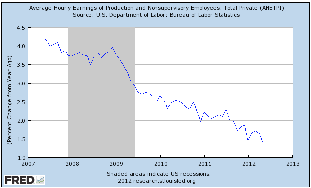
First of all, here is a graph showing YoY growth in average wages for non-supervisory employees. Note that this measures the mean increase rather than the median. You may recall that when we measure by median wages (which unfortunately are only updated quarterly) and by quintiles, the situation is even worse:


Note that measured on a YoY basis, wage growth is declining by about 1/2 percent a year. It took about 4 years for average wage growth to decline from 4% to 2%. We're now at about 1.5% meaning if the trend continues, in about 3 years wages will be completely stagnant on average.

And that's before we take inflation into account.

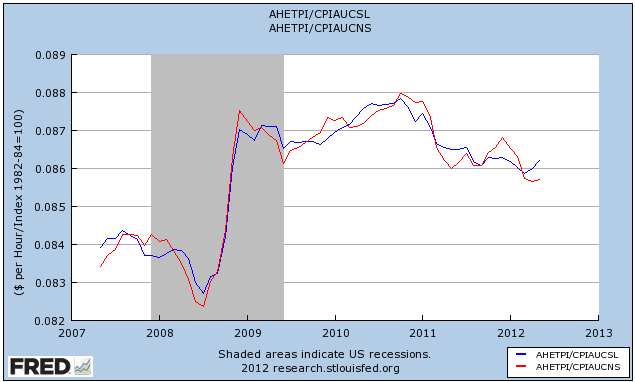
Here are real wages adjusting for inflation for the last 5 years. The effect of the price of oil plummeting at the end of 2008 was to increase real wages. Since that time the oil choke collar has tightened the noose again:


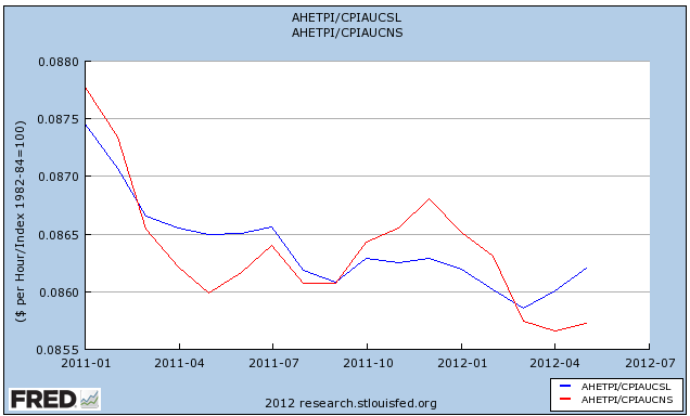
In the graph above I've measured the CPI in both seasonally adjusted (blue) and non-seasonally adjusted terms (red). When you pull into a gas station you aren't offered the "seasonally adjusted price of gas," you pay the price on the pump. Thus in measuring the effect of the Oil choke collar on the average American's finances, the non-seasonally adjusted CPI is probably the better measure. Note that by so doing, we can see big downdrafts in real wages in early 2011 and to a lesser extent in early 2012, with an intervening increase during the second half of 2011, as shown when we zoom in on 2011-12:


This dynamic goes a long way towards explaining why we are seeing stalls in economic growth in the first half of the last 3 years, and re-acceleration in the second half, and why the second half of 2010 had the highest quarterly GDP since the recession bottomed.

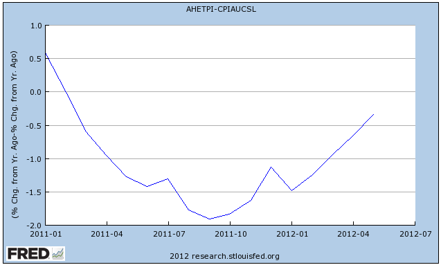
Depending on how you measure, in the above graph it looks like real wages may have made a short term bottom in March or April. As a result, measured YoY real wages may turn positive as soon as July:


That plus the sharp increase in refinancing ought to translate into more consumer spending, and it is spending that leads jobs, not the other way around. Indeed, the more the rest of the world falters, the more inflation in the US will ease, and American families will get a respite from real declining wages.

But only for a limited time. The ligatures are tightening, we have only a short time left, and it ought to be setting off a general alarm in Washington -- but alas official Washington is too busy summoning Jamie Dimon so that they can compete to tongue-wash his shoes.

Morning Market Analysis: Long-Term Bear Markets In More Than a Few Places


The Italian and Spanish weekly charts are nearly identical in their interpretation.  The price chart itself is very weak with prices below all the EMAs and all the EMAs moving lower.  Each chart has tried to rally over the last few weeks, only to fall short below the EMA.  Volatility is increasing (although it is higher for the Spanish market), momentum is negative, and volume flow is negative.  The only good sign is the volume spike on the Spanish chart may signal selling exhaustion.  Since late Spring 2011 (a little over a year ago), the Italian market has fallen by about 44% and the Spanish has fallen by 45%.  That's solidly in bear market territory.


With the weekly Russian cahrt, I can merely add, "ditto."  At least the drop is less -- only coming in at 38%,


The Indian market has been dropping for a bit longer -- since the end of 2010.  However, we see an overall price drop of 39.4% over the last year and a half.


And the Brazilian market is down about 32% since the beginning of 2011.


Monday, June 18, 2012

Bonddad Linkfest

  1. Policy paralysis hurting growth (FT)
  2. India holds rates (FT)
  3. Bank of India's mid-quarter policy review (RBI)
  4. The right gives GOP hell over Obamacare and Taxes (TPM)
  5. Can any president succeed today? (WaPo)
  6. Why the Republicans oppose the individual mandate (Exra Klein)
  7. Unless and Except (the Big Picture) 
  8. Offsetting the trade deficit (Carpe Diem)

Brazil's Economy Turns Negative

From the FT:


Brazil’s economy was likely to have contracted in April compared with a year earlier – the first such decline since September 2009, according to a central bank leading indicator.

The Banco Central do Brasil’s IBC-Br economic activity index for April contracted 0.02 per cent, indicating that the global slowdown, which has undermined demand for Brazilian exports and investment, is beginning to weigh on the country as much as during the 2008 financial crisis.

“It’s hard to draw some good conclusions from these numbers,” said Guilherme Loureiro, economist at Barclays Capital in São Paulo. But he said government stimulus measures should help the economy recover during the second half of the year.
 
Brazil’s growth has become the slowest of the so-called Brics club of large emerging economies that also includes Russia, India and China.

Last Week's Economic Numbers Were Not Encouraging

Last week, we received a some important numbers on the US economy.  Unfortunately, most were not good.

First, I covered retail sales here and drew the following conclusion:
The next 2-3 months of data are now very important in this series.  We need more data to determine if the gas story is the real story, or whether the general merchandise story continues.  We really need to keep an eye on auto sales; a drop there would be very damaging.

For now retail sales are flashing yellow.
Next up is producer prices:
The Producer Price Index for finished goods fell 1.0 percent in May, seasonally adjusted, the U.S. Bureau of Labor Statistics reported today. Prices for finished goods moved down 0.2 percent in April and were unchanged in March. At the earlier stages of processing, prices received by manufacturers of intermediate goods decreased 0.8 percent in May, and the crude goods index fell 3.2 percent. On an unadjusted basis, prices for finished goods advanced 0.7 percent for the 12 months ended in May, the eighth straight month of slowing year-over-year increases following a 7.0-percent rise for the 12 months ended September 2011.
Part of this is good for consumers because it means they are not getting hit by inflation.  But it also means a lack of demand is lowering the price of raw materials, which is a signal of an economic slowdown.

And then we have CPI:
The Consumer Price Index for All Urban Consumers (CPI-U) decreased 0.3 percent in May on a seasonally adjusted basis, the U.S. Bureau of Labor Statistics reported today. Over the last 12 months, the all items index increased 1.7 percent before seasonal adjustment.
The previous comments apply here as well.

We also got industrial production numbers from the Federal Reserve:
Industrial production edged down 0.1 percent in May after having gained 1.0 percent in April. A decrease of 0.4 percent for manufacturing production in May partially reversed a large increase in April. Outside of manufacturing, the output of mines advanced 0.9 percent in May, while the output of utilities rose 0.8 percent. At 97.3 percent of its 2007 average, total industrial production in May was 4.7 percent above its year-earlier level. Capacity utilization for total industry declined 0.2 percentage point to 79.0 percent, a rate 1.3 percentage points below its long-run (1972--2011) average.
The big hit here came from the consumer market, as none of the consumer industrial groups registered an increase.

And the Empire State Index dropped, but is still slightly positive:
The June Empire State Manufacturing Survey indicates that manufacturing activity expanded slightly over the month. The general business conditions index fell fifteen points, but remained positive at 2.3. The new orders index declined six points to 2.2, and the shipments index fell a steep nineteen points to 4.8. Price indexes were markedly lower, with the prices paid index falling eighteen points to 19.6 and the prices received index dropping eleven points to 1.0. Employment indexes also retreated, though they still indicated a small increase in employment levels and a slightly longer average workweek. Indexes for the six-month outlook were generally lower than last month’s levels, suggesting that optimism was waning somewhat, with the future general business conditions index falling to 23.1, its fifth consecutive monthly decline.
Right now, positive growth is hanging on by a thread.


Morning Market Analysis

Let's start the week by looking at where we are in the bigger cycle -- the monthly charts:


The QQQs are right at long0term support (long-term here meaning a three year uptrend).  While the EMA picture is good, notice that momentum has stalled and prices are fairly weak (the RSI).  A move below the 60 area would signal the end of a three year rally, with the 20 and 50 week EMAs as the next logical support level.


The SPYs are also nearing a three year support level.  Also note that prices rallied to resistance around the 140 level (a price level established in late 2007) and have not moved lower.  The MACD reading -- one of equal heights and about to give a sell signal -- is not encouraging.


The IWMs have rallied into the upper 80s/lower 90s twice over the last year, only to be rebuffed.  More importantly, the latest rally was to a lower high -- another technical development that is concerning.  And, momentum is declining.

Technically, on the long term charts, the averages are at (in the case of the QQQs) or near very important technical levels.  In addition, we see a weakening MACD situation across the board, which is not encouraging.  On the positive side, volatility is low and the CMF's are positive.  However, there are chinks in the armor of the market.

Now let's turn to the bond market, and again look at the various elements of the curve from a monthly perspective:


The entire treasury curve is in the middle of a long-term (and by long-term, I mean multi-year) rally.  The SHYs (top chart) are compressing, but that's because shorter yield literally have very little room to move lower.  The IEIs (5-7 years and second chart from the top) are in the middle of a multi-year rally; notice the strong EMA position.  The IEFs and TLT are also showing a very strong multi-year trend, especially from the EMA perspective.

What do these two sets of data tell us?

1.) The equity markets are starting to teeter on the edge of breaking long-term upward sloping trend lines at the same time that treasury bonds are rallying.  This means the rally which we've seen in the equity markets over the last three years is, by definition, weak.