Saturday, December 7, 2013
Weekly Indicators for December 2-6 at XE.com
- by New Deal democrat
Weekly Indicators are up over at XE.com.
Thanksgiving Day wreaked some havoc with a number of seasonally adjusted comparisons YoY, but the thrust is still positive.
By the way, thanks to those commenters who pointed out the glitch with my ISM graphs disappearing. Their IT guy assures me he is working on it. If it isn't fixed in a couple of days, I can repost a graph here.
One thing Bonddad and I can't do is crosspost pieces, although we do link and use teasers. So far it is working well, driving increased traffic there, as well as a noticeable uptick in traffic here. Beginning this week, our XE pieces are going to be blasted out to 200,000+ subscribers, so that is pretty cool!
And we are assured that the improvements will slowly continue.
Friday, December 6, 2013
On Social Security, "doing nothing" is the best option with a GOP House
- by New Deal demorat
Duncan Black a/k/a Atrios, acknowledges that part of his campaign to espand Social Security benefits, is to put "doing nothing" on a firmer footing.
In fact, over the next 20 years, unless job creation and real wages suddenly accelerate on a secular basis, "doing nothing" isn't enough. There is a real, albeit small and fixable, problem with the Trust Fund. Bruce Webb of "Social Security defenders" has acknowledged that this is why he came off the "doing nothing" fence and endorsed the "Northwest Plan" which solves the shortfall by increasing tax withholding.
As I've shown in the last few weeks, the problem can be fixed for so long as the grandchildren of today's children live, by a reasonable combination of small tax withholding increases, increases in the percentage of income subject to the tax, an increase of about 3 to 4 months in the ultimate retirement age, and alternatively, if necessary, about a 3% cut in benefits over the next 20 years. Atrios disagrees with me, but he's wrong.
But there is simply no reason to enter into a bargain, Grand or otherwise,with a GOP that wants to destroy Social Security, whether in small steps or all at once. Making the Social Security Trust Fund solvent forever can abide the election of a democratic majority in both Houses of Congress.
November jobs report: a solid positive month (but still not good enough)
- by New Deal democrat
In November 203,000 jobs were added to the US economy. The unemployment rate dropped sharply, down 0.3% to 7.0% -- and for once it included an increase in the labor force as well as a decline in the number of people without jobs. There is little in this report for Doomers to latch onto - although the percent of the working age population that is employed remains near its post-recession low, and this November's reading was 37,000 less than last November's +240,000 report.
First, let's look at the more leading numbers in the report which tell us about where the economy is likely to be a few months from now. These were all positive.
- the average manufacturing workweek rose 0.1 hour from 40.9 hours to 41.0 hours. This is one of the 10 components of the LEI and will affect that number positively.
- construction jobs increased by 17,000.
- manufacturing jobs rose by 27,000.
- temporary jobs - a leading indicator for jobs overall - increased by 16,400.
- the number of people unemployed for 5 weeks or less - a better leading indicator than initial jobless claims - fell by 300,000 reflecting the return to work of those laid off during the government shutdown and is near its post-recession low.
Now here are some of the other important coincident indicators filling out our view of where we are now:
- The average workweek for all nonsupervisory workers increased by 0.1 hour from 33.6 hours to 33.7 hours.
- Overtime hours increased from 3.4 hours to 3.5 hours.
- the index of aggregate hours worked in the economy surged by 0.5 from 98.8 to 99.3. This is also a post-recession record.
- The broad U-6 unemployment rate, that includes discouraged workers declined from 13.8% to 13.0%, also a post-recession low.
- The workforce rose by 561,000. Part time jobs fell by -331,000.
- the alternate jobs number contained in the more volatile household survey increased by 818,000 jobs, reversing the government shutdown -735,000 in October, for a net gain of 83,000.
- Government jobs once again decreased by 7,000.
- Combined revisions to the September and October reports totalled a net gain of 8,000 jobs.
- average hourly earnings increased $.04 to $24.15. The YoY change decreased from +2.2% to +2.0%, meaning that YoY average real wages probably actually declined in November, given the epected +0.3% rise in consumer prices..
- the employment to population ratio increased 0.3% to 58.6%, which again just reversed October's decline likely due to the government shutdown. The labor force participation rate actually rose 0.2% to 63.0%
All in all, this was a solid report. Everything moved in the right direction, and for the right reasons. The employment-to-population, however, remains stuck near its all time low. There is no reason to doubt that this continues to be partly due to people simply giving up on the idea of ever working again, and partly due to burgeoning Boomer retirements. And of course, even a solid report like this simply isn't good enough to put a big dent in the population-adjusted lost jobs since the onset of the Great Recession.
Thursday, December 5, 2013
Pensions and Bankruptcy: a fix is available and should be enacted by Congress
- by New Deal democrat
Yesterday a bankruptcy judge decided that, Michigan's Constitution notwithstanding, the city of Detroit could be admitted into bankruptcy and its pensions attacked.
As an initial matter, the decision is probably correct as far as it goes, i.e., Federal laws are supreme over state laws, so US bankruptcy law trumps Michigan's Constitution. Where I have a real problem is that Michigan, at its most fundamental level, sought to make it ultra vires (outside of their lawful powers) for any actor to file for municipal bankruptcy in that State. You an I can't simply march into US bankruptcy court and put General Electric into bankruptcy. We have to have the lawful right to make the filing. Michigan said that nobody had the right to make a lawful filing as to its municipalities. In my opinion, that should have been enforced against the State-appointed city manager who made the filing.
But there is a deeper problem, and that is the cavalier attitude towards pensions that has been allowed to exist in US bankruptcy courts for 25 years. If you haven't seen it yet, watch the interview with the elderly, retired Detroit municipal worker who worked for his pension for 40 years and now faces having his retirement income severely cut (and remember that many of these workers do not qualify for Social Security). He asked, "What do they expect me to do now?"
Since pensions were allowed to be cut in bankruptcies, Congress - including Democrats - has simply shrugged and said, "Too bad." That doesn't have to be the case, and it shouldn't be the case.
In many cases in private industry, corporate raiders attack a well-functioning company sitting on a pile of cash, including its pension funding. After the corporate treasury is raided, the company files for bankruptcy and the pensions are cut or even entirely negated.
There is simply no justifiable reason for this rule. Pension liabilities are publicly known and quantifiable. In many cases the contractual benefits were earned years, and maybe decades, before. All subsequent contractual liabilities are made (and should be deemed made) with full knowledge of those pre-existing liabilities to employees. If there is a bankruptcy, nobody who became a creditor after the vesting of the pension benefits should be allowed to participate in any distribution until those prior contracts are honored.
This doesn't mean that pensions are sacrosanct. It simply means that creditors who obtain their rights under subsequent contracts have to stand in line behind pensioners who earned their rights in previous contracts. In the case of Detroit, it means that somebody who bought a bond issued by Detroit 5 years ago shouldn't get paid until that retired worker's pension previously earned benefits are honored in full.
There are public entities, and corporations as well, that promised too much in pensions. Further, in the case of a necessarily ongoing entity like a municipality, pensions can't be honored in full at the expense of providing necessary municipal services to current residents. But there is simply no reason to put recent bondholders on the same footing as, let alone ahead of line as, pre-existing pensioners.
Under the rule I am discussing here, if I am a potential new bondholder for a city or company that has huge pension liability, I am either not going to buy their bonds, or else I am going to demand a very high interest rate to hedge against the likelihood that the bond issuer is going to default. The net effect is that profligate municipalities will go into bankruptcy sooner, when their finances are in less dire straits - which is a good thing.
In short, there is a federal legislative fix for this problem. It ought to be on the Democrats' agenda, and applicable prospectively to any contracts entered into subsequent to its enactment.
In the meantime, the last several decades have taught workers a brutal lesson: never trust assurances of future payment. I want the retirement funding up front, hived off in a defined contribution account that belongs to me, not my employer.
Wednesday, December 4, 2013
Sorry, Doomers, there really, truly, honestly, STILL is no second US housing bubble
- by New Deal democrat
The Census Bureau released September and October new home sales and median new house price data this morning, and that gives me a chance to update a post I wrote 6 months ago.
They reported that 444,000 new homes were sold in October, which is just below June's 454,000 for the highest number of sales since the Great Recession. September sales were only 354,000, however, which was the lowest since April of 2012. In general, sales as reported look to be going sideways. I suspect that increased mortgage rates will continue to pressure the housing market, and it will be interesting to see if October's blowout housing permits report is an outlier for a flattening or decreasing trend or not.
The Census Bureau also reports on median new house prices, however, and that gives me the perfect opportunity to finish off the debunking of the "second US housing bubble" claim that raised its head this past spring.
About 90% of all housing sold in the US is from existing sales. Only about 10% of houses sold are new houses. Back in June, I debunked a dishonest Zero Hedge graph that divided nominal increases in house prices by inflation-adjusted disposable income, predictably showing that, so measured, house prices were even higher than at the height of the housing bubble. Of course, it turned out that when you did the honest comparison, i.e., nominal-to-nomial or real-to-real, there was no bubble at all.
But the Political Calculations blog was doing a real-to-real comparison of new homes, and there there had been a run-up in late 2012 to April 2013 in prices to near the 2005-06 peak. I suspected it was a short-term phenomenon and not a real bubble, or at best a "minibubble" that would shortly be reversed.
And indeed we now have confirmation that neither new nor existing median house prices in the US have formed any kind of bubble at all.
First of all, let's look at the Case Shiller 20 city index. In the below graph I have deflated the raw price data by average hourly income (blue) and by consumer inflation (red):
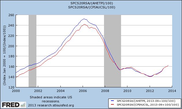
As you can see, existing houses are selling at the price levels they were at in 2001 or 2002, a far cry from the top of the bubble. In fact, since 2009 the general trend is pretty flat. Yes there has been a rebound, and it's certainly possible that the rebound has overshot a little, but this looks nothing like a bubble.
Now let's turn to median new house prices. As measured over 50 years, and once again deflated by average wages (blue) and consumer prices (red) there has been an increase in new home prices:
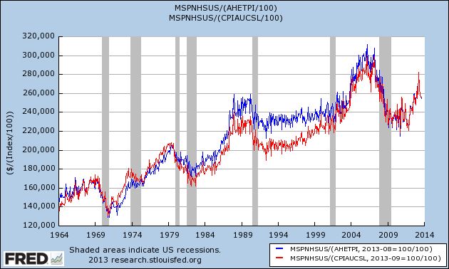
But it's well to keep in mind that the average square footage of a new house increased by something like 25% from 1600 s/f to 2000 s/f over that period. So on a square-foot basis, the overall trend is probably closer to flat.
Further. in the long graph we can see the bubble forming in the early 2000's and then deflating, before rising again to near its former peak in 2012.
Now here is the same data in close-up, better to show the recent trend (note: this does not include this morning's October report showing a median price of $245,800):
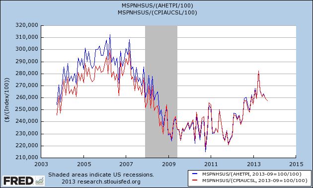
And with this morning's release of new home data we can see that the late 2012/early 2013 run-up in prices has entirely been given back. In fact, the median house price in October 2013 was $1400 lower than October of 2012, even before taking average wage growth of about 2% or inflation of 1% into account.
Keep in mind that the same Doomers who are telling you now that there is a housing bubble are the same Doomers who predicted foreclosure tsunamis that never arrived, and that housing prices wouldn't bottom in early 2012. On the other hand, besides yours truly who called both the top of the bubble as it happened and in summer 2011 that the bottom of the bust would occur in the early months of 2012, three other people who have a, shall we say, pretty decent record in calling the housing market - Bill McBride a/k/a Calculated Risk, Nobel Prize winner Robert Shiller, and Fed Chair nominee Janet Yellen - all agree with me that there is no new US housing bubble now.
Sorry, Doomers. But keep at it, some day things will turn down again.
French and Italian ETFs Trading Right At Support
France and Italy are two of the weaker EU economies, which is reflected in both to their respective ETFs. Although both rallied since mid-summer, they have both traded sideways for the last month as the economic numbers from the EU have weakened. NOw both are trading at their respective support levels, right near the 50 day EMAs. In addition, momentum is weak and the CMF is declining for both.
Tuesday, December 3, 2013
ISM manufacturing suggests above trend GDP growth, decent Nov. and Dec. jobs reports
- by New Deal democrat
I have a new post up at XE.com, showing that yesterday's good ISM manufacturing report suggests 3%+ GDP growth in the 4th quarter, as well as a minimum of 140,000 jobs added in both November and December.
British Pound is Rallying
The above chart shows the pound verses the dollar. Over the last few months the economic news from the UK has been very promising. It has also been better than that coming from the US, which explains the rally that started in August. Prices have spent the last month and a half consolidating between the 157 and 159/160 level. But over the last few days, prices have advanced to just over 161. A strong move upward from here would be a buy signal.
Monday, December 2, 2013
The anatomy of median wage stagnation: paltry wage increases and gyrating gas prices
- by New Deal democrat
Periodically in the last 6 months I have written stories challenging the dominant narrative about "median household income" and "median wages." As to each measure, it has been suggested that there has been no real economic recovery because both fell since 2009. While paltry nominal wage increases averaging only 1.8% since 2009 are an important part of the story, at least as important has been the effect of huge swings in the price of gasoline.
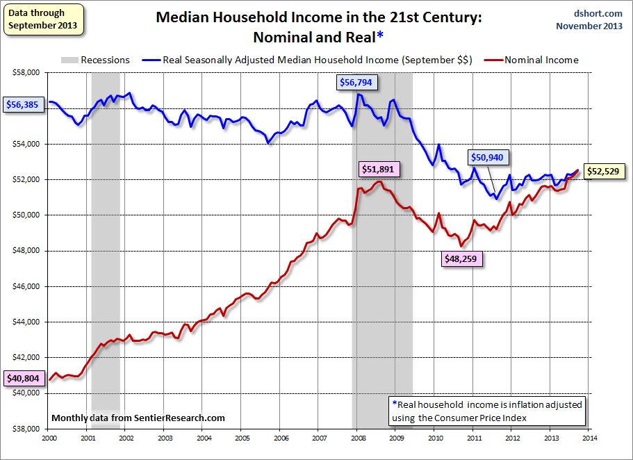
In the case of "median household income," I've shown that the measure is being swamped by the trend of Boomer retirements. Retirement of a wage earner on average causes a decline of about 50% in a household's income. Since households headed by retirees are included in the data, and Boomers are retiring at the rate of about 10,000 a day, the percentage of retiree-headed households is rising, and thus the dominant secular trend in median household income is likely to continue on a downward trajectory for the next decade or more. Despite that, measures of "median household income" have increased slightly since 2011, as shown in this graph from Doug Short's monthly update using data from Sentier Research:
In this post I'm going to update my examination of the other metric, "median wages." There are four specifically median measures of median wages, one from the Social Security Administration, measured two ways, and three from the Bureau of Labor Statistics. The former measure by the SSA was just updated for 2012 and caused a stir, because it showed a very slight further decline from 2011, but essentially this compared the situation 12-24 months ago with that of 24-36 months ago.
In my previous post, I noted that whether median real wages are declining or not depends very much on your starting point. In summary,
1. Real median wages did decline during the recovery from 2009 into 2012, but
2. Real median wages actually rose during the great recession, and by roughly the same amount.
3. Meaning that median wages measured from any period from 2007 or earlier up until the start of the Millennium have generally stagnated.
4. The primary reason median wages rising during the worst recession in 75 years and falling thereafter is the same: real median wages (blue) have been the mirror image of gasoline prices (red):
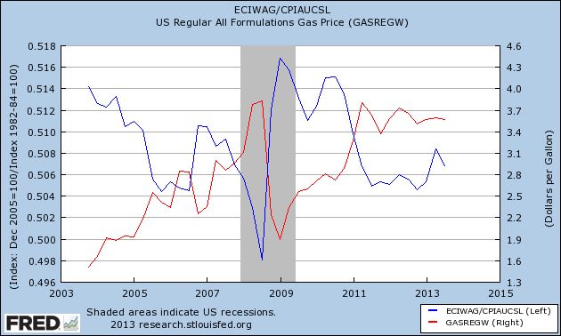
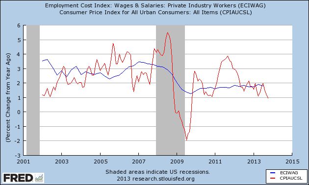
Between 2000 and 2007, nominal wages rose by about 3% a year - and so did consumer inflation. Increases in nominal wages fell during and right after the recession to as low as 1.3% YoY in late 2009, and since 2011 nominal wage increases have averaged only 1.8% YoY.
With that backdrop, let's update the 4 measures of median wages. Are they "still falling," as implied by some of the commentary describing the 2012 Social Security Administration release, or have they hit bottom?
The above measure by the Social Security Administration is annual net compensation and is derived from actual W-9 tax withholding forms. Two other measures are compiled by the Bureau of Labor Statistics, which conducts the household employment survey, reports "usual weekly earnings" for full time workers each quarter. Separately, it also keeps track of occupational employment statistics which are reported annually. Finally, I have also included the BLS's Employment Cost Index which is also released quarterly.
Here's the table of all four calculations, updated to show the recent reports. Remember that all measure the median, i.e., 50th percentile, and all are adjusted for inflation. The peak in wages is bolded. One series shows a bottom, and that is italicized:
| Year | Social Security | Usual weekly earnings | Occupational Employment | Employment Cost Index |
|---|---|---|---|---|
| 1999 | 27,164 | --- | --- | --- |
| 2000 | 27,374 | --- | --- | --- |
| 2001 | 27,713 | --- | 16.78 | 116.3 |
| 2002 | 27,784 | --- | 16.95 | 117.2 |
| 2003 | 27,657 | --- | 16.91 | 118.0 |
| 2004 | 27,903 | 785 | 16.80 | 117.3 |
| 2005 | 27,331 | 774 | 16.71 | 116.3 |
| 2006 | 27,832 | 774 | 16.80 | 116.8 |
| 2007 | 27,984 | 778 | 16.70 | 115.9 |
| 2008 | 27,468 | 778 | 17.22 | 119.7 |
| 2009 | 27,584 | 801 | 17.12 | 117.9 |
| 2010 | 27,382 | 797 | 17.13 | 118.1 |
| 2011 | 26,963 | 781 | 16.86 | 116.6 |
| 2012 | 26.959 | 778 | 16.71 | 116.7 |
According to my calculations, the employment cost index for wages bottomed in 2011 and rose slightly in 2012, while real median wages were down ever so slightly in 2012.
The decline in each series from peak to trough is -3.6% for Social Security, -3.4% for hourly adjusted Social Security, -4.1% for usual weekly wages, -3.0% for the employment estimates, and -2.6% for the Employment Cost Index.
Two of the above series, Usual Weekly Wages and the Employment Cost Index, are updated quarterly, se can get a more granular look at wage trends, and also see how 2013 is shaping up so far. The below table does that, starting with the first quarter of 2007:
| Quarter | usual weekly earnings | Employment Cost Index | |
|---|---|---|---|
| Q1 2007 | 336 | 118.5 | |
| Q2 | 335 | 118.1 | |
| Q3 | 336 | 118.2 | |
| Q4 | 332 | 117.7 | |
| Q1 2008 | 335 | 117.4 | |
| Q2 | 335 | 116.7 | |
| Q3 | 331 | 115.6 | |
| Q4 | 340 | 118.8 | |
| Q1 2009 | 344 | 120.0 | |
| Q2 | 345 | 119.7 | |
| Q3 | 345 | 119.1 | |
| Q4 | 344 | 118.6 | |
| Q1 2010 | 344 | 118.9 | |
| Q2 | 342 | 119.5 | |
| Q3 | 342 | 119.6 | |
| Q4 | 342 | 119.2 | |
| Q1 2011 | 338 | 118.3 | |
| Q2 | 336 | 117.6 | |
| Q3 | 336 | 117.2 | |
| Q4 | 335 | 117.3 | |
| Q1 2012 | 335 | 117.2 | |
| Q2 | 337 | 117.5 | |
| Q3 | 333 | 117.1 | |
| Q4 | 334 | 117.3 | |
| Q1 2013 | 331 | 117.3 | |
| Q2 | 334 | 117.7 | |
| Q2 | 333 | 117.6 |
The above quarterly data shows that the decline in real median wages appears to have stopped in the third quarter of 2012, and the Employment Cost Index to have bottomed in the first quarter of 2013.
In summary, in the longer view since the turn of the Millenium, real median wages have stagnated. Gas prices caused them to rise during the recession, and then decline thereafter as the effects of those gas prices filtered through the economy, and nominal wage increases averaged a poor +1.8% annually. Annual measures which have only been updated through 2012 do not yet show a bottom, but more timely quarterly measures suggest that, with the slight decline in YoY gas prices for most of 2013, real median wages have risen slightly.
Junk Bond ETF Breaking Out on Daily Chart
The junk bond ETF (JNK) has been in a short rally since mid-August. Prices moved through the upper 39 level in mid-October, pulling the shorter EMAs with them. Momentum is about to print a buying signal and money is flowing into the market.
The weekly chart also shows a strong multi-yearrally that started in the 3Q11 and continues to this day. Prices have followed a very nice pattern of rallying followed by consolidation. Also note the technical confirmation from both the MACD and CMF.
Subscribe to:
Comments (Atom)


