Saturday, March 9, 2013

Weekly Indicators: confusing consumer spending reports edition


 - by New Deal democrat

Monthly data released in the past week was dominated by yesterday's payroll report, showing 238,000 jobs added, and both the U3 and broad U6 unemployment rates declining slightly to new post-recession lows. The participation rate remained generally flat. Other reports included the ISM services report, up and signalling good expansion in the services sector. Factory orders, however, declined. Customer credit increased, as did wholesale inventories.

Let me remind readers that this look at high frequency weekly data is not predictive, but attempts to capture the most up to the minute pulse of the economy in the present. As I've done for the last few weeks, due to the recent payroll tax increases, let's start again this look at the high frequency weekly indicators by checking what is happening with tax withholding:

Employment metrics
Daily Treasury Statement tax withholding

  • $149.6 B (adjusted for 2013 payroll tax withholding changes) vs. $156.7 B, -4.5% YoY for the last 20 days.  The unadjusted result was $172.1 B for a 9.8% increase.
Initial jobless claims
  •   340,000 down 4,000

  •   4 week average 348,750 down 6,250
American Staffing Association Index
  • up 1 to 90 w/w up 3.2% YoY
Employment metrics were again mixed this week.  Initial claims have established a new lower range of between 330,000 to 375,000.  The ASA is still running slighty below 2007, and slightly ahead of last year.

I am adjusting my YoY tax withholding figures to reflect the increase in personal withholding taxes. While the YoY collections are up substantially, they should be up over 15% to compensate for the tax increase.  Since I can think of no reason why employment itself should have fallen off a cliff in January, it is very possible that there is a lag in the payment of withholding taxes with the new increase.  If this hypothesis were correct, I would have expected tax withholding to be much more reliable by about now. So far, that isn't happening.

Consumer spending Gallup has been very positive for 3 months. After tailing off in late February, there was another splurge of spending (over $100/day on the survey) in the first few days of March.  The ICSC varied between +1.5% and +4.5% YoY in 2012. with one excpetion, the report for the last few weeks has been near the bottom of this range.. The JR report this week is in the middle of its typical YoY range for the last year.  Even in the worst case, it still looks like consumer spending has not collapsed due to the tax withholding increase. The rebound in the last several weeks may be due to tax refunds finally arriving in consumers' hands.

Housing metrics

Housing prices
  • YoY this week. +3.9%
Housing prices bottomed at the end of November 2011 on Housing Tracker, and have averaged an increase of +2.0% to +2.5% YoY for the last year. For the fourth week in a row, this week was the best YoY comparison in about 7 years.

Real estate loans, from the FRB H8 report:
  • +0.3% w.w

  •  +0.5% YoY

  • +2.4% from its bottom
Loans turned up at the end of 2011 and averaged about 1% gains YoY through most of 2012, but recently showed somewhat more YoY strength.  In the last few weeks have been less positive.

Mortgage applications from the Mortgage Bankers Association:
  • +15% w/w purchase applications

  • +17% YoY purchase applications

  • +15% w/w refinance applications
Purchase applications had been going sideways for 2 years. In the last couple of months they have finally broken out of that range - slightly - to the upside.  Refinancing applications were very high for most of last year with record low mortgage rates, but did decreased recently with an increase of mortgage rates. In the last week, mortgage rates declilned again, and refinancing went up.

Interest rates and credit spreads
  •  4.78% BAA corporate bonds down 0.09%

  • 2.00% 10 year treasury bonds down -0.12%

  • 2.78% credit spread between corporates and treasuries incrreased +0.03%
Interest rates for corporate bonds have generally been falling since being just above 6% two years ago in January 2011, hitting a low of 4.46% in November 2012.  Treasuries have fallen from about 2% in late 2011 to a low of 1.47% in July 2012. Spreads have varied between a high over 3.4% in June 2011 to a low under 2.75% in October 2012.  The  last several months have seen a marked increase in rates and credit spreads have widened slightly.

Money supply

M1
  • +0.1% w/w

  • -0.6% m/m

  • +9.4% YoY Real M1

M2
  • -0.2% w/w

  • -0.1% m/m

  • +5.1% YoY Real M2
Real M1 made a YoY high of about 20% in January 2012 and has generally been easing off since.  This week's YoY reading remained above a new low set several weeks ago.  Real M2 also made a YoY high of about 10.5% in January 2012.  Its subsequent low was 4.5% in August 2012.  It was weak once again this week.  Both are still quite positive in absolute terms. In absolute terms, M2 made a high 2 months ago and is down -0.9% from that peak. The behavior of M2 thus bears close scrutiny.

Oil prices and usage
  •  Oil $91.95 up $1.27 w/w

  •   gas $3.76 down $0.02 w/w

  • Usage 4 week average YoY +1.1%
Although the price of a barrel of Oil has backed off recent seasonal highs, and are actually down $.03 YoY  Unusually for the last year plus, the 4 week average for gas usage for the fifth week in a row was positive YoY.  This may be due to winter weather having been actually winter-like this year.

Transport

Railroad transport from the AAR
  •  +600 or +0.2% carloads YoY

  • +1400 or +0.8% carloads ex-coal

  • +20,000 or +9.7% intermodal units

  • +22,500 or +4.4% YoY total loads
Shipping transport Rail transport appears to have returned to its pattern from last year.  Traffic ex-coal has now returned to being positive for the third week in a row.  The Harpex index remains slightly off its 3 year low of 352, and the Baltic Dry Index remains above its recent low.

Bank lending rates The TED spread increased slightly from its 18 month+ low.  LIBOR remained at its new 52 week low and is close to a 3 year low.

JoC ECRI Commodity prices
  • down 0.87 to 126.74 w/w

  • +0.59% YoY
I am really not sure what to make at all at this point of tax withholding. Unadjusted of course it is running very well above last year. But it should be about 15% higher, after adjusting for the payroll tax increase, not 10%, and we are now more than 2 months into the year. ICSC and Johnson Redbook consumer spending came in rather weak. And then there is Gallup consumer spending, which after a pause, is back on a tear. This is a thoroughly confusing picture.

Relatively weak comparisons included commodities, real estate loans, and bank credit rates and spreads. M2 money supply has declined since the first of the year.

In addition to Gallup consumer spending, other continuing positives once again include housing prices and mortgage applications. Bank lending rates remain positive.  Gas usage remains positive, and Oil prices are more accomodating. Initial claims are very positive. Rail traffic was also positive again, even including coal.

Only commodities and tax withholding adjusted for increased rates, plus real M2 measured from the beginning of this year are outright negative. Still, many of the others are less positive than they used to be, and are close to neutral. Thus I remain more cautious than in recent months.

Have a nice weekend.

Friday, March 8, 2013

Weekend Weimar, Beagle and Pit Bull

It's that time of the week again.  NDD will be here tomorrow.  I'll be back Monday, until then, enjoy some pictures of the pups eating ice cream:


ECRI and the stock market: I report, you decide


. - by New Deal democrat

In its most recent defense, ECRI has sought to downplay the fact that the S&P 500 has been rising to new highs long after the beginning of its alleged recession in July 2012. Most recently this morning in a television interview they claimed that no bear market had ever occurred during the recessions of 1926-27, 1945, and 1980.

To begin with, even under ECRI's own chosen metric, the stock market has appropriately reacted to recessions in 12 of the 15 instances of recession in the last 90 years.

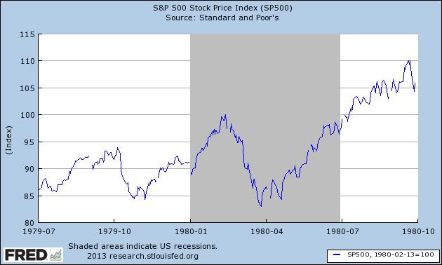
But there are further problems with its analysis. In the first place, by specifying a "bear market" as the metric, they are cherry picking. For, in the 6 month long 1980 recession, the stock market did make a peak less than 45 days in, on February 13, and thereafter fell 17% to a 52 week low in April, before rising again and thus predicting the end of that short recession:


So the 1980 recession performance of the stock market actually supports ECRI's critics, rather than ECRI.

Secondly, the 1945 demobilization recession only lasted 8 months. So the stock market did not rise through a recession that lasted longer than 8 months - where ECRI says we are now - in 1945. That only happened once in the last 90 years - in the 13 month long 1926-27 recession.

So there are 14 instances that either don't support or outright contradict ECRI's claim, to only 1 instance in support.

So which conclusion looks more compelling to you?

While I'm at it, a similar likelihood plays out with regard to nonfarm payrolls, which, according to ECRI, have now risen for 7 straight months into their recession. This length of a continued upturn has only happened exactly 1 time since World War 2 - in 1974. Payrolls turned down at worst only 3 months into each and every other recession.

And initial claims have never continued to decline after the onset of a recession. And vehicle sales have never continued to rise after the onset of a recession. but they made a their most recent high in November.

And the ISM manufacturing index - now over 54 - similarly has only been at this high a level only once in any recession since World War 2 - declining through it in the 1974 recession.

So we either have a recession that is an exception to boatloads of reliable data from other recessions - ECRI's position. Or else no recession started in July in which case ECRI is wrong for the 4th time in the last year and a half about the onset of recession.

I report, you decide.

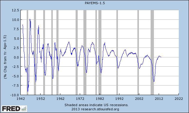
Update: ECRI just published a piece at their site, claiming that the YoY% growth in employment is recessionary - with a graph going back exactly one year. Just in case you're interested, here is the exact same graph extended back 70 years:


Yep, it sure look recessionary! Well, except for 1952, 1964, 1987, 1994, and 2002-03!

Employment +236,000; Unemployment at 7.7%; Finally a Better Than Average Report

From the BLS:

Total nonfarm payroll employment increased by 236,000 in February, and the unemployment rate edged down to 7.7 percent, the U.S. Bureau of Labor Statistics reported today. Employment increased in professional and business services, construction, and health care.

On the surface, these are good numbers.  The total number of jobs has increased over 200,000 and the unemployment rate ticked down .2%.

The employment-population ratio held at 58.6 percent in February. The civilian labor force participation rate, at 63.5 percent, changed little.

These numbers tell us that on a macro scale comparing the total number of employed to the total population, nothing really changed last month.

In looking at the establishment data, let's start with this nugget:

In February, employment in construction increased by 48,000. Since September, construction employment has risen by 151,000. In February, job growth occurred in specialty trade contractors, with this gain about equally split between residential (+17,000) and nonresidential specialty trade contractors (+15,000). Nonresidential building construction also added jobs (+6,000).

Yes -- it's only one month of data.  But it indicates that the housing rebound is starting to have a positive impact on construction employment -- long a laggard in the statistics.  This is a very good development.

Professional and business services added 73,000 jobs in February;
The health care industry continued to add jobs in February (+32,000).
Employment in the information industry increased over the month (+20,000),
Employment continued to trend up in retail trade in February (+24,000).

So -- we see good gains across the spectrum

However -- the really good news is here:

In February, the average workweek for all employees on private nonfarm payrolls edged up by 0.1 hour to 34.5 hours. The manufacturing workweek rose by 0.2 hour to 40.9 hours, and factory overtime edged up by 0.1 hour to 3.4 hours. The average workweek for production and nonsupervisory employees on private nonfarm payrolls increased by 0.2 hour to 33.8 hours. (See tables B-2 and B-7.)
 

Average hourly earnings for all employees on private nonfarm payrolls rose by 4 cents to $23.82.  Over the year, average hourly earnings have risen by 2.1 percent. In February, average hourly earnings of private-sector production and nonsupervisory employees increased by 5 cents to $20.04. (See tables B-3 and B-8.)

The workweek and earnings increased.  And the increase in actual earnings was pretty large by one month standards.

On a scale of 1-10, this report is a 7.5.

----------------
NDD here with a few additional comments:

As usual for me, let's emphasize the forward-looking indicators:
  • the manufacturing workweek increased .2 hours to 40.9.  This is a component of the LEI.
  • temporary jobs increased 16,000.  These turn before the overall report.
  • manufacturing jobs increased 14,000.  These also usually lead.
  • the number of those unemployed between 0 and 5 weeks decreased by -99,000. This metric tends to turn before weekly initial jobless claims.
  • the household survey showed 170,000 jobs added.  This survey, while more volatile, tends to turn before the establishment survey which gives us the "headline" number.
Among coincident data,
  • aggregate hours increased by .5, with the index increasing to 97.8, its highest reading since before the 2008-09 recession.
  • the U6 unemployment rate declined 0.1% to 14.3%, a new post-recession low.
  • construction jobs added 58,000. The new health in this sector continues to appear.
  • average hourly earnings increased $.04 to $23.82.  Average hourly earnings are up 2.1% YoY, which, since inflation is only up 1.6% YoY means that Joe/Jane Sixpack's paycheck has started to grow in real terms.
This is an unambiguously good report.  The only caveats are that there may be some remaining seasonality in the numbers, because February has been a good month repeatedly for the last several years.  The second caveat, of course, is that the report is not good enough.  The employment to population ratio is stubbornly low at 58.6%, meaning it will take more or less forever at this rate to make up for all of the jobs lost during the Great Recession on a population-adjusted basis.

Finally, the forward looking internals in this report are not consistent with a recession.  Also, despite the flailings of the forecasting service that continues to insist that a recession started in September 2011, oops no in the first quarter of 2012, oops again by midyear 2012, oops no this time we really mean it in July 2012, sometines employment continues to rise in the early stages of a recession.  Well, in only one recession in the last 90+ years has employment risen more than 3 months into a recession (8 months in 1974).  We are now allegedly 7 months into this recession, and we have added far more jobs than in 1974.

Morning Market Analysis: Rally Still In Place


The above chart has the SPYs in 15 minute intervals since the end of December.  Notice that -- with the exception of the late February sell-off -- the same trend line supports the entire rally.  An argument could be made that the sell-off formed a reverse head and shoulders formation, but I think the actual formation is a bit weak for that description to stick.


On the daily chart, note that while the actual candles and underlying volume are a bit weak, the other technicals are still very strong.  The MACD has given a but signal and the CMF shows volume inflow.  In addition, the EMA picture is very strong.


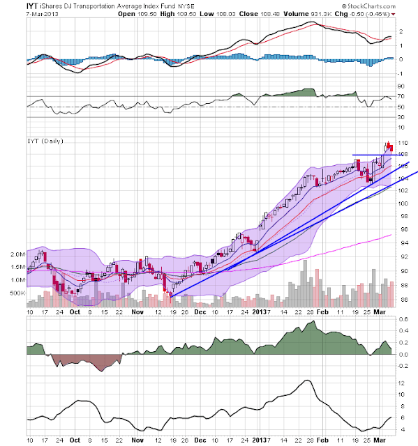
The underlying technicals for the transports are similar to those of the SPYs.  What is important with this that is that the transports are also moving into record territory, confirming the SPYs move.


And finally, we have the Russell 2000 ETF, which is also confirming the new move higher.


Thursday, March 7, 2013

Who's Economically Healthy And Who's Not?

The following table is from the latest Taiwan export figures.  It shows the year over year and month over month percentage growth of exports to various regions of the world:


Feb.
Jan. - Feb.

Amount
As % of  All Exports
Annual Change Rate
Amount
As % of  All Exports
Annual Change Rate
Mainland China &   Hong Kong
7,216
36.6
-21.8
17,525
38.6
4.3
U.S.A.
2,056
10.4
-11.9
4,600
10.1
-4.2
Japan
1,427
7.2
0.5
3,013
6.6
8.7
Europe
1,871
9.5
-17.2
4,290
9.4
-7.3
ASEAN-6
3,947
20.0
-10.9
8,740
19.2
6.9


The first and most obvious point to make is the year over year numbers are down by large amounts.  This data point really highlights the slowdown that has occurred over the last 9-12 months, especially in China.  However, the slowdown to the EU region of 17.2% also highlights how that region's recession is really hurting global growth.

But also pay attention of the month to month percentage change in China, Japan and the ASEAN-6, indicating that overall this is where global growth is occurring right now.

Where's Growth? Part II: South America

Let's continue out look at happy chart porn, by showing you some of the various GDP prints from Latin America:

 Let's start with Mexico, which has been printing solid rates of growth for the duration of this expansion.


Peru has also been printing some impressive growth rates, again for the duration of the expansion.

While the latest GDP print from Columbia is disappointing, the country has been printing some great numbers prior to that.

And finally there is Chile, which has been very impressive in its growth as well.


A note about initial claims


- by New Deal democrat

Weekly initial unemployment claims were reported this morning at 340,000. The 4 week average of new claims fell to 348,750 - a five year low.

Both of these numbers are close to what we would expect in a "normal" expansion, which I would expect to show claims of 335,000 or less.

I'd like to point out two things.

First, yesterday the forecasting service which initially forecast a recession beginning in August, September, or October 2011, issued a new report cherry-picking data series to back up version 4.0 of their claims (that being that recession started in July 2012. Version 2.0 was recession probably starting in the first quarter of 2012, and version 3.0 was recession starting by midyear 2012). For example, twice in the last century the stock market has continued to rise through a recession (and all of the other times it peaked before or shortly after the onset of the recession). So, we were told to ignore the stock market and focus on, inter alia, money velocity, which has been declining for several years - even though for the majority of recessions since World War 2, money velocity has risen into recessions and declined thereafter.

Well, initial jobless claims have never fallen to new lows after the onset of a recession. Not even once. Ever!

Which highlights the second point, which is that sequestration probably means that initial claims are shortly going to begin to rise. It is disgraceful that Washington DC is so myopic or malicious that it is willing to risk putting the economy back into a downturn just when employment - you know, the statistic probably most important to most people - is reaching this point.

Morning Market Analysis


After falling back to the 27 level, the homebuilding ETF has rallied, again reaching the 29.5 price level.  While the underlying technicals are positive -- the MACD has given a buy signal and the CMF has turned positive -- there is a weak volume reading that's mildly concerning.  However, no bull chart s perfect.


The Canadian dollar is in the middle of a drop.  The 6 month daily chart (top chart) shows that prices are at 6 month lows.  They broke through support at the 98-99 level earlier this month, and have continued to move lower.  On the 1 year daily chart (bottom chart) notice that the next level of support occurs at the 99-99.5 level.  Notice also the declining MACD for the last 9 months.


On the daily junk bond ETF, notice that prices broke the long-term trend in February and since then the trend line support has become resistance.


Finally, consider that the IEF's monthly chart still shows the treasury market in a long-term rally.


Wednesday, March 6, 2013

Latest ISM Data Points To Continiued Expansion

We've had both of the latest ISM numbers released over the last few days.  Let's look only at the anecdotal notes, as these give us some level of insight into what people are thinking and saying about the economy.'

From the services report:
  • "Our business is beginning to turn up slightly." (Health Care & Social Assistance)
  • "Business seems to be improving; RFQ volume and orders also up." (Management of Companies & Support Services)
  • "Continuing to see slight uptrend in activity, primarily related to 1st quarter initiatives started." (Finance & Insurance)
  • "Construction market showing some positive signs." (Real Estate, Rental & Leasing)
  • "The economy continues to slowly pick up, perhaps at an even faster pace than had been previously projected. New housing permits and business licenses are at a multiyear high, although still lower than pre-recession." (Public Administration)
  • "February bouncing back to forecast levels, which was 11 percent over 2012." (Wholesale Trade)
  • "Business is picking up; more projects to bid and things are improving." (Construction)
 All seven of the anecdotal points are positive and indicate that the level of business activity is increasing.  Notice that two specifically deal with construction, indicating that the housing market's improvement is very real.

Let's turn to the manufacturing sector:
  • "Automotive is still going strong, which allows budgeting for capital equipment." (Machinery)
  • "Overall business is good." (Food, Beverage & Tobacco Products)
  • "Starting to pick up after a slower than normal year-end." (Miscellaneous Manufacturing)
  • "Continuing slowdown in defense spending." (Computer & Electronic Products)
  • "More RFQs coming in than the past three months." (Nonmetallic Mineral Products)
  • "Workload is growing; need qualified machinists." (Fabricated Metal Products)
  • "Europe is still a concern in the auto sector." (Transportation Equipment)
  • "Business seems to be on an uptick. The normal seasonal downturn for us has been much shorter and not as severe as in the past four years." (Furniture & Related Products)
  • "Demand indicators are robust. Supply is constrained. Pricing is escalating." (Wood Products)
  • "Customer demand has softened. At first, that decline was consistent with seasonal patterns but has persisted beyond historical periods." (Chemical Products)
 Like the service numbers, the manufacturing points are mostly positive and indicate an overall uptick in activity.  Notice there are two areas of concern: the sequester and its effect on defense spending and Europe. 

What Will the Next Recession Look Like? Pt. III

So, now that we've established that the traditional causes of a recession probably won't be in play this time around and that the next recession stands a high probability of being shallow, let's consider when might cause the next recession and the effects thereof.  I believe there will be two potential causes: weak income growth will lead to a contraction in personal consumption expenditures and/or the slowdown in the EU will lead to a drop in export orders.  Let's start by looking at the slow growth of wages over the last recession:


While inflation has been low, it's still just enough to take a fairly large bite out of the above number.  This low level of income growth is the direct result of higher unemployment; a lower level of labor utilization leads to less upward pressure on wages.

Another way to look at the data is to analyze median incomes in the US.  As the above chart show, real median household incomes have dropped since 2000, with a pretty sharp drop since the beginning of the great recession.

At some point, weak income growth will lead to a drop in personal consumption expenditures; as consumers realize their incomes aren't increasing or keeping pace with inflation, they will "tighten their belts" and slow their purchases of "stuff."


The above graph shows the relationship between the year over year percentage change in PCEs and GDP, going back to just after WWII.  Notice the relationship is very strong, meaning a drop in PCEs (personal spending) will have a pretty strong impact on GDP.


Another way to look at the relationship is to look at the year over year percentage change in real retail sales and real GDP growth.  While the real retail sales data only goes back to the early 1990s, we do see a pretty strong relationship.

Put directly, with consumers accounting for 70% of US GDP growth, a slowdown in consumer spending would lead to an overall slowdown in the economic expansion.

The second most likely cause of a slowdown will be a drop in export orders caused by the European slowdown.  While exports only account for 13.78% of US GDP, they impact manufacturing, which can have a ripple effect in the economy as a whole.

The best way to show this effect is to graph the ISM's new export orders index and the year over year percentage change in exports:


The above data -- which regrettably only goes to 1992, does show a close relationship between the two data points.


The above chart shows the year over year percentage change in exports and GDP.  The relationship isn't as strong as that between GDP and PCEs.  However, there are times when some type of correlation does exist.

Looking at the data and composition of the economy, I think the most likely slowdown will come from a drop in PCEs; there is simply not enough income growth to warrant continued consumer spending expansion over the near long term.  


Morning Market Analysis

Short summary: the SPYs and DIAs each hit a new high yesterday. In addition, the underlying technicals of both are improving. But, three sectors are responsible for the rise: utilities, health care and consumer discretionary.  As two of these sectors are defensive, the strength of the rally is in questions.  In contract, the live cattle ETF is near year long lows.


The big news yesterday was the new highs in the SPYs (top chart) and DIAs (bottom chart).  The underlying technicals of both are similar.  Both have bullishly aligned EMAs (shorter above longer, all rising), prices using the shorter EMAs for technical support and an MACD that has given a buy signal.  The primary different is the DIAs have formed a rising wedge pattern and broken through top side resistance.


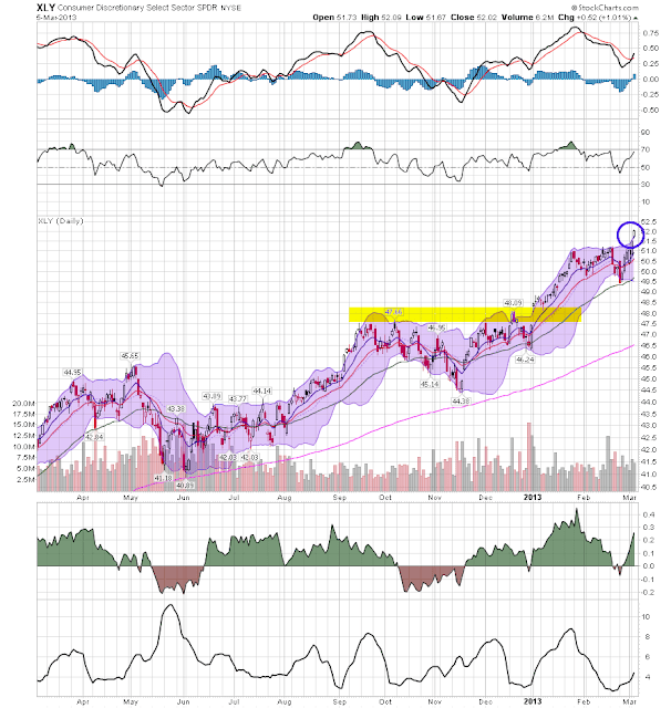
Interestingly enough, three sectors are responsible for the recent price action: health care (top chart), utilities (middle chart) and consumer discretionary (bottom chart).   There is no doubt that each of these charts is strong: the health care ETF is in the middle of a year-long rally; the utilities have rallied from a low in late November and consumer discretionary is also in the middle of a year long rally.  However, two of these sectors are defensive, bringing the recent price action into questions.


In contrast to the equity markets, the live cattle ETF came near to hitting a record low yesterday.  First, notice that for most of the last year, prices have been trading between roughly 27 and 29 -- about a 7.5% trading range.  Late last year, they broke the 200 day EMA, but after two attempts couldn't maintain upward momentum.  Since the beginning of the year, prices have been dropping sharply; momentum is weak and the CMF is negative.