Saturday, March 5, 2011

Weekly Indicators: Self-sustaining Recovery, meet Oil Edition

- by New Deal democrat

The monthly data this past week was all about income and jobs. The economy added 192,000 jobs in February, and both December and January were revised higher. This marks the 12th time in the last 13 months that the initial report for the prior month was revised higher. This is a sign of a self-sustaining recovery. The unemployment rate, against expectations, dropped another 0.1% to 8.9%. As I'll discuss on Monday, the drop in the unemployment rate could be the real surprise economic story of 2011. Both of the ISM indexes also showed increased expansion. Non manufacturing came close to equaling its best reading in 10 years, and the manufacturing reading was last exceeded almost 30 years ago, in 1983. Even so, only +33,000 manufacturing jobs were added. (BTW, I have discovered that I made an error in a post I wrote this week. I used the ISM employment index rather than the overall ISM index to calculate how this month would fit with the past. The correct calculation would have predicted +27,000 manufacturing jobs vs. +57,000 manufacturing jobs).

Meanwhile, personal spending rose a little, although not as much as inflation. Personal income rose over 1%, but only because of the withholding tax rebate. This is the equivalent of trying to feed the village some of its seed corn. Thankfully, for the moment the villagers are saving it. January factory orders were also up, and December was revised higher. Residential and nonresidential construction both remained flat on their backs.

Leading Indicators for February will be interesting, but will probably be up (the current forecast is +0.9). Initial claims were down strongly, and the manufacturing workweek increased, as did the ISM vendor delivery reading, and consumer expectations for the future. Interest rates and the stock market remained positive. But there was a significant decline in core capital goods spending, and we don't know what will ultimately happen with real MoM money supply, consumer nondurable new orders, and housing permits.

As you know, I am watching our high frequency indicators now especially to contrast the forces of continued strengthening against Oil's choke hold on the economy. In the last two weeks, both series have spiked past their inflection points.

The BLS reported that Initial jobless claims came in at 368,000. The 4 week average is 388,500. These are the lowest readings since July 2008.

Oil jumped another $7 to $104.42 a barrel. This is a 15%+ move in only two weeks, and qualifies as a price shock at this point. It is also about $10 over the point where it will sop up 4% of GDP. There WILL be a significant economic slowdown, the only questions is how much and for how long. Gas at the pump rose almost twenty cents in one week to $3.39 a gallon. This is an increase of $.70 in just over 4 months. Despite that, this week gasoline usage was almost 300,000 barrels a day higher than last year, or +3%. This may be an outlier since this week last year was unusually low compared with surrounding weeks. I expect this comparison to deteriorate if the oil price spike continues.

Railfax stabilized at up 4.4% YoY. Baseline and motor vehicle carrier traffic still remain barely ahead of last year on a 4 week moving average, and shipments of waste and scrap metal remain at last year's levels. Intermodal traffic, a gauge of imports, was up 7.2% YoY.

The Mortgage Bankers' Association reported a decrease of 6.5% in seasonally adjusted mortgage applications last week, canceling out last week's increase. This series continues to meander generally in a flat range since last June. Refinancing also decreased 6.5%, and also remains near its lowest point since last July 3. This is not an auspicious start to Spring selling season.

The American Staffing Association Index remained at 90 for the 4th week in a row. This series has completely stalled out in terms of relative YoY gains. In other words, it has stopped making progress towards its pre-recession peak, although it remains 7% ahead of where it was a year ago.

The ICSC reported that same store sales for the week of February 26 increased 3.3% YoY, and also increased 0.5% week over week. This series' YoY comparisons had been trending lower since the first of the year, but for the last two weeks there have been good YoY comparisons. Shoppertrak reported that sales rose a whopping 11.4% YoY for the week ending February 26. It attributed this to the change in the week of President's Day this year vs. last year. On a week over week basis, sales increased 0.1%.

Weekly BAA commercial bond rates dropped -.09% more, to 6.06%. This compares with a -.14% decrease in the yields of 10 year treasuries to 3.46%. Both series are declining from recent highs, and there is still no relative weakness in corporate bonds.

M1 was up 1.4% w/w, up 1.1% M/M, and still up a strong 10.1% YoY, so Real M1 is up 8.4%. M2 was up 0.1% w/w, up .6% M/M and up 4.3% YoY, so Real M2 is up 2.6%. M2 is back above 2.5%. There has never been a recession with real M1 and M2 at these levels.

Adjusting +1.07% due to the recent tax compromise, the Daily Treasury Statement showed that March started out poorly, as the first 3 days showed $27.2 B vs. $36.5 B a year ago, for a loss of -9.3 B YoY. For the last 20 days, $149.7 B was collected vs. $149.3 B a year ago, for a paltry gain of $0.4 B. The month of February, however, finished at $146.4 B vs. $139.6 B last year for a gain of $6.8 B. I suggest using this series with extra caution, because while we might be seeing a real slowdown in tax receipts collected, it may just be that the adjustment for the withholding tax compromise is incorrect - or it may be some of both.

So the leading data still looks positive, the monthly coincident data is strong, and the lagging data - the unemployment rate in particular - continues to improve. But Oil remains the 800 pound gorilla in the room, and I believe the weekly indicators, ex-jobless claims, for the last month show that it is already having an impact.

Finally, to help you understand why both of us have such a strong reaction to people who denigrate or ignore data which inconveniently conflicts with their pre-existing political narrative, I give you the following photograph of Bonddad and New Deal democrat relaxing together over a weekend:


Pardon me while I go look for my slide rule. Have a nice weekend!

Friday, March 4, 2011

Weekly Indicators

- by New Deal democrat

The good news for me is, I'm up to my eyeballs in work.

The bad news for you is, you have to wait until tomorrow morning for the Weekly Indicators.

In the meantime, enjoy the beverage, vice, or pastime of your choice this evening.

Sloppy Reporting and Confirmation Bias, Part II

Several weeks ago I wrote a piece called The Sheer Stupidity of U.S. Political Dialog where I noted that people on the right and left were equally guilty of politically tinged crap, only the type of crap was different. I made this observation about the political left:

Positive economic numbers are rigged; negative economic numbers are sacrosanct. As a corollary, all bullish economists are tools while bearish economists are completely trustworthy. Finally, take one bad economic number in a series of good numbers and claim it is a sign that the end of the world is upon us.


The left's reaction to today's jobs report completely typifies the above statement. The bottom line is the employment news is good and getting better. And yet, we see the doomer Kool-Aid out in full force.

Sloppy reporting and confirmation bias on full display with Jobs report

- by New Deal democrat

I will put up a detailed summary with updated graphs on Monday, but today really revealed what a sad piece of work most of the economic punditry in the blogosphere is.

Over at Balloon Juice, John Cole calls the report "moderately ok news", which is fine, but links to the following NY Times analysis:


While February’s number represented the fastest growth in nearly a year, it was partly the result of a bounce back from unusually depressed hiring in January, when winter weather shuttered offices and factories around the country. Taken together, the job growth for the first two months of the year has not been much better than it was last fall.
This is a quintessential example of the "disappointment syndrome" at work. The intial reports for January and February are being compared with the final reports from the fourth quarter of last year - when revisions to the intial numbers from October through December are over 100,000 jobs. As Bonddad has already pointed out, the first revision to January was also positive, and there is every reason to believe that the ultimate January - February numbers are going to be even better than they are now. In short, the trend of improving job reports that began late last summer is intact. The NY Times does some crappy reporting, but provides an excellent example of the Disappointment Syndrome.

Here are the initial and final monthly jobs numbers (in thousands) excluding census, showing total revisions, for the last quarter of 2010:


MonthInitialFinalnet change
Oct+151+210+59
Nov+39+92+53
Dec+103+152+49


In other words, from a paltry +98,000 as initially reported, the fourth quarter finally showed an average of +151,000 jobs added per month - enough to keep up with population growth.

Now here is that trend, averaging jobs by quarter:


QuarterAverage Job gain/loss
4Q 2009-135
1Q 2010+15
2Q 2010+97
3Q 2010+60
4Q 2010+151


So far this year the average is +130,000, but even with the first revision to January, +27,000 jobs were added to the initial reports. And oh by the way, the February reference period does not include the last two weeks of sub-400,000 initial jobless claims.

Over at Talk Left, Big Tent Democrat a/k/a Armando has recently been chugging Doomer Aid. He went on record a few weeks ago when we had one bad initial jobless claims report as saying the jobless claim trend hadn't been positive in a year. Both last week's 386,000 number and this week's 368,000 report went completely unacknowledged even though they eviscerate his argument, and did so again today:


Of course, we've been down this road before, a few good job reports followed by mostly bad reports. And with "austerity" the watchword in Washington and in state capitols, my personal view is this will be remembered as a blip. But today, this is good news.
As I've already shown above, that claim doesn't withstand scrutiny, at least not since the end of last summer. But what is really interesting here is the first two comments:

Sadly this isn't a good a jobs report since we need to create 250,000 a month to
even be keeping up the semblance of a recovery. It is a better figure than last
month, and that is now labeled a good jobs report. And the BLS
unemployment figure is mostly a specifically designed distortion of reality
these days.

and


I consider the Gallup figures on current unemployment at this time to be far more accurate than any unemployment figures the government is force feeding me.

(my emphasis)

Aside from the fact that we don't need 250,000 jobs a month to keep pace with the population growth in the age brackets of the workforce - more like 125,000 to 150,000 - the commenter is basically saying "I have a preconceived position. If the data goes against that position, it must be 'a distortion' or 'forcefeeding.' "

And of course, that position that data that conflicts with a pre-esisting narrative must be "fabricated" is on exceptionally florid display with the Pied Piper of Doom (no I won't link), who suddenly finds Paul Krugman untrustworthy (because Krugman is finally coming around to the point of view that the recovery is self-sustaining if Washington doesn't kill it). The Pied Piper didn't even wait for the report to come out before assuring his cultists that the jobs were crappy. (Funny, I thought we wanted manufacturing jobs, of which about 30,000 were created, not to mention that construction jobs in 2011 are actually going up for the first time in 6 years).

And the cultists all agree that any anecdotal evidence they see surely means that the BLS report is bogus, and unemployment must be over 20%, even though even U6 unemployment has fallen by over 1% in the last 4 months.

This in confirmation bias on full display. "I only pay attention to things I agree with." That is the sad state of affairs on blogs that now can only laughably call themselves "reality-based."

The Employment Picture Has Finally Turned the Corner

The employment reports for the last few months have been very frustrating, coming in at very low numbers, especially in comparison with the other macroeconomic data that showed increasing personal consumption expenditures, very strong manufacturing and very strong service sector growth. Now we have (finally) good news on the employment front.

From the BLS:

Nonfarm payroll employment increased by 192,000 in February, and the unemployment rate was little changed at 8.9 percent, the U.S. Bureau of Labor Statistics reported today. Job gains occurred in manufacturing, construction, professional and business services, health care, and transportation and warehousing.


Better yet:

The change in total nonfarm payroll employment for December was revised from +121,000 to +152,000, and the change for January was revised from +36,000 to +63,000.


Yet again we have an upward revision to previous employment numbers.

This, in conjunction with yesterday's initial unemployment claims data -- which showed initial unemployment claims dropping to 368,000 -- indicates the following: the employment situation has finanlly turned the corner.

Yesterday's Market


Thursday, March 3, 2011

The Stupidity of Our Political Debate

From the WSJ:

But the governor said the cuts proposed Tuesday—along with the bill restricting bargaining rights—are necessary to address a $137 million shortfall for the fiscal year ending June 30 and a projected $3.6 billion deficit for the following two fiscal years. He opposes raising taxes.

Mr. Walker recommended cutting total state spending over two years by $4.2 billion, or 6.7%. He's also seeking to limit the ability of local governments to offset state cuts by raising property taxes.


Once again, we're caught in the "free lunch" mentality in our political debate. Here is a news flash; it costs money to run a country. Roads need to be built, courts need to function, schools need to pay teachers ... you get the idea. And yet, once again, we're hearing a political debate based only on the idea that government is too large, taxes are sky high and we need to get rid of the public bloat.

The reality is we're now at the point where we are cutting our long-term potential nose to spite our face. At a time when the workforce needs increased educational spending to train people for the "jobs of tomorrow" we're cutting educational spending. At a time when out national infrastructure gets a near failing grade from civil engineers, we're saying infrastructure spending is too high and doesn't need to increase. At a time when our tax burden is at a 60 year low, we're saying its too high.

This entire "up is down" mentality in our political dialog is, at times, mind numbing.

Construction jobs in recoveries - a comparison

- by New Deal democrat

In my last couple of posts, I discussed how the recovery in manufacturing is giving us very few jobs relative to the strength of thats recovery, compared with 1946-1983 recoveries, to the tune of close to 1,000,000 jobs.

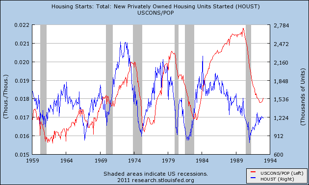
In contrast, let's look at construction. There first couple of graphs look at housing starts (blue) vs. construction jobs (both residential and non-residential), in the 1948-1983 period:


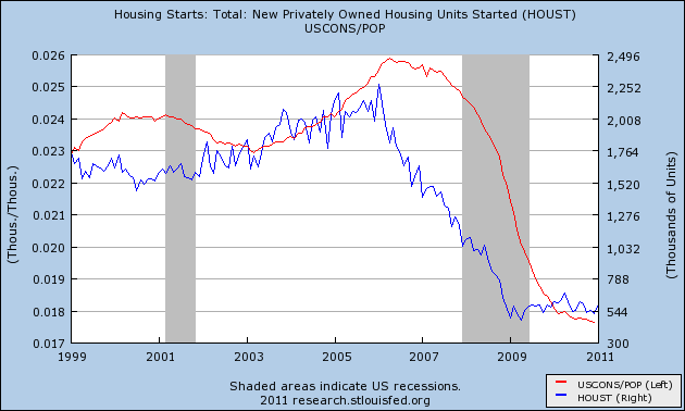
and for the last two recessions and recoveries:


Note that construction jobs lag housing starts by about 1 year, a pattern that continues now. (Also note, in the above graphs I divided construction jobs by population, to give the percentage of people working in construction, for ease in viewing purposes only).

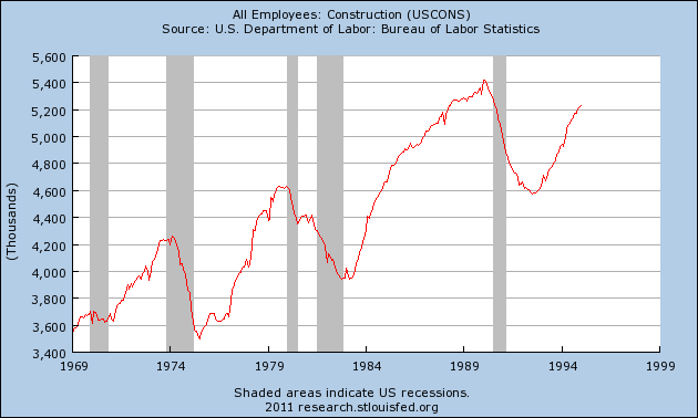
Now let's take out housing starts, and look at the change in raw numbers in construction jobs during recoveries. Here are the post-World War 2 recoveries:


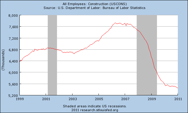
And here are the last two recessions and recoveries:


In the post-war period, about 200,000 construction jobs were added per year once growth started. None at all were added after the dot-com bubble until the housing bubble caused about 250,000 a year to be added.

By contrast, with the crash in the housing market, that has been limping along a bottom for 2 years, construction jobs are still being lost, albeit very slowly.

So, not only is the current boom in manufacturing failing to create many jobs in comparison with past booms, causing a population-adjusted shortfall of perhaps 1,000,000 jobs; but the continuing housing bust is costing another shortfall of 200,000 or more jobs.

That leaves the private and government service sectors to pick up the slack. We know the public sector is bad. I'll discuss the ISM non manufacturing report later.

More on strong manufacturing vs. weak manufacturing jobs

- by New Deal democrat

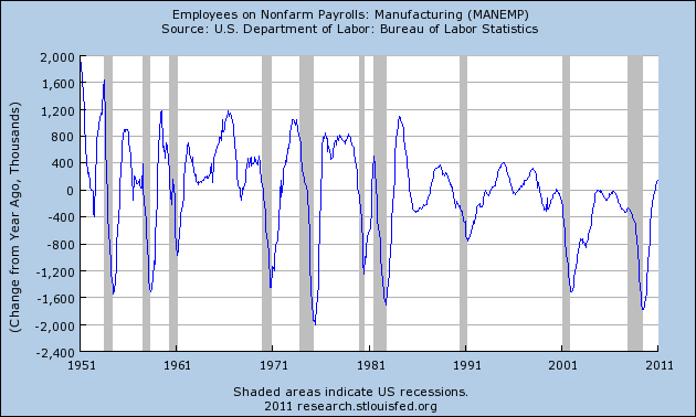
I have been trying to compare how economic strength has translated into jobs in recoveries past, vs. the present recovery. After putting up yesterday's post on the ISM index, I found a more dramatic way to illustrate the point. This first graph shows the year over year change in the absolute number of manufacturing jobs over the last 60 years:


As you can see, coming out of recessions, from the end of World War 2 until the early 1980s, it wasn't uncommon at all for 800,000 manufacturing jobs or more to be added in the first year of a recovery. But in real terms it is even more dramatic than that, because in 1950 the US population was half what is is now; in the 1970s two-thirds; in 1982 three-quarters.

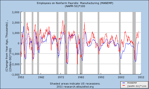
Now let's overlay the ISM manufacturing index on that prior graph:


In February we had the highest reading (save for one equal reading in 2004) since 1983. Yet the same amount of manufacturing expansion gave us only 150,000 new manufacturing jobs year over year.

So the comparison of equivalent strength measured by the ISM vs. actual manufacturing job growth, adjusted for population, looks like this:

1950s 1,600,000
1970s 1.200,000
1982 1,067,000
2010 150,000

I'm not exactly sure how the ISM survey phrases its questions, but I do not think they are asking the survey participants if they plan to expand in China. In other words, I believe the questionnaire deals solely with expansion in the US.

This effectively removes offshoring of jobs as a reason for the startling paltry number of jobs added - rather, it looks like this is all about automation. In recessions, manufacturers have been letting people go. In recoveries, they have been hiring new machines.

As a result, despite the great recovery of the US manufacturing sector, in terms of jobs creation it has come up over 1,000,000 jobs short compared with even 30 years ago.

The Quarterly Banking Profile, Part II; The Graphs

Let's continue the look at the banking sector, by examining the graphs from the report. Click on all graphs for a larger image.

We've now had four quarters of income growth. While it is still probably too early to declare victory, we're a lot closer to the end now than the beginning.


The large decrease in loan loss reserves is positive for two reasons. First, it indicates that loan performance is improving, which also indicates the economy is improving. Secondly, the decrease in loan loss reserves indicates there is less of a drag on earnings going forward.


Both return on assets and return on equity -- key measures of bank operations -- have bounced from their lows and are on the mend. Although these two figures have not reached pre-recession highs, the trend is clearly moving in the right direction.


The last three quarters have seen a continual decease in net charge offs and the quarterly change in non-current loans; both of these indicators are moving in the right direction.

On a quarterly basis, charge offs are clearly in a downtrend -- again, clearly, the right direction.

It appears the non-current loan rate has peaked -- albeit it at very high historical levels -- and is now on its way lower. It will be at least a year before we see this number approach anything like normal -- and probably longer.


Real estate construction loss rates also appear to have peaked -- although at high levels as well.

Residential real estate loan rates also appear to have peaked. Notice, however, that they appear to be remaining at high levels instead of dropping meaningfully.

Yesterday's Market


Wednesday, March 2, 2011

The Importance of Labor Unions

With all of the talk surrounding Wisconsin and the governor's desire to end collective bargaining, the issue of unions has again come to the forefront of debate. While I don't talk about it much, I am a big fan of unions and think they are an important part of the economy. However, the primary reason why I support unions is based in law, not economic policy.

The U.S. has a long legal tradition that stretches back to England in the middle ages. We can trace our legal roots in property, trusts, wills and criminal law to this era. Just as importantly, we can also trace contract law to this time. Contracts are a remarkably powerful tool; they essentially allow two or more parties to form a relationship within the broadest of boundaries. A court will not void a contract so long as the subject matter is not for an illegal act or voided because it is against public policy. In other words, people can form their own private law to further mutually beneficial relationships and the courts will uphold these agreements so long as they don't hurt the greater part of society.

However, inherent in the establishment of this relationship is the concept of equality of bargaining power. The law recognizes that a contract, whose terms are written by one party, is inherently biased. It calls these adhesion contracts and courts will interpret the contract terms of an adhesion contract against the drafter. But these interpretive maxims can only go so far; careful and well-drafted contracts, modified over many years by numerous lawyers can help to blunt that maxim.

Therefore, in order to establish a contract that is truly private law between two parties, it is imperative for the parties participating in the negotiations to be as close to equal as possible. This is the primary reason why labor unions are a vital part of the legal and economic process -- they provide a legal counter-weight to management.

There are numerous other benefits, such as increased wages and benefits for union members (which usually spread out an benefit non-union members), better working conditions and a social network that provides financial and emotional support. However, I personally view these benefits as ancillary -- although no less vital. The real benefit from unions is to provide another strong voice at the bargaining table when contracts are formed.

ISM Index suggests ~+57,000 new manufacturing jobs in February

- by New Deal democrat

As Calculated Risk pointed out yesterday, the ISM manufacturing report was an upside blowout, the strongest such report in several decades by some measures (the contrary "poor analysis" mentioned by CR was almost certainly the spin by the Doomorons at Zero Hedge. Google it if you feel you must). And Bonddad and I have separately written recently that the manufacturing sector has been exceptionally strong.

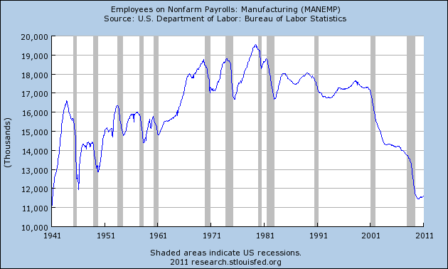
An important question is, how much does that translate to in terms of jobs? The ISM report is a diffusion index, meaning it measures expansion vs. contraction. Any number above 50 in any of its indexes means expansion, and visa versa. But like any data, it has shortcomings. All else being equal, with a population increase from 200 million to 300 million, an equivalent reading ought to suggest 50% more monthly hiring in the latter period than the former. But on the other hand, we know that due to efficiency and offshoring, the number of persons employed by manufacturing has fallen by 40% since the peak in 1979, as shown in this graph:


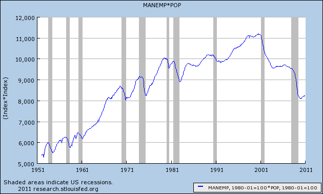
These crosscurrents suggest that the "real" effect of an equivalent ISM number on employment over time would look something like this graph, in which the number of manufacturing employees is multiplied by population (with 1979 = 1):


(BTW, admittedly this is not a true representation, since we would want to visit an alternate universe where either population was held constant or there were no efficiency gains or offshoring, but presumably you get the drift)

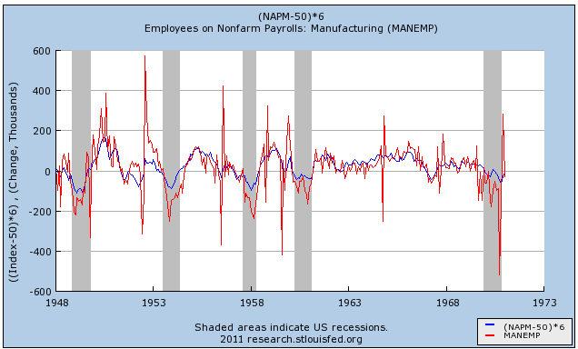
When I went to look at the data, I expected there to be both more hiring and firing over time, due to population increases, compared with equivalent ISM readings. That wasn't the case. In fact, since the ISM started publishing data in 1948, up until about 1999, the amount by which an ISM reading exceeded 50, multiplied by 6 (thousand), gave you an excellent idea of what manufacturing job gains were during the same month. Here is the period of 1948 through 1970:


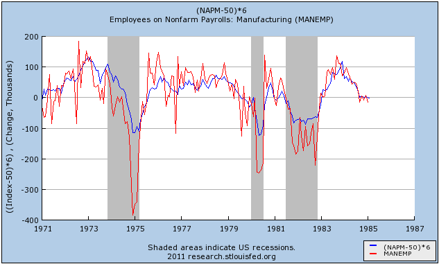
Here it is for the severe recessions of the 1970s and 1982:


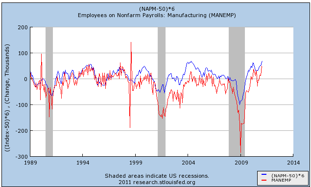
And here it is from 1989 to the present. Note that the red line (manufacturing jobs gained/lost per month, in thousands) no longer keeps up with the blue line (the ISM manufactuing index with equilibrium reset from 50 to 0 for easy comparison) after 1998:


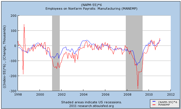
In fact, there is an excellent fit since 1998, but it involves resetting the equilibrium point at 55 instead of 50. In other words, subtract 55 (instead of 50) from the ISM reading, and multiply by 6 (thousand) and for the last 10+ years that will give you a very close approximation to the number of manufacturing jobs added that month:


February's ISM manufacturing index reading was 64.5. This is 9.5 above 55, multiplied by 6000, tells us that about 57,000 manufacturing jobs were probably added last month. This is an excellent number compared with the last decade, but before 1999 it would have suggested an increase of 87,000 manufacturing jobs. (Note: using a different analysis, Calculated Risk estimates ~+60,000 manufacturing jobs were added in February. Great minds think alike, etc.)

(As a side note, using the ISM manufacturing employment sub-index yields the same result).

I'm not sure what the underlying fundamental reason for the change is. There certainly were both offshoring and efficiencies taking place before 1999. China did not accede to the WTO until 2001, so that is an incomplete explanation at best. It is also possible, given the last few months' strong manufacturing employment data, that the decade long aberration is abating. Finally, relative strength in manufacturing jobs, even though substantial, is still only a minority part of the overall jobs picture. I'll deal with construction, government, and non-government services separately. In that regard, the ISM non manufacturing index will be released tomorrow.

The Great Myth About the Death of US Manafacturing

We don't make things in the US is a common refrain in the blogsphere -- as is the idea that US manufacturing is dead. However, nothing could be farther from the truth. Let's take a look at the data.


Above is a chart of the ISM's manufacturing index. Notice it recently printed the highest number in ten years, indicating manufacturing is growing at strong rates. In fact, manufacturing was one of the economic sectors that pulled the U.S. out of the last recession.


Above is a chart of total manufacturing output of the top manufacturing countries in the world. Notice that we're still the largest manufacturer in the world.

So -- we still make plenty of things here in the U.S., indicating that the "death of US manufacturing" theme is 100% wrong.

The real issue is manufacturing employment, which has dramatically dropped:


Notice we're now at levels not seen since right after WWII. The real reason for this is a continued increase in productivity, as measured by output per worker:

Yesterday's Market


Tuesday, March 1, 2011

Quarterly Banking Profile Overview, Part I

Every quarter, the FDIC releases the "Quarterly Banking Profile," which provides a great overview of the US' banking sector. Let's take a look at the highlights from the report.

Lower expenses for troubled loans continued to boost the earnings of insured commercial banks and savings institutions in fourth quarter 2010. The 7,657 institutions filing year-end reports posted quarterly net income of $21.7 billion, a substantial improvement over the $1.8 billion net loss in fourth quarter 2009 and the second-highest quarterly total reported since second quarter 2007. The greatest year-over-year improvement in earnings occurred at the largest banks, but almost two out of every three institutions (62 percent) reported better net income than a year ago. One in four institutions reported a net loss in the fourth quarter, an improvement from a year ago when more than one in three (35 percent) were unprofitable.


At the top line (gross revenue), this report is a good improvement. First, however, note the easy year over year comparison: last year we had a loss and this year we had a strong gain. However, the gain is still impressive. Nearly 66% of all institutions reported an increase in income -- a clear majority and the percentage of institutions reporting a loss decreased.

Insured institutions set aside $31.6 billion in provisions for loan losses in the fourth quarter, almost 50 percent less than the $62.9 billion they set aside a year earlier. This is the smallest quarterly loss provision for the industry since third quarter 2007. Much of the year-over-year reduction in provisions was concentrated among some of the largest banks. Seven large institutions accounted for more than half of the $31.3 billion reduction. However, a majority of insured institutions (54 percent) reduced their provisions in the fourth quarter compared to a year ago.


Again, this is a very good development, as a decrease in loan loss reserves obviously frees up reserves for loans and indicates the overall environment for loans is improving. While the decrease was concentrated in large banks, there are the same banks that had large problems that got us into the recession, so things are obviously improving for them as well.

Revenue Growth Slows

Revenue growth was sluggish in the fourth quarter. Net operating revenue (net interest income plus total noninterest income) was $163.6 billion, only $2.8 billion (1.7 percent) higher than a year earlier and $2.1 billion (1.3 percent) less than in third quarter 2010. This is the second-smallest year-over-year increase in quarterly net operating revenue in the past two years (after the $911 million year-over-year increase in second quarter 2010). Despite the small size of the aggregate increase, revenues were up at almost two-thirds of all institutions (62.4 percent).

Fee Income Declines

Among the notable areas of noninterest revenue weakness, service charge income on deposit accounts at banks filing Call Reports was $2.1 billion (20.7 percent) lower than a year earlier. This is the second consecutive quarter that deposit account fees have declined by 20 percent or more from the prior year. Asset servicing income was $2.2 billion (32.3 percent) lower, and securitization income was down by $1.5 billion (90.7 percent). Both declines were primarily the result of changes in accounting rules that affected financial reporting in 2010. The new accounting rules also were responsible for much of the $7.5 billion (7.5 percent) year-over-year increase in quarterly net interest income. A majority of institutions (59.8 percent) reported higher net interest margins than a year ago, but fourth quarter margins were lower than third quarter margins at 55 percent of institutions.

Full-year 2010 net income totaled $87.5 billion, compared to a revised net loss of $10.6 billion in 2009. This is the highest full-year earnings total for the industry since 2007. More than two out of every three institutions (67.5 percent) reported higher earnings in 2010 than in 2009. The proportion of unprofitable institutions fell from 30.6 percent in 2009 to 21 percent in 2010. This is the first time in six years that the percentage of institutions reporting full-year net losses has declined. The largest factor in the improvement in the industry’s net income was a $92.6 billion (37.1 percent) reduction in loan-loss provisions. The second-largest source of improvement was a $28.7 billion decline in charges for goodwill impairment.2 An additional contribution came from realized gains on securities and other assets, which were $10.8 billion higher. The improvement in full-year earnings was limited by increased income taxes, which were $32.2 billion higher than in 2009. Overall net operating revenue growth was relatively weak in 2010. The $10.8 billion (1.6 percent) increase was the second-worst year-over-year change in the past 16 years, after the $20.4 billion decline registered in 2008. Noninterest income from service charges on deposit accounts was $5.5 billion (13.1 percent) lower than in 2009. This is the first time in the 69 years that these data have been collected that full-year service charge income has declined. Insured institutions paid $53.9 billion in dividends in 2010, an increase of $6.7 billion (14.3 percent) over 2009, but less than half the annual record of $110.3 billion paid in 2007. Retained earnings totaled $33.6 billion, marking the first year since 2006 that the industry as a whole has reported internal capital growth.


Banks improved position is not coming from the revenue side of the equation, but instead a reduction in loan loss provisions. This indicates that banks have been using the last three - five years to heal -- they had a lot of bad loans that they had to account for. As a result, they had to increase loan loss reserves. At the same time, the economy was bad, so there was little to no reason to increase the number of loans they were making.

In short -- the above information indicates the banking sector is healing.

Real PCEs Drop .1%

From the BEA:

Real PCE -- PCE adjusted to remove price changes -- decreased 0.1 percent in January, in contrast to an increase of 0.3 percent in December. Purchases of durable goods increased 0.3 percent, compared with an increase of1.2 percent. Purchases of motor vehicles and parts accounted for most of the increase in durable goods in January and in December. Purchases of nondurable goods decreased 0.2 percent in January, in contrast to an increase of 0.1 percent in December. Purchases of services decreased 0.1 percent, in contrast to an increase of 0.2 percent.

.....

Personal income increased $133.2 billion, or 1.0 percent, and disposable personal income (DPI) increased $78.3 billion, or 0.7 percent, in January, according to the Bureau of Economic Analysis.

.....

Real disposable income increased 0.4 percent in January, compared with an increase of 0.1 percent in December.

.....

Personal saving -- DPI less personal outlays -- was $677.1 billion in January, compared with $620.9 billion in December. Personal saving as a percentage of disposable personal income was 5.8 percent in January, compared with 5.4 percent in December.


While PCEs dropped, notice the overall trend is still higher. In addition, PCEs are now higher than their pre-recession level.


Services account for the largest percentage of PCEs (roughly 65%). This category of expenditures dropped slightly last month. However, like overall PCEs, notice the overall trend is still higher and this category is now higher than pre-recession levels.


Expenditures on non-durable goods (about 22% of PCEs) also decreased last month. However, these expenditures are also at levels above those of the last expansion.


Durable goods purchases are also above pre-recession levels. More importantly they rose last month thanks to an increase in auto purchases.

Last months decrease was probably a simple cooling off period after a strong holiday season. The increase in personal income -- caused by the tax cut passed last year -- and the high personal savings rate (currently at 5.8% of disposible income) should provide enough fuel for consumer spending going forward.

Yesterday's Market