Friday, November 6, 2009
Weekend Weimer and Beagle
Until then....
Weekly Indicators
In other monthly figures, the wholesale inventory/sales ratio from two months ago dropped to 1.18. Projecting the steep decline forward to the present, wholesalers' supply is probably stretched taut. It should not be surprising if there is a sudden dramatic jump in manufacturing over the next few months. This is probably already reflected in the surge in the October ISM manufacturing report. But it was matched to the downside by the just-barely-positive non-manufacturing report, which also showed a decline in the employment number.
In other reports, auto sales for October rose strongly to an 10.5M seasonally adjusted annual rate, putting to rest the pessimists' wrong notion that cash-for-clunkers only borrowed sales from the future and so when it expired, auto sales would crash for months to come. To the contrary, October sales were the best all year ex-cash for clunkers.
Turning to high-frequency weekly indicators, while Shoppertrak reported Wednesday that "year-over-year retail sales declined 4.6 percent for the week ending October 31," these weekly Shoppertrak YoY sale reports have been consistently negative as compared to ICSC's same store sales.
Emblematic of that, ICSC same store sales for the final week of October were up 1.9% YoY and 0.1% WoW, the 5th week in a row of gains in both series. On a monthly basis, while as late as a week ago, ICSC Research expected same-store sales for October to be in the 0% to +1% range YoY, October same store retail sales actually rose 2.1%. All categories of stores except department stores saw increases.
With both auto sales and retail sales rising strongly, October's real retail sales number (the "holy grail" for future employment growth) is likely to look pretty good.
The Treasury Dept. reported total State and Federal withholding tax receipts of 137.7M vs. 157.7M in 2008 for the month of October. This metric typically lags the beginning and end of recessions by about 1 quarter, but is a decent measure of state and local fiscal distress. So far, there is no sign of a turnaround.
Weekly Railfax figures showed that rail traffic is beginning its regular seasonal decline, but less so than last year's drastic decrease, for better YoY comparisons.
Oil fell below $77/barrel on the poor unemployment figure.
Finally, Initial Jobless Claims fell to 512,000; and the 4 week average fell to 523,750, continuing the trend of reduced new layoffs since April.
Bottom line: this week's economic data suggests that the economic expansion continues to gain strength, but it is leaving behind far too many average Americans, and the numbers of those left behind continues to increase.
-------
From Silver Oz, re auto sales:
While the auto sales number has shown improvement from its recent lower levels, it is still an extremely sales rate (as low as the depths of the 1982 recession) and is not near a level that the auto industry can stabilize on let alone thrive with. Improvement is nice, but I would be very hesitant to call any number below 12.5 million (SAAR) good. Just an interesting comparison; at the 10.5 million rate in 1982 we were selling .045 cars per capita, now we are selling but .035 cars per capita, so in a population neutral comparison in 1982 terms we are at an 8 million unit sales rate (or the equivalent from 1982 would have sold 13.5 million cars today). The good news is that the sales rate moved up, the bad news is that it has a long way to go before the auto industry will be out of the woods.
Establishment Job Losses at -190,000/Unemployment Rate at 10.2
The unemployment rate rose from 9.8 to 10.2 percent in October, and nonfarm payroll employment continued to decline (-190,000), the U.S. Bureau of Labor Statistics reported today. The largest job losses over the month were in construction, manufacturing, and retail trade.
So, basically there is something for everyone here. The bears will focus on the 10.2% unemployment rate and the bulls will focus on the continuing decline in the rate of job losses.
On the unemployment side the total "civilian labor force" number changed little, decreasing from 154,006,000 to 153,975,000. That means the increase in the unemployment rate was not caused by math but by an increase in the number of people out of work.
Here is a chart of the unemployment rate:
On the establishment side we have a loss of 190,000. But there is some good news in the details.
The service producing sector only lost 61,000 jobs. And in addition to the usual gains in education and health care we also saw an increase in professional services of 18,000 While it's small, it's something. Goods producing industries continued to shed jobs -- construction lost 62,000 and manufacturing lost 61,000.
Here is a chart of establishment job losses.
Remember that last month the BLS added an additional ~800,000 job losses to the the total losses in the last recession. That means we have an even deeper hole to climb out of. So the continued decrease in the rate of establishment job destruction means the economy is still progressing.
As I mentioned earlier, there is something for everyone in this report. Personally -- and especially after last month's establishment job loss figures -- this report tells us we're back on track. At the rate we're going we should start seeing establishment job gains within the next ~6 months.
Quick update:
From Marketwatch:
In September, payrolls fell by a revised 219,000, compared with the previous estimate of a 263,000 loss. The unemployment rate was 9.8% in September.
Last months drop -- which was very disappointing -- is wiped from the record books.
Forex Fridays
Click for a larger image
The dollar chart is one of the best bear market charts available. First, notice it is printing a continued series of lower highs (B) and lower lows (A). In other words, prices a continuing to move lower in an organized, disciplined way.
Also note the EMA picture: they are all moving lower, the shorter are below the longer and prices have just moved below all the EMAs.
While the MACD has moved higher, that is likely to change as prices start to move lower.
Thursday, November 5, 2009
Today's Market
Click for a larger image
A.) Prices have moved through all the EMAs. Today they printed a very strong bar.
B.) Prices moved through support but by very little. That brings up an interesting question: when is a trend break a real trend break? There is no easy answer, although most people have their own rule of thumb. Personally, I like at least a 1% break -- that is, prices move at least 15 after they break the trend. Here prices came to about that level on the first day. But notice the second day of post-trend break trading -- prices printed a spinning top. This is a very weak candlestick. In other words, there wasn't much follow-through.
C.) The MACD is approaching the point where it will give a buy signal.
On the World Series
More importantly, as I was watching the game the camera showed various shots of kids -- I am assuming in the 8-12 year old range. Some of them were with their fathers, some were just looking at the game. I remembered what it was like to be 8-9 years old with a great baseball team. I was born in Cincinnati and some of my fondest childhood memories involved the Cincinnati Reds of 1975 and 1976. I can still name all the players from memory -- Rose, Concepcion, Morgan, Perez, Griffey, Geronimo, Foster and Bench. It was a great time to be nine years old.
So -- especially to Invictus who is a Yankees fan -- congratulations. The Yankees were the best this year.
The Establishment Survey: Musings on Seasonal Adjustments and the Birth/Death Factor
Every month the BLS adjusts the data gained from the Establishment Survey by a "seasonal factor" in an effort to reduce the noise in the survey from well known regular employment changes (ie Christmas hiring/firing, summer jobs, etc). These adjustments are important because they help us glean a more accurate and timely picture of what is really happening with employment across the nation. Since the non-adjusted data is also published each month, it is relatively easy to get a rough (and these are rough) estimate of the seasonal adjustments for each month. To further reduce "noise", I averaged the adjustments over the 2004-2008 (2009 where possible) period.
January - 1.62
February - 1.15
March - .63
April - .03
May - (.49)
June - (.79)
July - .16
August - .12
September - (.26)
October - (.72)
November - (.80)
December - (.56)
This shows us that seasonally we "add" in a lot of jobs in January and February, as this adjustment is applied to a current base of around 130 million (ie so every .1% adds or subtracts 130,000 jobs) and subtract a fair number of jobs going into the end of the year (which is why it will be difficult to see gains in jobs prior to January/February). The adjustments have been very consistent over the time period, with the biggest fluctuation coming in August, which went from a .2 add in 2004 to a .04 add in 2009 (but decreased gradually). the largest recent change was from a 1.65 add in January in 2008 to a 1.53 add in 2009 (a difference of about 150,000 jobs). But in most cases, the seasonal adjustments are pretty consistent (as one would expect them to be, as seasonally little if anything has changed over the last several years).
On the the maligned birth/death adjustment. This adjustment made each month to the Establishment Survey (before the seasonal adjustment) is essentially a mark to model approach to estimate new business formation following the loss of jobs or closing of businesses across the country. Since this adjustment is applied prior to the seasonal adjustment and since it is supposed to be reflective of business formation or destruction, one would expect this number to vary greatly both on a monthly basis and also on a yearly basis depending on underlying economic conditions. What I found though is the exact opposite of my expectations (again taking the average of the 2004-2008 period):
January - (269,000), but remember the January number also includes the benchmark revision for the previous year and is thus a poor indicator
February - 116,000
March - 147,000
April - 276,000
May - 206,000
June - 174,000
July - (38,000)
August - 123,000
September - 36,000
October - 65,000
November - 36,000
December - 65,000
Now, if you are wondering why I took averages, it is because the monthly numbers were very consistent over the time period, which implies that the birth/death factor is more of an additional seasonal adjustment than it is a model of business creation/destruction. With the exception of July, most months had a variance of less than 10% each year, which is quite odd considering that this "model" was supposed to estimate creation/destruction from survey respondents/non-respondents and one would expect the adjustments to have much more variance, especially during a deep recession like we experienced this year (which also included very tight credit conditions that should have greatly curtailed new business formation), but what we have actually seen this year are birth/death adjustments that mimic the previous averages. This leads me to believe that the model either a) is broken and cannot take into account adverse economic conditions or b) that the model is essentially a second seasonal adjustment, in which case it is probably more appropriate to eliminate the birth/death adjustment and simply change the seasonal factor (in most cases this would be by about .1%).
To conclude, the data above should enable us to more accurately examine the monthly Establishment Survey data by keeping close tabs on any changes in the seasonal adjustments or birth/death adjustments that fall outside their averages. This is important as we begin to emerge from this recession, as I would be very concerned if we see the seasonal adjustments for October-December move up (ie become less negative), as this would "create" more jobs that should be factored out under normal circumstances. i would also question any birth/death adjustments that fall outside their typical average as well (and since the seasonal factors are all relatively small you can essentially count the entire birth/death adjustment into the seasonally adjusted employment number, since it will only change by a statistically insignificant couple thousand jobs at most). Finally, keep in mind that the margin of error on the Establishment Survey is around 100,000 jobs and thus any number inside of that (plus or minus) tells us very little.
Initial Jobless Claims: 512,000
Additionally, the four-week moving average fell to 523,750. This is the 4th week in a row that the more stable 4 week average has been ~20% less than the peak number in April of 659,000.
One speculation of mine has been that, while Calculated Risk may be proven correct that temporary holiday hiring might not materialize this year, seasonal layoffs -- which are an even bigger trend -- might not materialize either, as employers "hoard" jobs in the face of increasing demand. A look at the initial claims data, non-seasonally adjusted, which is trending higher at a much slower than usual pace, suggests that is exactly what is happening.
While most bloggers, including notable economists, think that jobless claims must fall all the way to 400,000 before we begin to see actual job growth, my examination of past severe recessions from the '70s and early '80s (which saw growth despite more than 500,000 new layoffs a week) causes me to believe that we only need about one more month of claims at this level of 20% or more off peak to be consistent with net employment growth in the economy.
It appears we will soon find out. In the meantime, early next week I plan on updating my series asking "When will the Economy Add Jobs?" with the new data.
-----
From Bonddad:
From Bloomberg:
Initial jobless claims are clearly on the decline, down 20,000 in the Oct. 31 week to 512,000 (prior week revised 2,000 higher to 532,000). The four-week average is down for the ninth straight week, 3,000 lower at 523,750 for a 25,000 decrease from late September. Continuing claims are also declining but here the change is likely a negative, due largely to the expiration of benefits. Continuing claims, in data for the Oct. 24 week, fell 68,000 to 5.886 million for the seventh decline in a row. The unemployment rate for insured workers is unchanged at 4.4 percent, a level that is down 8 tenths from a peak in late June. In contrast, the overall employment rate has continued to climb, at 9.8 percent in September and is expected to increase another 1 tenth in Friday's data for October. Remember, improvement in both initial and continuing claims during September did not correlate to improvement in either payrolls or the household survey.
Here is the accompanying chart:
Note the 4-week moving average has been dropping since late April/early May. That's a clear trend.
Thursday Oil Market Round-Up
A.) Prices are above support and the 200 day EMA.
A.) Prices broke through EMAs on strong volume. Prices hung in this range for about a week and then pulled out of it.
B.) Prices gapped higher, but did so printing a series of spinning tops.
C.) Prices have a second round of buying, printing strong bars and moving through the 200 day EMA.
D.) Prices form a downward sloping pennant pattern. Prices have moved out of this pattern, but by printing a doji star -- a weak candle formation.
Wednesday, November 4, 2009
Today's Market
Let's coordinate fundamental and technical events.
At point A we learn get the Fed statement:
The Committee will maintain the target range for the federal funds rate at 0 to 1/4 percent and continues to anticipate that economic conditions, including low rates of resource utilization, subdued inflation trends, and stable inflation expectations, are likely to warrant exceptionally low levels of the federal funds rate for an extended period.
Basically, the Fed has walked into a frat house and yelled "FREE BEER"!!!!!!!!!!!
And yet
B.) The market ends the day on a sell-off.
This is the weakest reaction possible to this news.
ISM Services and Nonfarm Payrolls
This morning the ISM reported the second part of its data for October. The Non-manufacturing (services) Index came in at 50.6, down from last months's 50.9. The employment part of the Index came in at 41.1, down substantially from September's 44.3. Needless to say, this suggests that layoffs continue apace in the services sector. There was some good news, however, as new orders continued to grow at a faster pace, and vendor deliveries slowed (which is also good news and a leading indicator).
As I reported Monday, the ISM Manufacturing Index came in at a level which has always in the past been consistent with actual job growth. Because in past recessions about 90% of job losses have been in the goods-producing sectors, actual improvement in those sectors was enough to carry the entire economy into job growth.
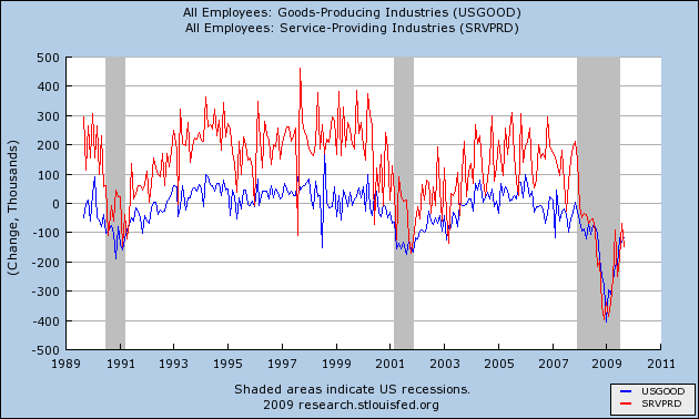
What has been different in the "Great Recession" is that fully half of all job losses have come in the services sectors. I've posted a chart several times, pointing out that ~3.5 million of the ~7.0 million job losses after August 2008 came from services. Here is that picture graphically:
You can see that in the previous mild recessions and "jobless recoveries" of 1991 and 2001, service jobs (red) were relatively unscathed, and recovered first, while goods-producing jobs (blue) felt the brunt of the downturns and recovered last.
Not so this time. Service jobs have felt the full force of this very deep recession, for the full last year. So even if, as I suggested Monday, manufacturing is having a V shaped recovery, that doesn't mean the entire economy is participating. In fact, today's ISM services report virtually guarantees that.
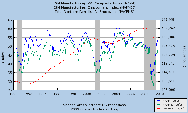
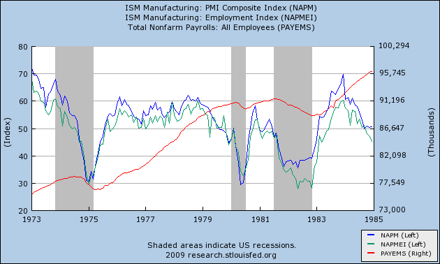
I characterized the ISM manufacturing index report Monday as a "blowout." Here is a graph showing how the overall index (blue) as well as the employment sub-index (light green) in that report stacks up compared with the "jobless recoveries" coming out of the last two recessons, together with jobs (red):
Note that both the blue and light green lines are already at levels they did not reach until well after both the post-1991 and post-2001 recoveries were underway. Specifically, they are already at levels that post-date the times when job losses had stopped, and employment was actually growing.
That brings us back to the ISM services index. Unfortunately, it suffers from the same problem as the "JOLTS" index that some bloggers have been highlighting -- it is only a little over a decade old, and only gives us information about the very shallow 2001 recession.
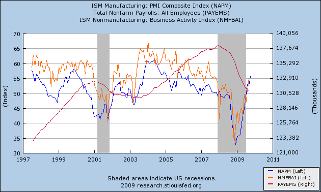
This graph shows the ISM manufacturing index (as above in blue), together with the ISM services index (in orange) and payrolls (in red):
Note that the limited data we have from the last "jobless recovery" indicates that the index had to reach ~60.0 before employment stabilized. The service employment subindex doesn't get graphed by the St. Louis Fed, so I can't show it to you, but I can tell you that it never went below 43.9. Between that reading and 50.0, gains in the sub-index generally coincided with service sector job gains, and declines coincided with job declines.
In this recession, by contrast, the employment sub-index troughed at 31.1 last November, and as of September was still at a reading of 43.4.
I feel much less comfortable making a projection from such limited data, but if we accept it as a best guess, than this morning's report suggests that Friday's October employment/unemployment reports will show little improvement over the last few months'. On the bright side, there may indeed be a "V shaped jobs recovery" in manufacturing, and we may see a positive print for manufacturing jobs. On the negative side, the recovery in the services sector where 85% or more of Americans now work, has at least begun as a "jobless" one.
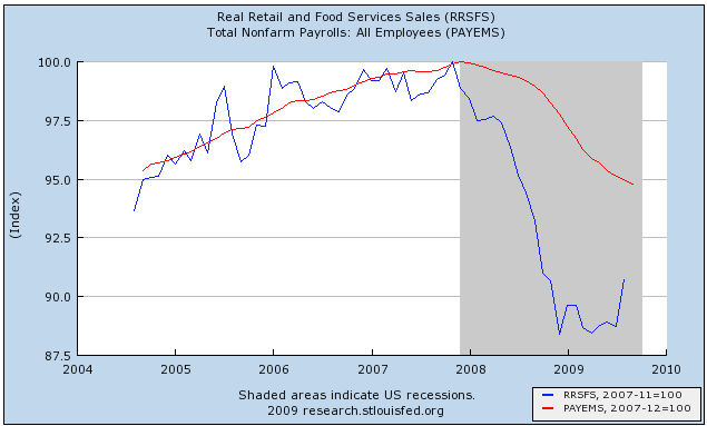
Why the difference? In manufacturing, quick deep cuts in employment with lean inventories have become the norm. Employers may have cut too deeply and with the snapback in new orders, may need to hire back quickly as well. With services, it's the opposite story. Here's a graph I posted a couple of months ago comparing retail sales with employment:
Do retail employers really need 95% of the previous workforce to sell 90% of the previous number of goods? No, and it appears that layoffs will continue in the services sector until those two lines meet, either by sales picking up, employment going down, or a combination of the two.
In that regard, there has been some good news about October retail sales in the last few days. I anticipate discussing that, and updating my "When Will the Economy Add Jobs" series early next week, after this Friday's official jobs data.
----------
P.S. H/t to commenter Brodero who points to an ISM model by Danske Research, whose report on Monday's manufacturing number concludes:
[W]e believe that there is more upside to the ISM index. Our hard-data based inventory demand ratio is to indicating a heavy production back-log in the US economy. This measure of future manufacturing activity is currently sending the most positive signal for the ISM seen in the past 40 years. Furthermore, this is supported by our model, which provides a year-end target for the ISM at 60 and indicates some possibility of even further strength early next year. That said, the recent deterioration in the ISM new orders-inventory ratio suggests that future improvement is likely to happen at a slower rate. In summary, today’s report underpins our forecast for around 4% GDP growth in the current and the coming quarters driven by substantial positive contributions from slower inventory depletion.
Needless to say, an ISM Mfg. number of 60 with +4.0% GDP in the next few quarters is very bullish for job creation.
On Financial Reform
So -- what do we do about the financial system?
Let's start with two observations.
The first is the financial system stands at the middle of the economy. Often times the phrase "financial intermediary" is used to describe a bank or other financial player. These companies take individual finances like small savings accounts and pool them into larger amounts of money that then go to finance large projects. Hence, they act as intermediaries. In addition, the Federal Reserve effects the economy through these institutions. These actions by the Federal Reserve fundamentally impact the direction of the economy. Because of the unique roll these institutions play in the economy they must be looked at differently. At a minimum, these institutions must be functioning at a basic level in order for the US economy to work.
Secondly, there are different types of intermediaries that are largely classified by the type of risk they undertake. As an example, take an investment bank which is
A financial intermediary that performs a variety of services. This includes underwriting, acting as an intermediary between an issuer of securities and the investing public, facilitating mergers and other corporate reorganizations, and also acting as a broker for institutional clients.
and compare that to a standard bank which "borrows short and lends long" meaning they take in deposits, pool them and make loans with the pooled money. Notice these institutions still perform financial intermediation, but perform the roles in far different manner.
The second Glass Steagall (which was repealed with the Gramm Leech Bliley Act in 1999) prevented different financial intermediaries from participating in certain other types of financial intermediation. For example, a commercial bank -- which lent money to corporations/larger borrowers -- couldn't own a brokerage company/investment bank. The reason is these types of financial companies had very different risk profiles. While the commercial bank did take on risk it was usually far less than an investment bank's risk. Hence, by preventing certain types of companies with a certain risk profile from owning another company with another risk profile, the legislation essentially prevented risk from being centered in one or more institutions -- more commonly referred to as "too big to fail".
Here's an example. Sometime over the last few years Bank of America -- a bank -- purchased Merrill Lynch -- an investment bank. This could not have happened under the old Glass Steagall act but can happen now. Also note the different financial services each offers. Bank of America takes in deposits and makes loans whereas Merrill Lynch is a brokerage company the buys and sells securities along with other, riskier investment banking operations.
The primary benefit of Glass Steagall is separation/segregation of risk. The act essentially prevents risk from being concentrated in a small group of institutions at the center of the economy. However, there is a drawback -- and it is a large drawback. It prevents "one stop shopping" for financial services. For example, large company X needs a variety of financial services such as general corporate banking and investment banking. By preventing consolidation, the Glass Steagall act does not allow larger companies to consolidate operations, thereby lowering costs through economies of scale.
Let's return to the Bank of America/Merrill Lynch example. By combining services, Bank of America can now service a larger group of clients (individuals to companies) and perform a far wider swath of services (banking and investment banking). While this does combine risk it also allows the company to increase its customer base and lower cost through economies of scale.
Many have blamed the repeal of Glass Steagall as a primary driver of the financial meltdown that started in 2007. Hence putting it back in place should be part of financial reform. The repeal of Glass Steagall was clearly a factor. But suppose that instead of occurring in a lax (or non-existent) regulatory environment, regulators had been far tougher on larger institutions. For example, suppose simple mortgage under-writing standards were more stringent (like actually requiring a meaningful down payment for a house). Would that have prevented the melt-down from occurring? There is no answer for that. However, the point is there is more than one way to look at financial reform.
Wednesday Commodities Round-Up
Click for a larger image.
A.) Gold spent three months consolidating in a triangle pattern.
B.) Gold breaks out on strong volume.
C.) Gold consolidates original gains.
D.) Gold gaps higher on strong volume
E.) Gold consolidates gains
F.) Gold again breaks out on strong volume
Notice that throughout this process the EMA picture has remained constant: the shorter EMAs were above the longer EMAs.
Tuesday, November 3, 2009
Today's Market
Click for a larger image
A.) Prices have dropped from 110.31 to a low of 103.08 -- a decrease of 5.9%.
B.) Prices are below all the EMAs. However, they are right below the 50. Also note that prices have formed a bullish engulfing pattern. This could indicate a reversal of trend. Finally, the 10 and 20 EMAs are moving lower and the 10 day EMA has crossed below the 20.
C.) Momentum is decreasing for the SPYs despite the upward trend of prices.
D and E) Notice the RSI printed a lower total on the latest top.
More on the ISM Number
The recovery in manufacturing strengthened in October as the PMI registered 55.7 percent, which is 3.1 percentage points higher than the 52.6 percent reported in September, and the highest reading for the index since April 2006 (56 percent). A reading above 50 percent indicates that the manufacturing economy is generally expanding; below 50 percent indicates that it is generally contracting.
A PMI in excess of 41.2 percent, over a period of time, generally indicates an expansion of the overall economy. Therefore, the PMI indicates growth for the sixth consecutive month in the overall economy, as well as expansion in the manufacturing sector for the third consecutive month. Ore stated, "The past relationship between the PMI and the overall economy indicates that the average PMI for January through October (44.6 percent) corresponds to a 1.1 percent increase in real gross domestic product (GDP). However, if the PMI for October (55.7 percent) is annualized, it corresponds to a 4.5 percent increase in real GDP annually."
ISM's New Orders Index registered 58.5 percent in October, 2.3 percentage points lower than the 60.8 percent registered in September. This is the fourth consecutive month of growth in the New Orders Index. A New Orders Index above 48.8 percent, over time, is generally consistent with an increase in the Census Bureau's series on manufacturing orders (in constant 2000 dollars).
ISM's Production Index registered 63.3 percent in October, which is an increase of 7.6 percentage points from the September reading of 55.7 percent. An index above 50.4 percent, over time, is generally consistent with an increase in the Federal Reserve Board's Industrial Production figures. This is the fifth consecutive month the Production Index has registered above 50 percent.
ISM's Employment Index registered 53.1 percent in October, which is 6.9 percentage points higher than the 46.2 percent reported in September. This is the first month of growth in manufacturing employment following 14 consecutive months of decline. An Employment Index above 49.7 percent, over time, is generally consistent with an increase in the Bureau of Labor Statistics (BLS) data on manufacturing employment.
Overall, this isa very good report. New Deal described it as a blow-out. While I am loathe to use hyperbole when writing about economic numbers, I would say this is an incredibly positive number across the board. And the internals are especially positive.
Last Post on This, I Promise...
Legendary Dean of Market Deans Bob Farrell summed up perfectly today what concerns me -- and should concern us all:
If bubbles are created by the indiscriminate use of credit, the next big excess must surely be developing in Washington. We used to think spending forecasts in the billions of dollars was a lot of money (and debt). Today, billions are like pennies and the politicians talk in trillions as if they could grasp the meaning of such astronomical numbers. Unlimited spending and debt, almost certain increases in taxes, and bigger and bigger government are bubble-like ingredients that can only be damaging over the long run. We appear to have reached a tipping point where “growth” by government fiat is considered preferable to growth through private investment. As we move in this direction and toward wealth redistribution there is hardly a “business as usual” to return to after our systemic credit scare recession. The last bubble was created by excess use of leverage to bid up assets in the private sector. What we are facing is undisciplined debt creation (spending) in the public sector. We know from experience the pain caused by the private sector debt bubble. We can only guess what runaway public sector debt will do to our ability to grow in the future. We suspect our markets do not know either and that the “Washington Bubble” is not yet priced into our markets. We are not smart enough to know the answers either but until there is more clarity to the consequences of our public profligacy and government intervention we think markets will continue the wide swinging volatility of the past decades. This is another reason we default toward the market models of the US in the late 1930s and Japan in the 1990s as we have for some time. There may be more upside in the next few months but with the uncertainties about 2010 already increasing, the 60% gain so far since March may well be the major part of the upside.
As I mentioned previously, I get all the Keynesian stuff, but where, exactly, is this bridge taking us, and what's going to take us from there? I continue to come back to the consumer -- 70% of GDP -- and continue not to like what I see.
Treasury Tuesdays
From a broader perspective, here are the broad parameters of the Treasury market.
A.) In general, prices are trading between two broad trend lines.
B.) A mini-rally started at the beginning of August. Prices have now broken through the trend line.
C.) There is a third trend line providing both support and resistance.
Looking closer at this chart we see:
A.) The EMAs are bunched together indicating an overall lack of direction for the market.
B.) Prices fell through support yesterday.
Treasury's are caught between a rock and hard place right now. The issuance calendar is huge which should be sending prices lower in a big way. Yet yields remain low by historical standards and there have not been any problems digesting the issuance so far.
An Observation on ISM (Manufacturing) and NFP
Here is what I found:
It would appear there is -- or has been until now -- a very high correlation between PMI Manufacturing (Blue, Left Hand Scale) and the Year-Over-Year Percentage change in Nonfarm Payrolls (Red, Right Hand Scale). That relationship has disintigrated in this cycle, as PMI turned up while employment continues to fall. This is a very troublesome chart. What it shows us, I think, is that the government can exercise some influence over production (e.g. Cash for Clunkers, homebuyer tax credit, both of which supported their respective industries), but it simply cannot exert sufficient influence over the labor market to make any meaningful difference. And, again, what happens as the life-support is removed?
Monday, November 2, 2009
Today's Market
First, consider this chart of the VIX.
Notice the big spike upwards over the last few days. That tells us to expect more volatility. Now consider today's chart:
A.) Prices opened a bit higher then sold off into the 10 and 20 minute EMA. Prices rallied from this level to
B.) the 200 minute EMA. Prices couldn't make it through this number so they sold off to the 10 and 20 minute EMA. Then
C.) Prices moved lower, printing longer and stronger downward bars. This was followed by
D.) A double bottom from which prices rallied into the close.
However, notice all of the action we say in one trading session: a mini-rally, an accelerating sell-off followed by a bottom and then a move higher. That's why I brought up the VIX -- expect more of the same going forward.
Person Income And Spending
Personal income decreased $0.1 billion, or less than 0.1 percent, and disposable personal income (DPI) decreased $0.2 billion, or less than 0.1 percent, in September, according to the Bureau of Economic Analysis. Personal consumption expenditures (PCE) decreased $47.2 billion, or 0.5 percent. In August, personal income increased $17.4 billion, or 0.1 percent, DPI increased $14.1 billion, or 0.1 percent, and PCE increased $139.8 billion, or 1.4 percent, based on revised estimates.
Let's break the information down into sub-categories. Click on all images for a larger image.
Note that wage and salaries appear to be bottoming. They have been printing in a smaller range for the last four months. In addition, government transfer payments are more or less holding steady at current levels. My guess is this is the result of increased unemployment/personal assistance payments.
Regarding the actual expenditures, first consider that services account for 66% of all purchased, non-durable purchases account for 22% and durables account for 12%. That being said:
Service purchases have been increasing since May.
Non-durable purchases were decreasing until July but have risen strongly the last two months. Remember -- these aren't durable (as in cash for clunkers).
Here we see the impact of cash for clunkers -- a big spike followed by a fall.
But also notice that we have other areas of spending increasing.
Point of Clarification
1) My primary concern is -- and always has been -- about the "handoff" or sustainability of growth. I think we can all agree that the government can't -- and shouldn't -- prop up the economy indefinitely. I get all the Keynesian stuff, but the government "bridge," such as it is, has to let you off on the other side at some point. My visibility as to where that might be is still extremely hazy.
2) I was for the stimulus package. In fact, I was for a bigger stimulus package. And while I'm not bemoaning -- only pointing out -- that last week's 3.5 print was largely government subsidized, I always seem to be left wondering, "Where do we go from here?" What is going to be the driver, the growth catalyst, to get GDP back up the sustainable trend (~3.0 or so) we require to get to fuller employment and see some wage growth? This is something that could have been -- should have been -- under discussion six months ago and is, as best I can see, still not.
3) My concern about sustainability is focused on the consumer. To that end, the following appeared in a piece of Merrill Lynch research last week:
What will sustain the recovery?
Take a look at page A2 of today's Wall Street Journal, "Consumers Unlikely to Keep Pace". Here is what the Journal says: "Consumers helped propel the U.S.'s economic growth in the third quarter, but unemployment and tight credit are hampering their ability to lead a sustainable recovery - and it isn't clear what part of the economy can replace them." We would just point out that a 3.0%+ run-rate on consumer spending is not the deciding element in our forecast for a sustainable recovery. This is going to be a recovery driven by exports, inventory de-stocking, and business investment, in our view.
Now, the three items the Merrill team cites may, in fact, produce a "recovery." But now we're getting into semantics, because what those three factors can reasonably produce, over time and absent robust consumer participation, will be nothing more than the most muted, jobless recovery our country has ever seen.
I know Bonddad wasn't pointing a finger at me. We speak almost daily and we know exactly where each other stands (and I think we're generally in complete agreement). It's not my intention to be a downer, but I think we need to be realistic about what's ahead and how we're going to address it. The government simply cannot carry the ball forever, on that I think we'd all agree. In a nutshell, we need to figure out how we're going to put people back to work.
(I see Paul Krugman has a post up at his blog that speaks to the points I'm trying to make. It addresses what recovery "should" look like, and cites another post that's spot-on.)
ISM Manufacturing, Employment Indexes' Blowout suggest Job Growth!
The October ISM Manufacturing Index report is out, and it's a blowout. This is as good as it gets, there is definitely a V shaped recovery in manufacturing underway.
The overall index grew to 55.6 from last month's 52.6. (In this report, numbers over 50 represent expansion; numbers under 50 indicate contraction). This is the highest reading since April 2006.
New orders continued to grow, at 58.5, but at a slower pace than last month's 60.8. Production grew at 63.3 vs. September's 55.7. Inventories, at 46.9, are still contracting (a good sign). Supplier deliveries slowed from 58.0 to 56.9 (also good).
Perhaps most importantly of all, for the first time in ages, employment actually grew, at 53.1 vs. last month's 46.2. Additionally, 20% of employers reported plans to hire workers, and 64% who planned on stable workforces, for a total of 84, vs. 15% who planned layoffs, for a net +4 in the index.
At no point during the 1992-3 and 2002-3 "jobless recoveries" did the ISM manufacturing index ever rise to 54 or above. A number above 54 has always meant job growth in the overall economy. Likewise, an employment subindex reading of +4, and hiring plus stable reading of 75 or higher have always meant actual job growth in the economy.
In short, if October 2009 is like all prior post WW2 recoveries, the ISM readings would mean actual job growth in Friday's nonfarm payrolls report.
Because unlike prior recessions, over half of all job losses during the "Great Recession" were in services, however, we still need to see what the ISM service index shows on Wednesday before we can dare to hope that Friday's October jobs number might actually print positive.
Market Monday's
The SPYs have broken through key technical support and
have decreasing momentum. In addition
Notice that prices have been decreasing on (A) increasing volume. Prices are now below the 10, 20 and 50 day EMAs. In addition, the 10 and 20 day EMAs are moving lower and the 10 has crossed below the 20.
The big problem is the sell-off is occurring across all markets.
A.) The Russell 2000 formed a double top. This is a classic reversal pattern.
B.) Prices have fallen below the mid-point between the two tops on
C.) increasing volume. In addition
D.) The 10, 20 and 50 day EMAs are moving lower, the 10 day EMA has moved through the 50 day EMA and prices are below the 10, 20 and 50 day EMA.
A.) The Transports also formed a double top.
B.) Prices have fallen below the mid-point between the two tops on
C.) increasing volume. In addition
D.) The 10, 20 and 50 day EMAs are moving lower, the 10 day EMA has moved through the 50 day EMA and prices are below the 10, 20 and 50 day EMA.
The one good thing about the transports chart is it is approaching the 200 day EMA for technical support. But if it falls through that line, we've got problems.
A.) The QQQQs broke upside support some time ago and
B.) Prices are falling on increasing volume
A.) The 10 and 20 day EMA are both moving lower and the 10 day EMA has crossed below the 20 day EMA
B.) Prices have moved through the 50 day EMA on
C.) increasing volume.
Bottom line: this is a market that is looking to move lower.