Tuesday, December 31, 2013
Marking my forecast for 2013 to market
- by New Deal democrat
It's time to mark my 2013 forecast from back in January to market.
Here's what I said back in January about the first part of the year:
Here was my forecast for the second half of the year:for the next 3 to 6 months, the economy will continue to shamble along just barely avoiding recession. Thereafter all of the long leading indicators are suggesting further improvement
....
.... It appears that gas prices bottomed in December 2012 at the identical price they were in 2011. It is reasonable to expect that the Oil choke collar will engage by spring and remain engaged, with gas quite likely hitting $4 a gallon by summer.
So is the balance tipped towards expansion or contraction in the first part of the year?.... Congress and President Obama just threw a monkey wrench into the works, in the form of a 2% payroll tax increase on the first $110,000 of income. ... A new and significant drag has been added to consumer spending..... Frankly, I expect to see a significant pullback in consumer spending as a result of the decrease in disposable income within the next 3 months. Unless a further opportunity to refinance at even lower interest rates appears, that may be enough to tip us into a short term contraction at some point in the first 6 months of this year, specifically including one or more months of actual job losses beginning in March or April.
... the K.I.S.S. signal of a positive yield curve and positive M2 suggest that the economy continues to grow throughout 2013.My forecast for a cutback in consumer spending due to the reinstatement of an additional 2% withholding for Social Security, and a likely actual month or two of job losses as a result certainly did not occur. But then, just about everybody thought that consumers would pull back. It just goes to show that the American consumer is the world champion of their art!
.... the resurgence of the housing market, and the continuing accommodation in interest rates and monetary policy, look like they will come to the rescue again later in the year, provided Washington can avoid burdening the consumer with further austerity measures taking effect this year.
On the other hand, my forecast from January of a first half just shambling along, followed by stronger growth in the second half, and for the Oil choke collar to begin to loosen, was pretty much on target. First quarter GDP was just barely over 1% - which is usually consistent with a recession - but then improved to 2.5% in the second quarter, and 4.1% in the third quarter. Gas prices on average were down $0.10 for the entire year on a YoY basis. Industrial production, sales, payrolls, and wages all improved as the year went along.
Thanks for reading this year. I'll be back again with a 2014 forecast after New Year's!
Monday, December 30, 2013
The Important economic trends of 2013
- by New Deal democrat
I have a look back at 12 important economic trends of 2013 up at XE.com.
Before I post my 2014 forecast, I still need to rate my 2013 forecast.
Sunday, December 29, 2013
A thought for 2013: The Progressive Economic Case is still Equality, not Armageddon
- by New Deal democrat
Six years ago I posted an essay on Daily Kos entitled The Progressive Economic Case: Inequality,not Armageddon. On this final Sunday of 2013, I think it remains timely. I've posted it below in somewhat abridged from. To put it in context, two months previously in an essay called The Panic of 2008? I had said:
[E]very now and then it is prudent to be fearful. Not panic-stricken, but instilled with enough caution to focus on a serious problem, to check and double-check if one's house is truly in order.
Now appears to be such a time....
There is an excellent chance that the dominant issue of the 2008 election campaigns will not be Iraq nor Iran nor executive power nor immigation, It will be the economy, in the form of this "Panic. "
....Now here is my January 2008 essay:
This is NOT the Great Depression II. Nor is this the stagflationary 1970s. It is going to unfold as some other Beast. Only the broad outlines of this Beast appear discernable now: it will likely feature (1) increasing import prices; (2) wage stagnation (that does not keep up with price inflation; (3) real asset deflation; and (4) possibly a Japan-style "liquidity trap."
---------------------------
Recent surveys show that over 80% of Americans believe the country is on the wrong track. Increasing percentages of Americans identify themselves as democrats. They are "ready to jump," [like what a frog in water being heated actually does].
In order to convince them to jump, we need to provide them with the coherent, persuasive, intellectual underpinnings of why the Right Wing has failed, and why they should embrace a new New Deal.
There is an absolutely compelling case to be made, but too often among the blogosphere, that case seems to be marginalized, and drowned out by the shouts of "The Sky is Falling!" The case to be made isn't Armageddon. It is Inequality of Economic Opportunity, that has already, slowly but inexoribly, eaten into the standard of living of average Americans.
Now, it could very well be that disaster -- of devastating inflation or deep recession -- is around the corner, but is that what people have to be persuaded of in order to vote for a Democratic economic agenda? Relying on the idea that an economic Apocalypse is imminent makes us look like tin-hatters every time cataclysm doesn't show up on average Americans' front doorstep. And it isn't the case we need to make.
The progressive economic case is straightforward: the 28 years since Ronald Reagan's election have resulted in the middle class suffering, and suffering more acutely as time has gone on. Reagan used the hoary old line that "a rising tide lifts all boats" but we have seen in the generation since, that it just isn't so. The rich got bigger and more ornate yachts, while everybody else had to make do with the same old dinghy, a dinghy ever more difficult to maintain. And every year, about 10% of those dinghies get a hole, spring a leak and sink.
The case to be made isn't Armageddon. It is Inequality of Economic Opportunity: the corporations and the wealthy have gotten the benefits, and the average American has taken on the risk and picked up the bill.
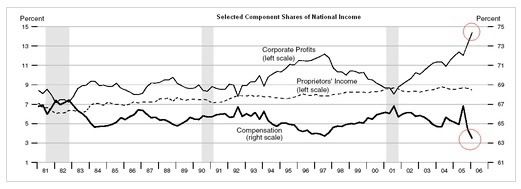
The case is compelling. The percentage of wealth concentrated on big corporations and financial institutions compared with labor is at a high not seen since the 1920s:

It's not a case of the average American's wealth growing, just more slowly than that of the wealthy. Rather, the middle class hasn't made any economic progress at all in the last 10 years, and is about to see their wealth decline again in this recession. Measured by quintiles, the lowest 20% has actually lost ground since the GOP came to power.
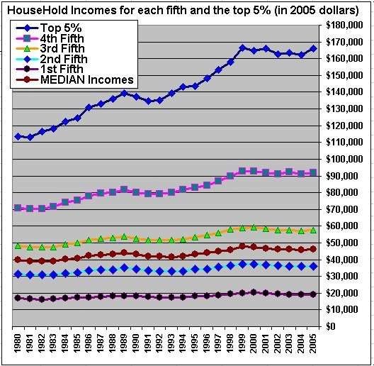
This is a permanent loss in middle class earning power.
To try to keep up, Americans have been taking on
Meanwhile pension plans have evaporated. And while CEOs get golden parachutes even for poor performance, if the company files for bankruptcy, it can
suspend benefits or terminate that pension plan. Indeed, the average American now lives in a society where each year about 1 in 10 households faces a 50% or more loss of income. But when large financial institutions get in trouble, savers are punished in order to bail them out with low interest rates, if they aren't bailed out directly.
The problem isn't Armageddon, it is inequality. Specifically, there is one set of rules for the Lords of Finance, and another set for the peon on Main Street. Finance is "too big to fail". The little guy or gal gets crushed, and has to deal with an onerous new Bankruptcy Law to boot. So profound is this inequality of economic opportunity that there is less social mobility now in America than there is in Europe.
This can't go on forever. And for the young, already it hasn't. Crushed by debt, the average 35 year old maleis less well off now than his forebear of the 1970s.
This is an absolutely stunning, devastating indictment of GOP economic policies. After 28 years, the statistics and the graphs can no longer be ignored. The historical record has been made. They have worked to engorge those already wealthy, while leaving all the risk on the backs of the middle and working classes. Profit has been privatized and risk left to the public, again and again and again.
A pro-middle class agenda is all we need to create a generation of progressive middle Americans who will vote Democratic. That agenda isn't too hard to imagine: an increase in progressive taxation. A re-commitment to reasonably priced higher education. An end to the system whereby your medical insurance and care depend on your job and medical costs are exploding. The re-invigoration of Usury Laws and action against predatory payday lending. A firm commitment to minimize leverage and speculative bubbles in the financial markets. Methods to make sure existing regulations are enforced. Real reform of the Bankruptcy Law to discourage unsuitable lending, and protect pensions from predation during bankruptcy reorganizations. Enacting a VAT or similar tax to capture profits from overseas outsourcing and to make sure the funds are directed at those in the US who suffered as a result. A commitment to rebuilding and modernizing our physical infrastructure. Sufficient budget discipline that progressive needs can be funded while the nation's long term financial well being is safeguarded. [And by no means least, a thorough refurbishing of the nation's Estate Tax laws, that prevents inherited wealth three or four or five generations removed from the earned fortune, becoming the basis of an entrenched plutocracy. ]
It is neither necessary nor particularly productive to base the appeal of progressive economic solutions on the idea that the four horsemen of the economic Apocalypse -- insolvency due to national debt, or hyper-inflation, or peak oil, or Great Depression 2 -- are just around the corner. Telling the truth about the slow, decades long assault on average Americans will suffice.
--------------
Postscript: Six years later, my beliefs are exactly the same. What is different is that the centrality of inequality - and by that I mean in particular inequality of opportunity, and unequal application of the law - has become accepted far and wide in the progressive econoblogosphere, by such people as Profs. Brad DeLong, Dean Baker, Mark Thoma, Robert Reich and Prof. Paul Krugman. Even Larry Summers has recognized that inequality is "profoundly corrosive." And of course President Obama recently described inequality the "defining challenge" facing America.
For reasons many of you already know, I detest even moreso than before those Pied Pipers of Doom who squeal with glee any time they can seize upon some "Sky is Falling" meme. The case to be made is not Armageddon. It is that America is failing as a land of equal opportunity.
Saturday, December 28, 2013
Weekly Indicators for December 23-27 at XE.com
- by New Deal democrat
Weekly Indicators is up at XE.com.
While the tone is still positive, relative weakness spread into more of the long leading indicators and into several shorter term indicators.
Weekly Indicators is up at XE.com.
While the tone is still positive, relative weakness spread into more of the long leading indicators and into several shorter term indicators.
Friday, December 27, 2013
OH NOES!!! So far in the year of Obamacare implementation, 100% of all net jobs created hae been pa- ... wait, what? ... FULL time jobs?!?!?
- by New Deal democrat
Remember how the implementation of Obamacare was killing full time jobs? Doomers, both right and left, were sure that full time jobs were evaporating this past summer.
In case you don't, here's an article from August in the McClatchy newspapers:
“Over the last six months, of the net job creation, 97 percent of that is part-time work,” said Keith Hall, a senior researcher at George Mason University’s Mercatus Center. “That is really remarkable.”This statistic was quickly seized upon by right wing bloggers as definitive proof that Obamacare was a colossal failure. Here's Ed Morrissey of Hot Air:
Hall is no ordinary academic. He ran the Bureau of Labor Statistics, the agency that puts out the monthly jobs report, from 2008 to 2012. ...
....
"There's something going on if such a large share of the hiring is part time," Hall said.
The July report only confirms that trend. Only 92,000 full-time jobs were created, while 172,000 part-time jobs got filled (not net numbers). The only major influence in 2013 that differs from the preceding three years of the recovery is the impending ObamaCare mandate on employers, which the Obama administration will try to postpone for a year. The data shows that businesses have already begun to react by minimizing their risk and costs through part-time employment, thanks to the perverse incentives set up by the ACA, and that this will continue as long as the mandate exists.Forbes' Chris Conover was even more dismissive:
Denialism may be too strong a term. But there seem to be a lot of people arguing that Obamacare has little or nothing to do with the rise in part-time employment. Some deny the rise is even happening, while others are content to deny that Obamacare is the culprit. Admittedly, it takes a little detective work, but if we systematically review the available empirical evidence in an even-handed fashion, the conclusion seems inescapable: Obamacare is accelerating a disturbing trend towards “a nation of part-timers"Needless to say, Zero Hedge was all over the story.
And left wing Doomers were just as certain of the fact as their right wing counterparts, if for different reasons, with one Daily Kos front-pager going so far as to call the questioning of the trend in a Marketwatch article "ridiculous."
Yours truly debunked these claims at the time, noting that:
... [E]ven though the household numbers are seasonally adjusted, it looks like there is some unaccounted seasonality still left in the numbers. ...[T]here has been a pattern ever since the recession whereby full time jobs ramp up through May, and then decline (or at least decelerate) through August, before rising again. In fact, through August of 2011, full time jobs were actually negative as measured from the first of the year.So, now that we are at the end of the year, with employment reports through November, has the alleged Obamacare disaster for full-time job creation persisted? Or has my critique, of unaccounted seasonality, been shown to be true?
....
When we do the actual apples to apples July to July comparison, lo and behold, not only is the full time job situation better than the part time job situation in 3 of 4 years, but in 2012 and 2013 the positive trend towards full time jobs is actually accelerating.
Here's the graph of both part-time (blue) and full-time (red) jobs, showing gains or losses since the end of 2012:
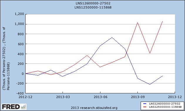
In 2013, 1,060,000 full-time jobs have been created, while part-time jobs have actually declined by -60,000.
And as for the broader claim that the recovery has "accelerated the trend towards a part-time nation," here's the same graph showing gains or losses since employment bottomed at the end of 2009:
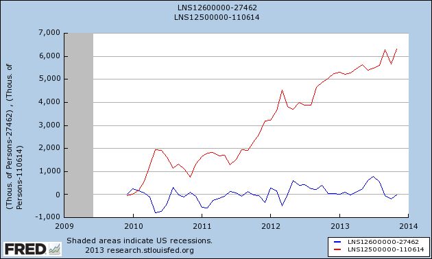
That's right. Four years into the recovery, and on net exactly minus -10,000 part time jobs have been "created", while full time jobs have increased by 6,314,000.
Oh.
That's probably why, for the last 3 months, when it comes to full time vs. part time jobs, there's been crickets from the Doomers.
And Zero Hedge has gone from treating the jobs report numbers as Gospel truth to calling it the "BLS random number generator."
I'm sure in 2014 Doomers will be back with selectively quoted statistics of the month. And I'll be here debunking all of them.
Thursday, December 26, 2013
Year-end posting
- by New Deal democrat
We've reached the end of the year, and data will be light until next Thursday. But I'm not done.
Tomorrow I'll be posting a scathing and sarcastic smackdown of one of 2013's most egregiously selective and stupid Doomer memes, that has - as usual - blown up in their faces.
Then on Monday or Tuesday I'll evaluate my 2013 forecast from January, and look back at the important economic trends from this past year.
An updated look at the real personal savings rate
- by New Deal democrat
I have a new post up at XE.com, discussing the most recent personal savings and spending data, explaining why there is no indication of any imminent retrenchment by US consumers.
Chinese Debt Levels Reaching Concerning Levels
From the Financial Times:
China’s
credit boom is still in full swing. Total credit in the economy (total
social financing) showed a 40 per cent rise in November over the prior
month and is on course for growth this year of almost 20 per cent. It is
continuing to expand at twice the rate of nominal, or money, gross
domestic product, and according to official data has pushed the credit
to GDP ratio up to 215 per cent in 2013, and most likely more. It is
clear that banking institutions, state-owned enterprises and local
government financing vehicles have remained relatively insensitive to,
or been able to circumvent, higher interest rates and bond yields,
central government curbs on the shadow banking sector, and the rampant
real estate and infrastructure markets.
There are basically two types of recessions. By far the most common occurs when the central bank raises interest rates to slow either demand pull or cost push inflation (or both). Both developments are the result of an economy running too hot. Recovery from these types of recessions is usually fairly quick. The second type of recession is a debt-deflation recession. Here, a credit fueled asset bubble bursts, leading those who hold the asset to sell same in order to pay off the loan backing the asset purchase. As everybody does this at the same time, asset prices plunge, leaving many who have loans underwater on those loans. This leads to a painfully slow recovery -- much like the one the US has been experiencing for the last 4 years.
China has been running hot for some time -- as in years. However, inflation is not a major issue. That leaves the most probably cause of the next Chinese recession as an asset bubble bursting, leading to a debt-deflation scenario.
That does not offer my much comfort heading into 2014.
Wednesday, December 25, 2013
Santa had a very rough night ...
- by New Deal democrat
In the spirit of "value added," giving you something you won't find on any other economics blog....
I went looking for a depiction of Santa delivering presents to an economist, or a blogger, or even a Doomer. I didn't find that, but what I did find was a photo of Santa after a particularly rough night delivering presents to all of the above. It is probably NSFW. In fact it is probably unsafe for family, and probably unsafe for just about everywhere else, so I won't even post it, just link instead.
WARNING: You cannot unsee what you will see if you copy and paste the link, but click if you dare:
https://blogger.googleusercontent.com/img/b/R29vZ2xl/AVvXsEgfKiJ8yPoxfVQ7JUyaA-gSeO5BENHZPaKxoknvlO3NU3td3h0lwSxB7QOmchF2T7e0oMkMAChJQkWC8DEdM3MUK_ePE62eQ-weugaLrcliAQs30ArCs3psyXz_Dv9TR1wUiCmlUyuwwKY/s1600/santa_drunk.jpg
Tuesday, December 24, 2013
Monday, December 23, 2013
One graph shows why the present stinks (and why the 1960's kicked a**!)
- by New Deal democrat
I was working on a couple of year-end type pieces yesterday, when I downloaded one graph that says so much about what has happened to the US economy, and in particular to the fortunes of the US middle class, during that time.
Here it is, the YoY percentage growth of real disposable personal income:
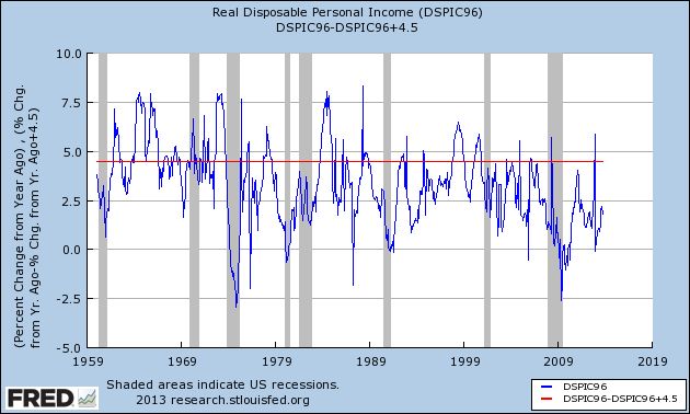
I've drawn a line across it at the +4.5% mark.
Remember, this is disposable income, and it is adjusted for inflation, for a period of over half a century.
I pulled it for my year-end piece, because real disposable personal income grew again, especially in the second half of this year. But even so, it was at a pathetic pace of less than 2.5%.
But the longer term is even more startling. Before 1974, real personal disposable income grew, on average, at about 4.5% a year. After 1974, the only times that has happened beyond a month or two was (1) right after Volcker broke the back of inflation in 1982, when unions still had some clout, and interest rates on things like CD's could still be had at rates like 7%; and (2) during the tech boom of the mid- to late 1990's -- the only time in the last 40 years that "felt like" the 1960's.
I remember the 1960's. The 1960's kicked ass!!! We were number 1, we were the most prosperous middle class that had ever existed in the history of mankind, and we knew it.
Two oil shocks (the 1970's and the 2000's), and one era of financialisation, trickle-down, and offshoring later, in 2013 I am thankful that the middle class got a little respite.
Saturday, December 21, 2013
Weekly Indicators for December 16-20 at XE.com
- by New Deal democrat
Weekly Indicators are up at XE.com. Coincident measures have weakened significantly this month.
Friday, December 20, 2013
Yesterday's poor initial jobless claims report: some signal buried in the snow of seasonal noise?
- by New Deal democrat
Yesterday's surprisingly poor initial jobless claims report of 379,000 was certainly a head-scratcher. I didn't see any obvious explanations. At the same time, coming in the middle of the holiday season, only two weeks after a 298,000 report, and with no other economic data showing any serious signs of tanking, my inclination is to treat it as noise and wait to see if a few more weeks sorts the matter out.
But let's go deep into the weeds for this one.
To begin with, December seasonal adjustments can be huge. Here's a graph of non-seasonally adjusted initial jobless claims divided by seasonally adjusted claims for the last 10 years:
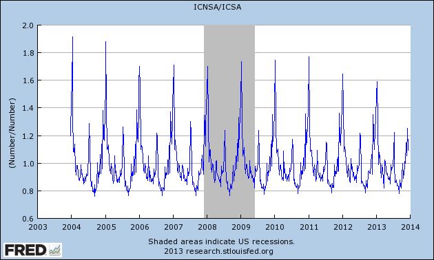
It's pretty easy to see that we are at the time of year when the largest seasonal adjustments of the year take place.
Not only that, but the variation just from week to week can be large. For example, the adjustment in the previous week was ~0.80. Last week it was ~0.92. Had the previous week's seasonal adjustment been used, jobless claims would only have been reported at 331,000!
Even for this reference week, which creeps by a day or two YoY, the adjustments can vary substantially. This year's 0.92 is the smallest adjustment for the reference week in the last 10 years. Last week it was 0.91, but in 2004, 2005, and 2009 the average of the two closest reference weeks was 0.85 - which would give us a report of 343,000. In other recent years, it would have been higher than 343,000 but lower than 375,000.
None of this is to fault the DOL, The point is simply that seasonal adjustments are particularly prone to noise at this time of year.
Other evidence that seasonality may be playing havoc with the claims number comes from the fact that, as I've said a number of times before, weakness starts with a slowdown in hiring before there is an increase in firing, i.e., hiring precedes firing. Below is an update of a scatterplot graph I've run before comparing the monthly jobs report (net hiring) with the monthly average of new jobless claims (firing), in which the last 20 months are highlighted in red:
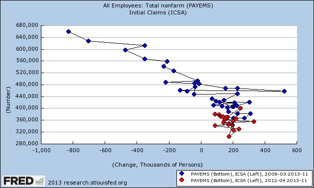
Before a recession, the scatterplot points shift significantly to the left. But as you can see from the above, while the points have stagnated, there has been no significant shift to the left in recent reports.
Further evidence of the relative strength in hiring comes from this graph of the YoY% change in jobs, which has been showing a slight increase during this year:
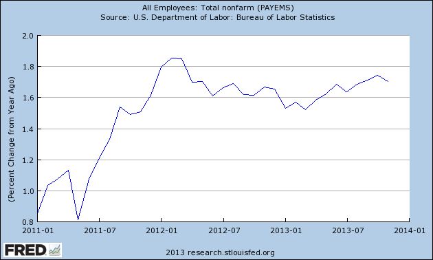
This is simply not something I would expect if we were on the cusp of a near-recession.
Also, even if there is "signal," it still may be affected by the season. Last year, due to tax shifting, there was a huge spike in personal income in November and December. That was reflected in large gains in the 14 day average of Gallup's daily consumer spending report, which ramped up from $65 in November to $90 in December 2012. This year in the equivalent period spending has only increased from about $87 to $100 at its peak so far.
What follows is my best guess, so take it with appropriate grains of salt, but if retailers mistakenly expected a similar ramping up this year, they have been sorely disappointed. Not to mention, in many parts of the country there have been some unusually significant December winter storms, which kept shoppers home. Those retailers may have begun layoffs of seasonal hires early, which would have a heightened impact on the jobless claims reports.
The bottom line is, while it looks like some actual signal (in most years, even with the seasonal adjustment, the number would have been reported as 350,000 or more), there is an excellent chance that this week's jobless report is still primarily seasonal noise.
Thursday, December 19, 2013
Interest rates' effect on housing in 2014
- by New Deal democrat
We've had interest rates back up by over 1% since April. I have a piece up at XE.oom discussing the likely negative impact of that rise in rates on housing in 2014, disagreeing (politely of course) with the position taken by Bill McBride a/k/a Calculated Risk.
Wednesday, December 18, 2013
Subdued inflation takes average wages to near 3 year high
- by New Deal democrat
So anyway, we've gone from a dry spell where there was barely any data to write about, to a deluge of new information, which means I don't have the time to write posts highlighting all the interesting (well, interesting to a nerd like me) trends!
Yesterday was the first time since I've been using the price of gas as a KISS method to track inflation that my forecast was off: non-seasonally adjusted CPI was -0.2% and seasonally adjusted was unchanged, vs. unchanged NSA and +0.3% seasonally adjusted as I had forecast. But YoY inflation was +1.2%, which was within 0.1% of my +1.3% forecast.
One by-product of this subdued inflation, caused in large part by somnolent gas prices, is that real, inflation-adjusted wages are starting to rise again. Here's a graph of average hourly wages on non-supervisory workers adjusted by inflation for the last 10 years:
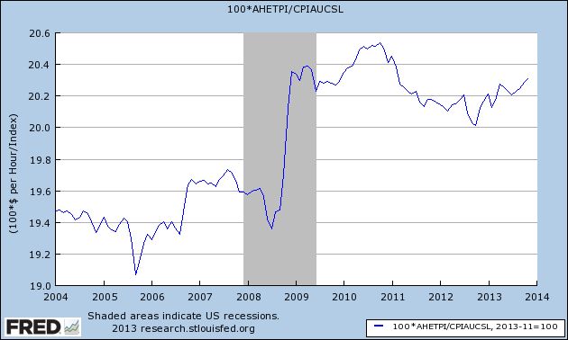
Yes, real wages did spike higher during the Great Recession, because in late 2008 gas prices fell from $4.25 a gallon to about $1.50 a gallon. They declined in 2011 and 2012 as gas prices went back as high as $3.95 a gallon again.
With the loosening of the Oil choke collar in 2013, however, real average wages as of yesterday rose to their highest level since February 2011, nearly 3 years ago.
The trend has turned positive, with YoY real wages rising by about 1%, as shown in the graph below of the YoY% change in real wages:
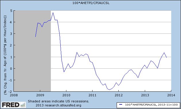
Since YoY real wages are about 1% below their 2010 peak, this means that we could actually establish a new high in average (not necessarily median) real wages for nonsupervisory workers by the end of 2014 - if gas prices remain somnolent.
Not grounds for "Allelulia's," but a welcome trend nevertheless. One which is going to be overlooked by about 98% of econobloggers because it doesn't fit their worldview.
Tuesday, December 17, 2013
Monday, December 16, 2013
Industrial production now higher than before recession.
- by New Deal democrat
This is Up over at XE.com.. At this point, 3 of the 4 indicators used by the NBER to determine recessions and expansions have risen above their pre- Great Recession peak.
France Holding Back EU Recovery
Above is a chart of the French ETF. First, notice the strong rally from mid-July to mid-November, when prices rose from a low of 22.58 to to a little over 28 -- a net percentage gain of 25.5%. Prices consolidated sideways after the move higher, trading between the lower 27s and 28s. However, now prices are slowly drifting lower, pulling the shorter EMAs with them. Also notice the declining MACD and negative reading on the CMF.
Sunday, December 15, 2013
An NDD holiday special: semi-healthy pecan pie with maple, caramel, and peanut butter
- by New Deal democrat
My mom made a terrific pecan pie. Unfortunately, most pecan pie recipes basically consist of corn syrup, sugar, and pecans, and they taste that way. They may as well be obesity and diabetes on a plate. So I experimented to come up with a recipe that is relatively healthy, has less calories, and is more flavorful. Here is my own, original, recipe for pecan pie that you can enjoy several times during the holiday season without guilt.
Start with either a store-bought or homemade 9 inch pie crust.
Pre-heat the oven to 350 degrees.
Take about 12-16 caramel candies, and put in a measuring cup.
Add 3 tablespoons of brown sugar.
Add 3 tablespoons of Splenda.
You want the total to equal 3/4 cup. You may need to add or subtract one or two of the candies so that you wind up with the right amount.
Put in a saucepan over low heat. Add:
1/4 cup (4 tablespoons) peanut butter
3/4 cup real maple syrup (dark is better than light)
1/2 teaspoon vanilla
1 tablespoon orange zest (or orange juice)
Stir as necessary. Keep the mixture over the heat just long enough so that the caramel and peanut butter completely melt. Then set aside.
In a separate bowl, add 1/4 cup light whipping cream
2 whole eggs
2 egg whites
Stir the eggs and whipping cream until thoroughly mixed.
Add the eggs and whipping cream to the saucepan, folding in till mixed thoroughly.
Take 1 and 1/2 cup chopped pecans, sprinkle over the pie crust in the shell.
Add the mixture from the saucepan.
Place in the oven and cook at 350 degrees for about 40-45 minutes, until the pie has jelled. The pie filling will inflate some while it cooks, so you might want to put some aluminum foil underneath to catch any overflow!
The result is a pecan pie that is lighter, more flavorful, has fewer calories, and has at least a passing resemblance to nutritional value. The challenge will be waiting until it has cooled off some before digging in. Enjoy!
Saturday, December 14, 2013
Weekly Indicators for December 9-13 at XE.com
- by New Deal democrat
Weekly Indicators are up at XE.com. Still positive, with the same cautions I've been giving for several months.
Come January, the picture could change significantly.
Friday, December 13, 2013
Unemployment: positive and improving, but not good
- by New Deal democrat
Over at Digby's place, David Atkins wrote that Democrats shouldn't be crowing about the unemployment rate. I'm not sure if anyone has actually been doing that, but on the other hand, I don't think we should pretend that no progress has been made on the unemployment front, either.
Too often I see comparisons that boil down to looking at the basic or U-3 unemployment rate before the recession vs. some other measure, like the U-6 rate, after the recession. Or the comparisons never look at prior recessions and recoveries. That's comparing apples and oranges.
Another argument has centered on the employment to population ratio, contrasting the issue of discouraged workers vs. Boomers retiring. On that score, sometimes it appears that the observing is arguing an all-or-nothing point of view. That isn't correct, either. The issue really is, how much is due to discouraged workers vs. how much is due to retiring Boomers. My point of view is, there's no really good data, and if you simply ascribe 50% to each, you probably aren't far off. That the ratio of unemployed 25 to 54 year olds has stayed in the basement argues that there is still a lot of work to do, no matter what.
One attempt to explain the data has come from the Economic Policy Institute. They claim to have a metric for "missing workers" that takes into account Boomer retirements. One problem with their work, as I pointed out earlier this week, is that the monthly Household Survey, the data on which they rely, already specifically has a measure ofworkers who want a job now but aren't actually looking, the precise thing they claim to be estimating. I don't understand why I should give much credence to their metric, which relies upon the continuing accuracy of an estimate made in November 2007, when I have the up to the present data specifically published each month.
Beyond that, their measure shows an average of -20,000 or more "missing workers' over a 24 month + period from summer 2006 through autumn 2008. A negative number of "missing workers" is a logical impossibility and cannot be laid off on monthly variance where it occurs so consistently for so long. In fact, if the nonfarm payrolls report has been an accurate measure for the last two years, their current reading of nearly 6 million "missing workers" might not just be wrong, it might be nearly impossible! - but I haven't crunched the numbers enough to be reasonably sure.
So what is the overall story as to unemployment? The below graph shows the situation pretty well, I think The normally reported U-3 rate, currently at 7%, is in blue, and the measure including marginally attached and part time workers for economic reasons, or U-6, is in red. The green line is the number of unemployed workers plus those not in the labor force, but who say they want a job now. Finally, the broad measure of discouraged and part time workers, plus those who haven't looked, but say they want a job now, is in orange:
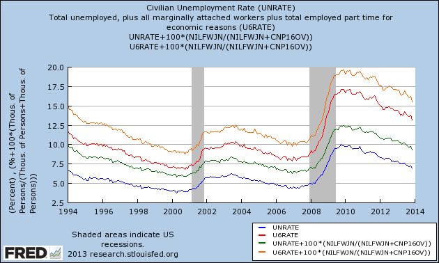
The bottom line for all of these measures is really the same. There has been substantial improvement since their worst readings at the end of 2009. The U-3 bassed measures have fallen about 3%, and the broader U-6 measures, by nearly 5%.
But this is tortuous progress over a 4 year period. During the period from early 1933 through early 1937, the rate most analogous to U-3 fell from about 25% to nearly 10%.
More pointedly, while the unemployment rate is positive, and it is improing, it can hardly be characterized as "good." Back when I rode my pet T-Rex to Bedrock Junior High in the 1960's, 6% (U-3) unemployment was considered the dividing line between a fair and a poor economy.
That strikes me as about right now as well. At the rate the unemployment situation is improving, it will take another year for the U-3 rate to cross that threshold. It will take another 2 years for all of the rates shown above to reach the levels they were at in the late 1990's and throughout most of the 2000's up until the "great recession." And there is no guarantee at all that we won't have already started our next recession by then.
Thursday, December 12, 2013
A note about today's initial jobless claims and retail sales data
- by New Deal democrat
Since I am sure there will be breathlessly wrong Doomer commentary, I just wanted to confirm something you may have already read elsewhere about this morning's initial jobless claims number: this was due to seasonality (Thanksgiving day falls in different reference weeks in different years) and payback for last week's 298,000 number. When you average this morning's 368,000 number with last week's revised 300,000 number, you get 334,000, which is right in line with the recent trend.
The 4 week moving average was 328,750, again right in line with the overall recent trend.
Retail sales, however, were a straightforward good number, and especially the upward revision of October to +0.6%. Since we actually had -0.1% deflation in October, that makes the real retail sales number +0.7%. November's +0.7% retail sales number will probably have to be adjusted by a +0.3% inflation report, which will make it a net +0.4%.
YoY real retail sales are a pretty good leading indicator for jobs. From mid-2012 through early 2013, YoY real retail sales averaged generally under +2.5%. Since June of this year, however, with one exception real retail sales YoY growth will have averaged over 3.0%. This suggests at least a slight strengthening of the monthly jobs report numbers in coming months.
(Note: corrected for original error of Oct. retail sales of 0.8%. It does not change the YoY improvement).
Wednesday, December 11, 2013
An updated look at the US long leading indicators
- by New Deal democrat
This post is up At XE.com. Why I see continued growth for at least the next 9 months.
Tuesday, December 10, 2013
Oil Rebounds From Recent Lows
After falling to the 91.77 level, oil has rebounded a bit, hitting resistance at the 98 price level. This level has proven significant for oil for the last year. It was the prime point of resistance for oil's attempted rally during the first half of 2013. It is also an important Fibonacci level, adding further strength to its technical position.
< Sigh > If only there were a way to count people who aren't looking for work, but want a job now. Oh, wait ...
- by New Deal democrat
It's tough to be a Doomer these days. Almost none of the data is cooperating. But at least one crutch they can always lean on is alternative unemployment measures that show a higher unemployment rate than the official 7%. It used to be that you could make a good case by citing the alternative U-6 rate that counts the underemployed. But even though that remains unconscionably high at 13.2%, it has been dropping in tandem with the official rate, and is down 3.9% from its peak in 2009 of 17.1%. It is now almost as low as the 11.8% rate in 1994 when the series was first published.
So the new methods work from pre-Great Recession employment to population ratios. One such method, favored by Mish and Naked Capitalism, is to assume that, except for the 2008-09 recession, the employment to population ratio would have remained constant at its level of about 10 years ago. This method boils down to, "What would the unemployment rate be in an alternative universe in which there were no Baby Boom, and Boomers weren't retiring in droves?" and has about as much credibility as that quote implies.
But there is a more sophisticated method that has been promoted by the Economic Policy Institute. They describe their method as designed to count "missing workers." They say:
In today’s labor market, the unemployment rate drastically understates the weakness of job opportunities. This is due to the existence of a large pool of “missing workers”—potential workers who, because of weak job opportunities, are neither employed nor actively seeking a job. In other words, these are people who would be either working or looking for work if job opportunities were significantly stronger. Because jobless workers are only counted as unemployed if they are actively seeking work, these “missing workers” are not reflected in the unemployment rate.(Bold is my emphasis. We'll come back to that later.)
That method extrapolates from a November 2007 study by the BLS, which projected a trend going forward at that time, and which estimated the impact of Boomer retirements on that trend. Since that established the secular baseline, so the theory goes, so any deviation from that trend must show the "real" unemployment rate due to the Great Recession. Using that methodology, the EPI estimates that there are 5,660,000 "missing workers" as of November 2013, and so the current "real" unemployment rate is 10.3%, as shown in this graph:
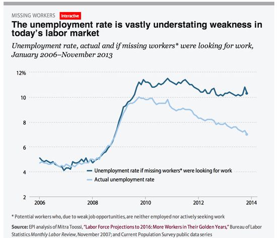
See? told ya! There's no real "recovery" after all!
In essence, what the EPI describes as "missing workers" are, as one advocate of their methodology has said, are people who "have no work and aren't looking but want a job."
Sort of like the data series from the Household Survey called, ummmmm, errrrrr, "Not in Labor Force, Want a Job Now"!
Yes, ladies and gentlemen, there is a seasonably adjusted data series, updated by the Household Survey and included in the Jobs report every single month, which measures exactly what the EPI says it is trying to estimate in that phrase I bolded from their explanation: the number of people who haven't looked for a job in the reference period, but want a job now. And here it is:
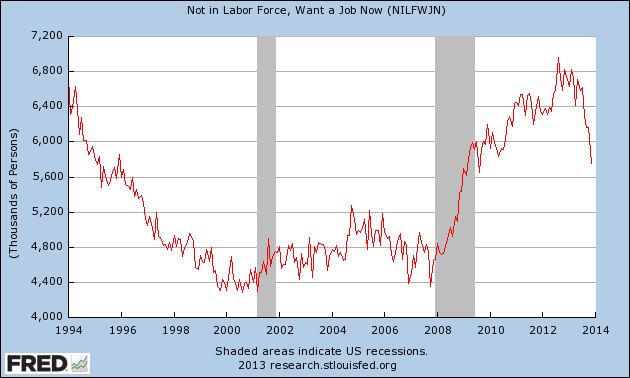
As you can see, that number increased by 50% from trough to peak. And currently the number of such people is 5,740,000, which is very close to the EPI's estimate.
But what does that mean for the unemployment rate, if this group were included? Since the unemployment rate is the number of unemployed divided by the civilian labor force of which they are a part, to include those who want a job but haven't looked, we have to add them to both numbers, I.e., the numerator and the denominator. When we do that, here's what the number looks like since the start of the recession:
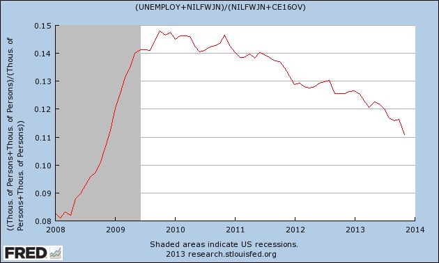
Well, lookie there, just over 10%, just like the EPI's number. See, it's really not a "recovery," right?
Wrong.
For starters, we didn't go from 0 "missing workers" in 2007 to 5.5 million now. According to the actual data, at its trough in 2007, the series measured 4,390,000 people. At its height in August 2012, it measured 6,956,000, before falling almost half the way back to its pre-recession low as of now. And at 5, 740,000 this is almost identical to the number in February 1995, not notably an awful period for the economy - and that's before adjusting for population growth since.
But the bigger problem for Doomers is that the data series "Not in Labor Force, Want a Job Now" goes back to 1994. So here's what happens to the unemployment rate when we include this group over the entire 20 year period:
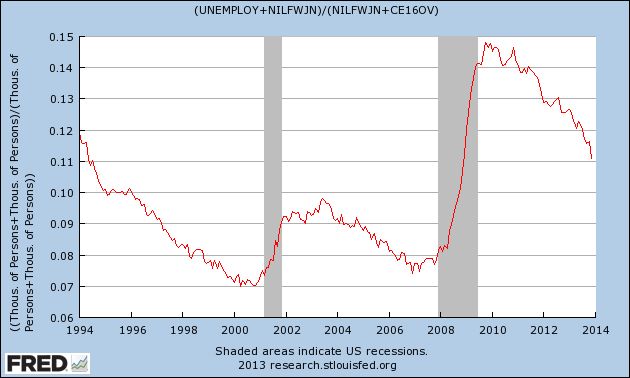
The lowest rate ever is 7%, and the unemployment rate is as low now as it was in 1994. And since the end of the Great Recession, it has dropped from just under 15% to just over 11.%.
So, while I would count the EPI as among the "good guys," I'm at a loss for why we should be counting anybody who says they don't want a job now as among the unemployed. Unless and until the EPI gives me a reason to think otherwise, between the EPI's estimate based on a study from 6 years ago, and the Household Survey's actual number, updated monthly, of people want a job now but haven't looked, as far as I am concerned the Household Survey is far more accurate.
Finally, look what happens when we extrapolate by adjusting the official rate to fit the trend including this group, and extend the series all the way back for 50 years:
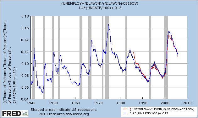
It looks like the current number is on par with the recoveries from the severe 1974 and 1981 recessions.
Oh.
Like I said, it's tough being a Doomer these days. The data just isn't cooperating.
Monday, December 9, 2013
Longer Term US Charts Still Bullish
Above are the weekly charts for the respective ETFS of the Russell 2000 (IWM), Nasdaq (QQQ) and S&P 500 (SPY). All show strong uptrends with rising momentum and EMAs and strong volume flow. All three support the idea the market will continue moving higher with shorter term periods of consolidation.
Sunday, December 8, 2013
A thought for Sunday: Why stagnant wages and trends in interest rates make me a longer-term Doomer
- by New Deal democrat
A commenter to a post I wrote this past week asked if there were anything I am "Doomerish" about. As it happens, yes there are several such things. I guess that makes me a "closet Doomer."
By nature, I am pessimistic. I am always expecting Pandora's box to be opened and for all kinds of horrors to come flying out. But I am also a math nerd, and that means I view Pandora's box like a safe with a combination. Doom can't come flying out until all of the tumblers have fallen into place. Until the proper combination has been found, and the safe unlocked, Doom is at bay. In fact, my first post ever at Daily Kos, in October 2005, was entitled "Not Doomed Yet".
Let me explain in detail the source of my longer-term pessimism, by referencing two posts I wrote in 2007 and 2008.
By 2007, all of the tumblers appeared to have triggered, and in August 2007 I wrote what I still think is one of my best posts ever, "Are Hard Times near? The Great Decline in interest rates is ending". My overall view of the economy now is really the same as it was then. The "Great Moderation" so beloved of Alan Greenspan was actually a chimera of declining interest rates. Here's what I said then:
... [T]he "Big Picture" from 1981 - present is that [t]he American consumer has had largely stagnant wages since 1974. While from 1980 through 2006, the median income of an American household has risen only from $39,700 to $48,200 in real terms, house prices for example have shot up form nearly $125,000 to $246,500. Consumers have responded generally by taking on more and more debt. Total household debt service has risen from 16% in 1980 to 19.4% in 2006.
Fortunately for consumers, there has been a generation-long decline in interest rates since they peaked at 15.21% for the 30 year US Treasury bond in October 1981. This has allowed consumers to refinance their debts at ever lower rates every few years. They have also been assisted by a bull market in stocks that took the S & P 500 from 102 in 1982 to 1553 in 2000, and the subsequent housing boom/bubble.
There are signs that this "Great Disinflation" of declining interest rates is coming to an end. Only twice in the last 27 years has the consumer been unable to refinance debt or tap into his or her stock or house ATM. ... [T]he 3rd and final time is almost certainly near.
.... [Given wage stagnation], the only way American consumers have been able to significantly improve their lifestyles is either to take on debt, using assets which have appreciated in value as collateral [stocks from 1982-2000 and housing thereafter], or to refinance their debt at lower interest rates. If consumers are unable to tap the value of assets, or to refinance, then without improvements in wages, they will pull back and cause a consumer-led recession....
.... The Longer-Term: are Hard Times coming? Interest rates are no longer declining
Beyond the possibility of a recession in the very near term, a first-order danger signal for the long term future is that long term interest rates seem unlikely to move lower than 4% anytime soon.... These problems suggest that the 27 year decline in interest rates is ending. From here we may well see fluctuating interest rates that begin to rise in sustained fashion again at some point in the next 3-8 years. A rising interest rate environment would be deadly for consumers and for other debtors like the US Treasury.
If long term interest rates do decline again, consumers may yet have one more chance to refinance their spending for the next few years. But any increase in interest rate yields for 30 year US Treasury bonds above 5.5% would likely mean that the Great Disinflation of interest rates is over, and Hard Times -- when individual and Sovereign debtors alike must "pay the piper" -- are upon usWhile the thesis obviously wasn't perfect, Hard Times did come to pass just as expected, as overextended consumers (and banks!) had to pay down debt. In January 2008, which we now know was only one month into the "Great Recession," I wrote "The Slow Motion Bust unfolds in earnest," saying:
Whoever inherits the White House on January 20, 2009 is likely to confront serious and urgent economic conditions unlike any we have seen in our lifetimes. For the mortgage crisis is only part of a bigger insolvency crisis that has already taken longer to unfold than most economic downturns in our history.Below the fold I'll describe past "panics" or economic busts from the 19th century, to show you how quickly they unfolded....Consider this, not a set of predictions for 2008, but rather a look at the Big Economic Issue that will dominate this year and the entire next Presidency.
.... By a "slow motion bust", I mean to suggest that the current situation is like the 19th-early 20th century "panics" described above, except that instead of unfolding quickly, the situation is unfolding at a snail's pace. Like an ageing behemoth of a warrior, the economy may need to sustain 1000 blows before it goes down, but that onslaught of blows is ever so gradually accumulating.As it turned out, the bankruptcy of Lehman Brothers was the blow that slay the beast, and also there was one more chance to refinance, as Ben Bernanke and the Fed engaged in Quantitative Easing, and long term interest rates sank as low as 1.52% in July 2012.
So what am I Doomerish about?
Now at the end of 2013, we still have the same long term problem that I wrote about in 2007. Over the long term, wages are still stagnant, and below their 2010 peak. Interest rates are more than 1% above where they were 17 months ago. HELOCs are a thing of the past. We have just had a new peak in stock market prices, however, and the "wealth effect" should lead to some increased spending by the top 10%-20% of households.
I have long thought that the secular Bear which began in 2000 was not going to end until about 2020, and that there would probably be 3 stair-steps down. The first 2 have already happened, but if there is a 3rd, at the end the situation will probably be worse than it was in late 2009. With nominal wages only increasing by 1.8% a year for the last 4 years, even 2% inflation causes households to lose ground. This can't go on indefinitely. Either real wages must meaningfully improve, or that 3rd recession is going to happen sometime soon (but not now, and almost certainly not in the next 9 months). It may well start from a position of incomplete recovery from the 2008-09 recession, and if so that next recession is likely to feature actual wage deflation.
With the oxygen of refinancing shut off in the era of sideways and then rising interest rates, a era which I believe began in July of 2012 and will last at least a generation, economic expansion can only take place once real wages start to rise again and/or sustained asset price inflation persists.
Doomerish enough for you?
Saturday, December 7, 2013
Weekly Indicators for December 2-6 at XE.com
- by New Deal democrat
Weekly Indicators are up over at XE.com.
Thanksgiving Day wreaked some havoc with a number of seasonally adjusted comparisons YoY, but the thrust is still positive.
By the way, thanks to those commenters who pointed out the glitch with my ISM graphs disappearing. Their IT guy assures me he is working on it. If it isn't fixed in a couple of days, I can repost a graph here.
One thing Bonddad and I can't do is crosspost pieces, although we do link and use teasers. So far it is working well, driving increased traffic there, as well as a noticeable uptick in traffic here. Beginning this week, our XE pieces are going to be blasted out to 200,000+ subscribers, so that is pretty cool!
And we are assured that the improvements will slowly continue.
Friday, December 6, 2013
On Social Security, "doing nothing" is the best option with a GOP House
- by New Deal demorat
Duncan Black a/k/a Atrios, acknowledges that part of his campaign to espand Social Security benefits, is to put "doing nothing" on a firmer footing.
In fact, over the next 20 years, unless job creation and real wages suddenly accelerate on a secular basis, "doing nothing" isn't enough. There is a real, albeit small and fixable, problem with the Trust Fund. Bruce Webb of "Social Security defenders" has acknowledged that this is why he came off the "doing nothing" fence and endorsed the "Northwest Plan" which solves the shortfall by increasing tax withholding.
As I've shown in the last few weeks, the problem can be fixed for so long as the grandchildren of today's children live, by a reasonable combination of small tax withholding increases, increases in the percentage of income subject to the tax, an increase of about 3 to 4 months in the ultimate retirement age, and alternatively, if necessary, about a 3% cut in benefits over the next 20 years. Atrios disagrees with me, but he's wrong.
But there is simply no reason to enter into a bargain, Grand or otherwise,with a GOP that wants to destroy Social Security, whether in small steps or all at once. Making the Social Security Trust Fund solvent forever can abide the election of a democratic majority in both Houses of Congress.
November jobs report: a solid positive month (but still not good enough)
- by New Deal democrat
In November 203,000 jobs were added to the US economy. The unemployment rate dropped sharply, down 0.3% to 7.0% -- and for once it included an increase in the labor force as well as a decline in the number of people without jobs. There is little in this report for Doomers to latch onto - although the percent of the working age population that is employed remains near its post-recession low, and this November's reading was 37,000 less than last November's +240,000 report.
First, let's look at the more leading numbers in the report which tell us about where the economy is likely to be a few months from now. These were all positive.
- the average manufacturing workweek rose 0.1 hour from 40.9 hours to 41.0 hours. This is one of the 10 components of the LEI and will affect that number positively.
- construction jobs increased by 17,000.
- manufacturing jobs rose by 27,000.
- temporary jobs - a leading indicator for jobs overall - increased by 16,400.
- the number of people unemployed for 5 weeks or less - a better leading indicator than initial jobless claims - fell by 300,000 reflecting the return to work of those laid off during the government shutdown and is near its post-recession low.
Now here are some of the other important coincident indicators filling out our view of where we are now:
- The average workweek for all nonsupervisory workers increased by 0.1 hour from 33.6 hours to 33.7 hours.
- Overtime hours increased from 3.4 hours to 3.5 hours.
- the index of aggregate hours worked in the economy surged by 0.5 from 98.8 to 99.3. This is also a post-recession record.
- The broad U-6 unemployment rate, that includes discouraged workers declined from 13.8% to 13.0%, also a post-recession low.
- The workforce rose by 561,000. Part time jobs fell by -331,000.
- the alternate jobs number contained in the more volatile household survey increased by 818,000 jobs, reversing the government shutdown -735,000 in October, for a net gain of 83,000.
- Government jobs once again decreased by 7,000.
- Combined revisions to the September and October reports totalled a net gain of 8,000 jobs.
- average hourly earnings increased $.04 to $24.15. The YoY change decreased from +2.2% to +2.0%, meaning that YoY average real wages probably actually declined in November, given the epected +0.3% rise in consumer prices..
- the employment to population ratio increased 0.3% to 58.6%, which again just reversed October's decline likely due to the government shutdown. The labor force participation rate actually rose 0.2% to 63.0%
All in all, this was a solid report. Everything moved in the right direction, and for the right reasons. The employment-to-population, however, remains stuck near its all time low. There is no reason to doubt that this continues to be partly due to people simply giving up on the idea of ever working again, and partly due to burgeoning Boomer retirements. And of course, even a solid report like this simply isn't good enough to put a big dent in the population-adjusted lost jobs since the onset of the Great Recession.
Thursday, December 5, 2013
Pensions and Bankruptcy: a fix is available and should be enacted by Congress
- by New Deal democrat
Yesterday a bankruptcy judge decided that, Michigan's Constitution notwithstanding, the city of Detroit could be admitted into bankruptcy and its pensions attacked.
As an initial matter, the decision is probably correct as far as it goes, i.e., Federal laws are supreme over state laws, so US bankruptcy law trumps Michigan's Constitution. Where I have a real problem is that Michigan, at its most fundamental level, sought to make it ultra vires (outside of their lawful powers) for any actor to file for municipal bankruptcy in that State. You an I can't simply march into US bankruptcy court and put General Electric into bankruptcy. We have to have the lawful right to make the filing. Michigan said that nobody had the right to make a lawful filing as to its municipalities. In my opinion, that should have been enforced against the State-appointed city manager who made the filing.
But there is a deeper problem, and that is the cavalier attitude towards pensions that has been allowed to exist in US bankruptcy courts for 25 years. If you haven't seen it yet, watch the interview with the elderly, retired Detroit municipal worker who worked for his pension for 40 years and now faces having his retirement income severely cut (and remember that many of these workers do not qualify for Social Security). He asked, "What do they expect me to do now?"
Since pensions were allowed to be cut in bankruptcies, Congress - including Democrats - has simply shrugged and said, "Too bad." That doesn't have to be the case, and it shouldn't be the case.
In many cases in private industry, corporate raiders attack a well-functioning company sitting on a pile of cash, including its pension funding. After the corporate treasury is raided, the company files for bankruptcy and the pensions are cut or even entirely negated.
There is simply no justifiable reason for this rule. Pension liabilities are publicly known and quantifiable. In many cases the contractual benefits were earned years, and maybe decades, before. All subsequent contractual liabilities are made (and should be deemed made) with full knowledge of those pre-existing liabilities to employees. If there is a bankruptcy, nobody who became a creditor after the vesting of the pension benefits should be allowed to participate in any distribution until those prior contracts are honored.
This doesn't mean that pensions are sacrosanct. It simply means that creditors who obtain their rights under subsequent contracts have to stand in line behind pensioners who earned their rights in previous contracts. In the case of Detroit, it means that somebody who bought a bond issued by Detroit 5 years ago shouldn't get paid until that retired worker's pension previously earned benefits are honored in full.
There are public entities, and corporations as well, that promised too much in pensions. Further, in the case of a necessarily ongoing entity like a municipality, pensions can't be honored in full at the expense of providing necessary municipal services to current residents. But there is simply no reason to put recent bondholders on the same footing as, let alone ahead of line as, pre-existing pensioners.
Under the rule I am discussing here, if I am a potential new bondholder for a city or company that has huge pension liability, I am either not going to buy their bonds, or else I am going to demand a very high interest rate to hedge against the likelihood that the bond issuer is going to default. The net effect is that profligate municipalities will go into bankruptcy sooner, when their finances are in less dire straits - which is a good thing.
In short, there is a federal legislative fix for this problem. It ought to be on the Democrats' agenda, and applicable prospectively to any contracts entered into subsequent to its enactment.
In the meantime, the last several decades have taught workers a brutal lesson: never trust assurances of future payment. I want the retirement funding up front, hived off in a defined contribution account that belongs to me, not my employer.
Wednesday, December 4, 2013
Sorry, Doomers, there really, truly, honestly, STILL is no second US housing bubble
- by New Deal democrat
The Census Bureau released September and October new home sales and median new house price data this morning, and that gives me a chance to update a post I wrote 6 months ago.
They reported that 444,000 new homes were sold in October, which is just below June's 454,000 for the highest number of sales since the Great Recession. September sales were only 354,000, however, which was the lowest since April of 2012. In general, sales as reported look to be going sideways. I suspect that increased mortgage rates will continue to pressure the housing market, and it will be interesting to see if October's blowout housing permits report is an outlier for a flattening or decreasing trend or not.
The Census Bureau also reports on median new house prices, however, and that gives me the perfect opportunity to finish off the debunking of the "second US housing bubble" claim that raised its head this past spring.
About 90% of all housing sold in the US is from existing sales. Only about 10% of houses sold are new houses. Back in June, I debunked a dishonest Zero Hedge graph that divided nominal increases in house prices by inflation-adjusted disposable income, predictably showing that, so measured, house prices were even higher than at the height of the housing bubble. Of course, it turned out that when you did the honest comparison, i.e., nominal-to-nomial or real-to-real, there was no bubble at all.
But the Political Calculations blog was doing a real-to-real comparison of new homes, and there there had been a run-up in late 2012 to April 2013 in prices to near the 2005-06 peak. I suspected it was a short-term phenomenon and not a real bubble, or at best a "minibubble" that would shortly be reversed.
And indeed we now have confirmation that neither new nor existing median house prices in the US have formed any kind of bubble at all.
First of all, let's look at the Case Shiller 20 city index. In the below graph I have deflated the raw price data by average hourly income (blue) and by consumer inflation (red):
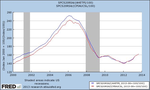
As you can see, existing houses are selling at the price levels they were at in 2001 or 2002, a far cry from the top of the bubble. In fact, since 2009 the general trend is pretty flat. Yes there has been a rebound, and it's certainly possible that the rebound has overshot a little, but this looks nothing like a bubble.
Now let's turn to median new house prices. As measured over 50 years, and once again deflated by average wages (blue) and consumer prices (red) there has been an increase in new home prices:
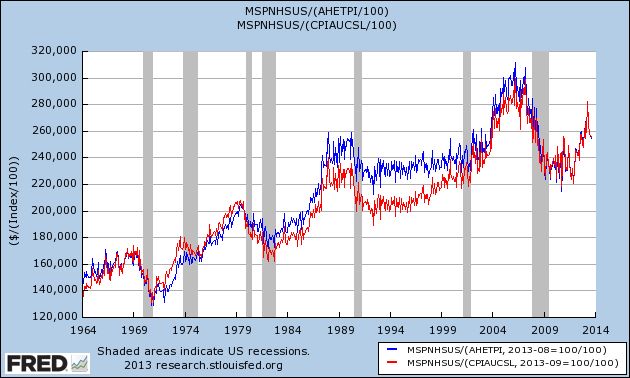
But it's well to keep in mind that the average square footage of a new house increased by something like 25% from 1600 s/f to 2000 s/f over that period. So on a square-foot basis, the overall trend is probably closer to flat.
Further. in the long graph we can see the bubble forming in the early 2000's and then deflating, before rising again to near its former peak in 2012.
Now here is the same data in close-up, better to show the recent trend (note: this does not include this morning's October report showing a median price of $245,800):
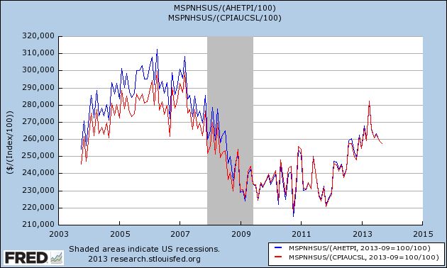
And with this morning's release of new home data we can see that the late 2012/early 2013 run-up in prices has entirely been given back. In fact, the median house price in October 2013 was $1400 lower than October of 2012, even before taking average wage growth of about 2% or inflation of 1% into account.
Keep in mind that the same Doomers who are telling you now that there is a housing bubble are the same Doomers who predicted foreclosure tsunamis that never arrived, and that housing prices wouldn't bottom in early 2012. On the other hand, besides yours truly who called both the top of the bubble as it happened and in summer 2011 that the bottom of the bust would occur in the early months of 2012, three other people who have a, shall we say, pretty decent record in calling the housing market - Bill McBride a/k/a Calculated Risk, Nobel Prize winner Robert Shiller, and Fed Chair nominee Janet Yellen - all agree with me that there is no new US housing bubble now.
Sorry, Doomers. But keep at it, some day things will turn down again.
French and Italian ETFs Trading Right At Support
France and Italy are two of the weaker EU economies, which is reflected in both to their respective ETFs. Although both rallied since mid-summer, they have both traded sideways for the last month as the economic numbers from the EU have weakened. NOw both are trading at their respective support levels, right near the 50 day EMAs. In addition, momentum is weak and the CMF is declining for both.
Subscribe to:
Comments (Atom)


