Saturday, March 23, 2013

Weekly Indicators: just lukewarm edition


 - by New Deal democrat

First of all, a welcome to our many new readers. Every weekend, I look at data that gets reported on a weekly basis. While it can be noisier than monthly or quarterly data, it has the virtue of being virtually up to the minute. Amplifications or reversals of trend will show up here before they show up in monthly data, which can already be two months old by the time they are reported.

Monthly data released in the past week included the Conference Board's Index of Leading Indicators, up .5 for February. January was also revised upward to +.5. After faltering for the second summer in a row in 2012, these have been more positive in recent months, indicating a strengthening economy this spring and summer. Housing starts and permits (a component of the LEI) also made new post-recession highs in February. Existing home sales also rose slightly. The Philly Fed report was also slightly positive.

Let's start again this week's look at the high frequency weekly indicators by checking what is happening with tax withholding:

Employment metrics

Daily Treasury Statement tax withholding

  • $157.1 B (adjusted for 2013 payroll tax withholding changes) vs. $162.2 B, -3.1% YoY for the last 20 days.  The unadjusted result was $180.8 B for an 10.3% increase.

  • $145.2 B was collected for the first 15 reporting days of March vs. $130.1 B unadjusted in 2012, an 11.5% increase YoY.
Initial jobless claims
  •   336,000 up 4,000

  •   4 week average 339,750 down 7,000
American Staffing Association Index
  • down 1 to 90 w/w up 2.6% YoY
Employment metrics were mixed this week, with initial claims remaining very positive, but temporary staffing turning neutral. Then we have the ongoing quandary as to what is happening with tax withholding.  Initial claims have established a new lower range of between 330,000 to 375,000.  The ASA is still running slighty below 2007, and slightly ahead of last year.

To reiterate, I am adjusting my YoY tax withholding figures to reflect the increase in personal withholding taxes. While the YoY collections are up substantially, they should be up over 15% to compensate for the tax increase. (Last week several commenters asked me to clarify this. Last year's tax withholding for SS was 6.2% from the employer, plus 4.2% from the employee, plus 1.45% Medicare withholding. The total withholding was approximately 12%. This year employee withholding increased to 6.2%, so total withholding increased to approximately 14%. The increase from 12 to 14 is just over 15%)  Since I can think of no reason why employment itself should have fallen off a cliff in January, it is very possible that there is a lag in the payment of withholding taxes with the new increase.  If this hypothesis were correct, I would have expected tax withholding to be much more reliable before now, but that doesn't appear to have happened.

Consumer spending Gallup has been very positive for 3 months. This week's YoY comparison is with one of the best spending weeks in 2012, and was still up over 10%.  The ICSC varied between +1.5% and +4.5% YoY in 2012. with one exception, the report for the last few weeks has been near the bottom of this range.. The JR report this week is at the top of its typical YoY range for the last year.  Even in the worst case, it still looks like consumer spending has not collapsed due to the tax withholding increase. The rebound in the last several weeks may be due to tax refunds finally arriving in consumers' hands.

Housing metrics

Housing prices
  • YoY this week. +4.5%
Housing prices bottomed at the end of November 2011 on Housing Tracker, and have averaged an increase of +2.0% to +2.5% YoY during 2012. This week backed off last week's best YoY comparison in about 7 years.

Real estate loans, from the FRB H8 report:
  • down 5 or -0.1% w.w

  • unchanged YoY

  • +2.1% from its bottom
Loans turned up at the end of 2011 and averaged about 1% gains YoY through most of 2012.  In the last month these have stalled.

Mortgage applications from the Mortgage Bankers Association:
  • -4% w/w purchase applications

  • +6% YoY purchase applications

  • -8% w/w refinance applications
Purchase applications had been going sideways for 2 years. In the last couple of months they have finally broken out of that range - slightly - to the upside.  Refinancing applications were very high for most of last year with record low mortgage rates, but did decreased recently with an increase of mortgage rates.

Interest rates and credit spreads
  •  4.91% BAA corporate bonds up 0.06%

  • 2.04% 10 year treasury bonds up 0.08%

  • 2.87% credit spread between corporates and treasuries down -0.02%
Interest rates for corporate bonds have generally been falling since being just above 6% two years ago in January 2011, hitting a low of 4.46% in November 2012.  Treasuries have fallen from about 2% in late 2011 to a low of 1.47% in July 2012. Spreads have varied between a high over 3.4% in June 2011 to a low under 2.75% in October 2012.  The  last several months have seen a marked increase in rates and credit spreads have widened, although the situation eased in this past week.

Money supply

M1
  • -2.1% w/w

  • -1.6% m/m

  • +8.3% YoY Real M1

M2
  • unchanged w/w

  • -0.2% m/m

  • +4.6% YoY Real M2
Real M1 made a YoY high of about 20% in January 2012 and has generally been easing off since.  This week's YoY reading remained above a new low set several weeks ago.  Real M2 also made a YoY high of about 10.5% in January 2012.  Its subsequent low was 4.5% in August 2012.  It was weak once again this week. In absolute terms, M2 made a high over 2 months ago and is down -0.7% from that peak. The behavior of M2 thus bears close scrutiny.

Oil prices and usage
  •  Oil $93.71 up $0.26 w/w

  •   gas $3.70 down $0.01 w/w

  • Usage 4 week average YoY +1.5%
The price of a barrel of Oil has backed off recent seasonal highs, and is actually down YoY.  Unusually for the last year plus, the 4 week average for gas usage for the seventh week in a row was positive YoY.  This may be due to winter weather having been actually winter-like this year.

Transport

Railroad transport from the AAR
  •  +1400 or +0.5% carloads YoY

  • +4100 or +2.4% carloads ex-coal

  • +1600 or +0.7% intermodal units

  • +3100 or +0.6% YoY total loads
Shipping transport Rail transport appears to have returned to its general trend from last year, but was just barely positive in all respects this week.  The Harpex index remains slightly off its 3 year low of 352, and the Baltic Dry Index remains above its recent low.

Bank lending rates The TED spread increased slightly from its 18 month+ low.  LIBOR remained at its new 52 week low and is close to a 3 year low.

JoC ECRI Commodity prices
  • down -0.12 to 127.97 w/w

  • +2.49 YoY
In general the weekly indicators have remained positive, but increasingly less so, over the course of the last month or so. Housing prices and mortgage applications remain very positive, while broader real estate loans have turned neutral. Initial jobless claims are strongly positive, and leading, employment indicators, while temporary staffing has turned more neutral. Tax withholding receipts, which "should" be up about 15% YoY, are only up about 10% (although this week was the best YoY comparision in 2 months.).

Rail and shipping are positive, but just barely so. Commodities are neutral. Money supply, especially real M2, reamins positive, but at the very low end of YoY comparisons. Corporate bond rates are up slighly. Spreads between corporates and government bonds are down slightly. Overnight bank lending rates remain somnolent.

Probably the brightest spots are consumer spending, still resilient in the face of the payroll tax increase, and gas prices, which are negative YoY and accomodative, and gas usage, which has been up YoY for several months.

Overall the tone remains positive, but muted. Have a nice weekend.

Friday, March 22, 2013

Weekend Weimar, Beagle and Pit Bull

This has been a great week for the blog from a linkage perspective.  First, a big thanks to Professor Paul Krugman for linking to us this week.  In the immoral works of Wayne's World:


Our piece on how Cyprus became an international tax haven also attracted some nice attention from Business Insider and Abnormal Returns.  Who knew my day job would actually lead to a blog post?

Anyway for our new readers, I take the weekend off.  NDD posts a weekly high frequency indicator column over the weekend.  Until Monday (and the start of another trading week), here are some pictures of Mr. and Mr$. Bonddad's Pups:

 
Cassie the "legal beagle."


Lita the amazing pit bull, and 


Sarge the barrister Weimar (with photo shop help help from sister-in-law).

Trends in initial jobless claims


- by New Deal democrat

Here are some graphs regarding initial jobless claims that I haven't updated in awhile.

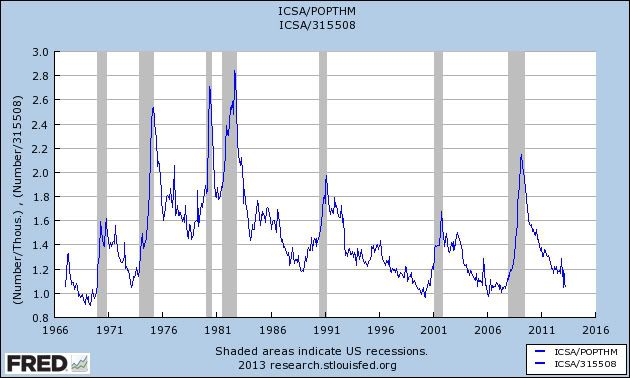
First of all, here are population adjusted initial jobless claims (i.e., jobless claims as a percent of the overall population. 300,000 claims vs. a 300 million population is something quite different than 300,000 claims vs. a 150 million population):


Initial claims normed by population are now among their best readings at any point in the last 40 years.

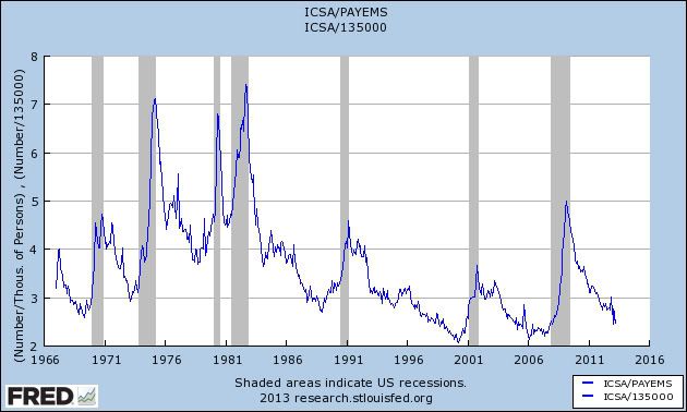
From time to time, I'll see comments elsewhere that initial jobless claims are only low because "there's nobody left to lay off." There's a little bit of validity to that criticism -- but only a little bit. Here are initial claims as a percentage of total nonfarm payrolls:


Not quite as positive as population-adjusted claims, but still well within the range of normal economic expansions.

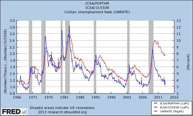
Next, as I've pointed out a number of times in the past, population adjusted initial claims tend to lead the unemployment rate. Here's the long term version of that relationship:


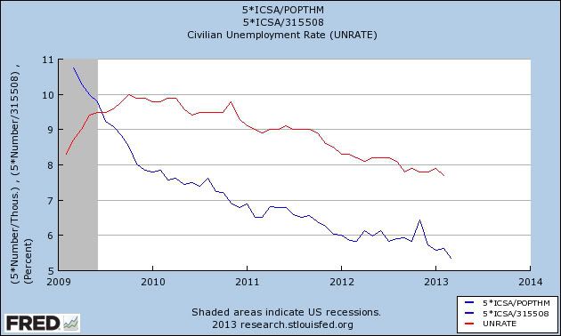
Here's the same data, starting in 2009. In 2009, the relationship blew out, but beginning in 2010, the relationship began to reassert itself, and initial claims tend to be leading the direction of the unemployment rate by a month or two:


This suggests we may see another tick down in the unemployment rate shortly.

Finally, recall that in each of the last two years, we've had a significant decline in the number of initial jobless claims in the first quarter, only to see a dramatic increase in the second quarter (red in the graph below):


This may be just coincidence, or an artifact of seasonality, or possibly related to the springtime increase in the price of gasoline. In any event, beginning in a week or two, I'll be watching to see if the pattern reasserts itself.

Morning Market Analysis


The Mexican ETF has been rallying since early July last year.  Starting at the end of the summer, the 200 day EMA started to edge higher, as it was pulled in that direction by rising prices.  But for the last three months, the ETF has been in a triangle consolidation pattern.  The declining MACD and weaker (though still positive) CMF reading show that momentum is down, but certainly not out.


Since the end of last summer, the 7-10 year treasury ETF has been trading in a fairly right range, bound by 105 and 108.


The South Korean ETF is down a little over 7.5% since the beginning of March, with prices now below the 200 day EMA.  Prices have also broken several trend lines -- one that started in late July and the second that started near the end of last year.   While the country is not in recession, it has been printing weaker GDP numbers; the recent hacking incident did not help matters.  I have a price target on this of at least 56. 


Copper broke a three month uptrend in mid-February and has been dropping ever since.  Now prices and the EMAs are very bearishly aligned with prices approaching a yearly low.  The declining MACD and CMF add to the bearishness on this chart.  I think copper will hit near its yearly lows within the next few weeks.


At the beginning of the year, the Columbian ETF's MACD started to move lower which was soon followed by prices.  We see a standard rounding top formation with this ETF.   Also note that prices have moved through the 200 day EMA and are approaching the recent lows of 20.25

Thursday, March 21, 2013

Will Japan Return To Growth?


The above weekly chart of the the Japanese ETF shows two recent rallies.  The first occurred at the end of last year.  The ETF traded in sideways for the first few weeks of the year, then started to move higher.  Now prices have moved through resistance at around the 10.5 area and have a fair amount of daylight to the 11.1 level.

However, the real story for Japan has been the drop in the yen's value:


From the peak to low on the chart, we see a decline of a little over 20%. 

Most of the recent market action is due to the hope that the new head of the BOJ will engage in a reflation of the economy:

Investors are betting that Prime Minister Shinzo Abe’s nominee to run the Bank of Japan will open the monetary floodgates, buy government bonds and pursue a 2% inflation target to reflate the long-stagnant Japanese economy. The new leadership team at the BOJ, led by Haruhiko Kuroda, is awaiting approval from the Japanese Diet this week.

Viewing Japan as the mother of all reflation plays, foreign investors are pouring money into Japanese stocks at a frantic pace. Last week, overseas investors bought about $10.5 billion worth of Japanese equities. That matters since non-Japanese investors drive about 60% of the daily trading activity at the Tokyo Stock Exchange.

Abe is trying to simultaneously push the BOJ to weaken the yen to boost exports, and stoke domestic demand by creating inflationary expectations. Nomura estimates that Japan currently has about a $170 billion gap between current GDP and potential GDP. The yen has already weakened dramatically against the dollar. However, it’s uncertain whether the central bank can move Japan from its current deflation to moderate inflation. (For a useful guide to Abenomics, check out this recent post from Business Insider.)

Let's take a look at some underlying Japanese data, starting with GDP.


At the end of 2010 and beginning 2011, we see a contraction caused by the Tsunami that occurred in the spring of 2010.  However, since the sharp rebound in 3Q11, GDP has been on a downward trajectory.

Let's take a look at the detail of the GDP report:


The most obvious point of the above graph is that Japan has been contracting for the last three quarets.  The primary reason for this has been a drop in private demand.  In looking at the sub-components, notice that non-residential investment has either stood at 0 or contracted for the last three quarters.  However, we see an uptick in this number from the latest data:


Inventory adjustments have also been responsible for two quarers of contraction.

However, for the Japanese, the big issue is the drop in exports.  Remember: Japan invented the Asian model for growth, namely, export your way to prosperity.  Yet exports have been dropping for the last three quarters, and have contracted in four of the last five.  One of the things that traders are betting on is that the 20% drop in the yen will turn this number around.  This is necessary, as the nominal Japanese trade balance has been negative for the last seven quarters:


Part of the reason for this drop has been the EU recession and US' slow growth.  However, the US appears to be at least holding its own.  Also remember that Japan and China had a 2 quarter trade spat last year that greatly reduced Japanese exports to that country; this spat has been calming down over the last few months.

Japan isn't out of the woods by any stretch.  However, the government is hoping for the following series of events to take place: a drop in the yen leads to an increase in exports, which in turn leads to an increase in business investment to support the increase in external demand.


Link for all charts and economic data.

How Did Cyprus Become This Important?

Last weekend, I called NDD about something related to the blog.  During the call, he informed me that Cyprus was now an EU hot spot.  He gave me the 30,000 foot view, which I followed up on after the call.  However, not really explained very well in this story is how Cyprus became so important to international finance.  So, below is an explanation that comes from my day job: international tax planning (among other things).

First, let's classify countries geographically.  If you look at a map of the world and then look at the tax rates of most countries, the small countries -- typically islands -- have low to non-existent tax rates.  The reason is actually pretty simple: they have small populations and small geographic areas.  Hence, their need for tax revenue is greatly reduced (they don't have a social safety net to pay for and they don't have a great deal of infrastructure needs).  This is why the islands in the Caribbean have become tax havens -- a development made far easier because of electronic banking.  And when low tax rates are combined with bank-secrecy laws, an entire industry is now born -- offshore banking.

The creation of these tax havens led to a new type of international tax structure utilized by most major multi-national companies: the hub and spoke system.  The "hub" is typically a company incorporated on one of these island nations which receives incoming payments and stores them in bank accounts.  The "spokes" are payments from higher tax countries to these small islands, usually in the form of dividend payments, interest payments, royalty payments or payments based on some type of transfer pricing structure.

However, this structure can run into trouble when it comes to cross-border payments -- payments that move from one country to the other.  Typically, the country where the payment is coming from has a fairly hefty tax at the border, largely because this is the last time that jurisdiction will get a bite at the apple.  Hence, companies look for ways to lower the tax bite on these cross-border payments.

This is where the concept of tax treaties comes in.  A tax treaty is signed  by two countries for several reasons, one of which is to provide a maximum rate of taxation on cross border tax flows.  For example, a tax treaty between two countries will state that the most country X can tax a cross border dividend payment is 5%.  The purpose of signing these treaties is to create certainty for taxpayers (they have a fairly clear idea up front of what the tax rates will be) while increasing cross border transactions (lower taxes can increase capital flows).  The first model tax treaty was written by the OECD and published in 1963.  Several revisions have followed.  The US also has a model tax treaty as does the UN.  However, there are really very few meaningful differences between the three; the OECD is still considered the model treaty from an international planning perspective.  (If you're interested, I have a power point presentation on tax treaties here and a video presentation on tax treaties here). 

Now --suppose the following:
  • we could form a small island country 
  • with a small population 
  • that had an extensive tax treaty network (to make cross border transfer payment easier), 
  • a low rate of corporate taxation (10%), 
  • a first world governmental structure (for political stability), and 
  • that was located next to a large region that was also one of the most populated areas with a high standard of living? 
You'd get both Ireland and Cyprus. 

And that is how Cyprus became an international banking center.


Morning Market Analysis


Given the underlying uncertainty associated with the EU situation, one would expect the safe haven sections of the market to rally.  And we see exactly that in the above charts.  The consumer staples sector (top chart) is in the middle of a rally that started at at the end of last year.  Notice the underlying strength of the EMA picture as well.  The MACD is neutral, show that the 12 adn 26 day EMA are remaining about equidistant from each other over the course of the last three months.

The utilities sector (bottom chart) is also in the middle of a rally that started at the end of last year.  At the beginning of March, prices moved through resistance a bit above the 37 price level.  Also note the very bullish EMA picture.


The yen continues to move lower.  First, notice the very bearish EMA orientation -- all EMAs are moving lower, the shorter EMAs are below the longer EMAs and prices are using the EMAs as resistance.  Right now there is short-term support at the 101.57 level.  As move through that level would mean lower lows were ahead.


The emerging EU ETF gapped lower on the Cyprus news, falling below the 200 day EMA.  This was a continuation of the downtrend the ETF has been in since the beginning of February, which has lead to a deterioration in the technical indicators -- the MACD is falling, as is the CMF.  A break of the 38.2% Fib level would make the next tar

Wednesday, March 20, 2013

Dear God, This Is Stupid

Via Mark Thoma:


Human capital is probably our most important resource.  We should treat as such.


Will France Be the Next EU Basket Case?

The numbers coming out of France continue to disappoint.  More importantly, there is little indication there is any room for improvement in the near future.  The most concerning conclusion is the economic numbers are slowly degenerating to the point where France becomes the next EU country to have an economic crisis.

Let's start with a look at GDP:


The red line shows overall GDP growth.  It was barely positive in 2011 and has printed three quarters of negative growth in 2012.


The above chart places the 2012 slow growth number in perspective.  The biggest problem is a lack of investment, which contracted strongly in three of the last four quarters.  Also note the breadth of the decline, which occurred at the business, household and government level.  The other areas of the economy are in fair shape, with PCEs and trade growing, albeit at low levels.


 Since mid-2011, the unemployment rate has been ticking up.  It now stands at 10.6%.

And then there are the latest Markit readings from both the service  and manufacturing sector.  Let's start with the service sector:

Business activity in the French service sector continued to fall sharply in February. Marked reductions in incoming new work and outstanding business were also recorded, while employment was lowered further. Confidence regarding future activity dipped to a four-month low, while margins were squeezed by a combination of rising input costs and declining output charges.
 

The seasonally adjusted final Markit France Services Business Activity Index – which is based on a single question asking respondents to report on the actual change in business activity at their companies compared with one month ago – posted 43.7 in February. The latest reading was little-changed from the near four-year low of 43.6 in January, and signalled a marked rate of contraction. A difficult economic climate and declining levels of incoming new work were cited by panellists.

Here's a chart of the data:


To put it bluntly, the French service sector is in terrible shape.  And the manufacturing sector isn't much better:

The French manufacturing sector remained in the grip of a sharp downturn in February. Although rising slightly from January’s four-month low, the headline Purchasing Managers’ Index® (PMI®) – a seasonally adjusted index designed to measure the performance of the manufacturing economy – remained indicative of a considerable rate of deterioration in overall operating conditions. This was highlighted by an index reading of 43.9, from 42.9 in January. That was marginally higher than the earlier Flash reading of 43.6.

Output at French manufacturers decreased for a twelfth consecutive month in February. The pace of contraction remained marked, despite easing since January.


And this fall has led to a drop in industrial production:


Like the service sector, these numbers are terrible.

Finally, France's current account and government deficit are weak:


There is simply no way to spin these numbers.  The French economy is in terrible shape.  Most importantly, it's possible that this low level of activity could start to feed on itself, dragging the economy as a whole down with it.


Morning Market Analysis


The Chinese market is at a critical level right now.  After forming a head and shoulders top over the first three months of the year, the average is now sitting on the 200 day EMA.  Prices have moved through the lowest Fib fan level although there are two other Fib levels for technical support.  Prices are below the shorter EMAs with a declining and negative MACD reading.


Given the situation in Europe, I thought it would be good to look at a healthy economy and a not-so-healthy economy.  Germany (top chart) has barely been effected by the Cyprus situation.  Prices formed a bearish engulfing pattern yesterday and there is a slight weakness in prices (as evidenced by the latest top being below the late January level), but prices are still in decent shape.  In contrast, we see Italy (bottom chart) where prices are already below the 200 day EMA with the 10 and 20 day EMA crossing below the 200 day EMA as well.  Although the MACD is rising, it's in negative territory and close to giving a sell signal.  The real issue with this chart, however, is it's much wider engulfing pattern.


After spiking last summer, the grains complex has been meandering lower.  While prices are currently below the 200 day EMA, they are just barely negative.  They are also using the 38.2% Fib level for technical support.  Recent reports on the latest crop have been very strong; the biggest change is that thanks to a very wet winter, there is more moisture in the ground for the crop.  There are also record plantings in several countries.


Yesterday, the Indian central bank lowered interest rates 25 BP, but also warned they have little downward room because of inflationary pressures, making this a less than compelling interest rate cut.  As such, we see the Indian ETF sell-off to the 200 day EMA yesterday.  Also note the MACD is negative and has given a sell signal, although the CMF is showing a positive money flow.

If prices break the 200 day EMA, the next level of support will be around the 56 level.  

Tuesday, March 19, 2013

How to cause a bank run (or at least a loping walk) in one easy step


- by New Deal democrat

If you want to know why Mish is on our blogroll despite major disagreements, his post this afternoon is a good example. He notes:
Here's one for the thick book of EU lies and hypocritical statements "Deposit guarantees only protect against bankruptcy, not levies"

Guarantees on deposits in the European Union are only there if a bank completely collapses, and does not protect from fiscal steps decided by parliaments, the European Commission said on Tuesday, defending a decision to impose a levy in Cyprus.
Wow. Just wow.

Let's just assume for purposes of this post that some sort of bank levy is the least awful option for Cyprus to obtain a loan from EU and related agencies. Let's also posit that deposit insurance is a good thing, and inciting runs on banks is a bad thing. Given that, it seems clear that the EU ought to have a co-ordinated message on the order of
We regard deposit insurance as sacrosanct, and we will always honor it. In no way did we insist that Cyprus levy on insured deposits vs. uninsured deposits over Euro 100,000. Nor will we ever do so in the future.

The sole authority which decided to levy on insured deposits was the Cypriot government. They are sovereign and we have no legal right to compel them not to do so.
That at least places the responsibility for breaking the cardinal rule on the government of Cyprus, not the EU.

Instead, the European Commission has told savers in Greece, Italy, Spain, Portugal, and Ireland that "we reserve the right to do the exact same thing to you that just happened in Cyprus."

If I were a depositor in one of those countries, I wouldn't necessarily run to the bank tomorrow, but I would certainly be thinking about diversifying my deposits over the next few months or year to banks in Germany, the UK and the US. In view of the statement Mish quotes, it would be irresponsible and irrational not to do so. So while there might not be bank runs in those countries, I would strongly suspect that starting immediately there might be a loping walk.

We bow down before the almighty Krgthulu


- by New Deal democrat

As we've mentioned from time to time, while our blog doesn't have the biggest readership, we like to think it has quality readership. In other words, you. But while we've achieved more and more visibility and links from prominent bloggers, the Holy Grail of progressive blogging - a link from Paul Krugman - eluded us.

Until now.

Prof. Krugman just linked to and discussed Bonddad's smackdown yesterday of John Hinderaker. So I hereby congratulate Hale. And we bow down before the almightly Krgthulu. Thank you, Professor. Please feel free to keep reading. We've got a darned good forecasting record, and we think you'll like our compleat nerdiness.

Is the Economy Stronger Than We Think?

A quick introductory note from Bonddad:  for both NDD and myself,  we wanted to welcome all the readers who have come here from a link on Professor Krugman's NY Times blog and Professor Mark Thoma's blog.  We are flattered and honored to be noted by both of these economic commentators.

At the beginning of this year, I wrote several posts wherein I concluded that the underlying nature of the US economy had not meaningfully changed: we were still in a post financial crisis recovery which by definition is very weak.  Here was my general conclusion:

To sum up the national and international position, I just don't see strong enough overall growth in any economy to warrant a strong long position right now.  The best reading of the data is that we'll see a stronger second half, with the US housing market providing sufficient domestic stimulus combined with a more settled fiscal situation.  This would also allow the EU to continue strengthening or bottoming. The stronger second half argument leads could lead into the fact that the market is a leading indicator of anticipated future activity -- a fair point as far as it goes, but I just don't see the overall underlying strength to support the rally long term.

At the beginning of February, I wrote two columns wherein I focused on the positive and negative economic numbers, with the positive numbers coming from new home sales, auto sales and manufacturing and the negative coming from the fiscal situation in Washington.  I drew no formal conclusion from these two competing sets of data, but my feelings were that the negative Washington situation would trump the positive developments and lead us to more of the same: sub-par growth in the 0%-2% range.   

However, recent economic numbers have led to to question that conclusion.  Consider these recent economic developments:

Housing continues to rebound:

Sales of new single-family houses in January 2013 were at a seasonally adjusted annual rate of 437,000, according to estimates released jointly today by the U.S. Census Bureau and the Department of Housing and Urban Development.  This is 15.6 percent (±18.9%)* above the revised December rate of 378,000 and is 28.9 percent (±21.7%) above the January 2012 estimate of 339,000.

However, read this from Calculated Risk
But also read this from CR


Employment continues to grow:

The latest employment numbers were unabashedly strong: non-farm payrolls increased 236,000, unemployment dropped .2%, wages ticked up  four cents (a big increase on a month scale) and hours worked increased .1.  Gains were seen across all major groups, including construction.  While this is only one month of data, the underlying components of this report were very good.

Initial Jobless Claims are In Good Shape:

Initial jobless claims fell 10,000 in the March 9 week to 332,000. The week's total was the second lowest of the recovery. There were no special factors skewing the report. The four-week average is now at its lowest level of the recovery, down 2,750 from the prior week to a 346,750 level that is a bit below the 350,000 trend of the month-ago comparison in what is an early positive indication for the March employment report. Continuing claims are also moving lower, down 89,000 in data for the March 2 week to 3.024 million which is another recovery low as is the 4-week average at 3.098 million. 

Retail Sales Increased 1.1%.

As both NDD and I noted, the latest retail sales numbers were very strong: 

The U.S. Census Bureau announced today that advance estimates of U.S. retail and food services sales for February, adjusted for seasonal variation and holiday and trading-day differences, but not for price changes, were $421.4 billion, an increase of 1.1 percent (±0.5%) from the previous month and 4.6 percent (±0.7%) above February 2012. Total sales for the December 2012 through February 2013 period were up 4.5 percent (±0.5%) from the same period a year ago. The December 2012 to January 2013 percent change was revised from +0.1 percent (±0.5%)* to +0.2 percent (±0.3%)*.

These are, simply put, great numbers even when adjusted for inflation.

Industrial Production

The latest IP report was also very strong.

Industrial production increased 0.7 percent in February after having been unchanged in January. Manufacturing output rose 0.8 percent in February, and the index revised up for the previous two months. In February, the output of utilities advanced 1.6 percent, as temperatures for the month were near their seasonal norms after two months of unseasonably warm weather. The production at mines declined 0.3 percent, its third consecutive monthly decrease. At 99.5 percent of its 2007 average, total industrial production in February was 2.5 percent above its level of a year earlier. The capacity utilization rate for total industry increased to 79.6 percent, a rate that is 0.6 percentage point below its long-run (1972--2012) average.

While the mining component has been decreasing for the last three months, the manufacturing number more than makes up for the decline.

Both the ISM Manufacturing and Non-Manufacturing Numbers Have Been Strong:

The latest Manufacturing ISM Report:

The report was issued today by Bradley J. Holcomb, CPSM, CPSD, chair of the Institute for Supply Management™ Manufacturing Business Survey Committee. "The PMI™ registered 54.2 percent, an increase of 1.1 percentage points from January's reading of 53.1 percent, indicating expansion in manufacturing for the third consecutive month. This month's reading reflects the highest PMI™ since June 2011, when the index registered 55.8 percent. The New Orders Index registered 57.8 percent, an increase of 4.5 percent over January's reading of 53.3 percent, indicating growth in new orders for the second consecutive month. As was the case in January, all five of the PMI™'s component indexes — new orders, production, employment, supplier deliveries and inventories — registered in positive territory in February. In addition, the Backlog of Orders, Exports and Imports Indexes all grew in February relative to January."

The Latest Service Number:

The report was issued today by Anthony Nieves, C.P.M., CFPM, chair of the Institute for Supply Management™ Non-Manufacturing Business Survey Committee. "The NMI™ registered 56 percent in February, 0.8 percentage point higher than the 55.2 percent registered in January. This indicates continued growth at a slightly faster rate in the non-manufacturing sector. This month's reading also reflects the highest NMI™ since February 2012, when the index registered 56.1 percent. The Non-Manufacturing Business Activity Index registered 56.9 percent, which is 0.5 percentage point higher than the 56.4 percent reported in January, reflecting growth for the 43rd consecutive month. The New Orders Index increased by 3.8 percentage points to 58.2 percent, and the Employment Index decreased 0.3 percentage point to 57.2 percent, indicating growth in employment for the seventh consecutive month. The Prices Index increased 3.7 percentage points to 61.7 percent, indicating prices increased at a faster rate in February when compared to January. According to the NMI™, 13 non-manufacturing industries reported growth in February. The majority of respondents' comments reflect a growing optimism about the trend of the economy and overall business conditions."

Both of these numbers indicate the underlying business community is doing well.

The underlying numbers have one drawback: they are only one month of data for all.  However, we don't see many chinks in the underlying numbers; readings are solid all the way around, leading to the conclusion that the underlying economy may be better off then previously thought.

From NDD:

Bonddad asked me to comment on his thesis in this post, and with all the Europanic excitement yesterday, I neglected to get around to it.

The data in the last few months has turned stronger again.  But I think extra caution is warranted.  We've seen this movie before -- economic strength in the winter crumbling into a complete stall in the summer -- in each of the last several years.  Not only is Bonddad's column something we could have written a winter or two ago, almost certainly we did.

It has been suggested by some commentators that the huge downdraft in autumn and winter 2008 has created a new seasonal distortion in the averaging of the numbers.  That may or may not be true, but I also think it has a lot to do with seasonal increases and decreases in gasoline prices -- moving from about $3/gallon in December to about $4/gallon before Memorial Day -- and then back down again.  Oil prices are acting like a governor or a choke collar on the economy, and that may explain why we get an acceleration in good economic numbers around this time of year.

I'll explore that later this week.


Morning Market Analysis

Quick Summary: despite the news from the EU, the SPYs traded fairly well yesterday.  As expected, the treasury market and dollar caught a safety bid while the euro sold off.


Despite the news coming out of Europe, the SPYs actually traded fairly well yesterday.  On the 5-minute chart (top chart) we see a standard "fill the gap" trade; prices gapped lower at the open, but then rallied until about right before, when they started to fall.  They found support at the 38.2% Fib level before a quick, pre-close spike.  On the daily chart (bottom chart) we see the uptrend is still very much intact.


Considering the news yesterday, we see that prices in the treasury market (top chart) and the dollar (bottom char) spiked upwards.


Yesterday, the euro spike down.  But notice that it closed right at short term support a touch about 128.


Monday, March 18, 2013

John Hinderaker: The Economic Stupid is Strong With This One

I read four political blogs regularly: Daily Kos, Talking Points Memo, Hot Air and Powerline.  They each have good and bad points, but I find that each helps to explain the respective position of each party/point of view in some manner.

All four try to report on economics, and all four do a terrible job of it, largely because each have no choice but to see through their respective political lenses without much underlying economic theory or knowledge to back it up.  Or, if they rely on economic knowledge, it's usually knowledge that has been fantastically wrong for the majority of the time.

Case in point: yesterday's post of an imminent economic collapse as written by John Hinderaker at Powerline.  It's rare that you find a column so full of inaccurate statements (with the exception of his own global warming denial posts).  So, let's begin:

First -- where are these reports of a crash?  I read Bloomberg and the Financial Times everyday and Marketwatch a bit less regularly.  I also read most major economic statistical reports in the AM and most major economic bloggers.  I haven't seen any doomsday report issued.  Evidently, however, these reports are widespread in some circles.  

Just about everyone expects the economy to crash, in some fashion, in the next few years. The fundamentals are very bad: year after year of virtually no growth; ever-declining labor force participation; grotesquely wasteful government spending; exploding federal debt; cronyism that saps vitality from our economy; and a largely dysfunctional education system. The questions are: 1) when will the crash happen? and 2) what form will it take? 


Let's start with real GDP growth.  As the chart above demonstrates, GDP has been growing consistently for the last four years and is now higher than pre-crisis levels.  While he is correct that growth has been slow, that does not mean stagnant or non-existent.

And then there is the labor force participation argument. He is correct that this number has been dropping for the last four years.  However, it's also obvious that he hasn't read any research on the issue.  This is a topic we've been covering for awhile now.  Remember that with the baby boomers now entering retirement, we're seeing about 10,000 people leaving the labor force every day.  As a result, the general consensus is that about half of the drop is due to retirements (see this paper from the San Francisco Fed).

And then there is the exploding federal debt issue.  First -- where was this guy in 2004 when we decided to invade a country and not raise taxes to pay for it?   Was there even a peep of concern about that long-run issue?  Probably not, even though that was a primary cause of the debt we're currently facing.  Remember that for Korea we raised taxes -- which was then considered to be a move of good governance.  As for the runaway deficit issue, it's actually projected to do much better than he things, as the most recent CBO analysis notes: 


Regarding the wasteful the wasteful government spending argument I would note that with the exception of defense spending, I sincerely doubt the federal government does much good in Mr. Hinderaker's mind.  However, let's look at total government expenditures:


Notice how the total number has been stable for the last few years?

Next, Mr. Hinderaker discusses the last two asset bubbles.  He does OK with the tech bubble, but then we get this gem of crap:

In 2008, the situation was quite different. Hardly anyone foresaw what happened. Very few understood how feel-good government policies that forced banks to make bad mortgage loans, the Typhoid Mary role played by Fannie Mae and Freddy Mac, and the little-understood consequences of securitization would come together to create financial disaster. I was probably a typical investor–when the crisis hit, my retirement portfolio was weighted toward bank stocks because they weren’t considered to be very risky.

Yes, it's the old "CRA led to the collapse canard" back from the dead.  There are numerous reasons for the mortgage collapse, but the CRA isn't one of them -- not even remotely.  As the Federal Reserve noted back in 2008:

In conclusion, I believe the CRA is an important model for designing incentives that motivate private-sector involvement to help meet community needs. The CRA has, in fact, been helpful in alleviating the financial isolation of many areas of concentrated poverty, but as our report illustrates, there is much more that could be done in these communities. Contrary to the assertions of critics, the evidence does not support the view that the CRA contributed in any substantial way to the crisis in the subprime mortgage market. Today's discussion is an important first step in the process of identifying other initiatives and areas of cooperation between government and the private sector that will effectively address the continuing challenge of poverty in the United States.

I would also suggest doing a search on Barry Ritholtz's The Big Picture Blog to get an idea for how completely and thoroughly debunked this idea is.

As for no one warning anybody about the real estate crash, it's obvious he didn't read any major economic blogger at the time who were collectively warning about the bubble crashing.  

So -- what will happen with the big crash?

So what form will the next crash take? The great fear, of course, is inflation. Ben Bernanke has gone on a money-printing spree without precedent in our history, to the point where we are like the cartoon character who walks off a cliff and keeps going for a while before he realizes there is nothing holding him up.

The old "money printing and an inflation" argument.  First, we've been seeing this argument from Chicago School economists for the last four years.  It hasn't happened as shown in this chart of the year over year percentage change in US CPI:


See?  No inflation.  And the reason is simple (for anyone who actually looks at the data): monetary velocity is low:


What if you printed a lot of money, and no one spent it?  The entire CPI explosion goes out the window. We would need to see a massive and quick spike in velocity the likes of which we have never seen in order for the "inflation is around the corner" argument to have any validity.  And that assumes that the Fed is asleep at the wheel when it comes to mopping up excess liquidity.  Does Hinderaker seriously think the Fed hasn't given an ounce of thought for how to end the program?

And what of the exact nature of the crash?

All of that is rather comforting. Still, I doubt whether I, or anyone else, has foreseen the nature and dimensions of the next crash. We are all passengers on a railroad train, facing backward. We see the past and try to make sense of it. That is a worthy endeavor, but invariably, the future comes out of nowhere and takes us by surprise. Only when it has receded into the past do we claim to understand it and, perhaps, to have seen it coming.

Translation: I really have no idea, but it's really going to be bad.  Very bad.  Because Obama.  Or CRA.  Or taxes.  Or debt.  Or deficit..... you get the idea.  Simply put, this is nothing more than an individual who is scared for political reasons letting those fears guide his economic "analysis."

I usually don't jump into political frays, largely because they are so utterly devoid of the possibility of developing any meaningful dialog.  But the above "analysis" (and I use that term because none other really presents itself) is so full of wrong statements (about the only thing he got right was his name) that it needs to be hacked apart.  I read the financial press regularly and there are no calls for imminent doom or collapse -- unless you consider World Net Daily or Breitbart reputable sources for any information.  The world is not projected to fall apart tomorrow.  The people calling for a massive spike in inflation have been doing so for the last four years and they're no closer now to being right than they were when they first opened their mouths.  Instead, the general consensus is that we're in a slow growth, post-financial crash recovery which is slow due to the massive amount of de-leveraging that is going on. 

I should also add that I'm praying that anyone who relies on the above analysis deserves to be on the other side of any trade I execute over the next few years.  At least then I'll know that I'm taking money from a complete sucker.


It's time for the annual springtime Eurozone crisis!!!


- by New Deal democrat

"Springtime for Merkel and Germany,
Winter for Cyprus and Greece!"
( - with apologies to Mel Brooks)


_______________________
From Bonddad:
The following is general background information on Cyprus:

First, let me provide some tax background on the Cyprus issue. When the EU was formed, the big question from a tax planning perspective was how to find the front door into the union; that is, where can we establish a company that has access to a variety of EU markets that is also a good location from a planning perspective? This led to two answers: Ireland and Cyprus. The reason for both is that for foreigners, both locations have low rates of taxation and an extensive tax treaty network, so that that once you’re physically located in Cyprus you can do business in other countries and transfer money back to Cyprus in a tax advantaged manner. This is what a tax planner calls a “hub and spoke” planning system; it’s used by virtually everybody who engages in international transactions in one form or another. Because of their tax haven status and extensive treaty network, Cyprus has become a major banking center for the EU.

At the same time, for the last year Cyprus has been in the middle of a fairly deep recession. For the last year, their employment rates have been contracting on a quarter to quarter and year over year basis GDP has been contracting for the last four quarters on a quarter to quarter and year over year basis. Their unemployment rate has risen from 9.9% in January 2012 to 14.7% in January 2013. Their current account deficit currently stands at -10.4% to GDP and their government deficit is -6.3% of GDP. Putting it bluntly, the country is an economic mess.

_________________
From NDD:

Spring will be here on Wednesday, and you know what that means: it's time for that annual rite of spring, the Eurozone financial crisis! I have to say, this year the Germans and their Eurocrat friends really seem to have outdone themselves, mandating across the board confiscations of depositor cash in Cyprus banks, all so that senior bondholders (other Eurozone banks) would remain unscathed. The minimum rate of confiscation is supposed to be about 5%. By contrast, I have read that if a US depositor kept a proportionate share of their deposits in each and every US bank from 1929 through 1933, their net loss would have been 4%.

It's hard to disagree with virtually every commentator who has examined this deal so far, from Mish to Paul Krugman, that it practically invites a run (or at least a brisk walk) on the banks in every Mediterranean Eurozone country.

Because of that, i.e., because it is easy to see how disastrous a policy this is, it is also likely that the deal will change between now and the end of the week.

But's let's assume that the policy is rammed through the legislature in Cyprus. What are the ramifications to the US economy?

The most important ramification is likely to be that US banks will once again attract European deposits, just as they did when depositors' faith in European banks was shaken 2 years ago. Here's a graph of M1 for the last 5 years.


Note the straight move upward two years ago. At that point, YoY growth in M1 came close to 20%. A similar more now certainly can't be ruled out.

The second important ramification is that the influx of money into the US as a safe haven should cause interest rates to decline further, and in particular mortgage rates are likely to decline to fresh new lows. Here's a graph of mortgage rates for the last 5 years, compared with mortgage refinancing (from Mortgage News Daily):


Note that each spring for the last 3 years, mortgage rates have declined sharply, with each new global financial crisis. This policy all but assures another, further decline in rates, which will spur yet another round of household deleveraging in the US as homeowners refinance. In fact, the spike in refinancing could be higher, as the recent rebound in housing prices make more homeowners eligible for refinanncing.

The US dollar will also likely strengthen, meaning US imports will increase and exports will suffer, but on blalance, just as in each of the last three years, the net result is likely to be positive for growth in the US.

As I said at the outset, however, the European crisis should be seen as in a state of flux, so the policy announced Sunday may no longer be the policy by Friday.

But really, the latest move in the Eurozone richly deserves this musical accompanyment: