- by New Deal democrat
I'm vacationing this weekend, but will get this up sometime before Sunday night. In the meantime, enjoy yourselves over hot dogs, hamburgers, and the libations of your choice!
Saturday, May 26, 2012
Friday, May 25, 2012
Weekend ..... 12C!?!?!?!?!
I realize that in posting this picture, I'm really dating myself. However, above is my indispensable HP 12C Financial Calculator. I've had this for over 15 years. As you can tell, it's been heavily used. It's been dropped, banged around briefcases and the like. If you look really closely at the lower right hand corner, you'll notice that one of my gods thought it was a chew toy for a very brief time.
However, all the keys still work. And frankly, I couldn't live without it; it's a bit of a safety blanket.
I'll be back on Monday; NDD will post the weekly numbers on Saturday.
Have a safe and happy weekend.
The India Story is Deteriorating
From the FT:
This is a huge story. Back in 2009, I noted that foreign economies would help to lift the world economy out of recession.
However, that story is now changing. As the above story notes, India is having serious problems that will hamper growth going forward. That means that overall, the world economy has a big problem.
India’s economy has been slowing for more than a year as corruption scandals involving senior members of the Congress-led coalition government have paralysed parliament and blocked key reforms to boost investment.
India’s macroeconomic landscape has deteriorated further since the start of the year. New Delhi’s fiscal and trade deficit have ballooned to 5.8 per cent and 9.9 per cent of GDP respectively, while inflation has shot back into double digits.
The Indian rupee also weakened to a record low against the dollar this week, which is likely to fuel inflation further in coming months.
Meanwhile, industrial output contracted 3.5 per cent in March 2012 and exports have been declining consistently, as demand in Europe for cheap Indian goods has dropped.
This is a huge story. Back in 2009, I noted that foreign economies would help to lift the world economy out of recession.
There's a great myth that goes around the Internet: the US doesn't make things anymore. If that were true, then we would have exported $1.8 trillion dollars of goods in 2008. And in 2008, we exported $108 billion of foods and beverages, $388 billion of industrial supplies, $457 billion of capital goods, $121 of automotive products and $161 billion of consumer goods. In other words, exports account for about 13% of GDP. And they may become far more important to US growth:This has occurred over the last 3 years, as US exports have been a bright spot in the expansion.
In the process of gorging on overseas goods and services, the US by happenstance fired up emerging economies such as China, Korea, Taiwan, India, Brazil and Mexico to build their productive capacities and spawn their own middle classes and consumer cultures. Paulsen has long called this trend the US's "emerging-market Marshall Plan."As US consumer spending slows we will import less, thereby lowering the total amount of imports in the trade deficit formula. At the same time, Emerging economies have seen a growing middle class which will want to buy more goods and services. And some of those will come from the US.
However, that story is now changing. As the above story notes, India is having serious problems that will hamper growth going forward. That means that overall, the world economy has a big problem.
The Dollar -- the De Facto Safety Trade
Earlier today, I noted that that dollar is approaching key levels and may be about to rally. The charts below show that the dollar is, in fact, the only safe haven currency out there.
The Australian economy is actually one of the best performing economies in the globe. But recent numbers have shown some weakness, leading the Australian central bank to lower rates. The primary issue here is a bi-furcated economy; mining and natural resources are doing very well, but other areas of the economy are a bit weaker.
The weekly euro chart shows that it's moving through key support levels, with the next logical price target around 118.5.
The yen started to drop in February when the BOJ announced they would engage in additional easing and possibly accept a higher inflation rate. The yen has rallied over the has few months largely because it's considered a haven currency. But we still have the specter of the BOJ in the background.
The Swiss franc was considered a haven currency, until the Swiss Central Bank intervened aggressively in the market (the highlighted yellow area). Since then the franc has been much more subdued.
The pound is caught between two countervailing trends. One one hand, it's a haven currency close to Europe, making it the natural choice for the safety trade for EU traders. On the other hand, the UK economy is in terrible shape. In addition, inflation is higher than the BOE wants, interest rates are low and there are further rumblings about additional easing.
Thursday, May 24, 2012
Morning Market Analysis
I didn't mean to publish this until the AM. But, so long as it's up....
It appears the SPYs may be trying to bottom. Consider these charts:
First, on the daily chart, prices are currently trending up the lower part of a Fib fan. In addition, they're hitting resistance at the 10 day EMA. However, the lower volume totals for the last four trading days indicate this is probably a relief rally to the move lower that occurred throughout May.
The 60 minute chart shows that the 130/131 price level is providing some support.
And the 30 minute chart shows that prices are consolidating in a triangle consolidation pattern. Resistance is around the 133 level and support is around the 129.5/130 level.
Oil is still trying to find a bottom. The 92.3 level provided some support for a few days, but prices have moved through that level. The rate of decline has lessened, indicating a bottom is probably closer, but we still haven't reached it yet.
The dollar is close to making an important technical break-through at the 22.7/22.8 area. A move through that level would make the 23.4/23.5 level the next logical upside price target.
Bonddad Linkfest
- EU composite PMI at 35 month low (Markit)
- UK revised GDP at -.3% (PDF)
- Germany IFO Business Climate (IFO)
- Australian LEIs increase slightly (Conference Board)
- BOJ Rate Decision (BOJ)
- BOE Minutes (BOE)
- EU economy contracting (FT)
- France calls on ECB to issues bonds (FT)
- Durable Good Increase Slightly (Census)
- Initial Claims at 370,000 (DOL)
Housing: department of "Huh?!?"
- by New Deal democrat
Yesterday Barry Ritholtz published a piece that read, in its entirety:
For the crowd who are still clinging to the RE recovery meme, have a gander at these charts. Note that there are more new permits than starts, and more new starts than completionsNow, let me say that Barry has been a friend of this blog and has cross-published Bonddad or myself a number of times, so there is no ill will whatsoever, but we do have a disagreement about whether housing prices are making a bottom. Further, like Bill McBride, I really think we're past the point where it can be argued that housing sales aren't recovering (i.e., going up, even if the raw numbers are still very very low).
In any event, Barry's entire point puzzled me, since housing permits exceeding starts, which in turn would exceed completions is exactly what I'd expect to see in a recovery. The reason is the timing. Permits take place a month or months before a house is started, which in turn takes a number of months to complete. So it housing sales are going up, the increase has to make its way through the system chronologically. For example, is sales are going up 1% a month, and it is six months between getting a permit and starting the house, and 6 more before completion, we'd have something like 112,000 permits this month, with 106,000 starts based on permits taken out 6 months ago, vs. 100,000 completions of permits taken out a year ago. The reverse would apply in downturns.
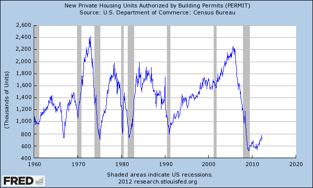
Just to be sure, I went to the data. First let's pull up the entire history of housing permits, just to see the periods of time housing was going up vs. down.
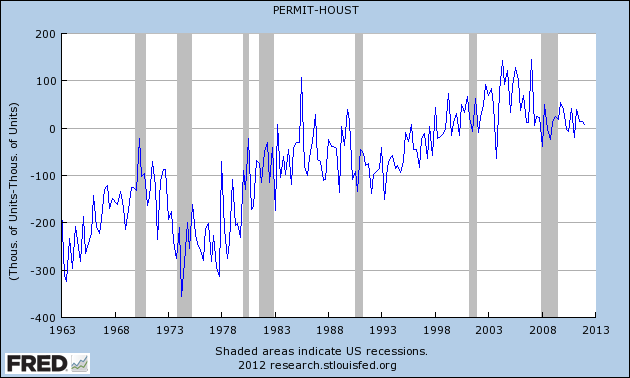
Now let's subtract housing starts from housing permits. We'd expect to see a negative number in recessions and a positive number in expansions. what we actually get suggests a strong secular change over time (I have no idea how you get starts exceeding permits for several decades straight, but there it is). But at very least from 2000 to the height of the housing boom, there were more permits granted than starts begun. During the bust, more starts were made than permits issued. And now recently, more permits have once again been issued than starts made:
But it is in comparing starts with completions that the pattern really asserts itself. Here there is no doubt of the truth that starts exceed completions in a boom, and trail them in a bust:
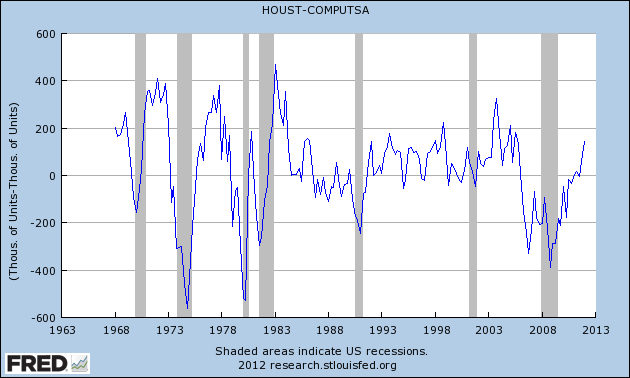
So Barry winds up making a very effective case that the housing recovery has indeed begun.
Long Term View of the Markets Not Looking Good
Pulling the camera lens back to a monthly view, the charts of the major averages aren't looking that good. Consider the following:
In the last three year, the IWMs have rallied into the 80-85 price area and failed. Also note the declining MACD over the last two peaks, indicating declining momentum. However, we do an increase in the CMF, telling us that money is flowing back into the market.
Like the IWMs the SPYs have rallied into a key area (140-142) twice over the last three years, only to be rebuffed. Also note the moderating MACD reading.
The NASDAQ is defying the overall trend by have a "higher high, higher low" rally since 2009. The MACD reading is positive, as is the CMF. Also note the rising EMA picture, with the shorter above the longer, all moving higher and prices above the EMAs.
The failure of two averages to make new highs -- and to be denied when they tried to move higher -- is not a good sign.
Morning Market Analysis; the Flight To Safety
Let's start by looking at the treasury market, where we see that the entire curve is trading near or above the top of a trading range that started at the end of last summer. This is the respective highest level for all of these sections of the curve in nearly two years. While the MACD has given a buy sign for all the sections, I wouldn't expect too much of a rally from here, largely because treasuries are constrained by yield on the flip side. However, the positive and rising readings from the respective CMFs tell us that money is flowing into the markets.
We see the exact same situation along all parts of the corporate curve as well; short, intermediate and long-term parts of the curve all all near two year highs, largely due to a flight to safety.
We also see the same flight to safety issues in the municipal and mortgage back bond markets.
Simply put, investors are looking to park money in interest yielding investments to ride out the storm.
Wednesday, May 23, 2012
Random Notes
We've settled into the annual "will the EU blow-up the world" environment. Additionally, the news has been lackluster, so from a writing perspective we're in a bit of a holding pattern. So, here are some random points:
1.) The Facebook IPO has been hysterical. While I use FB sometimes, I'm still trying to figure out how they're going to make money. About the only service I see them offering long-term is being a glorified, "opt-in" direct mail list company. And frankly, there are plenty of other firms that already do that cheaper.
2.) I still don't see Greece leaving the EU, largely because (I think) the primary players will realize the incredible damage this will do long-term to the world economy. Let's play this out: Greece leaves, or says they'll leave and starts to make preparations. At this point, the creditors know they're about to lose everything. So, at minimum, Greece now can't borrow money at all. This, for a country that is already in the middle of a very deep recession, will lead to cataclysmic failure at the country level. By failure, I mean rioting in the streets level of problems. I think this is the best scenario we can hope for. And that's why I don't think that will happen.
3.) There's an interesting dynamic occurring at the very macro level: the BRICs aren't growing as fast as they used to. India is mired in deeply entrenched political problems that have no easy solution; China is converting to a more consumer oriented economy; Russia has to change from a country who primarily exports oil to a country that encourages international investment (but may not make the change) and Brazil is getting hit by the overall world slowdown. These countries led the world out of recession; but they can't do that anymore. While other countries are emerging as growth stories (Turkey, Poland, Singapore), they're simply not large enough from an economy or population perspective to drive growth; collectively, their combined size might equal one BRIC, but not all four. As such, the developed world has to make a move, and we're just not equipped for that right now.
4.) The US economy is moving back into an extremely slow-growth profile. The last two employment reports indicate companies are hiring, but just barely. Initial unemployment claims are rising, but below the 400,000 level. Retail sales are fair; the regional manufacturing reports are mixed; inflation is moderating. Recession isn't in the cards (yet), but we're certainly not going to break any growth records.
Why I think ECRI is wrong about real personal income: Refinancing!
- by New Deal democrat
The effect of miserably inadequate wage increases compared with corporate profits is the most potent case for economic pessimism. If people don't have the money, they can't buy your stuff!
In his most recent appearances, ECRI's spokesman emphasized this negative, as have many other bears. While it's a legitimate concern, in my opinion all of the bears are overlooking the very powerful effect that refinancing mortgages at lower interest rates has on disposable income.
As an initial matter, I continue to have problems with ECRI's sudden focus on YoY comparisons of seasonally adjusted data. The rationale is that the 2008-09 recession distorted those adjustments. Even if that is true, it misses the lion's share of the issue with real personal income.
First off, here's the graph of real personal income since 1999, measured as a YoY%:
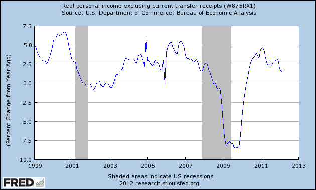
It has suddenly declined in the last 3 months to a level equivalent to entering the last two recessions. WE"RE DOOMED!
Not so fast. Remember the Social Security tax rebate that started in January 2011? It had a profound effect on personal income, as indicated in this bar chart of monthly changes:
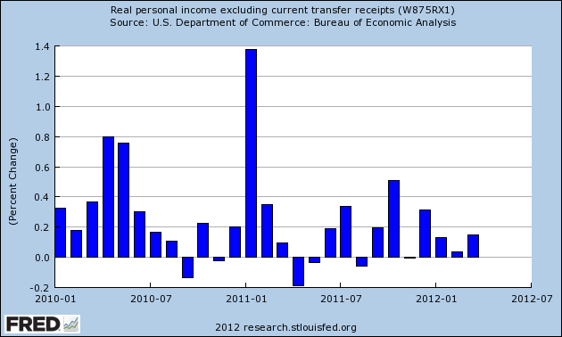
A +1.4% change in real personal income is going to have a big effect on YoY comparisons, that will end exactly 12 months later. And so it did, as shown in this next graph in which the effects of the Social Security tax rebate are deleted, in red:
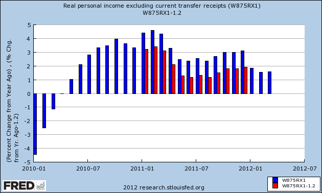
When we strip out the effects of that rebate, the decline in growth of real personal income occurs in midyear 2011 rather than beginning in 2012. That doesn't mean that the rebate didn't have an effect. Consumers filled up their gas tanks with it, as it almost exactly offset the big increase in gas prices in the first half of 2011. But that is hardly a seasonality issue. So, if increases in real income have stunk so bad for nearly a year, why didn't we move into recession by the end of last year?
Let's look at a graph of actual income since 1999. This looks more positive, doesn't it?
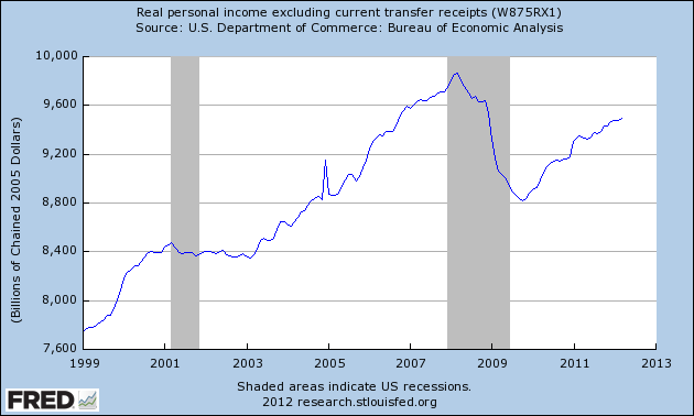
Note that in contrast to its continuing increase now, real income was flat to slightly declining all the way through 2002 and the first part of 2003. During this same period, as in 2011, the economy was muddling through at about 2% or less annualized GDP. So why didn't we have a double-dip then?
The answer takes us directly to the effects of refinancing. Below are three graphs I have run before, and can't be emphasized enough.
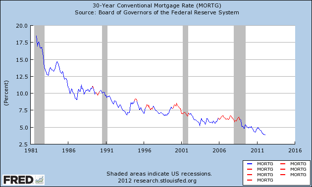
First of all, here are mortgage rates since their peak over 30 years ago. So long as households could refinance at lower rates, no recession has occurred (blue). Once the tap was shut off by no move lower in rates for at least 3 years, recessions ensued (red):
In the next graph, from Mortgage News Daily, you can see how refinancing had slowed to a trickle through almost all of 2007 and the first eight months of 2008:

Refinancing has come back with a vengeance since then, and continues right up until the present.
As a result, household debt a a percentage of disposable personal income continues to decline rapidly:

The Federal Reserve releases this info at the end of the ensuing quarter, so the last data available was released in March covering the 4th quarter of last year. In a month we'll find out what happened in the first three months of this year, and there is every reason to believe that household debt as a percent of disposable income as I write this post has already declined to 30 year lows.
So long as the ability to lower the carrying cost of household debt continues, I do not think the low positive growth in real personal income signals recession.
Morning Market Analysis; Developing Markets Leading Lower
Today, let's start with the Brazilian market, which has been dropping since the beginning of March. In fact, this market has dropped over 25%, placing it squarely in the bear market camp. The underlying technicals are also bearish; prices are below the 200 day EMA, all the shorter EMAs are moving lower, the MACD and CMF are dropping and we see a pick-up in volatility.
The weekly Brazilian chart shows that prices are near three year lows.
The daily chart of the Russian market is very similar to the Brazilian market; overall it's another developing market that has an extremely bearish chart.
The Indian market has been dropping since the end of February. Prices rose above the 200 day EMA, but have since moved lower. However, prices are still slightly above lows established at the end of last year. But this does not offer much solace, as the Indian economy is slowing and the political system is caught in a terrible cycle of dysfunction.
The weekly chart of the Indian market shows that prices are right at technical support levels -- and near three year lows.
The Chinese market has fared a little better, largely because of its attempted rally from mid-April to early May. But prices found resistance near the 200 day EMA level and have been moving sharply lower for the entire month. Again, note the bearishness of the overall technicals -- a dropping MACD, negative CMF and rising volatility.
The picture painted by the charts of all the developing markets is one of a deteriorating situation. In fact, the charts tell us that things could get downright ugly.
Tuesday, May 22, 2012
Professor Taylor's Misunderstanding of the Current Economic Situation
Professor John Taylor has compared the current recovery to the Reagan recovery of the 1980s. Unfortunately, this is an incorrect comparison which I've previously noted (here and here). Today I want to highlight the primary structural difference between this recession and the 1980s: that of debt deflation.
The theory was originally developed by Irving Fisher. The entire theory can be read here. In addition, Fisher wrote a very good economic textbook which you can purchase for Kindle here.
Here is the key paragraph from the debt deflation theory, which outlines a series of events that cause debt deflation:
Fisher developed this theory to explain the Great Depression. Additionally, the above chain of events provides an excellent explanation of the bursting of the housing bubble and its long-term ramifications. First, let's walk through the basic chain of events of the 2000s.
1.) People start to borrow a ton of money to buy things. Here's a chart of total mortgage debt outstanding in log scale format:
Simply eyeballing the chart, we see total mortgage debt of about $10.5 trillion being the peak. Also note the acceleration in debt accumulation during the housing bubble; total mortgage debt stood at about $5.5 trillion after the early 2000s recession and nearly doubled over a 6-7 year period.
Another way to look at the above number is the relationship of mortgage debt to real disposable income:
The above chart shows that total mortgage debt to real DPI was slightly over 1 at the height of the bubble, indicating that consumers were heavily indebted -- and that's before we add in credit card debt etc...
Now -- as prices for the asset purchased with all of this debt start to fall (or, put another way, the mania starts to fall), we start to see panic selling:
Note that selling in the housing market started to show-up in the Case Shiller index a little before 2008. This contributed to:
An overall decrease in monetary velocity.
Put another way, we get the following: Before the bubble bursts, we see euphoric buying as everybody and their brother participates in the mania. When the bubble starts to burst, everybody starts to sell, but there are few buyers; hence, prices drop. This drop in activity leads to a slowdown in velocity, indicating more hoarding of cash.
After this cycle starts, it starts to spread to the economy as a whole. Businesses net worth takes a bit, leading to a drop in profits and a drop in output. Let's take a look at this data:
The above charts highlight the overall trend outlined by Fisher. Net worth drops, leading to a drop in profits and an overall drop in industrial production.
The above chain of events lead to a drop in confidence:
So, we see the basic chain played out in the actual data.
The logical counter-argument to the above series of events is that corporate balance sheets have recovered; net worth has risen as have profits. Therefore, the cycle is over. This is an incorrect conclusion, largely because of the continued low reading of velocity:
The above charts show the velocity for M1, M2 and MZM. It's important to understand what this measures; velocity is
When this series of events is compared tot he Reagan recovery of the 1980s, the clear distinctions become apparent; Reagan's recovery was caused by the Fed raising rates and strangling inflation. There was no buying mania of any commodity or good prior to the recession; hence the long-term effects of a bursting bubble had nothing to do with the 1980s -- and, in fact, the absence thereof is a reason for the fast pace of recovery after that recession.
In contrast, this recovery is still mired in high debt readings, low consumer confidence and low velocity, indicating we're nowhere near healed.
The theory was originally developed by Irving Fisher. The entire theory can be read here. In addition, Fisher wrote a very good economic textbook which you can purchase for Kindle here.
Here is the key paragraph from the debt deflation theory, which outlines a series of events that cause debt deflation:
Fisher developed this theory to explain the Great Depression. Additionally, the above chain of events provides an excellent explanation of the bursting of the housing bubble and its long-term ramifications. First, let's walk through the basic chain of events of the 2000s.
1.) People start to borrow a ton of money to buy things. Here's a chart of total mortgage debt outstanding in log scale format:
Simply eyeballing the chart, we see total mortgage debt of about $10.5 trillion being the peak. Also note the acceleration in debt accumulation during the housing bubble; total mortgage debt stood at about $5.5 trillion after the early 2000s recession and nearly doubled over a 6-7 year period.
Another way to look at the above number is the relationship of mortgage debt to real disposable income:
The above chart shows that total mortgage debt to real DPI was slightly over 1 at the height of the bubble, indicating that consumers were heavily indebted -- and that's before we add in credit card debt etc...
Now -- as prices for the asset purchased with all of this debt start to fall (or, put another way, the mania starts to fall), we start to see panic selling:
Note that selling in the housing market started to show-up in the Case Shiller index a little before 2008. This contributed to:
An overall decrease in monetary velocity.
Put another way, we get the following: Before the bubble bursts, we see euphoric buying as everybody and their brother participates in the mania. When the bubble starts to burst, everybody starts to sell, but there are few buyers; hence, prices drop. This drop in activity leads to a slowdown in velocity, indicating more hoarding of cash.
After this cycle starts, it starts to spread to the economy as a whole. Businesses net worth takes a bit, leading to a drop in profits and a drop in output. Let's take a look at this data:
The above charts highlight the overall trend outlined by Fisher. Net worth drops, leading to a drop in profits and an overall drop in industrial production.
The above chain of events lead to a drop in confidence:
So, we see the basic chain played out in the actual data.
The logical counter-argument to the above series of events is that corporate balance sheets have recovered; net worth has risen as have profits. Therefore, the cycle is over. This is an incorrect conclusion, largely because of the continued low reading of velocity:
The above charts show the velocity for M1, M2 and MZM. It's important to understand what this measures; velocity is
The speed with which MONEY whizzes around the economy, or, put another way, the number of times it changes hands. Technically, it is measured as GNP divided by the MONEY SUPPLY (pick your own definition). It is an important ingredient of the QUANTITY THEORY OF MONEY.Put in less formal terms, lower velocity means more people are hoarding money. So, when they get paid, they spend less. While some of this is good as it indicates that people are saving more, it also means that people are scared -- hence the continued low confidence reading. Remember that an economy needs motion -- people buying things. And that is the central problem we face right now.
When this series of events is compared tot he Reagan recovery of the 1980s, the clear distinctions become apparent; Reagan's recovery was caused by the Fed raising rates and strangling inflation. There was no buying mania of any commodity or good prior to the recession; hence the long-term effects of a bursting bubble had nothing to do with the 1980s -- and, in fact, the absence thereof is a reason for the fast pace of recovery after that recession.
In contrast, this recovery is still mired in high debt readings, low consumer confidence and low velocity, indicating we're nowhere near healed.
Subscribe to:
Comments (Atom)


