- by New Deal democrat
Weekly Indicators is up at XE.com.
While the tone is still positive, relative weakness spread into more of the long leading indicators and into several shorter term indicators.
Saturday, December 28, 2013
Friday, December 27, 2013
OH NOES!!! So far in the year of Obamacare implementation, 100% of all net jobs created hae been pa- ... wait, what? ... FULL time jobs?!?!?
- by New Deal democrat
Remember how the implementation of Obamacare was killing full time jobs? Doomers, both right and left, were sure that full time jobs were evaporating this past summer.
In case you don't, here's an article from August in the McClatchy newspapers:
“Over the last six months, of the net job creation, 97 percent of that is part-time work,” said Keith Hall, a senior researcher at George Mason University’s Mercatus Center. “That is really remarkable.”This statistic was quickly seized upon by right wing bloggers as definitive proof that Obamacare was a colossal failure. Here's Ed Morrissey of Hot Air:
Hall is no ordinary academic. He ran the Bureau of Labor Statistics, the agency that puts out the monthly jobs report, from 2008 to 2012. ...
....
"There's something going on if such a large share of the hiring is part time," Hall said.
The July report only confirms that trend. Only 92,000 full-time jobs were created, while 172,000 part-time jobs got filled (not net numbers). The only major influence in 2013 that differs from the preceding three years of the recovery is the impending ObamaCare mandate on employers, which the Obama administration will try to postpone for a year. The data shows that businesses have already begun to react by minimizing their risk and costs through part-time employment, thanks to the perverse incentives set up by the ACA, and that this will continue as long as the mandate exists.Forbes' Chris Conover was even more dismissive:
Denialism may be too strong a term. But there seem to be a lot of people arguing that Obamacare has little or nothing to do with the rise in part-time employment. Some deny the rise is even happening, while others are content to deny that Obamacare is the culprit. Admittedly, it takes a little detective work, but if we systematically review the available empirical evidence in an even-handed fashion, the conclusion seems inescapable: Obamacare is accelerating a disturbing trend towards “a nation of part-timers"Needless to say, Zero Hedge was all over the story.
And left wing Doomers were just as certain of the fact as their right wing counterparts, if for different reasons, with one Daily Kos front-pager going so far as to call the questioning of the trend in a Marketwatch article "ridiculous."
Yours truly debunked these claims at the time, noting that:
... [E]ven though the household numbers are seasonally adjusted, it looks like there is some unaccounted seasonality still left in the numbers. ...[T]here has been a pattern ever since the recession whereby full time jobs ramp up through May, and then decline (or at least decelerate) through August, before rising again. In fact, through August of 2011, full time jobs were actually negative as measured from the first of the year.So, now that we are at the end of the year, with employment reports through November, has the alleged Obamacare disaster for full-time job creation persisted? Or has my critique, of unaccounted seasonality, been shown to be true?
....
When we do the actual apples to apples July to July comparison, lo and behold, not only is the full time job situation better than the part time job situation in 3 of 4 years, but in 2012 and 2013 the positive trend towards full time jobs is actually accelerating.
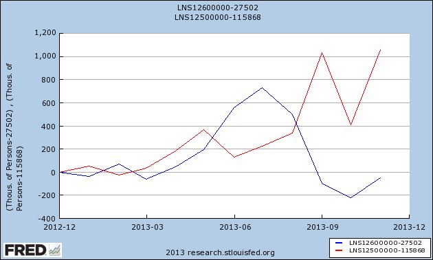
Here's the graph of both part-time (blue) and full-time (red) jobs, showing gains or losses since the end of 2012:

In 2013, 1,060,000 full-time jobs have been created, while part-time jobs have actually declined by -60,000.
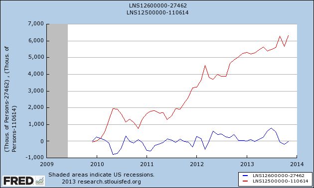
And as for the broader claim that the recovery has "accelerated the trend towards a part-time nation," here's the same graph showing gains or losses since employment bottomed at the end of 2009:

That's right. Four years into the recovery, and on net exactly minus -10,000 part time jobs have been "created", while full time jobs have increased by 6,314,000.
Oh.
That's probably why, for the last 3 months, when it comes to full time vs. part time jobs, there's been crickets from the Doomers.
And Zero Hedge has gone from treating the jobs report numbers as Gospel truth to calling it the "BLS random number generator."
I'm sure in 2014 Doomers will be back with selectively quoted statistics of the month. And I'll be here debunking all of them.
Thursday, December 26, 2013
Year-end posting
- by New Deal democrat
We've reached the end of the year, and data will be light until next Thursday. But I'm not done.
Tomorrow I'll be posting a scathing and sarcastic smackdown of one of 2013's most egregiously selective and stupid Doomer memes, that has - as usual - blown up in their faces.
Then on Monday or Tuesday I'll evaluate my 2013 forecast from January, and look back at the important economic trends from this past year.
An updated look at the real personal savings rate
- by New Deal democrat
I have a new post up at XE.com, discussing the most recent personal savings and spending data, explaining why there is no indication of any imminent retrenchment by US consumers.
Chinese Debt Levels Reaching Concerning Levels
From the Financial Times:
China’s
credit boom is still in full swing. Total credit in the economy (total
social financing) showed a 40 per cent rise in November over the prior
month and is on course for growth this year of almost 20 per cent. It is
continuing to expand at twice the rate of nominal, or money, gross
domestic product, and according to official data has pushed the credit
to GDP ratio up to 215 per cent in 2013, and most likely more. It is
clear that banking institutions, state-owned enterprises and local
government financing vehicles have remained relatively insensitive to,
or been able to circumvent, higher interest rates and bond yields,
central government curbs on the shadow banking sector, and the rampant
real estate and infrastructure markets.
There are basically two types of recessions. By far the most common occurs when the central bank raises interest rates to slow either demand pull or cost push inflation (or both). Both developments are the result of an economy running too hot. Recovery from these types of recessions is usually fairly quick. The second type of recession is a debt-deflation recession. Here, a credit fueled asset bubble bursts, leading those who hold the asset to sell same in order to pay off the loan backing the asset purchase. As everybody does this at the same time, asset prices plunge, leaving many who have loans underwater on those loans. This leads to a painfully slow recovery -- much like the one the US has been experiencing for the last 4 years.
China has been running hot for some time -- as in years. However, inflation is not a major issue. That leaves the most probably cause of the next Chinese recession as an asset bubble bursting, leading to a debt-deflation scenario.
That does not offer my much comfort heading into 2014.
Wednesday, December 25, 2013
Santa had a very rough night ...
- by New Deal democrat
In the spirit of "value added," giving you something you won't find on any other economics blog....
I went looking for a depiction of Santa delivering presents to an economist, or a blogger, or even a Doomer. I didn't find that, but what I did find was a photo of Santa after a particularly rough night delivering presents to all of the above. It is probably NSFW. In fact it is probably unsafe for family, and probably unsafe for just about everywhere else, so I won't even post it, just link instead.
WARNING: You cannot unsee what you will see if you copy and paste the link, but click if you dare:
https://blogger.googleusercontent.com/img/b/R29vZ2xl/AVvXsEgfKiJ8yPoxfVQ7JUyaA-gSeO5BENHZPaKxoknvlO3NU3td3h0lwSxB7QOmchF2T7e0oMkMAChJQkWC8DEdM3MUK_ePE62eQ-weugaLrcliAQs30ArCs3psyXz_Dv9TR1wUiCmlUyuwwKY/s1600/santa_drunk.jpg
Tuesday, December 24, 2013
Monday, December 23, 2013
One graph shows why the present stinks (and why the 1960's kicked a**!)
- by New Deal democrat
I was working on a couple of year-end type pieces yesterday, when I downloaded one graph that says so much about what has happened to the US economy, and in particular to the fortunes of the US middle class, during that time.
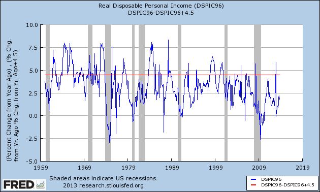
Here it is, the YoY percentage growth of real disposable personal income:

I've drawn a line across it at the +4.5% mark.
Remember, this is disposable income, and it is adjusted for inflation, for a period of over half a century.
I pulled it for my year-end piece, because real disposable personal income grew again, especially in the second half of this year. But even so, it was at a pathetic pace of less than 2.5%.
But the longer term is even more startling. Before 1974, real personal disposable income grew, on average, at about 4.5% a year. After 1974, the only times that has happened beyond a month or two was (1) right after Volcker broke the back of inflation in 1982, when unions still had some clout, and interest rates on things like CD's could still be had at rates like 7%; and (2) during the tech boom of the mid- to late 1990's -- the only time in the last 40 years that "felt like" the 1960's.
I remember the 1960's. The 1960's kicked ass!!! We were number 1, we were the most prosperous middle class that had ever existed in the history of mankind, and we knew it.
Two oil shocks (the 1970's and the 2000's), and one era of financialisation, trickle-down, and offshoring later, in 2013 I am thankful that the middle class got a little respite.
Subscribe to:
Comments (Atom)