Friday, November 2, 2007
Two Charts of the SPYs That Should Cause Some Concern
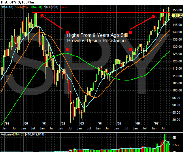
This is a 9-year chart of the SPYs. Traders have many adages. One of them is, "markets have memories." What this means is previous price levels are important. The above chart illustrates this point. Notice that a high achieved nine years ago is providing a ton of upside resistance for the SPYs now. Remember that chart, and then look at this one:
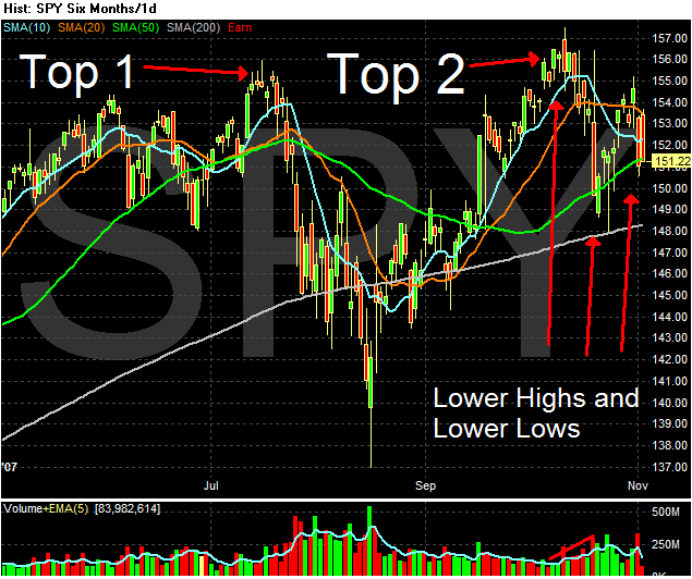
This is chart that shows a double top formation that occurred right around the previous highs. The markets tried to get through previous levels twice and couldn't make it. Now the markets are selling off in what is starting to look like a downward pattern of lower highs and lower lows. We don't know if that is how this will play out, but there are some strong bearish currents in the market right now. The financial sector (which comprises 20% of the S&P 500) is under extreme pressure thanks to subprime mortgage exposure. The energy sector -- which is one of the top performing sectors of the last year -- is taking earnings hits this quarter. Exxon and Chevron both reported sub par earnings.
The point is there are plenty of reasons for the market to move lower right now.
More on the Markets Tomorrow
I just got back in town and I'm beat. I'll post on the markets tomorrow morning.
Everybody relax and have a good Friday night.
Jobs Up +166,000
From the BLS:
Let's go back to the latest GDP report which had growth at 3.9% with an unbelievably low inflation level (.8%). Now, lets' approach the employment report from two angles.
1.) Let's assume the GDP report was correct and the inflation number was accurate. Then this number makes sense. With an economy growing at 3.9% you're going to see more job growth. It's that simple.
2.) Let's assume the GDP report was too high, largely because the inflation number was too low. Then this report is bit harder to swallow but it doesn't strain credulity. Let's assume that inflation is restated and takes the GDP report down to 2.5% -- which is a pretty large whack. Even at 2.6%, 166,000 isn't that hard to believe. While 2.5% isn't great, it's still growth and that means businesses will need more people to do stuff. In addition, employment figures have been low for the last three months indicating businesses may have been holding off on hiring and now have to hire because they have their "backs to the wall" as it were.
In short, given the latest GDP number this report isn't out of line with the current environment.
Total nonfarm payroll employment rose by 166,000 in October to 138.4 million, following increases of 93,000 in August and 96,000 in September. In October, job growth continued in several service-providing industries, while employment in manufacturing continued to trend downward. Construction employment was little changed over the month.
Let's go back to the latest GDP report which had growth at 3.9% with an unbelievably low inflation level (.8%). Now, lets' approach the employment report from two angles.
1.) Let's assume the GDP report was correct and the inflation number was accurate. Then this number makes sense. With an economy growing at 3.9% you're going to see more job growth. It's that simple.
2.) Let's assume the GDP report was too high, largely because the inflation number was too low. Then this report is bit harder to swallow but it doesn't strain credulity. Let's assume that inflation is restated and takes the GDP report down to 2.5% -- which is a pretty large whack. Even at 2.6%, 166,000 isn't that hard to believe. While 2.5% isn't great, it's still growth and that means businesses will need more people to do stuff. In addition, employment figures have been low for the last three months indicating businesses may have been holding off on hiring and now have to hire because they have their "backs to the wall" as it were.
In short, given the latest GDP number this report isn't out of line with the current environment.
A Look at Financial Sector Charts
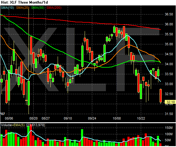
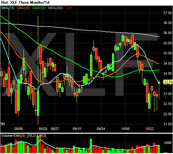
This is the three month chart of the XLF -- an ETF that tracks the largest financial sector stocks. Notice the following.
1.) The ETF is below the 200 day SMA and has been for the last three months. This is bear market territory.
2.) With the 20 day SMA crossing the 50 day SMA yesterday we now have a very bearish moving average picture. The shorter SMAs are below the longer SMAs and prices are below all the SMAs. In addition, all of the shorter SMAs are all heading lower. Add all of these elements together and you get a very negative reading for the financials market.
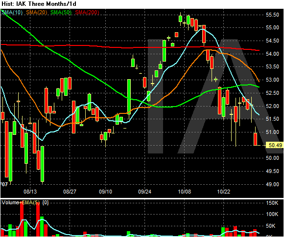
In insurers ETF is also incredibly negative.
1.) The 10 and 20 day SMAs are both heading lower.
2.) The 20 day SMA is about to cross the 50 day SMA.
3.) The index is below the 200 day SMA.
4.) Prices are below the SMAs and prices have been unable to get above the 10 day SMA over the last few weeks.
5.) Starting at the end of October we have a pick-up in volume. That indicates selling pressure is increasing.
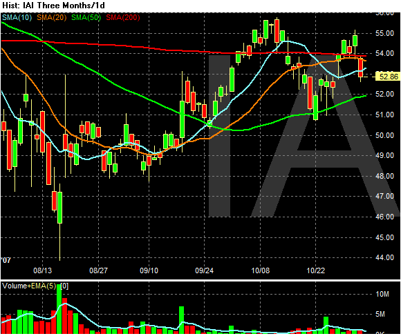
The Broker/Dealers is in a bit better shape.
The 10, 20 and 200 day SMA are bunched up. This indicates a lack of direction from either side of the market. While prices are below the 20 day SMA, they're trading around the index and have for the last month or so. This isn't so bad.
However on the negative side we may have the beginning of a classic downward shifting market making lower highs and lower lows. The key to this possibility is is this leg gets below $49.74 or so.
About That Citigroup Writedown and the Financials
Citigroup (NYSE:C - News) may have to cut its dividend to lift its capital levels, said CIBC World Markets. Morgan Stanley and Credit Suisse also downgraded the financial giant.
...
Stocks dived on the day's news. The Nasdaq fell 2.2%, while the S&P 500 and Dow slid 2.6%. The small-cap S&P 600 plunged 4.1%.
Banks led the way, with the SPDR financial ETF crashing 5%. Citigroup fell 7% to a 41/2-year low.
Credit Suisse (NYSE:CS - News) fell 5% after saying third-quarter profit fell 31%. It wrote down $1.9 billion in mortgage and leveraged loan losses.
Bond and mortgage insurers such as MBIA (NYSE:MBI - News) and Ambac (NYSE:ABK - News) dived on worries that subprime defaults will keep soaring. Insurance giant AIG (NYSE:AIG - News) fell 6% to a 52-week closing low.
The 10-year Treasury yield fell 11 basis points to 4.36%.
But it's not just problems at Citigroup:
After August's turmoil, credit markets had generally stabilized, and stock investors had begun to act as if the problems were over, driving stocks into record territory again. But beginning last week, with the $8.4 billion write-down by Merrill Lynch & Co., a drumbeat of bad news began to send a different message.
Merrill's write-down, which was larger than expected and led to the departure of its chief executive, was significant in that it included fresh financial information from September. All of the other major Wall Street firms ended their quarters in August, so investors interpreted Merrill's news as a sign that markets had soured that month.
Swiss bank UBS AG followed with a warning on Monday that the fourth quarter was likely to be weaker than it had projected. Bad news from mortgage and bond insurer Radian Group Inc. and from lender GMAC, which yesterday reported large third-quarter losses, added to worries that problems would persist at least through the end of the year.
First, I have to add that I love the irony of an analyst at one financial company downgrading another financial company for problems that are industry wide. That scenario is just, well, really funny.
But..on to more serious problems. All of the action quoted above (financials down, Treasuries up) indicates that investors are nervous about the financial implications of credit market problems. Basically we are returning to the central problem of credit derivatives: there are a ton of them out there and we have no idea what they are worth. Compounding that problem is that financial stocks comprise about 20% of the S&P 500. So -- the largest market segment has a huge balance sheet issue that won't be resolved for some time. That's the type of uncertainty that traders hate.
Right now photobucket is down for routine maintenance. I'll post charts when it's back up and running. Also, I'm traveling again today so I'll be posting from airports throughout the eastern and central US.)
Thursday, November 1, 2007
Today's Markets Pt. II
One of the funny things about traveling is you realize that there are certain things you just can't live without. I use QuoteTracker as my market following program and for charting etc... I literally can't live without it anymore.
Anyway, let's look at today's charts from a program that I know how to use.
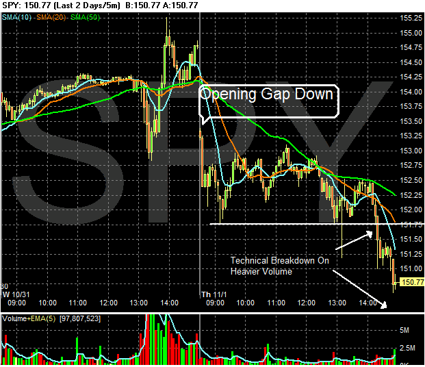
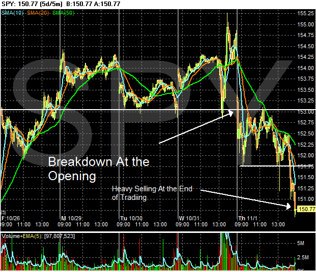
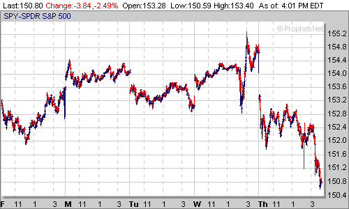
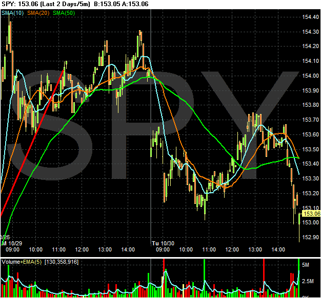
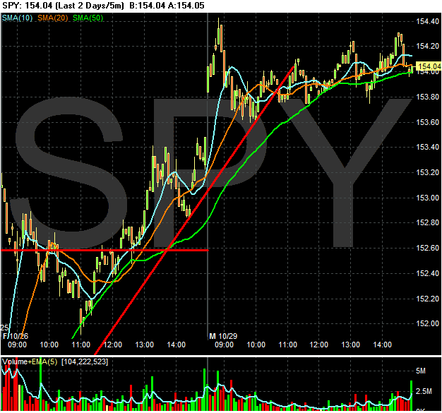
The SPY's gapped down at the opening and then traded in a range until about 2 PM. This is when the SPYs ran into upside resistance from the 50 day SMA. At this point volume picked up and traders literally ran for the doors.
On the 5-day chart we have a complete technical breakdown. The SPYs were holding to a consolidation pattern above about 153 as they waited for the Fed. That broke down right at the opening with the markets falling further as trading went on.
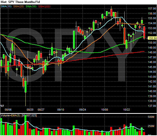
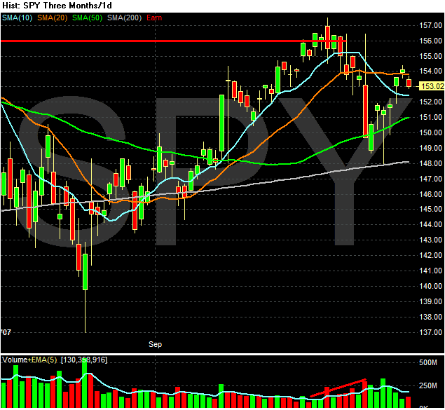
This chart should cause some concern. The good news is we are still above the 200 day SMA. The bad news is...
1.) Today the SPYs fell through 3 SMAs -- the 10, 20 and 50. That means there are three SMAs that will now provide upside resistance to a rally. That's not good.
2.) The upswing that started on 10/22 is now gone. From a long-term perspective, we could be seeing the market move into a period of lower highs and lower lows. In other words a correction (at least) and a bear market (at worst). However, the bear market is a long way off at this point. I'm simply thinking out loud on what the downtrend that started on 10/8 could be starting to look like.
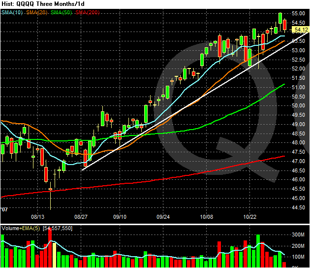
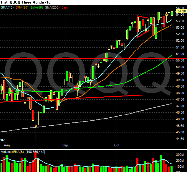
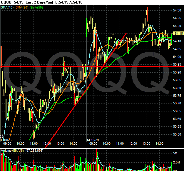
The QQQQs on the other hand, are still in good shape.
1.) The shorter SMAs are higher than the SMAs
2.) Closing prices are still above all the SMAs.
3.) All the SMAs are still headed higher. There may be some trouble brewing with the 10 day SMA, but we'll need a few more days of data for that.
As I mentioned below, the biggest change today is that bad news is now bad news and not fodder for "the Fed will cut rates again." That means the floor the thought of a Fed easing is now gone from traders thinking. That means we could have some seriously rocky times ahead.
Today's Markets
This is part 1. After dinner I'll put up some more charts with more analysis to see exactly what is going on.
Wow -- just one day after the Fed cuts rates the markets tank hard. So the question is -- why? Let's take a look at yesterday's Fed statement.
Traders interpreted this to mean the rate cuts were over -- no more liquidity for the stock market.
In addition, there was a ton of bad news today. An analyst report downgraded Citigroup and also speculated they would cut their dividend. The ISM manufacturing number was less than expected. Foreclosures doubled from year ago levels. In short -- it was a terrible news day.
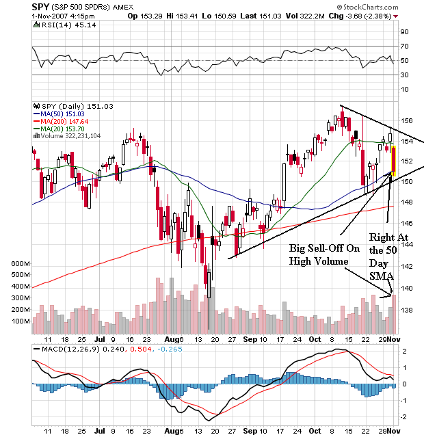
Looking at the 5 day SPY chart above notice a few things. First, the market opened lower but then consolidated. However, the market continued to sell-off in a big way at the end. That indicates traders are concerned about the news that will come out overnight. It also shows there was a ton of selling pressure late in the day.
On the daily chart we have the following developments.
1.) We printed a big bar on heavy volume. That's not good.
2.) The market has reversed direction from the rally it started on October 22. Also not the market did not get above previous highs on the most recent rally.
3.) The 20 day SMA is slightly downward, indicating the short-term trend is down.
4.) The market is trading right at the 50 day SMA.
Today's action did some technical damage to the index.
Wow -- just one day after the Fed cuts rates the markets tank hard. So the question is -- why? Let's take a look at yesterday's Fed statement.
Readings on core inflation have improved modestly this year, but recent increases in energy and commodity prices, among other factors, may put renewed upward pressure on inflation. In this context, the Committee judges that some inflation risks remain, and it will continue to monitor inflation developments carefully.
The Committee judges that, after this action, the upside risks to inflation roughly balance the downside risks to growth. The Committee will continue to assess the effects of financial and other developments on economic prospects and will act as needed to foster price stability and sustainable economic growth.
Traders interpreted this to mean the rate cuts were over -- no more liquidity for the stock market.
In addition, there was a ton of bad news today. An analyst report downgraded Citigroup and also speculated they would cut their dividend. The ISM manufacturing number was less than expected. Foreclosures doubled from year ago levels. In short -- it was a terrible news day.
Looking at the 5 day SPY chart above notice a few things. First, the market opened lower but then consolidated. However, the market continued to sell-off in a big way at the end. That indicates traders are concerned about the news that will come out overnight. It also shows there was a ton of selling pressure late in the day.
On the daily chart we have the following developments.
1.) We printed a big bar on heavy volume. That's not good.
2.) The market has reversed direction from the rally it started on October 22. Also not the market did not get above previous highs on the most recent rally.
3.) The 20 day SMA is slightly downward, indicating the short-term trend is down.
4.) The market is trading right at the 50 day SMA.
Today's action did some technical damage to the index.
Wow -- Gas Market is Looking Scary
For those of you who want to keep up with the real underpinnings of the oil market, read This Week in Petroleum. Its issued every Wednesday and it has the latest information on US stockpiles, reserves and oil production.
The latest report has some pretty interesting charts.
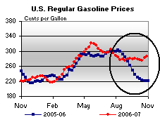
First there is this chart of gas prices.
What this tells us is retail gas prices are at least 50 cents higher per gallon this year than they were at the same time last year. (But remember -- inflation is under control.) Gas prices are usually seasonal in nature; they rise before the summer driving season and fall after the summer ends. That's not happening this year -- at least not yet. At this point I have to wonder whether these prices are going to impact the holiday season's shopping plans.
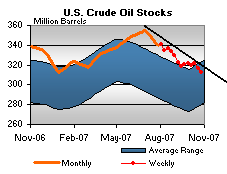
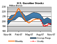
There are two other charts in the report that are very interesting.
Oil stocks are decreasing. This is the amount of crude oil on hand that is used in the production of oil based products. US oil inventories have been declining on a consistent basis since mid-summer. Why this is I don't know. It's also important to note that we're at the top end of the historical inventory range, so we're far from crisis levels. But the consistent decline is interesting to say the least.
Gas stocks -- the amount of gasoline that is on hand to sell to consumers -- is at a low level. I don't know why gas production is down, but it is. This is one of the reasons why are seeing retail level gas prices so high compared to last year.
The low level of gasoline inventories should raise serious concerns going forward. The figures in general indicate something in the oil market is not working as it should. I don't know what that something is -- and it could just as easily be a combination of things. But, there is something not right at present.
Wednesday, October 31, 2007
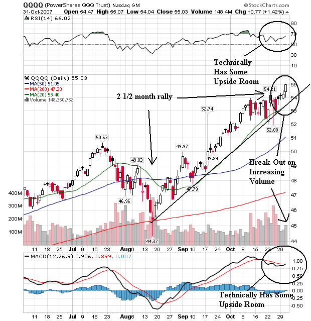
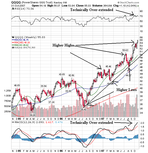
A Closer Look At the QQQQs
Tech has been "the" market of late, so it seems appropriate to look at the daily and monthly charts to get an idea for what is in store for the market.
The daily chart is very bullish.
1.) There is s strong uptrend in place that started about 2 1/2 months ago.
2.) All the moving averages are moving higher.
3.) The shorter moving averages are above the longer moving averages.
4.) Although the RSI and MACD are high, both have some upside room to move. Considering the Fed just cut rates this seems possible.
The weekly chart also has some very bullish points.
1.) Note the series of higher highs and higher lows. This is what a classic bull market chart should look like.
2.) The shorter SMAs are higher than the longer SMAs.
3.) All three SMAs are pointing higher.
4.) The only problem is from the technical indicators which are giving overbought indicators. Remember this is not fatal and it does not mean the market is going to drop. It could mean a period of consolidation.
The weekly chart gives us some pause, as it indicates consolidation might be on the horizon. However, with the rate cut, that consolidation might not last to long.
I'm Not the Only One Calling Bulls^#$ on the GDP Inflation Number
It's good to know I'm not alone in my questioning the GDP deflator number.
From the Big Picture:
A poster in the comments pointed me to this article from Marketwatch:
Read the whole thing.
From the Big Picture:
Price Indexes for Gross Domestic Product was an astounding low 0.8% (Table 4). In other words, this report benefited as much from higher inflation as it did from true growth.
I obviously take issue with that (as Crude Oil crosses $94 for the first time).
To highlight the impact that this 0.8% price gain had on the reported REAL GDP: that 0.8% gain matches a level last seen in 1998; prior to that, the previous deflator gain of .8% was n 1963.
Peter Boockvaar of Miller Tabak observes that "with the dramatic upturn in energy prices and other commodities, the decline in the Price Deflator is obviously unsustainable. The consensus today for Nominal GDP was 5.1% and came in today at 4.7%, thus weaker than expected. Q3 GDP was fine , but not as good as the headline report reads."
The average of the price index since Q1 2004 to Q2007 was 2.98, ranging froma low of 1.7% to a high of 4.2%. Thus, if the deflator matched consensus, it would have generated a GDP of 1.9%; if it was at its recent 3 year average of 2.98%, GDP would be ~1%.
A poster in the comments pointed me to this article from Marketwatch:
As odd as it sounds, the government reported that inflation was at a four-decade low in the third quarter, primarily because import oil prices rose so much.
If you don't understand that, welcome to the confusing world of national income accounting, where up sometimes is down, and where sometimes one plus one can equal zero.
The simple explantion:
Because of the way the government counts and reports the numbers, real-life inflation was understated and growth was overstated.
The economy didn't really grow 3.9%, and inflation really wasn't 0.8%. The numbers aren't as good as they look.
Read the whole thing.
Fed Cuts And More on Inflation
I'm in the Charlotte, NC airport between flights. Thankfully I have a bit of time to stretch my legs after the two hour ride in the airplane cattle car.
Anyway, the Fed cut ates. Here is a link to the statement.
Let's look at this statement in a bit more detail.
Today’s action, combined with the policy action taken in September, should help forestall some of the adverse effects on the broader economy that might otherwise arise from the disruptions in financial markets and promote moderate growth over time.
It looks to me that the Fed is attempting to prevent further problems with this action. They are looking ahead and thinking there could be further problems. Their hope is liquidity will solve that problem.
Readings on core inflation have improved modestly this year, but recent increases in energy and commodity prices, among other factors, may put renewed upward pressure on inflation.
First -- recent increases in energy and commodity prices? Where have these guys been over the last few years? From now on, all Fed governors must demonstrate in a public forum that they can read a damn price chart.
This statement dovetails nicely with some comments I received in the previous post on 3Q GDP. Some people were wondering why I though the .8% chained deflator was too low and others offered to help find out what was wrong with the particular inflation number. All these comments are appreciated, BTW.
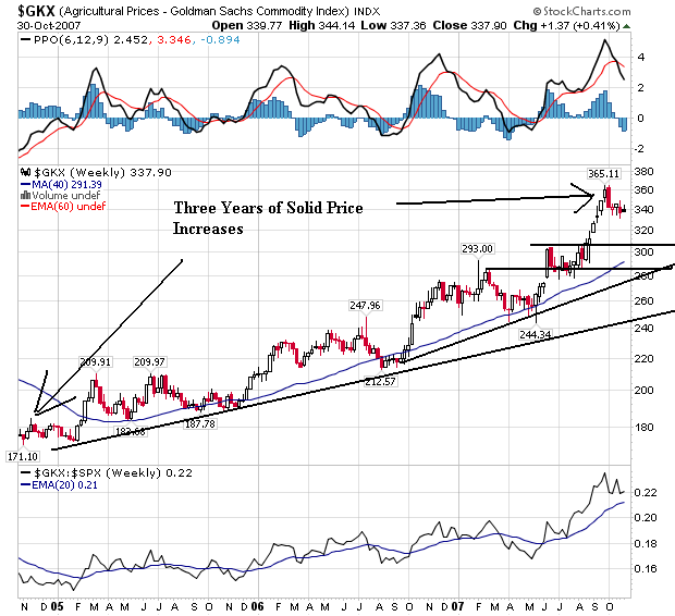
I have several problems with the inflation numbers -- most notably with the Fed's reliance on core inflation rather than overall inflation. In a period when food and energy prices are going though standard seasonal gyrations, the "we only watch core inflation" policy makes sense. However, we're not in that kind of environment right now. Largely thanks to India and China -- and their two billion or so residents who are seeing their incomes grow -- demand for commodities has really heated up. As a result we've seen a huge increase in commodity prices over the last 3-5 years.
Take a look at the following charts:
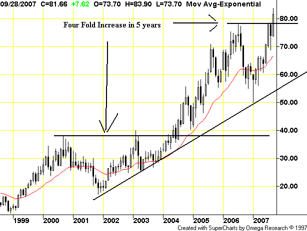
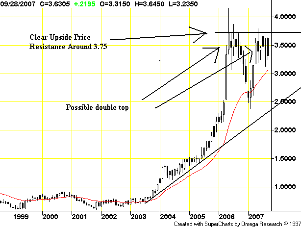
Oil (It should read a three-fold increase. Sorry -- airport blogging is a bit weird).
Agricultural prices:
Copper
Aluminum
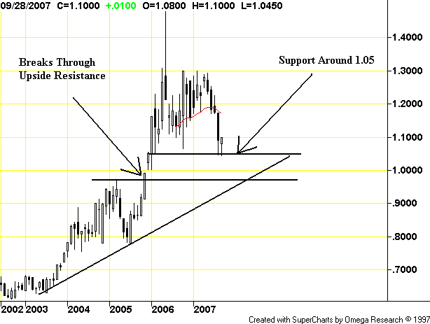
All of these charts shows big price increases. And no -- this is not an ephemeral argument. Recent earnings releases from Kraft and P&G have both noted they are experiencing margin hits because of rising commodity prices. If the largest companies in their respective financial areas are experiencing price hits, then smaller companies that lack the bargaining power surely are experiencing worse.
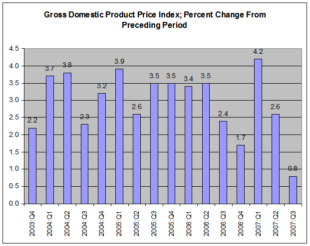
Now -- back to today's .8% increase in the chained GDP deflator. Here is a chart from the current release the shows the previous increases from the respective previous quarter.
Now, let's ask a few questions that build on each other.
Does the .8% increase make sense in light of the previous quarters rate of growth? (This is is the previously mentioned Sesame Street test -- one of these things is not like the other one).
Especially in an environment when the economy is growing near full capacity (3.9%)?
In light of the above commodity charts that show commodity prices have been increasing for an extended length of time -- as in years?
At a time when productivity gains are shrinking?
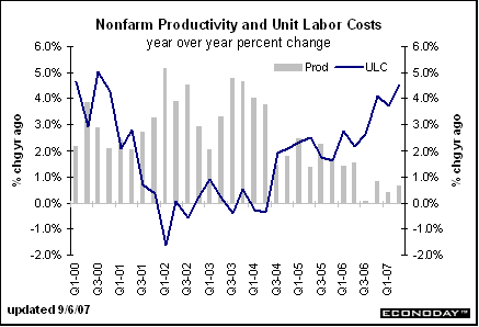
I'm not saying the small gain isn't possible. But in light of all the previous questions -- especially multi-year increases in commodity prices and declining productivity -- the number just doesn't add up.
I should add -- as I hopefully always do -- I could be wrong in all of this. I've been wrong before and will be wrong again (I thought Madonna was going to be a one-hit wonder). But the number is just sticking in my craw as it were.
Anyway, the Fed cut ates. Here is a link to the statement.
The Federal Open Market Committee decided today to lower its target for the federal funds rate 25 basis points to 4-1/2 percent.
Economic growth was solid in the third quarter, and strains in financial markets have eased somewhat on balance. However, the pace of economic expansion will likely slow in the near term, partly reflecting the intensification of the housing correction. Today’s action, combined with the policy action taken in September, should help forestall some of the adverse effects on the broader economy that might otherwise arise from the disruptions in financial markets and promote moderate growth over time.
Readings on core inflation have improved modestly this year, but recent increases in energy and commodity prices, among other factors, may put renewed upward pressure on inflation. In this context, the Committee judges that some inflation risks remain, and it will continue to monitor inflation developments carefully.
The Committee judges that, after this action, the upside risks to inflation roughly balance the downside risks to growth. The Committee will continue to assess the effects of financial and other developments on economic prospects and will act as needed to foster price stability and sustainable economic growth.
Let's look at this statement in a bit more detail.
Today’s action, combined with the policy action taken in September, should help forestall some of the adverse effects on the broader economy that might otherwise arise from the disruptions in financial markets and promote moderate growth over time.
It looks to me that the Fed is attempting to prevent further problems with this action. They are looking ahead and thinking there could be further problems. Their hope is liquidity will solve that problem.
Readings on core inflation have improved modestly this year, but recent increases in energy and commodity prices, among other factors, may put renewed upward pressure on inflation.
First -- recent increases in energy and commodity prices? Where have these guys been over the last few years? From now on, all Fed governors must demonstrate in a public forum that they can read a damn price chart.
This statement dovetails nicely with some comments I received in the previous post on 3Q GDP. Some people were wondering why I though the .8% chained deflator was too low and others offered to help find out what was wrong with the particular inflation number. All these comments are appreciated, BTW.
I have several problems with the inflation numbers -- most notably with the Fed's reliance on core inflation rather than overall inflation. In a period when food and energy prices are going though standard seasonal gyrations, the "we only watch core inflation" policy makes sense. However, we're not in that kind of environment right now. Largely thanks to India and China -- and their two billion or so residents who are seeing their incomes grow -- demand for commodities has really heated up. As a result we've seen a huge increase in commodity prices over the last 3-5 years.
Take a look at the following charts:
Oil (It should read a three-fold increase. Sorry -- airport blogging is a bit weird).
Agricultural prices:
Copper
Aluminum
All of these charts shows big price increases. And no -- this is not an ephemeral argument. Recent earnings releases from Kraft and P&G have both noted they are experiencing margin hits because of rising commodity prices. If the largest companies in their respective financial areas are experiencing price hits, then smaller companies that lack the bargaining power surely are experiencing worse.
Now -- back to today's .8% increase in the chained GDP deflator. Here is a chart from the current release the shows the previous increases from the respective previous quarter.
Now, let's ask a few questions that build on each other.
Does the .8% increase make sense in light of the previous quarters rate of growth? (This is is the previously mentioned Sesame Street test -- one of these things is not like the other one).
Especially in an environment when the economy is growing near full capacity (3.9%)?
In light of the above commodity charts that show commodity prices have been increasing for an extended length of time -- as in years?
At a time when productivity gains are shrinking?
I'm not saying the small gain isn't possible. But in light of all the previous questions -- especially multi-year increases in commodity prices and declining productivity -- the number just doesn't add up.
I should add -- as I hopefully always do -- I could be wrong in all of this. I've been wrong before and will be wrong again (I thought Madonna was going to be a one-hit wonder). But the number is just sticking in my craw as it were.
Quick Notes on GDP
I have about 10 minutes.
The overall GDP report is here
I have one big problem with this report. The GDP price deflator increased .8%? That is really low and just doesn't add up. The second lowest deflator over the last few years is 1.7 in the fourth quarter of 2006. Aside from that number and this month's number, most deflators are over 2% (see table IV in the link above). Playing the Sesame Street game "One of these things is not like the other one", that number should raise a ton of eyebrows.
Considering oil is near a record level, agricultural prices are in the middle of a multi-year bull run as are some metals, a deflator that low just doesn't add up.
Here's how the WSJ reported the inflation numbers from the report:
The price index for personal consumption expenditures rose by 1.7% after increasing 4.3% in the second quarter. But the much-watched PCE price gauge excluding food and energy accelerated, rising 1.8% after increasing 1.4% in the second quarter. Other price gauges in the report showed slowing inflation [BD's note -- really? Seen a chart of oil, agricultural or metals prices lately?], including the price index for gross domestic purchases, which measures prices paid by U.S. residents. It rose 1.6% after increasing 3.8%. The chain-weighted GDP price index increased 0.8% after increasing 2.6% in the second quarter.
Traveling Day
I'm traveling today. I'll try and post on the market had Fed action,, but I can't guarantee anything.
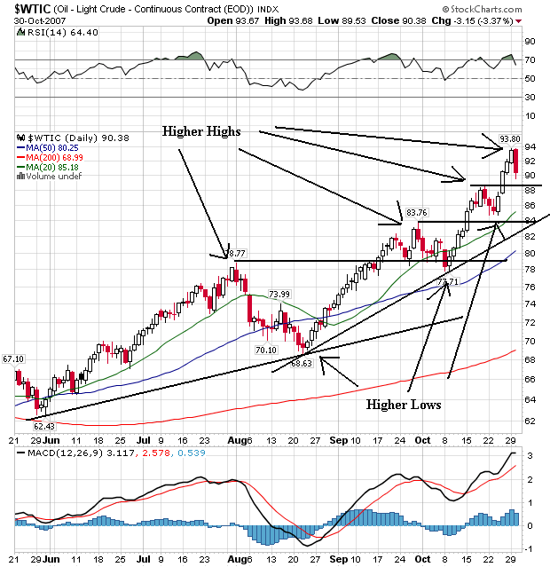
A Look At the Oil Market
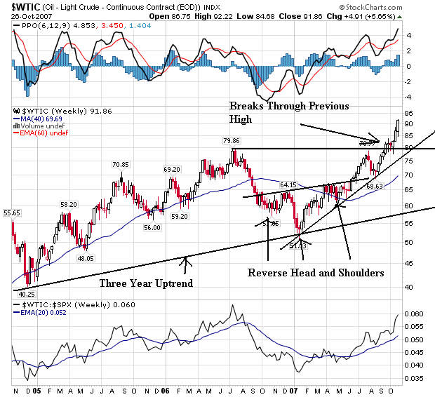
This is a great example of a bull market chart. Notice the following.
1.) A series of higher highs and higher lows.
2.) The shorter simple moving averages (SMAs) are higher than the longer SMAs.
3.) All the SMAs are moving higher. That means the short (2 month), medium (2 1/2 month) and long term (40 week) trend is positive.
4.) Notice how prices have moved through previous highs over the last few months. These previous price levels also provide a ton of technical support when prices are decreasing, making it more difficult for prices to move lower.
5.) Although two technical indicators are at or near overbought levels (the RSI and MACD) that does not mean prices are going to drop. Notice from mid-September to mid-October that prices were also overbought and prices simply consolidated above previous highs. Overbought technical conditions can just as often lead to consolidation as a drop in bull markets.
6.) There are two upward sloping trend lines in place.
Today's WSJ has an article on the oil market that seems to inherently admit the "peak oil" argument. This argument states (essentially) that most or all of the world's oil has already been found and the world is at or near the highest level of oil production we'll see. Because I'm not a petroleum guy I can't speak to the veracity of these arguments (which isn't to say they aren't true). However, for more information, go to the Oil Drum website for some really good discussion on the matter.
From the WSJ article:
Several leading oil experts, gathered here yesterday for an annual energy conference, sketched a near-term future in which mounting global demand and shrinking supplies push oil prices well past the $100-a-barrel mark.
Consuming countries, they argued, will simply have to deal with the fact that new pockets of oil are getting far harder and more expensive to tap. That, combined with years of underinvestment by the industry, has led to a tapering off of new oil supplies that will continue for years, despite rising energy demand in Asia, the Middle East and some industrialized countries.
....
Sadad I. Al-Husseini, an oil consultant and former executive at Aramco, Saudi Arabia's national oil company, gave a particularly chilling assessment of the world's oil outlook. The major oil-producing nations, he said, are inflating their oil reserves by as much as 300 billion barrels. These amount to hypothetical reserves that are "not delineated, not accessible and not available for production."
A lot of production in the Middle East is from mature reservoirs, and the giant fields of the Persian Gulf region, he said, are 41% depleted.
Global oil and gas capacity is constrained by mature reservoirs and is facing a "15-year production plateau," Mr. Husseini said. He predicted that supply shortages will continue to add $12 to the price of oil for every million barrels a day in additional demand. Global demand, now at some 85 million barrels a day, was on average 10 million barrels a day lower in 1999.
.....
Andrew Gould, the chairman and chief executive of Schlumberger Ltd., an oil-services company, expressed similar concerns, noting that 70% of the oil fields that now quench world demand are more than 30 years old. The growth in global demand since 2003, he said, has been roughly the equivalent of the daily output from two of the world's larger suppliers: the North Sea and Mexico.
Tuesday, October 30, 2007
Housing Is Nowhere Near the Bottom
From Bloomberg:
Anyone who is even thinking about calling a bottom in housing right now is just not paying attention to the underlying facts.
PMI Group Inc., the second-largest U.S. mortgage insurer, posted its first quarterly loss since its 1995 public offering as borrowers were unable to keep up with higher payments after their ``teaser'' rates expired. The company fell 10 percent in New York trading and a rating firm downgraded its debt.
.....
U.S. home foreclosures doubled in September from a year earlier as subprime homeowners struggled with payments, according to RealtyTrac Inc. MGIC Investment Corp, the largest mortgage insurer, also reported its first quarterly loss this month and predicted it won't be profitable in 2008. Mortgage insurers help reimburse home lenders when borrowers don't pay.
``The mortgage insurance industry at large is heading directly into the meat of the most challenging year or two in its history,'' said Seth Glasser, a credit analyst at Barclays Capital Inc. in a note to investors. He reiterated his ``underweight'' rating for PMI.
....
``The speed and the depth of the deterioration we saw in the third quarter, and in particular the month of September, was greater than we had expected,'' Smith said. Borrowers in California, Florida, Michigan, Indiana, Ohio and Illinois defaulted at rates exceeding the rest of the country, he said.
Anyone who is even thinking about calling a bottom in housing right now is just not paying attention to the underlying facts.
Today's Markets
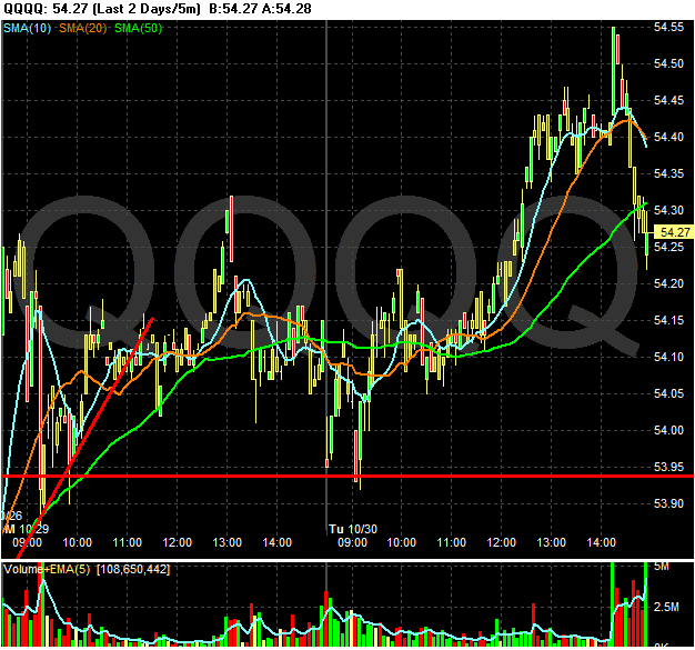
The SPYS opened lower and dropped. They rallied back to their opening, but then fell again near the close. Notice at the end the long candles and heavy volume. This indicates that traders were shedding positions before the close, not wanting to hold anything overnight. This indicates nervousness. Although the Fed won't release their interest rate decision until tomorrow afternoon, traders are probably concerned about an overnight fed related development.
On the daily chart notice there are six straight small candles in a row. This indicates there is a lack of strong sentiment in either way pushing the market in any direction. Instead, it looks like traders started to become concerned about the upcoming Fed meeting and have decided to sit on the sidelines until after the Fed releases their interest rate policy statement.
The QQQQs are on a different track. Because they are mostly related to technology -- and technology isn't mortgage related -- QQQQ traders are looking for further gains. However, like the SPYs we see a large sell-off at the end of the day on heavy volume.
Unlike the SPYs, there are a lot of bullish points on the QQQQ chart. All of the SMAs are moving higher and the shorter SMAs are higher than the longer SMAs. In addition, prices are above the SMAs which will pull the SMAs higher. Also note that prices consolidated for about a week and a half. The only problem with this chart is the declining volume over the last few days as the market went higher. However, I think Fed nervousness is the primary reason for this. If the Fed cuts tomorrow, I would expect the QQQQs to move higher.
What Inflation?
From the AP:
From the WSJ:
But remember boys and girls -- according to the Federal Reserve's policy board, energy and food costs don't matter.
P&G said gross margins are expected to be temporarily lower this quarter due to higher commodity and energy costs and investments needed behind its North America laundry initiative, in which it is offering concentrated formulas of Tide and other liquid detergents in smaller containers.
P&G said it expects gross margins to recover in the second half of its fiscal year due to pricing and increased cost savings from restructuring projects.
P&G officials said they plan to pass along some of the rising costs for oil and raw materials to consumers for some items, including Pampers diapers, Charmin toilet paper and Olay and Ivory personal cleansing products.
Company officials said the price hikes planned over the next few months -- in most cases 5 percent or more -- come as competitors also are raising prices.
A.G. Lafley, P&G's chairman and chief executive, noted that U.S. consumers are pressured by higher energy costs and the housing and credit crunches, but said P&G and its industry traditionally hold up during economic slowdowns.
From the WSJ:
Cold weather hasn't hit the Northeast yet, but record heating-oil prices mean high heating bills are on the way for many residents.
About eight million U.S. households -- largely in New England and the Central Atlantic states -- rely on heating oil to run their furnaces each winter. Last week, heating-oil futures hit a record of $2.36 a gallon, up more than 40% since the start of the year.
Weather forecasters are predicting a colder winter than last year, despite the unseasonably warm October in the Northeast. That's going to lift heating costs no matter what fuel a homeowner uses. Consumers who use heating oil, though, will feel the most pain. Their winter heating bill for the season is expected to average $1,785, compared with $891 for households that use natural gas, according to the Department of Energy. Unlike crude oil, natural-gas prices have been relatively restrained in the U.S. this year.
But remember boys and girls -- according to the Federal Reserve's policy board, energy and food costs don't matter.
Business Week Adds to the Comic Relief
From Business Week:
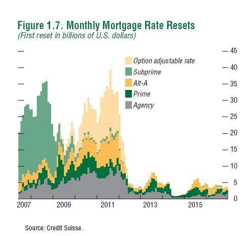
Any title that implies financial stocks are in some way attractive right now is simply put really damn stupid. There are three years of resets ahead as the chart from the IMF below indicates. Calculated Risk has been posting on the declining ABS/CMBS indexes. Home prices are still dropping. Short version, the credit crunch is just starting and won't let up for some time.
Yet some investors say such terrifying conditions are a great time to start buying stock in the financial sector.
Their argument: Financial stocks in the S&P 500 have tumbled almost 10% in the last six months, while the broader index is up 2.75%. Financial giants like Citigroup (C), Bank of America (BAC), Wachovia (WB), Merrill Lynch (MER), and big insurer AIG (AIG) are all trading at or just above one- and, in some cases, two-year lows.
....
For long-term investors, the beat-up financial sector may be the best place to look for bargains. The shares of some regional banks, in particular, are at levels that basically price in a "worst-case scenario" of a recession, says William Fitzpatrick, an equity analyst at Johnson Asset Management. Many banks are paying big dividends of 7% or 8%. On "any sort of recovery at all, these stocks are really going to rally," he says.
But Fitzpatrick and other expert investors warn that financial stocks are at low prices for very good reasons. Things really could go from bad to even worse.
Any title that implies financial stocks are in some way attractive right now is simply put really damn stupid. There are three years of resets ahead as the chart from the IMF below indicates. Calculated Risk has been posting on the declining ABS/CMBS indexes. Home prices are still dropping. Short version, the credit crunch is just starting and won't let up for some time.
There's No Housing Bubble!
Hat Tip to the Kirk Report
From October 2005:
From October 2005:
Ben S. Bernanke does not think the national housing boom is a bubble that is about to burst, he indicated to Congress last week, just a few days before President Bush nominated him to become the next chairman of the Federal Reserve.
.....
"House prices are unlikely to continue rising at current rates," said Bernanke, who served on the Fed board from 2002 until June. However, he added, "a moderate cooling in the housing market, should one occur, would not be inconsistent with the economy continuing to grow at or near its potential next year."
Country Wide Offers Comic Relief
From the WSJ:
Consider the following chart from the IMF:
Also add this from IBD:
Does it look like a financial company that is heavily invested in the real estate market is going to bounce back from problems quickly?
Countrywide Financial Corp. cheered investors last week by pledging a quick return to profitability, boosting the stock price that day 32%.
Consider the following chart from the IMF:
Also add this from IBD:
ABX indexes, barometers of demand for mortgage-backed securities, have plunged again in recent weeks. They range from the highest-rated AAA slice of mortgage debt to the riskiest tranches, rated BBB-.
The BBB- tranche from the second half of 2006 was worth just 17.94 cents on the dollar Monday, according to Markit.com. Some tranches eventually may prove worthless.
"It's probably not a straight shot to zero but it's close enough for me to stay fully invested," Lahde said.
....
Subprime loans from late 2006 are the worst of the worst. Lenders, desperate to keep loan origination strong, loosened their already-lax credit standards. Home prices were at or near their peaks. So these loans started going bad almost as soon as they were made — well before any interest rate resets.
Foreclosure filings doubled in September from a year ago. They are set to rise even further, dumping more homes on an already bloated market.
A record 17.9 million homes stood empty in the third quarter. It could get worse.
Does it look like a financial company that is heavily invested in the real estate market is going to bounce back from problems quickly?
Monday, October 29, 2007
A Closer Look at the Basic Materials Sector
Unlike the stock market rally of the 1990s, the latest rally is characterized by strong movements in basic materials. The reason is the growth of China and India. As these two countries have come on line -- and as they have developed their respective industrial bases -- they have demanded more and more raw materials. Hence, the run-up in the basic price of raw materials and the companies that extract them.
First, let's look at two charts of basic metals:
Copper really took-off in mid-2005, when the price moved from 1.50 to about 2.20 by year end. By early 2006 the price again increase to about 3.60, but then sold-off of the 2.60 level. Copper again rallied at the beginning of 2007 and is currently consolidating around the 3.50 area.
Simply put, this is a very bullish chart. There does appear to be upside resistance around the 3.75 area. On the bearish side, we could be seeing a double top forming. But for that to play out China and India would have to go off line. Considering they are currently growing over 10% year, that does not seem likely.
There have been two price runs in aluminum. The first occurred from mid-2003 to early 2004 when the price increased from about .65 to .8. The next big price run occurred from mid-2005 to early 2006 when prices increase from .8 to 1.10. Prices have been in a consolidation range from 1.10 to 1.30 since.
The point of the previous two charts is there is clearly money to be made in the raw materials/basic materials sector of the market. And the ETFs that trade in this area of the market have benefited.
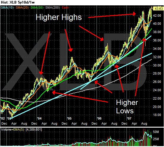
The five year basic materials chart shows a classic bull market chart. We have higher lows and higher highs -- always a good sign. There are also two strong upward slanting trendlines in play. Since mid-2006 the XLBs have used the 200 day SMA as downside support. All in all, this is a great long term chart.
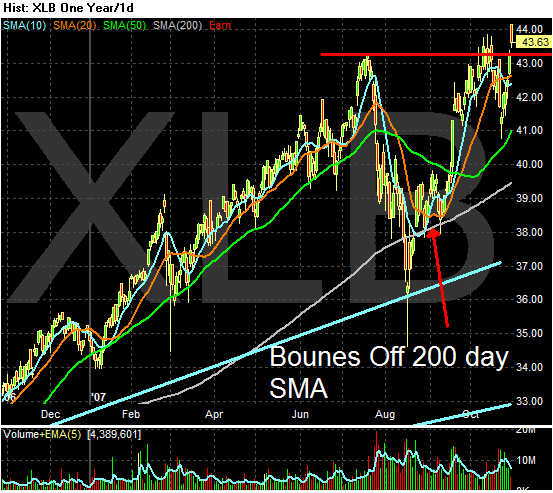
On the year long XLB chart there is a strong rally from November of 2006 to July of this year when the market sold-off. The XLBs traded down to their 200 day SMA and have rallied from that level.
However, the previous highs set in mid0July seem to be giving the index a hard time right now. Notice that in early October prices bunched up around the previous high but had to retreat to retest those levels. While prices have advanced beyond the mid-July levels, the volume has been less than inspiring -- especially yesterday's total. Also note the position of the moving averages. The 10 day SMA is below the 20 day SMA and the 20 day SMA is almost horizontal. While these are not fatal problems, they do not inspire a extreme confidence going forward.
I think a heavy sell-off is doubtful right now largely because the underlying fundamentals are incredibly strong. However, as noted in yesterday's IBD, 3Q basic materials earnings increased 0%. Considering the incredible bull run we have seen in this sector so far, I don't think traders will want to take all their respective chips off the table, instead opting for selling some of their positions in a weak market situation and waiting for fourth quarter results to come in.
Today's Markets
Not much really happened today in the markets. Basically we're waiting for the Fed to do something on Wednesday (or not -- wouldn't that be a surprise). Anyway, both markets opened higher and then found a tight range for the day.
Why Further Rate Cuts Will Only Hurt In the Long Term
From the WSJ:
From the WSJ:
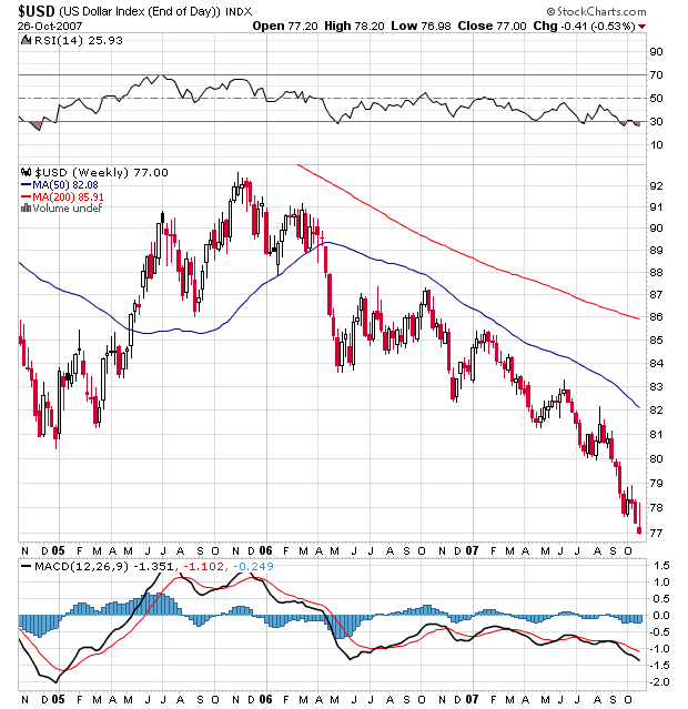
As we approach another possible rate cut, it's important to look at what that might actually do to inflation. One of the Fed's basic problems is most major commodities are priced in dollars. If the dollar is dropping in value this is a de factor price increase in most commodities. Additionally, as noted above, a weaker dollar encourages traders to bid up commodity prices as an inflation hedge.
First of all, the dollar is dropping.
This drop in the dollar is partially related to the increase in oil.
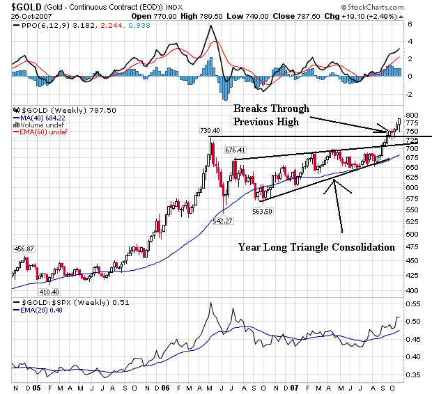
In addition, gold is increasing indicating traders are looking for an inflation hedge.
What makes this incredibly ironic is the Fed only looks at core inflation (this despite the clear indication that commodity prices are increasing in a year over year basis). So if the Fed lowers rates again they will further weaken the dollar. This will encourage traders to bid up the price of commodities priced in dollars which will add to commodity inflation. But this won't really count because the Fed only looks at core inflation.
This would be really funny ..... if it weren't something that would really hurt a lot of people.
Crude-oil futures rose past $93 a barrel for the first time on Monday, getting a lift as bad weather forced a halt to production in Mexico. Oil futures were also boosted by a weak dollar, which touched the lowest level against the euro in eight years.
Crude futures for December delivery rose as high as $93.20 a barrel in electronic trading. It also reached a new high of $92.56 in earlier regular trading. The contract was last seen up 59 cents, or 0.6%, to $92.45 a barrel.
>>>>>
"The Pemex shutdown is only putting a further floor under the already surging oil price, weakening dollar concerns are also pushing crude higher," said Kevin Kerr, president of Kerrtrade.com and editor of Dow Jones MarketWatch's Global Resources Trader.
The dollar dropped to $1.4438 per euro in early Monday morning, the weakest since the introduction of the 13-nation common currency in 1999. A weak dollar will increase the appeal of oil as an alternative investment.
From the WSJ:
Analysts said the dollar may continue to trade near its all-time low versus the euro as markets gear up for the interest rate decision Wednesday by the Federal Open Market Committee. The central bankers are expected to reduce rates to 4.50% from the current 4.75%, while some say it's possible the rate could be cut to 4.25%.
Lower rates by the Fed tend to hurt the greenback by lowering its appeal to investors looking for higher returns.
As we approach another possible rate cut, it's important to look at what that might actually do to inflation. One of the Fed's basic problems is most major commodities are priced in dollars. If the dollar is dropping in value this is a de factor price increase in most commodities. Additionally, as noted above, a weaker dollar encourages traders to bid up commodity prices as an inflation hedge.
First of all, the dollar is dropping.
This drop in the dollar is partially related to the increase in oil.
In addition, gold is increasing indicating traders are looking for an inflation hedge.
What makes this incredibly ironic is the Fed only looks at core inflation (this despite the clear indication that commodity prices are increasing in a year over year basis). So if the Fed lowers rates again they will further weaken the dollar. This will encourage traders to bid up the price of commodities priced in dollars which will add to commodity inflation. But this won't really count because the Fed only looks at core inflation.
This would be really funny ..... if it weren't something that would really hurt a lot of people.
Treasury Secretary Paulson Provides Comic Relief
From CNBC:
The markets say otherwise.
Look -- if the US wants a "strong dollar policy" they have to act like a strong dollar economy. That means things like exporting more than they import and not issuing mammoth amounts of new debt every year. You just can't say it; you have to act in a way that leads to that result.
Treasury Secretary Henry Paulson on Monday repeated his mantra that a strong dollar is in the best interests of the US, even as the currency was hitting fresh lows against the euro.
"I believe that a strong dollar is in our nation's interest and also that currency values should be set in a competitive marketplace based upon underlying economic fundamentals," Paulson said in response to a question about the greenback at a US-India CEO forum in Mumbai.
The markets say otherwise.
Look -- if the US wants a "strong dollar policy" they have to act like a strong dollar economy. That means things like exporting more than they import and not issuing mammoth amounts of new debt every year. You just can't say it; you have to act in a way that leads to that result.
More On Third Quarter Earnings
From IBD:
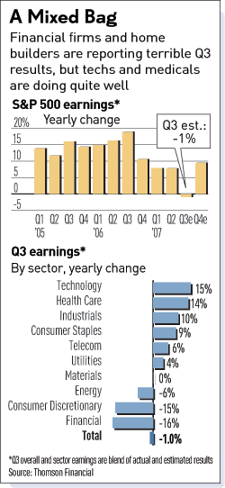
What does this tell us?
1.) The gains in consumer staples, health care and possibly telecom indicate more recession resistant economic areas are doing well.
2.) The cheap dollar is leading to rising exports which is helping industrials.
3.) Consumer discretionary is hurting. That indicates the US consumer may not be that healthy.
4.) Financials are taking a terrific hit from the subprime mess.
5.) I am completely mystified by tech's earnings gains. My main thought there is this is largely driven by growth in foreign markets, although any other observations would be great.
6.) the XLBs (Basic Materials ETF) is up 30.53% over the last year and 24.9% YTD. This ETF has been a market leader this year. But with earnings growth coming in at 0% so far this quarter, I have to wonder if traders will start to consider booking some profits for year end window dressing. The same can be said of energy (XLE), which is also a market leader of this rally, up 36.25% over the last year and 31.50% YTD.
The Bifurcated Nature of the Latest Rally
From the WSJ:
The S&P 100 bounced off its 50 day SMA on Friday printing a strong upward bar. The index also rose above the 10 day SMA. The 20 day SMA is currently offering upside resistance. While the moving average picture could be a lot stronger, the shorter SMAs are above the 200 SMA which is a positive sign. The 10 day SMA is below the 20 day SMA (which is bearish), but the move could be temporary as the 10 is barely below the 20 SMA.
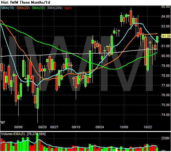
The Russell 2000 is trading around the 200 day SMA. In other words, this index is flirting with bear market territory. In addition, the Russell tried to break-out of this trading pattern in early October but couldn't hold above that technically important line. The moving averages are all bunched up offering no clear cut direction. In short, this part of the market looks fair at best.
Financials are in terrible shape. They have been below the 200 day SMA for the last three months -- ever since the summer sell-off. Prices are completely below all SMAs -- a very bearish signal. These are important observations because financials compose about 20% of the S&P 500.
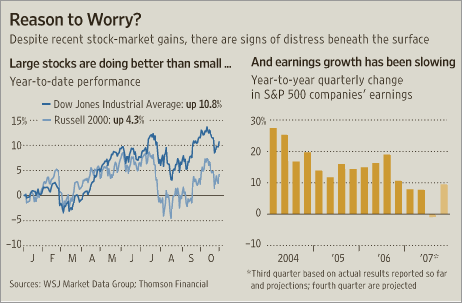
This split nature of the market is concerning. It indicates the market is rallying on the backs of a small swath of stocks and sectors. That means the strength of the rally is questionable.
The article linked to above also has a nice chart that shows earnings growth hasn't been there this quarter.
After the Fed's half-percentage-point interest-rate cut six weeks ago, major stock indexes rebounded, and the Dow Jones Industrial Average remains near its record high. But rising oil prices, mixed corporate profit reports and the spreading effects of a housing slump continue to fuel tumult in the economy -- and some underlying patterns suggest that stocks may have trouble maintaining their high-wire act.
The S&P 100 bounced off its 50 day SMA on Friday printing a strong upward bar. The index also rose above the 10 day SMA. The 20 day SMA is currently offering upside resistance. While the moving average picture could be a lot stronger, the shorter SMAs are above the 200 SMA which is a positive sign. The 10 day SMA is below the 20 day SMA (which is bearish), but the move could be temporary as the 10 is barely below the 20 SMA.
The Russell 2000 is trading around the 200 day SMA. In other words, this index is flirting with bear market territory. In addition, the Russell tried to break-out of this trading pattern in early October but couldn't hold above that technically important line. The moving averages are all bunched up offering no clear cut direction. In short, this part of the market looks fair at best.
Financials are in terrible shape. They have been below the 200 day SMA for the last three months -- ever since the summer sell-off. Prices are completely below all SMAs -- a very bearish signal. These are important observations because financials compose about 20% of the S&P 500.
This split nature of the market is concerning. It indicates the market is rallying on the backs of a small swath of stocks and sectors. That means the strength of the rally is questionable.
The article linked to above also has a nice chart that shows earnings growth hasn't been there this quarter.
Sunday, October 28, 2007
What Do the Markets Think About the Retail Sector?
With the Christmas season coming up, it seems like an appropriate time to look at the retail sector. Prophet.net is a great website for industry charts. The charts below are from the site.
The sectors that are doing well are the conservative sectors -- areas of the retail environment that provide necessary goods and are therefore somewhat more resistant to a recession.
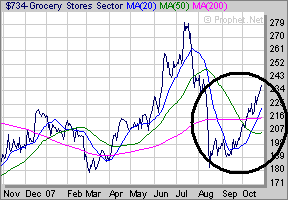
Grocery stores have rallied off a mid-August low and are now above the 200 day SMA.
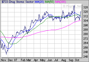
Drug stores haven't done much since early May. While they didn't participate in the last part of the S&P rally, they were also somewhat immune to the mid-summer sell-off.
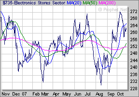
Electronic stores are near their highs for the year. My guess is traders are expecting a new group of "must have" electronics for the Christmas season. I'm guessing the IPhone also helps out here.
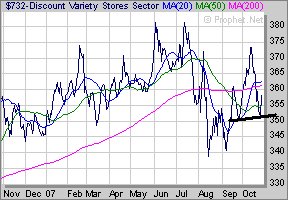
Discount stores tried to rally above the 200 day SMA, but they just didn't have the juice to stay above that crucial line. That is interesting because if the economy were slowing down these stores would be a natural beneficiary of a pinched consumer.
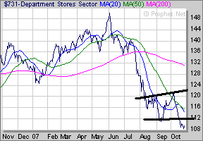
Department stores are near their lows for the year. Traders are obviously concerned about the consumer's ability to continue shopping here.
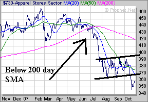
Apparel stores are also near their lows. This ties into traders concern about the consumers ability to continue spending on clothes in the current economic environment.
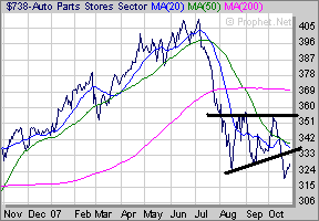
Auto stores are also hear their lows.
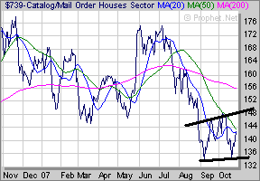
The Mail Order Business has bounced off its lows, but is still in bearish territory.
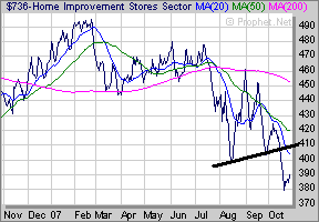
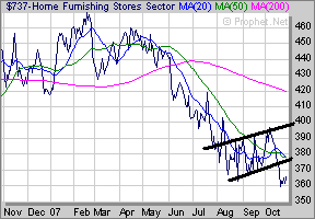
Home improvement and home furnishings are obviously impacted by the housing slowdown.
Out of 10 retail sectors, 6 are below their respective 200 day SMAs. Several are near their lows for the year. Two of the sectors that are doing well are recession resistant and one is dependent on the next cool thing. This tells us one very important thing about what the market is thinking: they are betting against the US consumer right now.
The sectors that are doing well are the conservative sectors -- areas of the retail environment that provide necessary goods and are therefore somewhat more resistant to a recession.
Grocery stores have rallied off a mid-August low and are now above the 200 day SMA.
Drug stores haven't done much since early May. While they didn't participate in the last part of the S&P rally, they were also somewhat immune to the mid-summer sell-off.
Electronic stores are near their highs for the year. My guess is traders are expecting a new group of "must have" electronics for the Christmas season. I'm guessing the IPhone also helps out here.
Discount stores tried to rally above the 200 day SMA, but they just didn't have the juice to stay above that crucial line. That is interesting because if the economy were slowing down these stores would be a natural beneficiary of a pinched consumer.
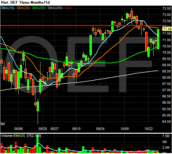
Department stores are near their lows for the year. Traders are obviously concerned about the consumer's ability to continue shopping here.
Apparel stores are also near their lows. This ties into traders concern about the consumers ability to continue spending on clothes in the current economic environment.
Auto stores are also hear their lows.
The Mail Order Business has bounced off its lows, but is still in bearish territory.
Home improvement and home furnishings are obviously impacted by the housing slowdown.
Out of 10 retail sectors, 6 are below their respective 200 day SMAs. Several are near their lows for the year. Two of the sectors that are doing well are recession resistant and one is dependent on the next cool thing. This tells us one very important thing about what the market is thinking: they are betting against the US consumer right now.
Subscribe to:
Posts (Atom)