It's that time of the week. Back on Monday.
Friday, October 9, 2009
Weekly Indicators
- by New Deal democrat
This week there was little "official" news, but weekly indicators from private sources were nonetheless interesting.
Officially, we learned that consumer credit was down 13% in August. As usual, doomers missed the significance of this, because this decrease coincided with a 2.7% sales increase, and a 1.1% increase ex-autos, meaning that consumers not only increased their spending, but were able to use cash instead of credit to do so.
Wholesale inventories/sales ratio was down another .02%, again for August. That means that two months ago, this ratio was already getting close to the point where inventories were held taut during the last expansion.
Initial jobless claims were down to 521,000, their best reading since mid-January.
Railroad traffic was up again last week, although slightly weaker year-over-year compared with last year. Seasonality should kick in by the end of the month, and rail traffic will begin to decline. Typically it has declined 15% from then until January in expansion years, so that will be the comparison to watch.
Shoppertrak reported mall sales up last week +4.1% from the week before, but still down year over year -3.0%.
The ICSC reported both weekly and monthly same store retail sales. Both were up compared with last year's numbers. Weekly sales were up +0.3% from the week before, and +1.0% from the year before. On a monthly basis, September's sales were up +0.1% from a year ago, the first year-over-year increase since July 2008.
While we know that auto sales tanked in September compared with August, it looks like retail sales ex-auto held on to their gains. We'll see next week.
Getting it (mainly) wrong about the LEI during the Great Depression
- by New Deal democrat
Well, Mish is at it again. This time he suggests that the LEI would probably have been positive throughout the Great Depression, because of its reliance in large part on monetary indicators. In response to my posting of the September LEI, Silver Oz raised a similar issue in comments, of whether the LEI's are failing to take account for the panicky deflationary aspects of the recession, and thus overstating their positive impact.
On the flip side, I have very little doubt that the reason the ECRI's long term indicator bottomed and began to turn positive after November 2008, is that is one year after the yield curve turned significantly positive. It is most likely that they also rely on some "real interest rate" calculation in their long term index.
As it happens, I already researched these indicators, so I can provide an answer to Mish's query.
First of all, let's recapitulate what the Conference Board's LEI consists of. The 10 indicators, with the weights given each indicator, are as follows:
- real money supply (35%)
- average weekly manufacturing hours (25%)
- interest rate spread (10%)
- manufacturers' new orders for consumer goods (8%)
- supplier deliveries (7%)
- stock prices (4%)
- consumer expectations (3%)
- building permits (3%)
- average weekly initial claims for unemployment insurance (inverted) (3%)
- manufacturers' new orders for durable goods (2%)
Of the above, can we stipulate that average manufacturing hours, new orders, supplier deliveries, and new claims for insurance benefits would be relentlessly negative throughout the Great Contraction of 1928-32? After all, Mish's comment is about the yield curve and monetary portions of the index as well as the stock market, presumably.
We also know about housing starts, although that data is annual. Here it is, declining precipitously from before the onset of the Great Depression through 1933.
At some point in 1933, housing starts bottomed. So building permits were presumably also negative throughout the 1929-32 period, except possibly at the very end.
What about the stock market? We know what a graph of that, measured by the DJIA looks like, courtesy of dshort. It is safe to say that, with a few exceptions, the three month measure of the stock index would be down except for brief periods in about December 1929, spring 1930, and September and December 1931.
So the bottom line is, if the LEI would be positive, with few exceptions it is going to have to be because of blowout yield curve and monetary conditions.
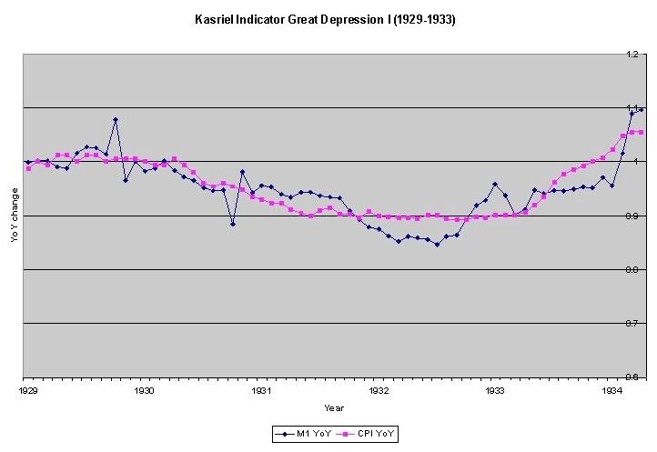
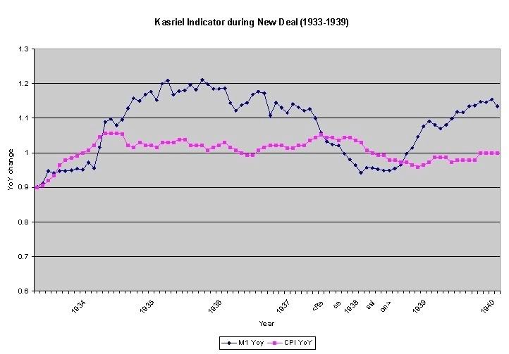
Well, here is real M1 from Milton Friedman's classic, "Monetary History of the United States." The graphs are cruddy basic Excel, but the information is accurate. As you can see, during the Great Contraction of 1929-32, real monetary supply was negative:
[blue is M1 YoY; red is CPI]
The exception is the period from October 1930-October 1931 and the end of 1932 (the latter of which would make it a correct LEI, since the Great Depression bottomed in March-April 1933). Real money supply was positive during the FDR New Deal expansion, and negative again during the 1937-38 recession.
Not a bad record at all.
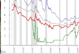
Finally, we come to the yield curve. Courtesy of Ned Davis research, as reposted by Theroxylandr, here is what the yield curve looked like in the late 1920s-1930s period:
[short term rates in green, long term bond rates in red]
I have been able to create a more specific graph by making use of the New York Fed's money rates (in blue) vs. long term rates (in green):
Here indeed we see a limitation of the yield curve. The curve had inverted in the deflation of 1928 (the Death Signal that was only repeated in 2007 since), but with the exception of late 1931 when the Fed disastrously raised rates, was positive beginning in mid 1930 in a fashion similar to today throughout the rest of the Great Contraction.
In short, during the entire period of the Great Contraction of 1929-32, the ONLY time that all three monetary/financial elements of the LEI would have been positive, would have been in September 1931.
Money supply and the yield curve would both have been positive from October 1930-October 1931. Based on how the LEI is presently calculated, those two elements would have been evaluated at about a combined +0.4 each month. The declining stock market would have subtracted 0.1 or 0.2 each of the months (aside from September 1931). Housing would have subtracted another 0.1 or so. So long as the other six indicators, which we have stipulated would have been negative throughout, would have subtracted at least 0.3 each month, then the LEI would have been relentlessly negative throughout the Great Depression until -- appropriately -- close to the end.
Note that any increase in LEI during the 1929-32 period would have been on just a few indicators, meaning the "diffusion index" of the ten LEI's would have been consistently negative. Contrast that with this year, in which 8 or 9 of the LEI's have turned positive on a 6 month basis.
It is worth restating that the yield curve is not as good an indicator during deflation -- which means that it is possible that the Conference Board is overstating its positivity now -- but when the rate of deflation itself turns positive (i.e., deflation lessens), as it did in 1933, that is a powerful indicator in the presence of a positive yield curve and positive real money supply growth, that a deflationary recession is ending. That also happened this past summer, correctly signaling that the "Great Recession" was ending.
UPDATE (Special bonus swipe at Calculated Risk): CR has a post and graph up now about the JOLTS survey. The "jobs openings" part is at an all-time low ("all-time" dating from 2000). He says that can't be a good sign.
Let me call your attention to the earlier part of the graph, becuase it does include the "jobless recovery" from the 2001 recession. See the point where the yellow line (job openings) hits bottom. Now look down to the month. It's August 2003. Exactly at the unemployment bottom. From there on until this recession, it was all up, up, up.
Now CR is as nice a guy on blogs as there is. But while the JOLTS survey isn't "good news", the "job openings" part of the data appears to be about as much of a lagging indicator as you could find.
Well, Mish is at it again. This time he suggests that the LEI would probably have been positive throughout the Great Depression, because of its reliance in large part on monetary indicators. In response to my posting of the September LEI, Silver Oz raised a similar issue in comments, of whether the LEI's are failing to take account for the panicky deflationary aspects of the recession, and thus overstating their positive impact.
On the flip side, I have very little doubt that the reason the ECRI's long term indicator bottomed and began to turn positive after November 2008, is that is one year after the yield curve turned significantly positive. It is most likely that they also rely on some "real interest rate" calculation in their long term index.
As it happens, I already researched these indicators, so I can provide an answer to Mish's query.
First of all, let's recapitulate what the Conference Board's LEI consists of. The 10 indicators, with the weights given each indicator, are as follows:
- real money supply (35%)
- average weekly manufacturing hours (25%)
- interest rate spread (10%)
- manufacturers' new orders for consumer goods (8%)
- supplier deliveries (7%)
- stock prices (4%)
- consumer expectations (3%)
- building permits (3%)
- average weekly initial claims for unemployment insurance (inverted) (3%)
- manufacturers' new orders for durable goods (2%)
Of the above, can we stipulate that average manufacturing hours, new orders, supplier deliveries, and new claims for insurance benefits would be relentlessly negative throughout the Great Contraction of 1928-32? After all, Mish's comment is about the yield curve and monetary portions of the index as well as the stock market, presumably.
We also know about housing starts, although that data is annual. Here it is, declining precipitously from before the onset of the Great Depression through 1933.
Year | Nonfarm housing starts | 2009 equivalent |
---|---|---|
1920 | 247 | 699 |
1921 | 449 | 1236 |
1922 | 716 | 1953 |
1923 | 371 | 994 |
1924 | 893 | 2350 |
1925 | 937 | 2423 |
1926 | 849 | 2177 |
1927 | 810 | 2042 |
1928 | 753 | 1867 |
1929 | 509 | 1252 |
1930 | 330 | 805 |
1931 | 254 | 615 |
1932 | 134 | 322 |
1933 | 93 | 221 |
1934 | 126 | 300 |
1935 | 221 | 522 |
1936 | 319 | 748 |
1937 | 336 | 781 |
1938 | 406 | 937 |
1939 | 515 | 1179 |
1940 | 602 | 1368 |
At some point in 1933, housing starts bottomed. So building permits were presumably also negative throughout the 1929-32 period, except possibly at the very end.
What about the stock market? We know what a graph of that, measured by the DJIA looks like, courtesy of dshort. It is safe to say that, with a few exceptions, the three month measure of the stock index would be down except for brief periods in about December 1929, spring 1930, and September and December 1931.
So the bottom line is, if the LEI would be positive, with few exceptions it is going to have to be because of blowout yield curve and monetary conditions.
Well, here is real M1 from Milton Friedman's classic, "Monetary History of the United States." The graphs are cruddy basic Excel, but the information is accurate. As you can see, during the Great Contraction of 1929-32, real monetary supply was negative:
[blue is M1 YoY; red is CPI]
The exception is the period from October 1930-October 1931 and the end of 1932 (the latter of which would make it a correct LEI, since the Great Depression bottomed in March-April 1933). Real money supply was positive during the FDR New Deal expansion, and negative again during the 1937-38 recession.
Not a bad record at all.
Finally, we come to the yield curve. Courtesy of Ned Davis research, as reposted by Theroxylandr, here is what the yield curve looked like in the late 1920s-1930s period:
[short term rates in green, long term bond rates in red]
I have been able to create a more specific graph by making use of the New York Fed's money rates (in blue) vs. long term rates (in green):
Here indeed we see a limitation of the yield curve. The curve had inverted in the deflation of 1928 (the Death Signal that was only repeated in 2007 since), but with the exception of late 1931 when the Fed disastrously raised rates, was positive beginning in mid 1930 in a fashion similar to today throughout the rest of the Great Contraction.
In short, during the entire period of the Great Contraction of 1929-32, the ONLY time that all three monetary/financial elements of the LEI would have been positive, would have been in September 1931.
Money supply and the yield curve would both have been positive from October 1930-October 1931. Based on how the LEI is presently calculated, those two elements would have been evaluated at about a combined +0.4 each month. The declining stock market would have subtracted 0.1 or 0.2 each of the months (aside from September 1931). Housing would have subtracted another 0.1 or so. So long as the other six indicators, which we have stipulated would have been negative throughout, would have subtracted at least 0.3 each month, then the LEI would have been relentlessly negative throughout the Great Depression until -- appropriately -- close to the end.
Note that any increase in LEI during the 1929-32 period would have been on just a few indicators, meaning the "diffusion index" of the ten LEI's would have been consistently negative. Contrast that with this year, in which 8 or 9 of the LEI's have turned positive on a 6 month basis.
It is worth restating that the yield curve is not as good an indicator during deflation -- which means that it is possible that the Conference Board is overstating its positivity now -- but when the rate of deflation itself turns positive (i.e., deflation lessens), as it did in 1933, that is a powerful indicator in the presence of a positive yield curve and positive real money supply growth, that a deflationary recession is ending. That also happened this past summer, correctly signaling that the "Great Recession" was ending.
UPDATE (Special bonus swipe at Calculated Risk): CR has a post and graph up now about the JOLTS survey. The "jobs openings" part is at an all-time low ("all-time" dating from 2000). He says that can't be a good sign.
Let me call your attention to the earlier part of the graph, becuase it does include the "jobless recovery" from the 2001 recession. See the point where the yellow line (job openings) hits bottom. Now look down to the month. It's August 2003. Exactly at the unemployment bottom. From there on until this recession, it was all up, up, up.
Now CR is as nice a guy on blogs as there is. But while the JOLTS survey isn't "good news", the "job openings" part of the data appears to be about as much of a lagging indicator as you could find.
A Look At the Gold Chart
Gold has been in the news lately so let's take a look at the chart to see what it says.
First on the long term chart notice there are two important formations.
1.) A head and shoulders. This formed over a one and a half year period. Remember -- the longer the formation takes to form the more important it is.
2.) Within the right shoulder we have a triangle formation that formed over a six month period. again note the length of time in the development of this pattern
A.) Notice that prices spent a few weeks consolidating right at the head and shoulder's neckline.
B.) Prices broke out on a gap higher with good volume.
Also note the technical picture of the EMAs -- the shorter EMAs are above the longer EMAs, all the EMAs are rising and prices are above all the EMAs. This is a very bullish posture.
A.) Prices are above the upper Bollinger band. This indicates prices are a bit over-extended and are likely to move a bit lower. However, that does not mean a precipitous drop in prices -- only a bit of profit taking.
B.) The MACD as some upward room to run from a momentum perspective.
House Considering Extension of Home-Buyer Tax Credit
From Bloomberg:
This is good news.
President Barack Obama and congressional leaders might extend or expand tax credits and housing aid as they seek to counter the decline in the U.S. housing market and reverse rising job losses.House Speaker Nancy Pelosi said lawmakers might extend an $8,000 tax credit for first-time homebuyers that is set to expire Dec. 1.
.....
Extending the tax credit for homebuyers is “under consideration,” Pelosi, a California Democrat, told reporters today in Washington. “The question is, would that be just first-time homeowners or would you open it up to other purchasers of homes?”
“There’s no question that I think it should be extended; for how long, we should discuss,” said House Ways and Means Committee Chairman Charles Rangel, a New York Democrat. He said the tax credit shouldn’t be made permanent.
This is good news.
Forex Fridays
Click for a larger image
A.) Prices continue to move through support and are bouncing lower off the 10 week EMA
B.) The EMAs are in a very bearish posture: the shorter EMAs are below the longer EMAs, all the EMAs are moving lower and prices are below all the EMAs
C.) Prices continue to become weaker
D.) The MACD is decreasing, but
E.) The MACD is approaching the lowest level over the last three years.
A and B.) Prices are in a clear downtrend.
C.) The EMAs are in a very bearish posture: the shorter EMAs are below the longer EMAs, all the EMAs are moving lower and prices are below all the EMAs
D.) Prices are right at key support levels.
E.) The MACD is about to give a sell signal.
Thursday, October 8, 2009
Today's Markets
Click for a larger image
A.) Today prices reached the same price level as Sept. 29.
B.) There is an uptrend in place that has been going on for four days.
C.) We've seen two gaps up this week. Gaps are technically important because they show a radical shift in the the supply/demand balance. Think of it this way. Prices close a $10. Over night something happens that greatly increases the perceived value of the stock. This means that when the stock opens traders are willing to buy it for $11. Also note, the bigger the gap the more important the shift in perception.
A Note on Inflation
Click on all images for a larger image
The above chart shows a very simple economic truth: you always want a little inflation in the economy. A little inflation indicates that there is enough pricing power somewhere in the buying cycle for someone to raise prices. And that indicates there is enough demand pull or cost push inflation that is the result of increasing economic activity. Now we can debate the proper level of inflation for the economy, but the bottom line is we always want some.
A.) This is what scared the hell out of everybody. It is deflation:
This was a primary reason why there was such a rush to get the stimulus package done. It looked as though we were going to start a deflationary spiral. This is one of the primary causes of the Great Depression -- a general collapse in prices caused by a corresponding drop in demand.
B.) Now we again have inflation -- a slight increase in prices. That tells us that somewhere out there in the economy is pricing power - the ability to raise prices. That means that somewhere there is enough demand pull or cost push inflation to be able to increase prices. And that is an incredibly health and important economic development.
The above chart shows a very simple economic truth: you always want a little inflation in the economy. A little inflation indicates that there is enough pricing power somewhere in the buying cycle for someone to raise prices. And that indicates there is enough demand pull or cost push inflation that is the result of increasing economic activity. Now we can debate the proper level of inflation for the economy, but the bottom line is we always want some.
A.) This is what scared the hell out of everybody. It is deflation:
A general decline in prices, often caused by a reduction in the supply of money or credit. Deflation can be caused also by a decrease in government, personal or investment spending. The opposite of inflation, deflation has the side effect of increased unemployment since there is a lower level of demand in the economy, which can lead to an economic depression. Central banks attempt to stop severe deflation, along with severe inflation, in an attempt to keep the excessive drop in prices to a minimum.
This was a primary reason why there was such a rush to get the stimulus package done. It looked as though we were going to start a deflationary spiral. This is one of the primary causes of the Great Depression -- a general collapse in prices caused by a corresponding drop in demand.
B.) Now we again have inflation -- a slight increase in prices. That tells us that somewhere out there in the economy is pricing power - the ability to raise prices. That means that somewhere there is enough demand pull or cost push inflation to be able to increase prices. And that is an incredibly health and important economic development.
Initial Jobless Claims: 521,000
- by New Deal democrat
Initial claims for state unemployment benefits
It is also a huge relief after last Friday's jobs report.
Since the monthly jobs report is allegedly based on a survey conducted on the 12th of each month, I intend to post a further hyposthesis about the relationship between these two figures next week.
Please note, the four week average is now more than 16% lower than the peak. This is the threshold at which, if sustained for a long enough period of time, I believe that jobs may actually be added to the economy.
Update from Bonddad:
Here is the chart of claims and the 4-week moving average
This chart is a big relief for me as well. It indicates that the initial unemployment claims continue to move in the direction of recovery.
Initial claims for state unemployment benefits
dropped 33,000 to a seasonally adjusted 521,000 in the week ended Oct.3, the lowest level since early January, the Labor Department said.This is the lowest weekly number, and the lowest four week average for new jobless since mid-January of this year.
Analysts polled by Reuters had forecast new claims slipping to 540,000 last week from a previously reported 551,000. A Labor Department official said seasonal factors expected a decline in new claims at the end of a quarter and a rise at the start of a new quarter.
The four-week moving average for new claims fell 9,000 to 539,750 last week, declining for a fifth straight week. The four-week moving average is considered a better gauge of underlying trends as it irons out week-to-week volatility.
It is also a huge relief after last Friday's jobs report.
Since the monthly jobs report is allegedly based on a survey conducted on the 12th of each month, I intend to post a further hyposthesis about the relationship between these two figures next week.
Please note, the four week average is now more than 16% lower than the peak. This is the threshold at which, if sustained for a long enough period of time, I believe that jobs may actually be added to the economy.
Update from Bonddad:
Here is the chart of claims and the 4-week moving average
This chart is a big relief for me as well. It indicates that the initial unemployment claims continue to move in the direction of recovery.
Thursday Oil Market Round-Up
A.) Note that oil prices are in a downward sloping channel. This is in fact a good development. Oil (and other commodities) helped to lead the rally. When they broke their upward trend line there was concern that prices would drop hard and fast. But right now they are moving slowly down. In addition,
Notice the incredibly tight range of prices and EMAs. This tells us the market is conflicted about overall direction.
Wednesday, October 7, 2009
What do you see on that chart. Nothing? Well that's about the size of the action. The markets moved sideways. The good news is there was a rally in the last hour of trading on increasing volume. That could be a good sing for tomorrow. But at the same time there was a lack of follow-through from yesterday's rise that is concerning. We had the same situation last week (lack of follow-through on Tuesday) and the rest of the week was terrible.
The markets have moved nicely from the 50 day EMA. Also note the MACD is about to cross the signal line.
S&P 500, DJIA close ***UP*** year-over-year
A quick note in addition to whatever Bonddad posts about today's markets.
Today, for the first time since the beginning of the recession, the Standard and Poor's 500 Index, as well as the Dow Jones Industrial Average, closed UP on a year over year basis.
One year ago today, the S&P 500 closed at 996.23. Today it closed at 1057.58. One year ago today, the Dow Jones Industrials closed at 9447.11. Today the DJIA closed at 9725.58.
Incidentally, this is something that never happened during the 1929-32 "great contraction."
Notes on Job Losses during the Great Recession
Last week Calculated Risk posted a summary of a New York Times opinion piece by David Leonhardt in which he argued that:
To the contrary, I think Leonhardt has it almost exactly wrong: not only are people who have lost their jobs are finding it very hard to find new ones, with the attendant terribly high consequences for the individual, their families, and for the economy generally; but also what is starkly different about this recession has been exactly the breadth as well as the depth of job losses.
First, let's look at a historical graph of the US job market.
Viewed on a long-term basis, we can see that since World War 2, the number of American manufacturing jobs has stagnated, while service jobs have grown sixfold!
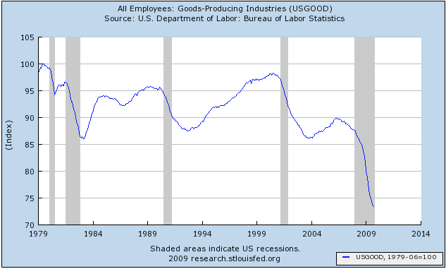
The total number of manufacturing jobs peaked in 1979 and has been in almost relentless decline ever since. The last decade -- even during the dreadfully lackluster "Bush expansion" -- has been particularly devastating:
Over 25% of all manufacturing jobs have now been lost. Although I haven't shown an even longer-term graph, in fact there are now fewer manufacturing jobs in the US than there were during the time of "Rosie the Riveter" during World War 2.
Contra Leonhardt, the "surprise" in this recession isn't how concentrated job losses have been, but how general. There truly was a dramatic difference this time. In all prior post-WW2 recessions, it was manufacturing and general goods producing that bore the brunt of job losses. Services were barely touched.
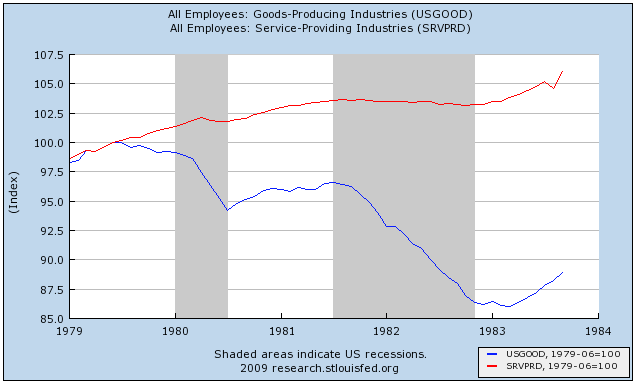
For example, here is the 1981-82 recession (expressed as a change in % of jobs from the manufacturing peak, where peak = 100):
This is the recession that was responsible for 10%+ (U3) unemployment. The vast majority of those job losses were in goods producing jobs (in blue). Note that services (in red), relatively speaking, did not suffer much at all. While almost 15% of manufacturing jobs were lost, only about 1% of service jobs were affected.
The same was true of the 1991 Kuwait War recession and "jobless recovery", and the 2001-2 Tech Bust and 9/11 recession and "jobless recovery".
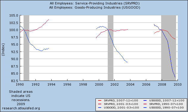
Not this time. This time, for the first time, services were every bit as hard hit as goods producing jobs. Here's a graph of total goods-producing vs. service jobs for the 1991, 2001, and "Great" recessions and "jobless recoveries":
Again, notice that while manufacturing jobs were hard-hit in all recessions, service jobs were barely touched, with losses of only ~1%, in the prior two recessions. Not so this time. Since August 2008, almost 3% of all service jobs have been lost -- and remember that since service jobs are about 6x the number of manufacturing jobs, this is equivalent to 18% of manufacturing jobs being lost -- a staggering amount!
Here's a chart, showing the same in terms of actual numbers of jobs lost: Note how dramatically the data from this recession sticks out.
Month Mfg # lost Services # lost
1979-82* 3.6M 0.3M
1990-91 2.1M 0.4M
2001-03 3.0M 0.5M
12/2007-8/2008 0.6M 0.4M
8/2008-9/2009 2.9M 3.2M!
[*Services measured from 10/80 peak. M = million]
Additionally, it is not so clear that those who haven't lost jobs need to have no fear of losing theirs henceforth.
Lenhardt observes that "if you’re lucky enough to be outside the gym, you will probably be able to stay there." True enough, but the chances of losing one's job even now are much more than trivial. Even if we accept that we are already out of the Recession in GDP terms, and even if we accept for purposes of this argument that the economy may yet start to actually add jobs before next year, at minimum there will probably be 250,000-750,000 more net job losses first. During that same period of time, as we know form weekly new unemployment claims, about 500,000-550,000 jobs will be lost per week. That's a total of something like 6 million (525,000 x 13 weeks) newly unemployed between now and the end of the year, counterbalanced by 5.5 million new jobs, for a net loss economy-wide of 500,000 by year-end. Since there are about 120 million employed, 6 million pink slips amounts to 5% of the workforce (note this % is for losses only, and does not count new jobs added). Those are non-trivial odds of currently employed people entering Leonhardt's "gymansium."
Finally, some notes in response to last Friday's abysmal jobs report. First of all, did I mention it was abysmal? It was, and for all the reasons spelled out by Invictus and others. Like Bonddad, however, I am impressed by the broad array of signs that indicate we have at least taken the first halting steps in economic expansion. That both ISM manufacturing and non-manufacturing surveys both show expansion for the first time since the recession began is particularly noteworthy, in addition to two months' straight of increased industrial production. That makes it all the more stunning that an expanding economy could nevertheless shed a quarter million jobs.
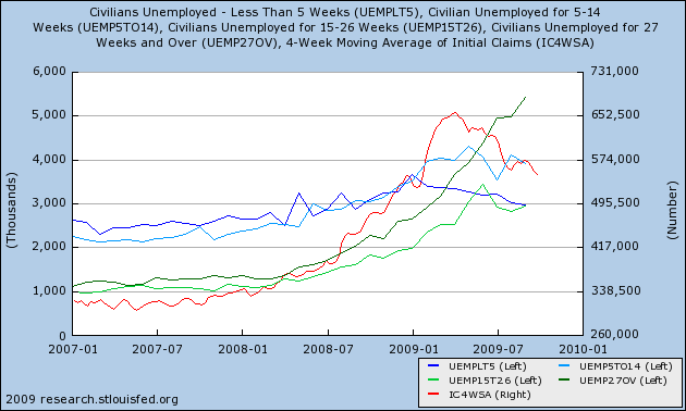
That being said, a graph breaking down the number of unemployed by weeks out of work, shows the exact same pattern as for all prior recessions and recoveries:
The graph above shows that initial jobless claims (red), unemployment for under 5 weeks (blue) and unemployment for 5-14 weeks (light green) have all likely peaked and are not "false dawns." Longer term unemployment continues to grow.
To use an analogy, suppose there has been a bad traffic accident on an expressway during rush hour. Several lanes of traffic are closed, but then as the accident is cleared away, lanes open up. Traffic at fist is at a near dead halt, and more and more traffic gets stuck in the rear of the jam. As lanes are cleared, more traffic leaves the front of the traffic jam, but more still continues to be added to the rear, increasing the total number of cars at a standstill. Eventually more traffic leaves than enters before the jam dissipates.
The above graph shows that the front of the traffic jam is able to leave at an increasing rate, but there is still on net more traffic entering the rear of the jam.
So, why the huge continuing job losses? Here's my best take. In the first place, 61,000 of the jobs lost in September were in government. While Invictus correctly points out that they consume just as much as anybody else, the fact is that job losses in government have historically come very late into recessions, or even months into the recoveries thereafter (as in, e.g., the three previous recessions.
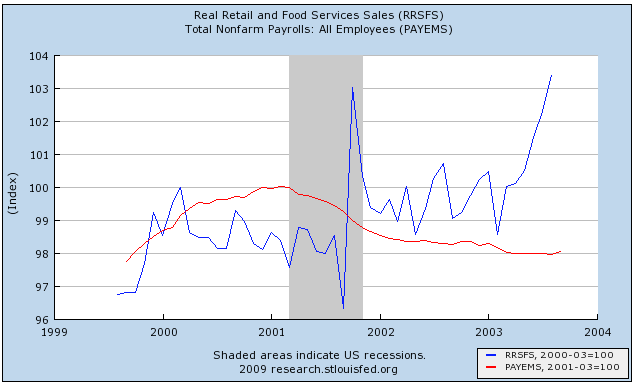
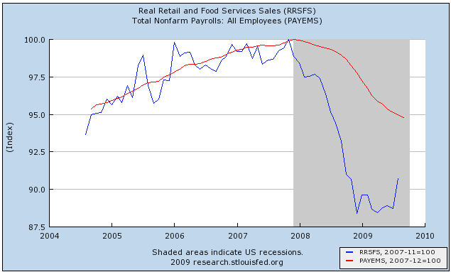
More disturbing is the 38,000 loss of retail jobs. As I have previously noted, most bloggers have it exactly backwards. Jobs don't lead consumption; historically consumption leads jobs. In the mild 2001 recession, consumption (real retail sales, in blue) barely flinched, and picked up soon enough that jobs (in red) were not lost beyond the same percentage as retail sales had declined:
In the "Great Recession," real retail sales have declined 10%, but service jobs have only declined about 5%:
While employers have been quick to cut jobs and slow to rehire, the fact is, do they really need 95% of the previous workforce to sell 90% of the previous number of goods? No, and eventually if sales don't pick up, that is what we might get. (Note per my recent analysis of jobs, I do believe that sales will in fact pick up).
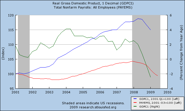
To put this in final perspective, here is a graph I prepared in connection with a previous post about Okun's law, to the effect that it requires 2% year over year growth in GDP to create a single new American job:
Note that when GDP briefly hit 2% YoY in mid-2002, there was a brief gain in payrolls, as well as the more sustained growth beginning in 2003. To get to 2% GDP growth for calendar year 2009, we need about 2.3% growth in each of the third and fourth quarters. Most analysts believe we will get that growth, at least in the third quarter. As to the fourth quarter, we will see.
In the job market, at least, the recession’s pain has been unusually concentrated. ... People who have lost their jobs are struggling terribly to find new ones. Since the downturn began in 2007, companies have been extremely reluctant to hire new workers, and few new companies have started. The economy and the job market are churning very slowly....
Try thinking of it this way: All of the unemployed people in the country are gathered in a huge gymnasium that’s been turned into a job search center. The fact that this recession is the worst in a generation means that there are many, many people in the gym. The fact that the economy is churning so slowly means that there is not much traffic into and out of the gym.
If you’re inside, you will have a hard time getting out. Yet if you’re lucky enough to be outside the gym, you will probably be able to stay there. The consequences of a job loss are terribly high, but — given that the unemployment rate is almost 10 percent — the odds of job loss are surprisingly low.
To the contrary, I think Leonhardt has it almost exactly wrong: not only are people who have lost their jobs are finding it very hard to find new ones, with the attendant terribly high consequences for the individual, their families, and for the economy generally; but also what is starkly different about this recession has been exactly the breadth as well as the depth of job losses.
First, let's look at a historical graph of the US job market.
Viewed on a long-term basis, we can see that since World War 2, the number of American manufacturing jobs has stagnated, while service jobs have grown sixfold!
The total number of manufacturing jobs peaked in 1979 and has been in almost relentless decline ever since. The last decade -- even during the dreadfully lackluster "Bush expansion" -- has been particularly devastating:
Over 25% of all manufacturing jobs have now been lost. Although I haven't shown an even longer-term graph, in fact there are now fewer manufacturing jobs in the US than there were during the time of "Rosie the Riveter" during World War 2.
Contra Leonhardt, the "surprise" in this recession isn't how concentrated job losses have been, but how general. There truly was a dramatic difference this time. In all prior post-WW2 recessions, it was manufacturing and general goods producing that bore the brunt of job losses. Services were barely touched.
For example, here is the 1981-82 recession (expressed as a change in % of jobs from the manufacturing peak, where peak = 100):
This is the recession that was responsible for 10%+ (U3) unemployment. The vast majority of those job losses were in goods producing jobs (in blue). Note that services (in red), relatively speaking, did not suffer much at all. While almost 15% of manufacturing jobs were lost, only about 1% of service jobs were affected.
The same was true of the 1991 Kuwait War recession and "jobless recovery", and the 2001-2 Tech Bust and 9/11 recession and "jobless recovery".
Not this time. This time, for the first time, services were every bit as hard hit as goods producing jobs. Here's a graph of total goods-producing vs. service jobs for the 1991, 2001, and "Great" recessions and "jobless recoveries":
Again, notice that while manufacturing jobs were hard-hit in all recessions, service jobs were barely touched, with losses of only ~1%, in the prior two recessions. Not so this time. Since August 2008, almost 3% of all service jobs have been lost -- and remember that since service jobs are about 6x the number of manufacturing jobs, this is equivalent to 18% of manufacturing jobs being lost -- a staggering amount!
Here's a chart, showing the same in terms of actual numbers of jobs lost: Note how dramatically the data from this recession sticks out.
[*Services measured from 10/80 peak. M = million]
Additionally, it is not so clear that those who haven't lost jobs need to have no fear of losing theirs henceforth.
Lenhardt observes that "if you’re lucky enough to be outside the gym, you will probably be able to stay there." True enough, but the chances of losing one's job even now are much more than trivial. Even if we accept that we are already out of the Recession in GDP terms, and even if we accept for purposes of this argument that the economy may yet start to actually add jobs before next year, at minimum there will probably be 250,000-750,000 more net job losses first. During that same period of time, as we know form weekly new unemployment claims, about 500,000-550,000 jobs will be lost per week. That's a total of something like 6 million (525,000 x 13 weeks) newly unemployed between now and the end of the year, counterbalanced by 5.5 million new jobs, for a net loss economy-wide of 500,000 by year-end. Since there are about 120 million employed, 6 million pink slips amounts to 5% of the workforce (note this % is for losses only, and does not count new jobs added). Those are non-trivial odds of currently employed people entering Leonhardt's "gymansium."
Finally, some notes in response to last Friday's abysmal jobs report. First of all, did I mention it was abysmal? It was, and for all the reasons spelled out by Invictus and others. Like Bonddad, however, I am impressed by the broad array of signs that indicate we have at least taken the first halting steps in economic expansion. That both ISM manufacturing and non-manufacturing surveys both show expansion for the first time since the recession began is particularly noteworthy, in addition to two months' straight of increased industrial production. That makes it all the more stunning that an expanding economy could nevertheless shed a quarter million jobs.
That being said, a graph breaking down the number of unemployed by weeks out of work, shows the exact same pattern as for all prior recessions and recoveries:
The graph above shows that initial jobless claims (red), unemployment for under 5 weeks (blue) and unemployment for 5-14 weeks (light green) have all likely peaked and are not "false dawns." Longer term unemployment continues to grow.
To use an analogy, suppose there has been a bad traffic accident on an expressway during rush hour. Several lanes of traffic are closed, but then as the accident is cleared away, lanes open up. Traffic at fist is at a near dead halt, and more and more traffic gets stuck in the rear of the jam. As lanes are cleared, more traffic leaves the front of the traffic jam, but more still continues to be added to the rear, increasing the total number of cars at a standstill. Eventually more traffic leaves than enters before the jam dissipates.
The above graph shows that the front of the traffic jam is able to leave at an increasing rate, but there is still on net more traffic entering the rear of the jam.
So, why the huge continuing job losses? Here's my best take. In the first place, 61,000 of the jobs lost in September were in government. While Invictus correctly points out that they consume just as much as anybody else, the fact is that job losses in government have historically come very late into recessions, or even months into the recoveries thereafter (as in, e.g., the three previous recessions.
More disturbing is the 38,000 loss of retail jobs. As I have previously noted, most bloggers have it exactly backwards. Jobs don't lead consumption; historically consumption leads jobs. In the mild 2001 recession, consumption (real retail sales, in blue) barely flinched, and picked up soon enough that jobs (in red) were not lost beyond the same percentage as retail sales had declined:
In the "Great Recession," real retail sales have declined 10%, but service jobs have only declined about 5%:
While employers have been quick to cut jobs and slow to rehire, the fact is, do they really need 95% of the previous workforce to sell 90% of the previous number of goods? No, and eventually if sales don't pick up, that is what we might get. (Note per my recent analysis of jobs, I do believe that sales will in fact pick up).
To put this in final perspective, here is a graph I prepared in connection with a previous post about Okun's law, to the effect that it requires 2% year over year growth in GDP to create a single new American job:
Note that when GDP briefly hit 2% YoY in mid-2002, there was a brief gain in payrolls, as well as the more sustained growth beginning in 2003. To get to 2% GDP growth for calendar year 2009, we need about 2.3% growth in each of the third and fourth quarters. Most analysts believe we will get that growth, at least in the third quarter. As to the fourth quarter, we will see.
Tax Credit For Employment Gains?
From the NY Times:
First, if this gets passed expect anyone who argued for any government stimulus to now argue these aren't real jobs and shouldn't be counted.
Seriously -- this is a good idea and should be done ASAP.
The idea of a tax credit for companies that create new jobs, something the federal government has not tried since the 1970s, is gaining support among economists and Washington officials grappling with the highest unemployment in a generation.
.....
One version of the approach, to be unveiled next week by the Economic Policy Institute, a labor-oriented research organization, would give employers a two-year tax credit if they increased the size of their work force or added significant hours of work (for example, making a part-time worker full time). Employers would receive a credit worth twice the first-year payroll tax for each new hire, amounting to several thousand dollars, depending on the new worker’s salary.
...
[a second proposal would be] a credit in the first year ... equal to 15.3 percent of the cost of adding an employee. In the second year, it would fall to about 10.2 percent.
For example, hiring a worker might cost a small business $50,000 annually. But with the tax credit, the cost would fall to $42,350 in the first year, and then be $44,900 the next year. After that, the cost would return to $50,000.
The credit would apply only to the portion of an employee’s salary under $106,800. Lowering the cap further, however, could provide an even greater benefit to low-wage, unskilled workers.
First, if this gets passed expect anyone who argued for any government stimulus to now argue these aren't real jobs and shouldn't be counted.
Seriously -- this is a good idea and should be done ASAP.
Wednesday Commodities Round-Up
Click for a larger image
A.) There is a lot of supply in the 40-41 area.
B.) Prices have found support at previously established price levels
C.) Momentum is decreasing, but notice that prices aren't crashing.
Bottom line: so far, it looks as though copper is holding its own.
Click for a larger image
The industrial metals chart has the following points.
A.) Prices have been in an upward trend line since mid-February.
B.) Prices consolidated in April and May in a triangle pattern
C.) Prices consolidated in June and July in a pennant pattern
D.) Prices consolidated in August and September in a pennant pattern
E.) Momentum has decreased but prices have simply consolidated to the trend line.
Tuesday, October 6, 2009
Today's Markets
ISM Non_Manufacturing Shows Growth
Note the index has been increasing since October -- that's almost a years worth of increases. In other words, there is a strong trend to this particular index.
Here is a link to the report.
The report always has representative quotes from various industries that show underlying trends. Here are the quotes from the latest report:
- "Sales are very steady and have risen some each month in the past six months. The bottom is now here." (Construction)
- "Economic recovery turnaround has begun in the financial services sector; however, cautious expense management is still practiced." (Finance & Insurance)
- "Lack of capital available for new project development." (Accommodation & Food Services)
- "Continue to see signs of slow recovery, but customers are still putting orders off until the beginning of 2010." (Professional, Scientific & Technical Services)
- "Inconsistent ... just when things seem to be settling a bit, a new set of pressures develops." (Retail Trade)
- "Improvements seen in prices available for natural gas and other fuels." (Educational Services)
Construction, professional and financial service quotes are consistent with an improving picture. Retail is showing problems, but that is to be expected. We're also seeing signs that banks are still reluctant to make loans right now.
This is another piece of data that shows the economy is coming out of the recession.
A commenter made a good point regarding word choice. The index has printed a positive number for the first time in a year. I used the word "increasing" to describe the path of the index. A better word choice would have been something like "decreasing at a slower rate."
The Jobs Report and The Argument for Recovery
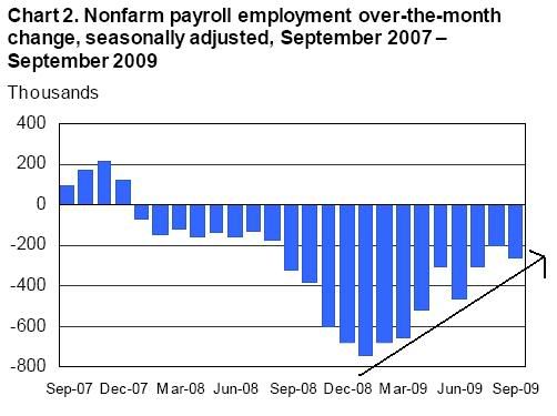
Friday's jobs report was a stunner -- and for all the wrong reasons. The consensus was for a decrease of roughly 175,000. This would have been consistent with a slow and gradual decline in the rate of job loss since the beginning of the year and would have been a positive development. Instead the number printed at -263,000. This means that for the last 5 months the economy has not printed a jobs number below a loss of 200,000. Simply put, that number is deeply concerning. However, has that number -- or more specifically has the last 5 months of jobs numbers -- destroyed the recovery?
First, let's look at why economists are talking about a recovery in the first place.
1.) The Philadelphia Fed's manufacturing index has been rising since just after the first of the year,
2.) ...as has New York's Empire State Index.
3.) The Richmond Fed's Manufacturing Index is now in positive territory
4.) ... as is the ISM Manufacturing Index.
5.) Industrial Production appears to have bottomed, printing two consecutive months of increases,
6.) ... along with two months of increases in capacity utilization.
7.) The rate of decline in durable goods orders has bottomed.
So -- we have seven different indicators that say the worst is over for the manufacturing sector. The regional fed surveys and the ISM have all climbed from incredibly low levels to show expansion.
8.) The index of leading economic indicators has increased strongly for the last 5 months.
9.) The threat of deflation -- which was one of the primary reasons for the massive stimulus plan -- is not an issue.
This is extremely important. The threat of deflation was one of the primary reasons for the stimulus spending. Deflation is what led to the great depression. Here's what happens. Consumers stop spending. Retailers lower their prices to attract buyers. This lowers retailers profit margins leading to more lay-offs. Lower sales means lower production of consumer goods which leads to more lay-offs. This lowers consumer demand and the process repeats itself. However, now there is moderate inflation. That indicates that somewhere in the economy there is enough demand pull or cost push from somewhere to increase prices.
10.) The credit markets have stabilized.
11.) The yield curve is showing expansion.
12.) The corporate and junk bond markets have rallied indicating a return of investor's risk appetite.
13.) The housing market appears to have stabilized.
14.) The pace of retail sales bottomed at the beginning of the year
15.) ... as did personal consumption expenditures.
16.) While the pollster.com's average of "is the economy getting better/getting worse" still shows more people thing the economy is getting worse, the percentages have been consistently increasing since March of this year.
17.) Commodity prices have increased (see charts for copper and industrial metals)
18.) Semi-conductor sales have increased for 6 straight months.
19.) Other economies have started to show growth.
20.) Rail traffic has increased on a the month to month basis.
21.) The stock market has rallied about 50%.
22.) The IPO market is starting to thaw.
23.) The M&A market is starting to show some life.
24.) The ISM services index is now positive.
In other words, there are numerous reasons to argue the economy has bottomed and is on the mend. In addition, there are some incredibly healthy developments in the list above. Consider the increase in inflation which indicates that pricing power exists at some point in the economy. Then there is the healing of the credit markets as demonstrated by the a2/p2 spread or the stabilization in both new and existing home sales.
Let's add one important factor to this discussion. Unemployment is a lagging indicator -- in decreases after the economy turns around. In other words, we're not in a position to even consider a decreasing unemployment rate yet.
Then there is the jobs situation, which is still the one main sticking point to a full-blown recovery. Let's take a look at the data to see where we are:
The above chart tells us the economy has yet to print a job loss of less than 200,000 -- a troubling sign. However, in the latest employment report, the BLS also told us they revised the total number of jobs lost during the recession lower by an additional 800,000+ thousand. That means that instead of coming down from a period where the economy lost 600,000/month at the end of last year and the beginning of this year, the rate of decline was even sharper. That indicates we're coming up from a deeper hole meaning an even longer recovery period then previously thought. Note that I have continually said about those who are arguing based solely on the jobs issue: an economy that losses over 2 million jobs in 4 months is not going to print a positive employment number anytime within the next 9-12 months." Now we know we are coming from a deeper hole.
My position on the jobs situation relative to the economy has changed to "I have no idea right now." When the jobs report first came out, I was extremely disappointed because the rate of decline failed to drop below 200,000. However, I did not consider completely the balance of information -- that is, considering the amount of news indicating the economy has bottomed verses the jobs situation. The reality is there are numerous data points that indicate we've reached bottom. It's not just one number. Consider: manufacturing is growing, housing sales have bottomed, consumer spending has bottomed, other economies are growing, the credit markets have healed, commodities are rallying, risk appetite has returned, semiconductor sales have increased, rail traffic is increasing. If it were one data point versus the jobs report, it would be a no brainer. But it's not. We have a ton of information pointing to a bottom and nascent recovery. In addition, the downward revision of the total jobs lost for this recession tells us we're digging out from an even deeper hole than before. That logically lengthens the time required to get back to a time of jobs creation. And finally, there is the issue of unemployment which is a lagging indicator. That means we shouldn't even be talking about the drop in the unemployment rate yet.
In short, when I figure it out I will let you know.
Treasury Tuesday's
A.) There is a long term trend line in place that goes back to mid-2007.
B.) There are secondary trend lines in place that go back to 2008.
C.) The MACD has given a buy signal
D.) Prices are strengthening relative to recent levels
A.) An upward trend line started in early August
B.) Prices moved through key resistance levels by gapping up on strong volume. This is about the strongest move an issue can make.
Notice the EMA orientation -- all the EMAs are moving higher, the shorter EMAs are above the longer EMAs and prices are above all the EMAs.
This is a very bullish chart.
Monday, October 5, 2009
Today's Markets
Click for a larger image.
A.) Prices opened higher on strong volume but couldn't maintain the upward momentum. Prices fell to the 50 minute EMA.
B.) Prices get just beyond the 200 minute EMA and then fall back in a downward sloping pennant pattern. Prices find support at the 20 minute EMA.
C.) Prices move through the 200 minute EMA and then consolidate sideways eventually finding support at the upward sloping trendline.
D.) Prices move through resistance on a volume spike, rally a bit and then move lower in a disciplined, downward sloping channel.
September Leading Indicators
- by New Deal democrat
Despite the rotten payroll and other numbers last week, it looks like the September Index of Leading Economic Indicators will print positive, for the 6th positive month in a row. The 10 indicators, with the weights given each indicator, are as follows:
- real money supply (35%)
- average weekly manufacturing hours (25%)
- interest rate spread (10%)
- manufacturers' new orders for consumer goods (8%)
- supplier deliveries (7%)
- stock prices (4%)
- consumer expectations (3%)
- building permits (3%)
- average weekly initial claims for unemployment insurance (inverted) (3%)
- manufacturers' new orders for durable goods (2%)
Here's my estimate of how each fared for September. The 7 positives were:
The yield curve is still positive, although slightly less so: +.30
Consumer nondurables up: +.06*
ISM deliveries up slightly +.03
Stocks' 3 month gain is worth +.05
Consumer sentiment adds +.20
Housing permits are worth about +.02
Initial jobless claims were much better:+.15
The 3 negatives were:
Real M2* has been trending slightly negative, so -.02
Aggregate hours in manufacturing down: -.06
Durable goods' plummeted: -0.10*
*These will be used to revise August and estimate September.
Bottom line: it looks like September Leading Economic Indicators (and revisions to August) will net about +0.6, the sixth positive reading in a row. For the last 6 months, LEI will be up ~5.2. Year-over-Year, LEI will be up ~2.5.
Redefining the Phrase "Jobless Recovery"
The first use I can find in the NY Times of the phrase “jobless recovery” comes from an article dated October 12, 1991. Some – emphasis on that word – of the similarities between then and now are striking:
"The consumer did come out of the closet in the spring," said Nicholas Perna, chief economist at the Connecticut National Bank. "The problem is that they ran straight into a jobless recovery."
The economy has generated just 224,000 jobs since April. Many large companies as well as state and local governments continue to announce cost-cutting measures that include layoffs, and few executives expect the kind of rip-roaring job growth that followed the deep 1981-82 recession.
"The growth in the economy has come mostly from rising productivity, not new jobs," Mr. Perna said.
That has kept consumers who have held on to their jobs feeling anxious. Confidence surged in March after the Persian Gulf war ended but "has been moving sideways ever since," said Richard Curtin, director of the Consumer Survey Research Center at the University of Michigan.
Lacking the Cash
And incomes, which have been inching up, have not recovered from the recession yet. On average, each American consumer lost about $450 in after-tax income in the recession and has recouped just $100 of that loss, according to David Kelly, an economist at Data Resources Inc. "The glass is just one-quarter full," he said.
So far, consumers have been squeezing their savings, freeing up ready money by paying off debt, and benefiting from lower inflation. But spending cannot continue to climb much faster than income for long. So with job growth likely to stay anemic, Mr. Kelly said he expected consumer spending to rise at just a 2 percent rate in the fall.
Employment peaked in June 1990 at 109,817,000. It troughed 11 months later at 108,196,000, for a loss of 1.6 million jobs. It returned to the previous peak 21 months later, in February 1993, when it hit 109,967,000. In other words, it took 32 months from start to finish to re-attain the previous peak.
Fast forward to the 2001 jobless recovery. Employment peaked in February 2001 at 132,530,000. We then did a slow bleed for some 30 months, hitting a trough in August 2003 at 129,822,000, for a loss of 2.7 million jobs. 18 months after that, in February 2005, we re-attained the previous peak as we got back to 132,720,000. All in, reaching the previous peak took some 48 months, making the last recession’s recovery even more jobless.
As of last Friday’s jobs report, we have now lost some 7.2 million jobs since the peak in employment that we hit in December 2007. We’re now 22 months in and still losing 263,000 jobs/month.
Via FRED, I have taken the average jobs numbers for the previous two “jobless” recoveries and overlaid our current recession. In addition, I have added an employment forecast provided by a friend who works as an economist at one of the country’s Federal Reserve Banks (frankly, I think he’s a bit optimistic, but we’ll go with it for now). Here’s what we see (click for larger image):
This chart scares me. (Lots of charts I make scare me; I don't know why I keep making them.)
The first thing that jumps out at me is how severely the labor market is contracting relative to the last two recessions. Second, though I think my Fed friend is a good economist, I do have a hard time buying into his forecast, which essentially calls for positive NFP prints starting next month and continuing for the next 14 months (and beyond).
Now, 36 months takes us to December 2010, at which point we will still be woefully behind the average jobs recovery of the last two recessions. I'd guess we'll still be behind the eight ball in December 2011, fully 48 months after the onset of the recession.
On a very related note, there was nothing -- nada, zilch -- in last week's employment report that hinted of recovery in the labor market. The headline number was worse than expected. Had a number of folks not dropped out of the labor market, the unemployment rate would have breached 10%. The most all-inclusive measure of labor market weakness -- the U-6 report -- climbed from 16.8% to another new record, 17%. And it's hard for me to buy into the argument that the report wasn't as bad as it looked because 53,000 of the jobs lost were government employees. Do those folks not shop? Not have to put food on the table, gas in the car, pay the mortgage?
And I'd be remiss if I didn't point out that in last Friday's release, the BLS announced wholesale backward-revisions:
"The preliminary estimate of the benchmark revision indicates a downward adjustment to March 2009 total nonfarm employment of 824,000 (0.6 percent)."
That's 824,000 more jobs lost than the 7.2 million we've alredy recorded, meaning that when these revisions are incorporated in a few months, the total for the period will be over 8 million, making the chart above all the more scary. Barry Ritholtz has more on the farce that is otherwise known as the Birth/Death adjustment.
On another related note, the Wall St. Journal reported on Friday:
Consumer bankruptcies topped one million for the first nine months of this year, the highest point since the system was overhauled in 2005.[...]
"Bankruptcy filings continue to climb as consumers look to shelter themselves from the effects of rising unemployment rates and housing debt," the institute's Executive Director Samuel J. Gerdano said.
My ongoing fear is that any semblance of recovery is going to be very elusive absent the participation of the consumer.
I've not seen a green shoot in a while, and I'm becoming fearful now that Cash for Clunkers is gone, the first-time homebuyer credit is going to (possibly) expire, and we got a scrape-along-the-bottom series of non-Armaggedon-like numbers, we've got nowhere to go. The stock market may -- stress "may" -- have also come to that realization over these past couple of weeks. It would appear the burden may have shifted to the green-shooters for now.
Market Mondays
Let's take a look at last week's market action. Click on all images for a larger image
First, on the long term chart, notice that (A) prices have broken through a long-term trend line that started in March.
Prices have also moved through the trend line started in early July.
A.) Prices hit the 50 day EMA and bounced higher. This is also the same price level established at a high point in August.
B.) The 10 day EMA is about to move through the 20 day EMA. This is not fatal as it is a short-term trend.
A.) Prices did not follow-through (move higher) after a strong showing on Monday.
B.) Prices dropped hard on high volume but rebounded. However,
C.) Prices moved through the same trend line again later in the day on high volume.
D.) As prices moved lower they continued to consolidate gains in upward sloping pennant patterns.
E.) On Friday, notice that prices had a slight upward bias. However, this can be seen as a long, upward sloping consolidation pattern on the way lower.
Subscribe to:
Posts (Atom)